Built with Framer
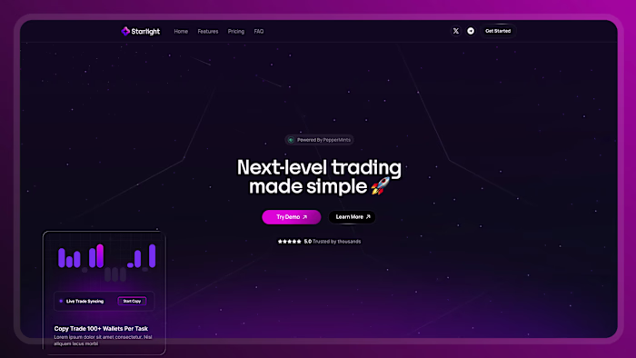
Gemini said This design utilizes stark
Z Hasan
Gemini said
This design utilizes stark light-on-dark contrast to immediately draw the eye, prominently featuring bright white, floating UI cards layered over dark, moody photographic backgrounds in both the hero and bottom sections. This high-contrast strategy continues down the page through bold, alternating color bands—shifting abruptly between clean white sections with dark text, a deep forest green block highlighting bright white service cards, and a solid black footer. These sharp visual breaks rhythmically guide the user's attention and make key actions and information blocks impossible to miss.
Like this project
Posted Mar 18, 2026
Gemini said This design utilizes stark light-on-dark contrast to immediately draw the eye, prominently featuring bright white, floating UI cards layered over...
Likes
0
Views
2