Built with Framer
The design strategically employs contrast
Z Hasan
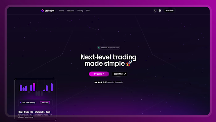
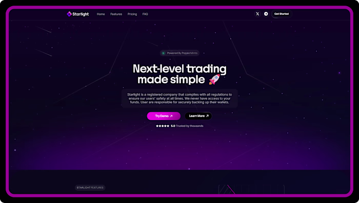
The design strategically employs contrast to guide the user's attention, most notably through a striking dark-themed block positioned about two-thirds down the page. Against the otherwise airy backdrop of white and pale lavender, this deep charcoal section creates a sharp visual break that instantly draws the eye to its core message: "Build and customize your payment platform." This high-contrast area acts as a powerful focal point, breaking the scrolling rhythm to emphasize a key secondary call-to-action. Beyond this large dark block, the design also utilizes vibrant purple buttons throughout the lighter sections, providing sharp, localized contrast that makes the primary interactive elements pop and clearly signals where the user should click next.
Like this project
Posted Mar 18, 2026
The design strategically employs contrast to guide the user's attention, most notably through a striking dark-themed block positioned about two-thirds down t...
Likes
0
Views
1