Drype Logo
Stuti Mehta
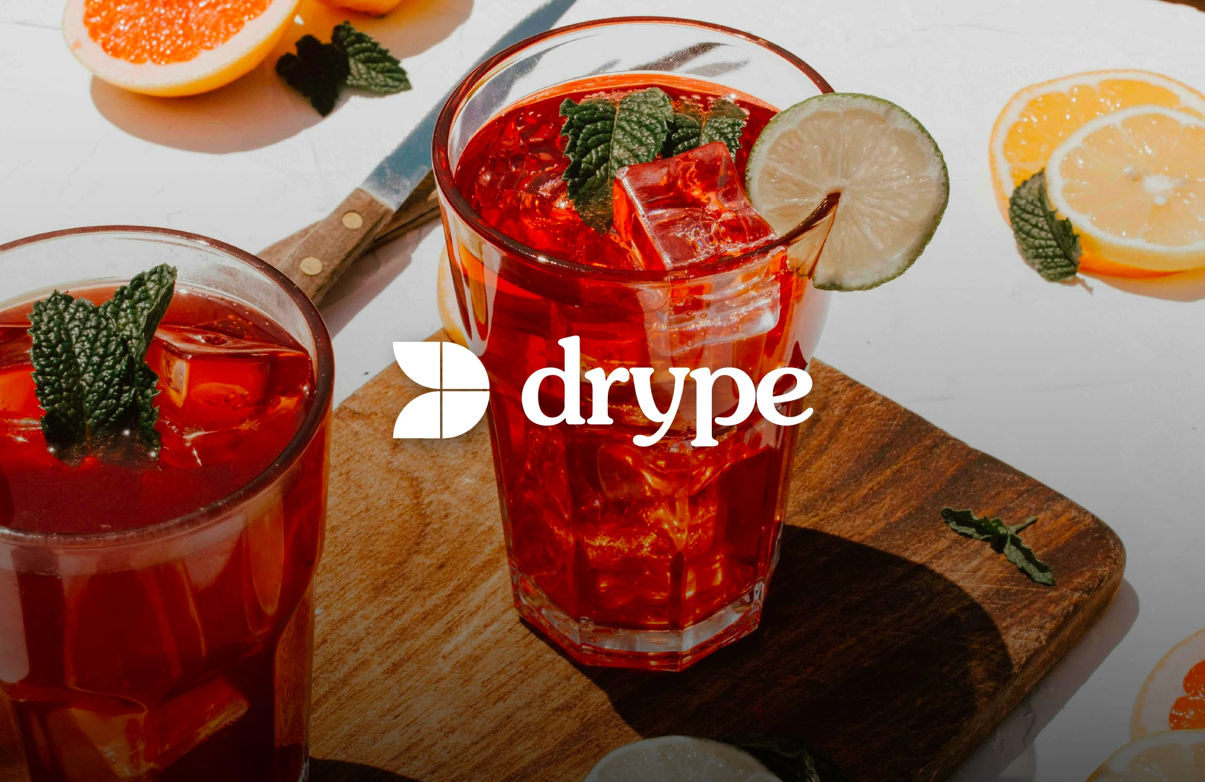
I participated in Terraviva's latest 2024 competition to redesign the Drype logo. Drype, always seeking to innovate and enhance its products, decided to explore new creative directions for its brand identity. By inviting designers worldwide to reimagine and redesign its logo, Drype opened itself to fresh possibilities for change and improvement. This is how I developed a new concept and look for their logo.
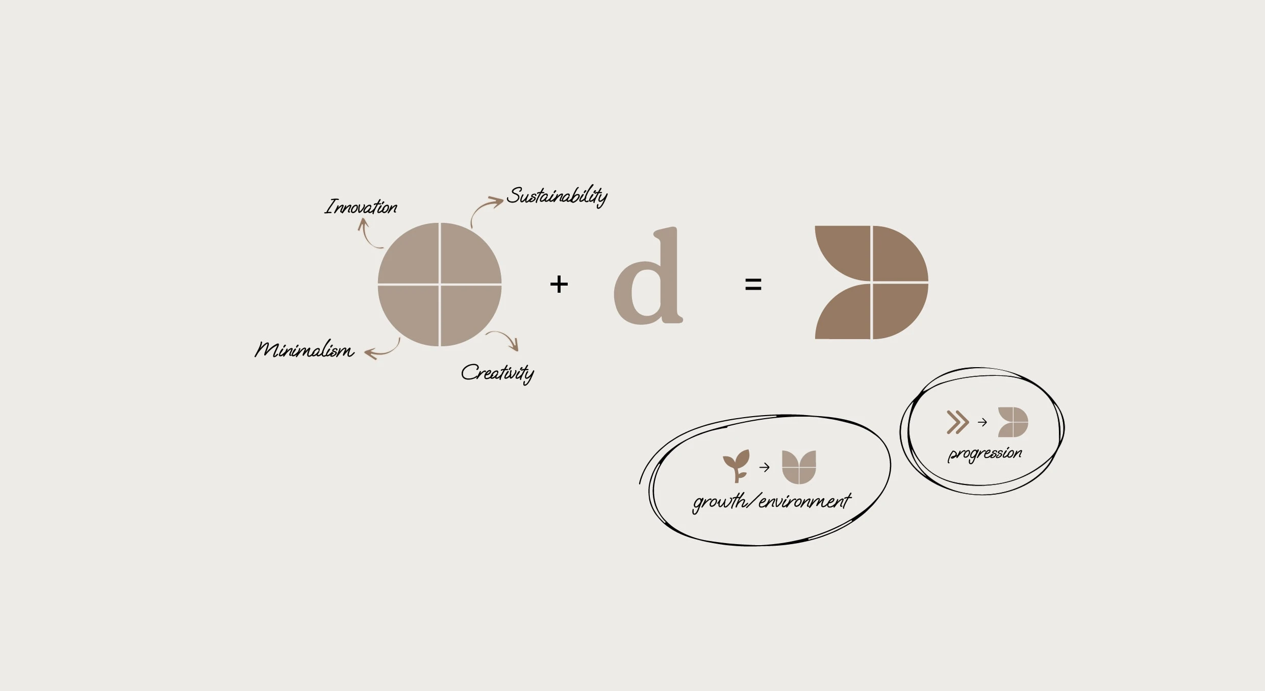
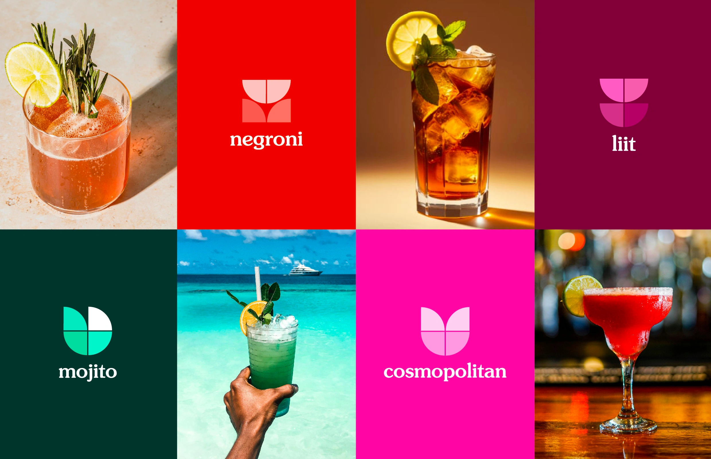
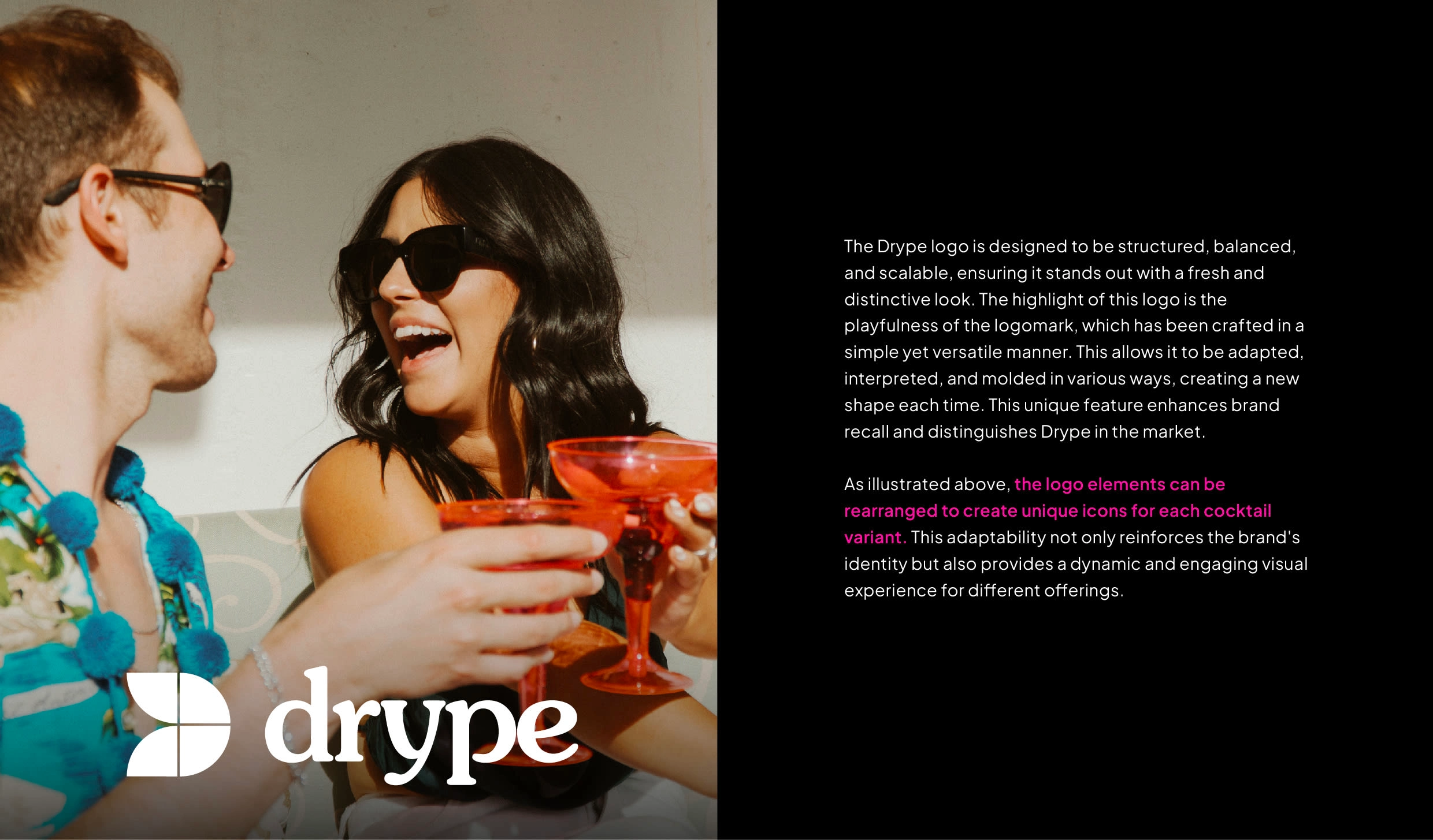
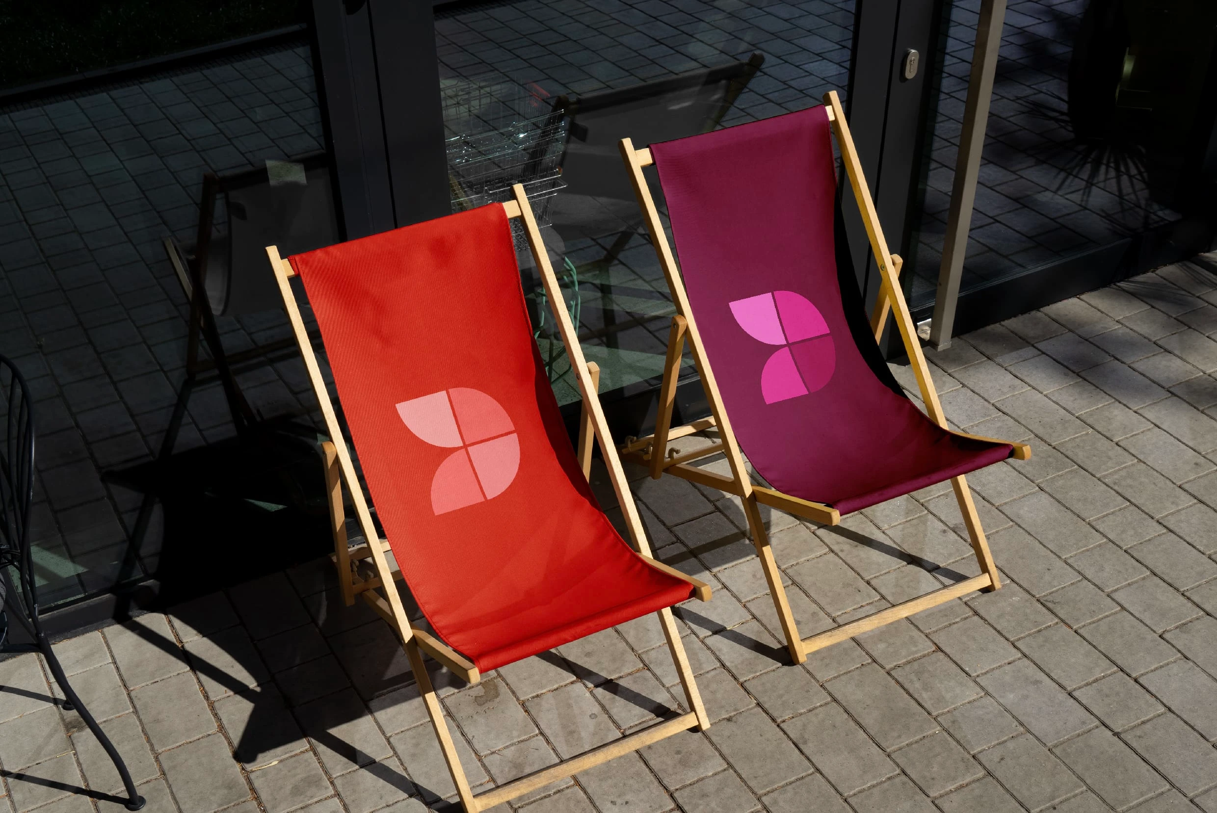
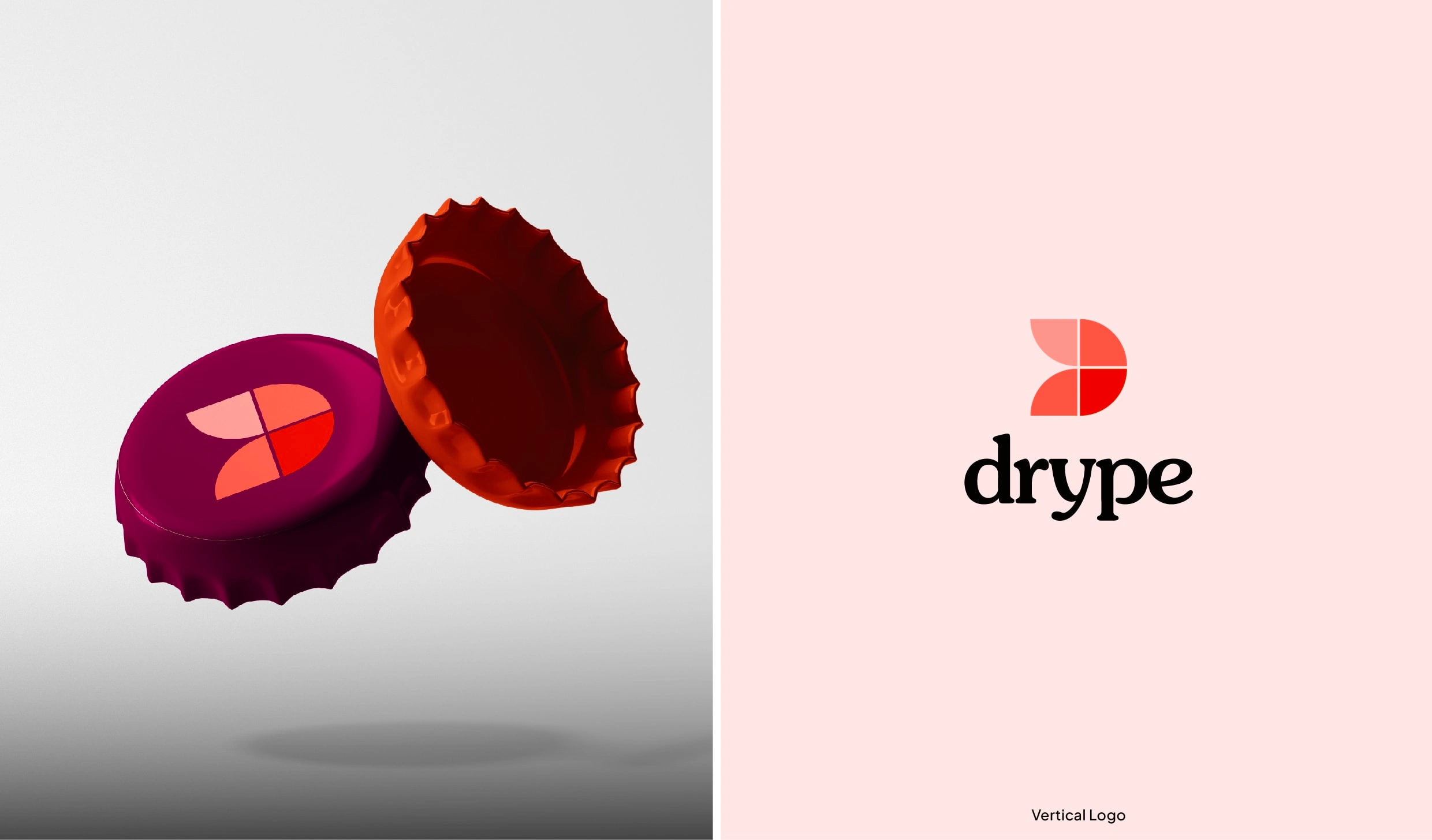
The logo mark for Drype is inspired by its four core values: innovation, sustainability, creativity, and minimalism. Starting from a simple circle divided into four parts, each segment represents one of these values, coming together to form a cohesive unit. These parts are creatively reimagined to shape the letter 'D' in 'Drype' in a visually engaging way.
Logomark
The logo mark for Drype is inspired by its four core values: innovation, sustainability, creativity, and minimalism. Starting from a simple circle divided into four parts, each segment represents one of these values, coming together to form a cohesive unit. These parts are creatively reimagined to shape the letter 'D' in 'Drype' in a visually engaging way.
Designed with simplicity, versatility, and easy recall in mind, the logo mark seamlessly adapts across various applications and sizes. More than just a symbol, it embodies various emotions and can be interpreted in multiple ways. It symbolizes growth, progression, and environmental consciousness, all while maintaining a modern, unique, and innovative aesthetic.
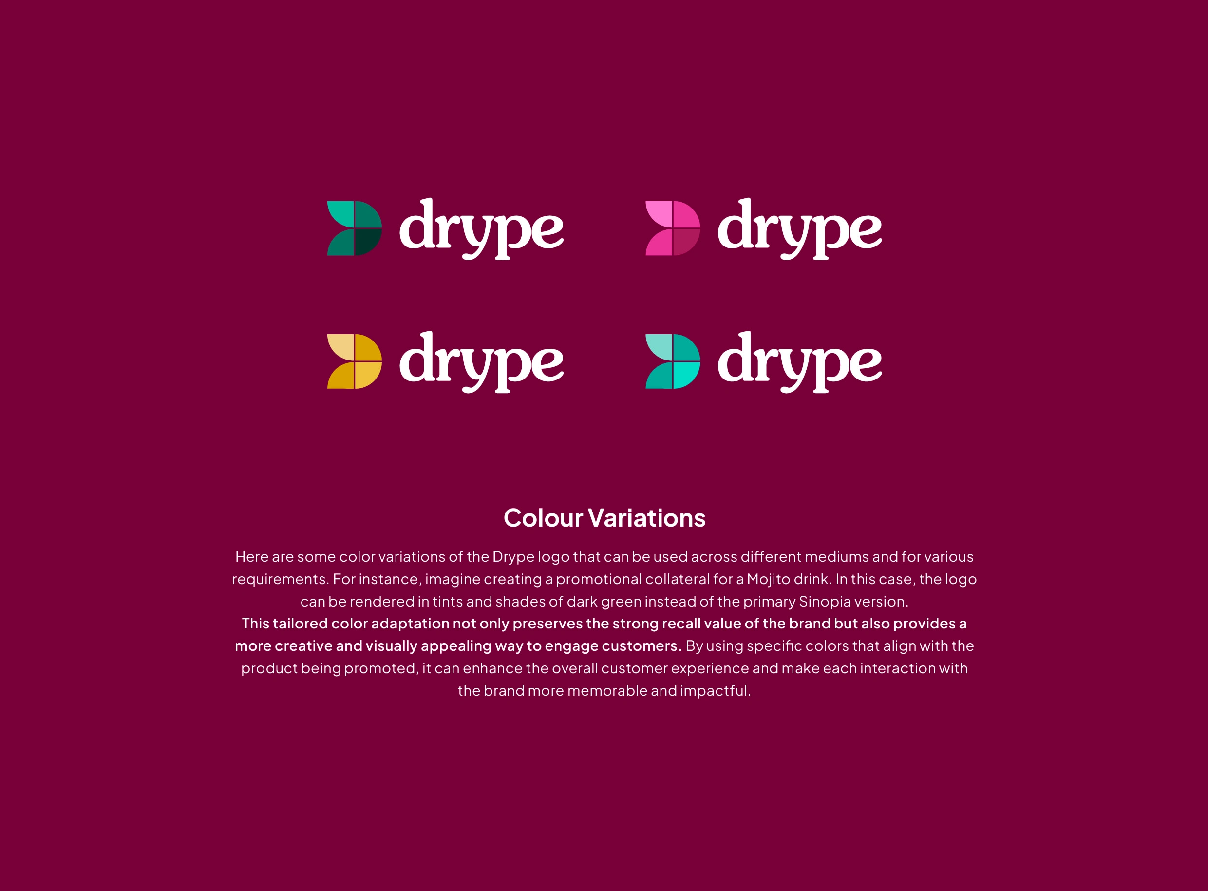
Colour Palette
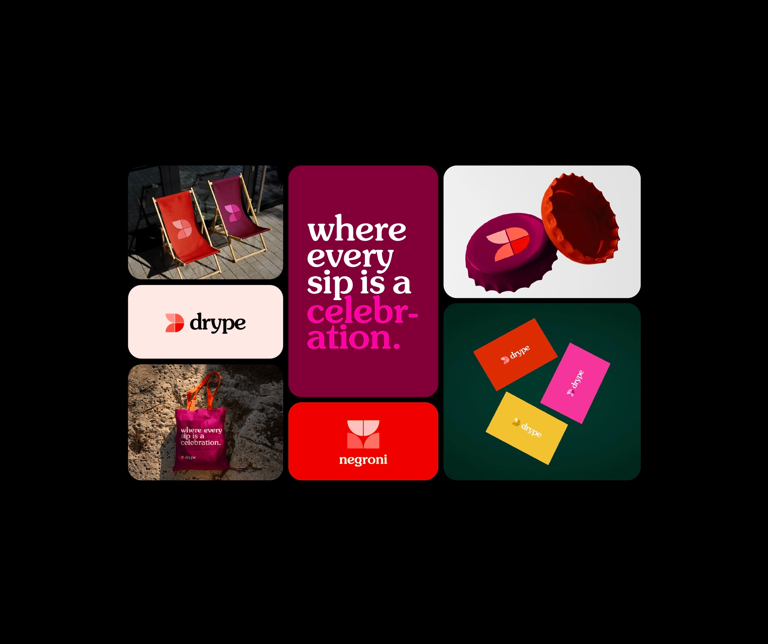
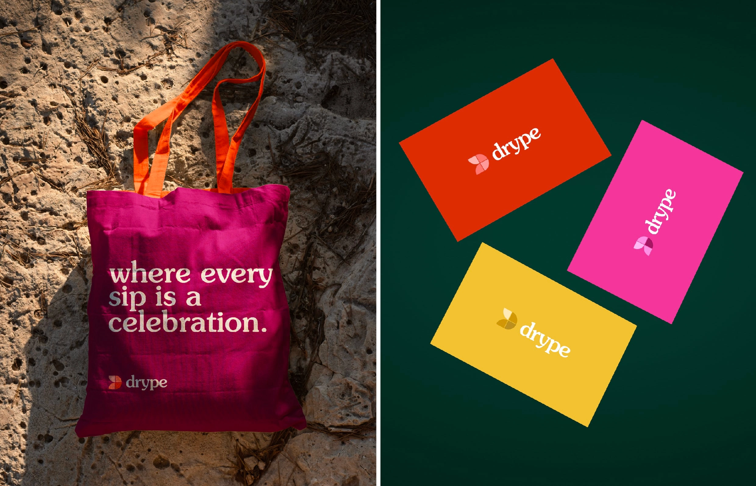
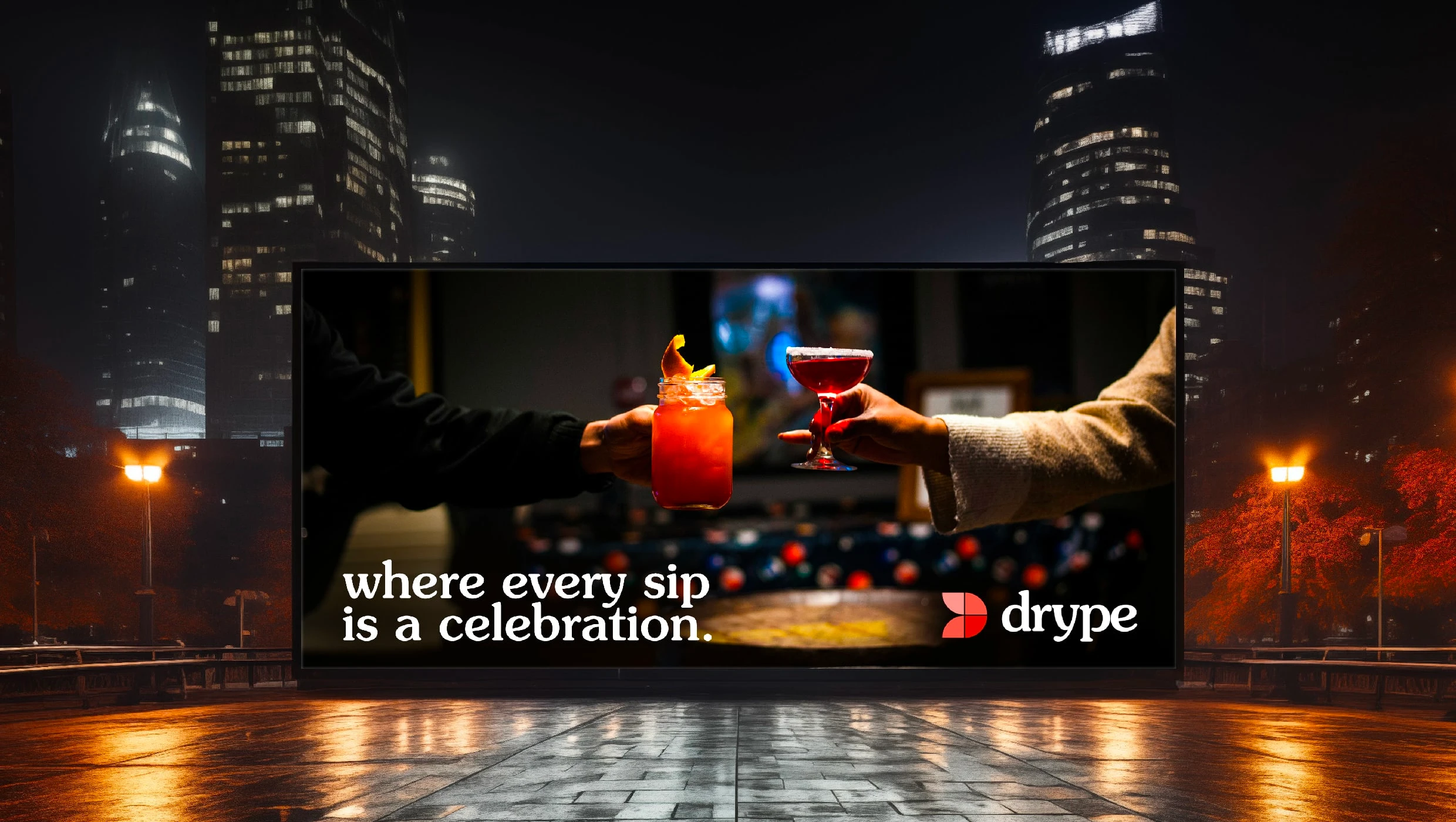
The colors chosen for Drype's visual identity are an unusual combination, especially for an alcoholic drinks brand. This choice aims to break away from the neutral tones typically associated with the industry, opting instead for a palette that feels rich, grand, yet playful and modern. This distinctive color scheme reflects the fundamental values of Drype's original and colorful cocktails.
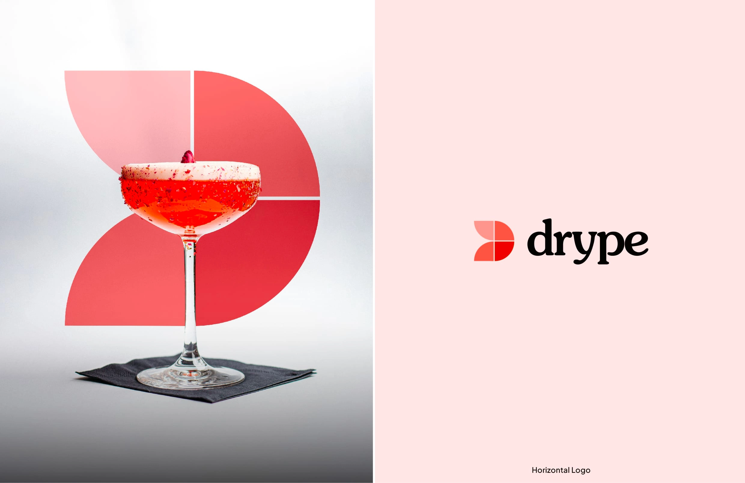
The visual identity includes four primary colors that can be creatively used to market the product, along with two secondary colors to add a pop of vibrancy when needed. These colors are inspired by the hues commonly found in cocktails, ensuring easy relatability for the audience.
The primary logo for Drype features shades and tints of Sinopia, chosen for its strong, powerful presence that commands attention. This fiery color symbolizes strength and newness. Additionally, the logo has variants to suit different marketing needs and situations, allowing for flexibility while maintaining brand coherence.
Logotype
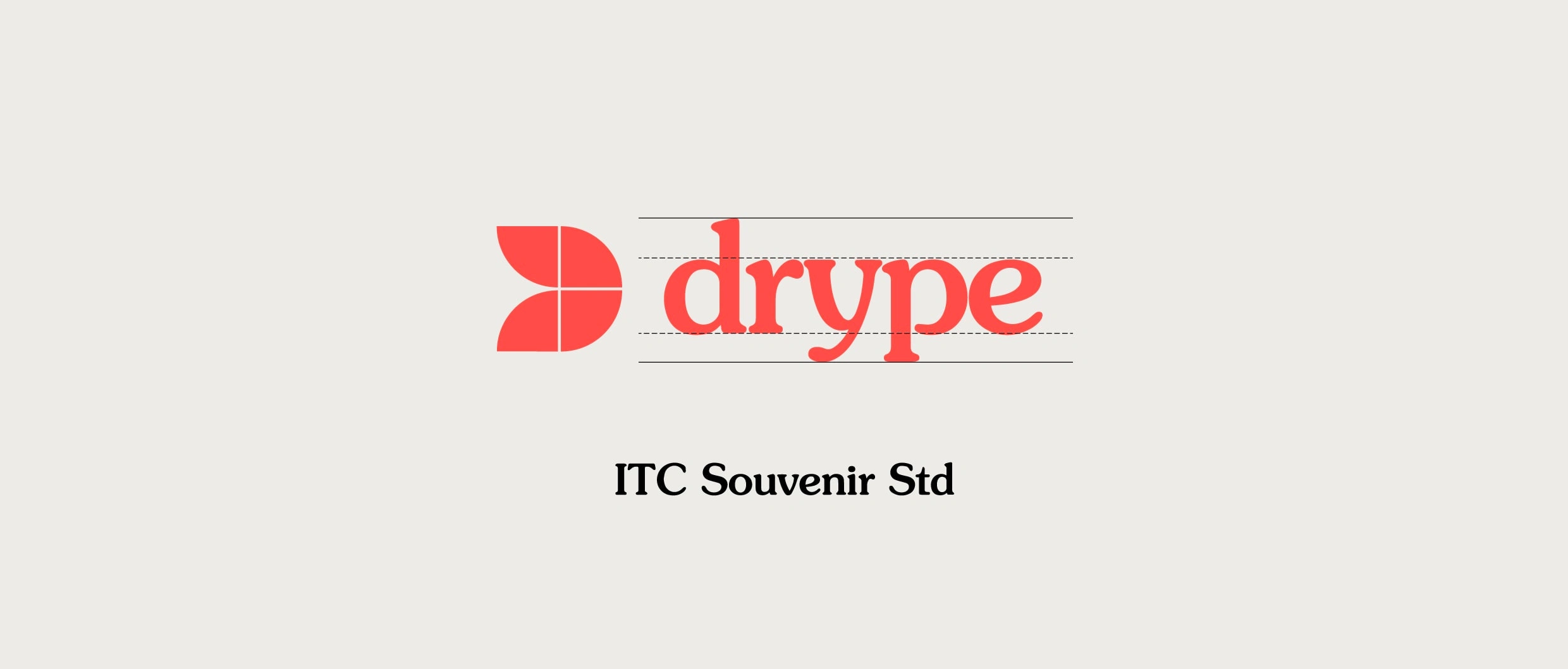
The typeface chosen for the 'Drype' logo is ITC Souvenir Std. The goal was to select a contemporary font that also exudes a classic appeal, engaging effectively with the audience. It needed to complement the logo mark without overshadowing it, creating a harmonious and unified visual identity. The font should appear balanced and relatable, fresh yet timeless.
ITC Souvenir Std perfectly fits these criteria. Its weight, curves, and classic modern serif style enhance Drype's logo, helping it stand out in the market while maintaining an elegant and distinctive presence.
Like this project
Posted Jun 22, 2024
I joined Terraviva's 2024 contest to redesign the Drype logo. Drype, seeking innovation, invited global designers to reimagine its brand. Here's my new concept.