Innovation Park | Branding a Master-planned Development

Kyle Eertmoed


Innovation Park
Branding a Master-planned Development
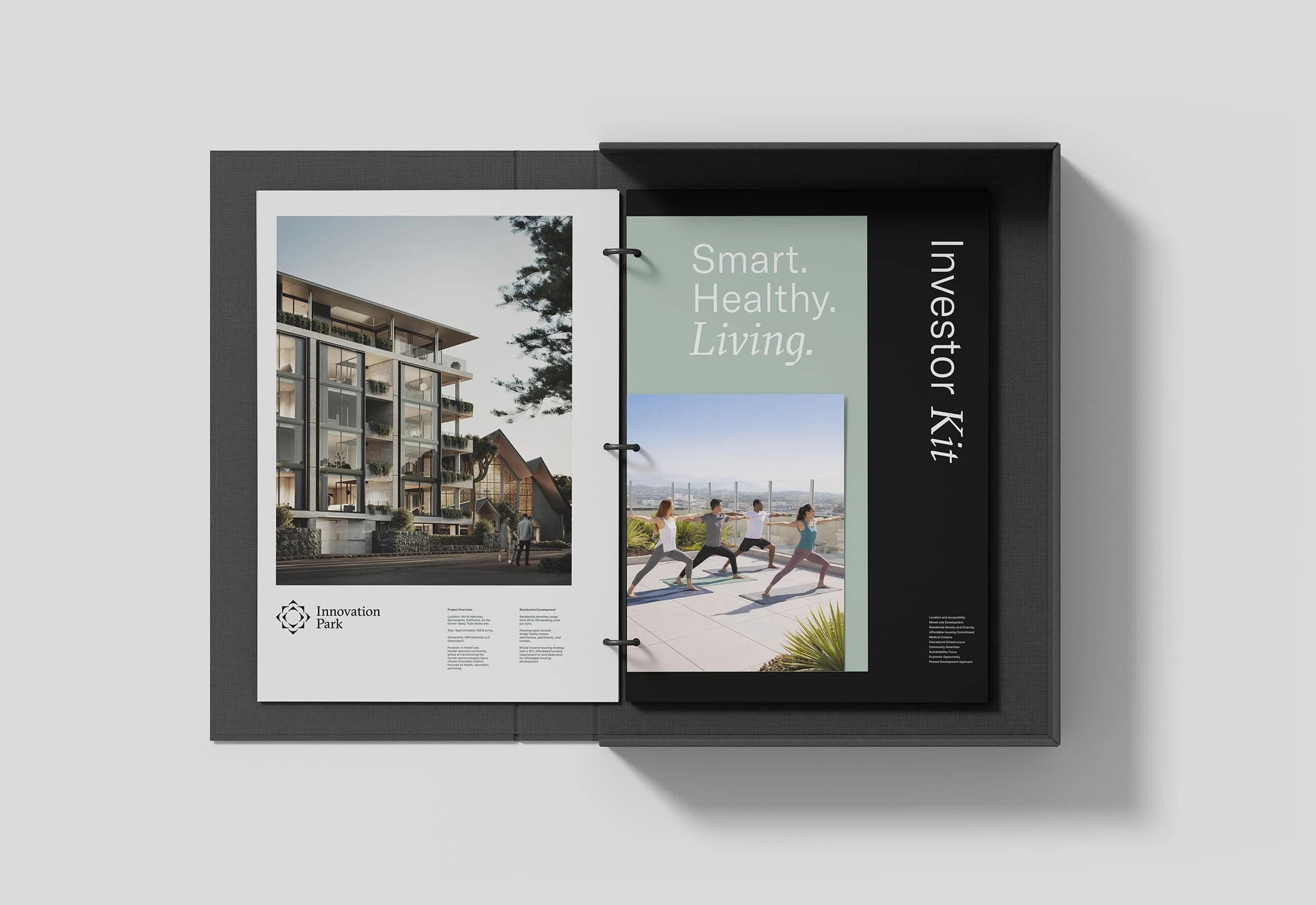
Partnering with Aero Agency, we translated audience and market insights into clear positioning, visual identity, and digital touchpoints for Innovation Park, a 183-acre, $1.8 billion mixed-use redevelopment project in Sacramento, California. Uniting housing, the California Northstate University Medical Center, and a STEM academy in one walkable neighborhood, the project required an identity that could speak to homebuyers, professionals, and investors alike. We built a complete system including identity, voice, website, photography direction, and vision book.
The Challenge
Innovation Park needed to speak to a wide range of audiences simultaneously: homebuyers, medical professionals, investors, and commercial developers. The risk with a project this broad is a brand that tries to say everything and lands nowhere. Rather than presenting a range of logo options, the work began with two complete strategic directions, each a distinct visual world with its own positioning, identity, and tone. Both were on strategy. The difference was one signaled urban progress, the other community and belonging. The client chose the second, Cultivation, and that decision shaped everything that followed.
Services
Brand Strategy
Visual Identity Design
Logo Design
Website Design
Credits
Kyle Eertmoed, Design Director
Nathanael Clanton. Creative Director, Aero Agency
Argent Development, Client
Fong Chan, Architect
Kim Knoll, Art
Recognition
2026 Creativepool Design Annual Shortlist
“An incredible designer. I partnered with Kyle to design the visual identity for Innovation Park, a 183-acre, $1.8 billion mixed-use redevelopment project in Sacramento. We built a complete system for my friends at Argent Development, including identity, voice, website, photography direction, and vision book. Needless to say, Kyle is a phenomenally talented creative, with a keen eye for design, tone, language, and aesthetics. I knew he was the right guy because I didn't just need 'a designer', but a true partner who could help me bring this vision to life. He didn't disappoint.”
—Nathanael Clanton, Creative Director, Aero Agency

By The Numbers
These figures reflect the scale of the Innovation Park development and the range of audiences the brand needed to serve.
184 acres of master-planned community
1,354 planned residential units across five housing types
730,000 sf teaching hospital anchoring the health district
260 patient beds, Level II trauma center
2,500 students served by the on-site STEM academy
35-acre health district
24+ acres of planned parks and open space
$14 billion projected economic impact
8,700+ jobs created
5 miles from Sacramento International Airport
The Work
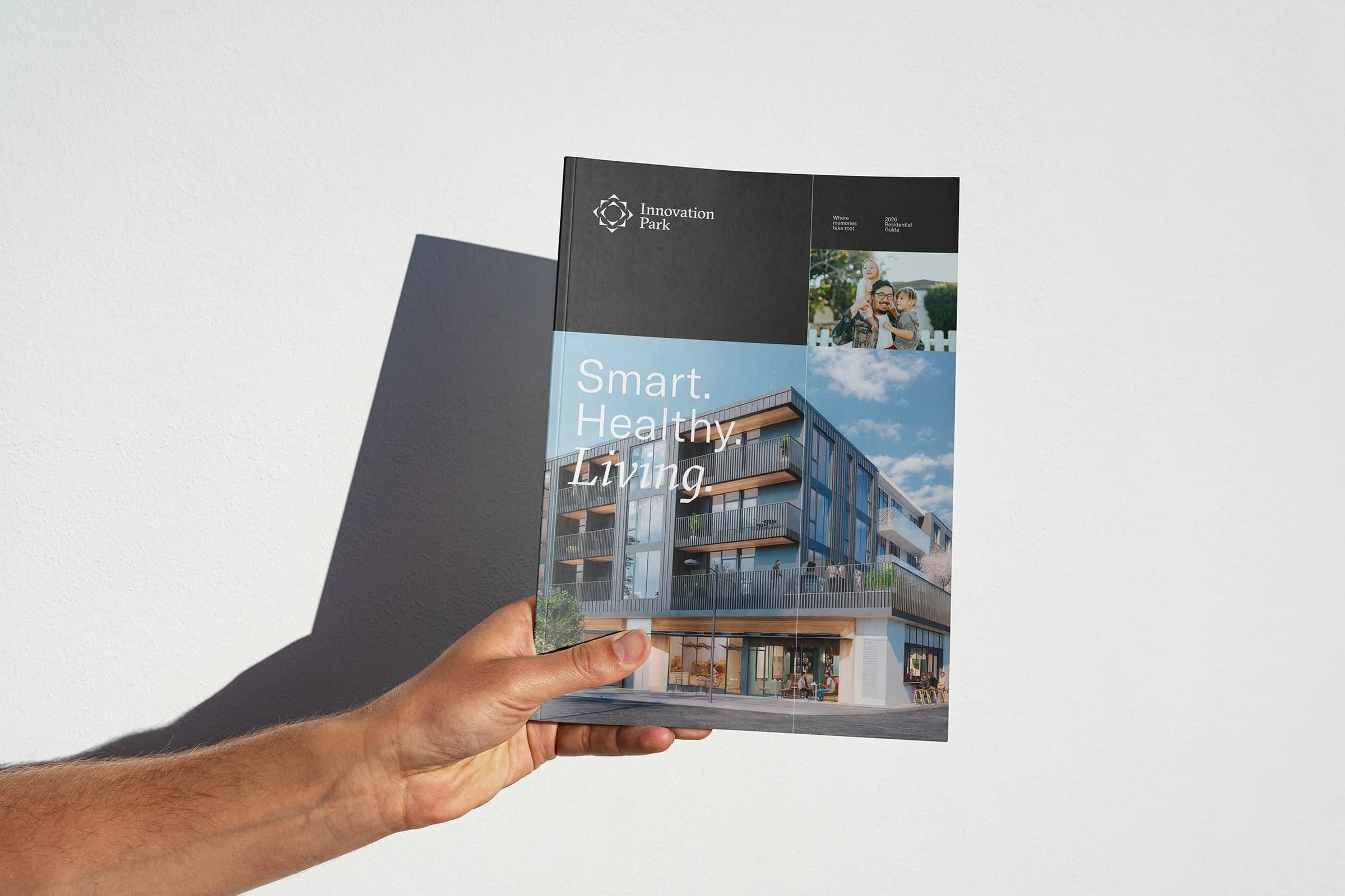
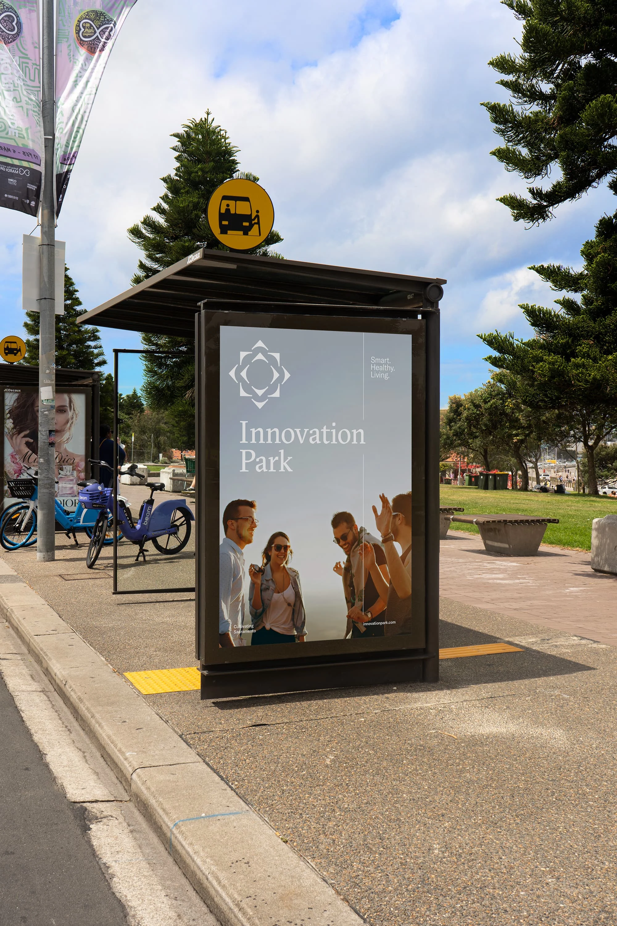
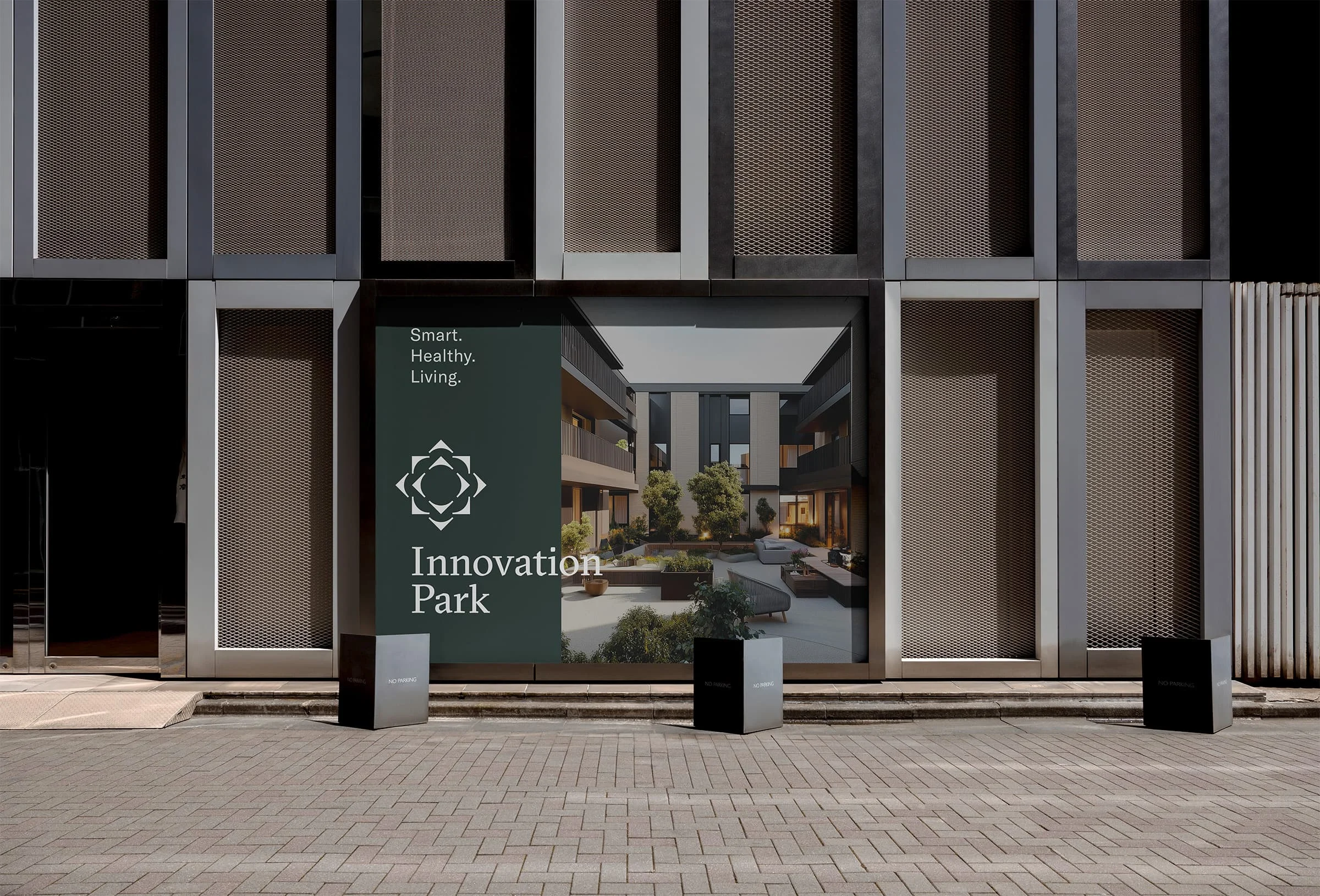
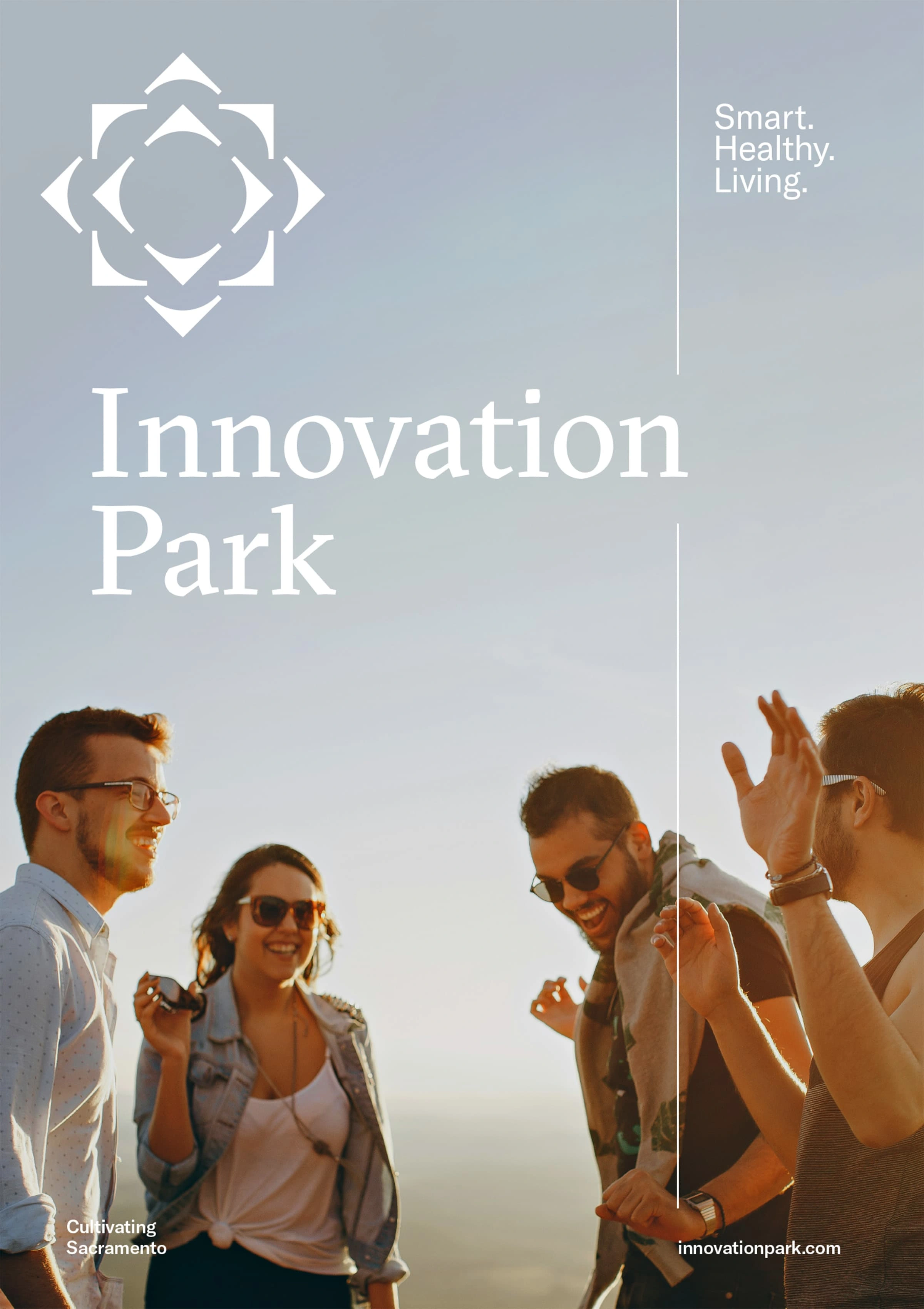
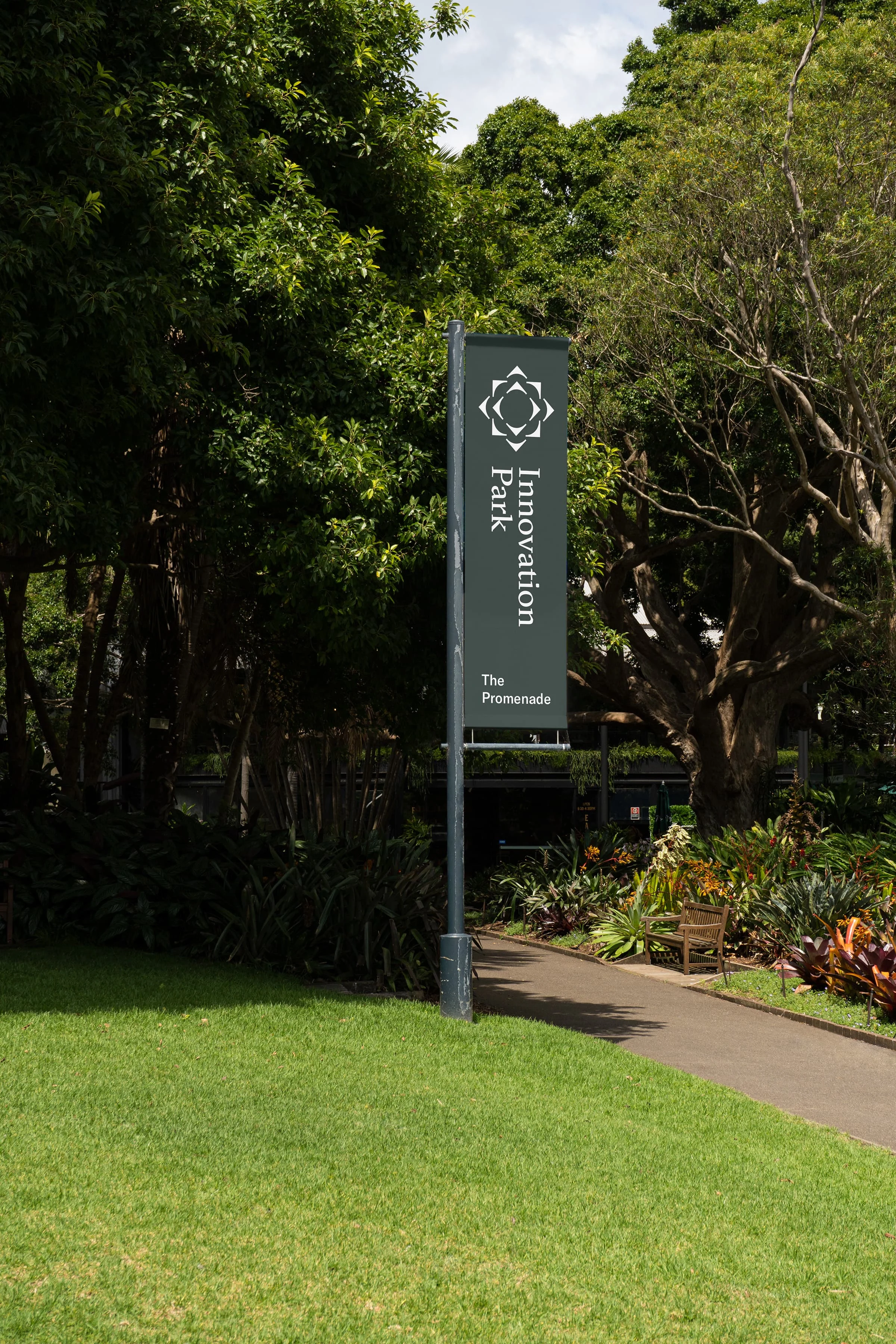
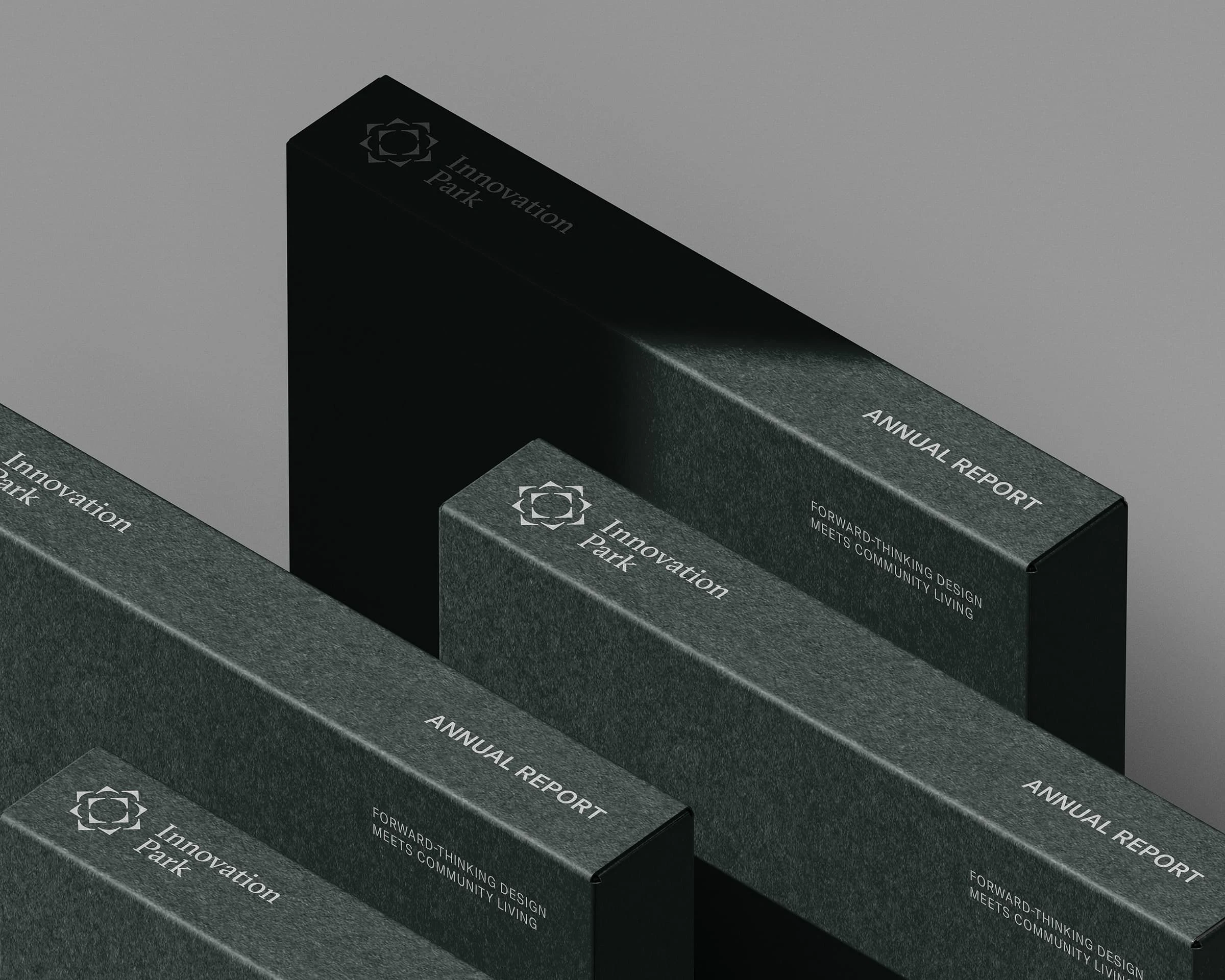
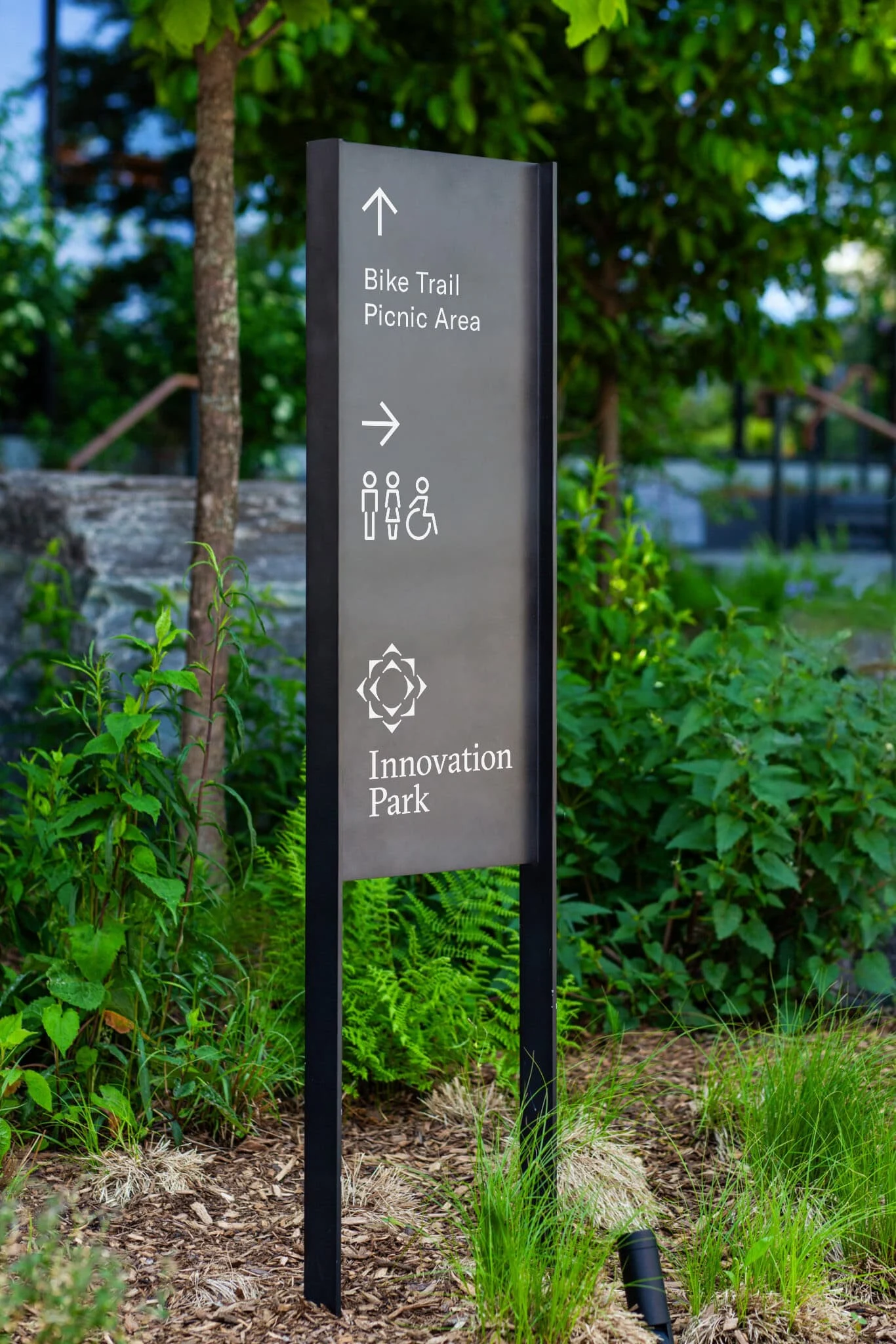
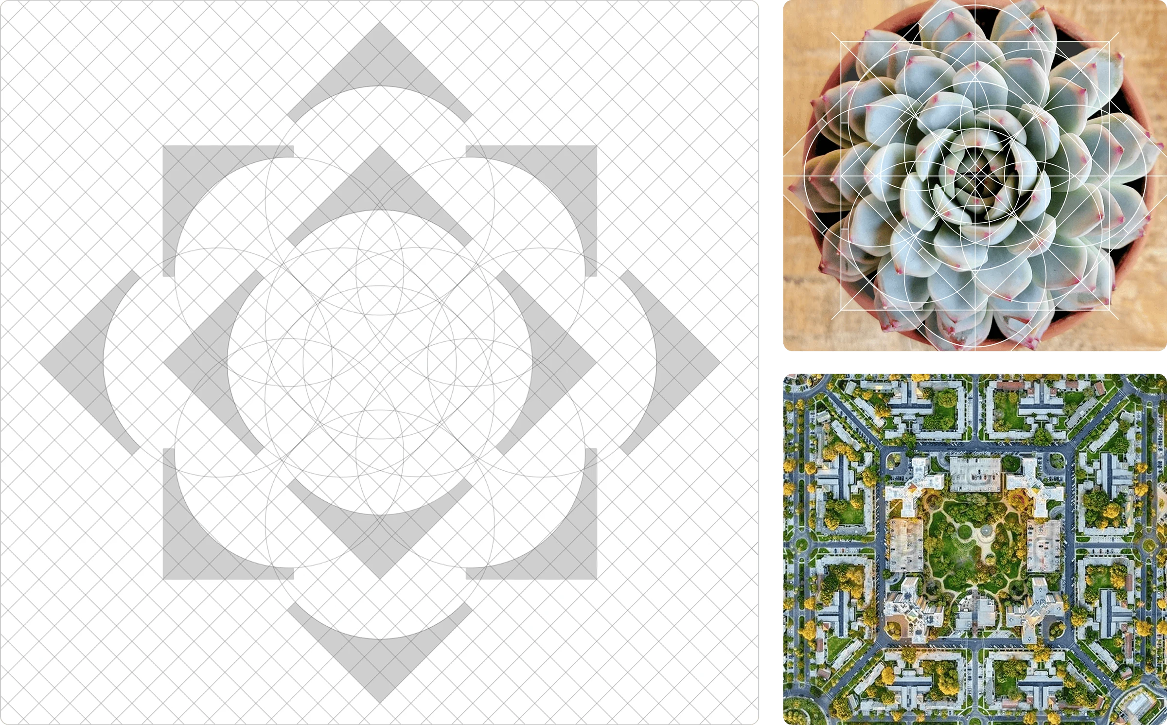
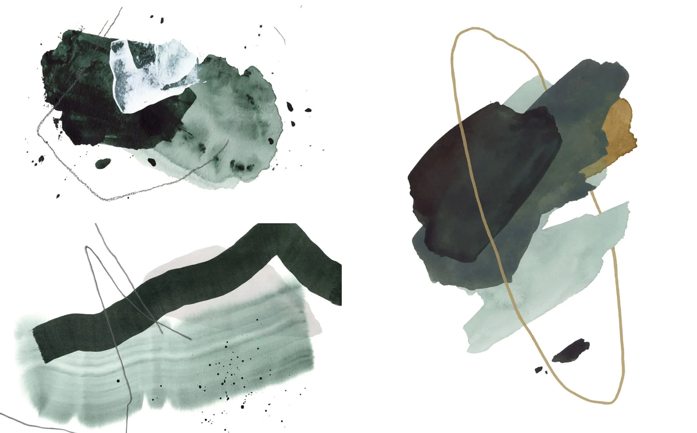
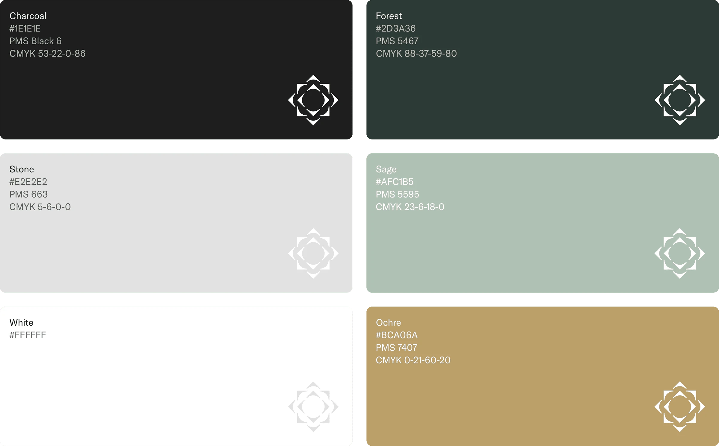
The chosen mark draws from layered geometric forms arranged in a radial, blossoming pattern, referencing growth, community, and natural geometry. Forest green and ochre anchor a palette that reads warm without feeling rustic, and holds up across print, digital, and environmental applications. Typography pairs GT Sectra with GT America, balancing editorial sophistication with functional clarity. The system extended across brand guidelines, a vision book, photography direction, motion graphics, signage, wayfinding, and digital. The brand voice, anchored by Smart. Healthy. Living., carried the same balance as the visuals: clear, warm, and forward-looking.
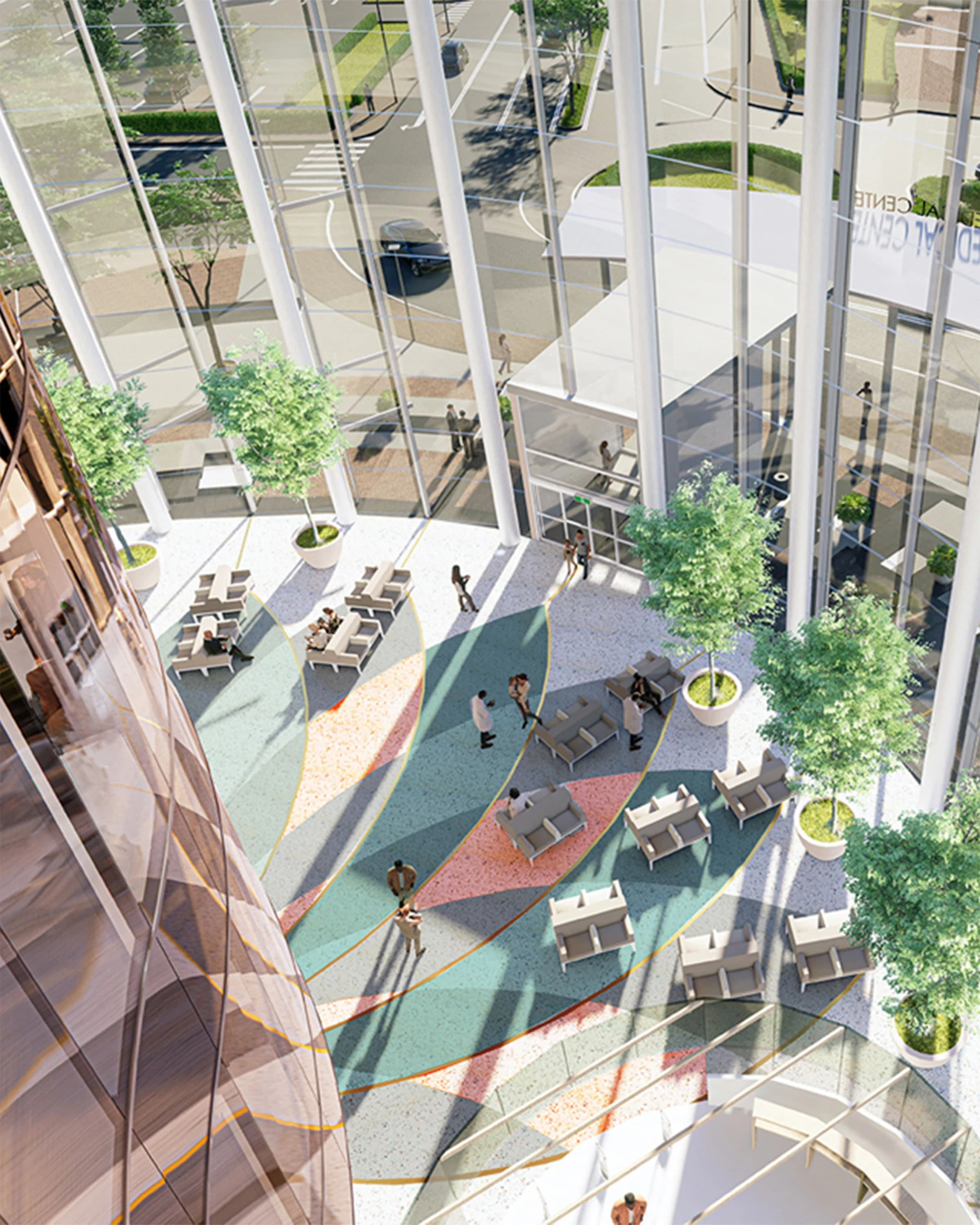
Renderings by Fong Chan, Architect
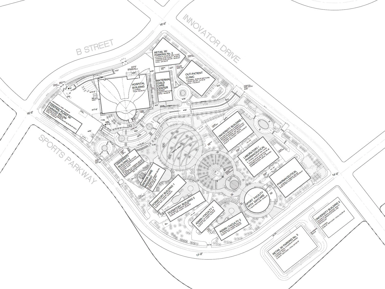
Plans by Fong Chan, Architect
Like this project
Posted Sep 28, 2026
Developed a complete brand system for Innovation Park with a focus on identity and digital touchpoints.