Home Page Design: UNCAP Digital Lab
Nicholas Smith
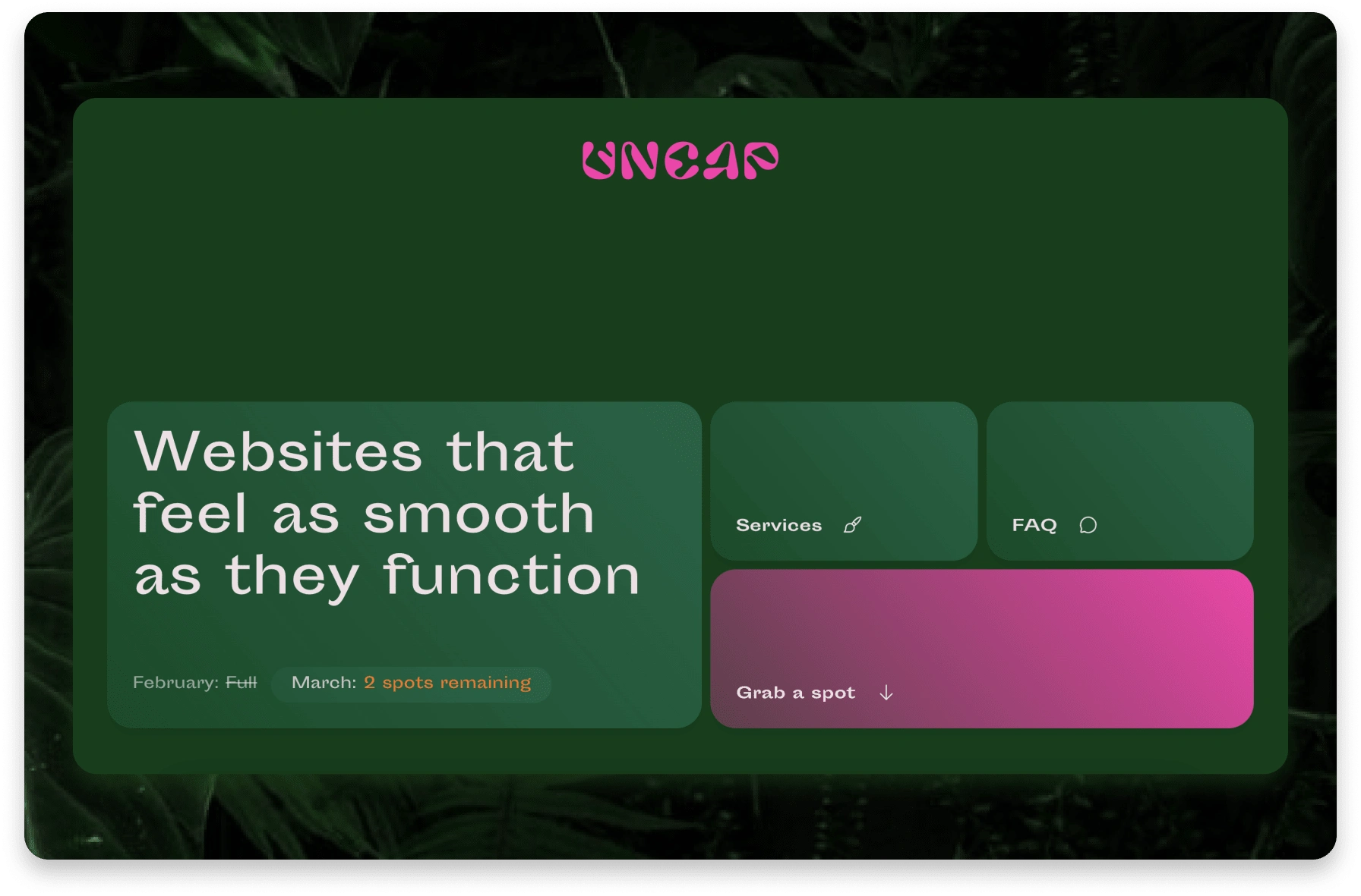
We created a simple, grid-based header that allows the colours and H1 to do the talking.
Simple, yet opposing tradition.
This site was crafted to provide comfort for the user, but also challenge their expectations of what a website could be. The smooth greens, rounded edges, and slower animations work on creating comfort, while the popping pink and uncommon layouts work to disrupt.
Styles
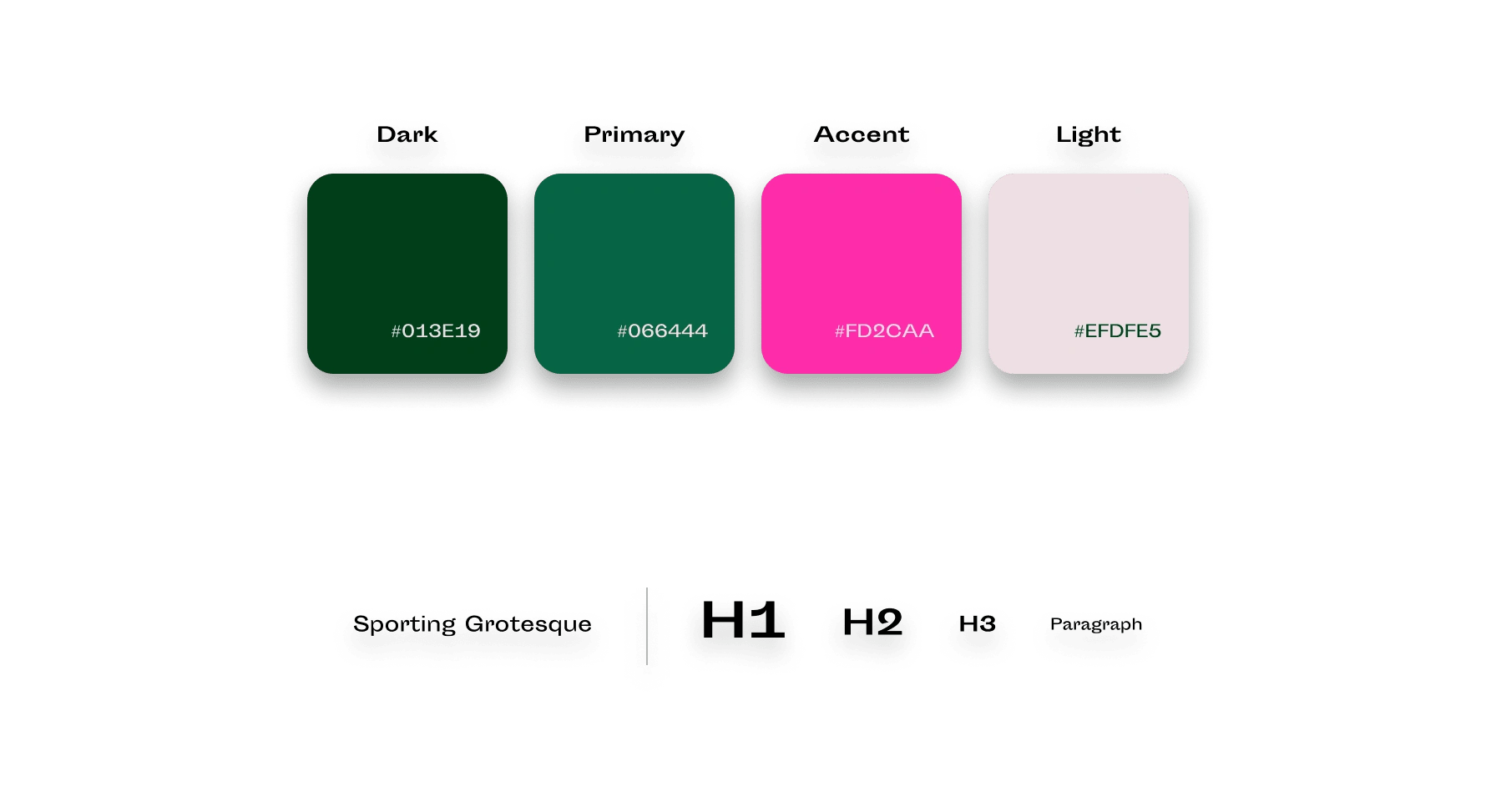
Smooth greens with a punchy pink, perfectly summed up with the Sporting Grotesque font
Interaction
Usually my sites will have subtle animations to make it feel like the site is breathing, this one I wanted it to feel as though the site was alive and playful, so it's a little more in your face.
Check out the live site https://uncapdigital.com
Like this project
Posted Feb 22, 2023
A smooth, yet punchy design of the UNCAP Digital Lab home page. Used colours, snappy text and interaction to take the users from comfortable to excited.
Likes
0
Views
10