Volunteer Recruitment Social Media Post
Deema Mubarak

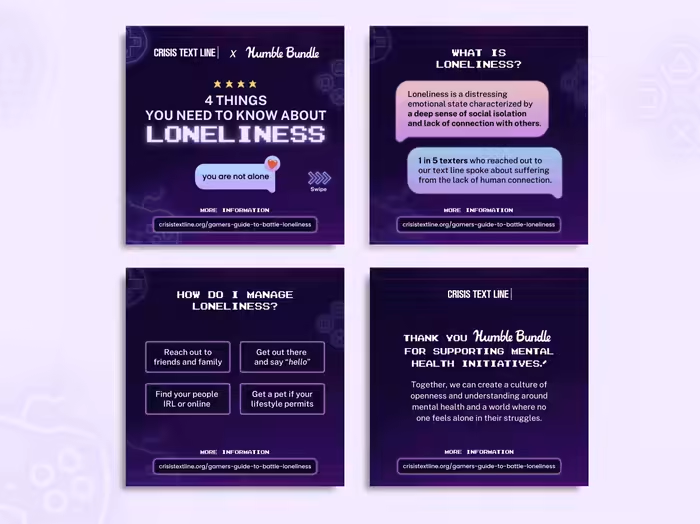
Designed a compelling recruitment post for social media to attract potential volunteers for Crisis Text Line, effectively highlighting the opportunity to make a meaningful impact through text-based support.
In the design, I used a mostly duo-tone color palette, using contrasting hues, to create visual interest and utilized illustrations to visually communicate the support and empathy inherent in the Crisis Text Line mission. For the typography, I structured the hierarchy of the text, emphasizing the most important call-to-action elements, ensuring clarity while guiding the viewer's attention in a logical flow.
Like this project
Posted Jan 15, 2025
Designed a compelling recruitment post for social media to attract potential volunteers to Crisis Text Line.