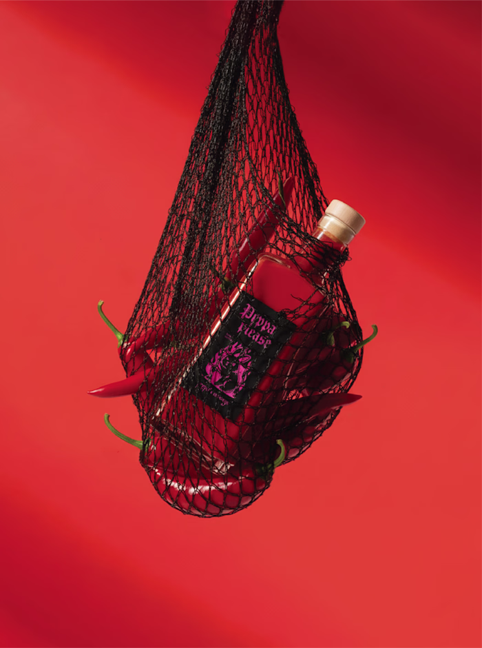
Peppa Please — Building a Bold, Scalable Hot Sauce Brand
May | Brand designer & strategist
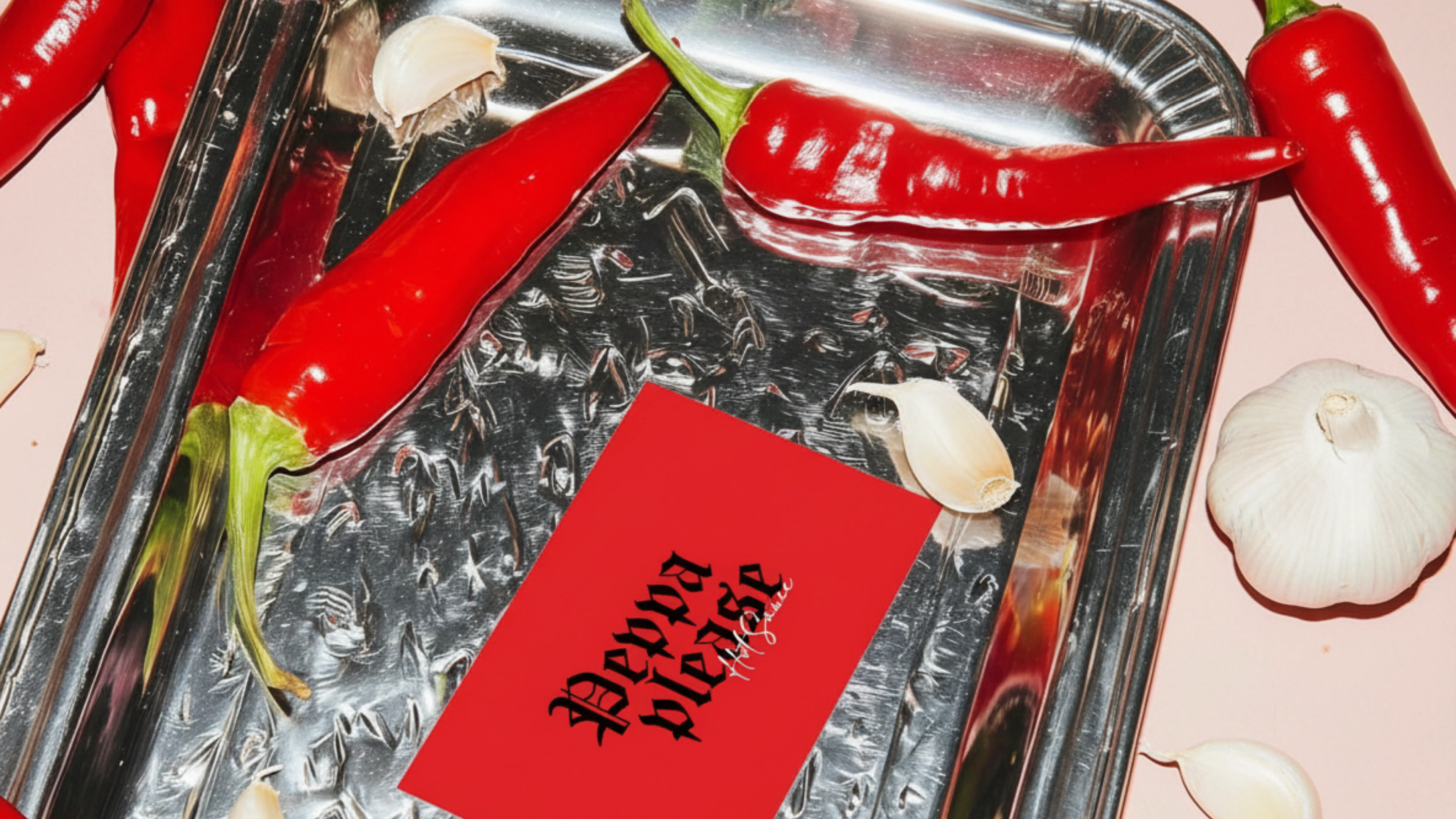
Peppa Please
Building a Bold, Scalable Hot Sauce Brand
Industry: Food & Beverage
Scope: Brand identity, logo, typography, packaging direction
Focus: Brand clarity, recognizability, scalability
Keywords: Bold, Spicy, Cheeky, Fun
Peppa Please is a hot sauce branding project focused on building a confident, recognizable identity designed to perform across packaging and digital touchpoints.
The work combines bold visual decisions with a clear system-led approach, ensuring the brand remains distinctive, consistent, and scalable as it grows.
This project reflects a strategic approach to branding — balancing strong personality with long-term usability.
The Challenge
The hot sauce market is visually crowded, with many brands competing for attention through loud graphics without a clear structure behind them.
Peppa Please needed a brand identity that could stand out immediately on shelf while remaining flexible enough to scale across packaging, web, and future product extensions.
The challenge was to create strong personality without sacrificing clarity — building a brand that feels confident, recognizable, and durable over time.
The Approach
The project began by defining the brand’s tone, positioning, and visual boundaries before moving into design execution.
Rather than creating isolated assets, the focus was on developing a cohesive brand system that could support consistent communication across all touchpoints.
Every design decision — from typography to layout logic — was made to reinforce recognizability, usability, and long-term scalability.
The Solution
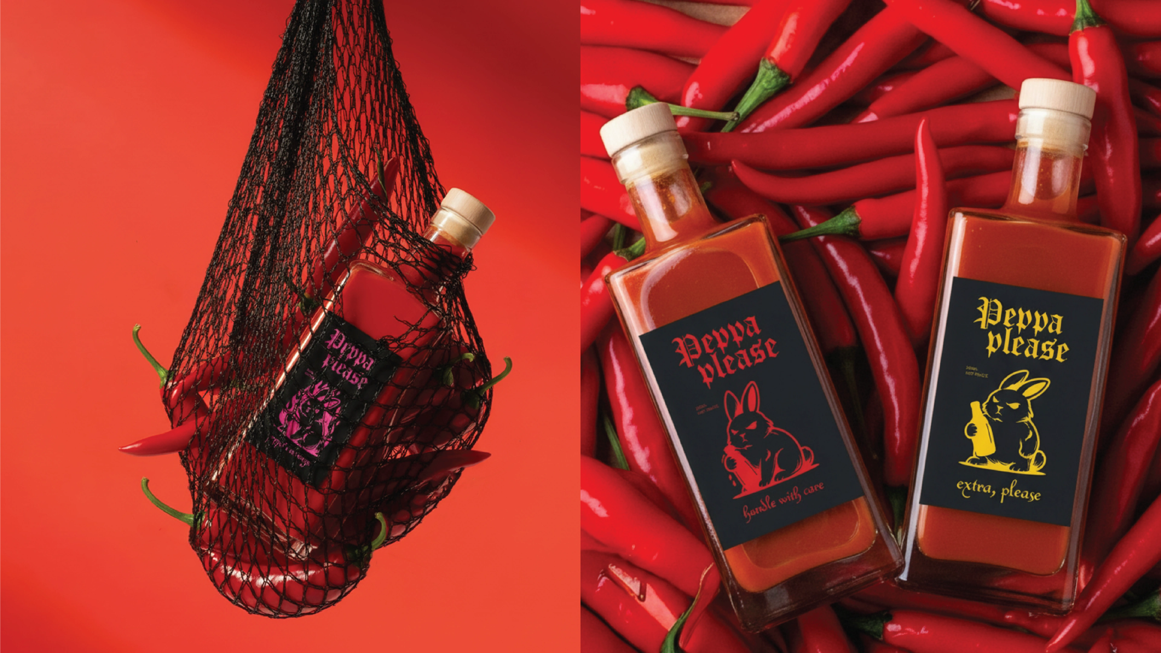
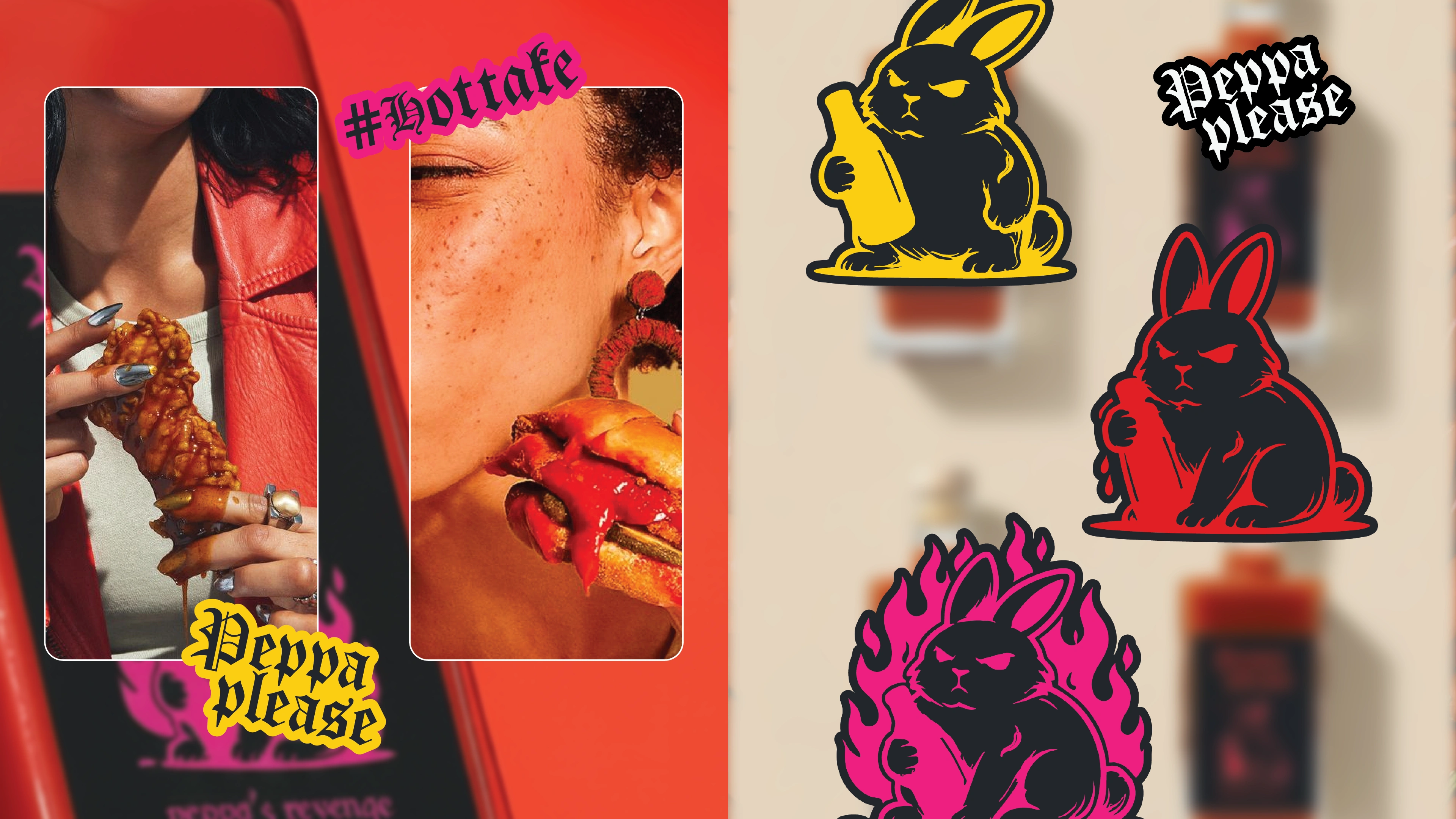
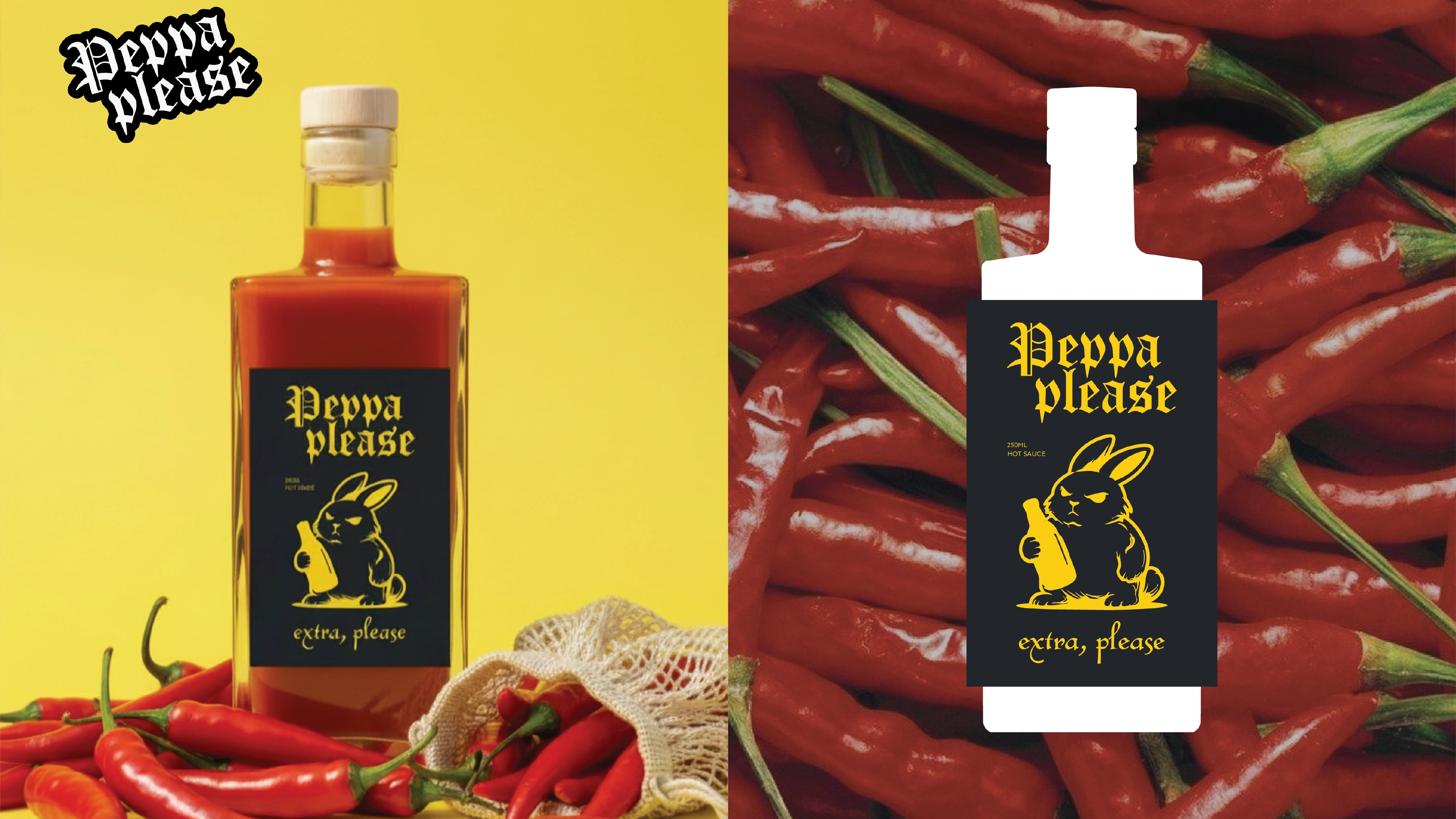
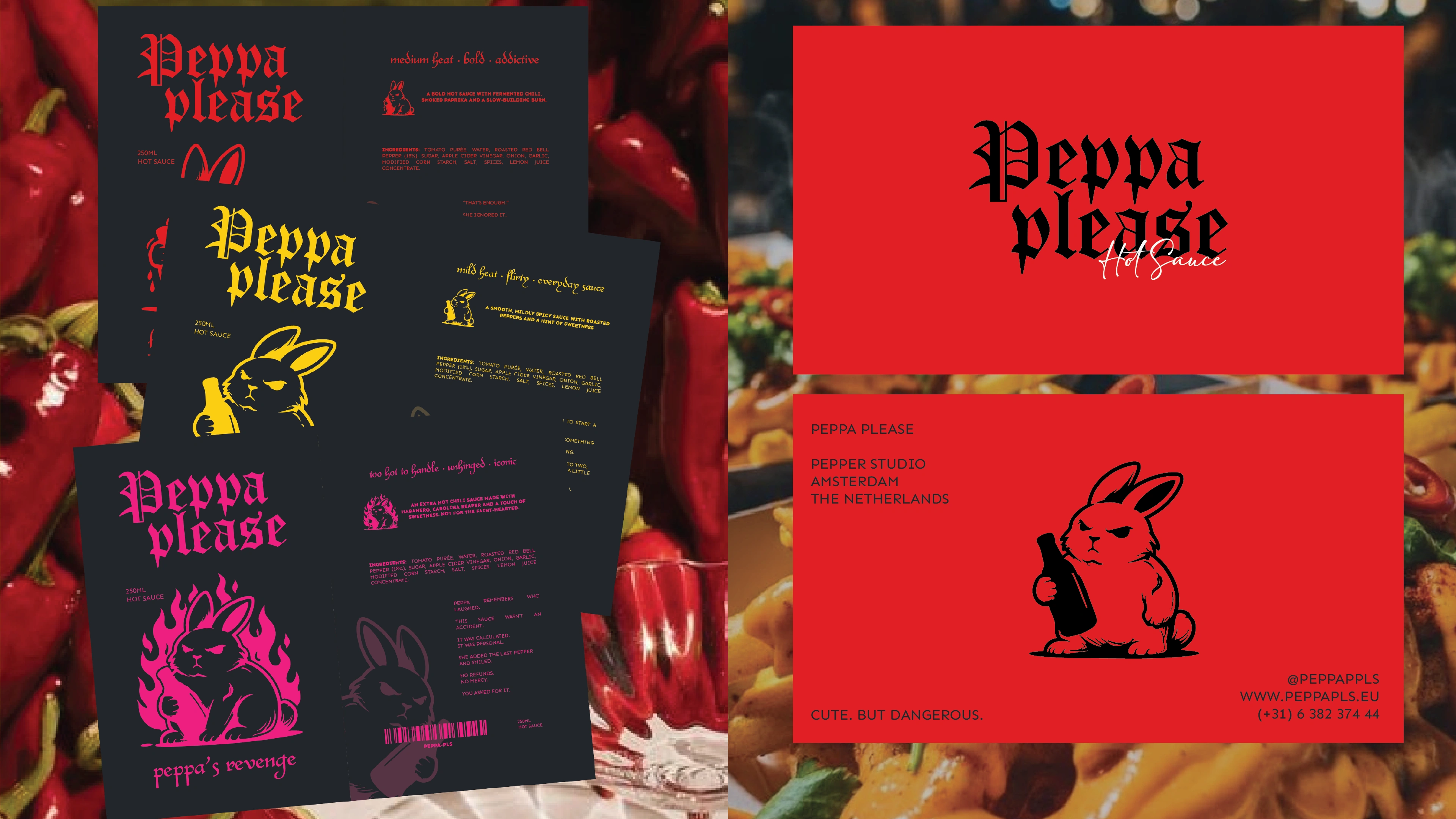
Brand Identity
The identity was designed to feel bold and self-assured, with a strong typographic foundation at its core.
The visual language balances expressiveness with structure, creating a recognizable presence that remains clear across formats.
Packaging
Packaging plays a central role in the brand’s visibility and recognition.
The system was designed to perform on shelf through clarity, contrast, and consistency, while remaining adaptable across different products and variations.
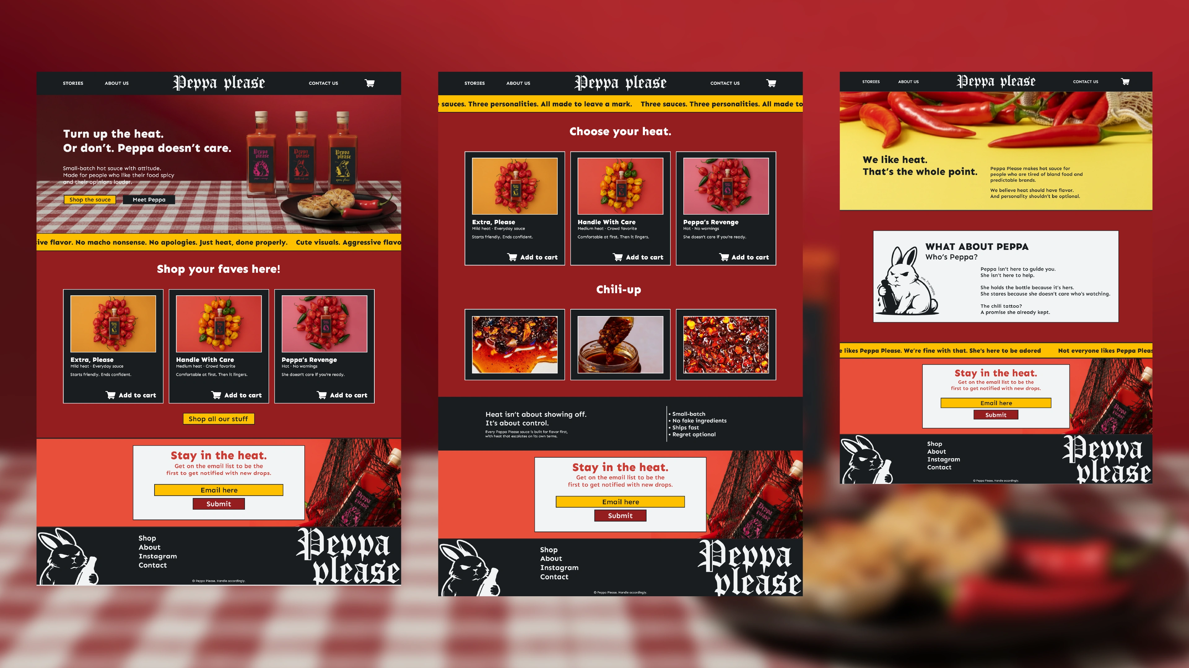
Web Design
The brand system was translated into a digital environment to ensure continuity across physical and online touchpoints.
Typography, hierarchy, and layout rules were applied to create a clear, structured web presence that reinforces the brand’s character without overcomplication.
The Outcome
Peppa Please now has a distinctive, confident visual identity that stands out in a competitive market while remaining flexible and future-proof.
The brand system provides a clear foundation for consistent communication across packaging, web, and future applications.
Rather than relying on short-term visual impact, the identity is designed to support long-term growth and recognition.
Thank you
Thank you for taking the time to review this project.
If you’re building a brand that requires clarity, structure, and long-term thinking, I’d be happy to explore whether we’re a good fit.
Let’s talk
If you have a project in mind or want to discuss a potential collaboration, feel free to reach out via Contra.
Like this project
Posted Jan 17, 2026
Brand identity, packaging, and web design for a hot sauce brand. Focused on creating a visual identity designed to scale across physical and digital touchpoints