Rebranding QProducts: A Market Leader Hidden in Plain Sight
Amelia Wozniak
QProducts & Services Rebrand
A Market Leader Hidden in Plain Sight
QProducts & Services (QProducts) is a specialized manufacturer that, for many years, remained one of the industry’s best-kept secrets. The company designs and produces passive thermal protection solutions for temperature-sensitive goods, serving customers in the pharmaceutical, food, chemical, and logistics sectors.
Founded in 1994, QProducts achieved early success through traditional strengths: engineering-driven product development, domestic manufacturing, and a highly responsive sales and support team. However, as digital channels reshaped how companies evaluated and selected partners, QProducts’ brand presence did not keep pace. Approaching its 20th anniversary, growth had plateaued. The visual identity no longer reflected the sophistication, scale, or strategic importance of its solutions.
The challenge ahead was to realign its brand with reality and position the company for its next phase of growth.
Strategic Objectives were simple in theory.
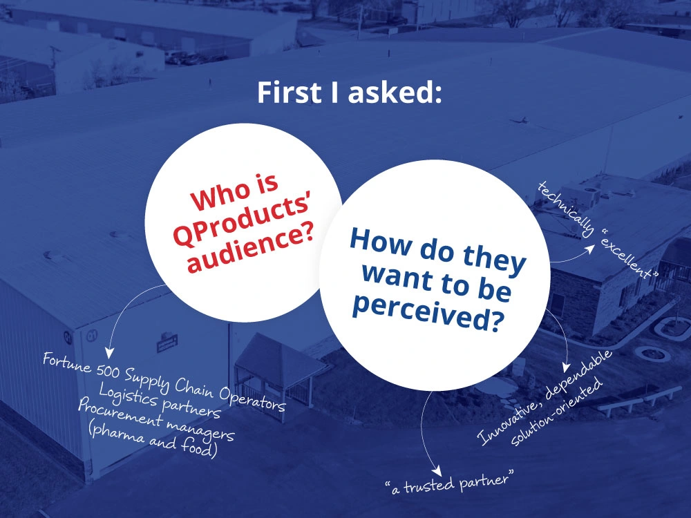
Discovery Phase
Brand Audit
I analyzed existing brand touchpoints and materials to understand how the company was presenting itself to the market.
Competitive Assessment
I benchmarked QProducts against competitors to highlight strengths, weaknesses and opportunities to differentiate.
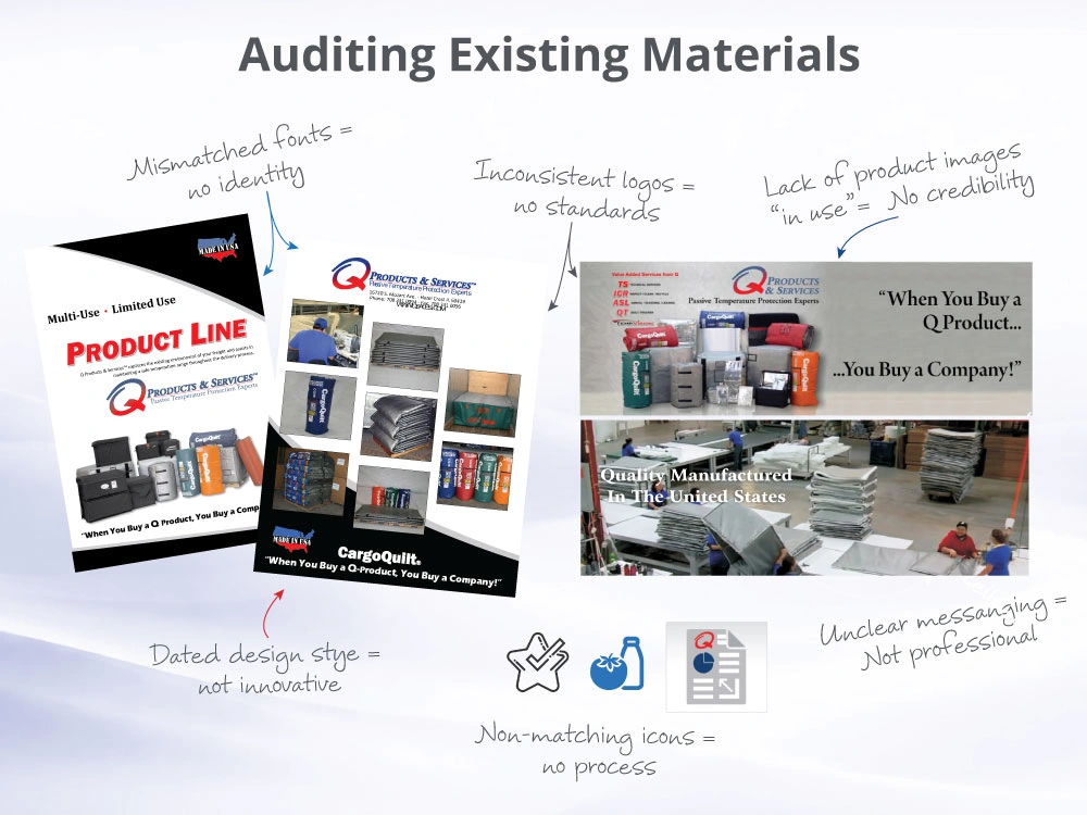
An audit of QProducts' existing materials told another story.
Brand Audit
While QProducts effectively communicated product breadth, they struggled with cohesion and brand perception. This created a diluted brand presence. Rather than reinforcing leadership and technical authority, the visual identity presented QProducts as a smaller, more tactical supplier. The brand was underselling the company’s expertise, innovation, and market position.
Typography is one of the strongest signals of brand maturity. When too many typefaces compete, as show here, cognitive load increases and readers expend effort decoding rather than absorbing.
Color Strategy needs to guide attention and reinforce brand recall. Here, the heavy, dark visual identity feels dated and transactional rather than premium. These types of stark color palettes tend to be associated with legacy companies rather than contemporary, innovative organizations.
Messaging should be used to direct attention and prioritize value proposition. Without editorial standards, the brand has numerous competing statements of similar visual weight, and signals over-explaining ("defensiveness") instead of confidence.
Product Imagery should be the hero. Instead, the presentation relies almost entirely on isolated catalog-style product shots arranged in a cluster. Offerings appear conceptual, even though they are not. The viewer sees objects, not solutions.
Competitive Assessment
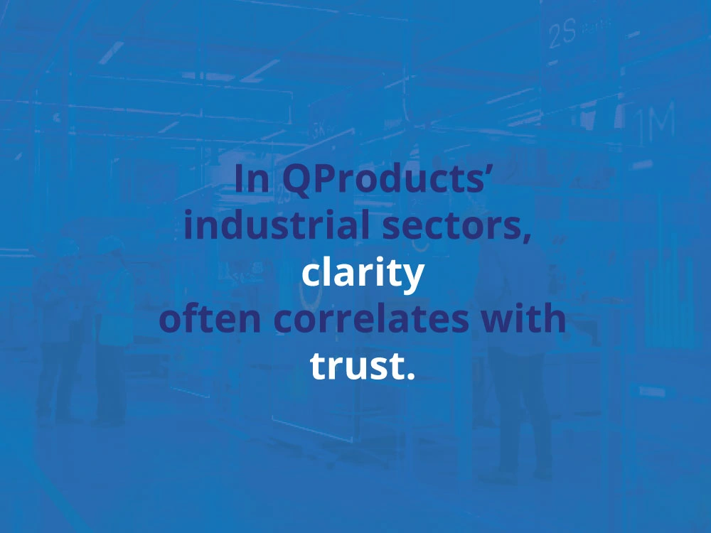
Competitive benchmarking revealed that buyers in pharmaceutical and food logistics assess risk visually. These types of buyers respond most strongly to visual systems that communicate clarity, and disciplined consistency.
Even when product quality is strong, inconsistent branding introduces friction against the company's image. In sectors dealing with temperature control and integrity of food and pharmaceutical products, trust is everything.
The “Q” Mark: It’s important to acknowledge what works.
Viewers found the large “Q” functions effectively as a visual anchor. That is significant and proves that the QProducts brand does have recognition potential.
The problem seems to be not the appearance of the logo mark, but dilution of its impact through over-accompaniment. When too much text surrounds an iconic symbol, the symbol loses dominance.
The rebrand opportunity for QProducts become clear:
Not to reinvent, but rather, to simplify.
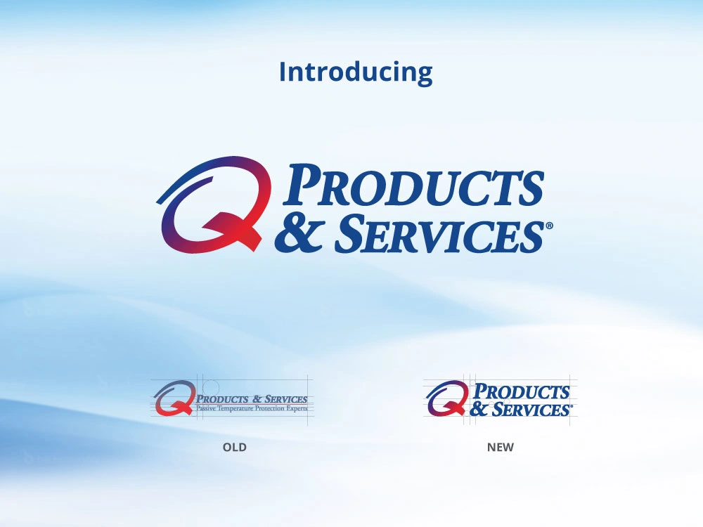
While the logo itself hasn’t fundamentally changed, its application has improved significantly.
The previous logo contained multiple layers of messaging, including a tagline, which acted more like a miniature advertisement than a brand mark.
A logo’s primary function should be identification, not explanation. In this update, the tagline is eliminated, and spacing and hierarchy is adjusted for consistent balance. Dead space at the top and bottom of the logo was rectified, the muddy gradient and faded colors corrected. Throughout everything, the large “Q” remains recognizable and memorable, preserving brand equity. It now operates within a system, rather than overpowering it.
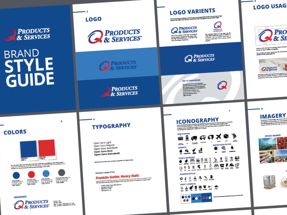
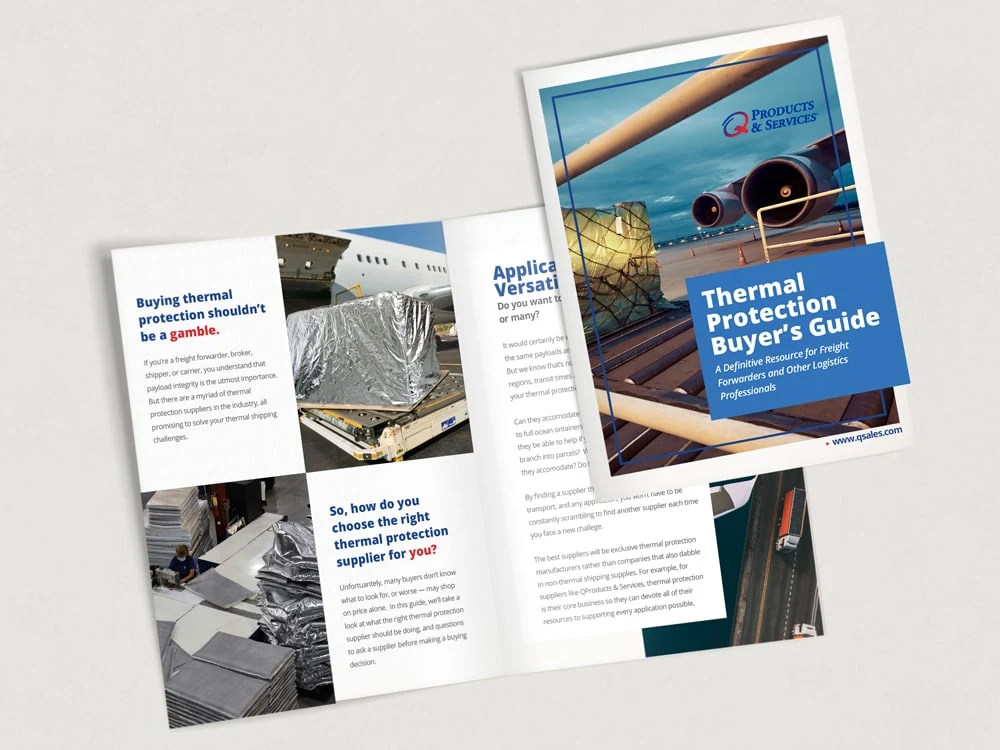
The new brand standards refined color usage, rather than replacing it. Maintaining the blue and red from the logo, but balancing it with plenty of white. A softer, complementary blue was added to enforce clear information structure, since exclusive use of bold colors, with text, can be harsh.
Typography is constrained to a simple, modern sans serif typeface for headlines and body text for clarity and overall cohesion. Typography can now support communication rather than competing for attention.
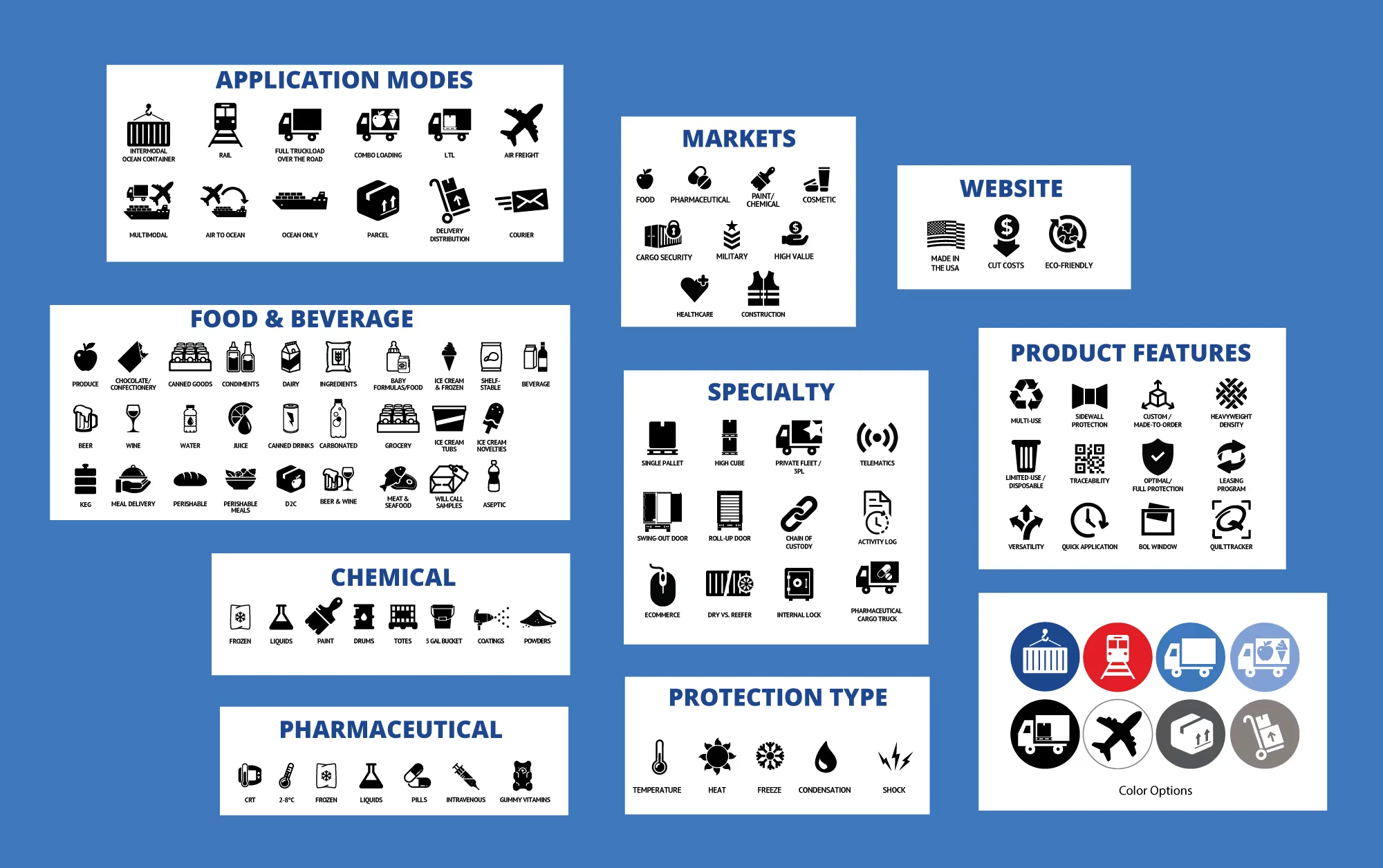
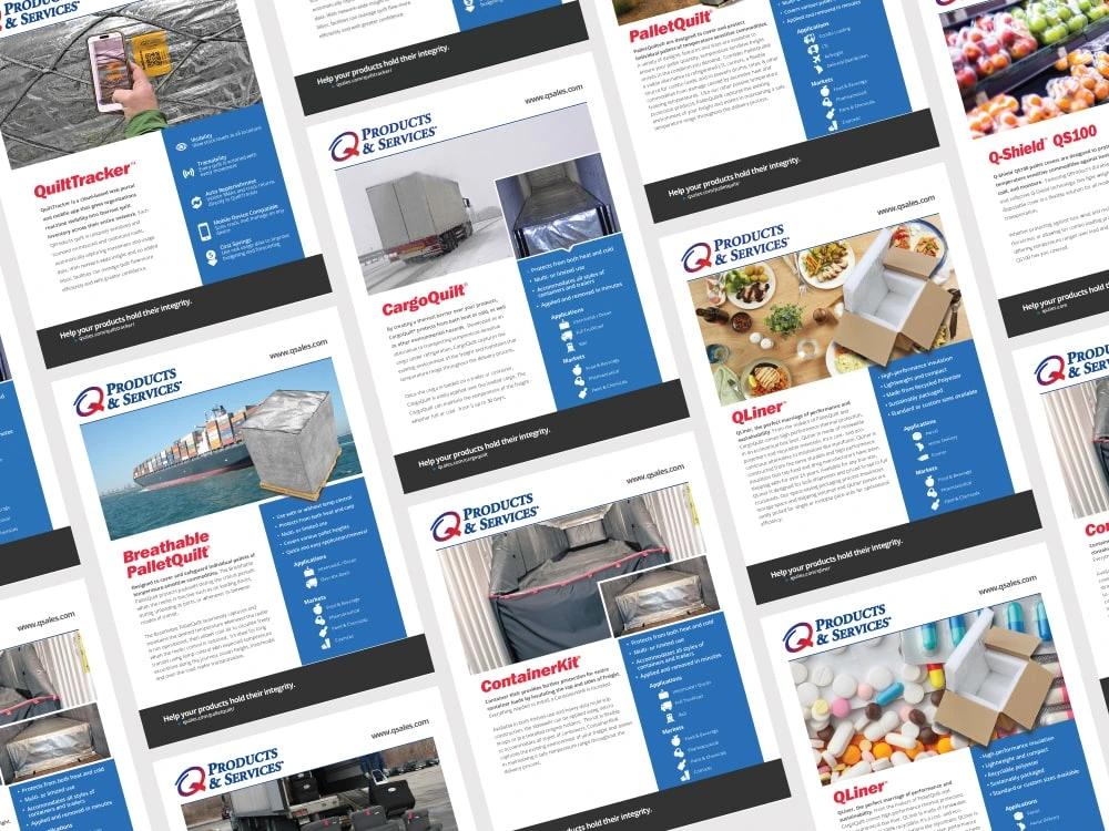
Iconography
This icon system may seem like a small tactical improvement, but in aggregate, icon consistency has a disproportionate impact on how structured and credible a company appears. An icon set made of stock art of different styles (some filled, some outlined, uneven proportions and spacing, different levels of detail) does not function as a cohesive system. And, in industries like cold chain logistics, visual inconsistency can be subconsciously interpreted as operational inconsistency.
Because the icons now share a predictable structure, viewers can interpret information more quickly. Building a library ensures future designs use the same icons in the future when communicating similar messages.
This is essential for a well-managed brand system.
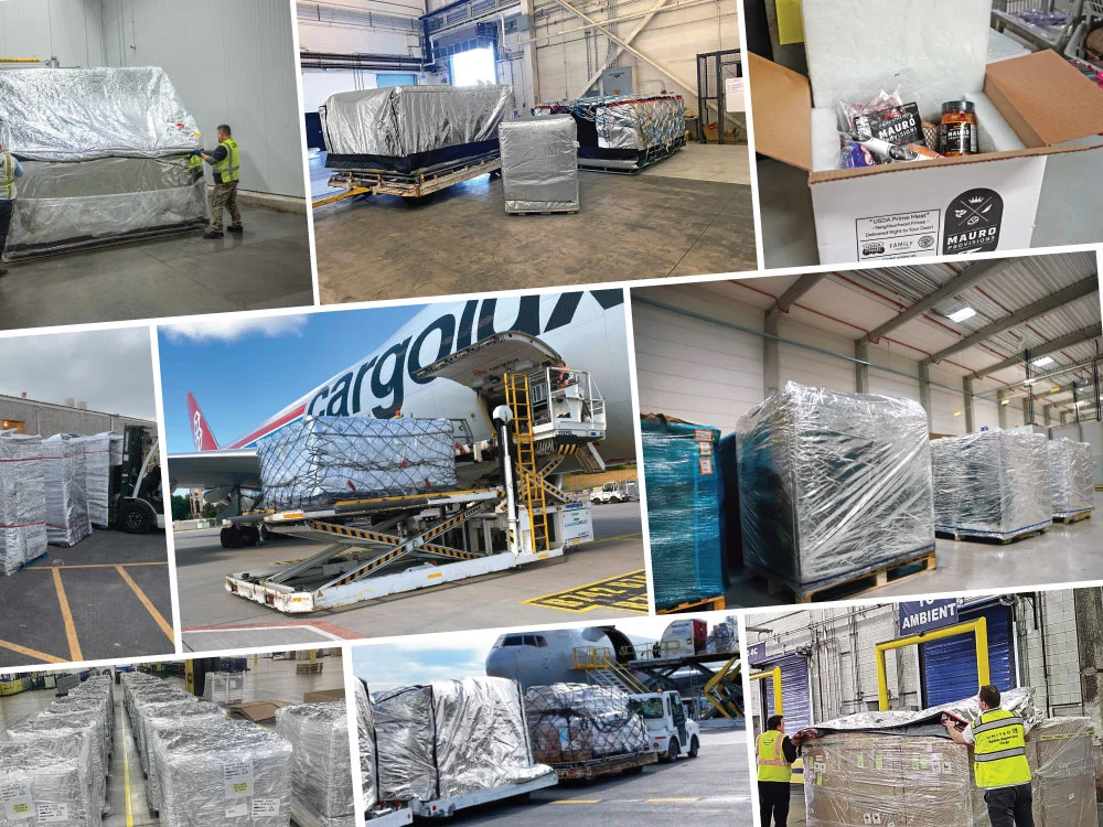
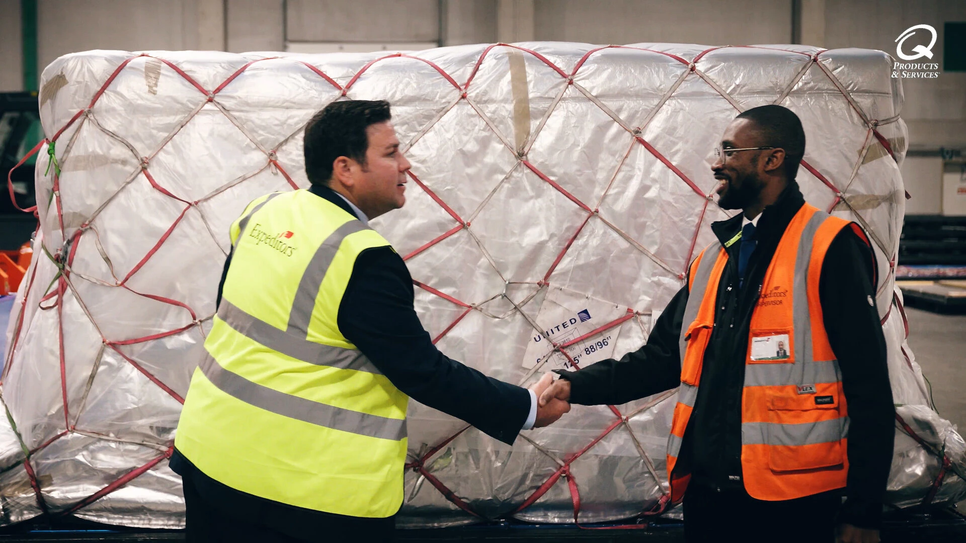
Photography
Numerous photo shoots were coordinated in real-life scenarios to build a library of real-use imagery. This is one of the most important credibility improvements. Seeing these products used in relatable environments, shifts perception from: “This is a product” to “This is a proven solution.”
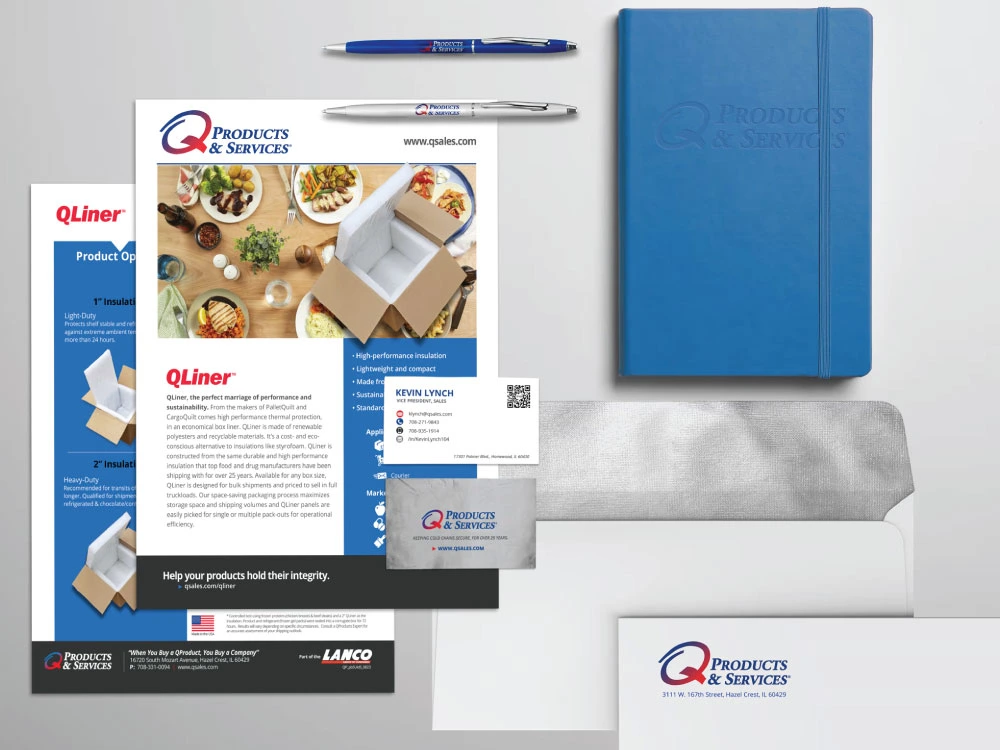
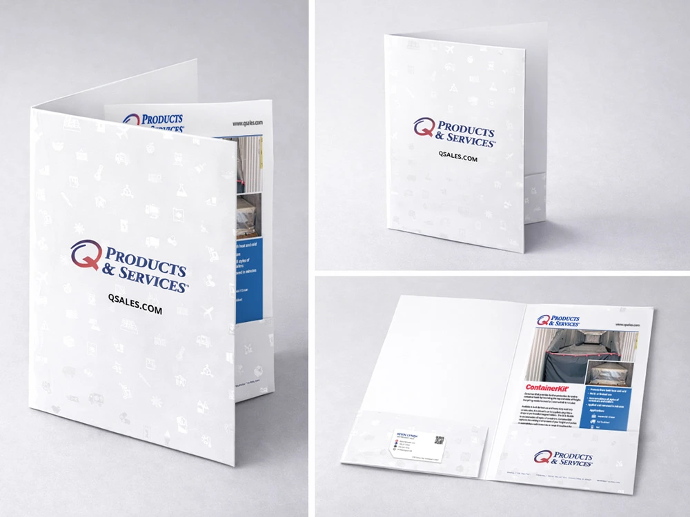
Bringing It All Together.
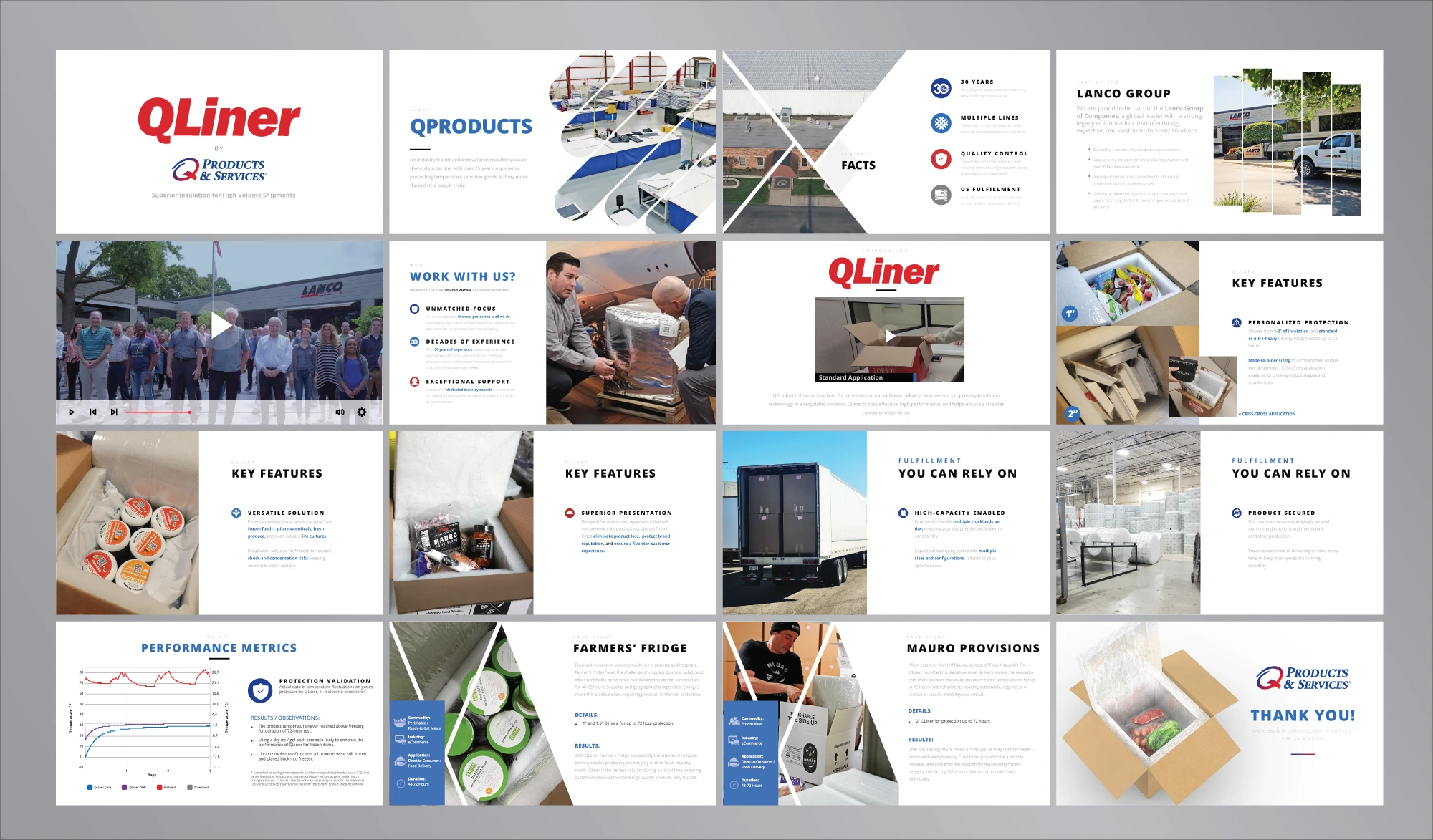
Results.
The Brand Now Has an Elevated Perception of Quality.
This is the ultimate outcome of the redesign. The previous brand unintentionally created visual friction that could undermine perceived product sophistication. The rebranded style communicates confidence, stability, technical authority and operationally maturity. Although the products themselves have not changed, the perceived value has increased.
The Brand Now Aligns Better with Its Market
The new presentation is far more aligned with the expectations of pharmaceutical logistics buyers, cold chain managers, supply chain executives and other procurement professionals, that expect precision, clarity, and professionalism.
This redesign does not radically reinvent the brand, and it was never intended to. Instead, it refines, organizes, and elevates what already existed.
Empowered by a disciplined, modernized brand system, the company emerged from the rebrand with renewed market alignment and was well-positioned to pursue its long-term vision of global leadership.
The strengthened brand presence supported strategic expansion into key international markets, including the establishment of a secondary sales organization in Belgium to serve the pharmaceutical hub of central Europe, a sales office in India to support emerging and secondary markets, and an ancillary manufacturing facility in Asia to improve responsiveness and service to customers throughout the Eastern Hemisphere.
Today, the rebrand continues to serve as a foundation for integration and alignment across the organization. Ongoing efforts are focused on uniting its international offices, partners, and manufacturing locations under one consistent global identity, ensuring that regardless of geography, customers experience the same standard of professionalism, performance, and trust.
The rebrand not only modernized the company’s appearance. It helped enable its evolution into a more unified, scalable, and globally competitive organization.
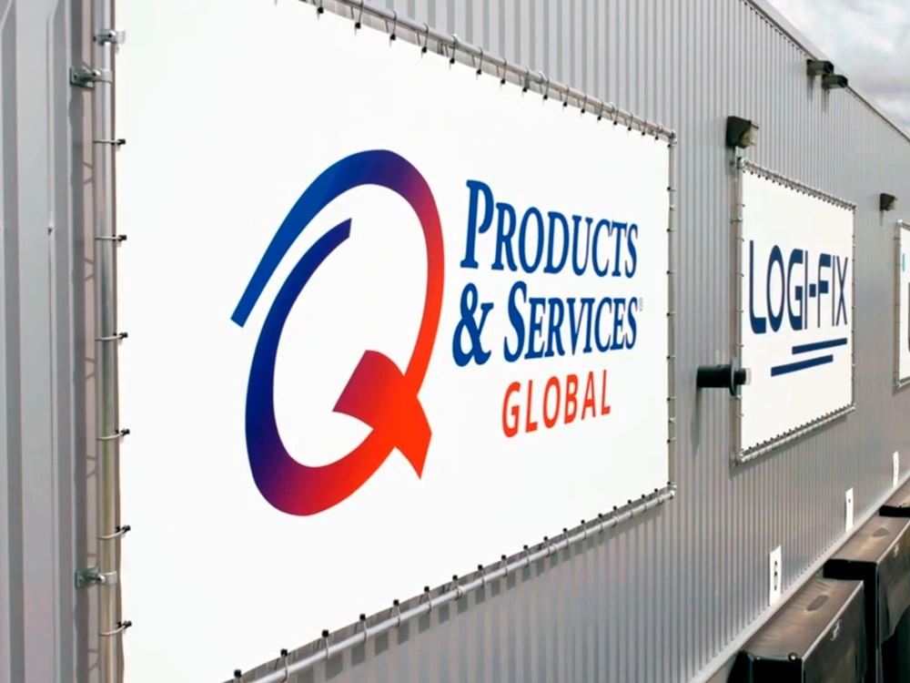
BruCargo in Brussels, Belgium. QProducts Global launched in 2023 to support the international sales efforts.
Like this project
Posted Feb 16, 2026
Rebranded thermal packaging leader with unified identity, modern visuals, and global-ready system to elevate perception, credibility, and support expansion.