Florist
Overview
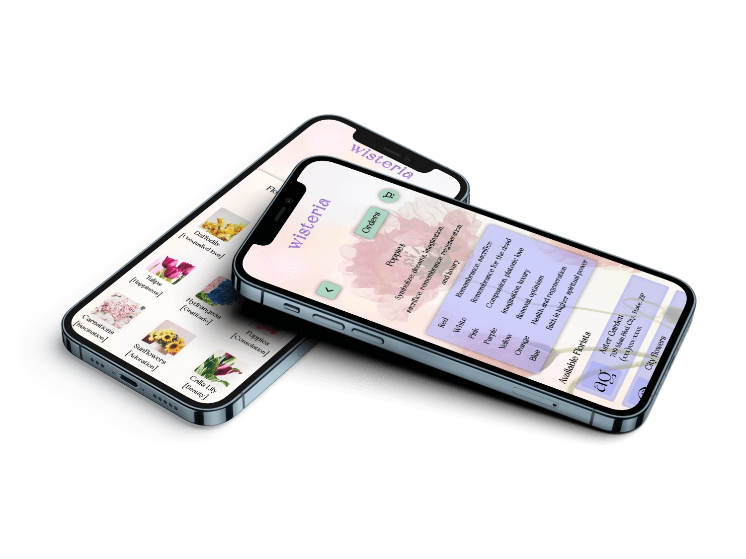
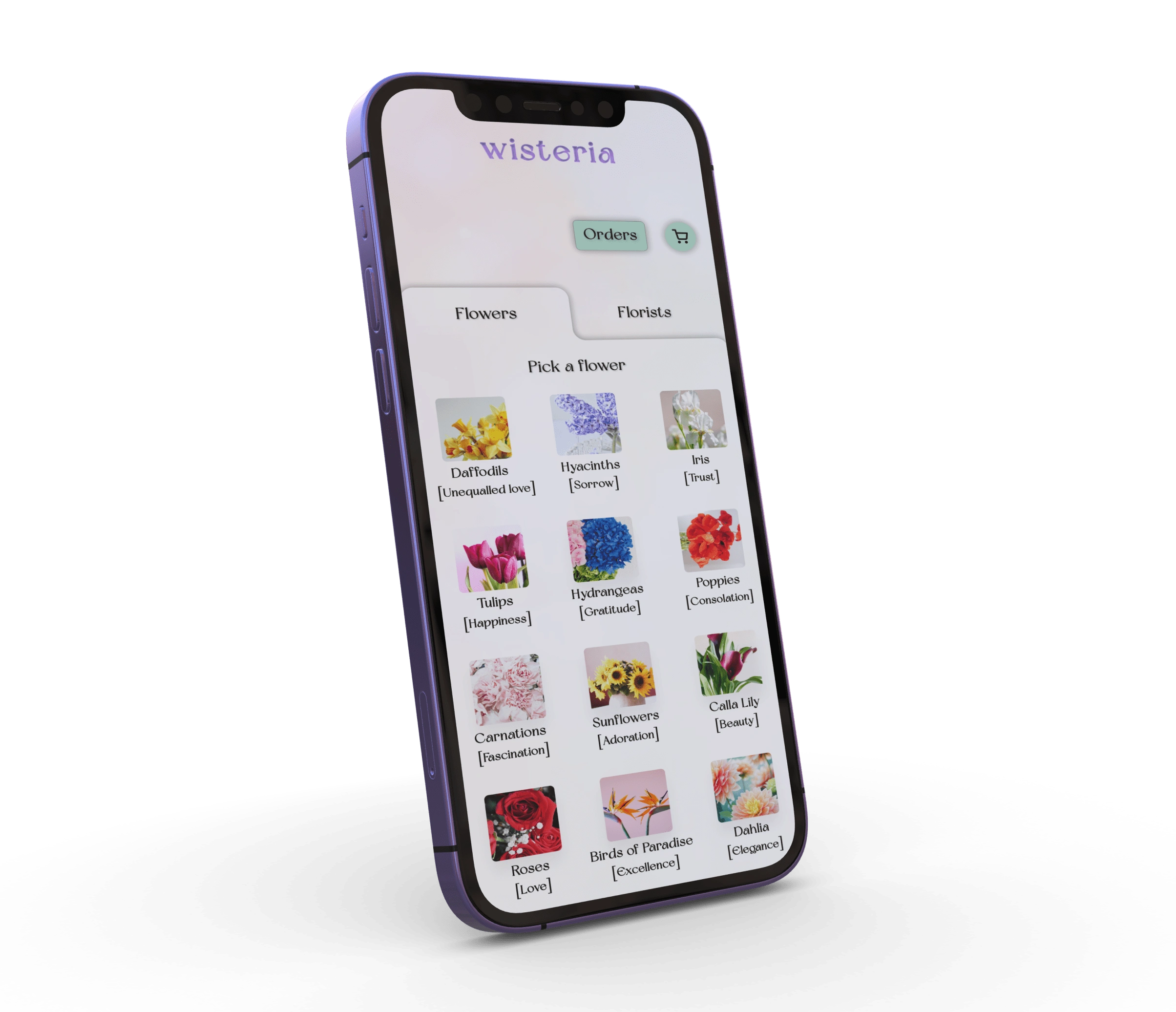
This app is designed for flower lovers who want to explore the meanings behind their floral purchases for themself or for gift giving.
Problem & Solution
After preliminary user research, the following was found to be the main pain points
Having to call multiple florist
No floral meanings in one place
Arrangement vs one flower bouquet - most big floral brands offer floral arrangements only, rose stems being the exception
Goals/Requirements:
The goal was to design an app for the users to find florists near them and buy flowers for themselves or their loved ones.
The users should also be able to view the floral meanings behind their purchase and see how to care for them.
Process
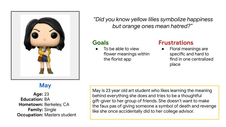
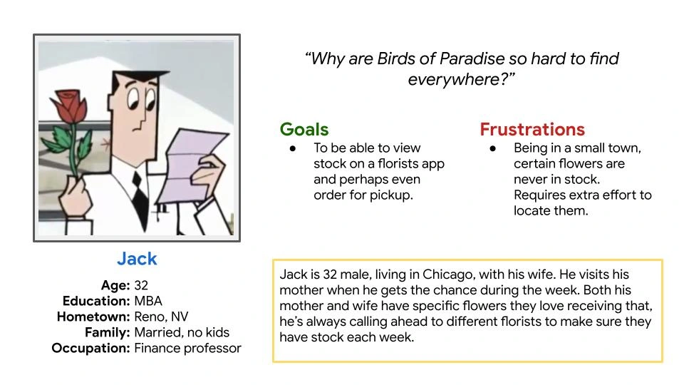
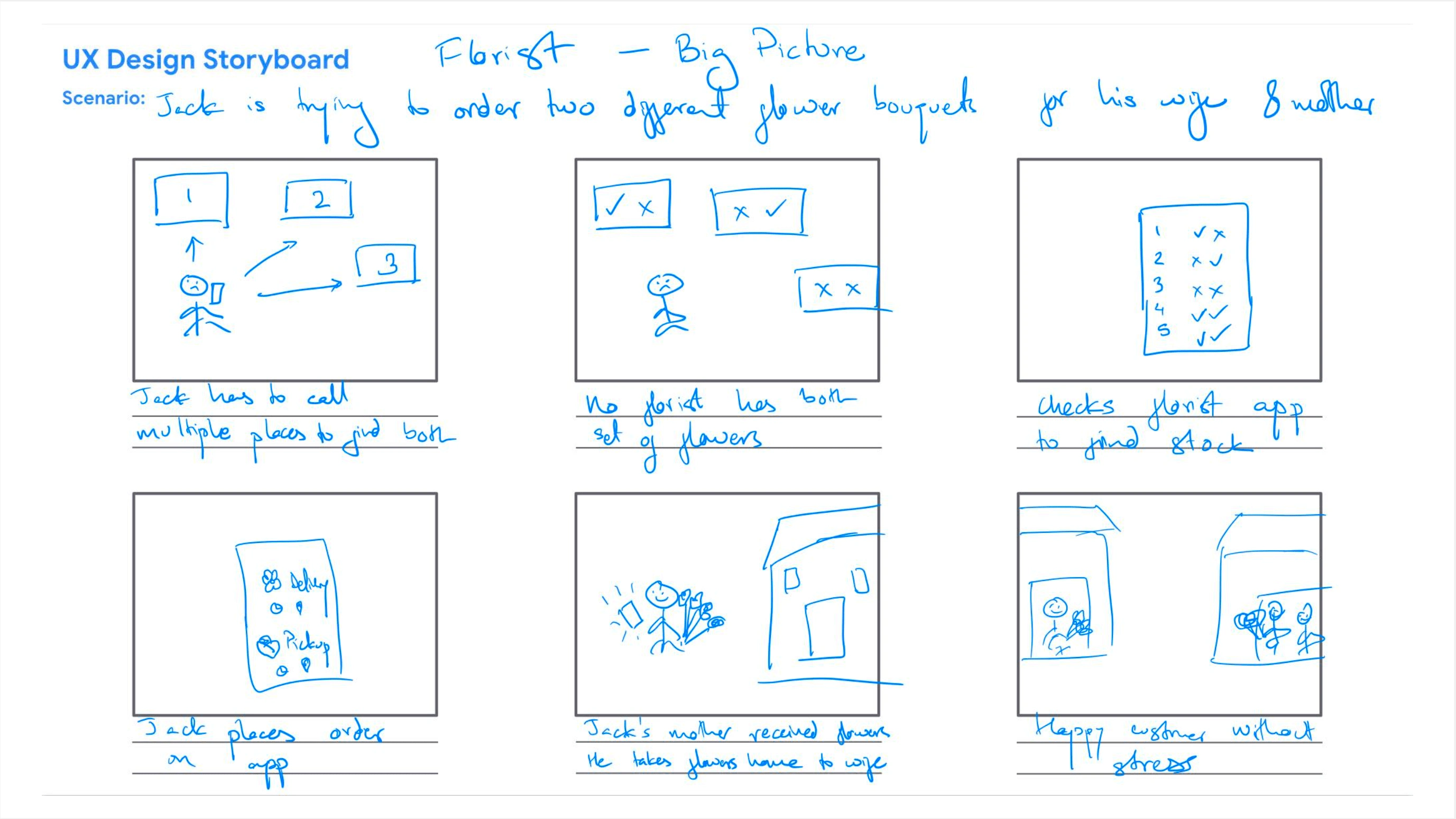
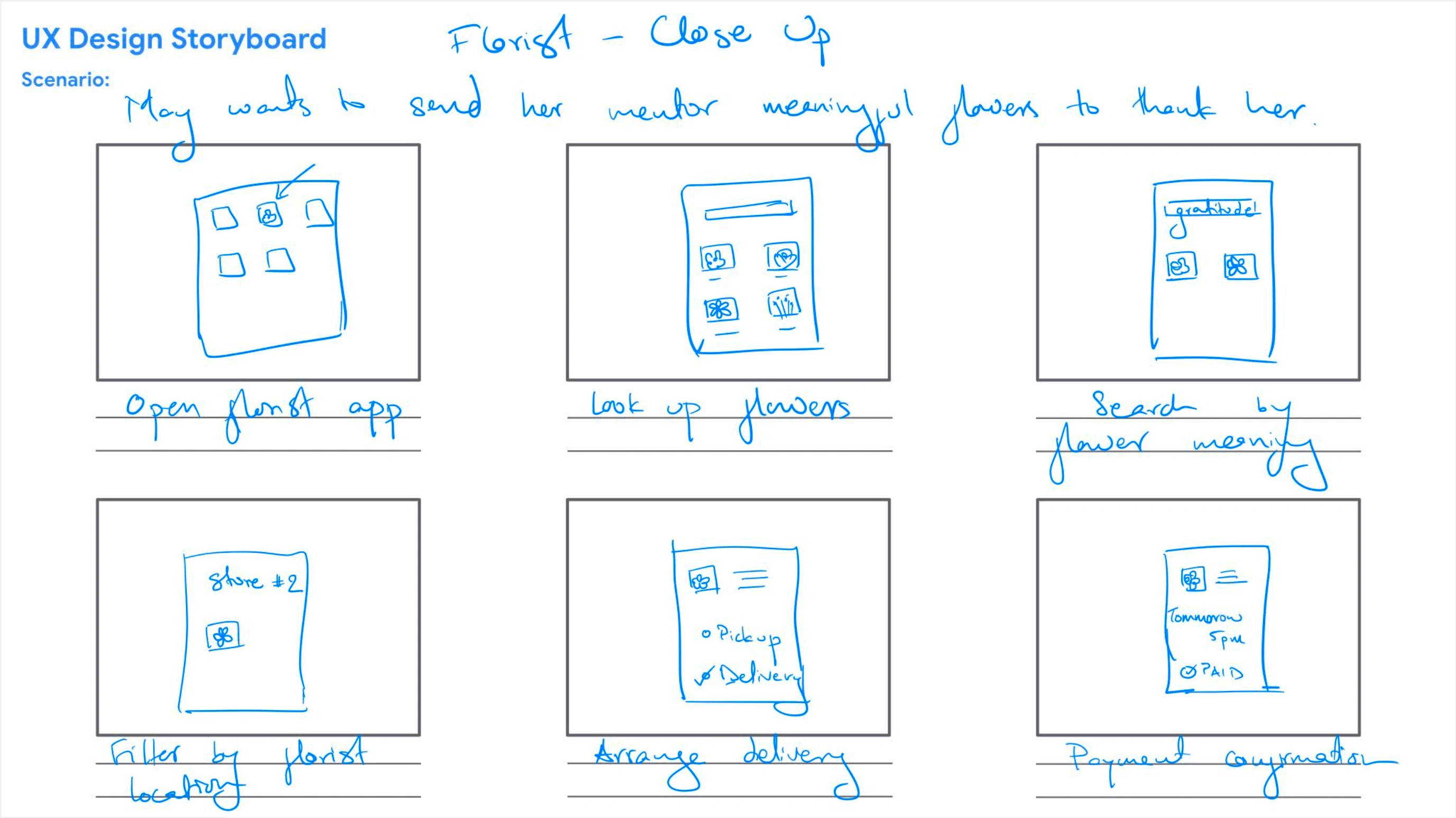
After user interviews, I created persons and user storyboards, drafted paper and digital wireframes, conducted usability studies, designed high-fidelity prototypes and mockups.
Personas
User Storyboard
Paper Wireframes
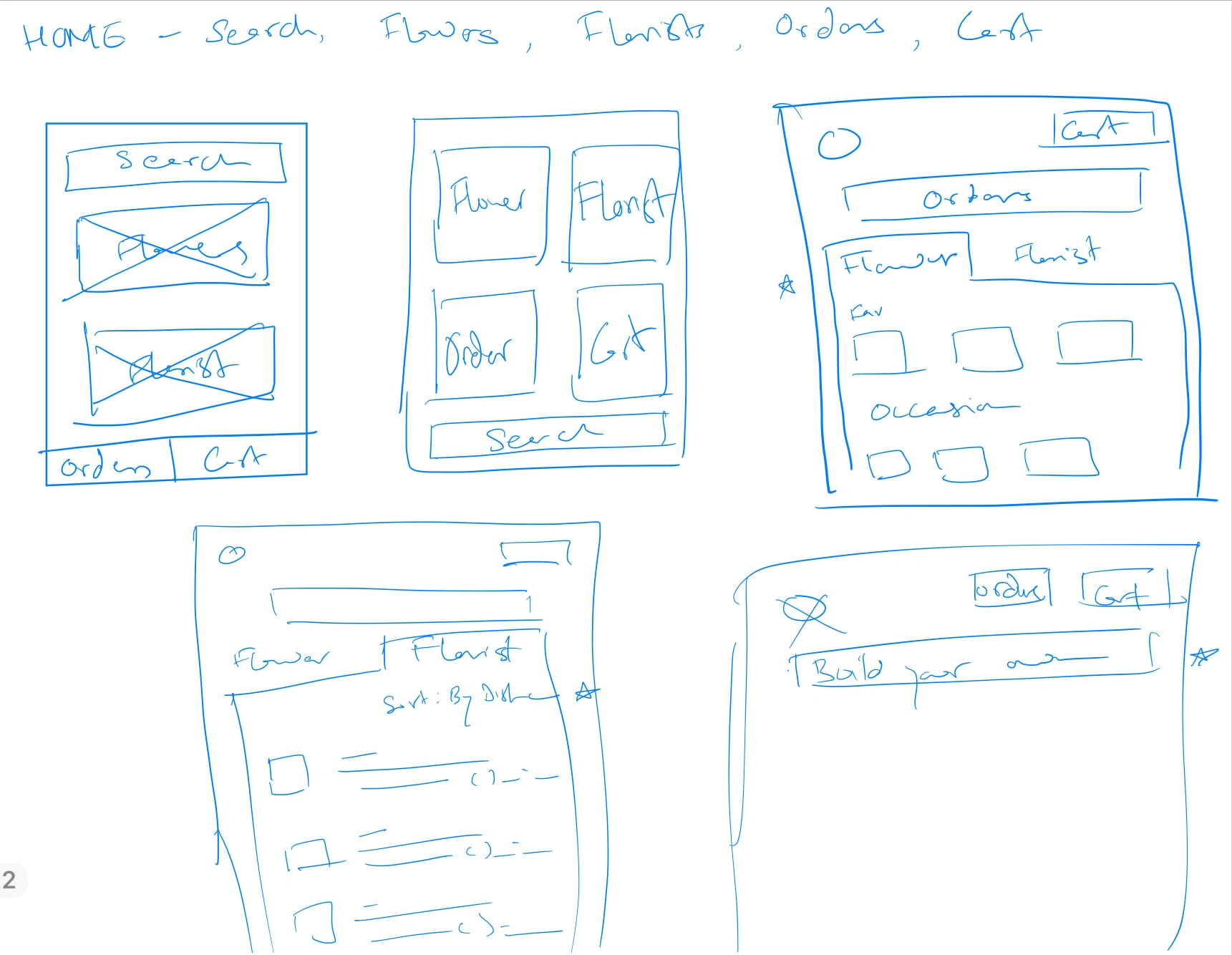
Variations of flowers and florists pages
I like the tabbed design to switch between Flowers' and 'Florists
In the beginning, I toyed with the idea of having a 'Build your own bouquet' page.
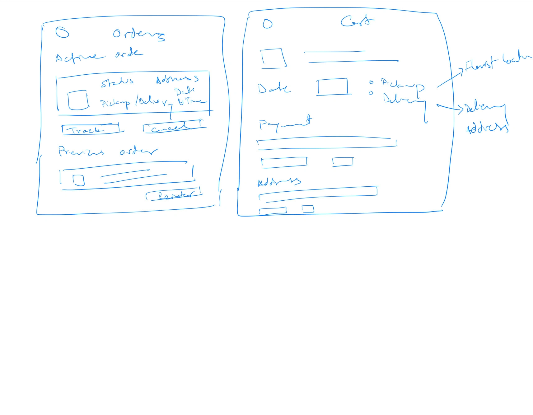
Order/Cart pages
I wanted the option of cancellation and reordering on the Orders page.
I wanted the Pickup and Delivery options also prominent on Cart page.
Digital Wireframe
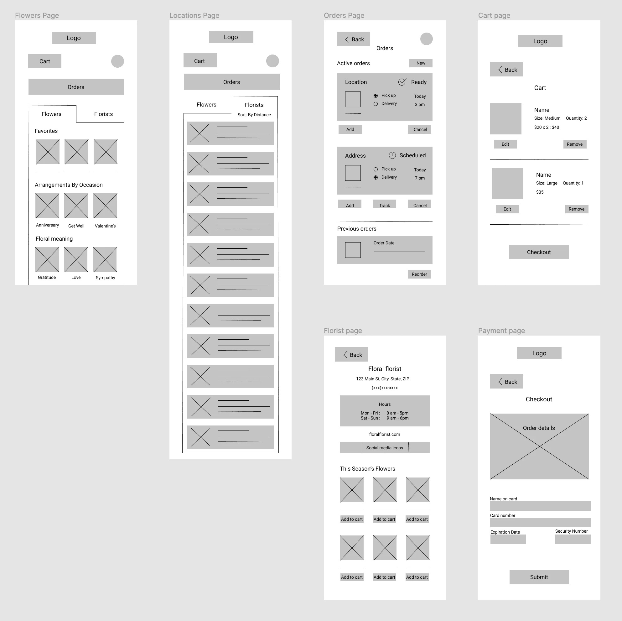
I added the Florist details page and the Payment page to the digital wireframe
High Fidelity Prototypes
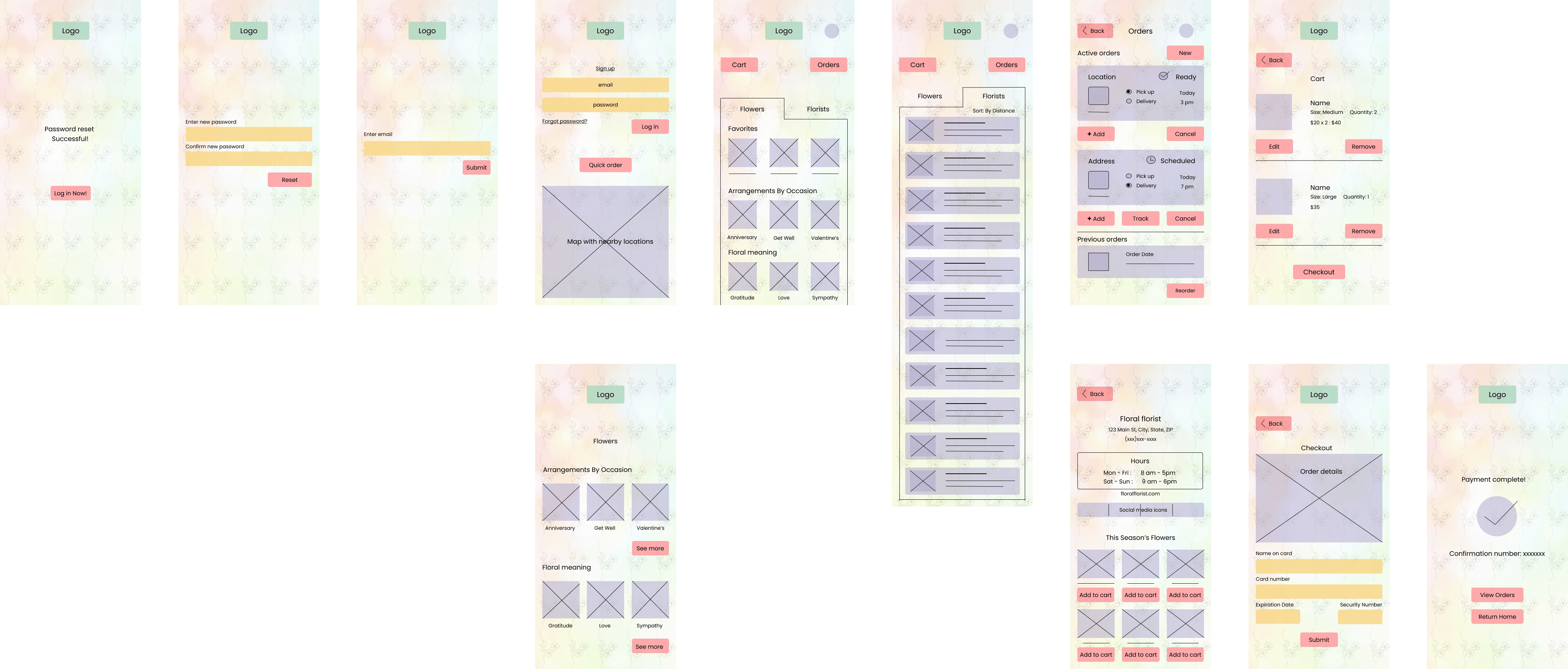
Version 1
I wanted to invoke the colorful, floral atmosphere of a florist
I added Login pages, as well as a Quick Order page, and Order Confirmation page
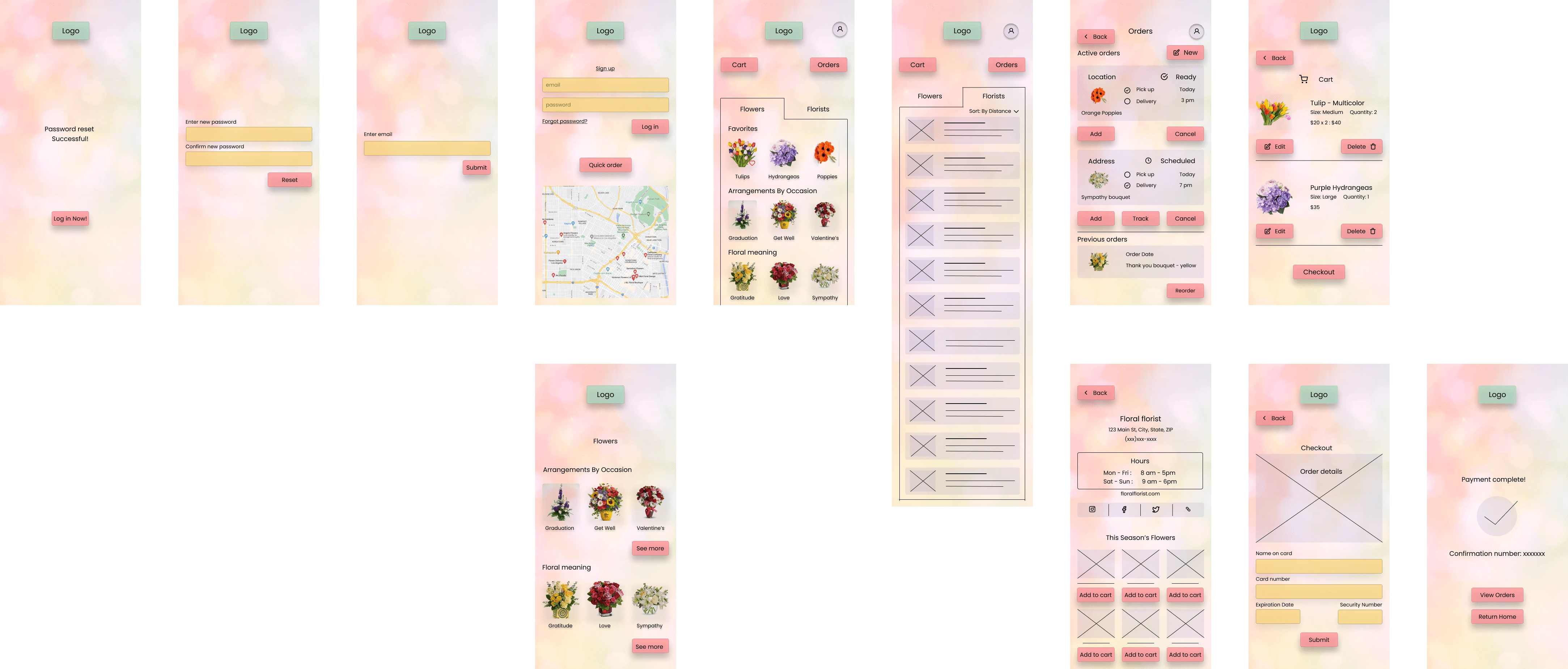
Version 2
I added the images, and the shadows on the buttons
I removed the background image to make the pages less busy
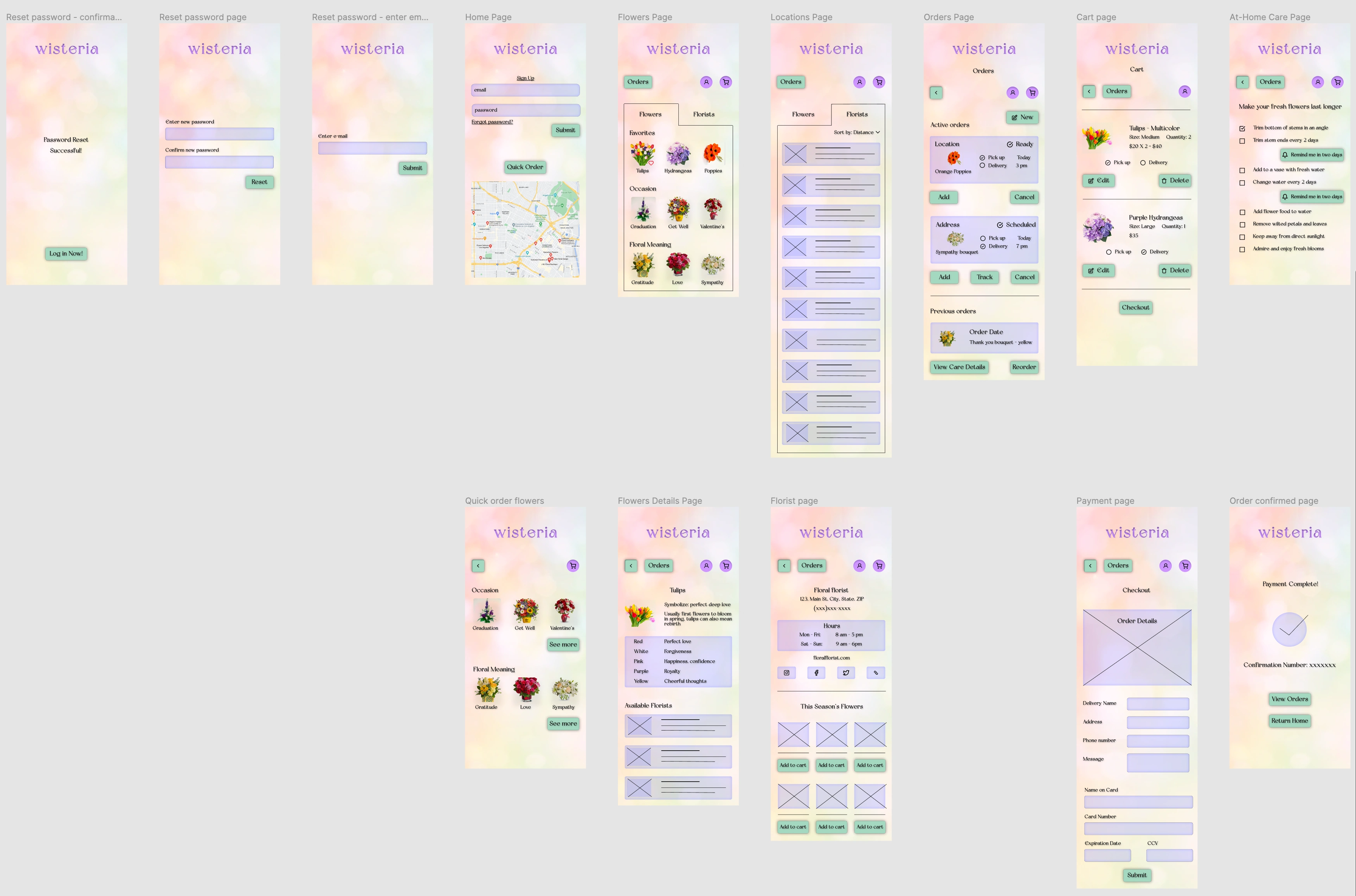
Version 3
I replaced the text logo with an actual designed logo, naming the app 'Wisteria'
I improved navigation by adding Orders and Cart buttons on each page, plus the Back button
I changed the colors of the buttons and textbooks to add more contrast and focus attention on CTAs
I added the purchased flowers Care Details page
I lowered the background color saturation
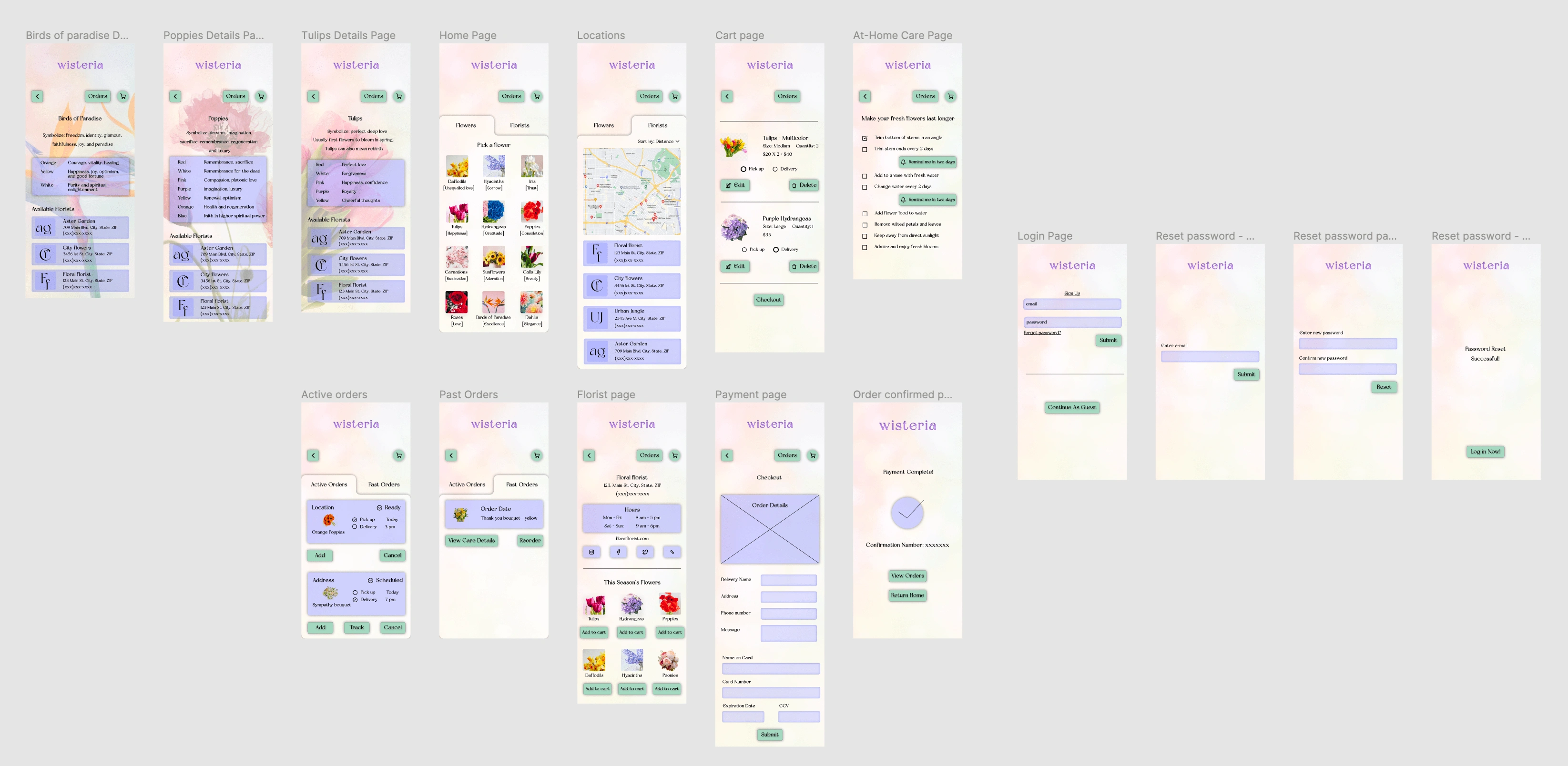
Final Version
I realigned the navigation buttons to the same Y axis on each page
I moved login window to the end of the user flow to leave the option of logging in with the user
I removed the Quick Order page, and floral arrangements, leaving only individual flowers
I lowered the background saturation even further to leave the focus on the content of the page
I added the flowers details page to view the meanings in detail and view available florists
I mimicked the tabbed design between Flowers and Florists to Active and Past Orders
Final Prototype
Accessibility Considerations
13.32:1 contrast used for all buttons and CTAs for easy readability
All transitions are set between 150-400ms
All headings and labels are descriptive of their purpose
Next Steps
Adding details on all the flowers shown
Implementing a way to add flowers to cart without having to go through florist page
Adding more florists pages, not just one
Compressing image sizes to ensure better load times
Takeaways
As my first project in Figma, I learned a lot about the system
I learned better contrast and color usability for better visibility
I also learned when to stop because I will want to keep adding more things as I learn how to do them
Like this project
Posted May 24, 2022
This app is designed for flower lovers who want to explore the meanings behind their floral purchases for themself or for gift giving.
Likes
0
Views
9


