Built with Framer
Dahlquist: A Premium Shopify Partner Website
Alex Prokhorov
Verified
Dahlquist: Repositioning a Shopify Agency as a Premium Partner
Client: Dahlquist
Year: 2026
Format: Design only (Figma)
Timeline: 2 weeks
Services: Research, positioning, brand foundations, web design
Overview
Dahlquist came to us as an established Shopify Select agency with a strong client roster but a website that didn't reflect their level. Over two weeks, we rebuilt their site in Figma from positioning down to typography, repositioning them from a service provider to a premium Shopify partner.
The challenge
Dahlquist's existing site read like a service catalog. Functional, but flat. They wanted to climb above the Shopify Select tier and start competing with agencies winning premium briefs.
The brief was open. Structure, layout, and visual direction were all up for discussion. Our north star was clarity and confidence: fewer pages, sharper narrative, and a partner-first voice rather than a vendor pitch.
Phase 1: Research and positioning
We started by auditing the current Dahlquist site and benchmarking premium Shopify agencies sitting above the Select tier in Shopify's Partner Directory. We mapped how those teams position themselves, structure their sites, and present their work, then pulled out the patterns worth adopting.
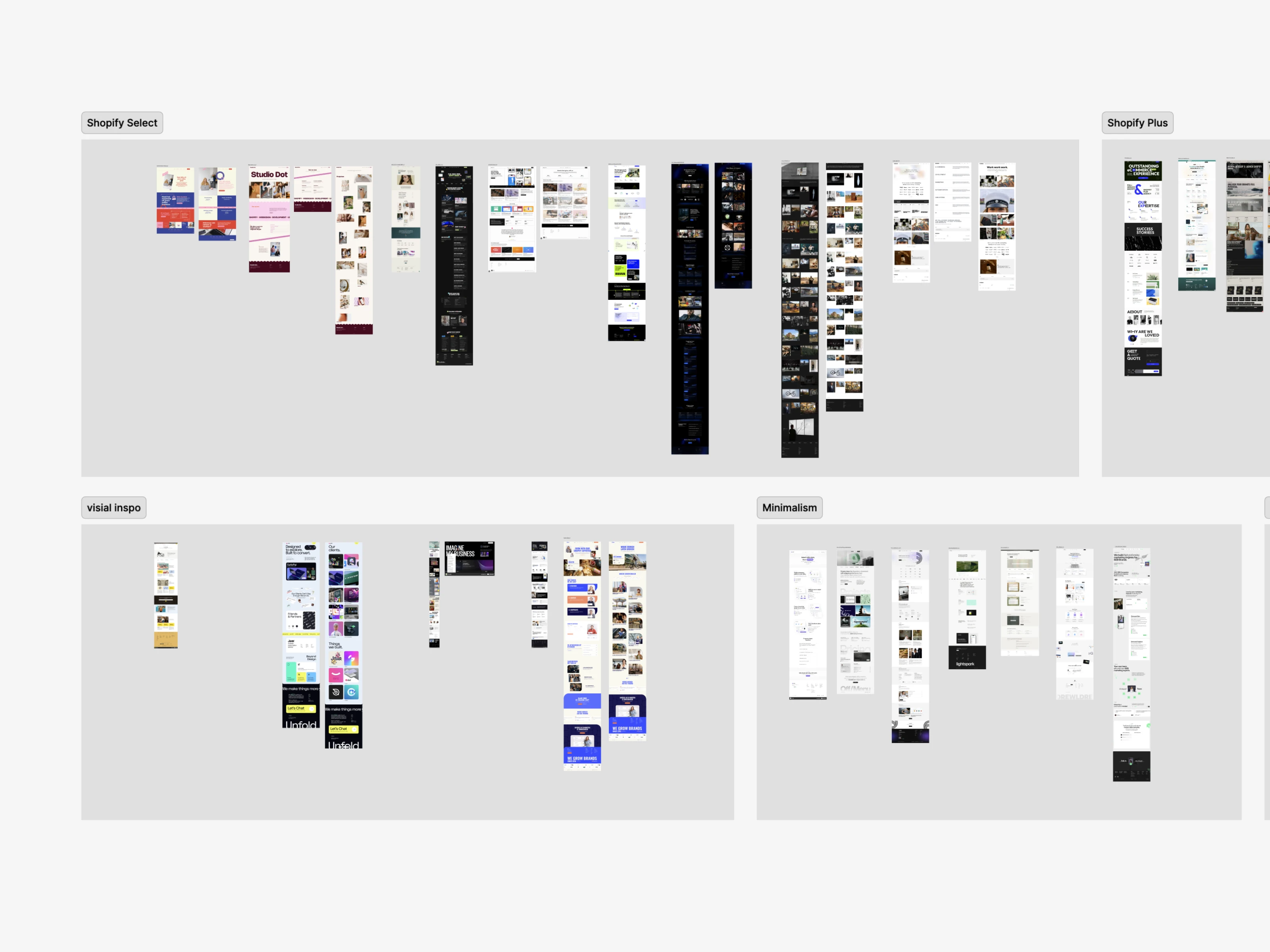
From that work we proposed a tightened positioning, a leaner site structure, and an initial creative direction. The headline shift: stop selling Shopify services, start selling a Shopify partnership.
Phase 2: Light brand foundations
The logo stayed. Everything else got a quiet upgrade. We built a minimal brand foundation so the website itself could carry the weight of the brand expression.
Deliverables:
Typography system
Color palette
Core UI primitives
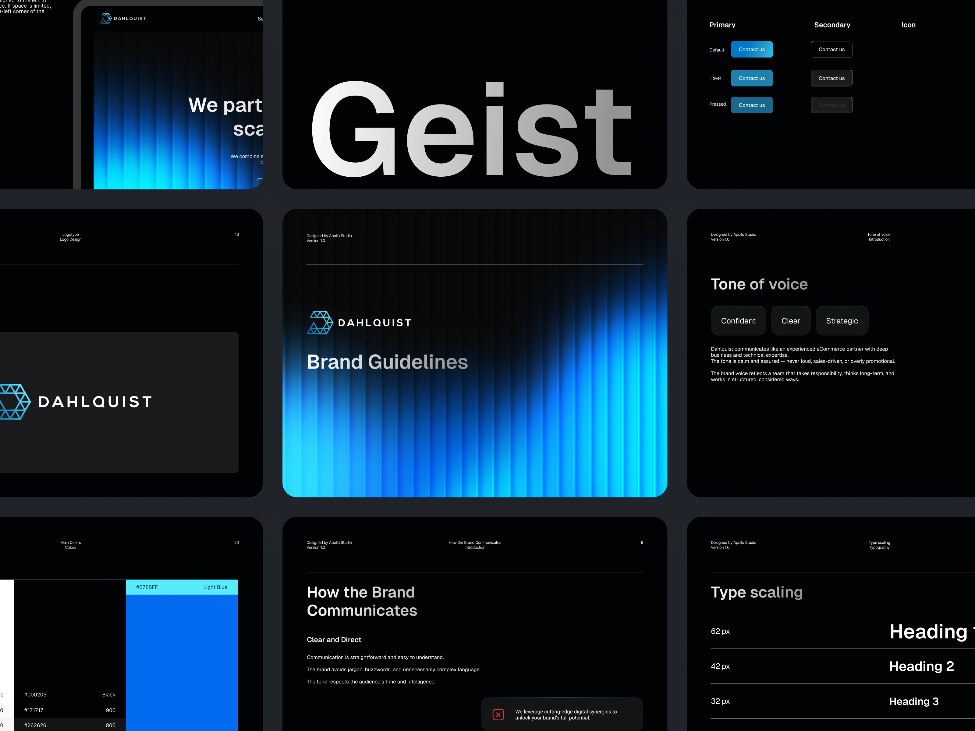
The system is intentionally restrained. A premium agency site doesn't need decoration. It needs to be confident in white space, type hierarchy, and the rhythm between sections.
Phase 3: Page design
Three pages, fully designed in Figma for desktop and mobile, with a reusable component library.
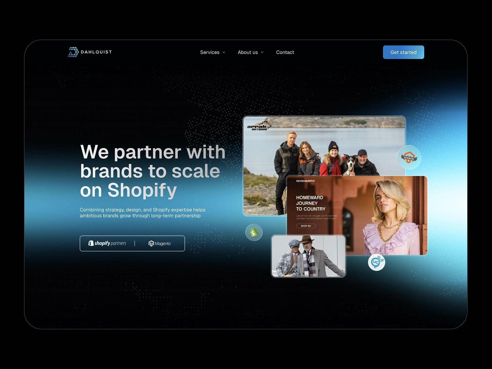
Home. Leads with the partnership thesis, then walks visitors through capability, proof, and process. We rebuilt the case study section to feel like a portfolio rather than a list, with a partner-focused narrative running through the page.
Shopify services. Restructured around outcomes rather than deliverables. Less "here's what we offer," more "here's what we solve." The page reads top to bottom as a single argument for working with Dahlquist.
Case studies. Treated as the proof layer of the site. Cleaner case study cards, stronger image hierarchy, and a layout that gives breathing room to client work.
Outcome
A complete design package ready for development handoff:
Positioning and site structure recommendations
Typography and color system
Three high-fidelity pages, desktop and mobile
Reusable component library
Dahlquist now has a foundation that matches the level of work they ship, and a website that competes on the premium tier they're aiming for.
Like this project
Posted Apr 30, 2026
Repositioned a Shopify Select agency as a premium partner. In two weeks I delivered research, visual foundations, and three core pages in Figma that make the agency look as senior as the clients it wants to win.
Likes
3
Views
91
Clients
Dahlquist E-handelskonsultation AB