✦ TYPOGRAPHY ✦
✦ Wara Lëepinlausky
Overview
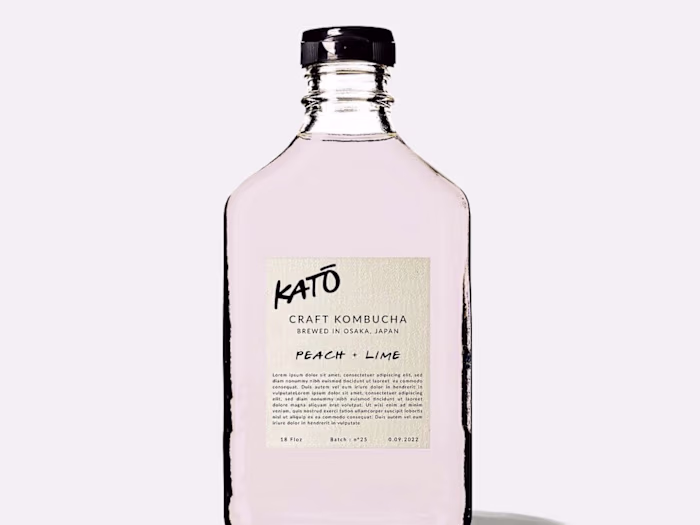
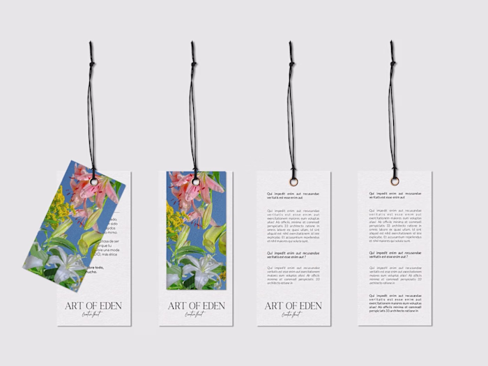
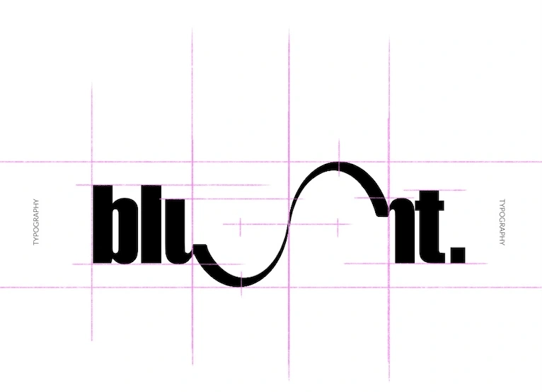
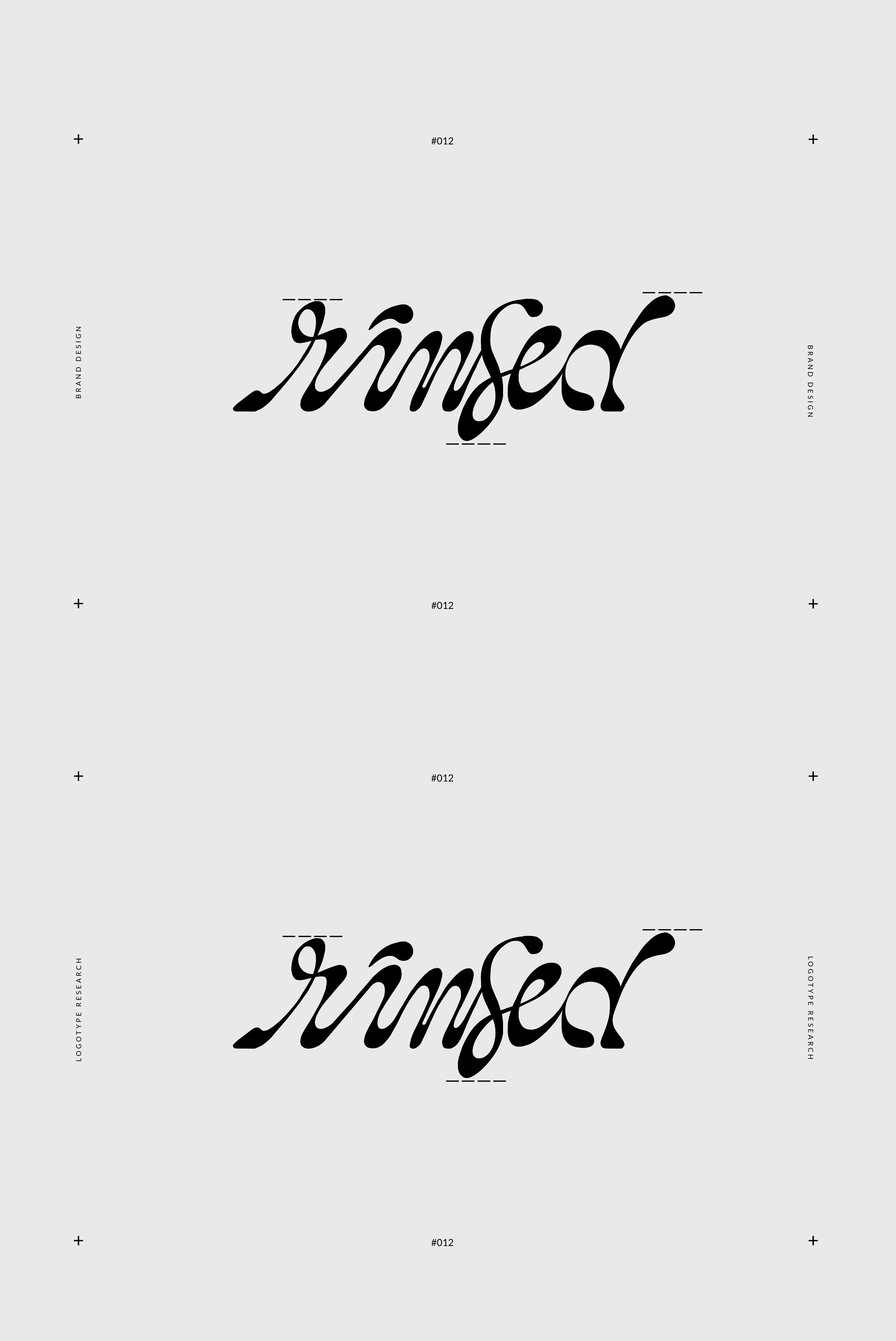
Very often in my work I like to work with contrasts. Whether it's with colors, textures or even with typography. I generally apply a principle that is found in almost all of my creations: associate an organic typography that will be used for titles and logo with a much wiser typography used for texts and second titles.
Problem & Solution
We are in a society that inherently judges at first glance so it is important to have an impactful identity as soon as the customer lays eyes on your logo.
That's why the first big step in my work is to focus on this first identity.
• I start by collecting a lot of content to get inspiration.
• Then I move to the execution phase, through sketches and samples.
• Finally the last step is to let my intuition run free to have the organic and non-vectorized rendering.
Results
By respecting my style, we obtain a unique result because it is handmade and allows us to bring humanity to the design to come.
PERSONAL TIP : It is important to think that very often the trends are out of tune with the world around us, they are several steps ahead. It is therefore very important to be visionary when building a brand. The world that surrounds us today is extremely digital, so it's only natural to want to refocus on organic and human things to create a balance. That's why I work a lot on this handwritten rendering.
Like this project
Posted Nov 5, 2022
In order to create a unique identity for each brand I work for, I dedicate a large part of my work to typography and logotype research.