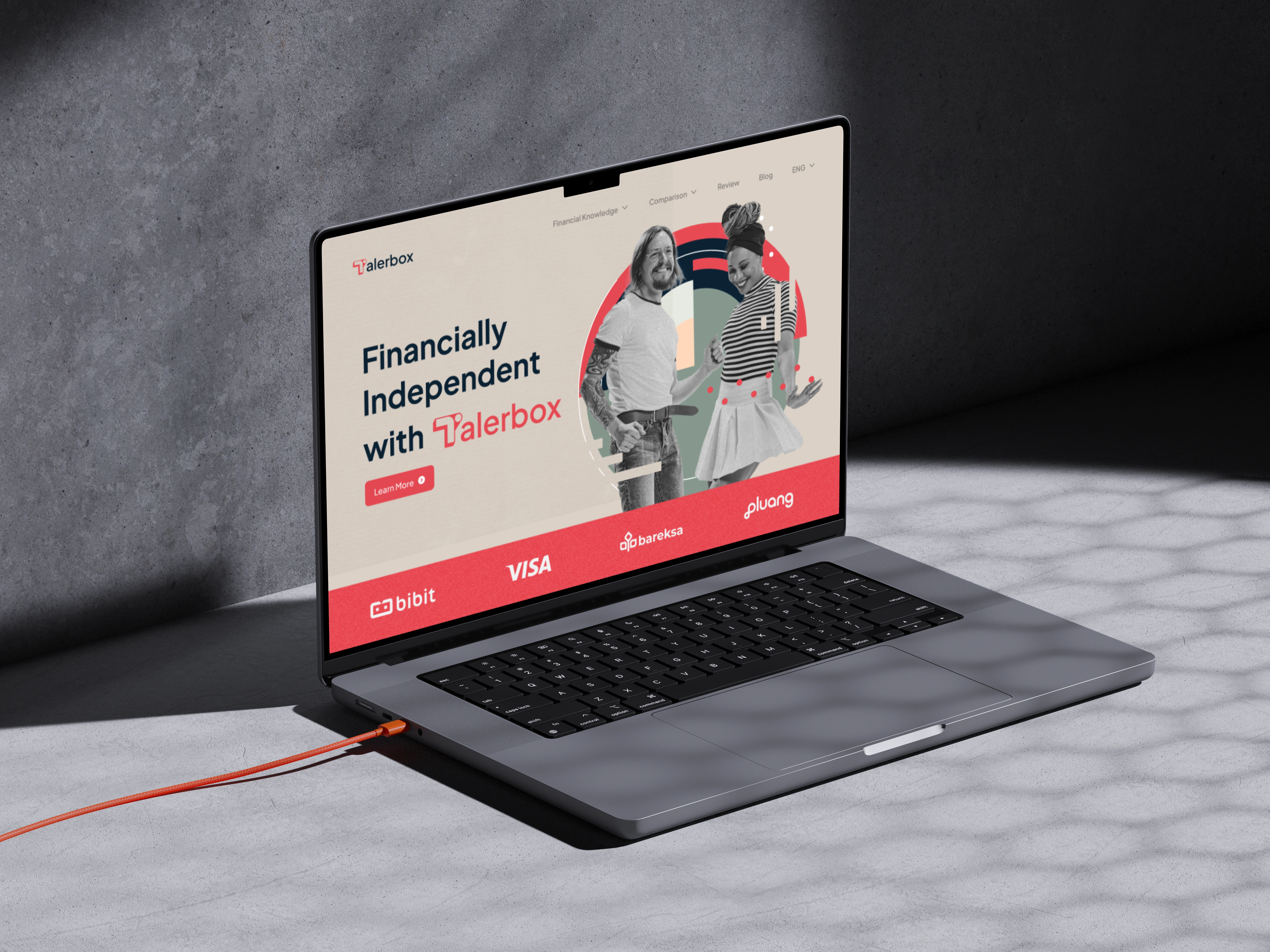
Talerbox-Rebranding

Website preview
Challenge
Audiences are very sensitive to the fees they have to pay, many growing up that stocks are a gamble and only for big hedge funds and partners. many also often feel overwhelmed by the pace of finances. New things like cryptocurrencies are often initially rejected and viewed with skepticism.
How we tackle
Our strategy was to create a visual identity that reflected the brand, in this case, we took an approach of an empathic and clear message and a combination of vintage and modern visuals. we took reference from the previous logo (saving box and coin) and wrapped the logomark from a slice of the box with the coin(reference as saving) it made the acronym "T" for Talerbox and the last touch we made dimension to make an edgy more and distinctive "T" Logomark.
Like this project
Posted Mar 3, 2023
Talerbox is financial education platform based in Germany, Talerbox is from Taler (Old coin) and box(Saving box), and the vision helps people to become more fin


