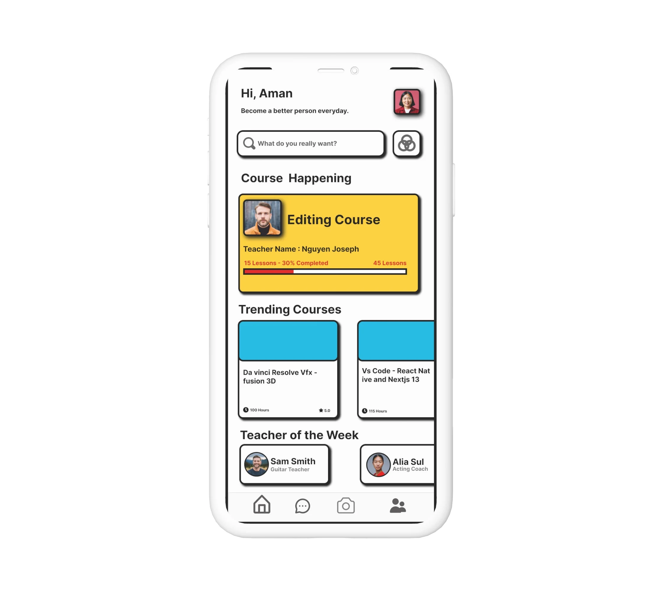
Homepage of a app in neo brutal design

neo brutal homepage
Problem
You were tasked with creating a homepage for a new app that used neo brutal design principles. Neo brutalism is a design trend that emphasizes simplicity, starkness, and geometric shapes. It is often used in tech and startup companies because it conveys a sense of innovation and modernity.
Solution
You decided to use a black and white color scheme with a strong focus on typography. The homepage features a large, sans-serif font that is used for the app's name and tagline. The rest of the text is kept to a minimum, which helps to create a clean and uncluttered look.
The homepage also features a few geometric shapes, such as a square and a triangle. These shapes are used to create a sense of balance and harmony on the page.
Results
The neo brutal design homepage was a success. It helped to create a sense of innovation and modernity for the app, and it also appealed to the target audience of tech-savvy users.
Analysis
The neo brutal design homepage was effective because it used simple, stark, and geometric shapes to create a clean and uncluttered look. These design principles are in line with the values of neo brutalism, and they helped to convey a sense of innovation and modernity for the app.
Recommendations
If you are looking to create a neo brutal design homepage for your app, I recommend using a black and white color scheme with a strong focus on typography. You should also use a few geometric shapes to create a sense of balance and harmony on the page.
Like this project
Posted Jul 6, 2023
neo brutal homepage app design
Likes
0
Views
29


