How an onboarding fix helped a 1.4M-user app hit 50M+ downloads

Mesut Yılmaz


The Project
The founder brought me on to figure out why revenue had stalled on Applock Pro, a privacy app already used by 1.4 million people a month.
When I asked him how he defined success, he said growing monthly revenue from ads and premium purchases.
I reasoned that meant one thing first: growing MAU. So I went looking for where people were actually leaking out of the app, and built the fix from there.
Downloads went from 20M to 50M+ and MAU grew 43% to 2M+ in the three months after launch.
Platform: Android
My Role: End to end Product Design, Visual Design, Animation & Video (In-house)
Status: Built and shipped, live on Google Play (acquired)
Team: Sole designer for the first half, then a UI designer joined and took over visual polish while I kept driving flows and decisions. Worked alongside the dev team throughout. (1 UI Designer, 1 Lead Android Developer, 3 Android Developers)
Timeline: November 2021 - February 2022
Defined success: Increasing monthly revenue from ads and premium purchases
What happened: Setup flow cut from 4 screens to 1, MAU grew 43% to 2M+, downloads grew from 20M to 50M+ in three months and the app is now acquired
Revenue had stalled, and nobody knew exactly why
Applock Pro lets people lock individual apps on their phone, a privacy tool. It already had a solid user base when I joined, but revenue wasn't moving. The founder could point to the symptom (flat revenue) but not the cause.
My first move was translating his business question into a design question: if he wanted more revenue, the fastest lever I had was growing MAU, since both ad revenue and premium purchases scale with how many people actually use the app regularly.
That's the thread I pulled on.
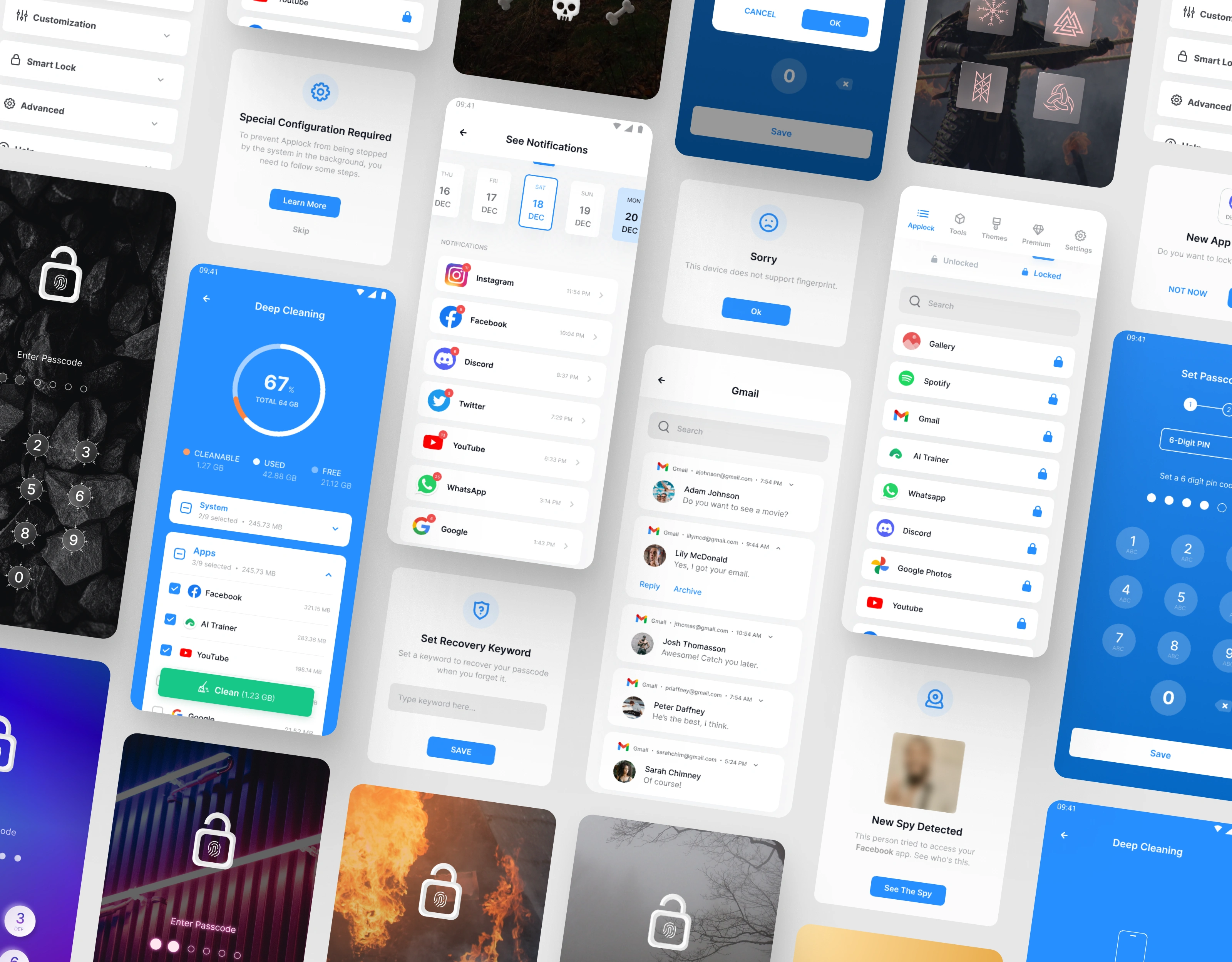
Hero Image
Tracing the drop in revenue back to onboarding
I didn't have direct access to analytics, so I built the picture from three angles instead. I used the app myself like a first time user and took notes on every point of friction.
I went through about 300 Play Store reviews from the previous three months, looking for patterns. And I asked the founder to pull drop off and session data for the screens I suspected were the problem.
All three pointed at the same place. People were leaving during setup, before they'd even gotten to use the app once. That one finding reframed the whole project.
Growing MAU wasn't about marketing or acquisition, it was about not losing the users who'd already installed the app. Alongside that, I found a second lever: premium conversion was low, and the app wasn't giving anyone a reason to personalize it, let alone pay for it.
I mapped the existing setup flow screen by screen and wrote down what a user would likely be feeling, thinking, and struggling with at each step, pulling those emotions and quotes from the reviews and my own testing. That's what turned a vague hunch into an actual list of things to fix.
All of this ran on a three month timeline with a founder who wanted the new version live as soon as possible, so there wasn't room for a slower research process.
I worked with what I could get.
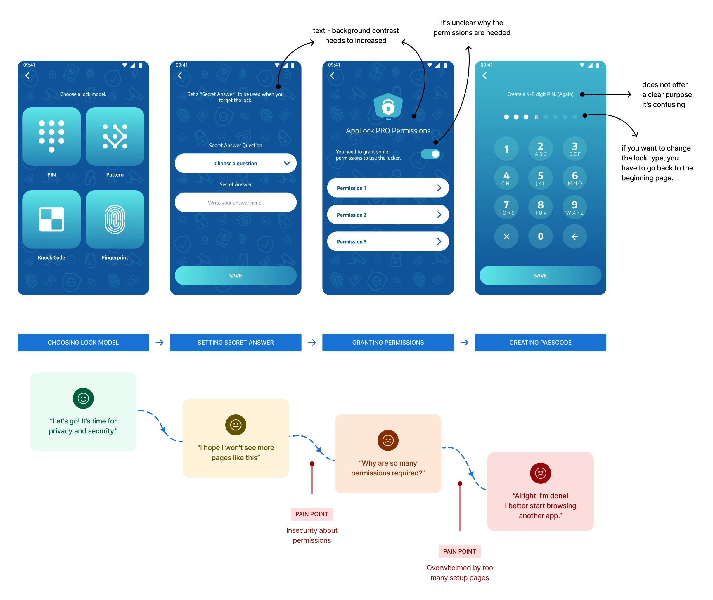
Customer journey
Rebuilding onboarding so people actually finish it
I could have just added explanatory copy to the existing permission prompt. That would've been the easy fix. But the reviews made it clear the problem wasn't that people didn't understand the permission request, it was that they didn't trust it yet.
Better copy wasn't going to fix that.
So I moved the request out of setup and into the homepage instead, letting the app earn permission by showing itself first. Combined with merging the lock type picker into the same screen as the settings, that's what took the flow from 4 screens down to 1.
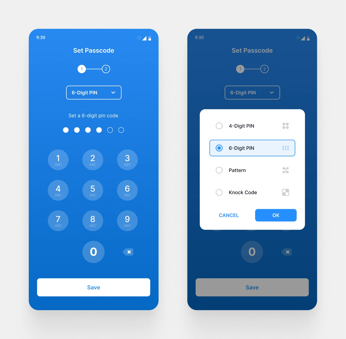
New setup screen
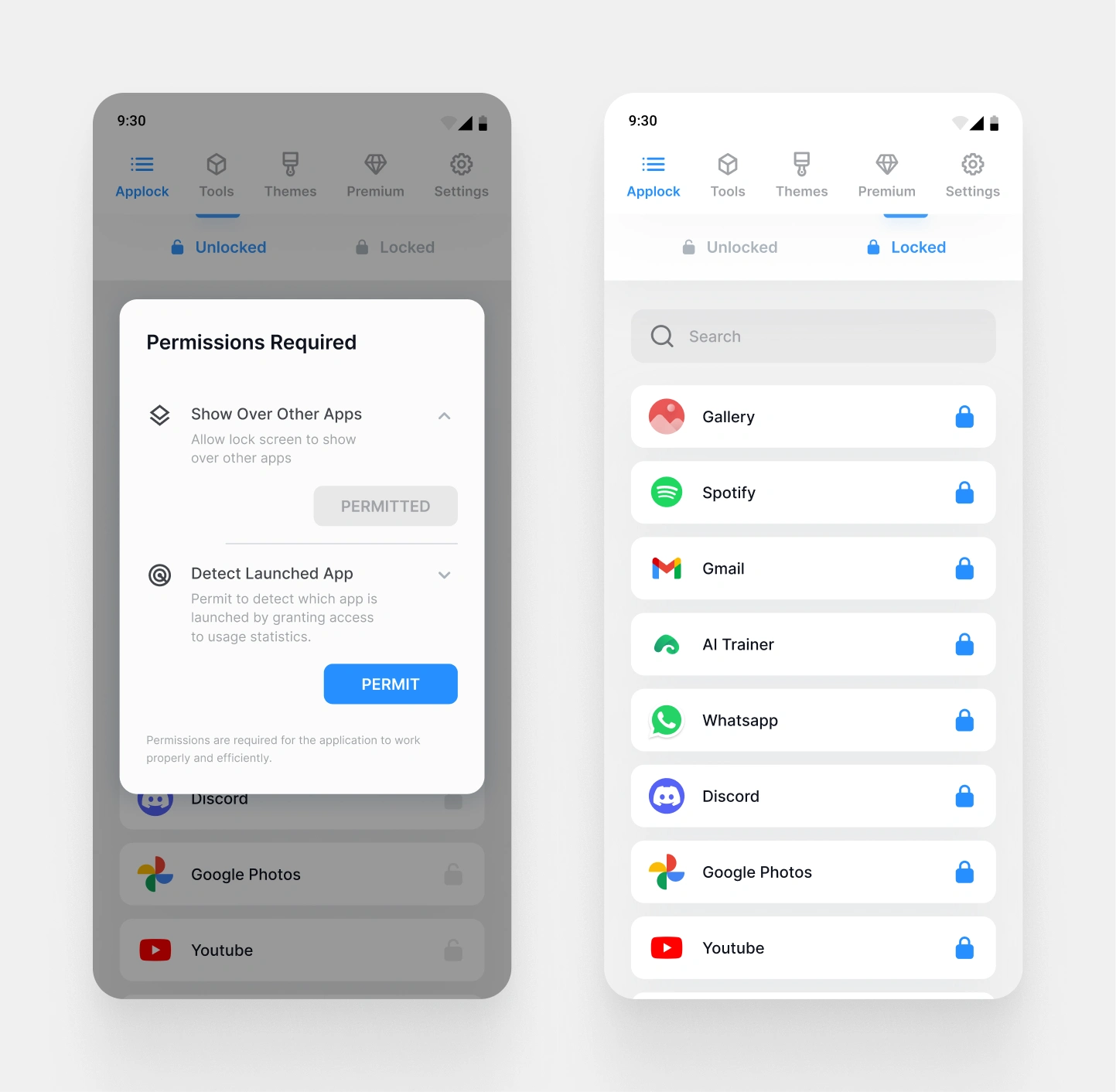
Homepage and permission popup
Giving people a reason to pay for premium
The original purchase screen just assumed people already knew why premium was worth it. It was a title and a button, nothing else.
I rebuilt it into a full page that actually explains the features and what you get from them. A purchase decision needs a reason, not just a prompt.
The founder ran an A/B test on this afterward. I never got the result, so I'm not claiming one here.
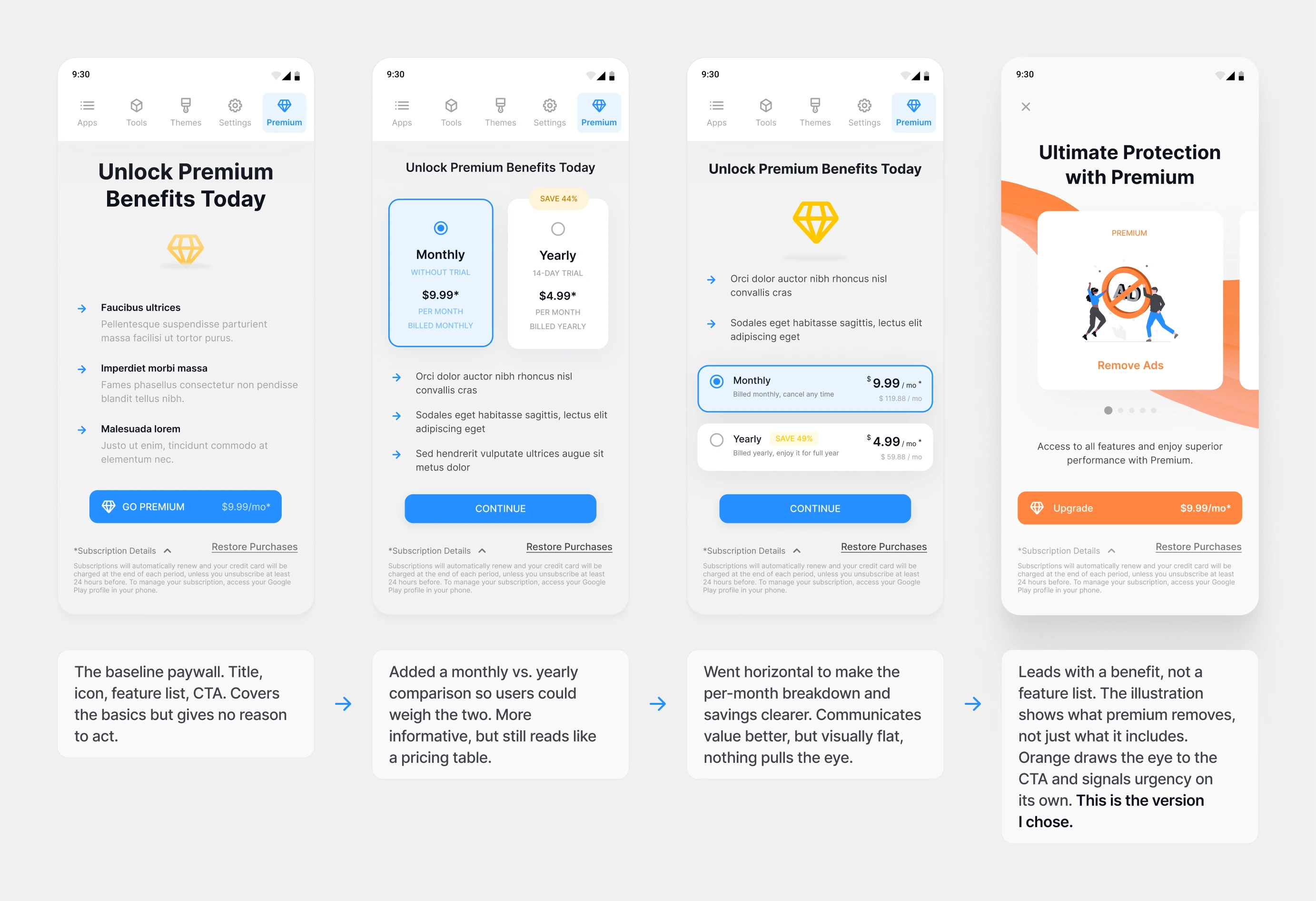
Paywall iterations
Giving free users a taste of premium, on purpose
Fixing the purchase page solved the "why would I pay" problem for people who were already paying attention. But I wanted another lever: giving people a reason to think about premium at all, even if app locking itself wasn't enough to pull them in.
So we expanded what Applock Pro actually did, shipping two new features, deep cleaning and notification history, that pushed the app closer to a super app than a single purpose tool.
Both features were available to free users, but with limits. Premium removed the restriction entirely. That structure was deliberate. It meant every user got a real taste of what premium unlocked, instead of hearing about it secondhand on a purchase page they might never visit.
The features themselves became the pitch.
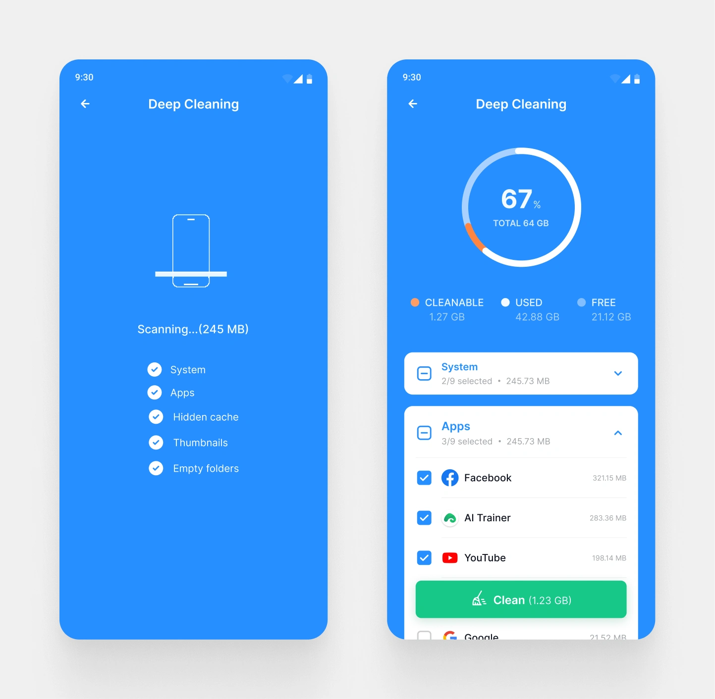
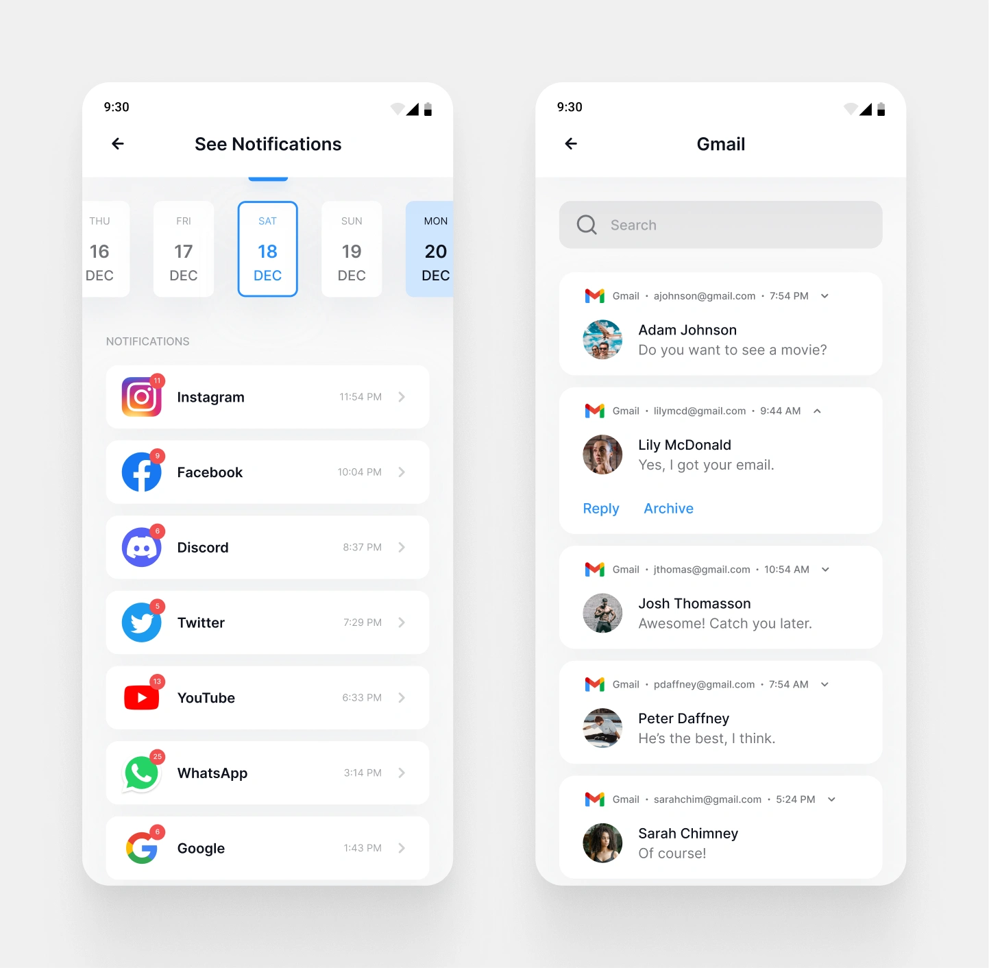
Betting on personalization to drive premium purchases
This is where the themes work connects back to the founder’s actual goal, not just a cosmetic upgrade. My thinking was that a lock screen is something people see dozens of times a day, closer to a personal surface than a settings menu, and that giving people a lock screen that felt like theirs would make premium feel worth paying for.
I shipped 90 themes across seven categories instead of a handful of polished ones, betting that coverage mattered more than curation. Reviews naming specific themes as favorites suggest that bet worked, though I can’t put a number on how much it moved premium purchases specifically.
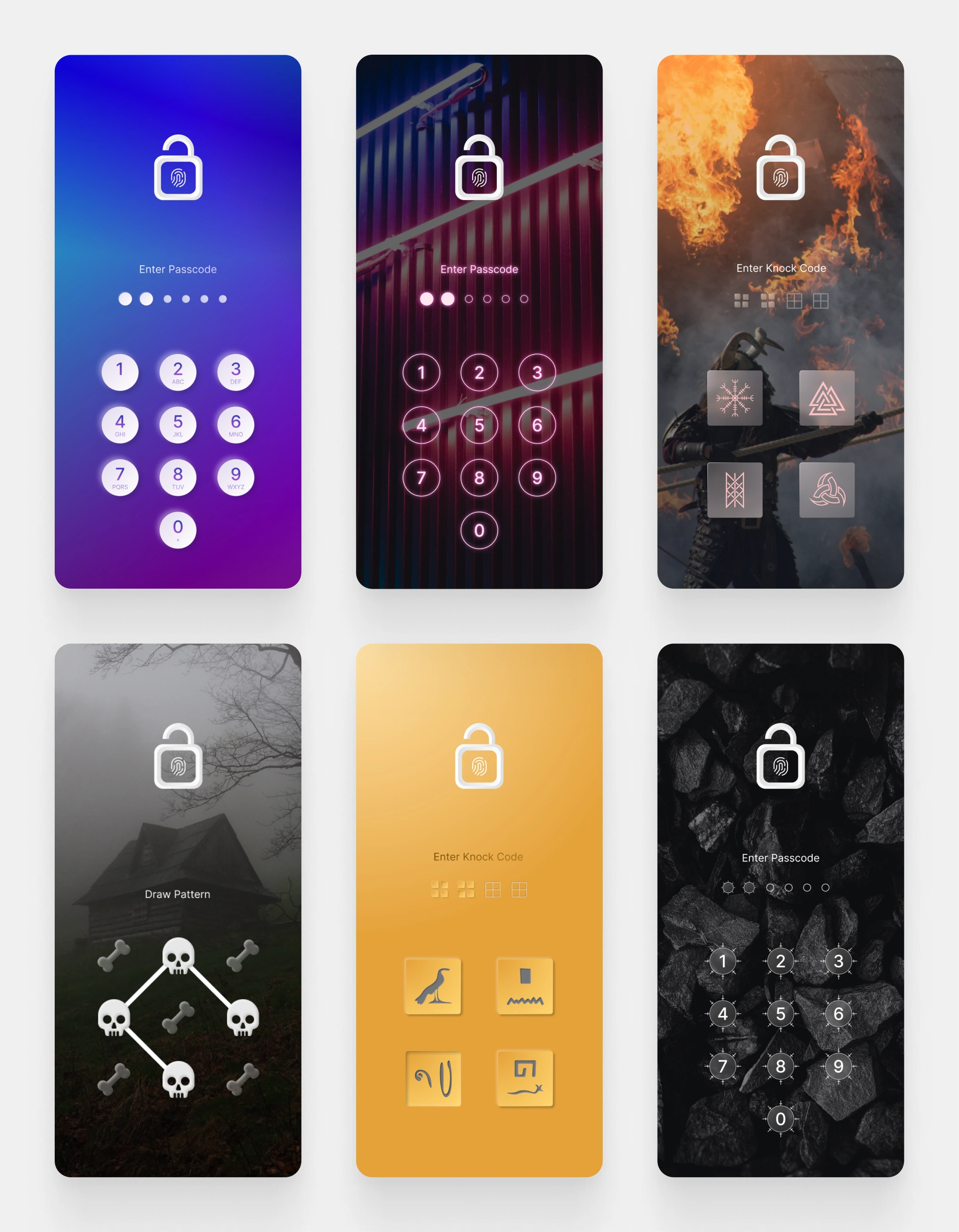
A few lock screen themes I designed
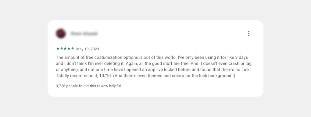
One of the user reviews on Google Play
Testing one variable at a time on the store listing
Outside the app itself, I also worked on the Play Store screenshots, since that’s the first impression before anyone opens the app. I designed 12 variants and split testing into two separate rounds, visual style first, then value proposition, instead of throwing everything out at once. That way, if something won, I’d actually know why.
3D hand graphics won the style round clearly enough that it became the permanent default. It’s the one result in this whole project where the cause is obvious, even without a conversion number attached to it.
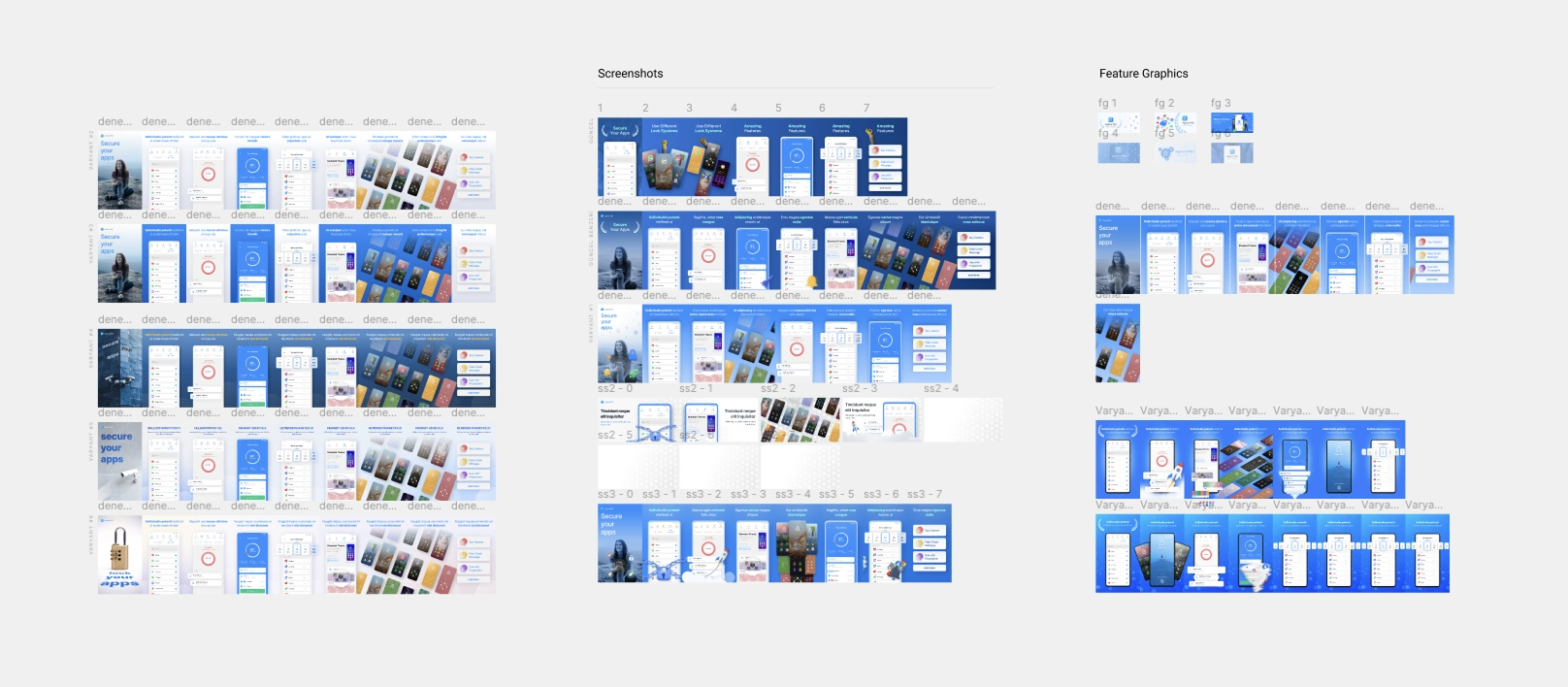
Screenshot variants for Google Play Store
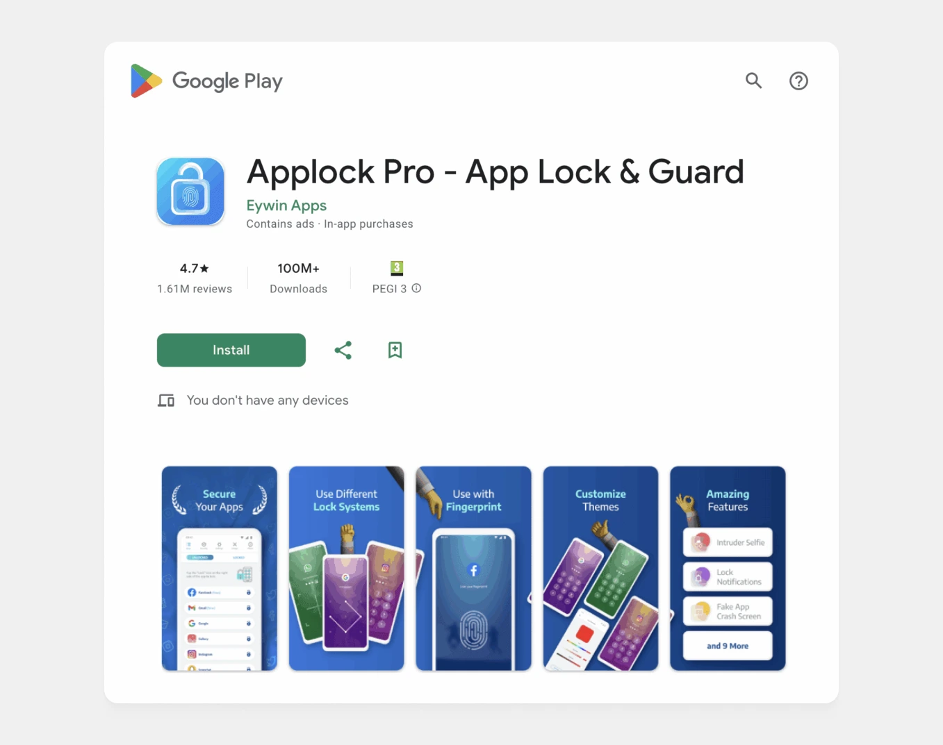
The one that drives conversion the most
The result
Here's the general direction things moved
Setup flow cut from 4 screens to 1, a 75% reduction
Downloads grew from 20M to 50M+ within three months of launch
MAU grew 43% to 2M+
The 3D graphics screenshot variant won the A/B test and became the permanent default
90 new themes shipped, repeatedly named by users in reviews as favorites
Deep cleaning and notification history shipped as new premium hooks, driving upgrade consideration among free users
I can’t fully isolate my work from marketing spend or seasonality in the download and MAU numbers, since both are founder-reported and aggregate. The screen count reduction and the screenshot test are the two outcomes I can trace directly to a decision I made. The rest is supporting evidence, not proof.
Testimonials
We did great things while working on the project as a team. It was a fun experience to me working with those people who are friendly and kind.
Here are some of their reviews for me. I quoted those recommendations from LinkedIn.
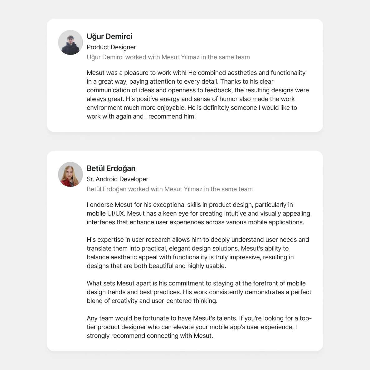
Testimonials
Want to have similar results?
Come and say hi!
Like this project
Posted Oct 9, 2026
Redesigned a 1.4M-user Android app that was later acquired. Downloads grew from 20M to 50M+ in three months.
Likes
0
Views
52
Timeline
Nov 30, 2021 - Feb 28, 2022
Clients
Eywin