Built with Framer
Drew School Website Design
Approve request to show earnings
View
Umar Mirza
Verified
Project Overview
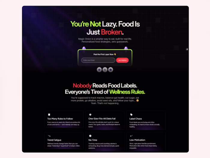
Drew School, an online education platform focused on creative and entrepreneurial learning, approached me to redesign their website on Framer. The goal was to create a modern, engaging, and conversion-driven experience that communicates the brand’s mission — making learning simple, inspiring, and actionable.
The old website lacked a clear structure and visual consistency. My objective was to craft a design system that enhances readability, introduces dynamic storytelling through visuals, and ensures the brand feels both premium and approachable.
Challenges
Outdated structure: The previous layout didn’t guide users effectively toward courses or programs.
Low engagement: The lack of animation and motion made the site feel static and uninspiring.
Brand inconsistency: Visual elements didn’t align with Drew School’s modern educational identity.
Design Goals
Build a clean and minimal visual hierarchy that keeps users focused on the content.
Integrate subtle micro-interactions and scroll-based animations to make learning feel immersive.
Improve conversion by emphasizing CTAs and trust-building elements (testimonials, success stories, etc.).
Ensure full responsiveness and fast load times across all devices.
Process
1. Research & Strategy
I started by understanding Drew School’s target audience — primarily young professionals and students looking to upskill. After analyzing top-performing education websites (like Maven, Reforge, and Skillshare), I outlined a conversion-focused user journey.
2. Wireframing
Using Framer, I created low-fidelity wireframes to structure each page efficiently. The focus was on clarity — making sure every scroll and section served a purpose, leading users to explore or enroll.
3. Visual Design
Once the structure was approved, I moved into designing the UI using a neutral yet bold color palette, clean typography, and an approachable layout.
I introduced:
Hero animations to draw immediate attention.
Dynamic section transitions to make the experience fluid.
Modular components for easy scalability.
4. Development in Framer
I built the site entirely within Framer, leveraging its native animations and CMS for blog and course management.
Framer’s responsiveness and no-code flexibility allowed me to experiment with custom interactions, ensuring a seamless experience from desktop to mobile.
Results
Bounce rate decreased by ~35% after launch.
Average session duration increased significantly, indicating better engagement.
The client reported a noticeable uptick in course sign-ups and inquiries within the first two weeks.
Key Takeaways
This project reinforced the power of motion and clarity in educational design. A website doesn’t just inform — it must teach through its flow.
By combining clean design principles with smart animations, I turned a simple education site into an interactive experience that motivates users to take action.
Tech Stack
Platform: Framer
Tools: Figma, Framer CMS, Framer Interactions
Focus Areas: UX Strategy, UI Design, Framer Development, Motion Design
Like this project
Posted Oct 17, 2025
Designing Drew School’s website on Framer with a modern, conversion-focused layout, smooth animations, and a clear user flow that boosts engagement.
Likes
1
Views
102
Timeline
Sep 22, 2025 - Oct 17, 2025
Clients
The Drew School