Garmin Connect Redesign
Overview 🔎
During my graduation project, I analyzed every piece of Garmin products. Even though they are a huge success in the physical world, they are outdated in the digital.
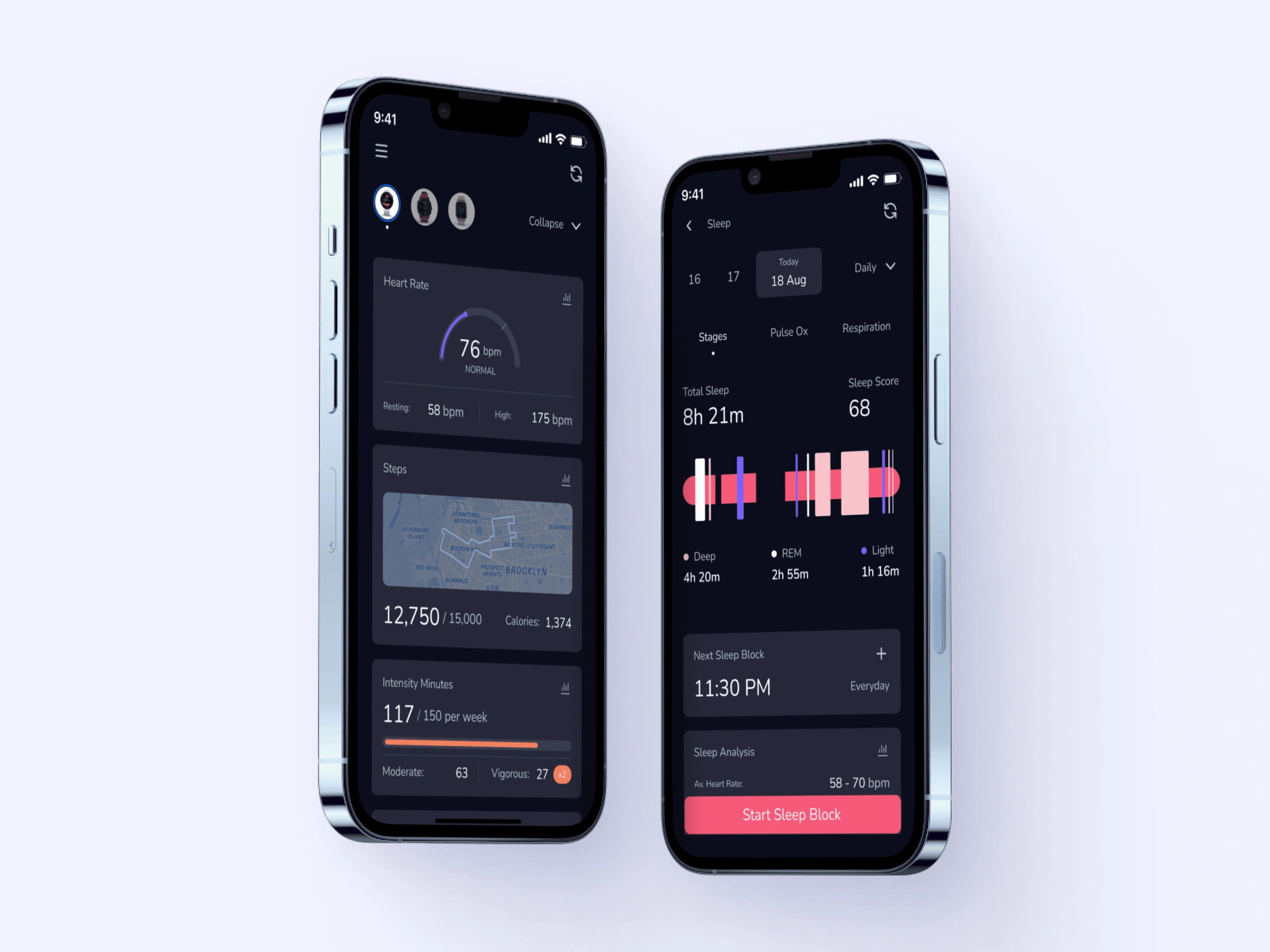
So, I tried to modernize Garmin Connect’s look and feel with minor UX changes.
New Look
Problem & Solution 🤝Garmin Connect HomePage Before&After
Garmin Connect has lots of functions. I spend 1-2 hours on Play Store & App Store and, here are the most common ones:
People struggle with keeping the track of data sources.
"Which watch is on and which watch's data i am seeing in the app?"
The existing manual activity page is texted based and it has no hierarchy between titles.
"The app is sometimes difficult to navigate with all the slight menu options. For example; customizing and naming my own exercises."
Sleeping mode is functionally inadequate. If the user wakes up in the middle of the night or has insomnia, the watch does not detect it.
"Most people have insomnia. If I read for 2 hours in the middle of the night, there is no way to enter it and the app comes out with 6-7 hours of sleep which is wrong."
The app's look&feel is outdated.
"I wish the app didn't look like it came from 2012."
Process 🛣
I wanted to get the work done with quick fixes. So I jumped into the inspiration phase real quick. Created a color palette and a mood board. For the color palette, I softened colors, because even tho, old ones made it really pop, they were not appropriate for the digital age.
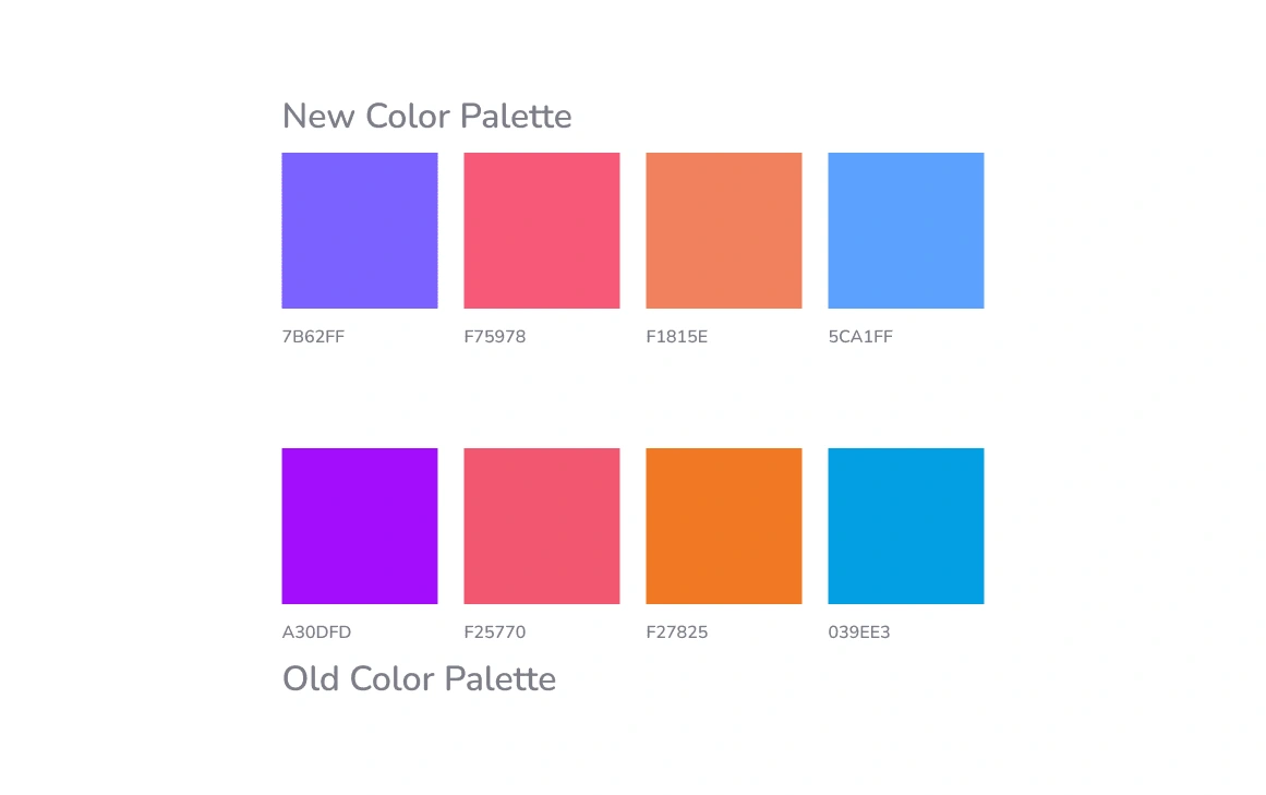
New Color Palette
Results 🎁
I organized the hero section of the home page. With 3 avatars on the top, users now can see which watch is selected. The menu and refresh button are separated from the profile.
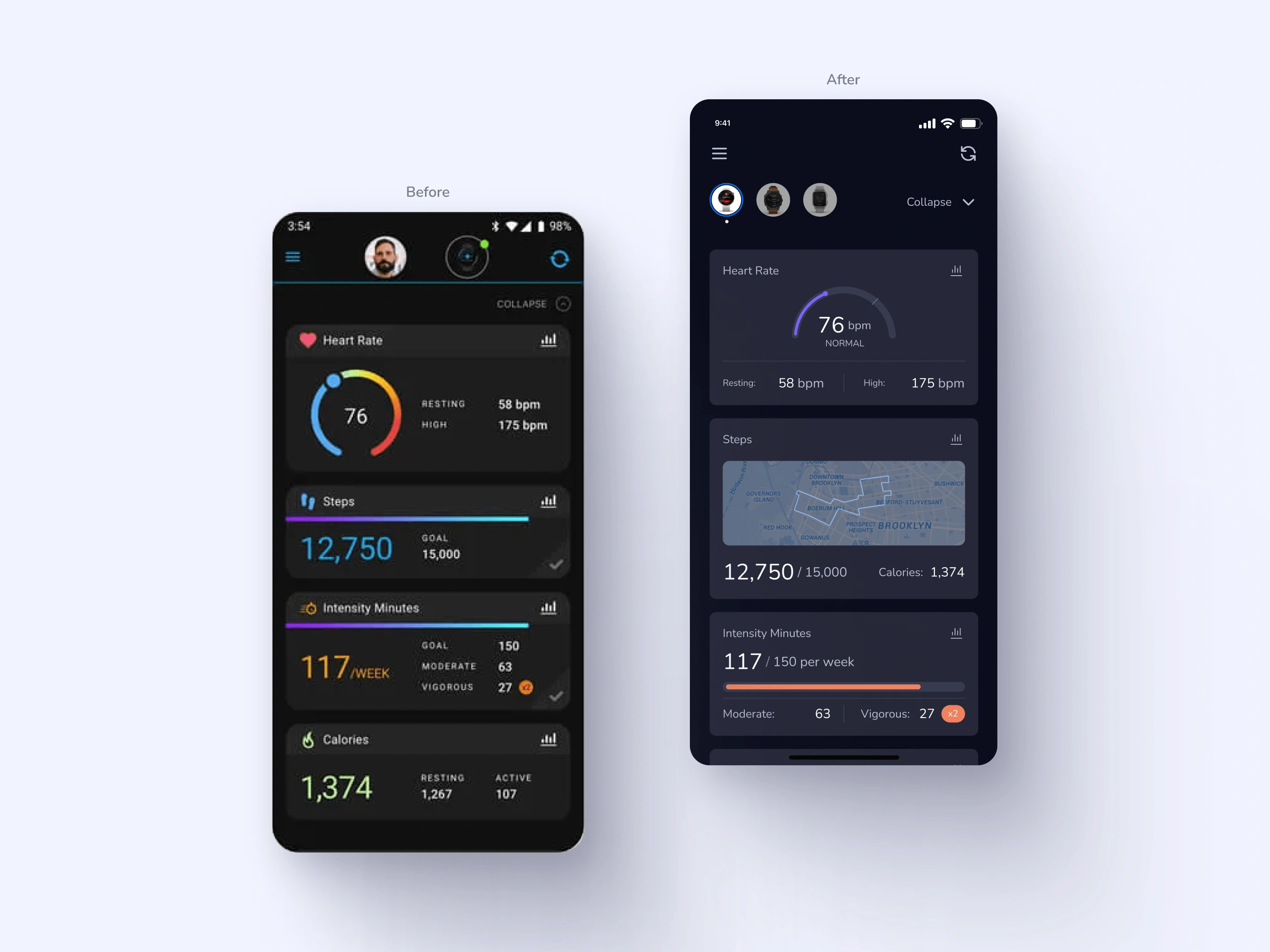
Home Page / Before&After
I divided the manual activity page into sections and made them visually different. The public version of the manual activity is more readable.
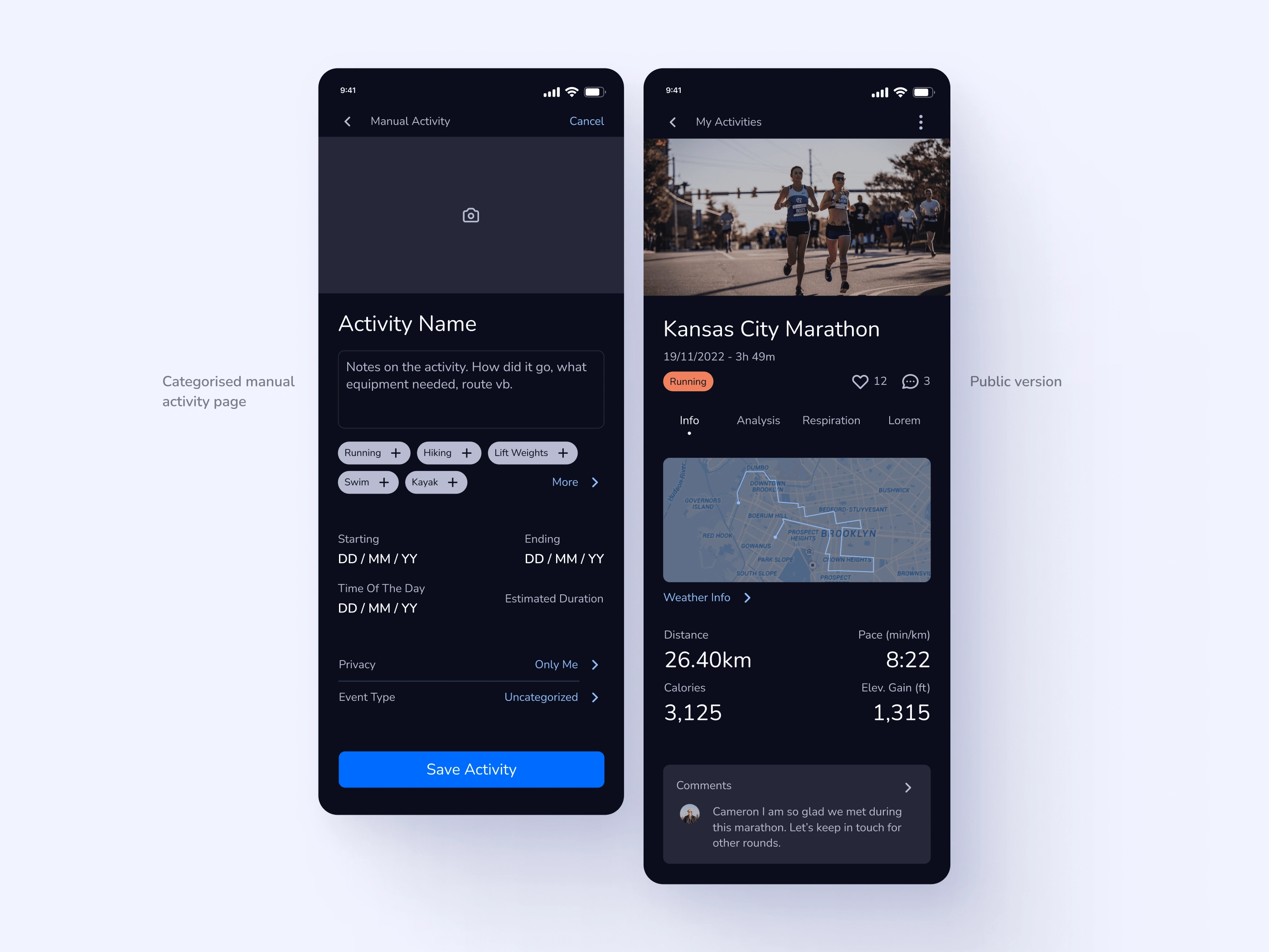
New Version Of Manual Activity
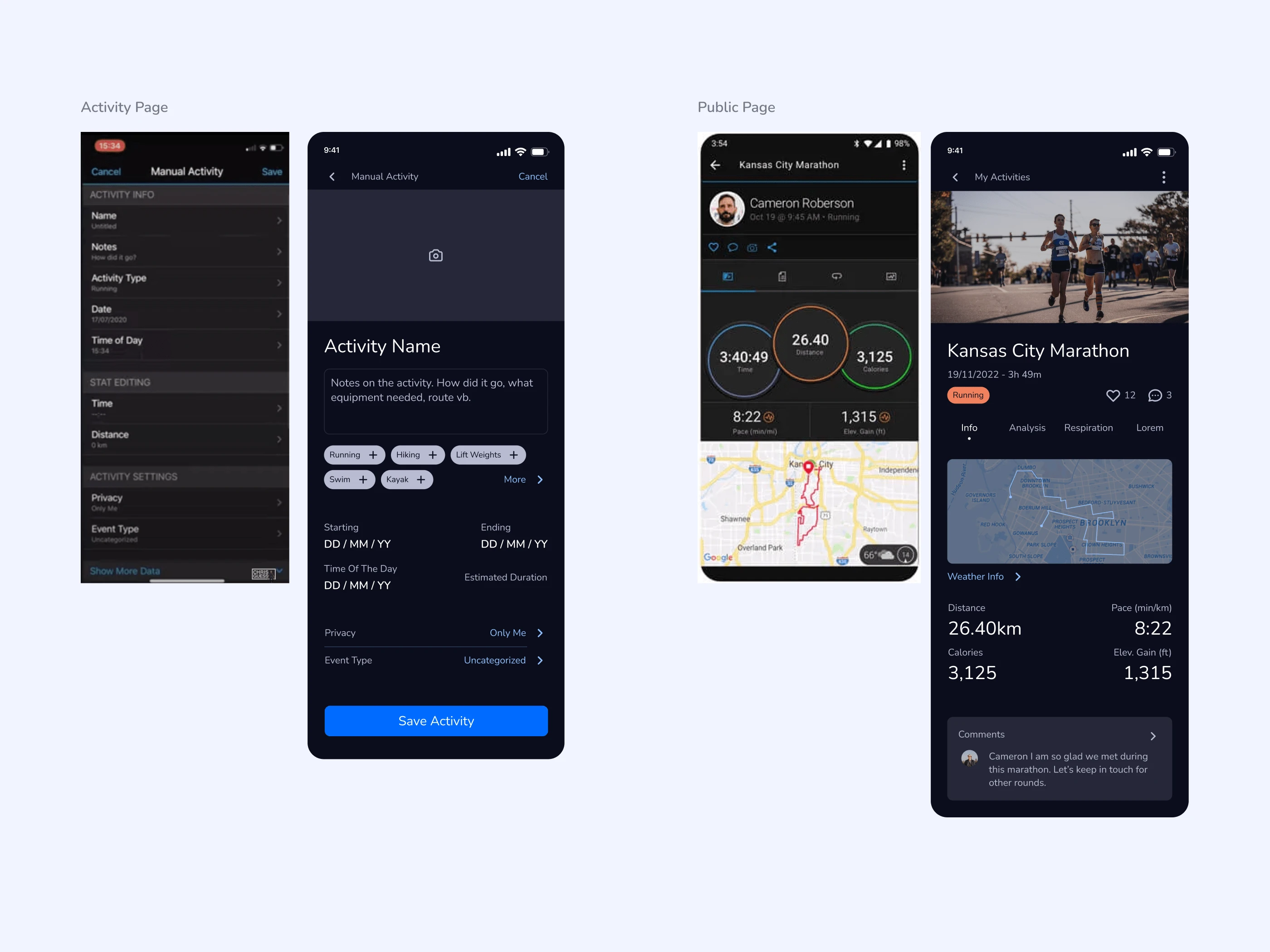
Manual Activity Page Before & After
As mentioned before, people with insomnia didn't get the correct results. I added a Sleep Block button so that when the user wakes up in the middle of the night, they can use the button and pause the sleep.
With that in mind, I created scheduling for sleep blocks and changed the graphical analysis. People now can see the sleep cycle in order.
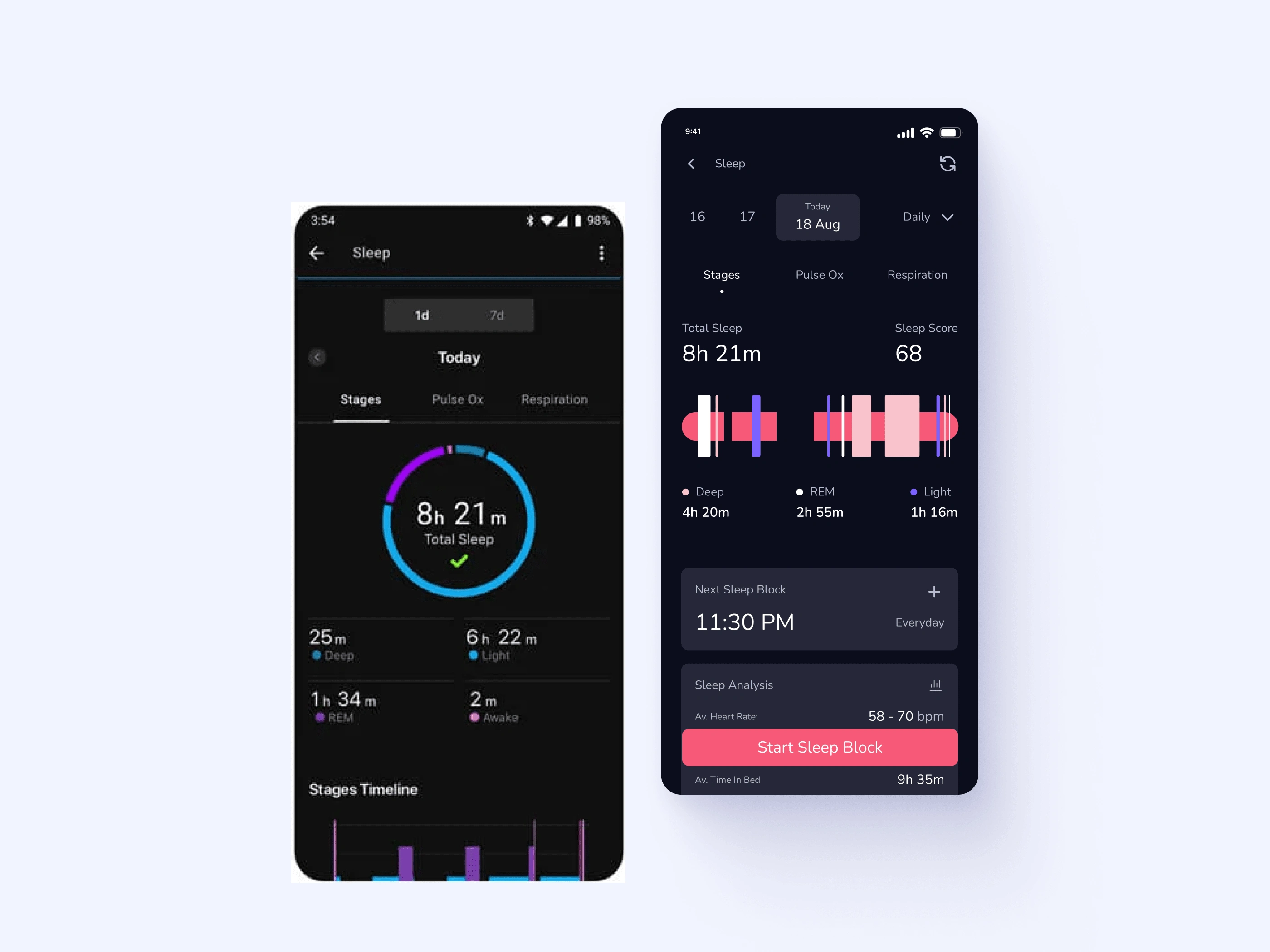
Sleep Analysis Before & After
Thank you.
Like this project
Posted Jan 27, 2023
I am a designer trying to upskill. So, I tried to modernize Garmin Connect’s look and feel with minor UX changes.


