A Complete UX Overhaul for a Canadian Restaurant Giant

Nicole Buloran


WHO ARE THEY?
You can find this go-to restaurant across Canada that can provide you with the best deals to fulfill your cravings while winding down with family, friends, colleagues and everyone in between.
PROJECT BACKGROUND
In 2021, Hudsons Canada’s Pub marketing director reached out to me about some difficulties the team and the customers are experiencing with using the website. Mainly:
Team: Lack of control on the website and requires a lot of help from the engineers to adjust the content, make pages, messy backend; challenges in identifying which reservation requests are for each location.
Customers: The customers are having a hard time using the company’s virtual menu and using the website’s booking form
The Approach
OLD WEBSITE
To provide context, I’ve included the company’s old website to illustrate the foundation we worked with. Through a detailed analysis and team collaboration, we identified several key pain points:
The website was visually outdated and needed a modern refresh to improve engagement.
Messaging lacked clarity and impact, failing to effectively communicate the company’s identity, offerings, and promotions.
Usability issues hindered the customer experience, particularly the reservation form, which was not functioning efficiently for either customers or the restaurant.
The content management process was restrictive, requiring developer intervention for updates, limiting agility.
Backend inefficiencies caused disorganized reservation data, mixing all locations into a single list, making it difficult for the front office team to serve customers efficiently.
By applying a detail-oriented and strategic approach, the team at Hudsons Canada’s Pub and my self worked cross-functionally to address these challenges, ensuring both customer needs and operational efficiency were prioritized.
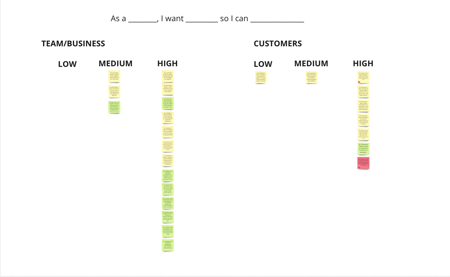
Request
We leveraged Miro to gather detailed requirements from both internal teams and customers, ensuring a comprehensive and structured approach to the new website’s development. By prioritizing these requirements, we set clear expectations for key functionalities and improvements.
To maintain organization and align functionality with user needs, we categorized requirements into two distinct groups:**
Team-Focused: Requests from internal team members aimed at improving workflow, efficiency, and content management.
Customer-Focused: Enhancements designed to improve website navigation, anticipate user needs, and create a seamless browsing experience.
This structured approach allowed us to strategically balance business goals with user expectations, fostering a more effective and user-centric redesign.
Goal
To ensure a consistent and user-centered approach, we established distinct primary goals for each audience:
Customers: Enhancing Navigation & User Experience
The primary objective was to improve the user experience for both new and returning customers. The website should enable users to:
Easily browse the menu
Seamlessly book or contact a restaurant location
Discover current deals and promotions
Team: Building a Scalable & Manageable System
To empower the internal team, we focused on creating a set of reusable components, allowing for greater control over website management. Key improvements included:
A more flexible backend for efficiently creating landing pages and updating content
Streamlined workflows for the corporate team and front-office staff to manage information and guide customers effectively
By strategically balancing customer needs with internal efficiency, this approach ensures a more sustainable and scalable website experience.
Persona
Hudsons Canada’s Pub serves both existing customers and internal team members, each with distinct needs and expectations.
Customers: Enhancing Convenience & Mobile Experience
The primary customer base consists of Millennials (ages 26–41) who frequently visit the pub. Their behaviors and needs include:
Often feeling hungry, stressed, or excited, seeking a seamless and quick browsing experience.
Primarily accessing the website via mobile devices, using Google Chrome and Safari as their preferred browsers.
Team: Improving Efficiency & Website Utilization
Hudsons Canada’s Pub’s internal team is also composed mainly of Millennials (ages 26–41) across different roles:
Restaurant managers and front-office staff often feel overwhelmed by high customer traffic but are committed to delivering an excellent dining experience.
Corporate managers and marketing teams aim to leverage the website to maximize profitability and better target customers with strategic marketing efforts.
By understanding these unique user needs, the website redesign focuses on enhancing usability for customers while providing internal teams with better tools to streamline operations and drive business growth.
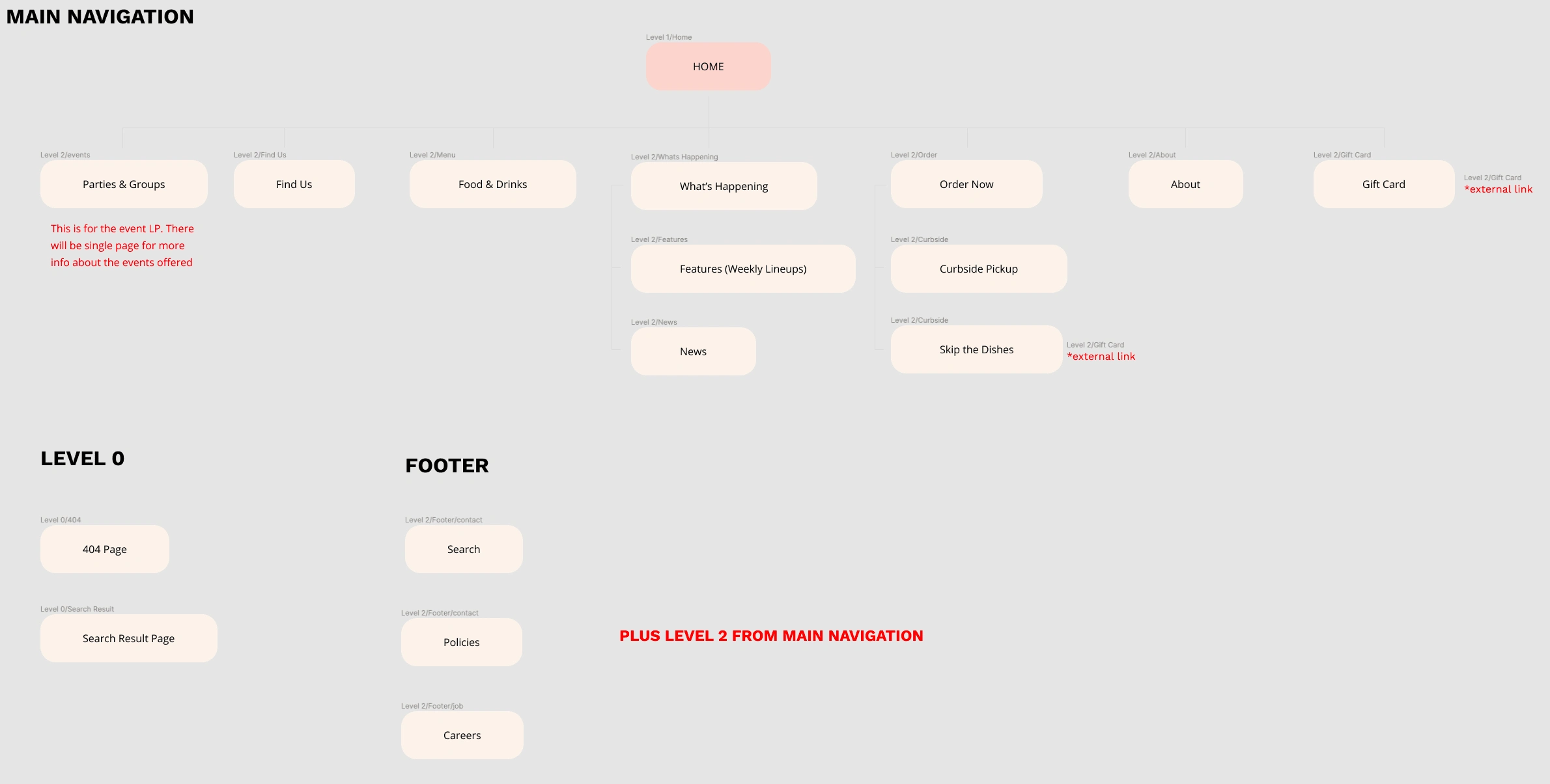
Information Architecture
We conducted a comprehensive audit of the client’s website to identify key areas for improvement while preserving the functionalities users valued. One critical finding was the need for a more structured and intuitive website architecture to better support the project’s overarching goals. Refining this foundation would enhance navigation, improve usability, and create a more seamless experience for both customers and internal teams.
Ideation
We began with an ideation session, gathering inspiration and compiling relevant screenshots to guide the design process.
To lead this session effectively, we first explored references within the company’s industry before expanding our scope to broader design influences. This approach not only sparked creativity but also provided valuable insights into competitor strategies, allowing us to identify industry best practices and potential areas for differentiation.
Styleguide
Hudsons Canada’s Pub already has an established brand identity. To ensure a cohesive design and streamline internal collaboration, we developed a naming convention guide for colors, spacing, and grid systems.
This structured approach enhances consistency across the design, simplifies component development, and improves communication—especially when working with engineers and preparing for a smooth client handoff.
Wireframe
Following the ideation phase, we moved directly into sketching and wireframing to establish the page structure using the predefined design blocks. This process provided early insights into the potential layout and functionality of the website.
During this phase, we also discussed configurable options for the design blocks, ensuring flexibility to meet various needs. The Hudsons Canada’s Pub team was given a detailed walkthrough of how these components could adapt to different use cases. Their feedback led to valuable refinements, which were incorporated to enhance both usability and alignment with their goals.
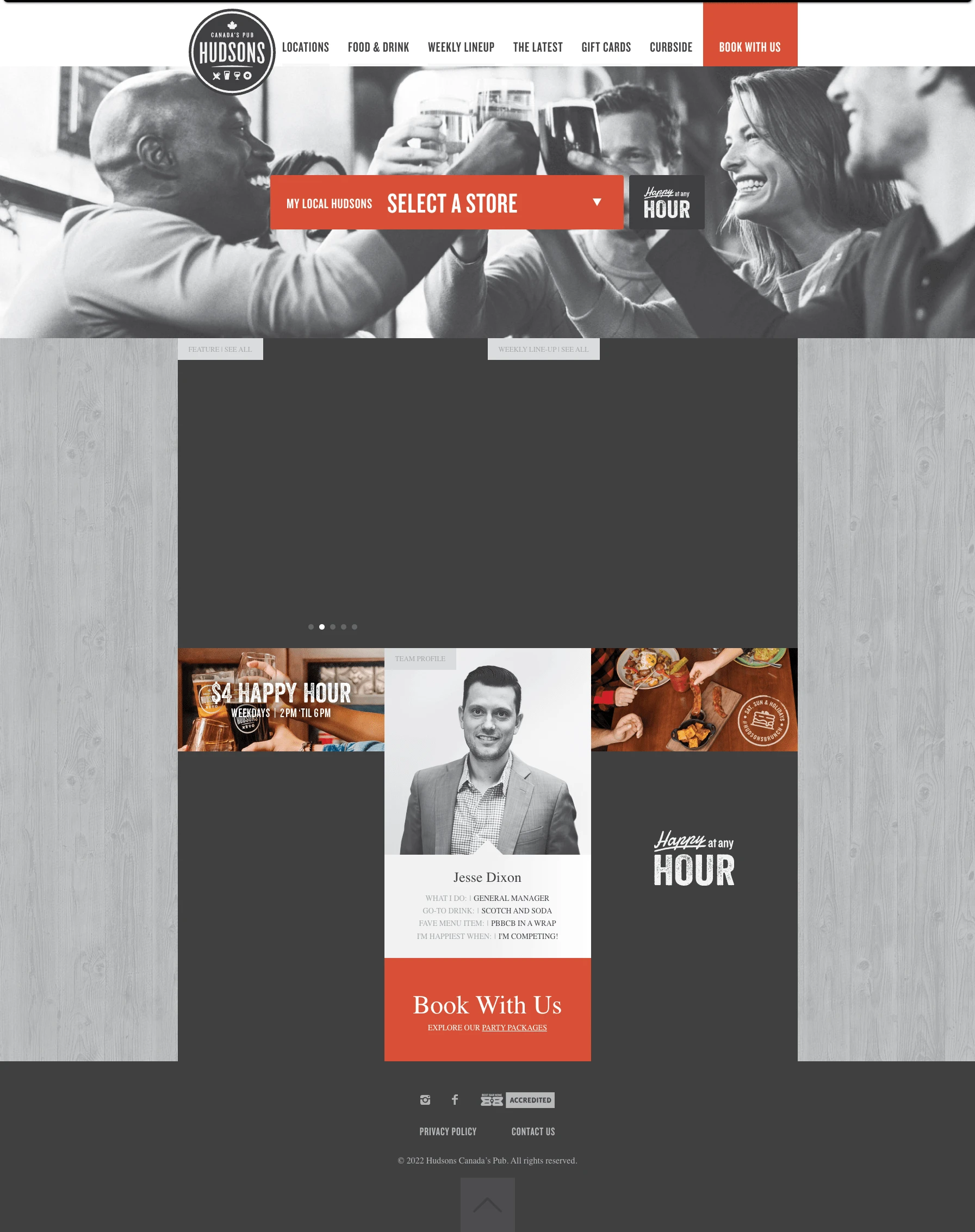
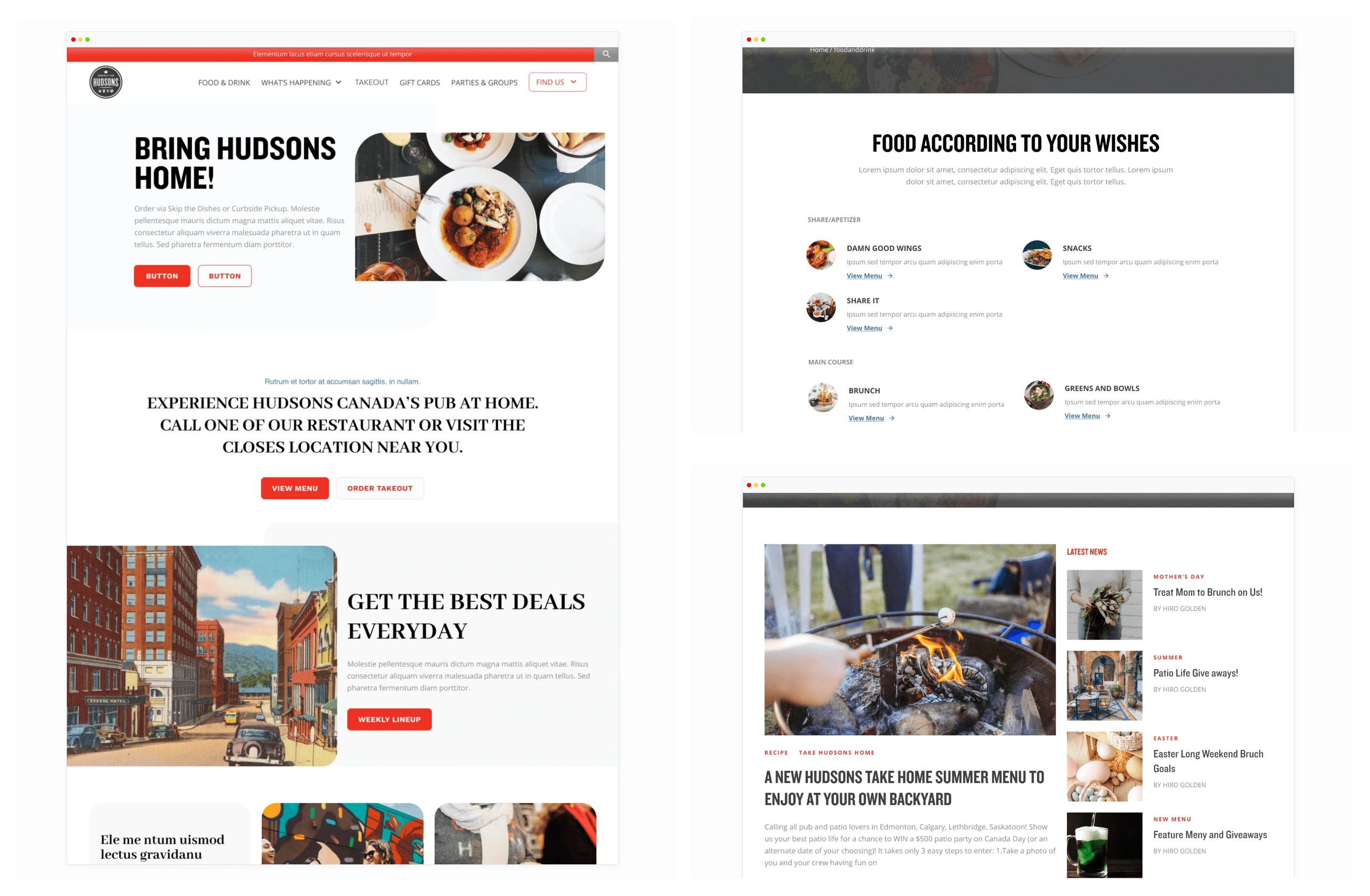
Final Design
The exciting part begins! After receiving approval for the wireframes, we started applying the company’s branding to the design blocks, bringing the visuals to life.
Conclusion
By streamlining backend processes and enhancing the user experience, Hudsons’ new website effectively addressed the needs of both the team and customers, providing a more manageable and engaging platform.
Like this project
Posted Feb 7, 2025
Hudsons Canada's Pub redesigned its site for better UX, navigation, and content control, creating a modern, user-friendly experience


Huge Blog Page Revamp with Smart Filtering System
Unsolicited Web Design for a Music Store
Multistep checkout for SkillStat Revamp
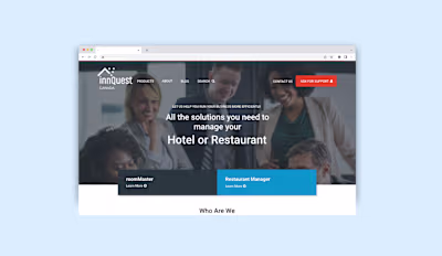
InnQuest Canada Web Revamp