Landing Page Design for SaaS Film Platform
Akinkunmi Ayo
Project Overview
This project is a landing page design for a creative SaaS platform that helps filmmakers and video creators preview, apply, and manage cinematic LUTs in real time.
The goal was to communicate technical power without complexity positioning the product as professional-grade while remaining accessible to creators at any level.
Core Design Goals
Position the product as industry-level and production-ready
Make advanced functionality feel fast, visual, and intuitive
Create instant credibility with creators and studios
Drive trial and activation through clear value communication
This is not a “feature dump” page. It’s a confidence-building entry point.
Visual Direction
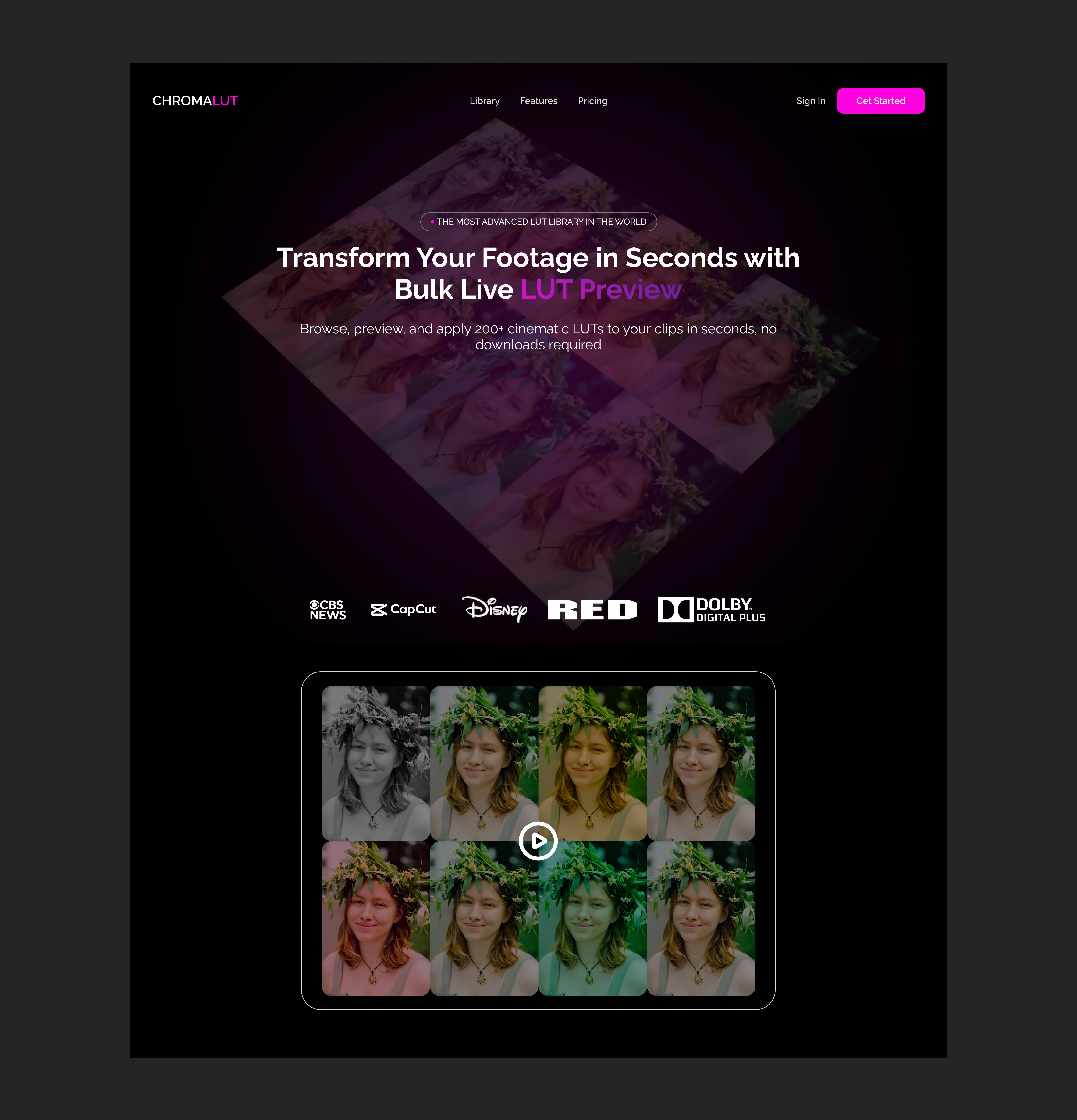
The dark, cinematic interface was chosen to reflect the environment creators already work in editing suites, grading tools, and professional software.
Key decisions:
Dark UI foundation to reduce visual noise and enhance color contrast
Magenta accent to signal innovation, speed, and creative control
Soft gradients and glow to suggest real-time processing and depth
The result is an interface that feels powerful, modern, and technically credible without being intimidating.
Hero Section Strategy
The hero section focuses on outcome over explanation.
Instead of listing features, the headline communicates the core benefit:
Transform footage in seconds.
The live LUT preview visual demonstrates the product before the user reads anything, reducing cognitive load and increasing comprehension.
This visual-first approach:
Speaks directly to creators’ workflows
Builds trust faster than text
Encourages interaction and exploration
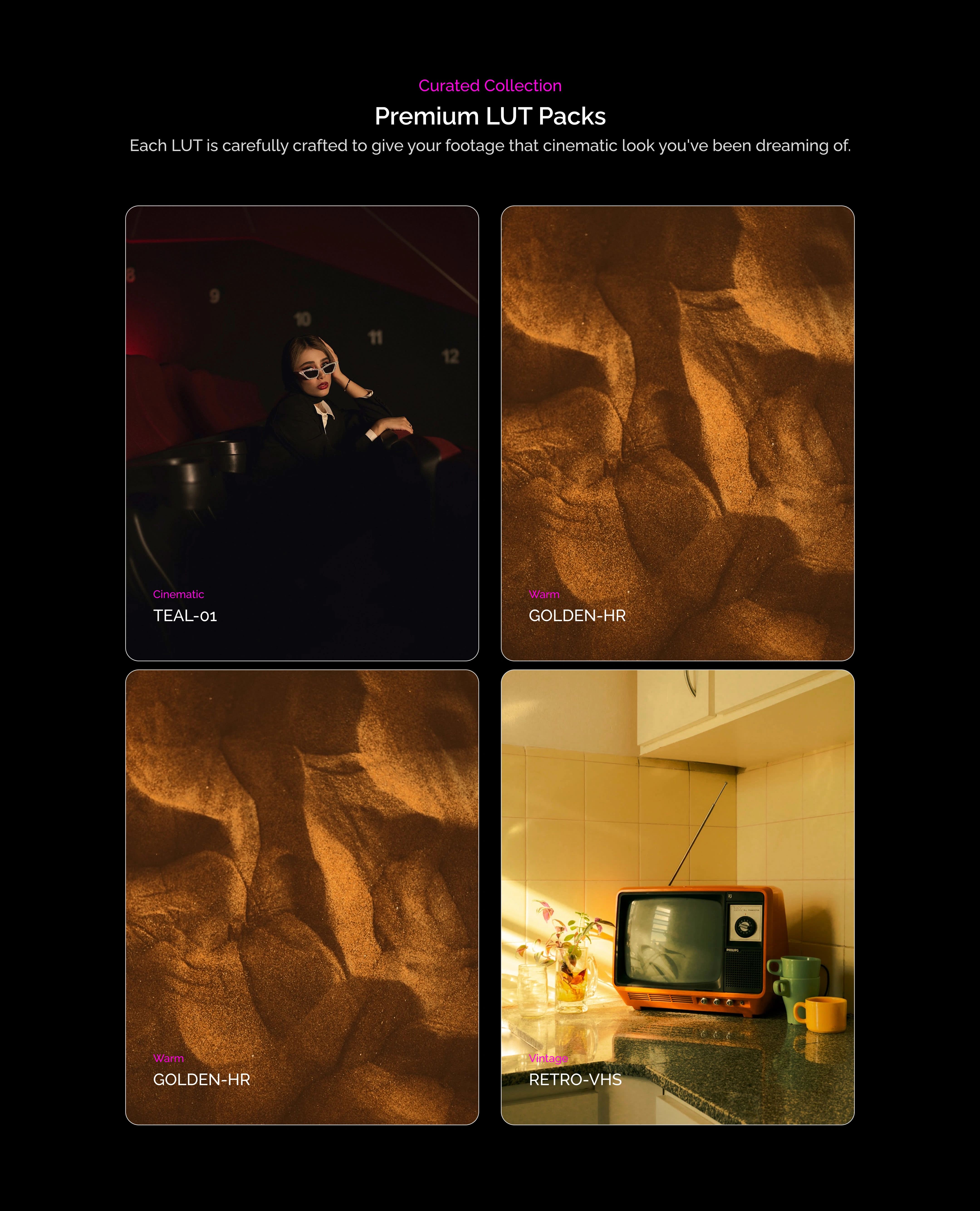
Product Demonstration
The multi-preview grid visually reinforces the platform’s biggest differentiator: instant comparison at scale.
Showing multiple color outcomes at once:
Highlights efficiency gains
Communicates technical sophistication
Aligns with how professionals evaluate color grading options
The embedded play interaction invites engagement without forcing commitment.
Trust & Social Proof
Industry logos were intentionally placed beneath the hero to:
Establish immediate legitimacy
Reduce skepticism for first-time visitors
Signal adoption by professional teams
This helps the product feel safe for studios, agencies, and serious creators.
Conversion Design
CTAs are intentionally minimal and high-contrast:
One primary action
No visual competition
Clear next step
The goal is activation, not distraction.
Final Outcome
The final design positions the product as:
Professional
Fast
Production-ready
It balances creativity with clarity showing that powerful tools don’t need to feel complicated.
This landing page is designed to convert creators who care about speed, quality, and control.
Like this project
Posted Jan 18, 2026
Designed a landing page for a creative SaaS platform for filmmakers, focusing on professional-grade appeal and ease of use.
Likes
13
Views
11