Eurozona Website UI/UX in Framer
Eurozona
Roadblocks Won't Get Me This Time
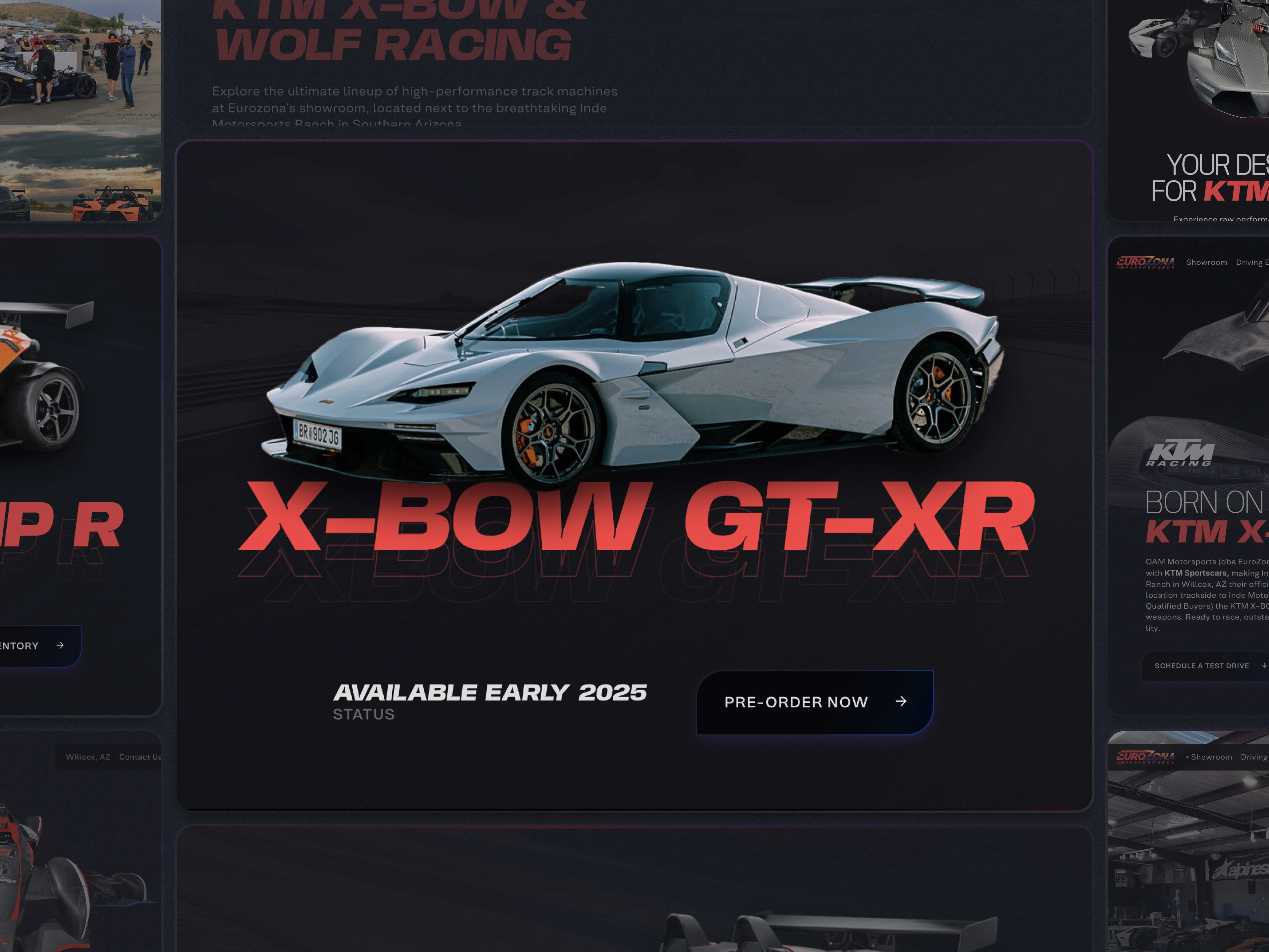
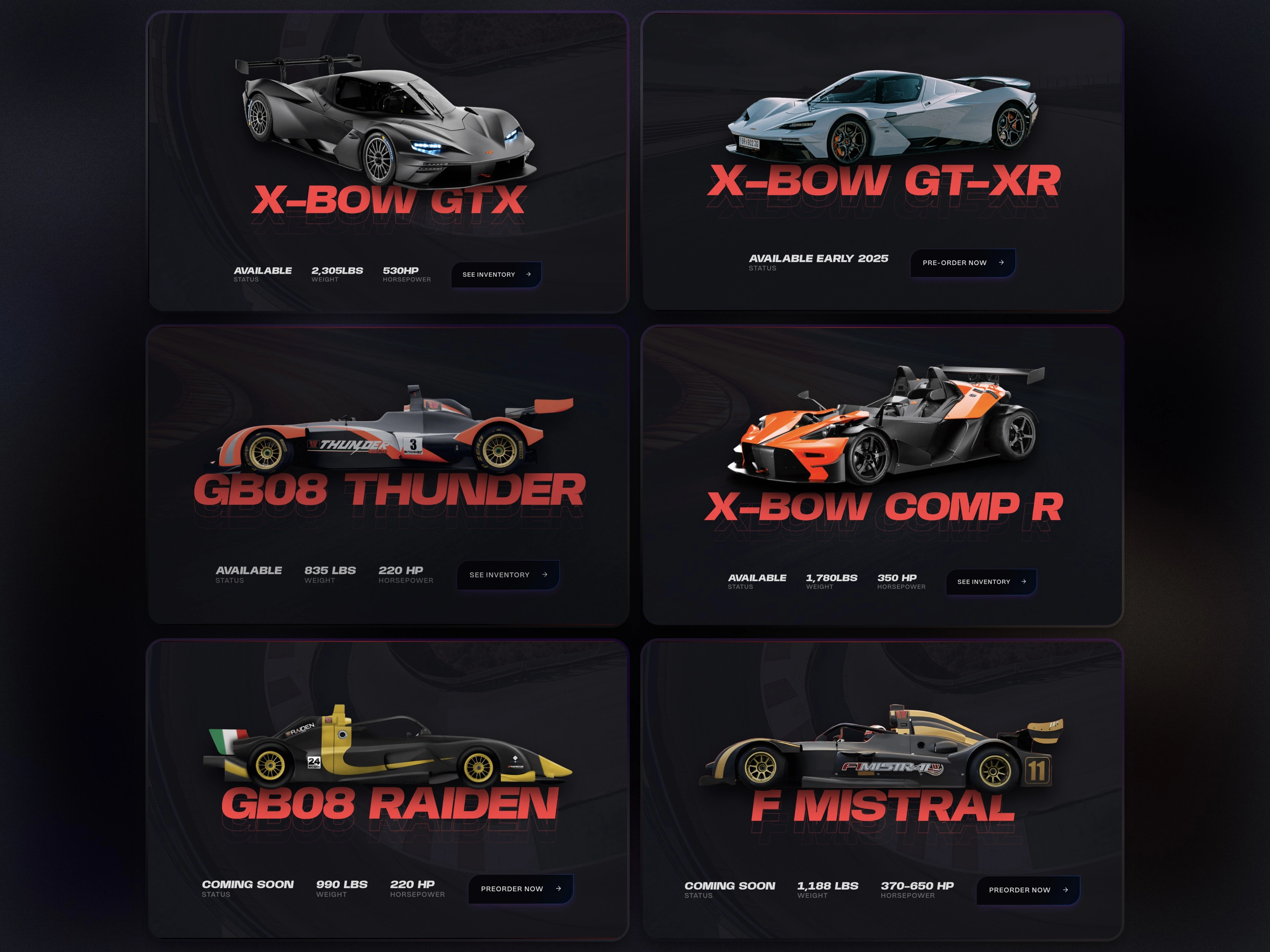
Eurozona, a high-end racing car broker, required a foundational digital presence to match the sleek sophistication of the cars they represent. Despite starting from scratch, the budget constraints posed significant challenges. Tyler Brown, a long time client of mine, needed a cohesive brand identity encompassing a website and visual aesthetic that conveyed Eurozona's exclusive offerings, including the Wolf Racing and X-Bow racing cars.
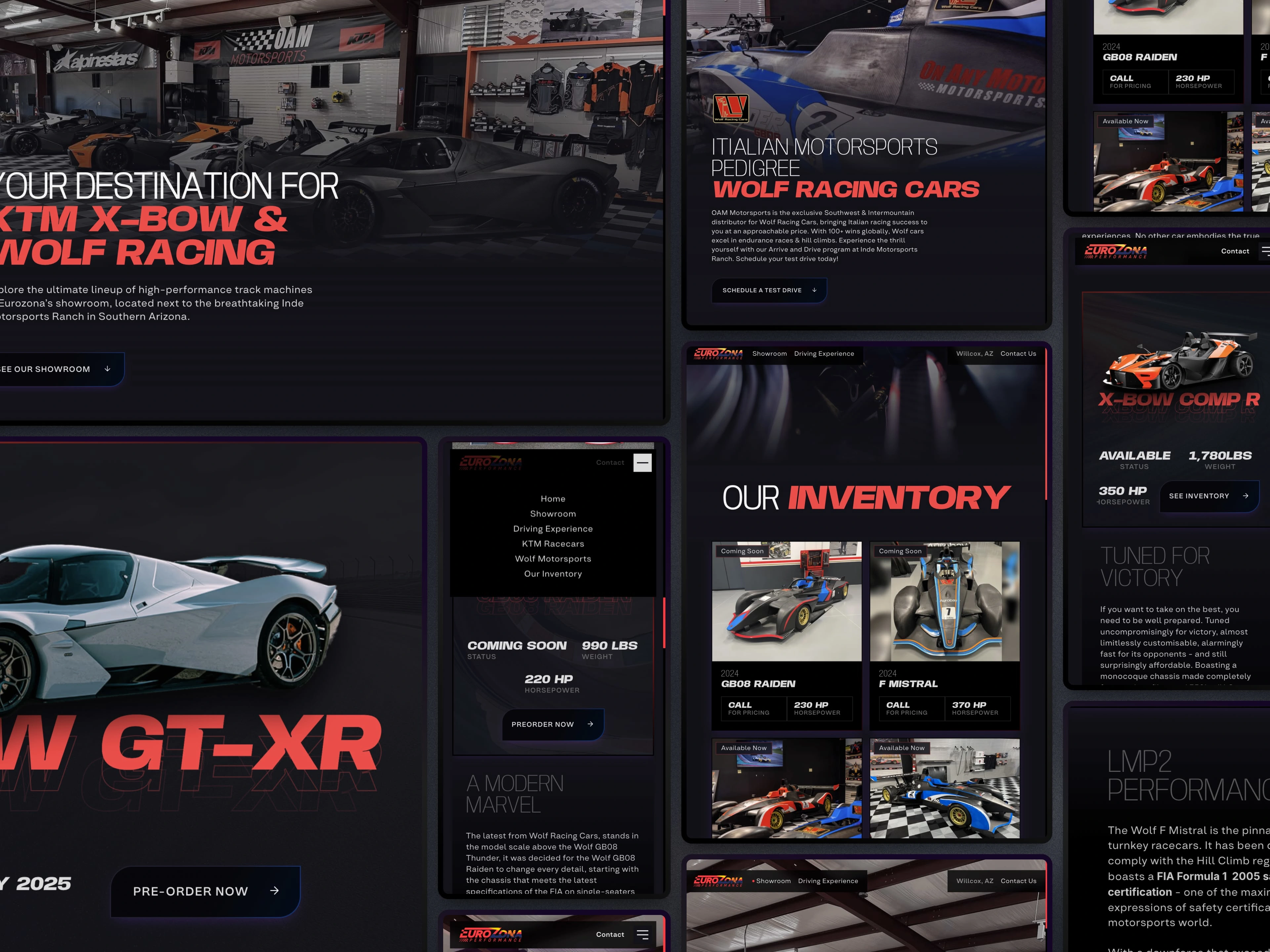
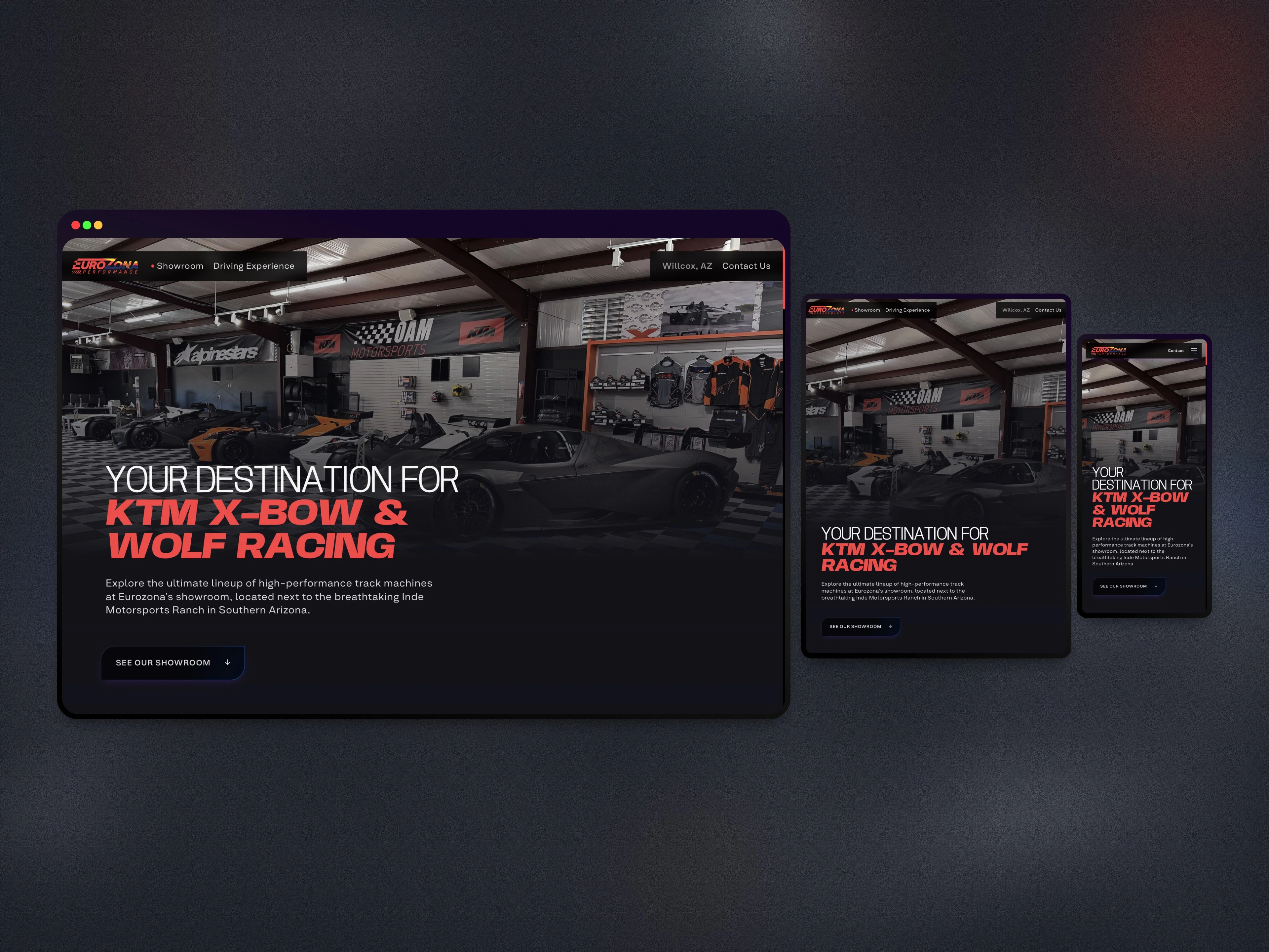
The website had to distinctly showcase three primary aspects: the racing experience of Eurozona's track and their vehicle showroom, and their extensive inventory. Additionally, it had to facilitate quick decision-making for users interested in test driving or purchasing a car, providing comprehensive yet accessible information on each car, while looking beautiful.
Accelerating Visual Identity & Website for Eurozona
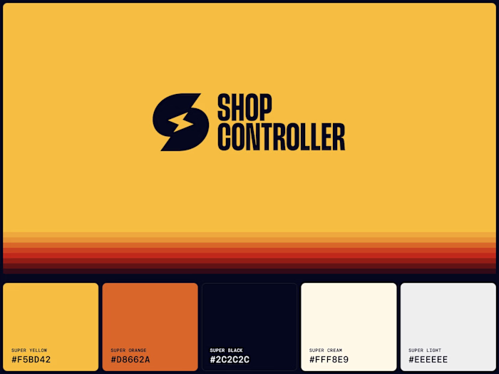
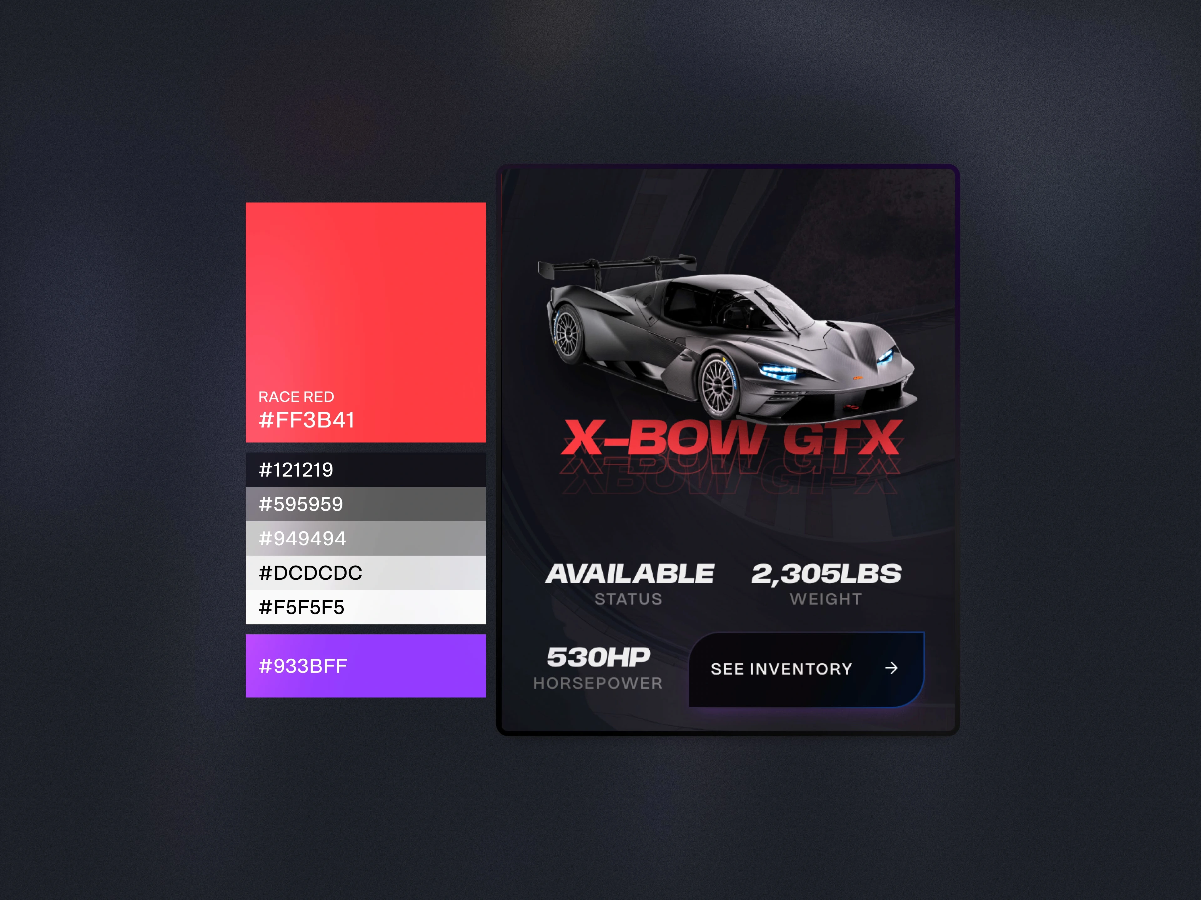
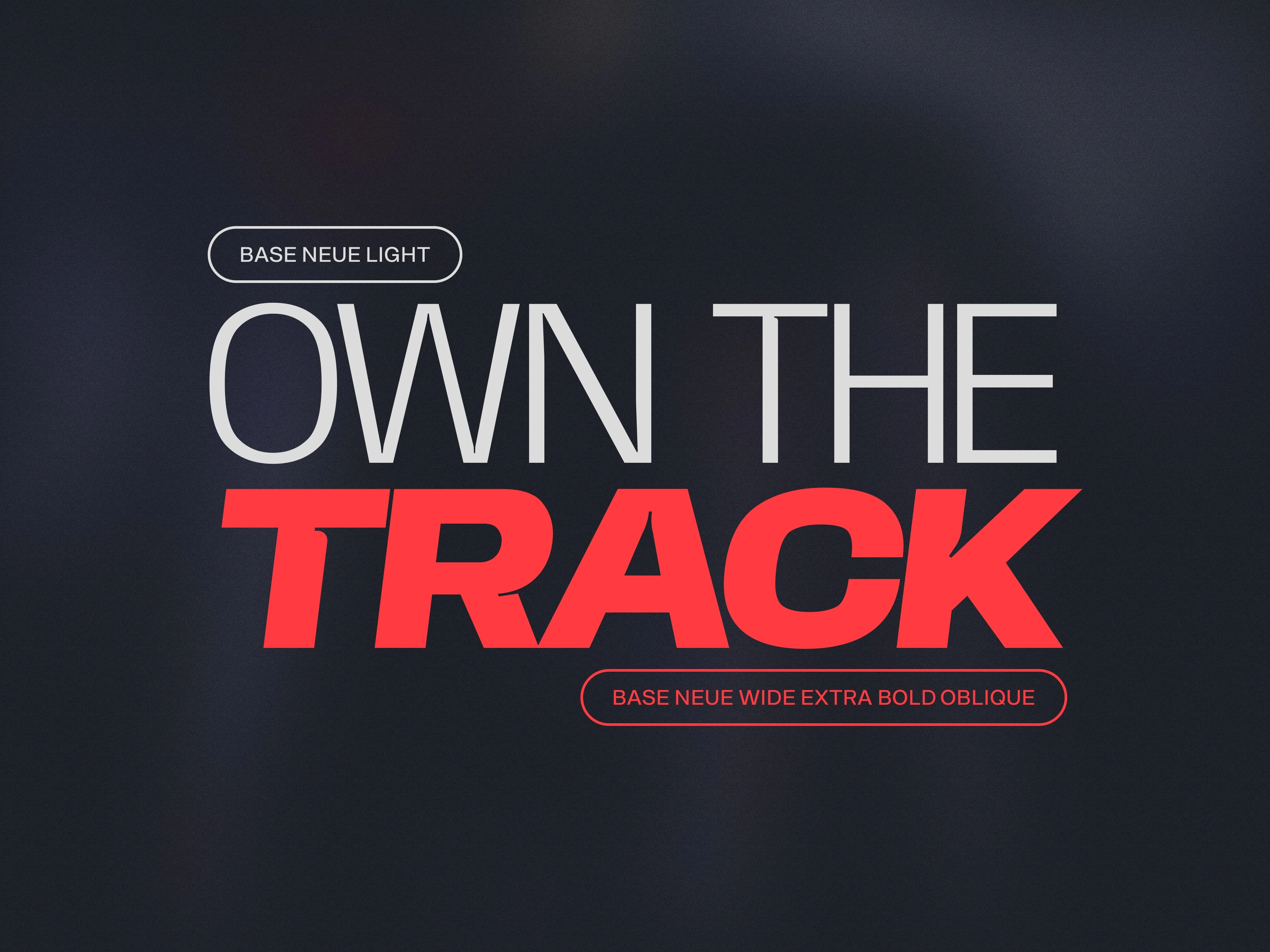
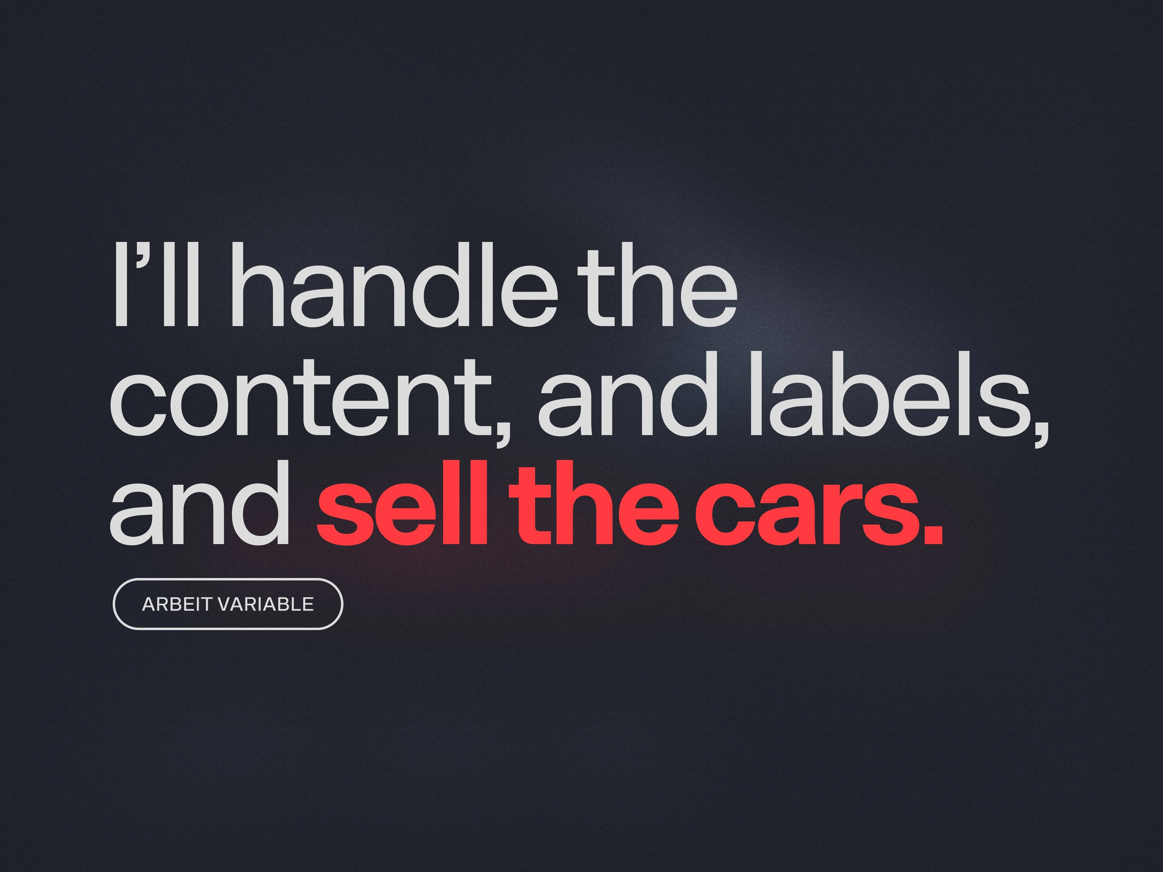
Leveraging this website UI project as a chance to develop Eurozona's visual identity, I meticulously devised the color palette, typography, and photography usage, emphasizing elegance and racing. The selection of the Base Neue typeface for headlines was intentional; its sturdy, condensed form exuded high-end sportiness, while the italic variations introduced motion-like ink traps to embody the racing spirit. I then used Arbeit Variable to handle the copy, labels, and any other small text.
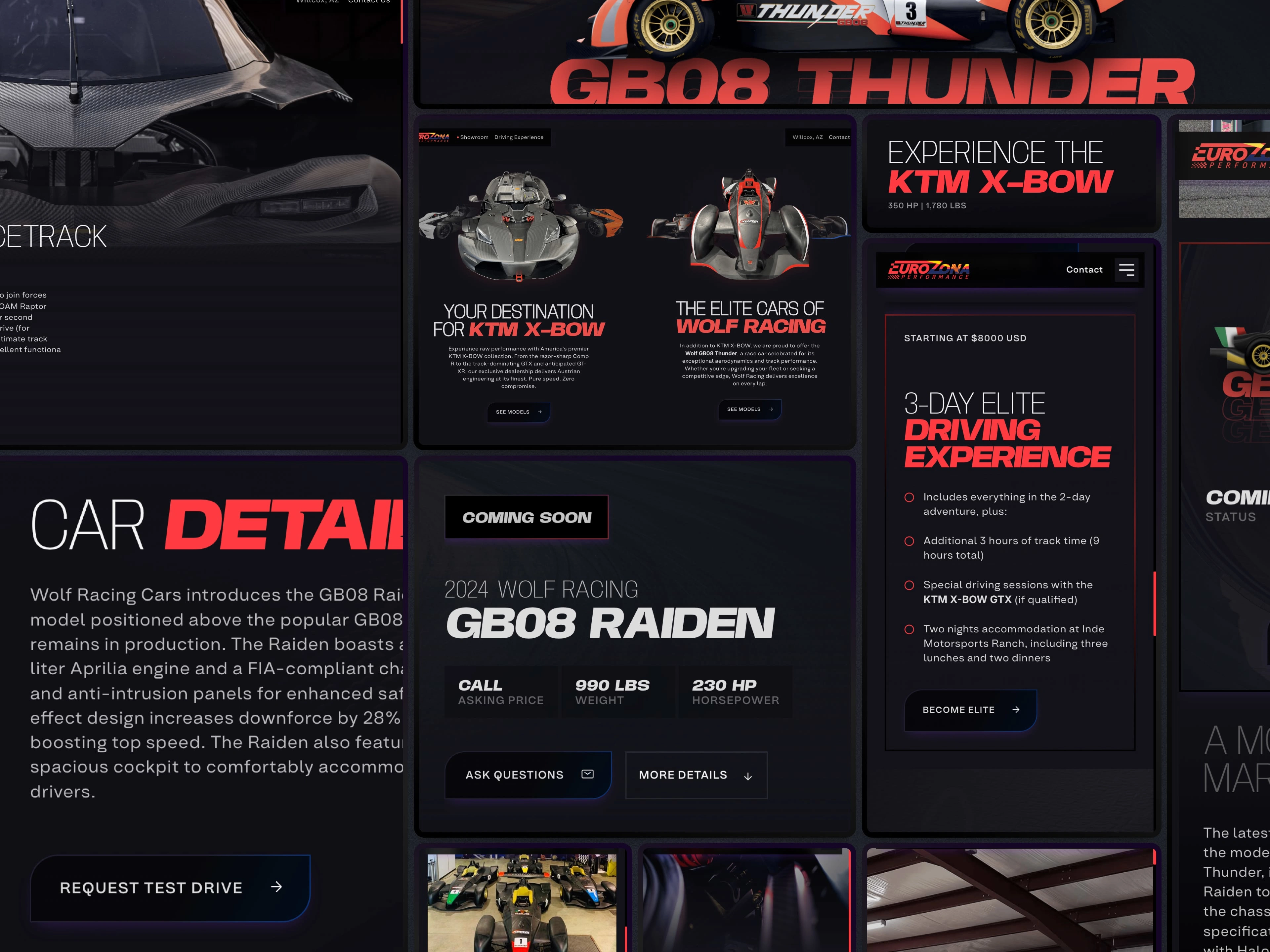
Working within budgetary limits, I streamlined the design and build process by executing the entire web design directly in Framer. Skipping initial prototyping and UI in Figma, this approach capitalized on an extensive market analysis of top-tier competitors such as McLaren and Jaguar, inspiring a visually striking aesthetic. The homepage served as ‘design kitchen sink,’ creating reusable components for website consistency and efficiency. A strategic layout divided the site into three core sections (Driving Experience, Showroom, Inventory), facilitating user navigation and reinforcing the brand's offerings—exclusive drive experiences and a show-stopping car inventory.
Each car's individual race car brand page highlighted aesthetically cut-out images that integrated seamlessly with bold, race-themed typography. An intuitive inquiry form with URL tracking ensured potential buyers’ interests were efficiently communicated to sales personnel. Finally, blending dark mode aesthetics with striking typography conveyed modern elegance and catered to Eurozona's target market.
Like this project
Posted Mar 6, 2025
Check out the mini case study for Eurozona and learn about the problems I solved using Strategy, branding, and web UI/UX.
Likes
1
Views
8
Timeline
Nov 21, 2024 - Dec 18, 2024

