Introfy Logo Brand Guidelines

Hardikkumar Vinzava
Verified


Brand Introduction
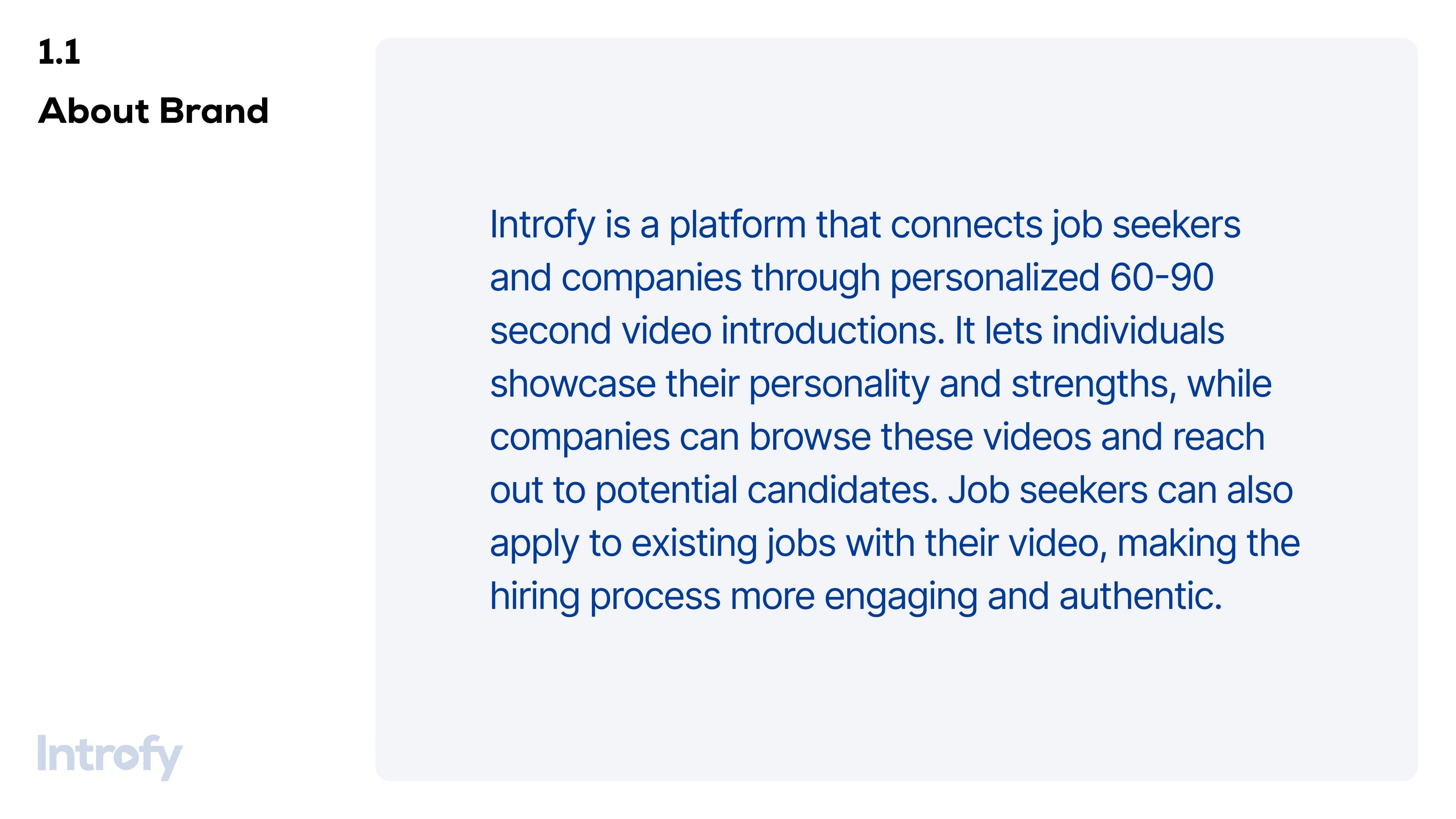
📖 1.1 About Introfy
Introfy is a platform that connects 🎯 job seekers and 🏢 companies through personalized ⏳ 60-90 second video introductions. It enables individuals to 🎥 showcase their personality and strengths, while companies can 🔎 browse these videos to discover potential candidates.
🔹 Job seekers can also apply to existing jobs with their video, making the hiring process more 🤝 engaging and authentic.
2️⃣ Brand Logo
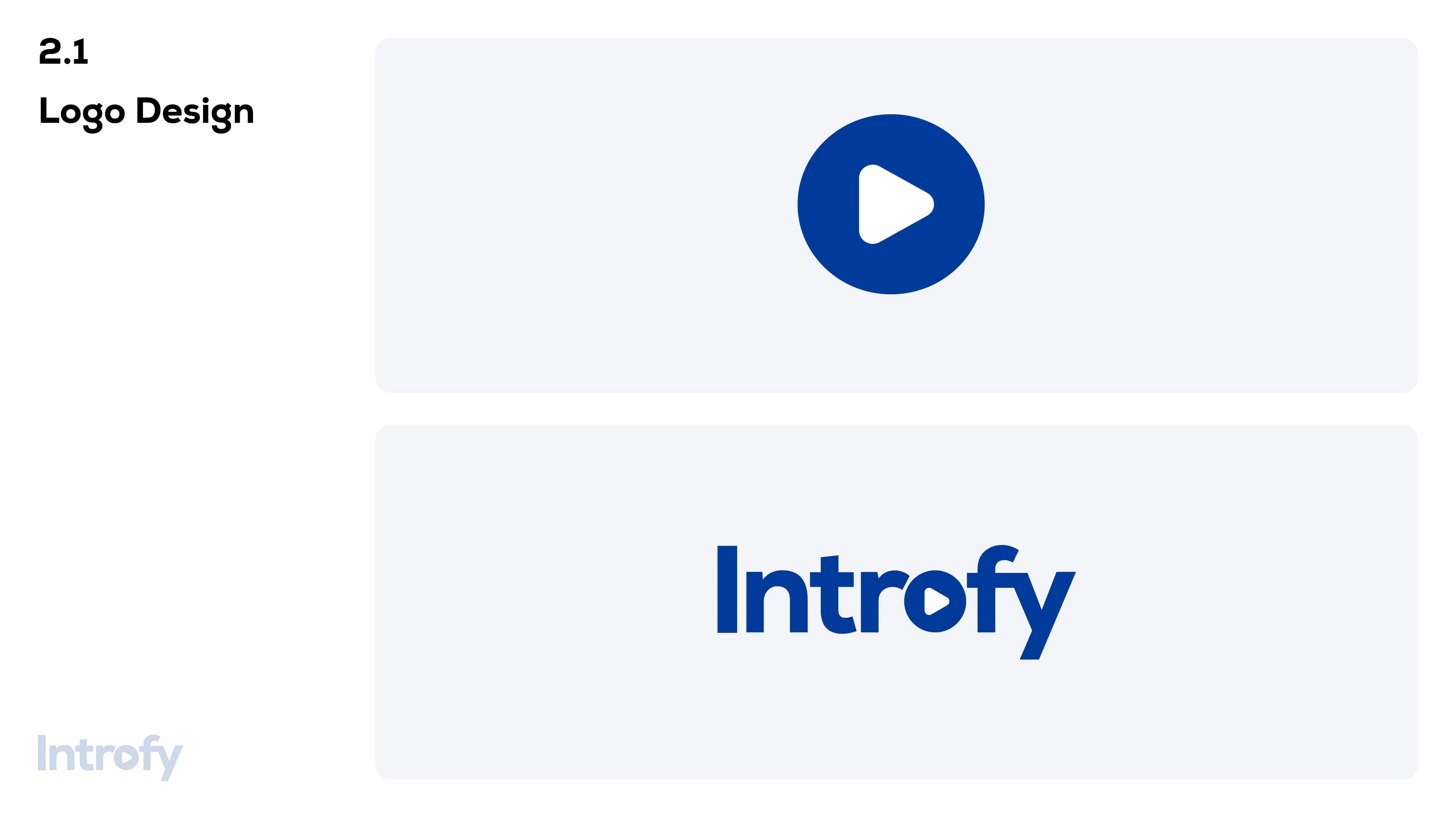
🎨 2.1 Logo Design
✅ The Introfy logo consists of a bold, modern typeface with a ▶️ play button integrated into the lettering, symbolizing video introductions.
✅ The primary logo features a 🔵 deep blue color, representing professionalism and trust.
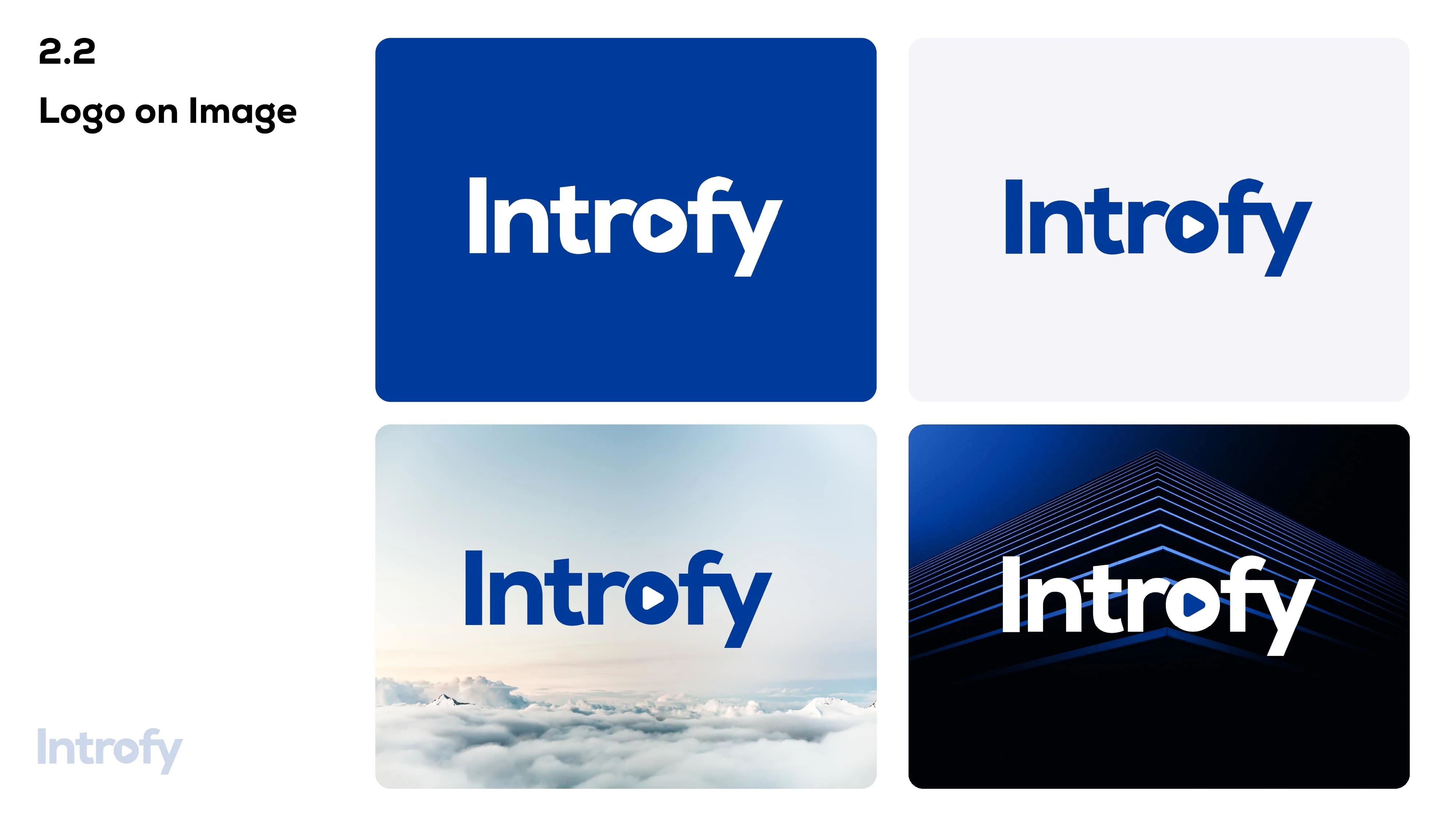
🖼️ 2.2 Logo on Image
✔️ The logo is designed to be 📏 versatile and scalable, working well on various backgrounds.
✔️ It can be used on 🎨 solid colors, 🏞️ images, and 🎭 gradients while maintaining readability and brand consistency.
🎨 3️⃣ Brand Colors
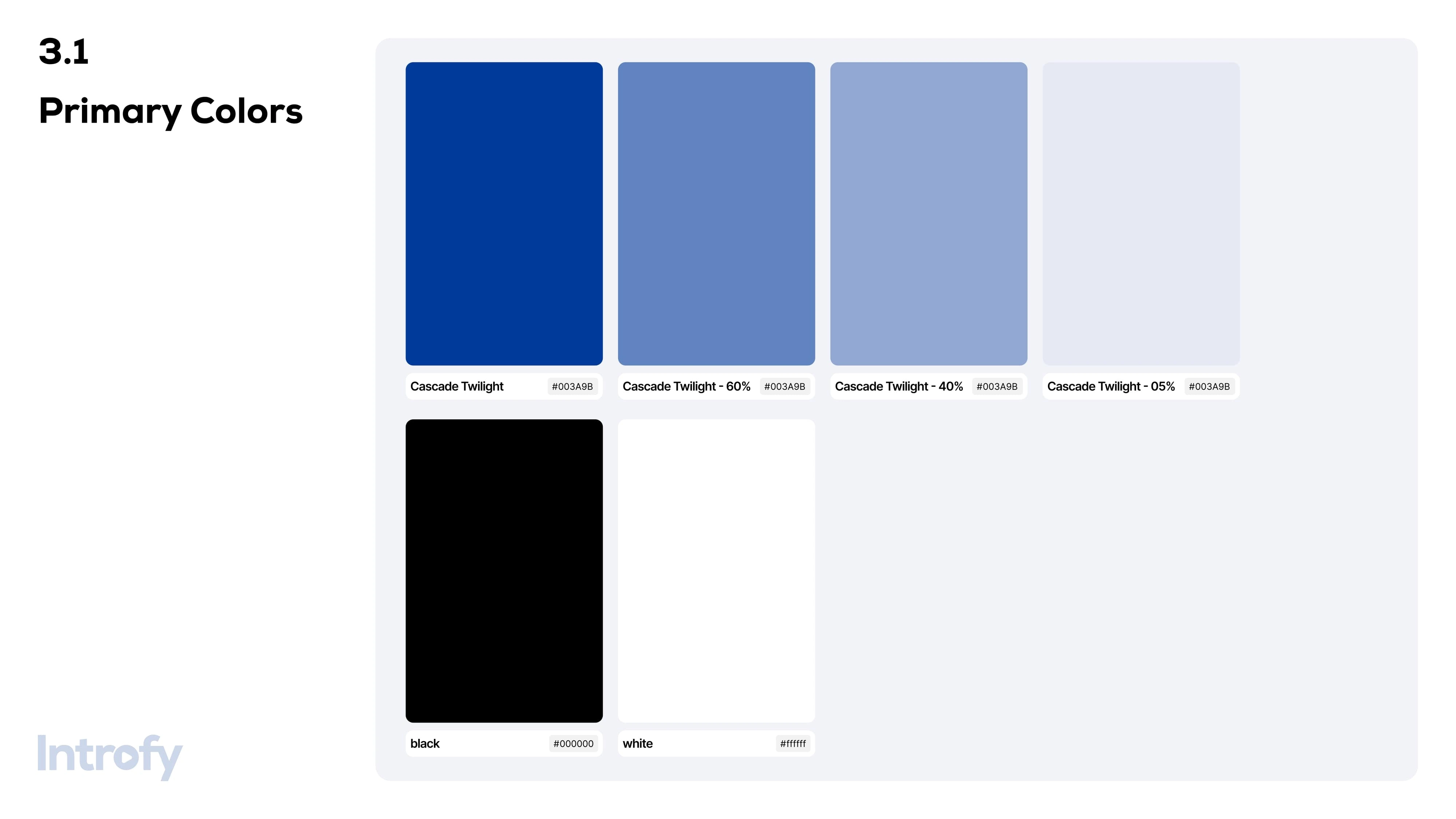
🌟 The primary brand color is a 🔵 deep blue shade, representing professionalism, trust, and confidence.
🌈 Additional gradient overlays with soft hues of 💙 blue, 💜 purple, and ❤️ pink add a modern, approachable feel.
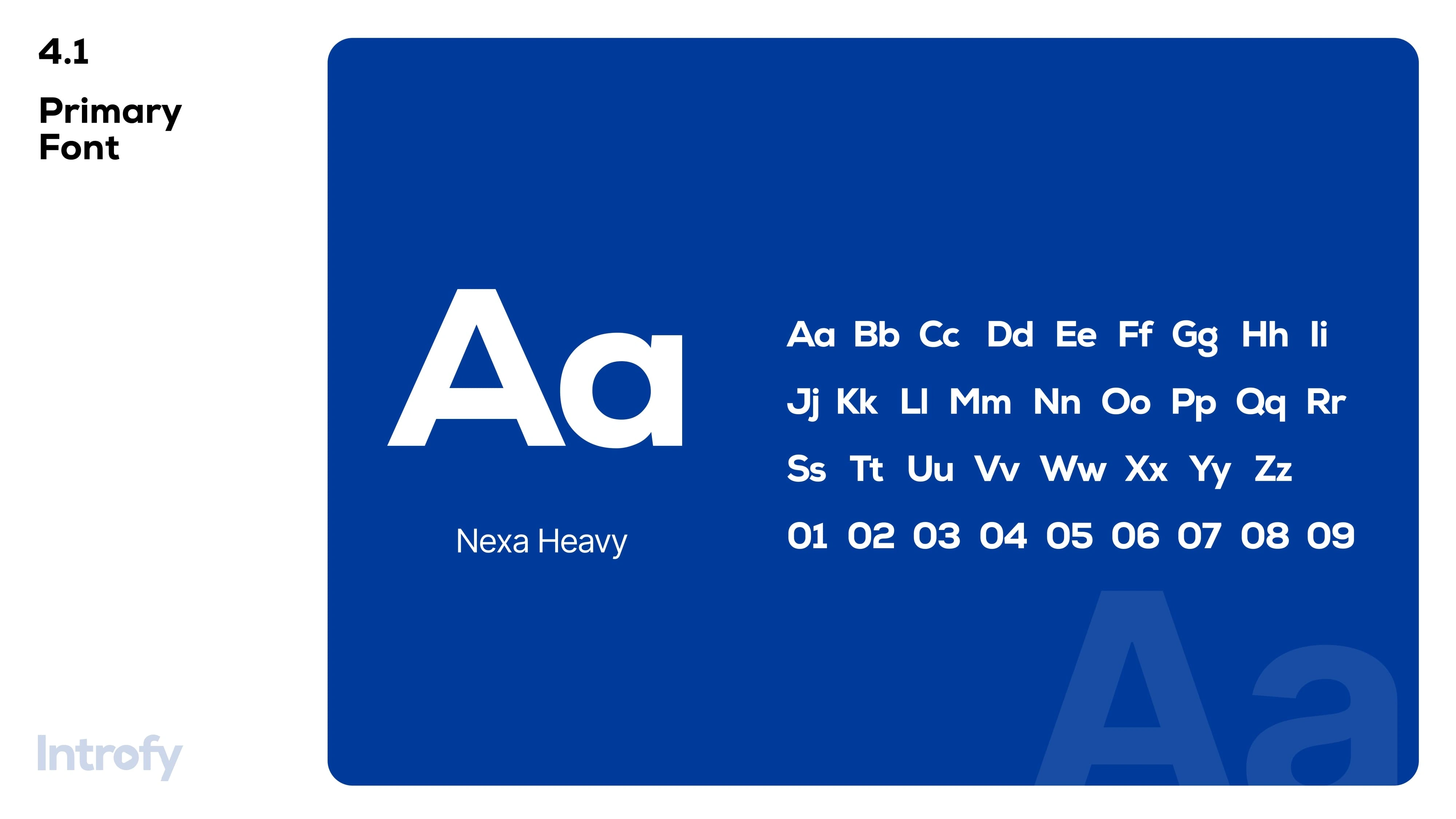
🔠 4️⃣ Brand Typography
🔤 The typography used in Introfy branding is 🆒 clean, 🔥 bold, and 🚀 modern, enhancing readability and impact.
🔤 The font complements the ▶️ play button icon to create a cohesive and recognizable brand identity.
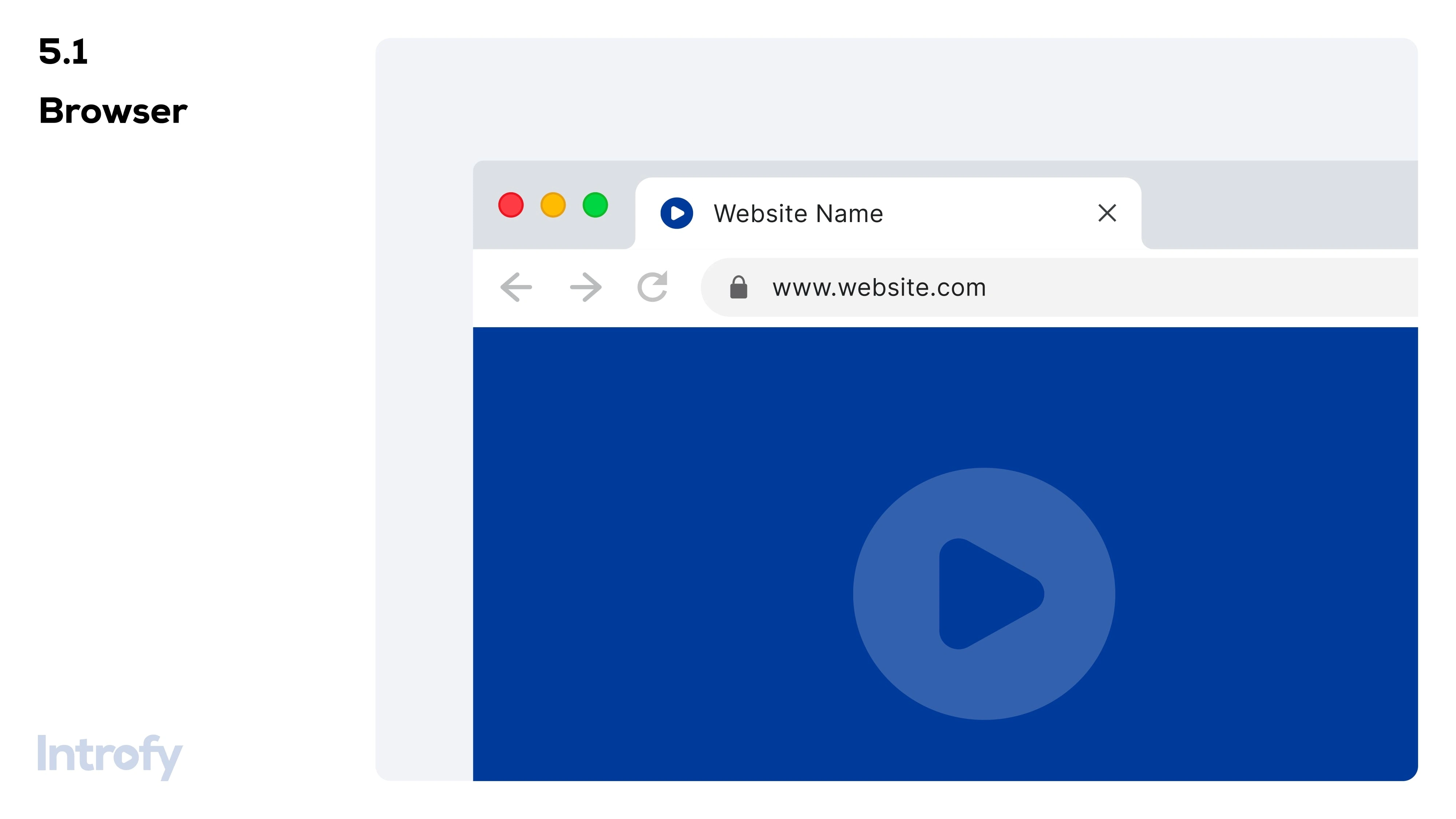
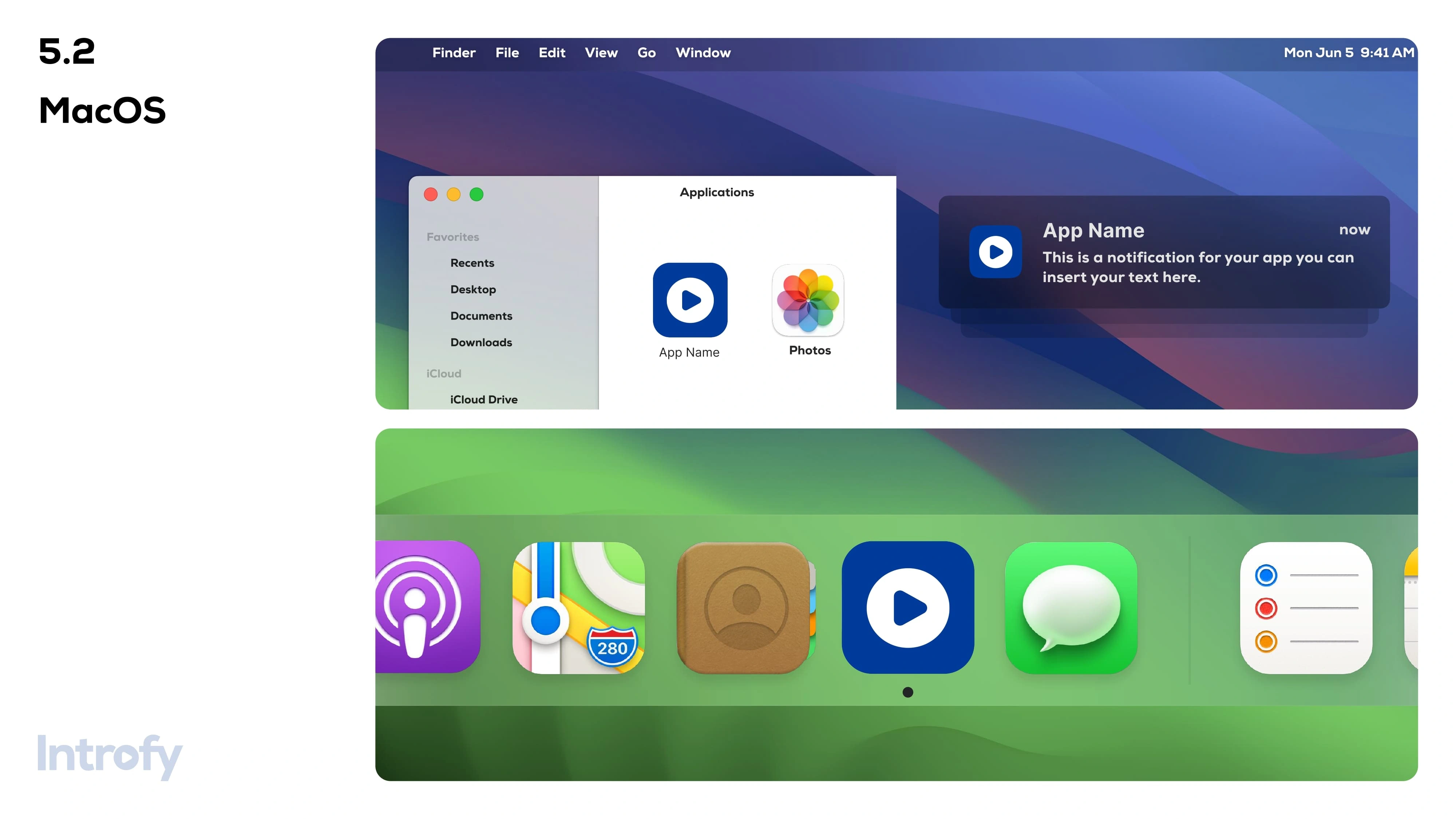
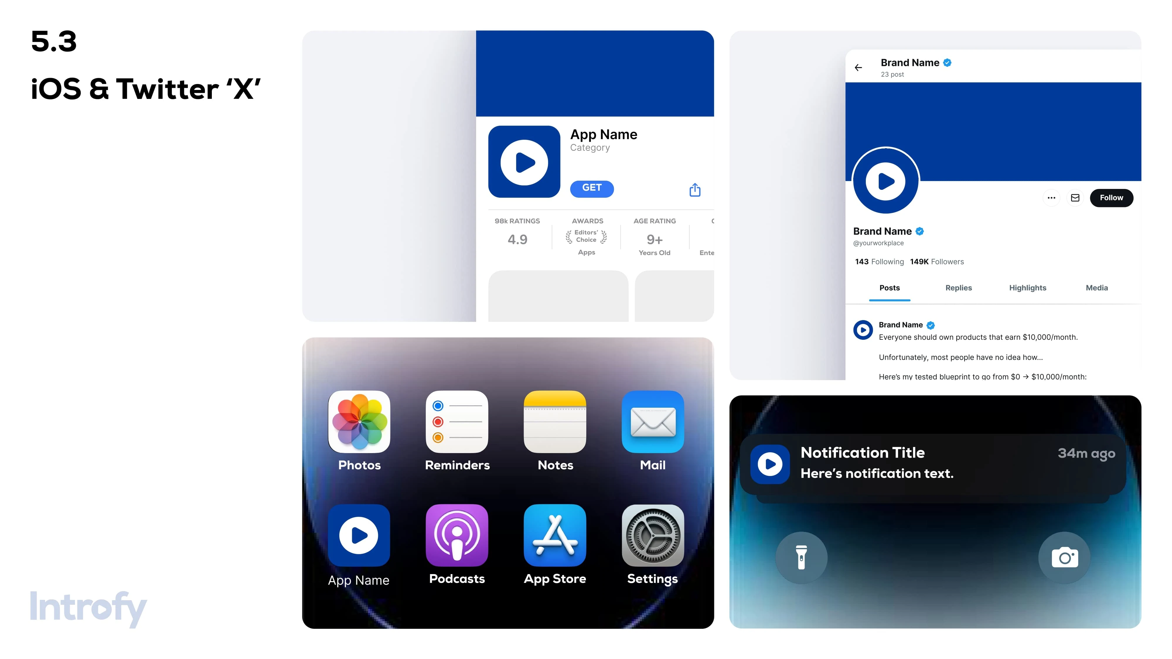
🖌️ 5️⃣ Application Icons
The icons used in the Introfy platform follow a 📐 structured grid-based system.
They maintain a ⚡ minimal and geometric design to align with the brand’s modern aesthetic.
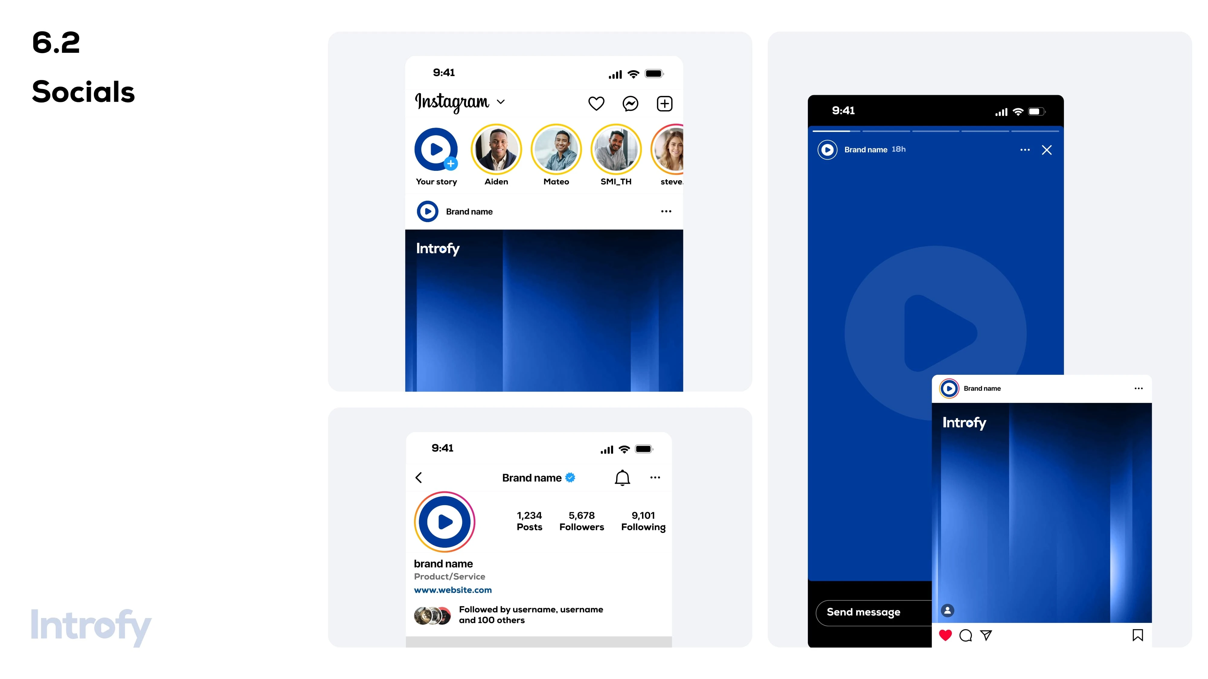
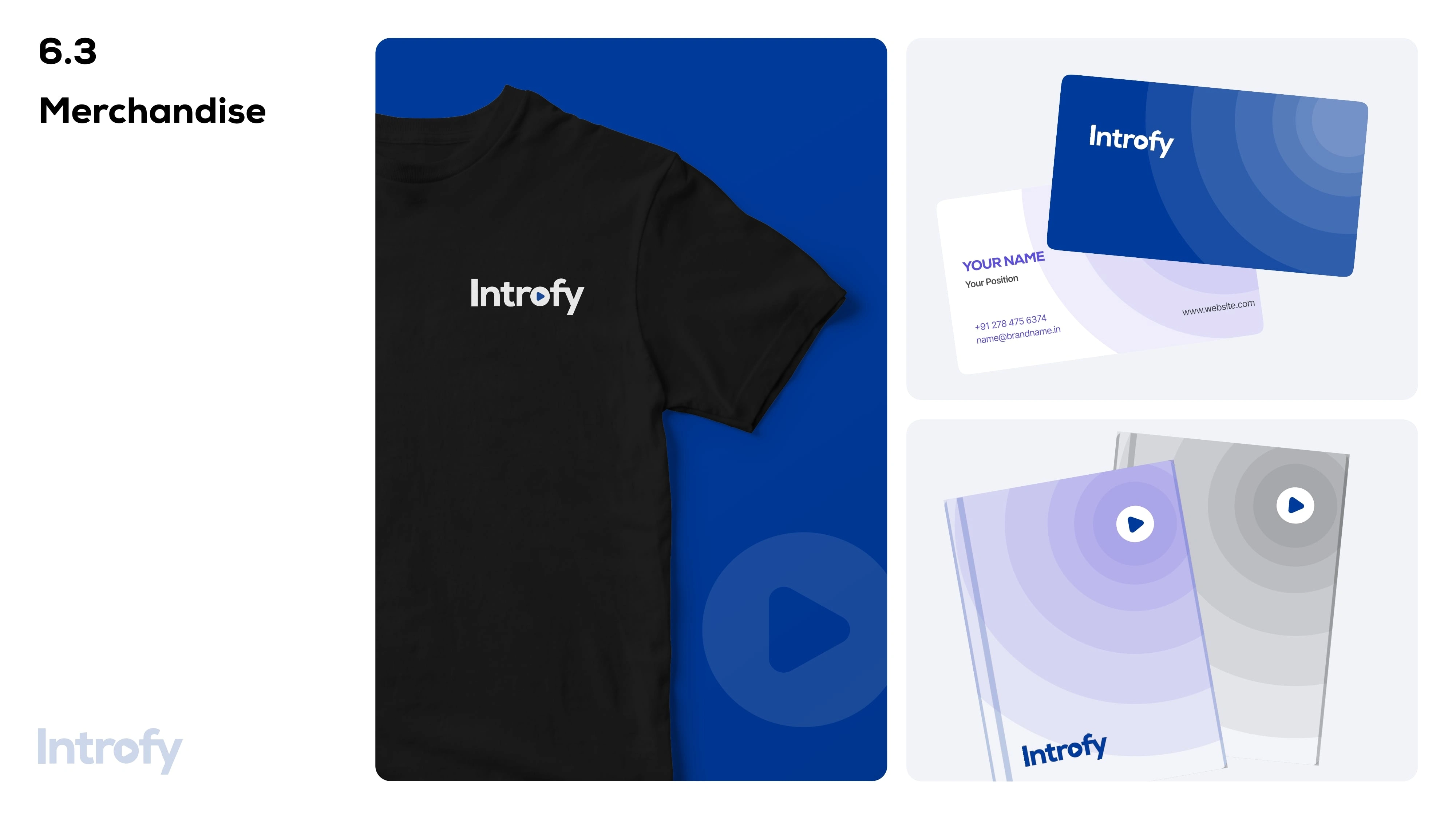
🖼️ 6️⃣ Brand Visuals
📷 The visual elements of Introfy include 🎨 custom illustrations, 👕 apparel designs, and 📢 marketing assets.
These visuals adhere to the 🔵 brand’s core color palette and design philosophy.
Like this project
Posted Mar 12, 2025
A comprehensive guide defining your brand’s logo, colors, typography, and usage rules for consistency.
Likes
2
Views
9
Timeline
Apr 27, 2025 - Ongoing
Clients
Envision


WA WorkFlow - A Better WhatsApp™ Experience
Professional Graphic Design | Custom Branding & Print
T-Shirt Design
Stationery Design