We live in constant noise. Orma is the antidote - a return t...

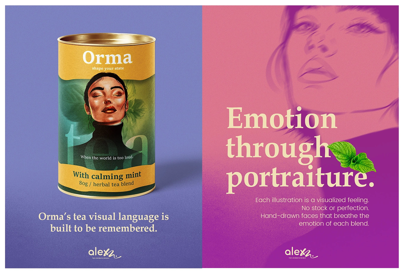
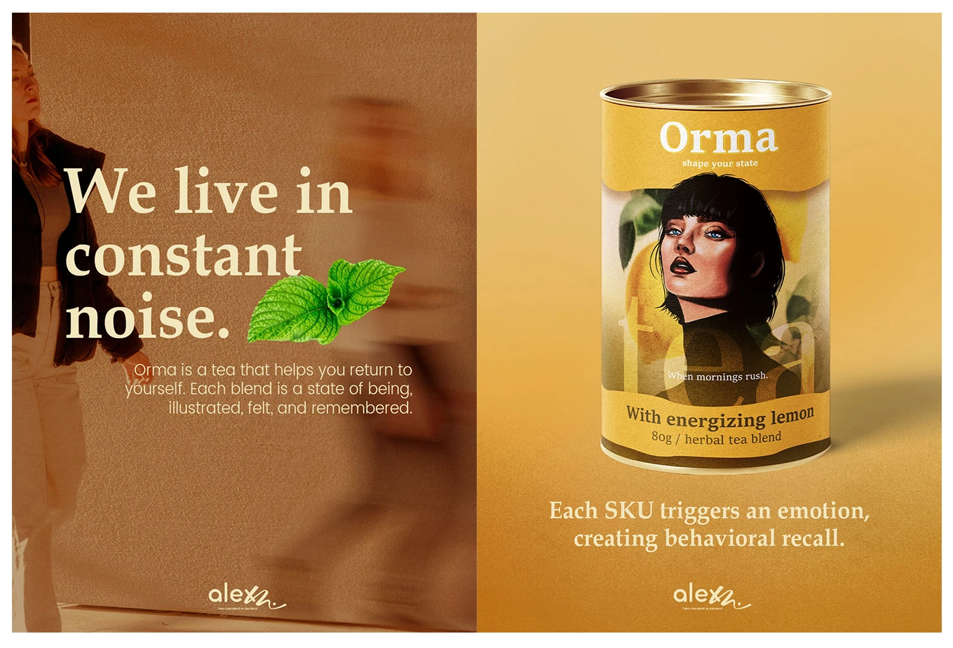
We live in constant noise. Orma is the antidote - a return to yourself.
The premium tea category is saturated with minimalism - white boxes, delicate leaves, and predictable serif fonts. While elegant, this "sea of sameness" creates a visual blur for the consumer. The Brief: Create a visual identity for Orma that actively competes for attention. The goal was to shift the focus from ingredients (what is inside) to outcome (how you feel).
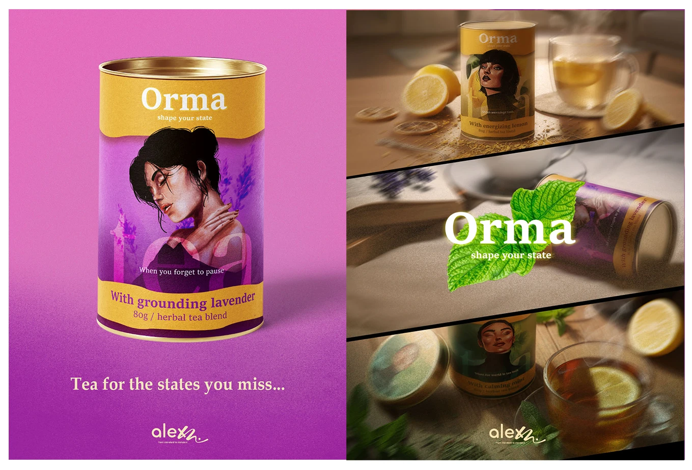
Orma is a visual interruption.
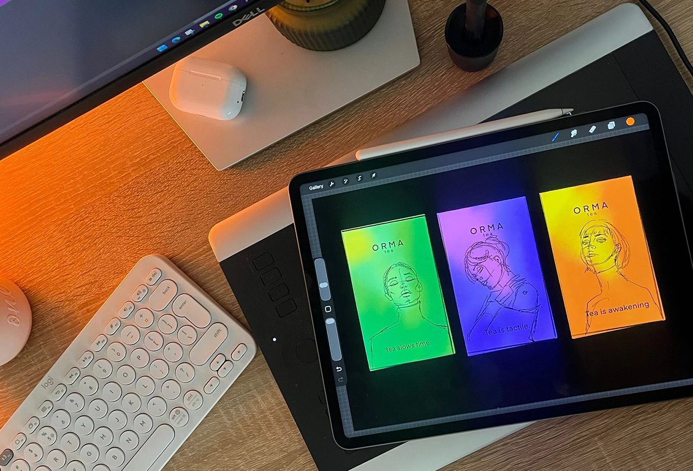
The design system turns the physical package into a behavioral cue, ensuring that the product is seen, felt, and remembered.
0 likes · 0 views · Nov 27, 2025
We live in constant noise. Orma is the antidote - a return to yourself. The premium tea category is saturated with minimalism - white boxes, delicate leaves,...