Brand identity for Kaora - Nature Health Club
Patrick Kos
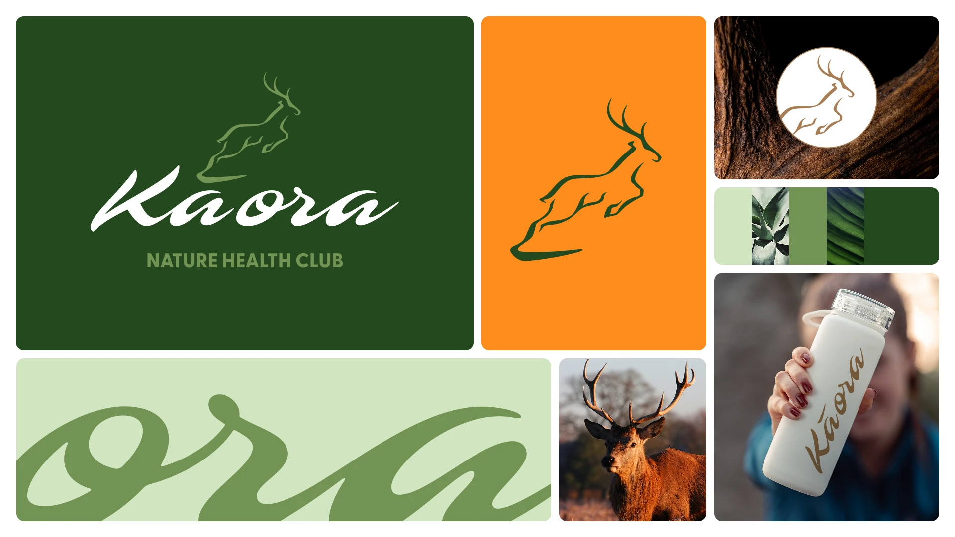
KAORA
VOEL JE LEVEND / FEEL ALIVE
Kaora is a wellness brand focused on transforming both physical and mental energy through a comprehensive approach. Their program combines physical exercise, mindfulness practices, and coaching to help clients achieve sustainable fitness and energy. Kaora means I live (in Maori culture).
BRAND PURPOSE: We believe that strengthening both body and mind gives you the energy to get more out of life.
BRAND ESSENCE: Nature health club.
BRAND MASCOT: Deer, because they symbolise grace, innocence, intuition, speed, and gentleness. Deer remind us to be kind to ourselves and others.
CREATIVE STARTING POINTS: Nature / Energy / Transformation / Elegance / Strength
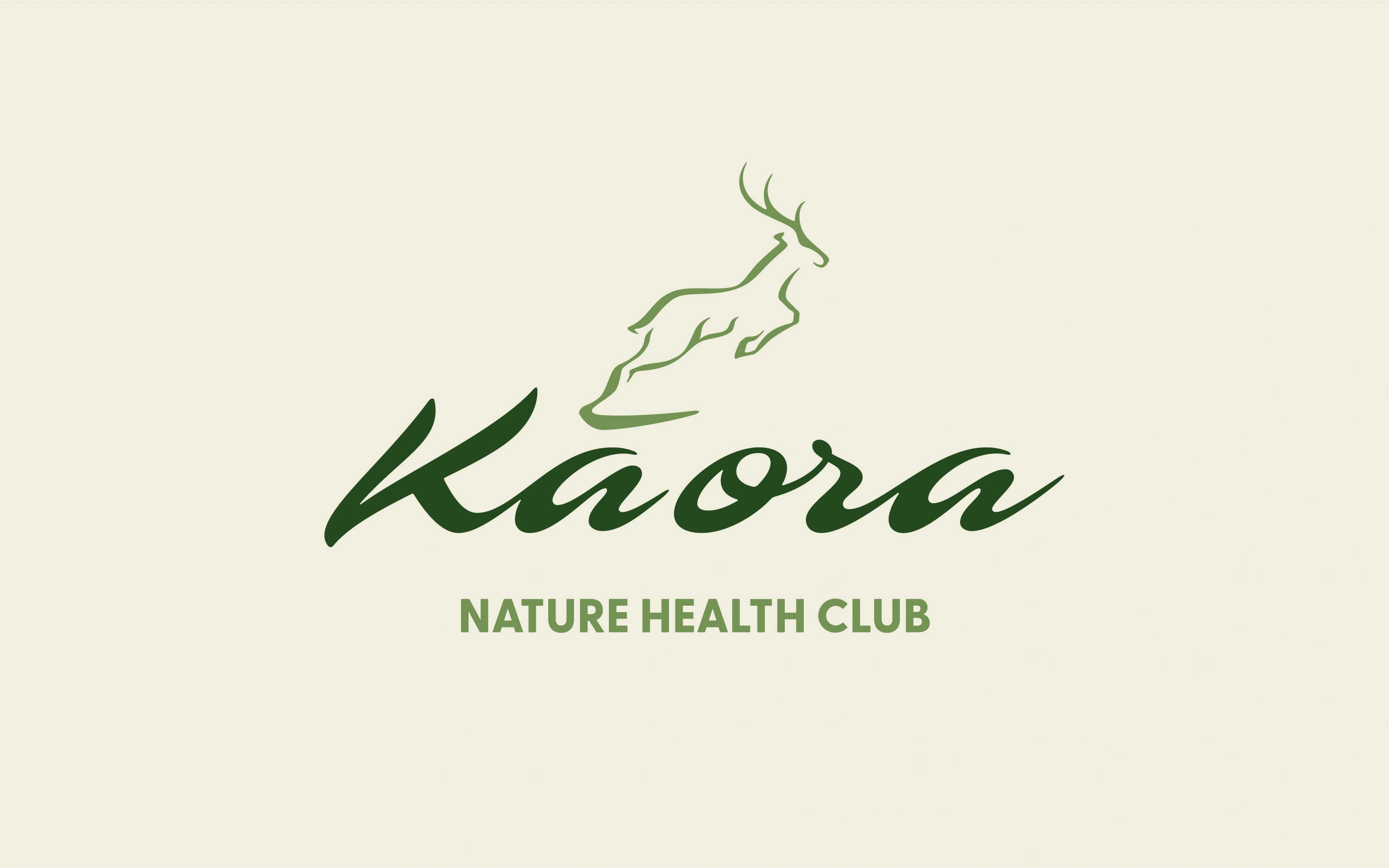
Master logo
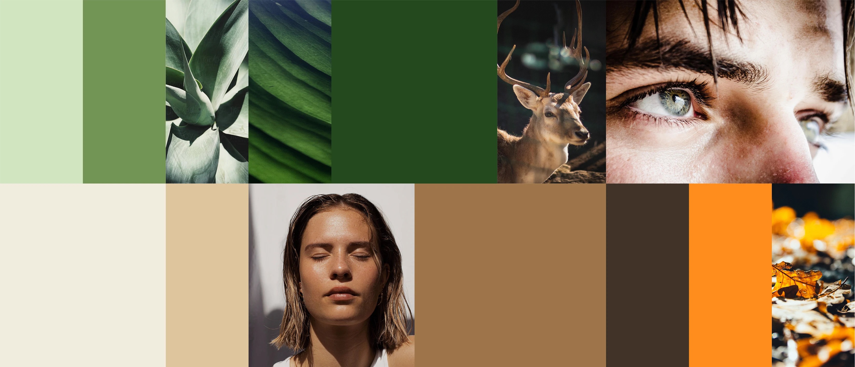
Colour palette
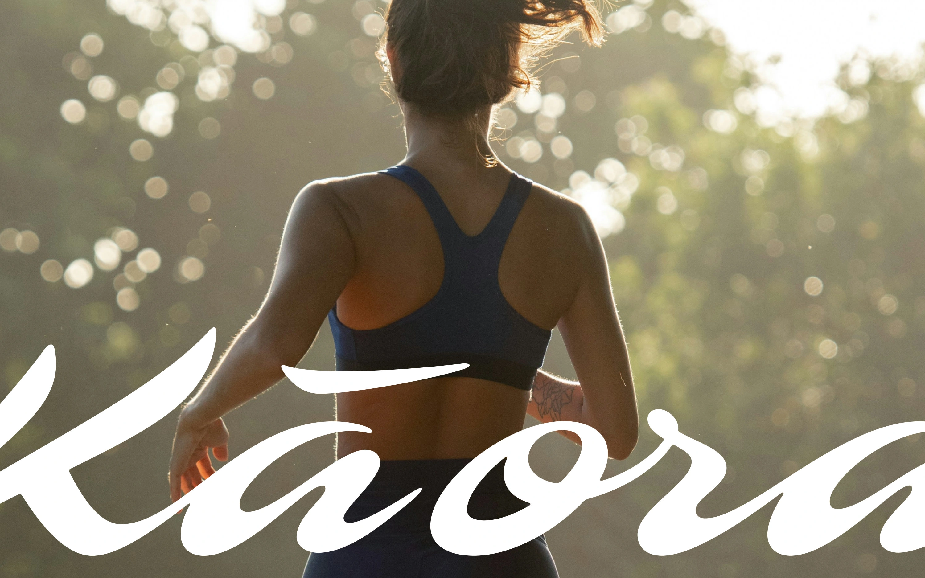
Logotype as a dynamic graphic element
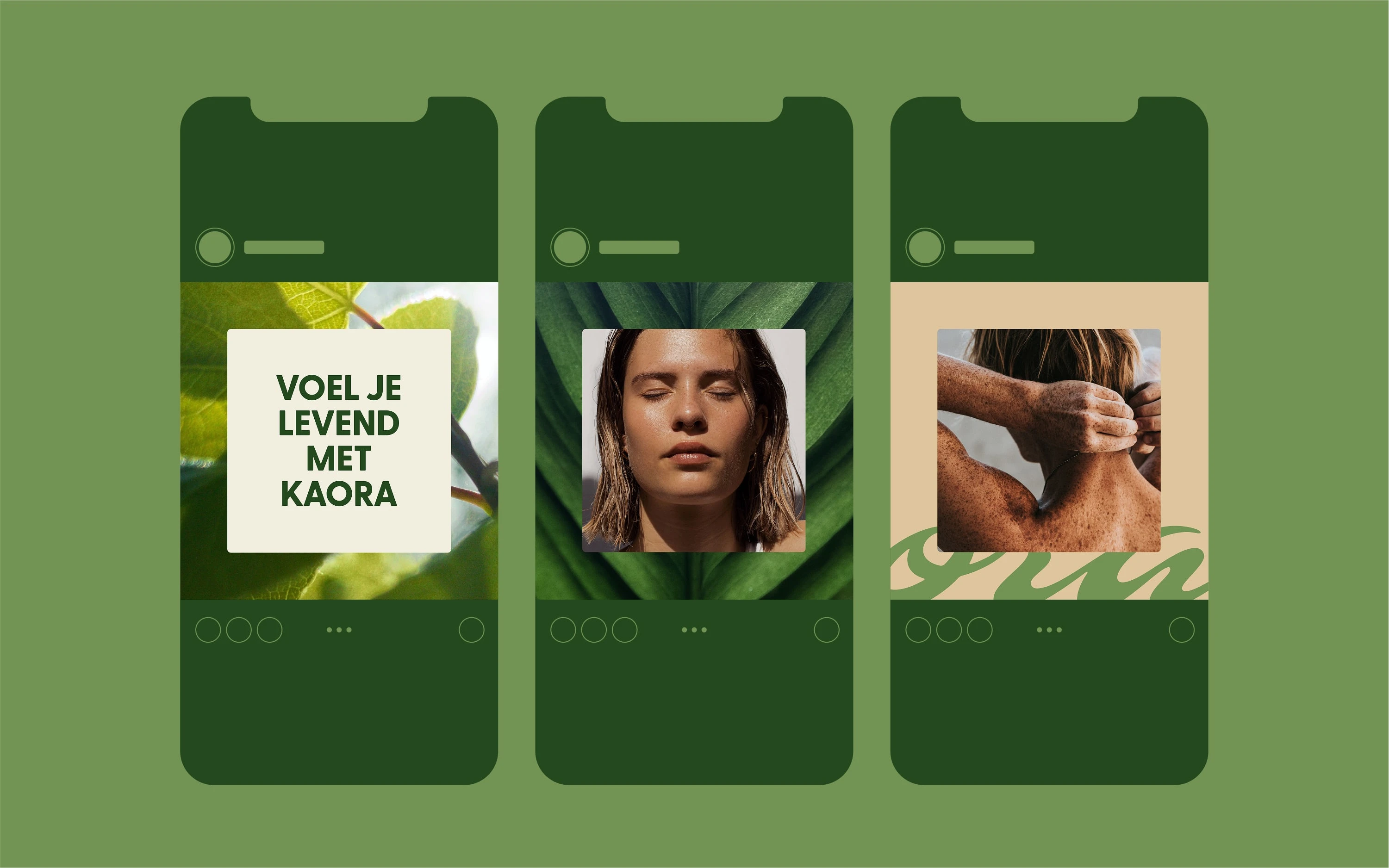
Social media posts
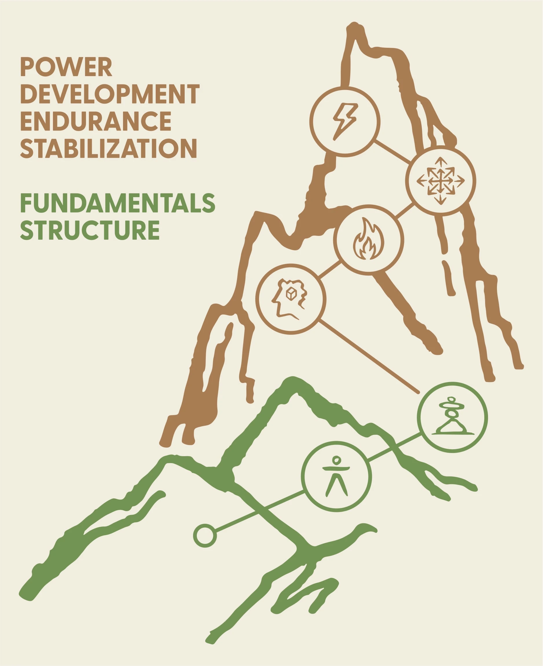
Wall graphic of the steps they take you through with training
See the full project, and more, here!
Like this project
Posted Jul 15, 2025
Brand identity for Kaora, a wellness brand focused on transforming your physical & mental energy through exercise, mindfulness practices, and coaching.