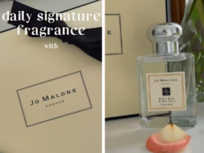
Morning rituals with Laneige
🪴 When brainstorming this project, the main focus was creating a visual that would match the company image and the product itself. Light colors, good lighting, and a familiar setting were all things that would be a good fit.
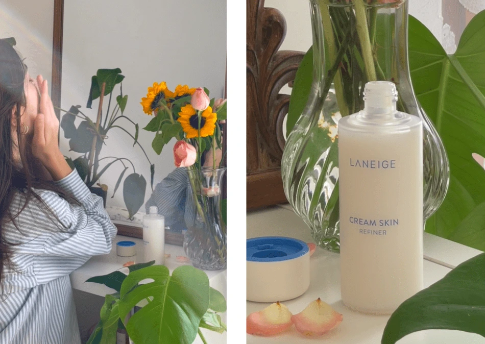
The backstage:
Different angles were used to add more dynamism and keep the attention span, as well as a palette, kept pastel and soft hues that wouldn't be too much in contrast with the product itself.
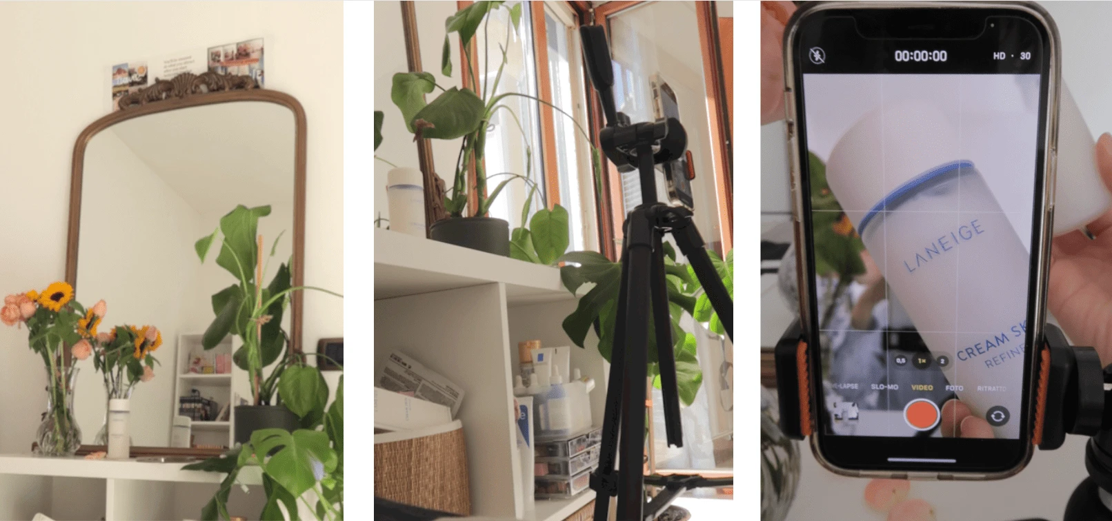
The setting:
Everything was kept simple: additional touches were only given to frame the procut in the shots.
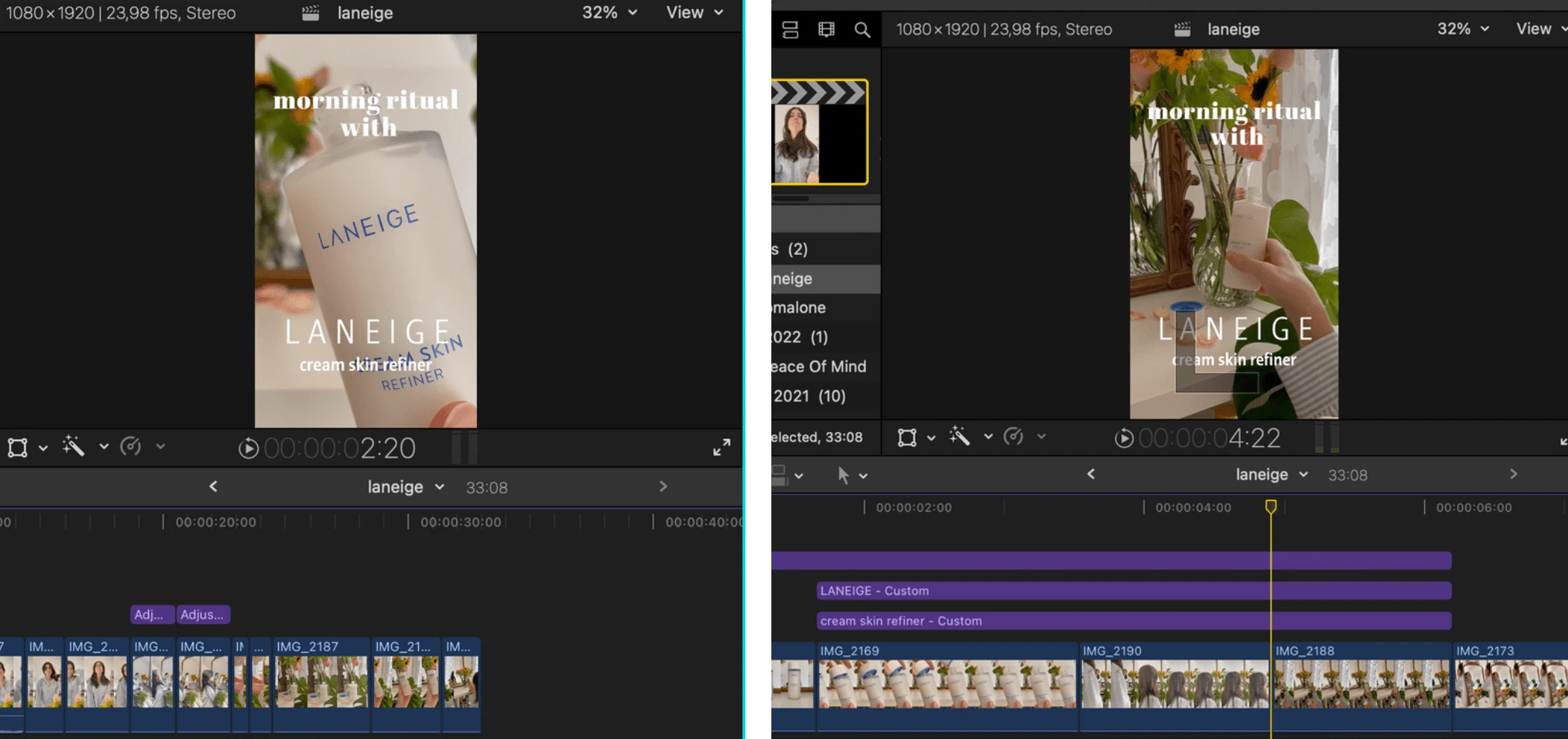
The editing process:
Software: Final Cut Pro x
☀️ Natural light that would give the impression of an "early morning routine", as to prove that is the first step of the day.
💐 Flowers and plants were used to give more color to the setting but also match the natural image of the company.
📹 There are more shots with green and wood in the background to warm up the scene and deliver a natural effect through color theory.
🎨Color correction was strategically used on a few cuts to have a more cohesive tone. Everything else was kept to minimal editing.
✍️The font used is the original from the company. It was not a request, but it's available for download on the company website so it seemed a good choice to use it.
🎵Music is simple and the track used was fitting for a morning routine.
The final message:
The video shows gestures and habits people can relate to, everything it's just made more "appealing" to the eye but people can see themselves in the process or achieve this feeling by buying the product.
🎥 Watch the final project here
Like this project
Posted Jan 3, 2022
Likes
0
Views
7
