Redesign Project: My HealtheVet :: Behance

Banner image: Summary.
The project was slated for three years, but we accomplished quite a bit in two years thus ending our contract early. We didn't realize how many teams we'd work with in those 2 years, but using both agile and SCRUM techniques we managed quite well.
After the initial Content Audit and Information Architecture clean-up review, we broke the site down into Epics, and organized our Design Sprints based on those Epics. As Testing was a separate contract, our core focus was taking the results of testing and research then developing a design/plan for a new site. The Human Factors Engineering (HFE) office of the VHA was responsible for the testing contract, so we worked very closely with their team throughout the process.

Banner image: Challenges.
The project cited various issues, from a business perspective. These included;
- Low overall use,
- Low retention rate,
- High support-call volume,
- Findability flaws,
- Multi-project disconnect (causing multi-login issues), and
- Outdated design and layout (still using tables for layout).
From a user standpoint, such issues were either direct results of, or caused further usability issues;
- User confusion,
- Inability to find important information,
- Information overload,
- "Go read the help guides",
- Hidden contact information and forms,
- Security concerns, and
- Health information confusion.
On-boarding, and background checks for a government contract ate up about 3 months of project time. At this stage we were given some research to read over. With 5 different research papers and 2 usability studies, there was a lot to read over and mentally process.
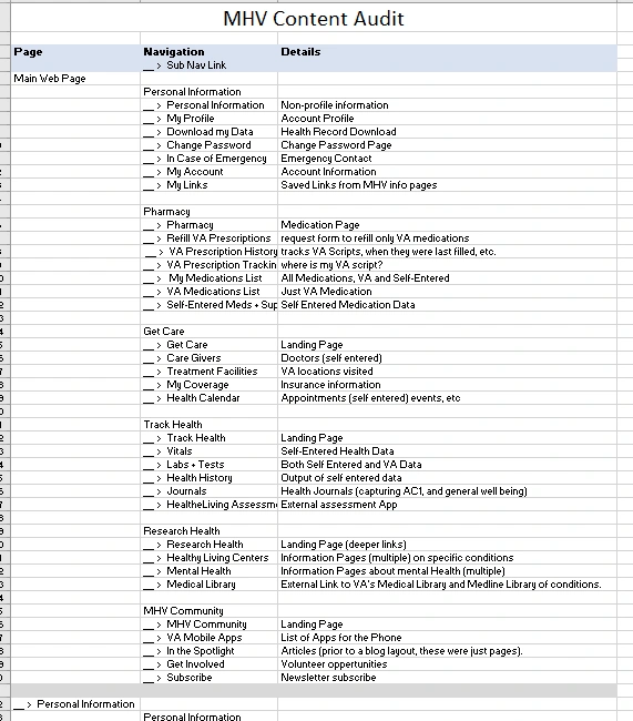
I also took up the responsibility to fully document the current site. This included a spreadsheet of pages, links, content, and initial issues I noticed as I trawled through the site page by page. The biggest problems were the poor Information Architecture (IA), nested help guides, duplicate content, and a glut of non-essential, though important, information.

Snapshot reproduction of the original Site Survey Excel file.
And these were only the surface challenges.
We found additional requirements of collaborating with no less than 10 other teams. One for each "section" of the site. For example - Pharmacy, Secure Messaging, Mobile, Site Development, Delegation, and the Health Assessment were all separate projects.
These projects, the state they were in (active, inactive, on-hold, etc), and where they were in their own development cycles (development, research, initial discussions, etc), heavily influenced our work.

Banner image: Process.
We used HipChat for internal communications, Skype for Business for communication and meetings with the VHA staff and stakeholders, and WebEx for work with HFE.
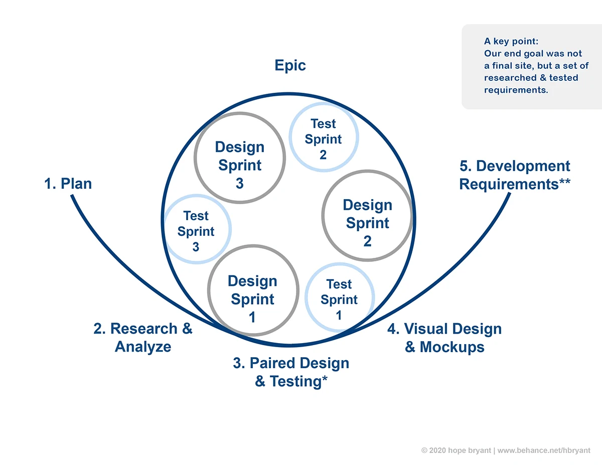
We used a hybrid of SCRUM for internal meetings (and later with external sub-section team lead meetings), and AGILE development. The VHA was still using the Waterfall method, so we needed to find a way to mesh the two formats. This primarily lead us to working outside of their development cycle, where our documentation was catalogued and added to their backlog of work. In some cases, if a project was currently under active development, they would add our documentation to their work load and update that portion of the site.
So our development cycle consisited of several smaller cycles and checkins with the other existing teams.

Design Sprint visual outline.
1) Core Plan
2) Initial Research
3) Paired Design & Testing
3.1) First Design/mockups
3.1.1) First Testing with HFE teams
3.2) Feedback incoporated into new design
3.2.1) Second testing (if this went well, the thrid stage of redesign and testing was skipped)
3.3) Third stage redesign with feedback, and improved visuals
3.3.1) Third stage testing (if required by Product Owners)
4) Cleaned up Visual Design and Functional Mock-ups
5) Documentation for the programing and development team
For business purposes and to show the improvement our solutions offered to the project, I suggested we do a comparative analysis using the prior HFE Usability Study.
Their prior test (baseline usability) informed a large portion of our work, and towards the end of our project, we revisited that baseline comprehensive test again using the same methods.
The result was a significant improvement in findability, overall improvement in tasks completion (a 20% or less task completion was increased to between 80% to 100%) and a SUS score of 80 (average). SUS Score was also increased in accessibility testing with significant appreciation voiced for the improvements in the site's accessibility.
Like this project
Posted May 14, 2024
My HealtheVet is a web-based health-portal for the VHA, and needed a "Face-lift". I was contracted on as a JR UX Designer with the team.
Likes
0
Views
8


