Built with Lummi
The Dragon Trip Brand Identity and Website Redesign
The Dragon Trip is known for its bold, immersive travel experiences, from backpacking across Vietnam to family tours through Japan. For over a decade, it’s captured the spirit of discovery across Asia, attracting a new generation of curious travellers looking to go beyond the ordinary.
As the brand prepared to expand beyond its Asian roots, the brief was clear: evolve the brand to feel global, while preserving the energy, youthfulness and human-led adventures that define it.
This wasn’t about reinventing The Dragon Trip. It was about helping it grow visually, structurally and emotionally into something that could carry its identity into new markets, new offerings and new audiences.
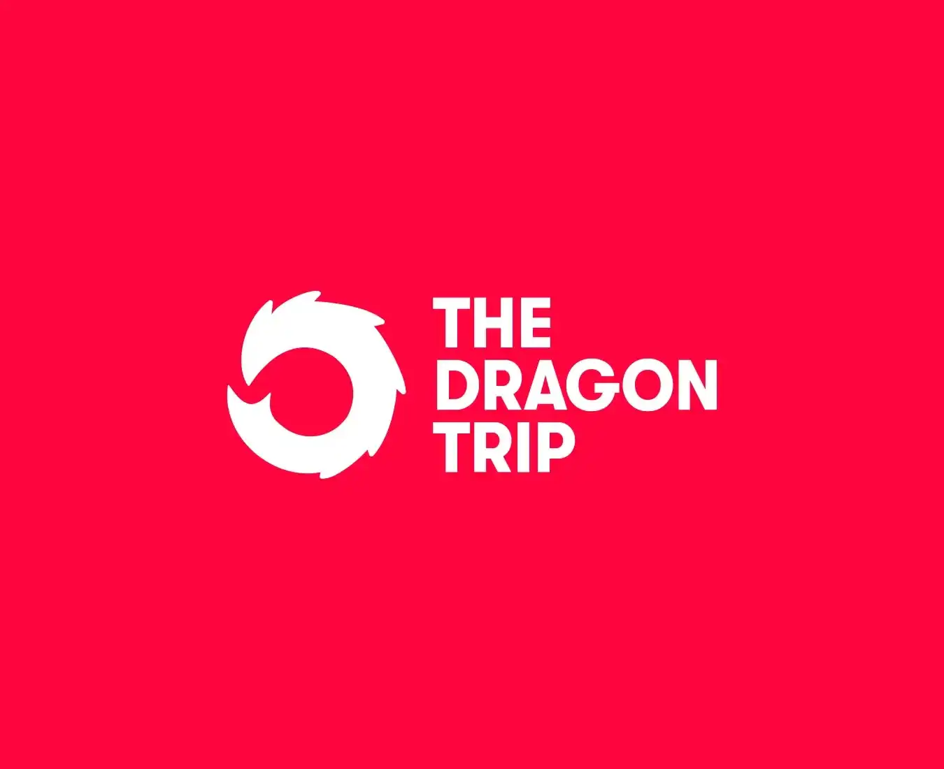
The NEW Dragon Trip Logomark
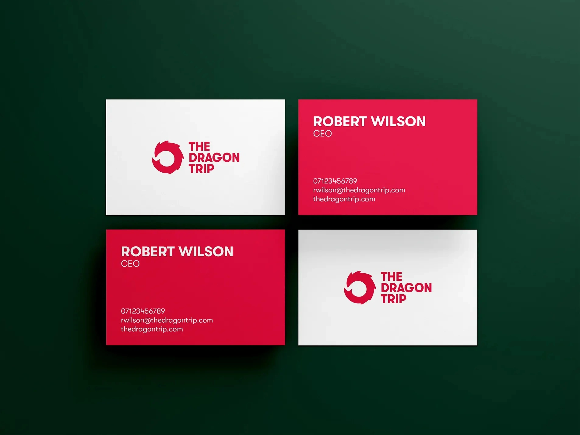
The refreshed logo captures The Dragon Trip’s bold, culturally immersive approach to travel. The symbol takes inspiration from the fluid path of a dragon, a nod to movement, curiosity and storytelling, while the custom wordmark keeps things clean and contemporary. Designed to feel fresh yet grounded, the identity speaks to a new generation of travellers and works seamlessly across digital, print and branded materials. It’s flexible, distinctive and rooted in the spirit of discovery that defines the brand.

The TDT Dragon Tail
The dragon tail extends beyond the logo itself, becoming a dynamic graphic element used throughout the brand. In photography, it arcs around travellers, often encircling people like an aura, subtly placing people at the centre of the story. This visual device adds energy and direction while reinforcing the brand’s core focus: immersive, human-led experiences that leave a mark.
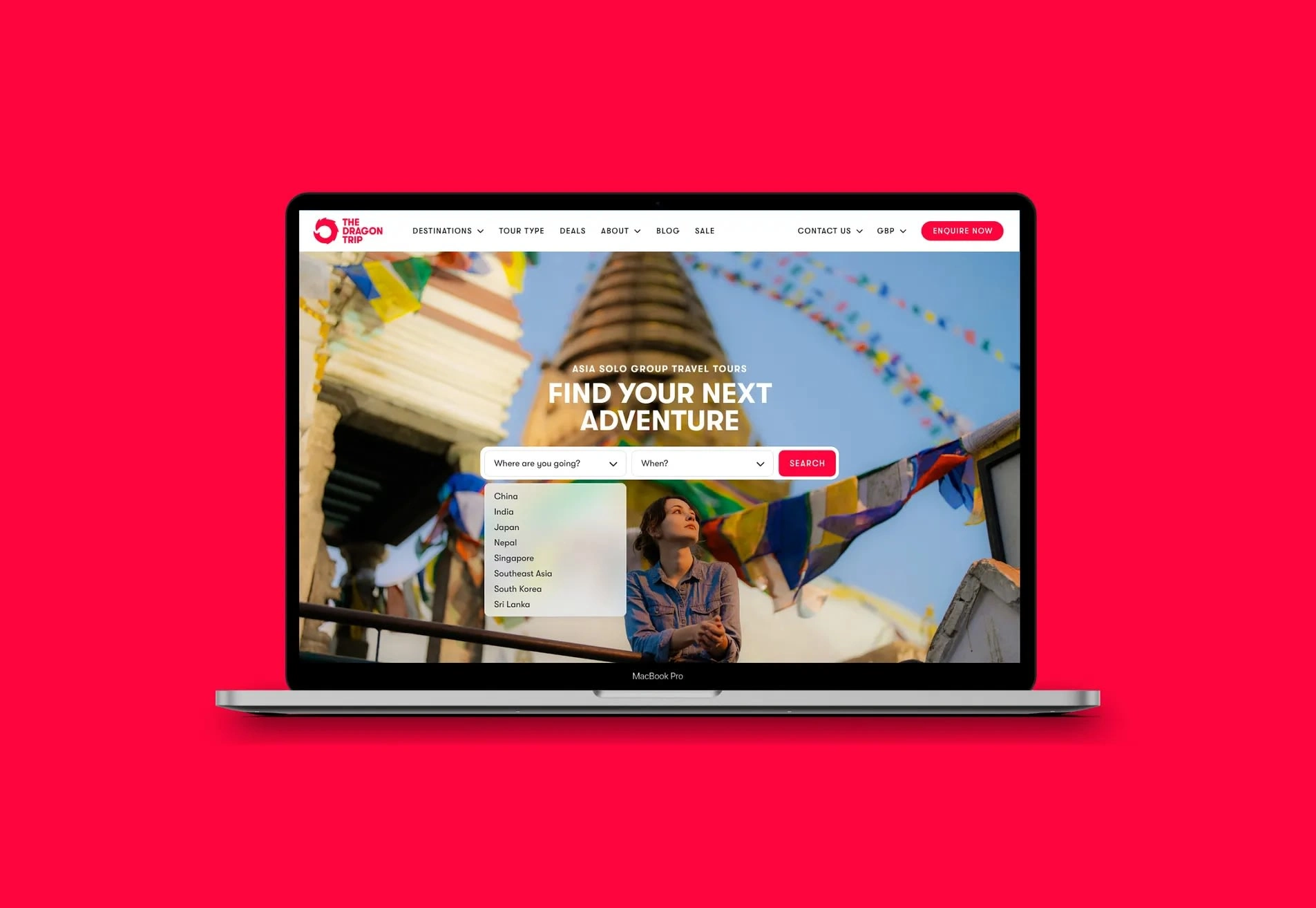
The website brings the brand to life in a practical, user-focused way. It’s been modernised to offer a seamless booking experience while showcasing the full depth of The Dragon Trip’s itineraries and travel styles. Rich in detail and easy to navigate, the site supports curious users as they explore trip options, compare experiences and dive into everything from day-by-day breakdowns to key adventure features, all designed to inform, inspire and convert.
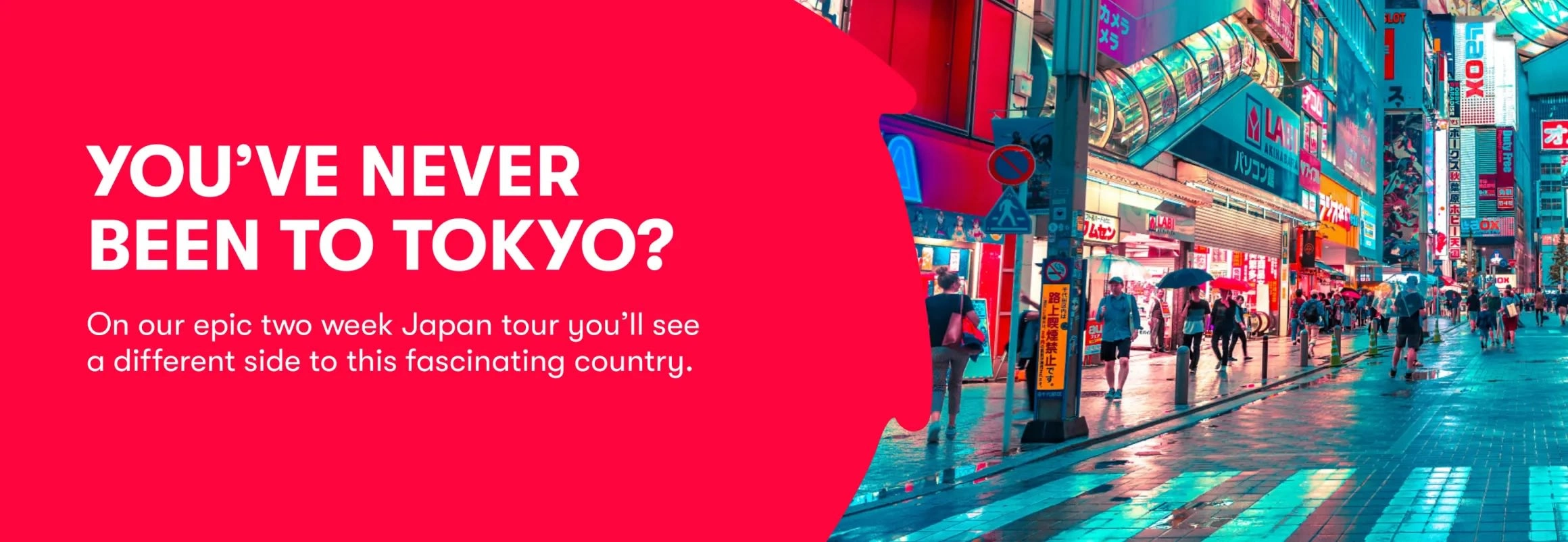

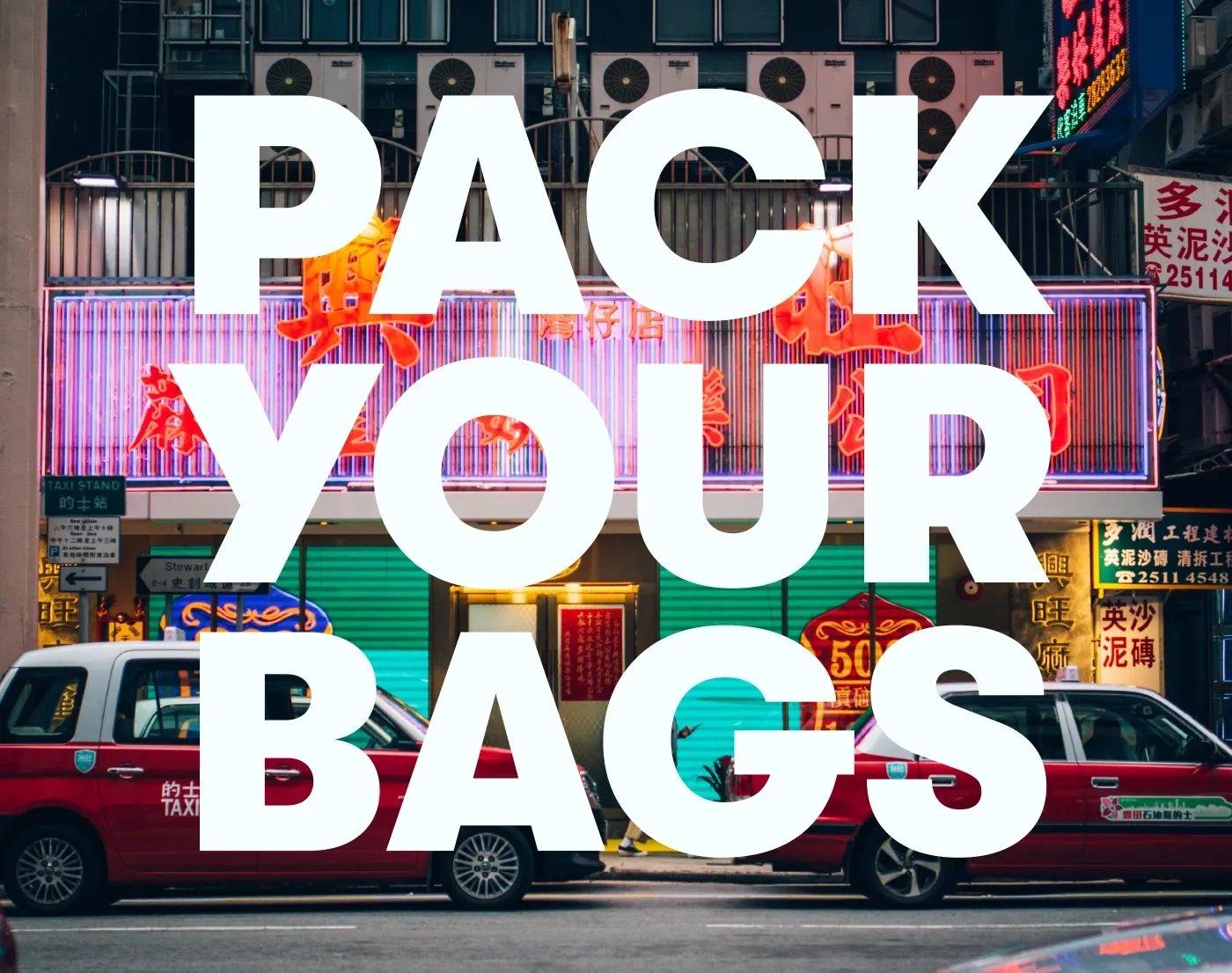
Big, bold typography is layered over destinations imagery to create a strong visual rhythm throughout the brand. Each short phrase is active and direct with just a few words that spark curiosity, speak to the reader and echo the adventurous spirit of The Dragon Trip. It’s a simple but powerful way to connect quickly with the audience.
Like this project
Posted Sep 5, 2025
Redesigned The Dragon Trip's brand identity and website to feel global, while preserving the energy, youthfulness and human-led adventures that define it.
Likes
0
Views
16
Timeline
Feb 1, 2024 - Nov 1, 2024
Clients
The Dragon Trip


