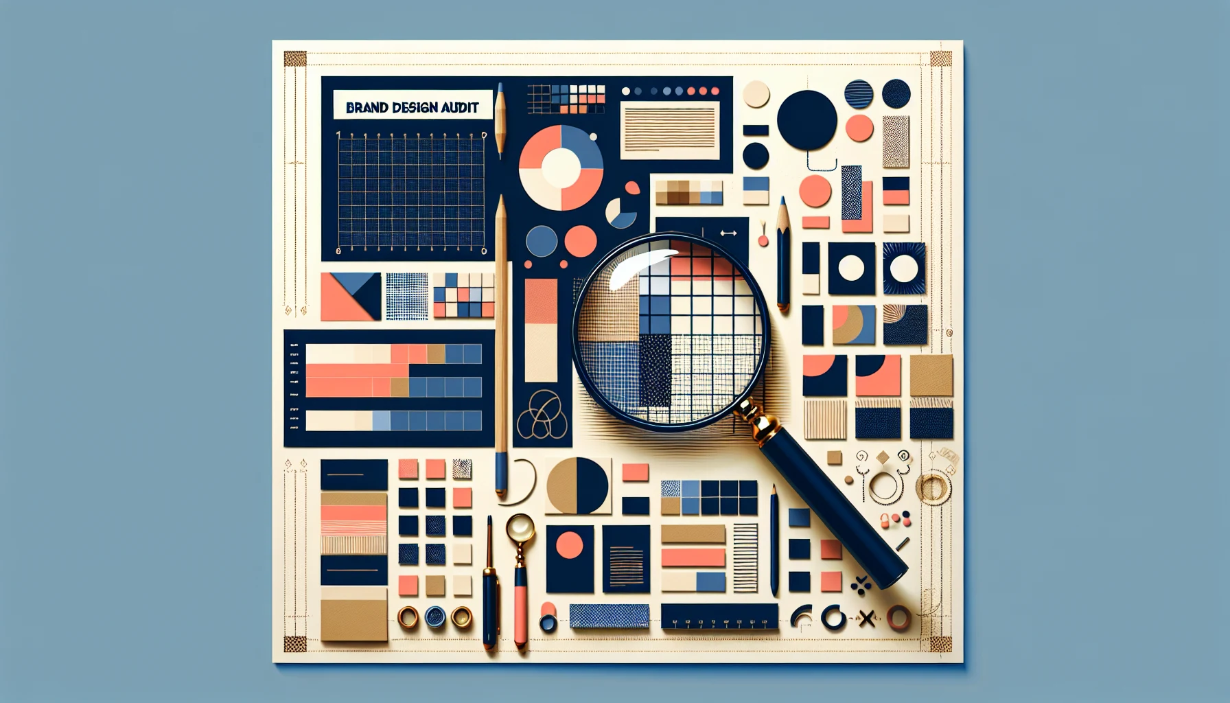
Brand Design Audit: Assessing Your Current Visual Identity
Rebecca Person
Brand Design Audit: Assessing Your Current Visual IdentityWhy Brand Audits Are ImportantSteps to Evaluate Your Current Identity1. Gather Your Brand Assets2. Check for Visual Consistency3. Analyze Competitor Positioning4. Get Audience Feedback5. Prioritize UpdatesKey Visual Elements That Shape PerceptionStrategies for Turning Insights Into ActionHow a Brand Designer on Contra HelpsFrequently Asked Questions about Brand Design AuditsWhat is the best time to do a brand design audit?Are brand design audits expensive?Can a small business benefit from a brand audit?Key Takeaways
Brand Design Audit: Assessing Your Current Visual Identity
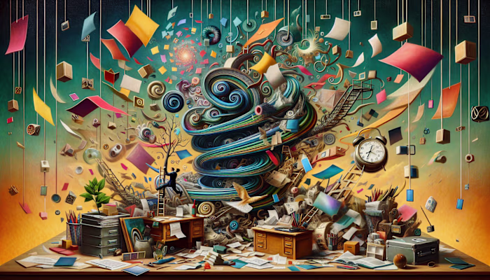
I’ve done a bunch of brand audits over the years—from early-stage startups with Canva-made logos to mid-size teams stuck with five versions of their brand colors floating around. Every time, the same thing surfaces: no one’s really sure what their brand looks like anymore.
Sometimes it's subtle. The logo on the website doesn’t match what’s on the pitch deck. Or the Instagram vibe is completely different from the product packaging. These little things pile up.
“A brand audit is like opening the junk drawer in your kitchen... except it’s your company’s identity.”
And most of the time, it’s not because people don’t care. It’s just that things evolve, and no one hits pause to ask: “Is this still working?” That’s where a brand design audit steps in. Not as a rebrand. Just as a clear-eyed look at what’s going on.
Why Brand Audits Are Important
A brand audit identifies where your visual identity breaks down. It shows you what’s consistent and what isn’t.
When your logo, colors, and typography don’t align across platforms, it creates friction. People notice—even if they don’t say anything.
Inconsistent design weakens recognition. If a customer sees three versions of your logo in one day, it’s hard to remember which one is real.
Visual consistency builds trust. It signals that the brand is intentional, organized, and paying attention.
It also makes everything easier for your team. When the design system is clear, no one’s guessing which blue to use.
A unified identity helps your brand feel like one voice, not five departments speaking over each other.
It’s not about being perfect. It’s about being clear.
Steps to Evaluate Your Current Identity
A brand design audit begins with collecting what already exists. From there, it becomes a process of comparison, observation, and refinement. Each step is intended to surface inconsistencies and clarify what your brand actually communicates—visually.
1. Gather Your Brand Assets
“If your logo exists in more formats than your team has Slack channels, it's time to get organized.”
Collect visual materials currently in use: logos (all versions), color codes (HEX, RGB, CMYK), font files, icon sets, social media templates, presentation decks, and any existing brand guidelines. Include both internal and public-facing files.
2. Check for Visual Consistency
Compare assets across platforms—website, print, social media, email signatures, product packaging. Look for mismatched colors, font substitutions, outdated icons, and spacing issues. Cross-check with your most recent brand guidelines.
3. Analyze Competitor Positioning
Document how 3–5 competitors present themselves visually. Note their color schemes, logo styles, tone of imagery, and typography. Identify where your identity overlaps or diverges. This highlights areas where your brand blends in or stands out.
4. Get Audience Feedback
Ask customers or users what comes to mind when they see your brand. Use short surveys, in-product polls, or casual interviews. Focus on first impressions, perceived tone, and visual clarity.
5. Prioritize Updates
Sort findings by what’s broken, outdated, or inconsistent. Identify items that confuse users or dilute recognition. Start with the changes that require the least effort but have the highest visual impact—like fixing color mismatches or standardizing logo usage.
“Fix the things people see first. Then worry about the footer icons.”
This framework doesn’t require new tools or big design budgets. It just asks for honesty and a full picture of what your brand currently looks like.
Key Visual Elements That Shape Perception
Visual perception starts with the elements people see first: logos, color palettes, and fonts. These components form the foundation of how a brand is recognized, remembered, or overlooked.
The logo acts as the primary identifier. Its effectiveness depends on clarity, scalability, and consistent usage. A simplified logo that works at 16px and 1600px prevents distortion across devices. Multiple variations or unauthorized tweaks—like stretched versions or altered spacing—can create recognition gaps.
Color defines emotional tone. Slight differences in hex codes across platforms (like #1A1A1A vs. #1B1B1B) may look minor in isolation but appear inconsistent when placed side by side. In print, mismatched Pantone conversions can cause brand visuals to feel off, especially in packaging or signage.
Typography controls hierarchy and tone. Fonts influence how formal, playful, modern, or traditional a brand feels. Inconsistent font families, missing web licenses, and poor contrast between text and background make content harder to read and dilute brand tone.
“If your email footer uses Arial, your site uses Montserrat, and your Instagram quotes are in Comic Sans… it's not a vibe.”
Common issues found in audits include:
🟥 Logos used with outdated color codes or incorrect padding
🟨 Color palette files missing secondary or accent colors
🟩 Unlicensed fonts used in professional materials
🟦 Text hierarchy missing (e.g., no defined H1/H2/H3 styles)
🟧 Inconsistent icon styles (e.g., mixing line and filled icons)
🟪 Low-resolution files used in high-resolution formats
Each inconsistency creates a small disconnect. When combined, they make the brand feel fragmented. Audits help surface these gaps so they can be corrected or replaced with standardized assets.
Strategies for Turning Insights Into Action
After a brand design audit, the next step is translating the findings into structured changes. This typically starts with creating or refining a brand style guide. The guide documents approved logo variations, color codes, typography, imagery styles, icon sets, and layout principles. It acts as a reference point for internal teams and external collaborators.
If a style guide already exists, updates may include correcting hex values, replacing deprecated fonts, or adding new use cases like social stories or mobile UI specs. Teams often miss these formats in earlier versions of their guidelines.
Internal training ensures the revised identity is understood and applied consistently. This may involve short sessions with marketing, product, or sales teams. In smaller companies, a single async Loom video walking through what's changed is often enough.
For external updates, apply changes in stages. Start with high-visibility areas—your website header, LinkedIn banners, and sales decks. Then phase in updates across packaging, internal docs, and secondary platforms. This reduces risk and avoids overwhelming teams or audiences.
“Rebranding your entire ecosystem in one sprint is like repainting your house during a thunderstorm—technically possible, but not ideal.”
Budgets vary. Larger companies may hire agencies to manage rollout, but leaner teams often use freelancers for targeted updates. Freelancers can update Figma libraries, audit presentations, or create new ad templates in a matter of days without the overhead of a full rebrand.
This flexibility helps teams with smaller budgets avoid delays. On Contra, it’s common to see collaborators work in sprints—one week on web graphics, another on social post templates—based on priority and budget. This makes implementation more manageable and reduces friction across the team.
“If your logo lives in five email threads and a Dropbox folder titled ‘Old Brand Stuff,’ it probably isn’t being used right.”
Consistency only works if it's maintained. That’s why brands often integrate their visual assets into shared tools like Notion, Figma, or Canva Pro libraries. This ensures everyone is pulling from the same source, even months after the audit.
How a Brand Designer on Contra Helps
A freelance brand designer on Contra works directly with the client—without intermediaries or project managers translating feedback. This simplifies communication and reduces the chance of misinterpretation across design iterations.
Since Contra doesn’t take commissions, the full project budget goes to the freelancer. This allows both sides to scope the work more precisely. A $2,000 budget means $2,000 worth of design, not $1,500 after platform cuts.
Designers on Contra often work in sprints. For example, a client might begin by updating only their logo system and color palette. A few weeks later, they might bring the same designer back to rework presentation templates and social media assets. This structure supports phased implementation without needing to hire a large agency.
Freelancers can also audit specific parts of a brand system. One client might request a typography audit to improve readability across their product UI, while another might focus only on packaging cohesion. The flexibility of working one-on-one allows the scope to adjust as new priorities emerge.
Most freelancers on Contra share working files (Figma, Illustrator, Notion) in real-time. This gives clients ongoing visibility into design progress. It also allows internal teams to reuse and adapt assets without waiting for final deliverables.
"A direct Slack message to the designer beats a 3-day email chain with 4 people CC’d."
Because brand audits don’t follow a rigid checklist, the designer’s ability to adapt is essential. On Contra, freelancers often tailor the process to fit the client’s goals—auditing only what’s relevant instead of using a generic template or bloated brand book.
Onboarding is fast. Clients typically send over their brand assets and a short brief. Within a few days, the designer identifies inconsistencies, flags outdated files, and begins organizing a shared visual system.
"The goal isn’t to redo everything. It’s to figure out what already works—and fix what doesn’t."
This model works well for companies without internal design teams or for those between brand phases—like post-funding startups, rebranding nonprofits, or product teams merging two brands after an acquisition.
Frequently Asked Questions about Brand Design Audits
What is the best time to do a brand design audit?
Audits are typically done before or after a major shift—such as a product launch, rebrand, funding round, or team restructure. Some teams schedule them annually to maintain consistency across growing assets.
“If your team is using three logos and none of them are in the brand folder, the timing is already right.”
Other prompts include inconsistent marketing visuals, unclear design documentation, audience confusion, or internal questions like “Is this still our logo?” or “Why does our website look different from our pitch deck?”
Are brand design audits expensive?
The cost depends on scope. Audits done by internal teams usually cost time—not budget—and may take a few days to a few weeks, depending on asset volume. External audits, whether by freelancers or agencies, are often scoped by deliverables: logo checks, color systems, typography, and platform-specific usage.
Freelancers on commission-free platforms like Contra often break audits into modular stages. For example, a $400 engagement might cover just a logo and color usage review, while a $2,000 scope could include a full visual system with documented inconsistencies and Figma updates.
There is no fixed price. It depends on who performs the audit, how many assets exist, and how many fixes are needed.
Can a small business benefit from a brand audit?
Yes. Smaller teams often have fewer assets, but more inconsistency. For example, a startup with a logo from 2019 might now use five Canva templates, two presentation decks, and one Shopify theme—all with different fonts.
“Small brands don’t have time to fix everything, so audits help them figure out what actually needs fixing.”
Audits help identify what visuals are still usable, which ones introduce confusion, and what’s missing. Even a basic audit—logo, font, and color alignment—can clarify how the business presents itself across touchpoints.
Key Takeaways
A brand design audit is a structured review of how visual assets are being used across platforms, compared to how they were intended to be used. It includes checking for consistency in logos, color values, typography, and imagery. Most audits uncover small but impactful mismatches, like outdated logos in PDFs or off-brand fonts in pitch decks.
Visual identity is shaped by a few core elements—logo, color palette, typography—and their consistency across digital and print materials. Common issues include stretched logos, mismatched hex codes, and inconsistent iconography. These issues build up across emails, social media, websites, and packaging.
Audits also compare visual identity to competitors, using observations to identify areas where the brand blends in or stands out visually. This step often reveals whether the brand is visually communicating what it thinks it is—or if the perception has drifted.
User feedback adds context to internal assumptions. A quick poll or short-form test can show what people actually associate with the visual identity, which often doesn’t match internal expectations. This helps prioritize which inconsistencies to fix first.
Updates are typically phased, not simultaneous. Teams start with high-impact, visible areas—like headers, social templates, or business cards—and expand from there. Freelancers often implement updates in short sprints, using tools like Figma, Notion, and Illustrator.
"Trying to fix every design inconsistency at once is like reorganizing your closet during a move—technically possible, but everything ends up on the floor."
Audits are snapshots. As brands evolve, new assets are created, and inconsistencies return. Repeating the audit process every 6–12 months keeps the visual identity aligned with current goals and use cases. Treating audits as ongoing maintenance—not one-time cleanups—helps keep the brand functional, recognizable, and adaptable.
📅 As of April 10, 2025, many teams are already using lightweight, freelance-led audits to keep pace with new platforms and shifting brand strategies. These audits are often quicker, more specific, and easier to implement than full rebrands.
Like this project
Posted Apr 10, 2025
Brand Design Audit: Assess your current visual identity for consistency, clarity, and alignment across logos, colors, fonts, and brand assets.