Students Exam scores: Exploratory Data Analysis
Youcef Belmokhtar
/kaggle/input/students-exam-scores/Original_data_with_more_rows.csv/kaggle/input/students-exam-scores/Expanded_data_with_more_features.csv
Hello everyone, it's been a while since I posted something here. I'm ready to make new projects and share other analysis with you!
In [2]:
import matplotlib as pltimport seaborn as sns
Data Processing:
In [3]:
df= pd.read_csv('/kaggle/input/students-exam-scores/Original_data_with_more_rows.csv')
In [6]:
df.isnull().sum()
Out[6]:
Unnamed: 0 0Gender 0EthnicGroup 0ParentEduc 0LunchType 0TestPrep 0MathScore 0ReadingScore 0WritingScore 0dtype: int64
In [7]:
df.rename(columns={'Unnamed: 0':'Id'},inplace=True)
Exams score by gender:
In [8]:
pv1=pd.pivot_table(df,index='Gender',values=['MathScore','ReadingScore','WritingScore'])
In [10]:
plt.style.use('ggplot')
In [11]:
p1=pv1.plot(kind='barh',y=['MathScore','ReadingScore','WritingScore'],edgecolor='black',linewidth=2,figsize=(12,8),title='Males vs Females ')p1.bar_label(p1.containers[0], label_type='edge',padding=0.5,bbox={"boxstyle": "round", "pad": 0.6, "facecolor": "white", "edgecolor": "#1c1c1c", "linewidth" : 2.5, "alpha": 1})p1.bar_label(p1.containers[1], label_type='edge',padding=0.5,bbox={"boxstyle": "round", "pad": 0.6, "facecolor": "white", "edgecolor": "#1c1c1c", "linewidth" : 2.5, "alpha": 1})p1.bar_label(p1.containers[2], label_type='edge',padding=0.5,bbox={"boxstyle": "round", "pad": 0.6, "facecolor": "white", "edgecolor": "#1c1c1c", "linewidth" : 2.5, "alpha": 1})
Out[11]:
[Text(0.5, 0, '72.8977'), Text(0.5, 0, '63.9787')]
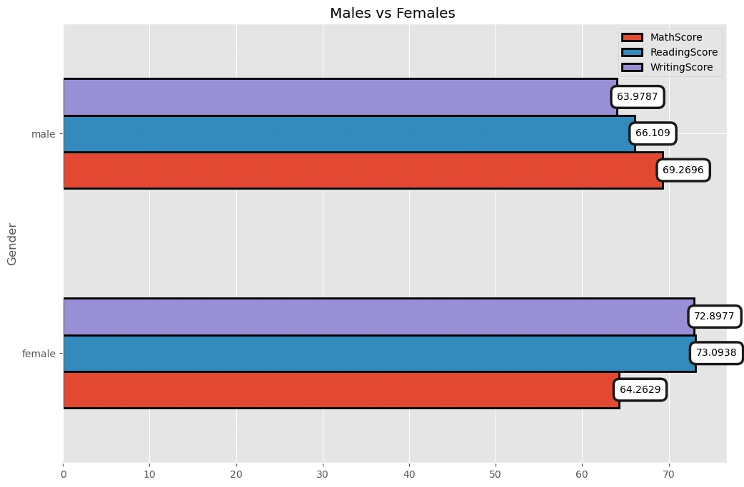
From the Bar chart above, it's clear that males are better in Math while females are batter in writing.
Let's create another columns which contain the overall score for each student by aggregating each exam score then devide it by 3
In [12]:
df['OverallScore']=(df['MathScore']+df['ReadingScore']+df['WritingScore'])/3
That's better!
Data Analysis:
Overallscore by EthnicGroup
In [14]:
pv2=pd.pivot_table(df,index='EthnicGroup',values=['OverallScore'])p2=pv2.plot(kind='bar',y=['OverallScore'],edgecolor='black',linewidth=2,figsize=(12,7),title='Overallscore by EthnicGroup ')p2.bar_label(p2.containers[0], label_type='edge',padding=0.5,bbox={"boxstyle": "round", "pad": 0.6, "facecolor": "white", "edgecolor": "#1c1c1c", "linewidth" : 2.5, "alpha": 1})
Out[14]:
[Text(0, 0.5, '65.0971'), Text(0, 0.5, '65.7512'), Text(0, 0.5, '66.855'), Text(0, 0.5, '69.7398'), Text(0, 0.5, '74.2322')]
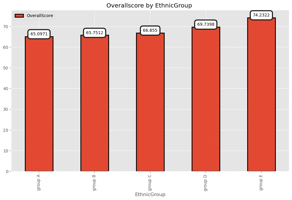
Group E got the highest average score!
Overallscore by Gender
In [15]:
pv3=pd.pivot_table(df,index='Gender',values=['OverallScore'])p3=pv3.plot(kind='barh',y=['OverallScore'],edgecolor='black',linewidth=2,figsize=(12,7),title='Overallscore by Gender ')p3.bar_label(p3.containers[0], label_type='edge',padding=0.5,bbox={"boxstyle": "round", "pad": 0.6, "facecolor": "white", "edgecolor": "#1c1c1c", "linewidth" : 2.5, "alpha": 1})
Out[15]:
[Text(0.5, 0, '70.0848'), Text(0.5, 0, '66.4524')]
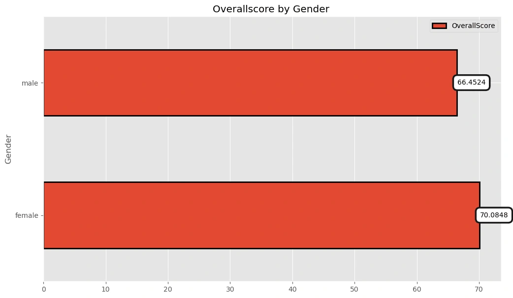
On average, females got a higher exam score!
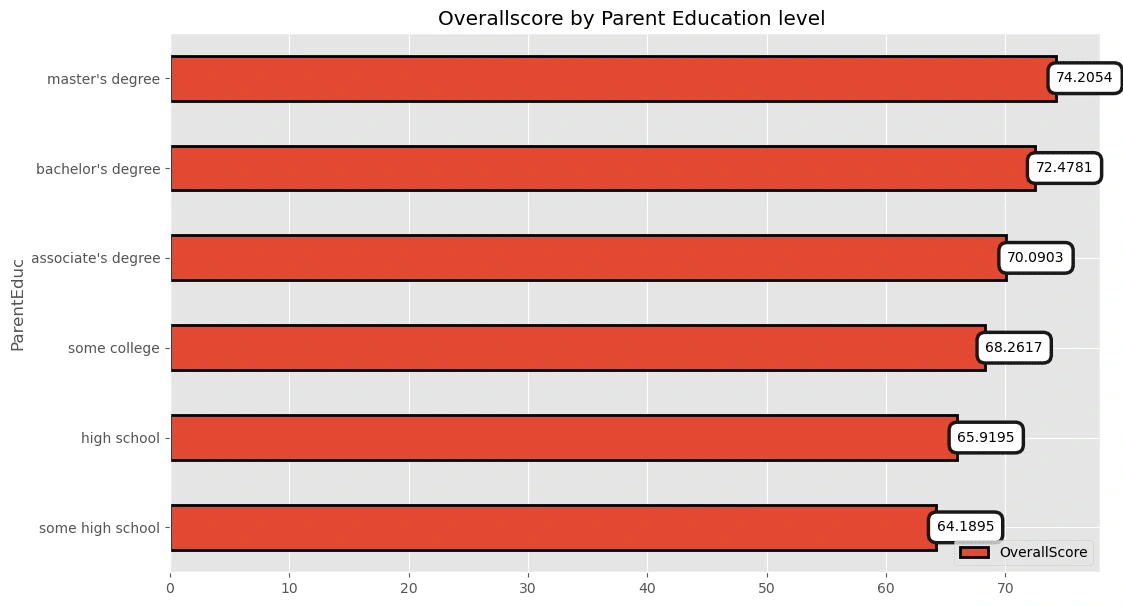
Overallscore by Parent Education level:
In [16]:
pv4=pd.pivot_table(df,index='ParentEduc',values=['OverallScore'])pv4=pv4.sort_values(by=['OverallScore'],ascending=True)p4=pv4.plot(kind='barh',y=['OverallScore'],edgecolor='black',linewidth=2,figsize=(12,7),title='Overallscore by Parent Education level ')p4.bar_label(p4.containers[0], label_type='edge',padding=0.5,bbox={"boxstyle": "round", "pad": 0.6, "facecolor": "white", "edgecolor": "#1c1c1c", "linewidth" : 2.5, "alpha": 1})
Out[16]:
[Text(0.5, 0, '64.1895'), Text(0.5, 0, '65.9195'), Text(0.5, 0, '68.2617'), Text(0.5, 0, '70.0903'), Text(0.5, 0, '72.4781'), Text(0.5, 0, '74.2054')]
In [17]:
p4=pv4.plot(kind='line',y=['OverallScore'],linewidth=4,figsize=(12,7),title='Overallscore by Parent Education level ')
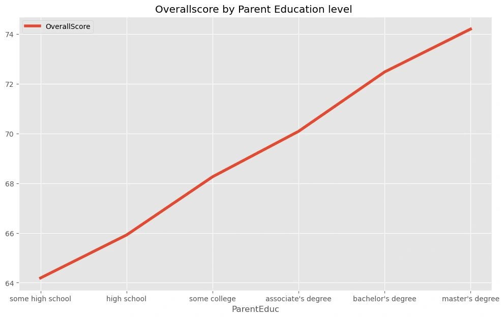
Some high school level got the lowest exam score while the master's degree' holders got the highest exam scores.
Does the Lunch Type matters?
In [18]:
pv6=pd.pivot_table(df,index='LunchType',values=['OverallScore'])pv6=pv6.sort_values(by=['OverallScore'],ascending=True)p6=pv6.plot(kind='barh',y=['OverallScore'],edgecolor='black',linewidth=2,figsize=(12,7),title='Overallscore by Lunch Type ')p6.bar_label(p6.containers[0], label_type='edge',padding=0.5,bbox={"boxstyle": "round", "pad": 0.6, "facecolor": "white", "edgecolor": "#1c1c1c", "linewidth" : 2.5, "alpha": 1})
Out[18]:
[Text(0.5, 0, '62.0637'), Text(0.5, 0, '71.6342')]
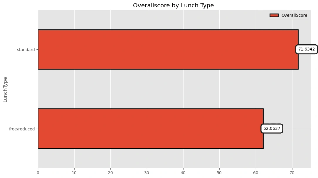
Actually, students who got a standard lunch type got a higher average exam scores then the others!
Overallscore by Test Preparation
In [19]:
pv5=pd.pivot_table(df,index='TestPrep',values=['OverallScore'])pv5=pv5.sort_values(by=['OverallScore'],ascending=True)
p5=pv5.plot(kind='barh',y=['OverallScore'],edgecolor='black',linewidth=2,figsize=(12,7),title='Overallscore by Test Preparation ')
p5.bar_label(p5.containers[0], label_type='edge',padding=0.5,bbox={"boxstyle": "round", "pad": 0.6, "facecolor": "white", "edgecolor": "#1c1c1c", "linewidth" : 2.5, "alpha": 1})
Out[19]:
[Text(0.5, 0, '65.8889'), Text(0.5, 0, '72.821')]
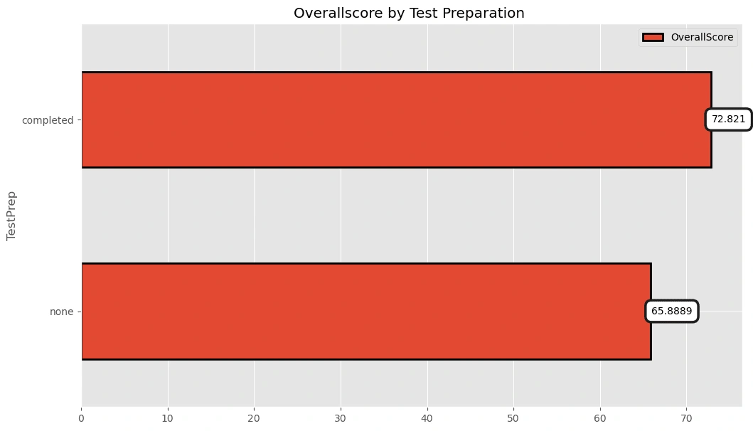
Students who prepared before the test got a better exam scores!
In [20]:
df['OverallScore'].plot(kind='hist',bins=40,figsize=(12,7),edgecolor='black',title='Overallscore distribution')
Out[20]:
<AxesSubplot:title={'center':'Overallscore distribution'}, ylabel='Frequency'>
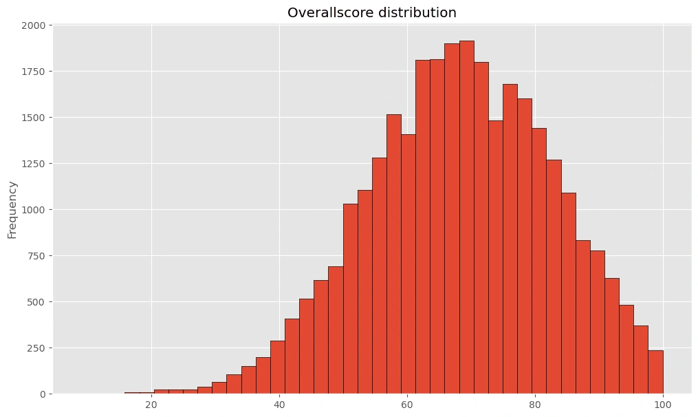
Most of the exam score range from 60 to 80!
Let's see what really impact the OverAll score:
In [21]:
df2=df.copy()
In [22]:
df2=df2.drop(columns='Id',axis=1)
In [24]:
df2['Gender']=pd.factorize(df2.Gender)[0]df2['EthnicGroup']=pd.factorize(df2.EthnicGroup)[0]
df2['ParentEduc']=pd.factorize(df2.ParentEduc)[0]
df2['LunchType']=pd.factorize(df2.LunchType)[0]df2['TestPrep']=pd.factorize(df2.TestPrep)[0]
Data correlation:
In [25]:
sns.heatmap(df2.corr(),annot = True, cmap= 'YlGnBu', fmt= '.2f')
Out[25]:
<AxesSubplot:>
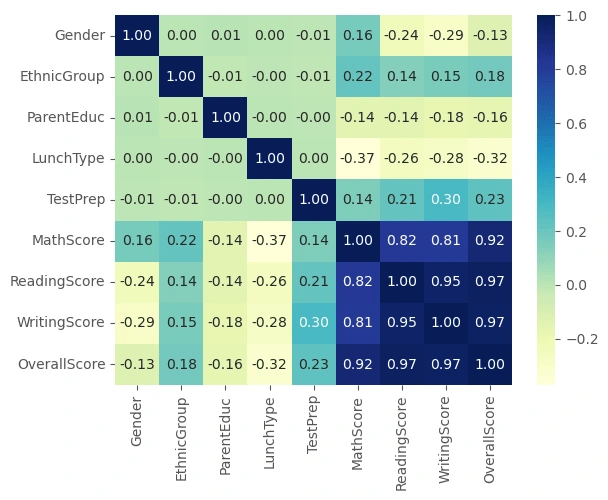
From the heatmap above, it's obevious that Lunch type and Test preparation has a higher impact on the student's overallscore. Gender, Ethnic group and Parent education level has an impact also on the score.
In [26]:
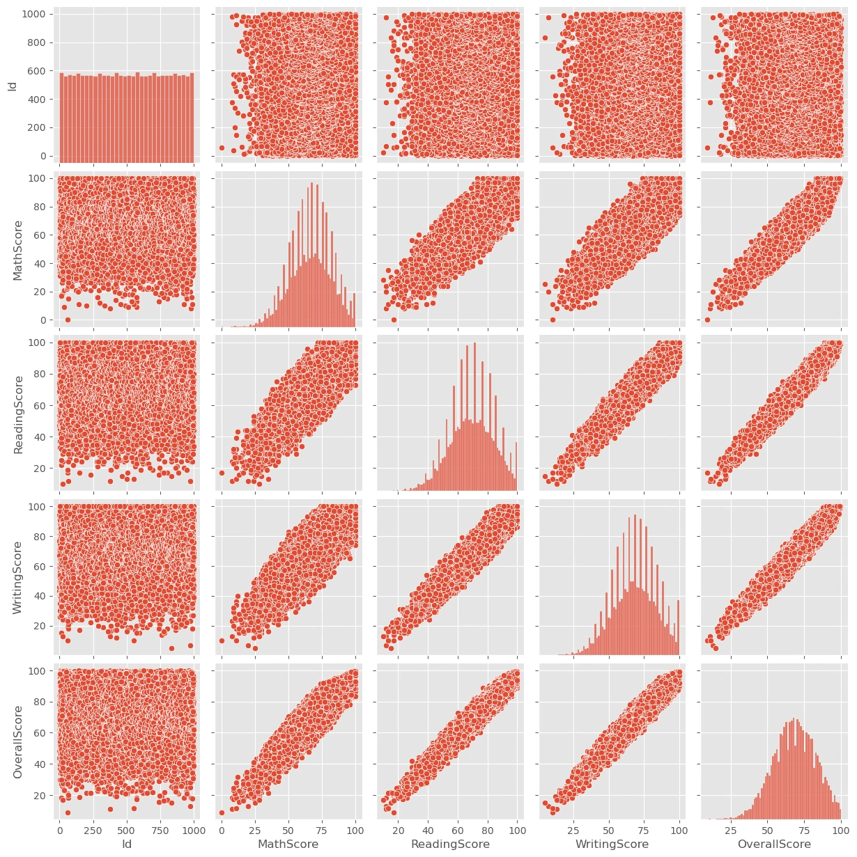
sns.pairplot(df)
Out[26]:
<seaborn.axisgrid.PairGrid at 0x70179a6a0650>
Original notebook:
Like this project
Posted Mar 24, 2024
Exploring Students Exam scores and what affect it