Redesigned the hero section for a cleaner and more cohesive ...
Hafsa Fatima
Redesigned the hero section for a cleaner and more cohesive look
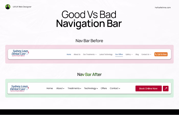
The original hero section had:
– Inconsistent typography sizes
– Uneven spacing and margins
– A color scheme that didn’t align with the brand
In the redesigned version, I:
- Fixed typography hierarchy for better readability
- Adjusted spacing and alignment for balance
- Matched the colors to the brand palette
- Added social proof to build trust and credibility
Now the hero section not only looks aligned but feels more professional and brand-consistent.
#UIDesign #WebDesign #HeroSection #BeforeAfter #DesignProcess
Like this project
Posted Oct 16, 2025
Redesigned the hero section for a cleaner and more cohesive look The original hero section had: – Inconsistent typography sizes – Uneven spacing and margins ...
Likes
0
Views
1