C.A.S.E. Brand Refresh
Vivian Suárez
Enhanced, Airy, Streamlined.
For years, the Center for Adoption Support and Education (C.A.S.E.) focused intently on its mission, achieving meaningful milestones in its work—but the brand wasn’t keeping pace. A fragmented identity, inconsistent logos, and a lack of communication protocols left C.A.S.E. without a cohesive graphic direction.
We dove into the heart of the organization, analyzing marketing strategies, priorities, and perceptions through in-depth interviews. These insights became the foundation for a refreshed brand identity.
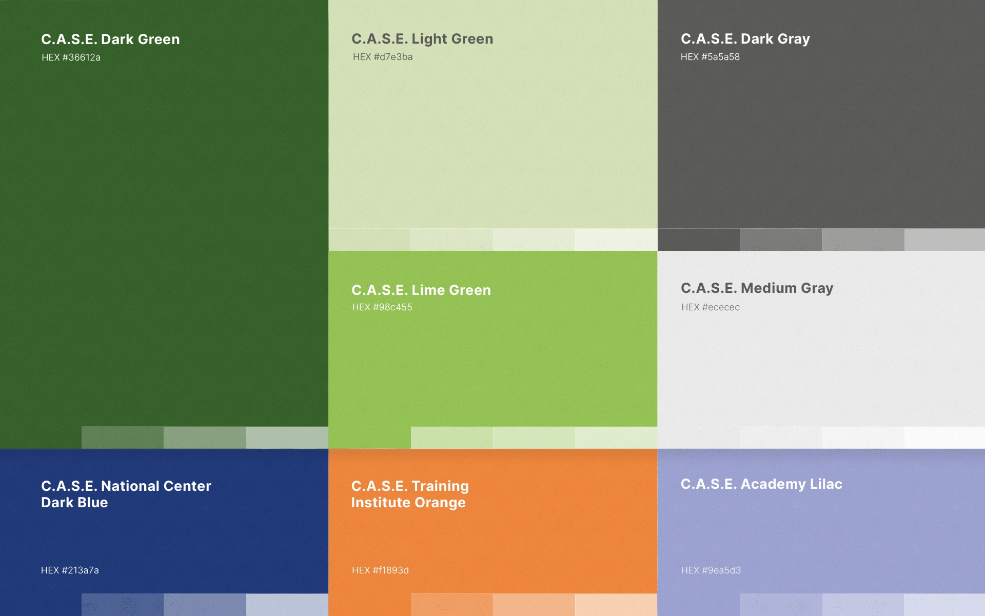
Color Palette
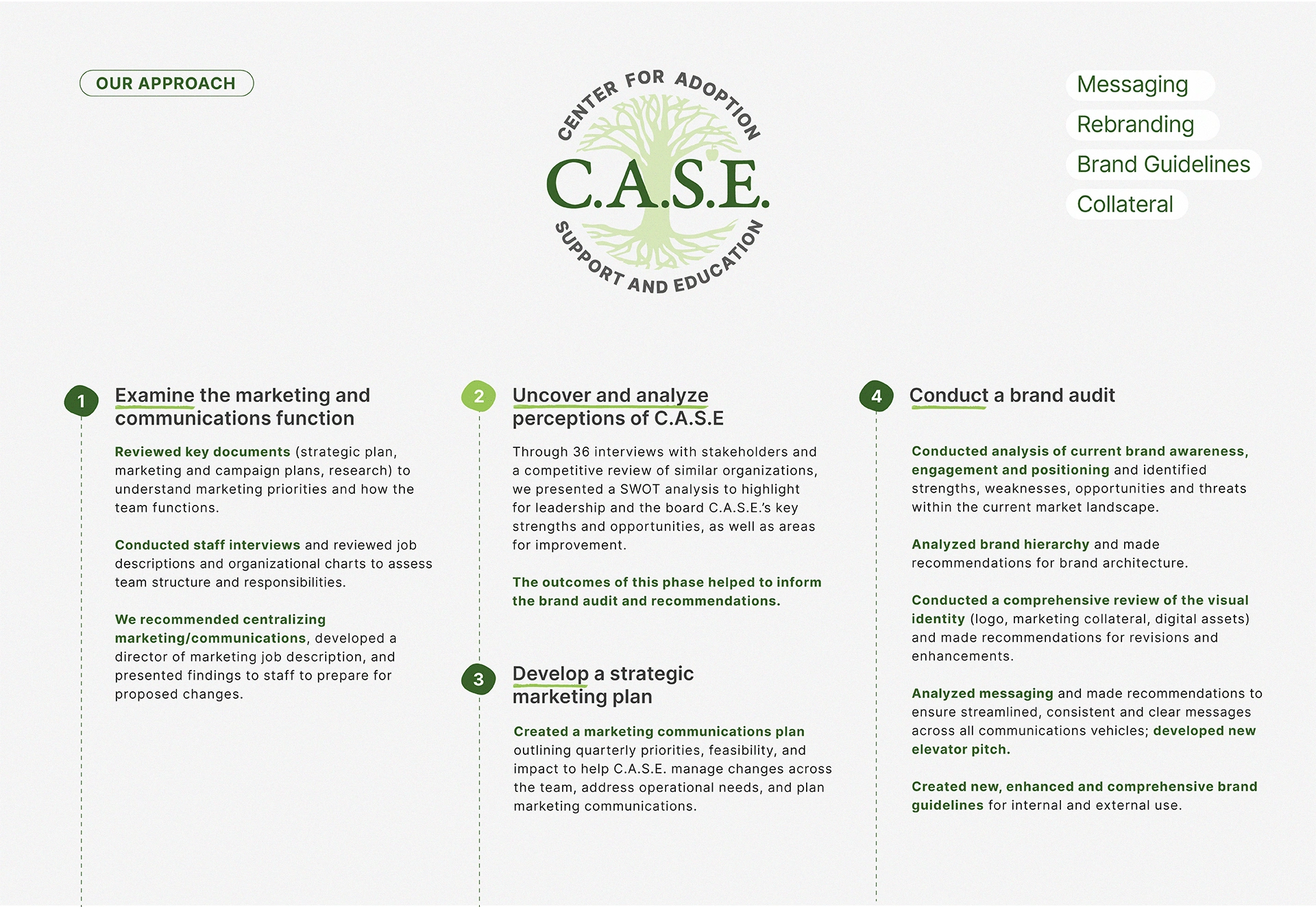
Our Approach
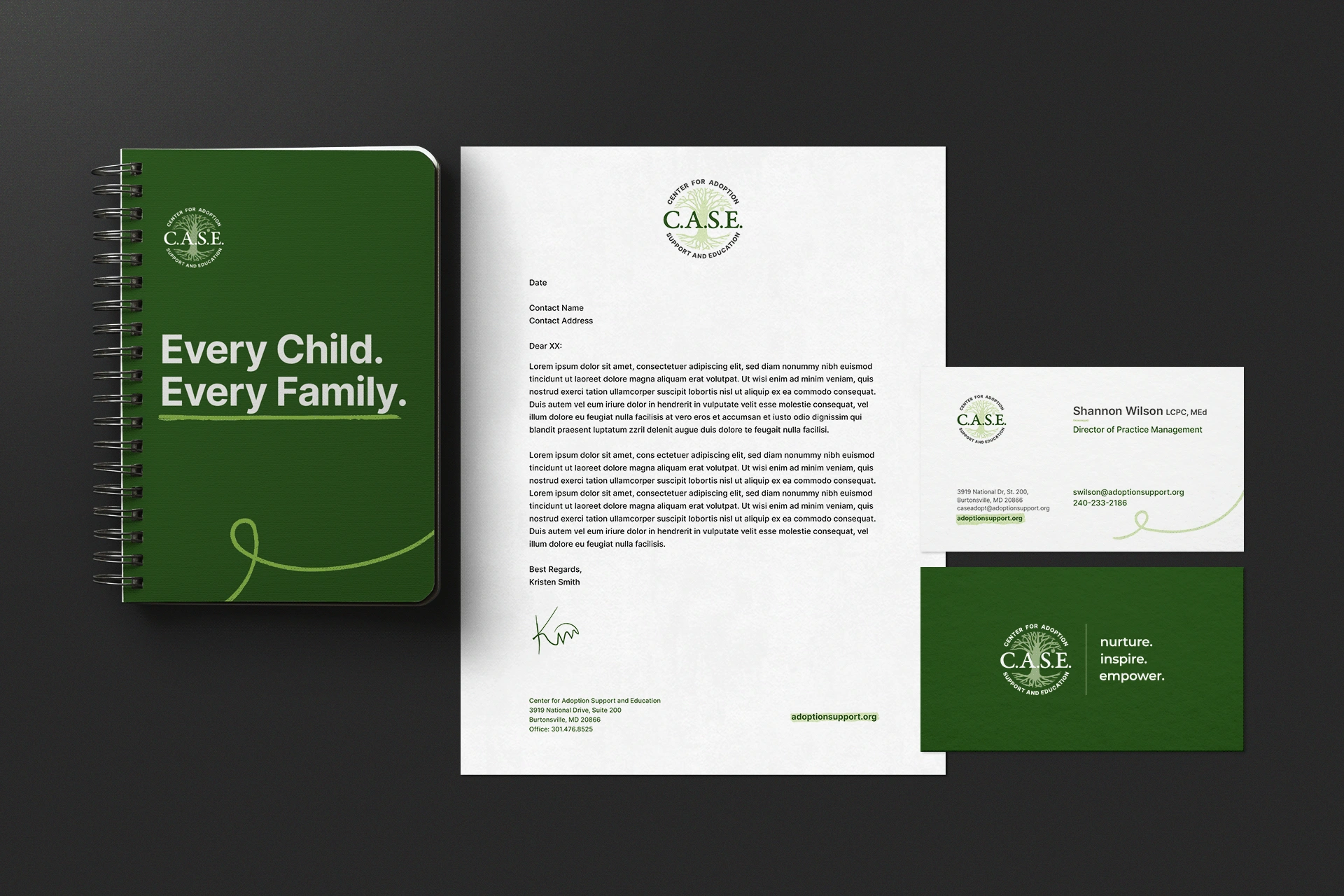
New Stationery
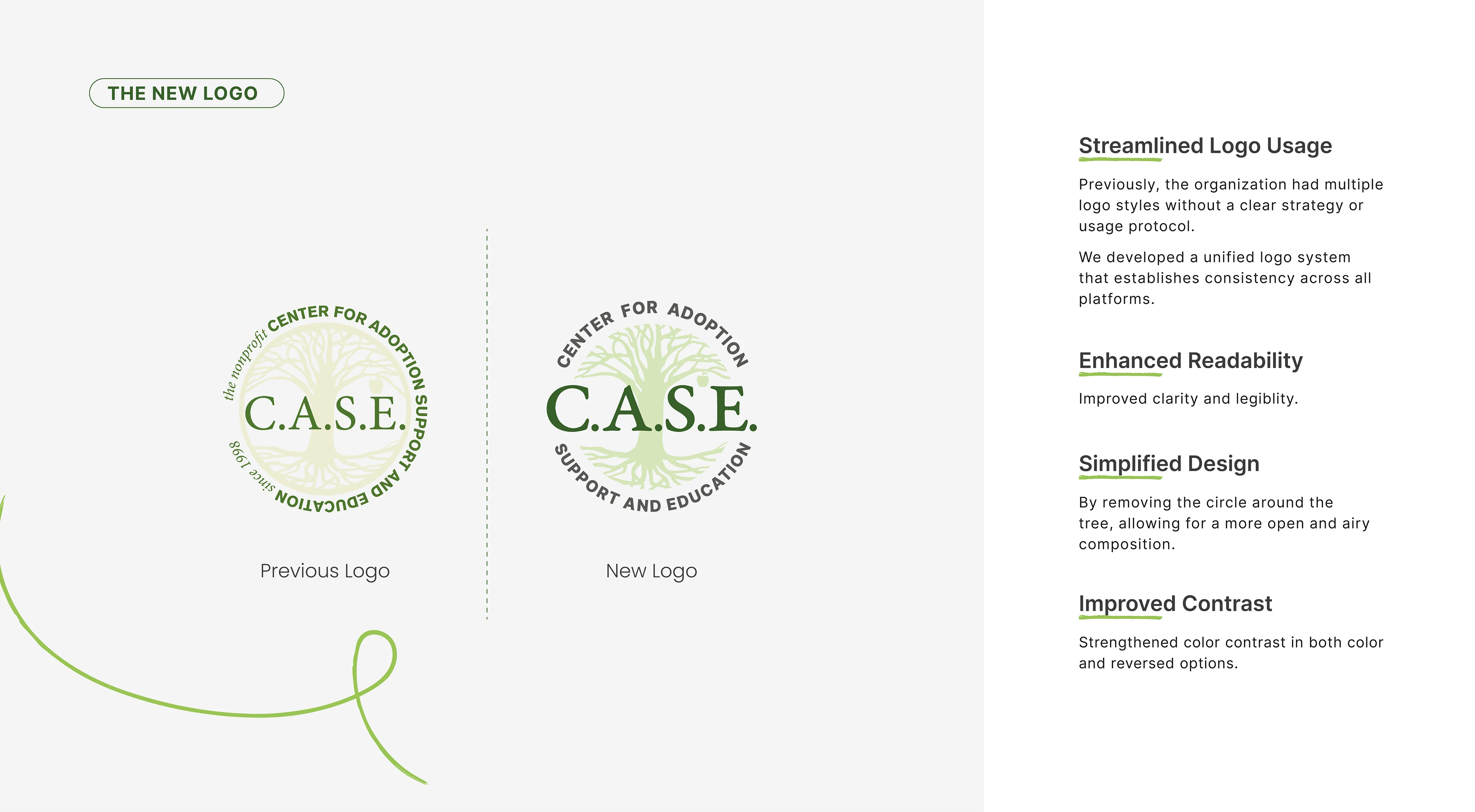
Improved Logo
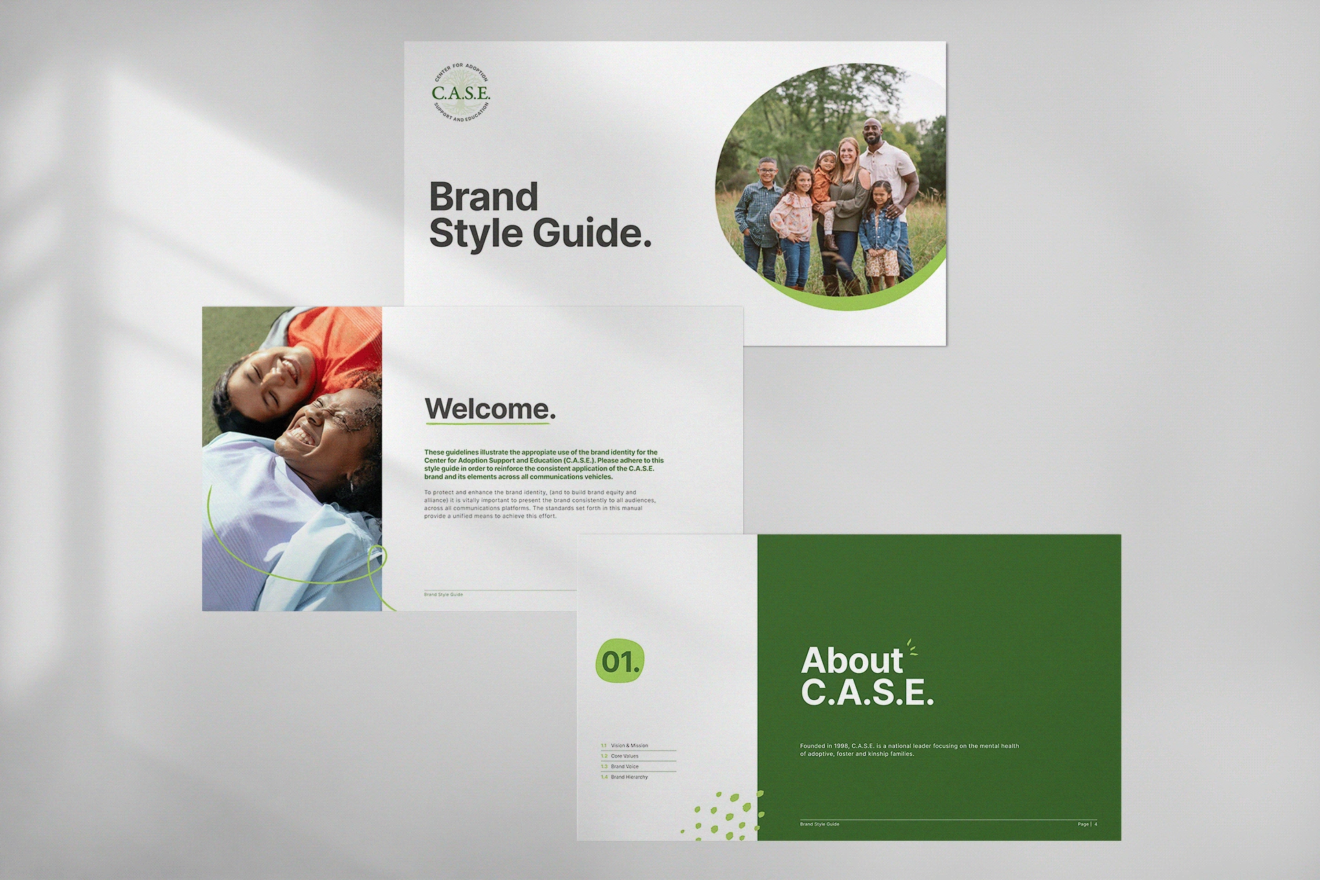
Brand Style Guide
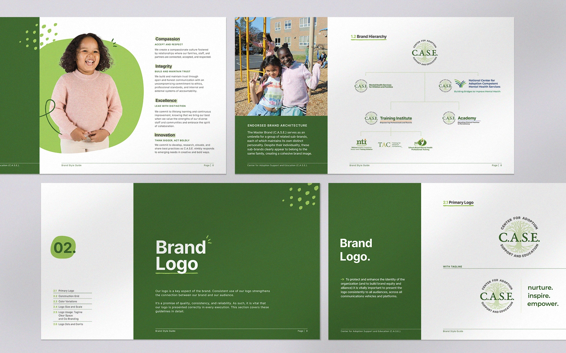
Brand Style Guide
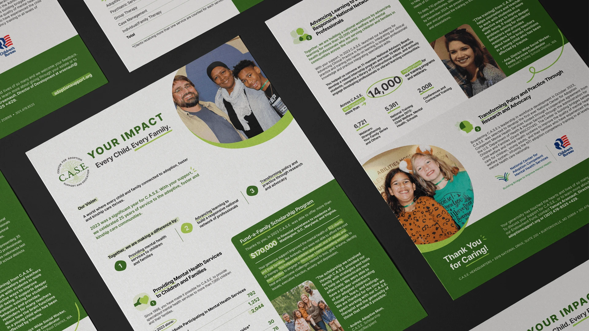
Impact Flyer Design
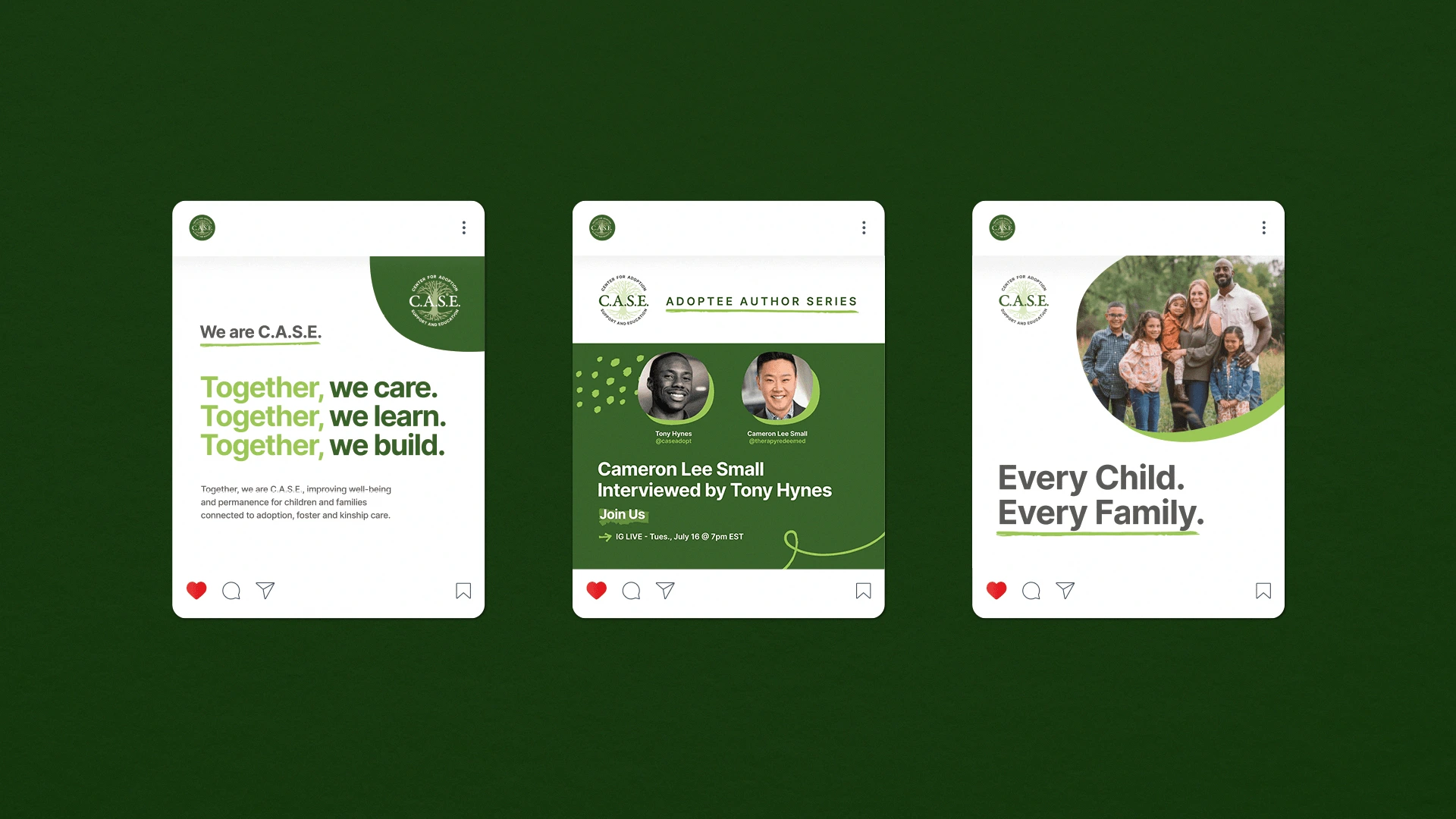
Social Media Templates
Like this project
Posted Dec 11, 2024
We refreshed C.A.S.E.’s brand with a redesigned logo and a cohesive graphic system, unifying their communications to better reflect their impact.
Likes
0
Views
4
Clients
C.A.S.E.