Fria Beauty
Jessalyn Bondoc
Fria Beauty
Fria Beauty is a clean beauty brand dedicated to enhancing natural beauty through pure and sustainable products.
Objective: Design a sophisticated and minimalist logo that captures the essence of Fria Beauty’s commitment to natural beauty. The logo should embody purity, simplicity, and freshness, inviting customers into a world of radiant skincare.
Design Approach:
Style: Minimalist, elegant, and clean.
Color Palette: A soft and clean color scheme that evokes nature and purity. The colors should promote calmness and freshness.
Typography: The font should be elegant but not overly decorative, conveying luxury and simplicity in harmony.
Deliverables:
Primary Logo: A refined logo suitable for use across digital platforms, packaging, and promotional materials.
Brand Guidelines: A document outlining color usage, typography, iconography, and placement rules to ensure a consistent and cohesive brand identity.
Outcome:
A visually appealing and sophisticated logo that embodies Fria Beauty’s commitment to clean and natural beauty. The design will reflect the brand’s values of purity and simplicity, resonating with eco-conscious customers seeking a luxurious yet natural skincare experience.
Gallery
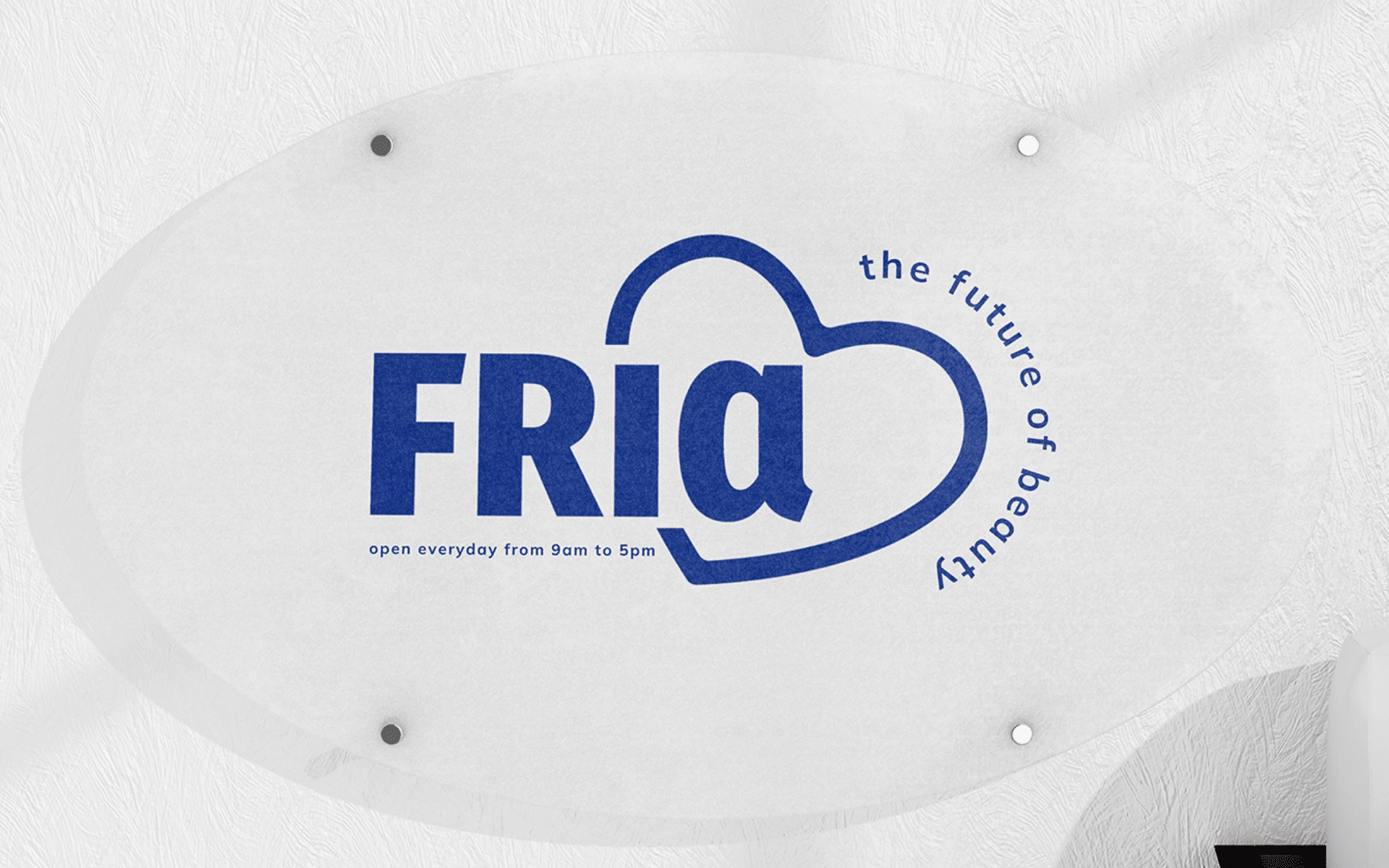
Logo Design
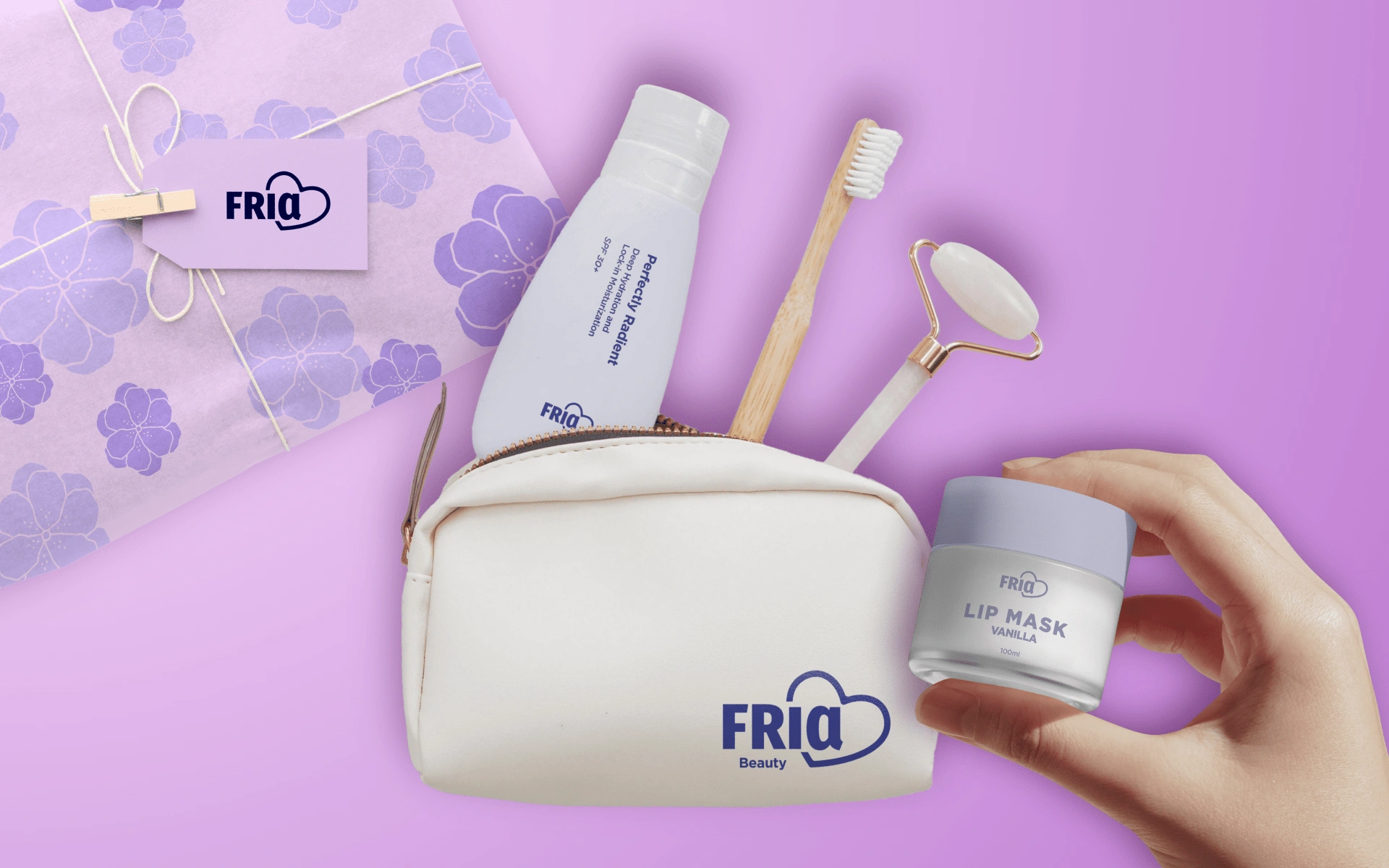
Product Packaging Mockup
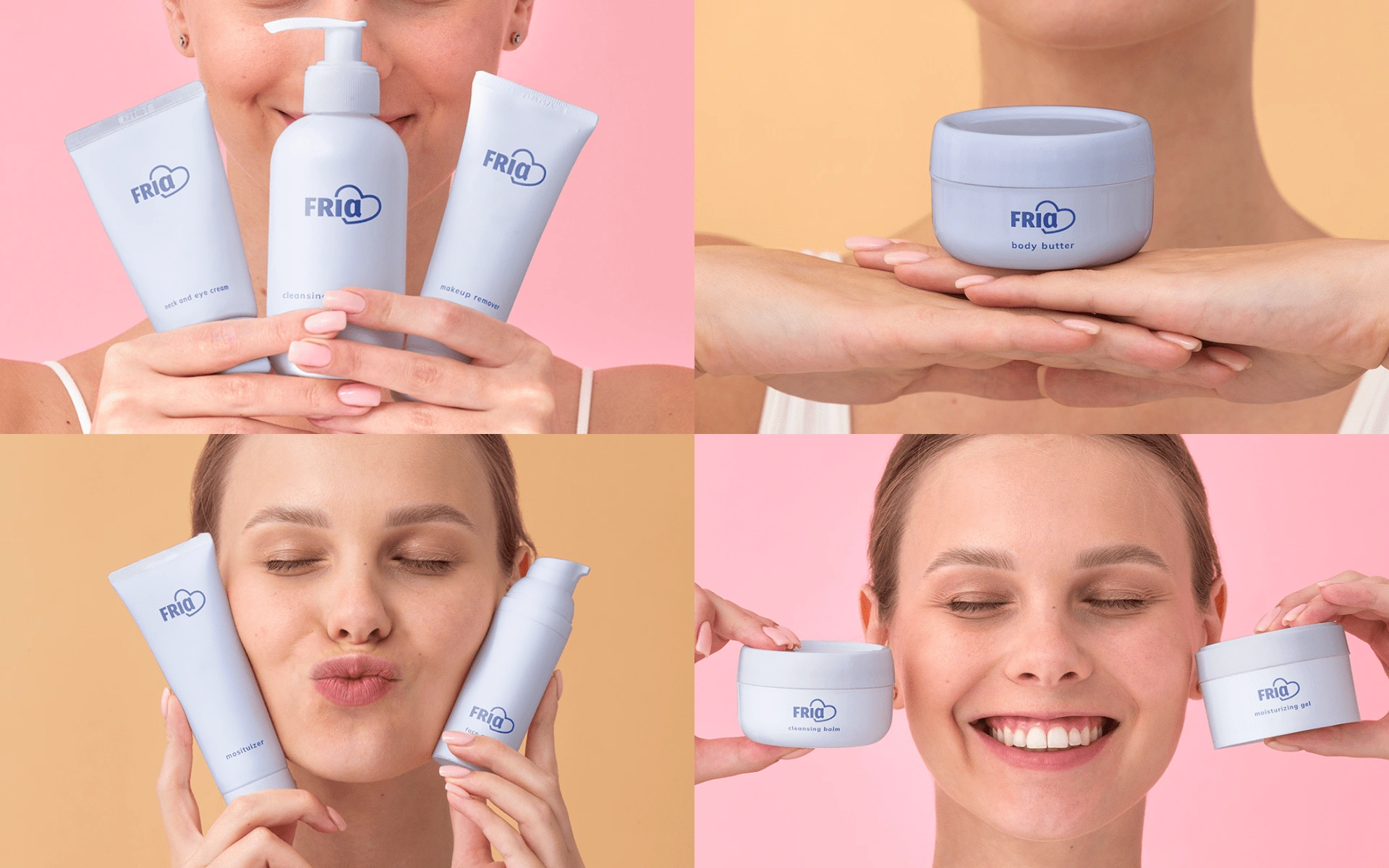
Product Packaging Mockups
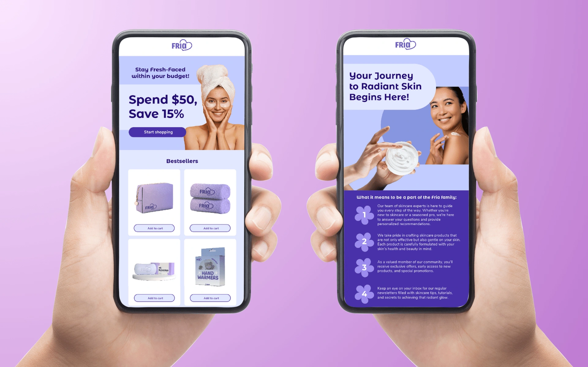
Email Designs
Like this project
Posted Sep 25, 2024
Branding for a clean beauty brand, Fria Beauty.