USMLE Vault — Product Redesign

Jaideep Singh


The challenge
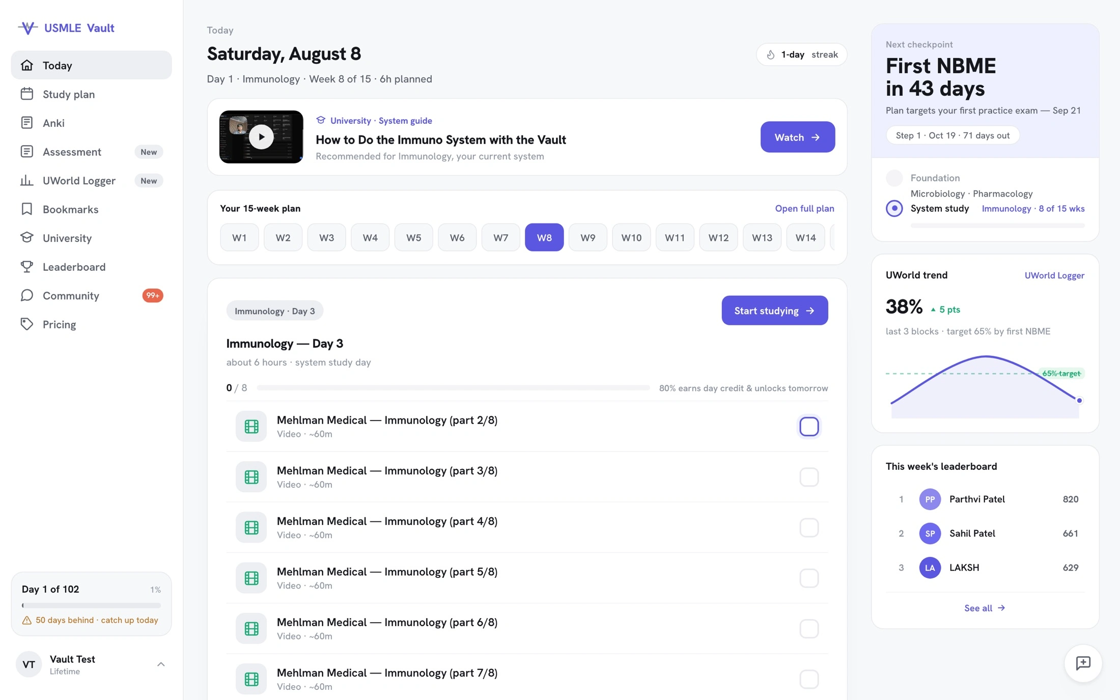
USMLE Vault had strong content and real students, but the product experience had drifted screen by screen. The interface relied on 3 typefaces, competing colors, decorative effects, and emoji-led navigation. Key study workflows were hard to find, especially on mobile.
What I did
I designed and coded the redesign in 2 weeks, working across the landing page, dashboard, study plan, library, and Anki study session. The agreed work shipped directly to production React.
The work included
A calmer visual language, codified as a 25-rule system in the repository
A study plan with clear context, progress, and less instructional noise
A library structured around the curriculum, with a consistent icon system
A focused Anki session that turned a 138-card dump into a scoped daily session with a finish line
Mobile-first UI and interaction states, built without a mockup handoff
Design and engineering in one loop
The founder was rebuilding the scheduling engine in parallel. I read the implementation intent from the commits and diffs, then folded the rewrite into the redesigned experience with 1 conflict and a green build.
The output was working code, not a file for another team to recreate. The team retained the visual rules and the shipped product surfaces to build from.
Result
4.2× weekly product revenue after the redesign went live, from $363 to $1,537 a week.
10+ core screens redesigned and shipped to React, with 0 mockup handoffs.
What shipped
A documented visual language across landing, auth, onboarding, dashboard, schedule, focus mode, and Anki
Core flows implemented in production React
A safely merged backend scheduling-engine rewrite
A rulebook the team’s agents can follow as new screens are built
Designed on the canvas. Shipped to code. No handoff.
Like this project
Posted Aug 25, 2026
Designed and coded in 2 weeks: USMLE Vault’s core study flows, shipped to production React with a 25-rule visual system and no mockup handoff.