Motivate You to Study — UI/UX Case Study of Online Course App

Bulan Cahyani


Disclaimer: The work is part of the Skilvul Kampus Merdeka UI/UX Design Batch 3 — 2022.
Case Study Objectives:
To complete independent study of Skilvul Kampus Merdeka UI/UX Design Batch 3–2022
To understand and apply the design thinking framework in UI/UX learning
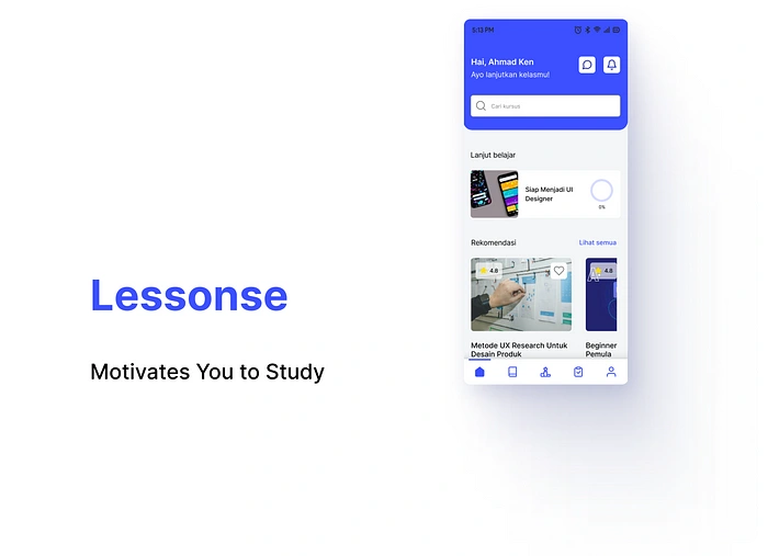
Lessonse Online Course App
With the increasing interest in online courses, the demand for online education platforms is also rising. Competition for online course provider platforms is inevitable, forcing providers to be the best in order to stand out and attract more users. online course platforms should also be able to satisfy users with features that can make them motivated, and feel that their learning efforts are worthwhile.
Lessonse is based on a simple idea: study the course and keep yourself motivated by scheduling what you want to complete.
My Role
Mentored by Syahdan Edy Murad, I collaborated with Geluh Tanaya, Alif Muhammad Shiddiq, and Haalhabsy in a team of 4 people. I play the role of team leader, user researcher, and UX designer. In the UX design process, I’ve been:
Conducting secondary research by conducting competitor analysis and looking for analytical data and research that might be able to assist the design process.
Defining problems based on research and identifying opportunities from there
Creating solution ideas that can overcome pain points and turn opportunities into reality
Arranging user flow according to user activity, from the beginning of registration to completion of the activity
Making the solution visualization a user-friendly experience via wireframe
Building a design system that contains components that will be used repeatedly while keeping the style simple and clear
Creating a user-friendly High Fidelity design based on wireframes that have been created
Creating prototypes that work according to user flow using Figma
Looking for participants for usability testing
Performing usability testing with real users based on user research stimulus and then creating user research data records
Project Specifications
Timeline: August 2022 — October 2022
Tools: Figma, Sheets, Docs, Zoom Meeting
Overview
This was a project to deliver a modern and convenient experience for people to conduct online learning that increases their learning motivation. Working on our debut project just starting out as UX designers, we came to this project with very little experience. It was exciting to take on the challenge of designing simplified solutions for complex flows.
Brief
Lessonse is an educational platform owned by Company X that provides various online courses to prepare digital talents in Indonesia by providing courses in the fields of Programming, Digital Marketing, UI/UX Design, Product Management, and many more. However, Company X has experienced a decrease in revenue since 1 year ago. Their research team has done a little research and found the causes of this case, namely
- Dissatisfaction with the display
- Complicated platform
- Long loading time
- Difficulty in finding the motivation to learn
Application Process Coverage
This application should cover the process of :
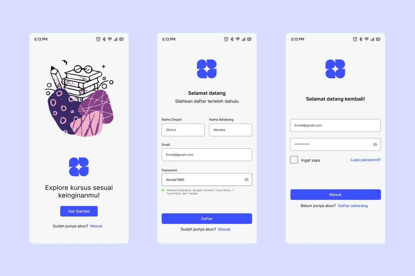
Account Registration
Login
Home
Course Details
Purchase
Learning Process
Problems
The user dissatisfaction with the appearance
The platform is complicated to use
Loading takes a very long time
The user has difficulty finding enough motivation to learn.
With the problems found, we as UX designers feel the need for a solution that can overcome these obstacles. That way, Lessonse online course platform will be able to meet users' needs and have a positive impact on company revenue.
Proposed Solutions
Based on research results, we were challenged to create an online course mobile application for Company X with the following objectives
Create an online course application with engaging visual and makes it easier for people to study and find the courses they want
Create an online course application that can motivate users to learn

Design Process
In this case, we use Design Thinking as our approach to the design process. Design Thinking is “human-centered” where the problem-solving process is carried out by prioritizing consumers’ needs above all else. We choose design thinking because using an observational and human-centric approach, we can identify problems based on what we see from user behavior, without asking them to verbalize it. That way, this method is able to define ambiguous problems. Design thinking can also help surface some of the unknown pain points that would otherwise have never been known.
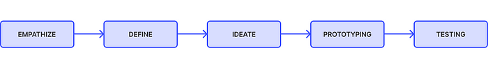
Design Thinking Stages
1 — Research
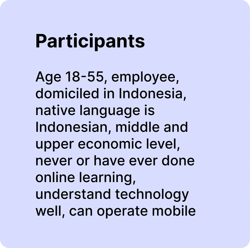
Design thinking is all about finding solutions that respond to human needs and user feedback. So this first stage involves stepping into the user’s shoes and building genuine empathy for our target users. By empathizing, we can uncover issues the users didn’t even know they had or that they could not themselves verbalize. Based on research conducted by Company X, the target users obtained are as follows
Age: 18–55 years old
Profession: Employee
Native Language: Bahasa Indonesia
Economic Level: Middle and upper-class
Other information that we get about the problems faced by users are
Dissatisfied with the interface design
The platform is complicated to use
Loading takes a very long time
Difficulty in getting the motivation to learn
In addition to this, we also conducted secondary research to obtain additional data such as competitor analysis, reference cases, analytical data, and other data to support the empathize stage.
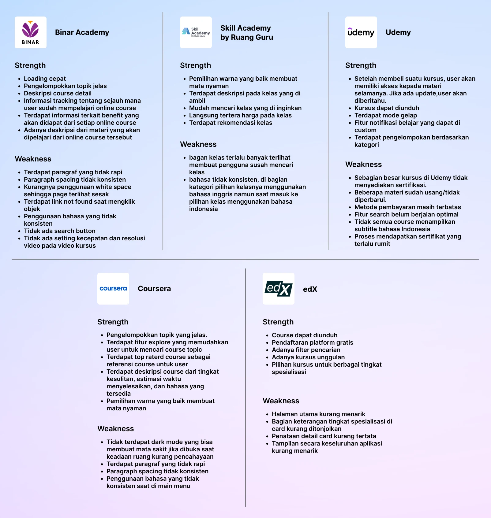
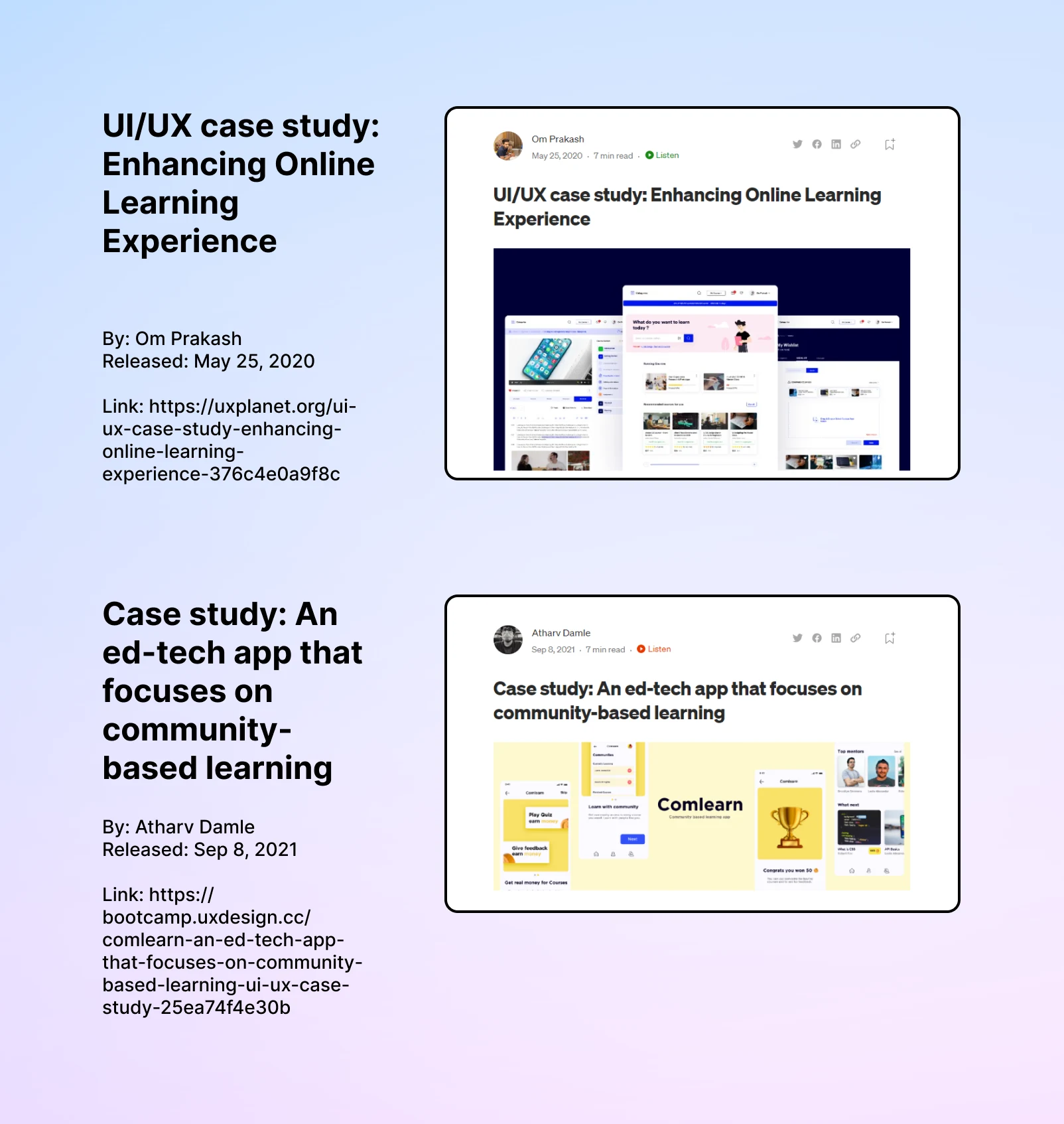
Secondary Research: Competitor Analysis, Reference Case Study
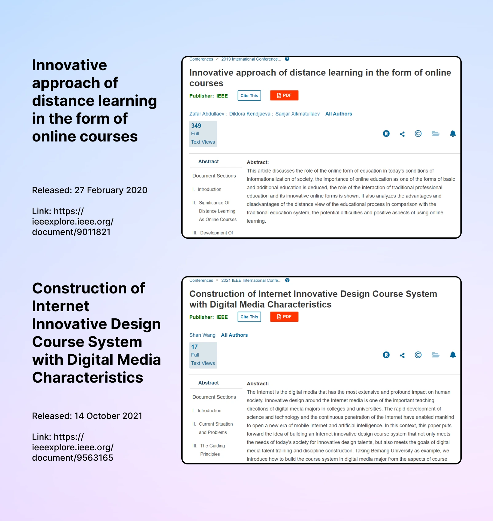

Secondary Research: Analytical Data, Research Data
2 — Define
In this second stage, we gathered our observations from the first stage to define the problem we’re trying to solve. It will guide the entire design process, giving us a fixed goal to focus on and helping to keep the user in mind at all times. We started our define stage with goals such as:
To uncover user pain points
To identify opportunities to improve the current process.

User Pain Points
After writing down all possible pain points, the problem becomes clearer. Next, our team determined how to turn those problems into opportunities with the help of How Might We. After voting, we decided that our design will focus on making it easier for users to use the application and increasing user motivation to learn.
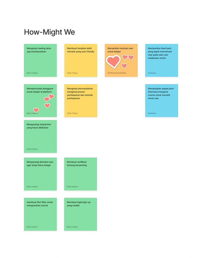
How Might We
After gathering a handful of pain points and opportunities, it was time to begin shaping the project scope. The goals to be achieved here were:
To determine what application feature would be most useful and helpful for users based on their feasibility
Map out and understand the user’s learning process to design a learning flow
Visualize potential design solutions and begin to formulate the product experience by planning an interface
Solution Idea
We used our imagination to explore as many ideas and potential solutions as possible. By focusing on the quantity of ideas rather than quality, we’re more likely to free our minds and stumble upon innovation.
“Imagination is the beginning of creation.” ~ George Bernard Shaw
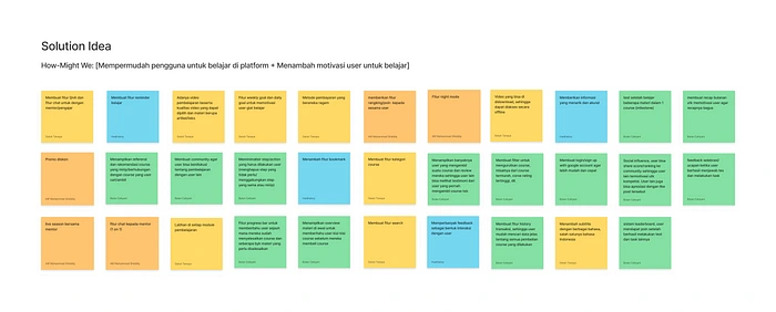
Solution Ideas
Affinity Diagram
We wanted to organize our ideas into groups based on their relationships, and therefore we use an affinity diagram. Affinity diagram cluster information in an organized manner so we can define grouping ideas easier.
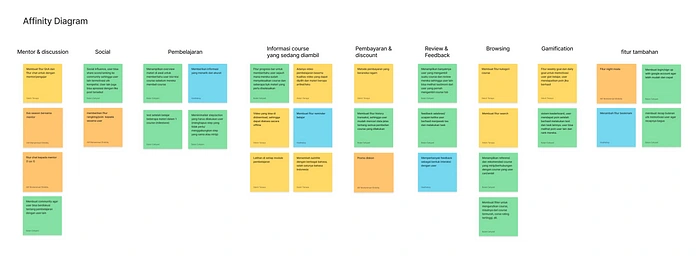
Affinity Diagram
Idea Prioritization
After completing the affinity diagram, we made an Idea Prioritization diagram to find the Minimum Viable Product. This stage helps to rank ideas based on their feasibility and impact by comparing their benefits with each other.
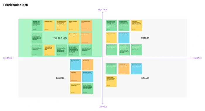
Idea Prioritization Diagram
Creating Flow
We created a User Flow that shows the path a user will take in the app to complete a task, from the registration process to the completion of the activity.
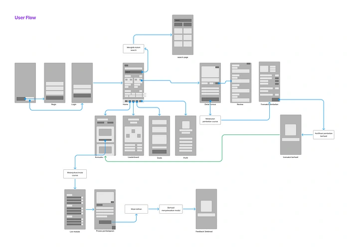
User Flow
Sketching a User-Friendly Experience
Next, we created a wireframe, namely the skeletal outline of an app, to help our team figure out the structure of the new design.
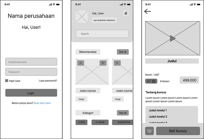
Wireframe: Login, Home, Course Details
3 — Design
After finalizing the wireframe and available data, we began the design process. Our goals at this stage were to:
Develop a design system for Lessonse that is simple, professional, and considerate
Design the mobile application interface in high-fidelity
Design System
Design system aims to maintain consistency on every interface page. This system contains components that will be used repeatedly, making it easier for us to compose the UI.
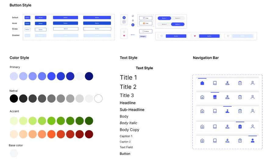
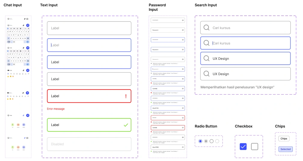
Lessonse Design System
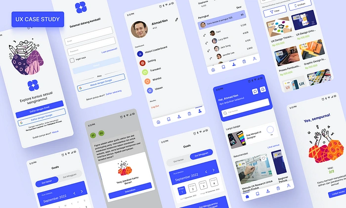
UI Design
Equipped with research and exploration, we started developing our wireframes and bringing the application to life by creating designs with great precision. The goal was to create an attractive and user-friendly design, which is able to attract users and make them comfortable using it.
High Fidelity UI
4 — Testing
We used the prototyping tool in Figma to link flows together for a number of scenarios to validate the design and check if there were any holes that could be fixed. The goals here were:
Making prototypes and prep the design for usability testing
Conduct and analyze user tests to measure the impact of the design and whether there are errors during the use
Prioritize feedback to improve and optimize the design
Prototype
After the system design is complete, we continue the process of making a high-fidelity design and then a prototype, according to the wireframe, and using the design system.
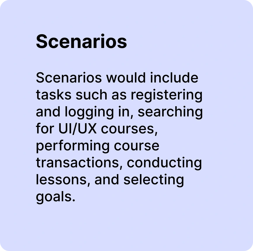
Usability Testing Plan
At this stage, we plan test scenarios for structured execution.
User Testing and Results
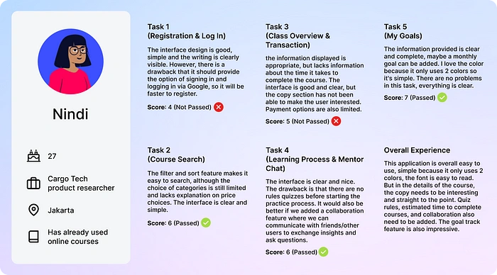
User Feedback (1)
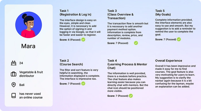
User Feedback (2)
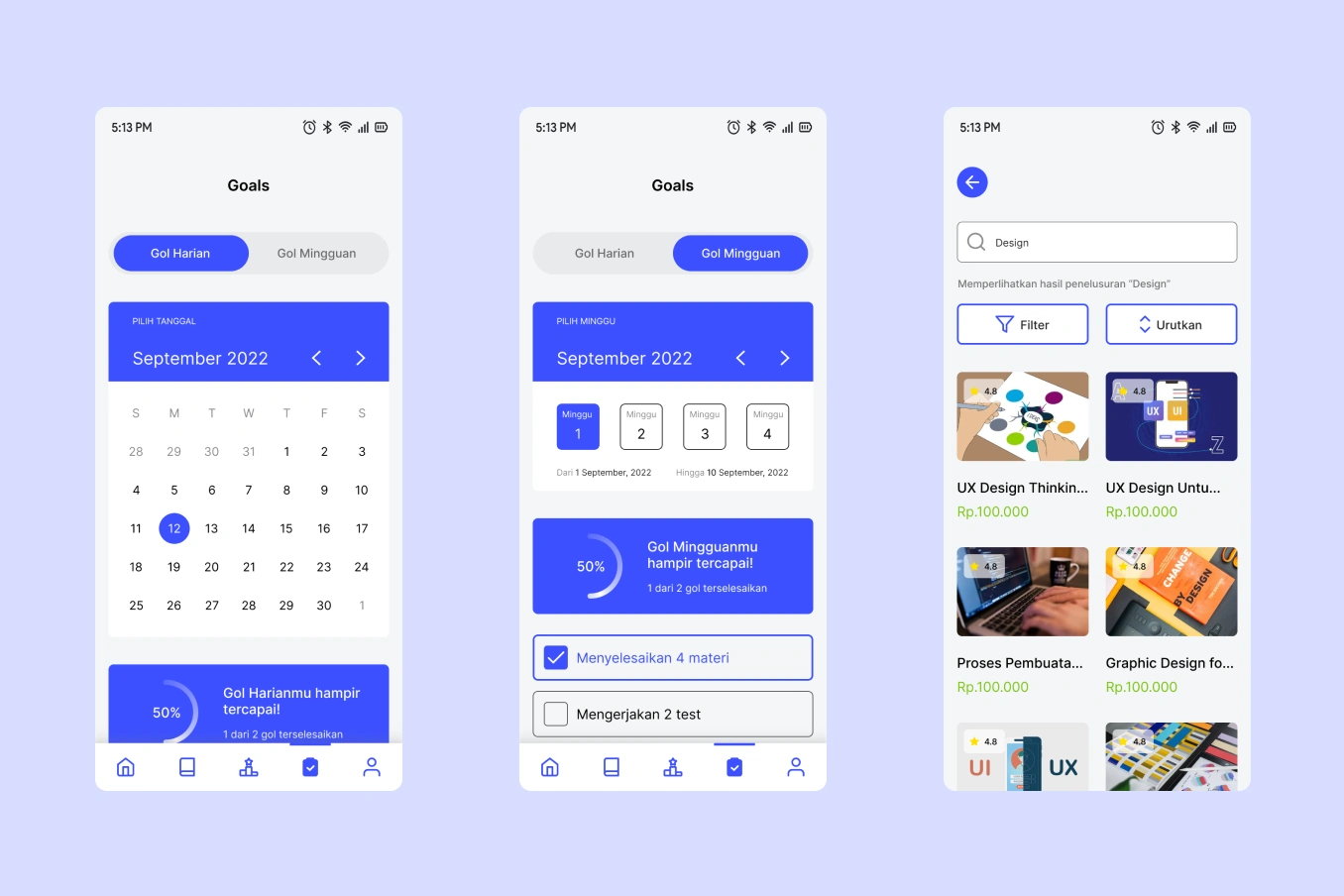
There are repeated problems regarding the unavailability of the option to register through Google which causes long registration and login process. Another obstacle experienced by all participants is the lack of payment method options in the course transaction section, so users who do not have available payment methods or are not ready with a limited choice of methods will find it difficult. All participants feel that the filter and sort feature greatly simplifies the search process and that My Goal feature can motivate users to learn. In terms of interface design, all participants were satisfied and even said “impressive!”.
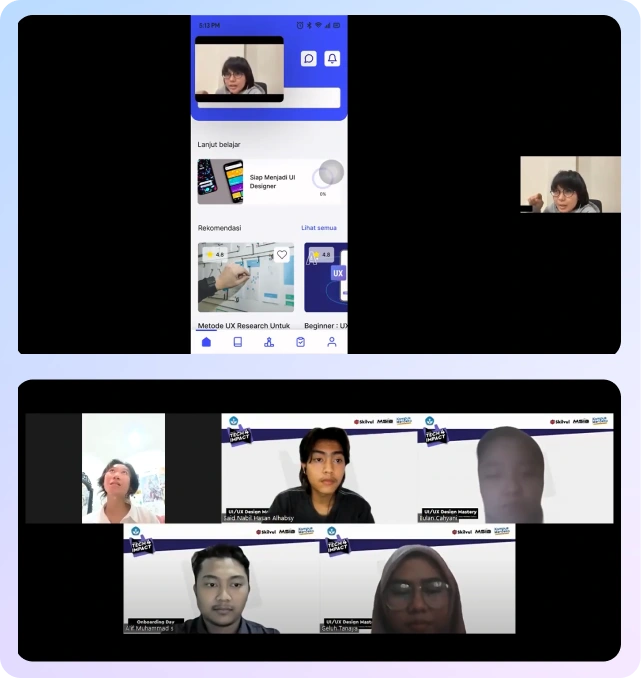
Testing Documentation
Takeaways
There has been repeated feedback regarding the choice of signing up via Google and adding payment method options. All participants mentioned that the Goal feature was impressive and very helpful to motivate them to study. Although the success rate in this test is not optimal, we are happy to be able to gain experience thanks to this first project. We also feel it is important to fix these problems and optimize the user experience of this application.
Next Steps and Learnings
Due to the many constraints regarding the registration process, simplifying and streamlining account registration will be the next important step in Lessonse development.
This project also has taught me many things, including:
I learned the importance of listening to users
Designing solutions to the most consistent problems
Working on UX projects in a structured manner
It is important to look back at the empathize and research stages to keep the project on track and in line with the original problem.
Designing with a consistent design system from the start is also very important so that the design doesn’t change every time the interface is edited.
How users value their time so much that it’s important to display how long it takes to complete an activity.
Like this project
Posted Aug 30, 2023
With the increasing interest in online courses, the demand for online education platforms is also rising. Competition for online course provider platforms is i…
Likes
0
Views
14