🍦 Brand Identity for Sweet Melts: Where Fun Meets Flavor
Lorena Alvarez

Description
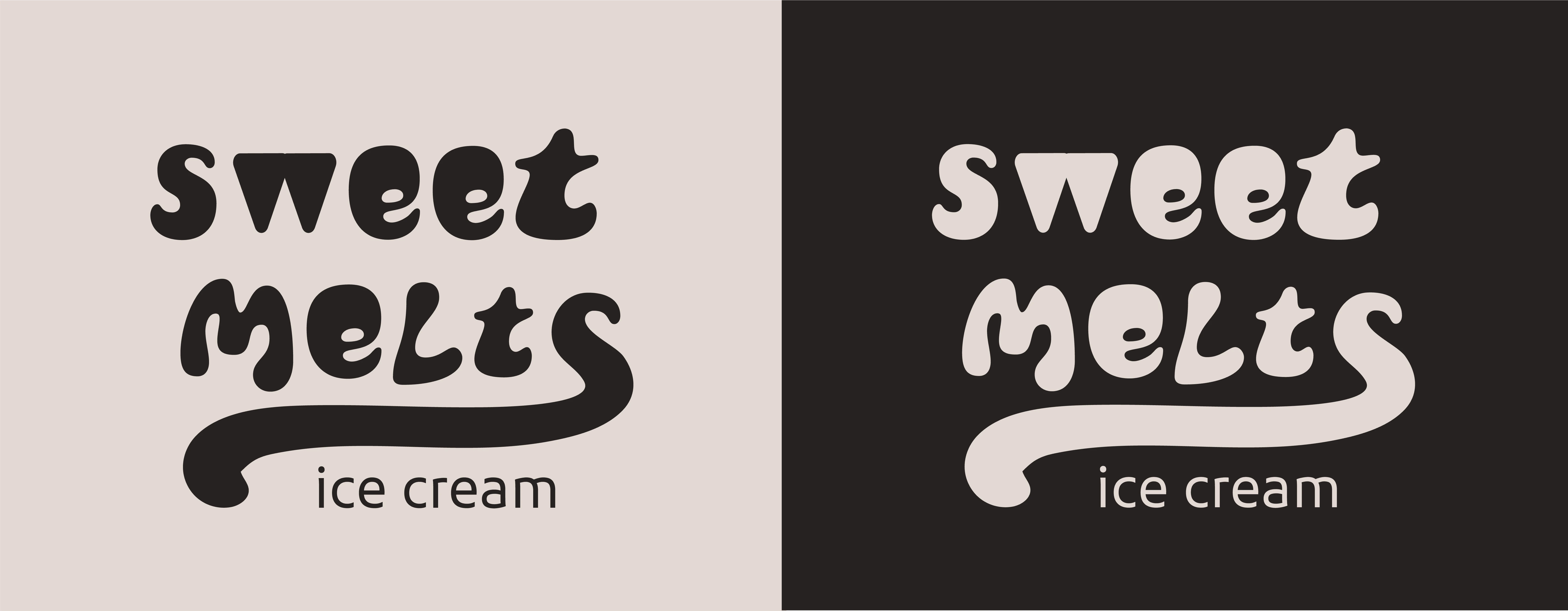
Sweet Melts is a company that makes and distributes delicious organic ice cream. The target audience is college students. Because their flavor combinations are exciting and bold, I looked at bright colors for elements that could be used in the branding that could convey a sense of sweetness and deliciousness.
My Role
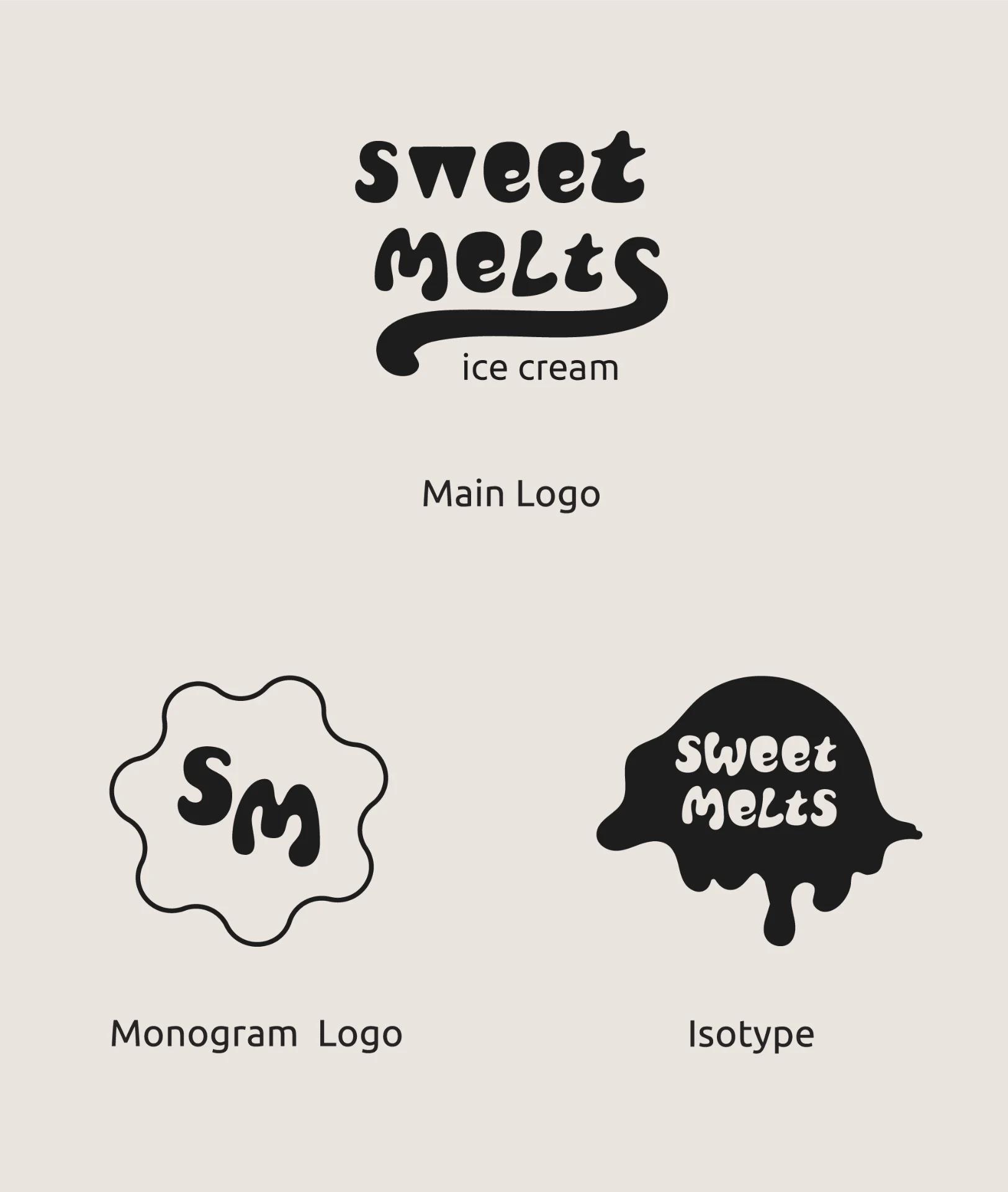
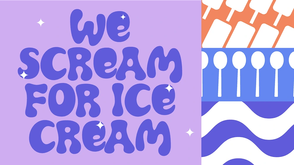
I created a branding package for this ice cream brand. As part of this, I created a consistent visual system and logo for Sweet Melts. The design is inspired by different shapes, waves, blobs, and other forms of seeing ice cream. The typography choice and the bright contrasting color palette keep the brand flashy and fun.
Logo Design
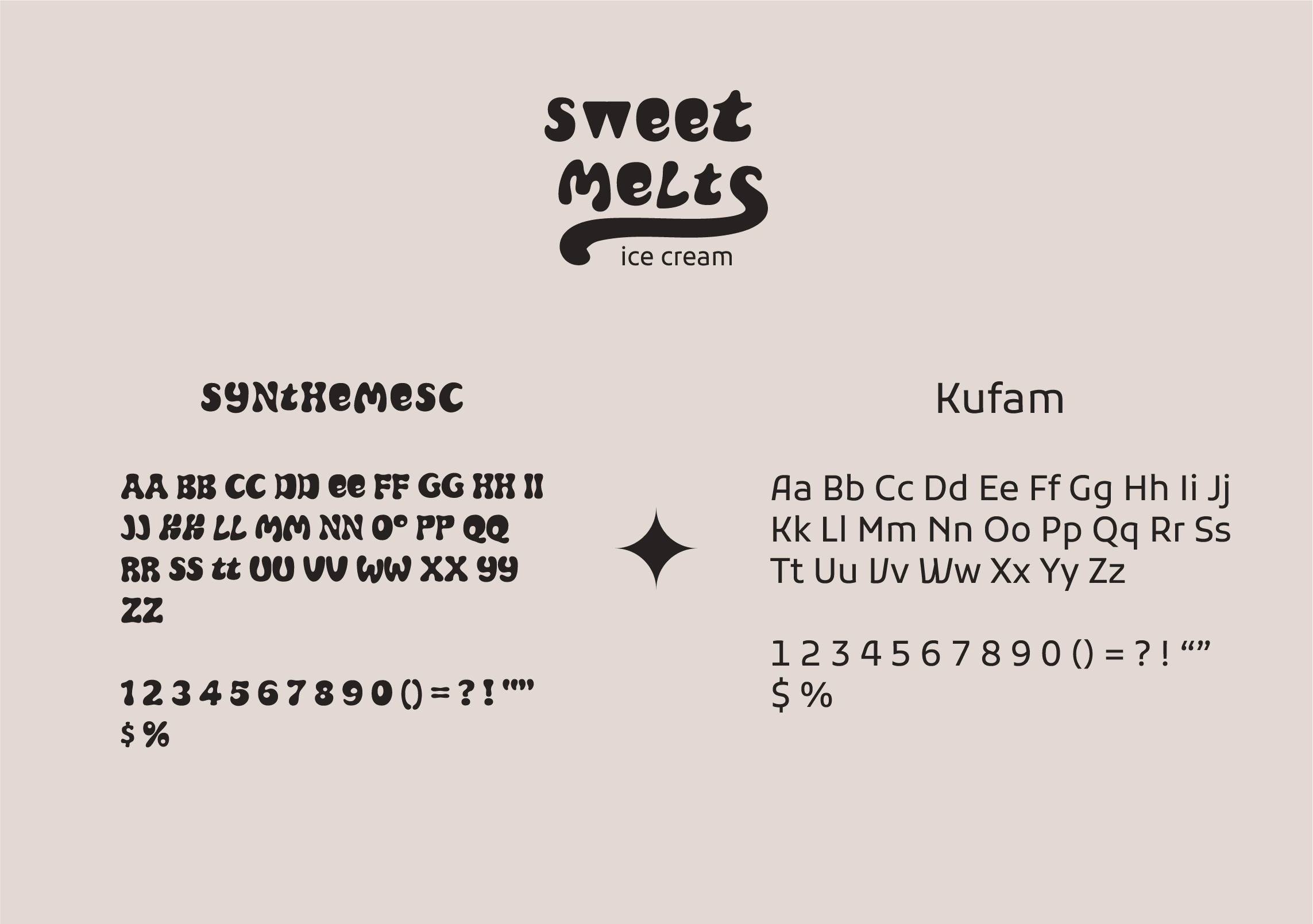
Typefaces
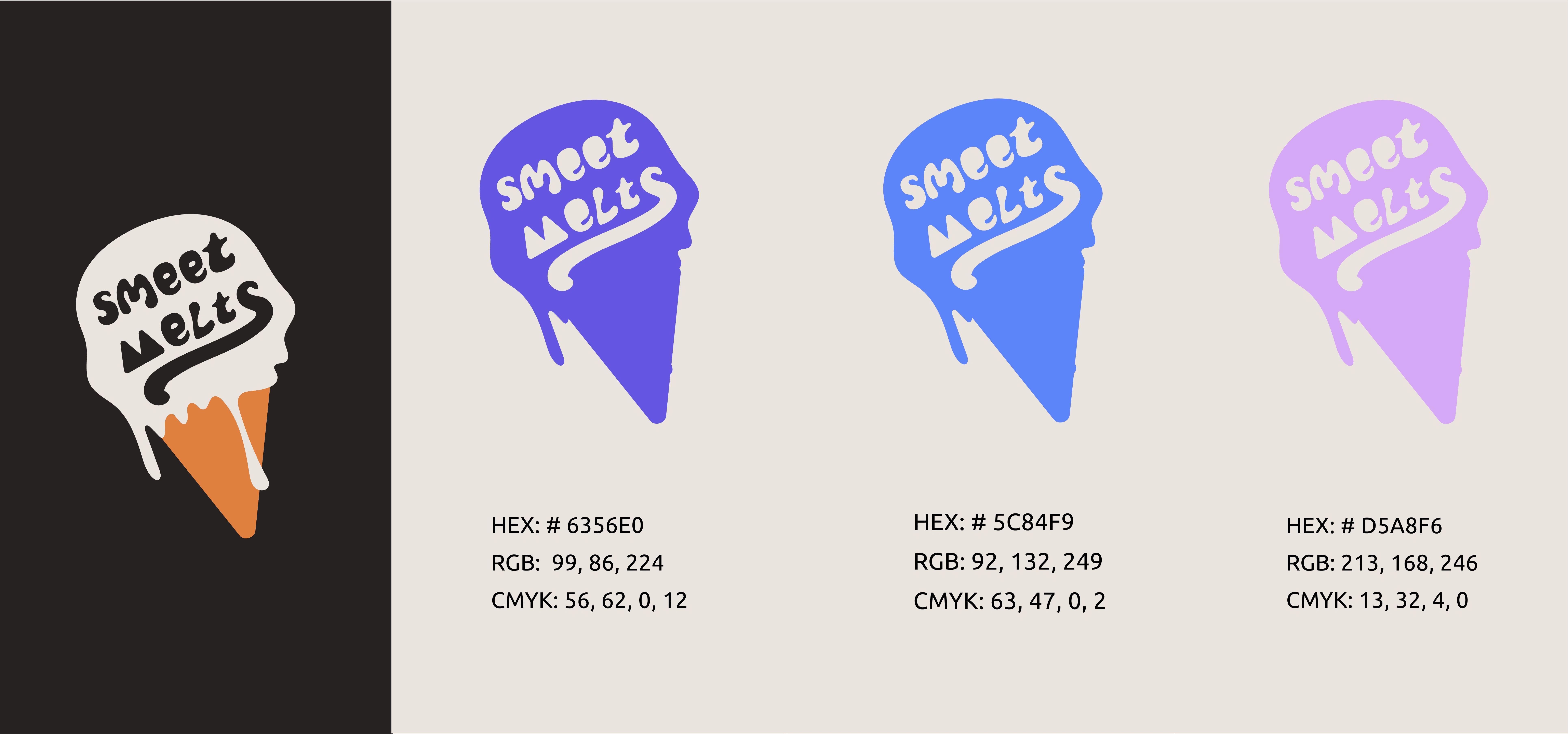
Color Palette
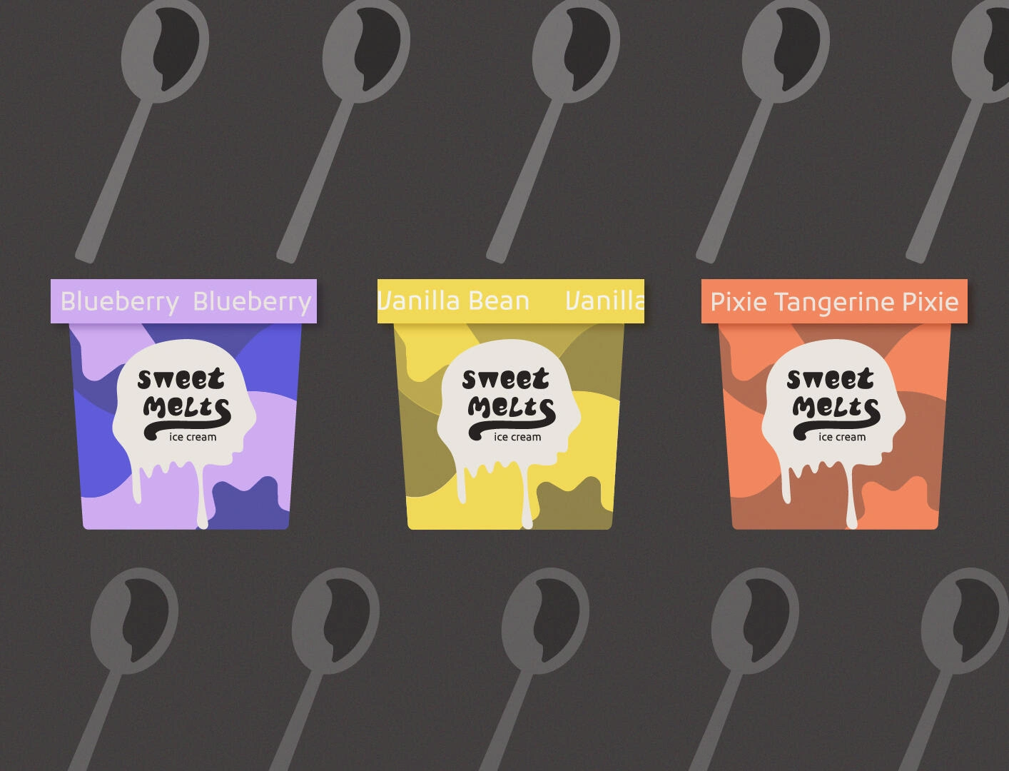
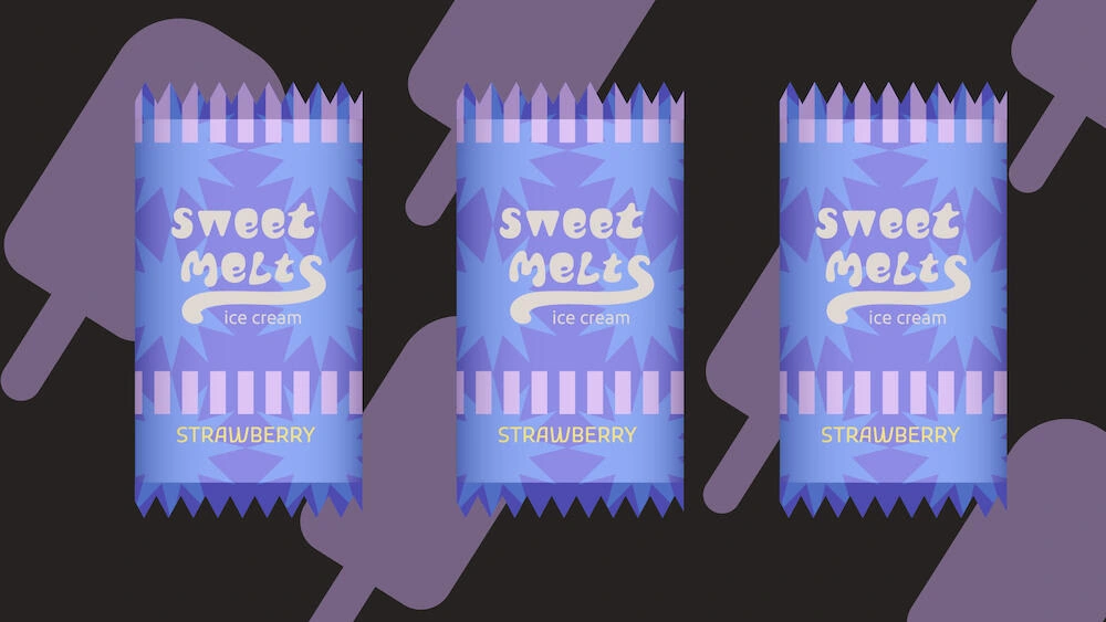
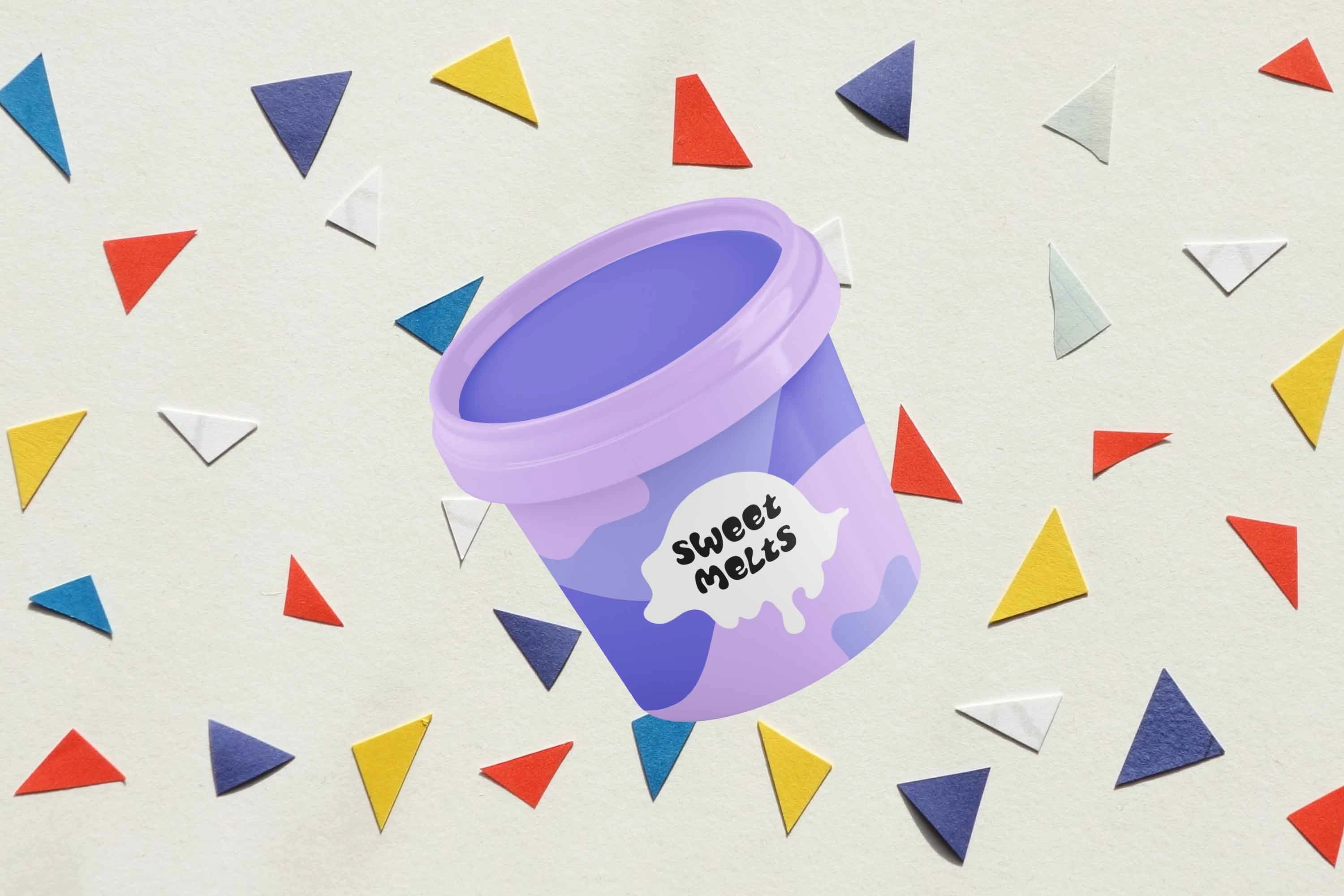
Packaging
The Outcome
Sweet Melts ice cream wants to convey the feeling of walking the streets with flavorful scoops in hand during the summer months. When I think of ice cream, the words creamy, flavorful, and friendly come to mind. Keeping those adjectives at the forefront, I drew different shapes for each flavor that mimic the swirly, smooth appearance of ice cream. The color scheme was selected based on the flavors. I chose a typeface that had a fun and quirky feel. Then, I customized some letters of the font to make the brand more unique and emphasize the creaminess of ice cream.

Like this project
Posted Aug 17, 2023
Conceptualized and developed a comprehensive branding identity for the delightful ice cream brand, Sweet Melts.