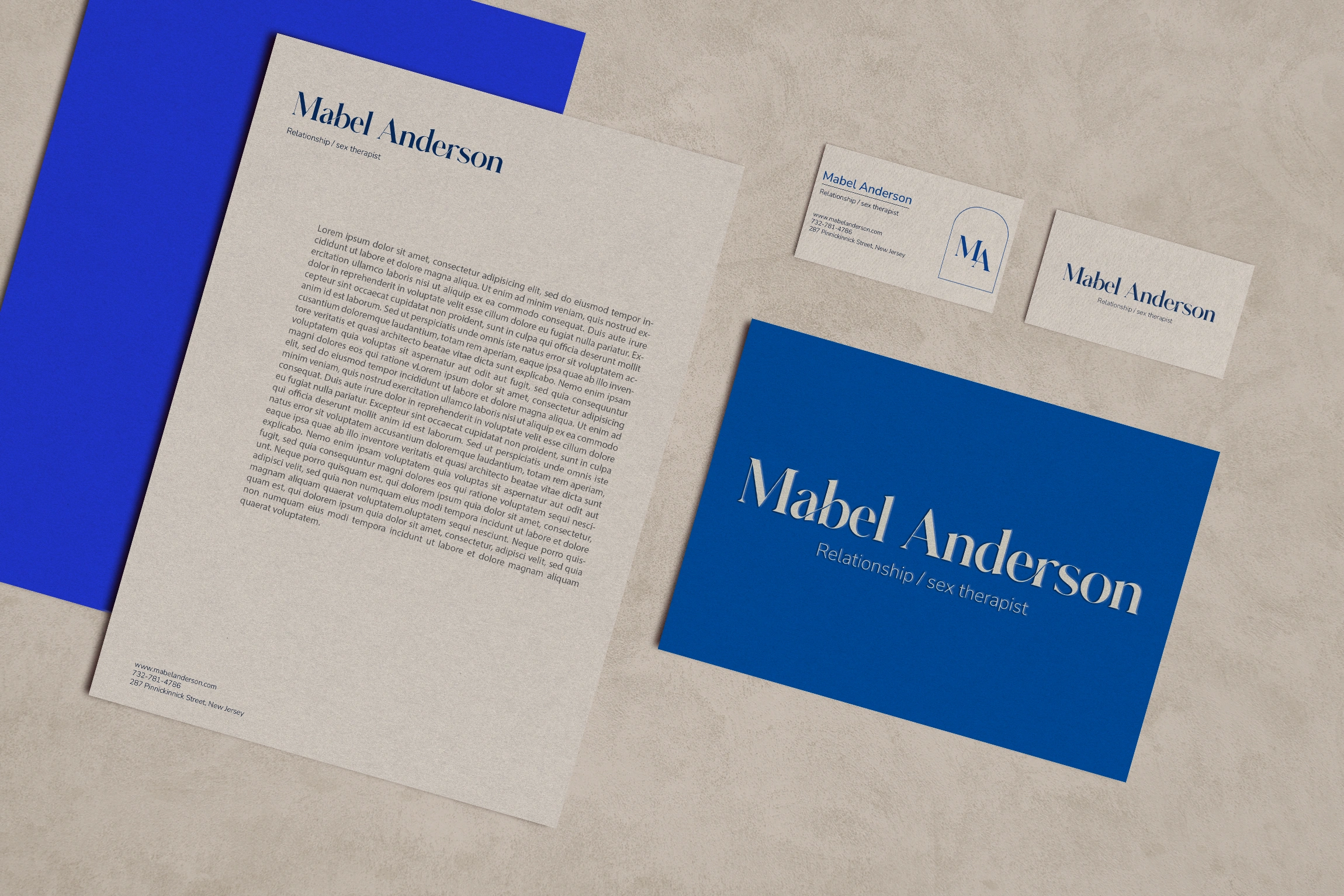
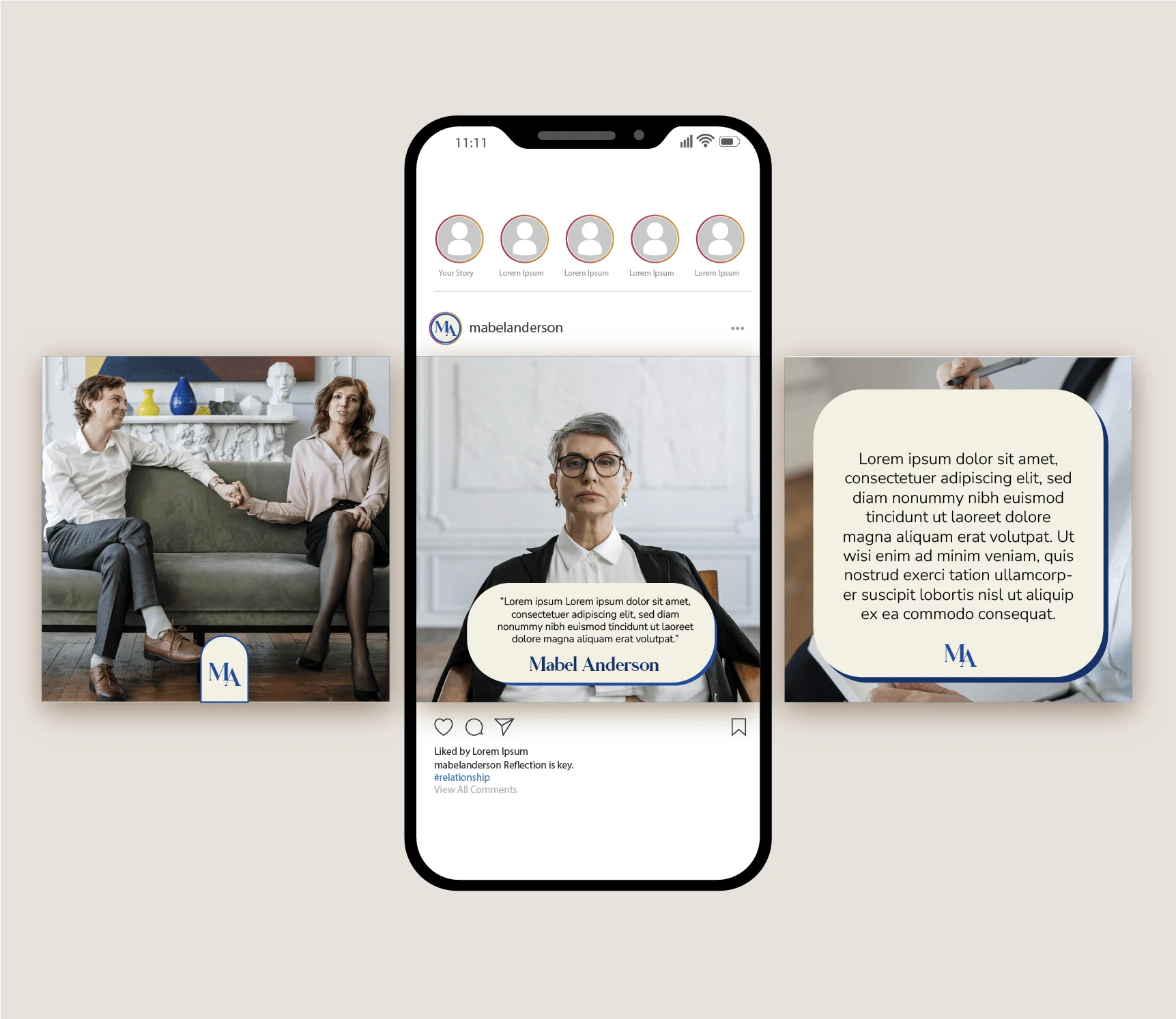
Mabel Anderson
Gunel Ibrahimli
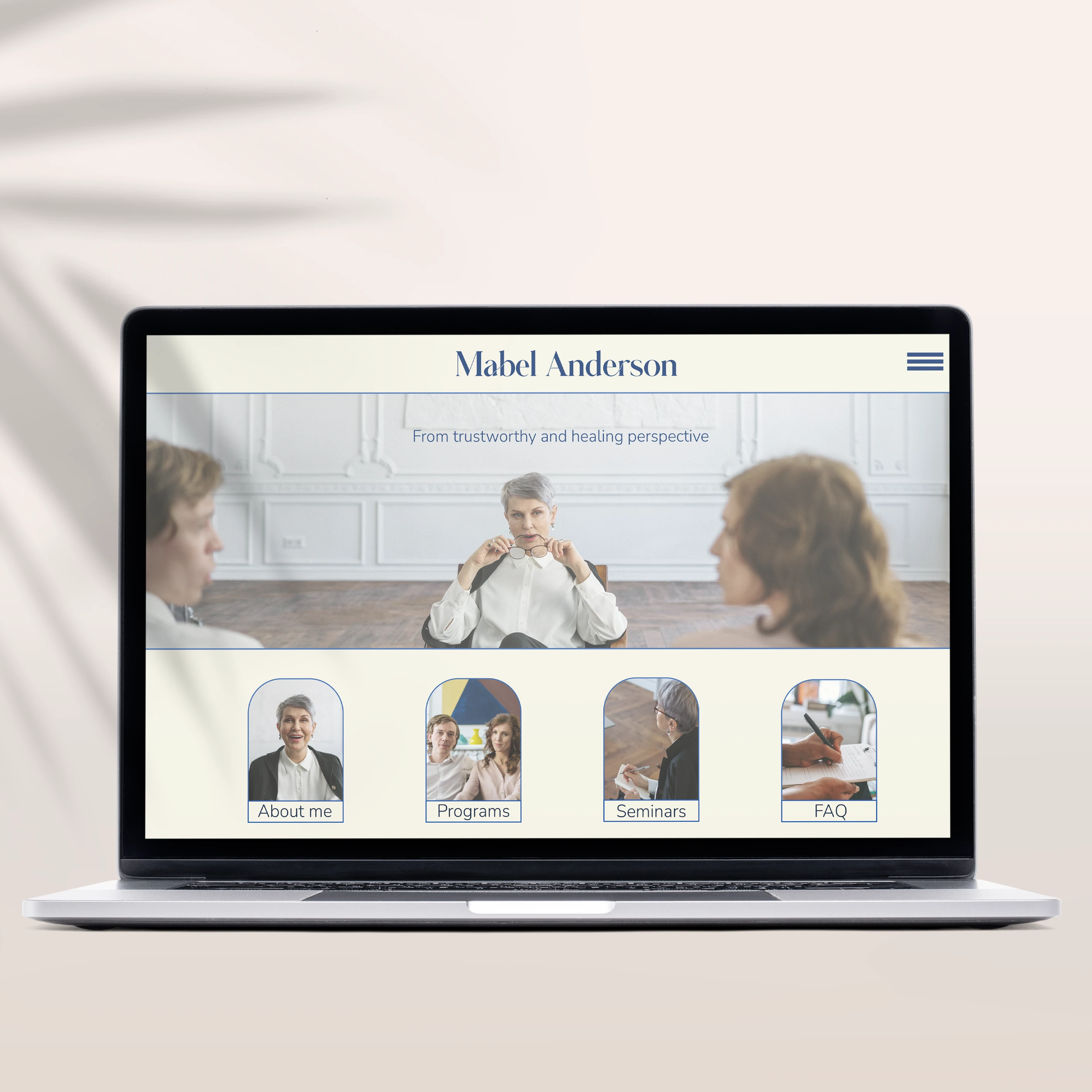
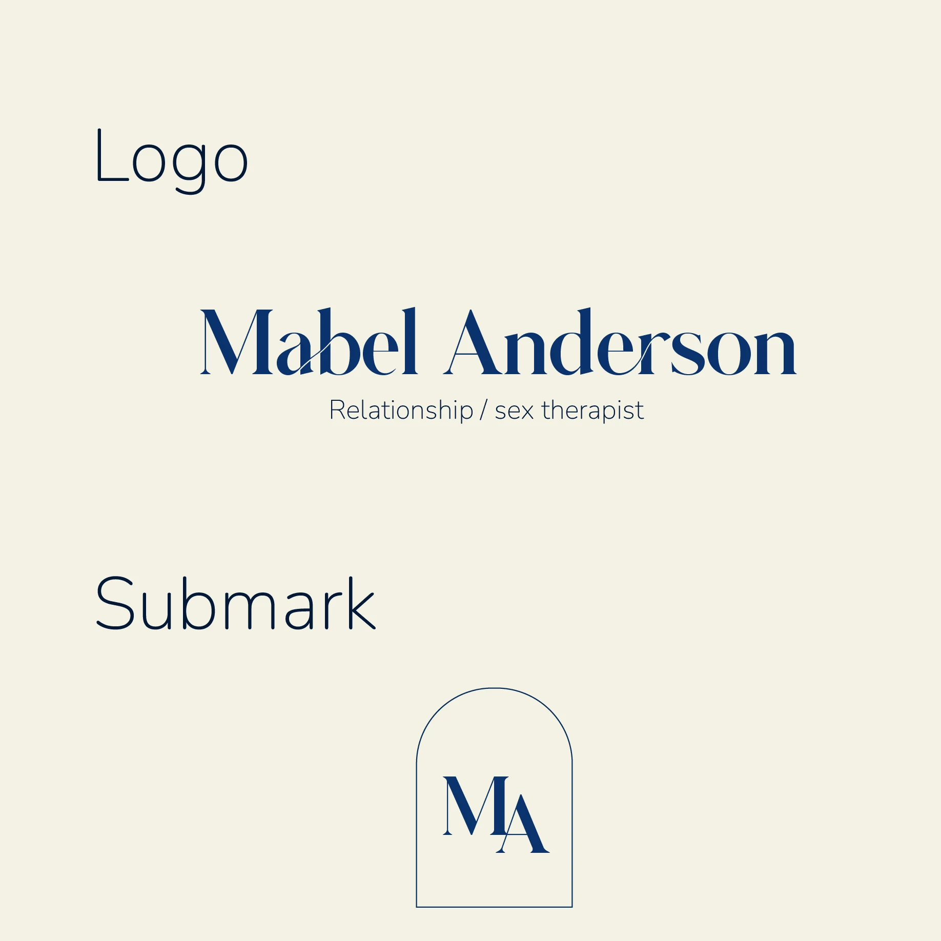
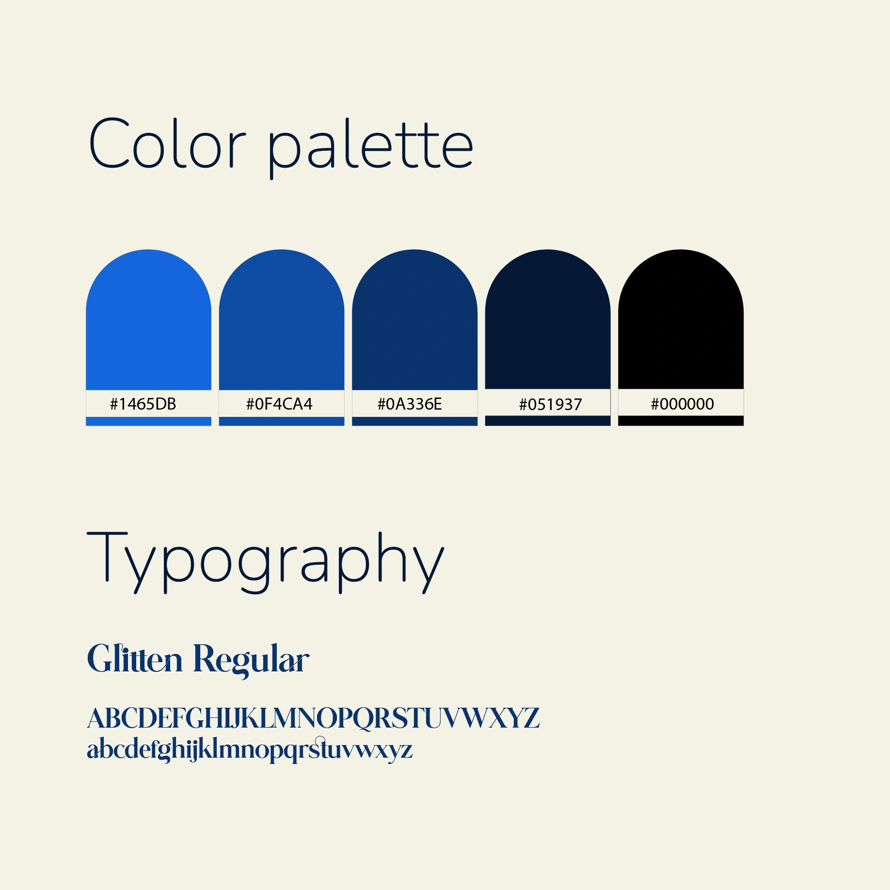
Mabel is a sex and relationship therapist and she wanted a clean and intuitional logo. In this project I wanted to emphasize trust and perspective of this client. Blue is a color which represents trust, confidence and healing. Window in sub mark represents her objective perspective to her patients. And typeface choice also is not random. The links between letters represents uniting and being together.
Like this project
Posted Jun 20, 2022
Mabel is a relationship and sex therapist.
Likes
0
Views
4