Aesthica | Creative Studio Portfolio on Wix Studio

Devansh Prakash

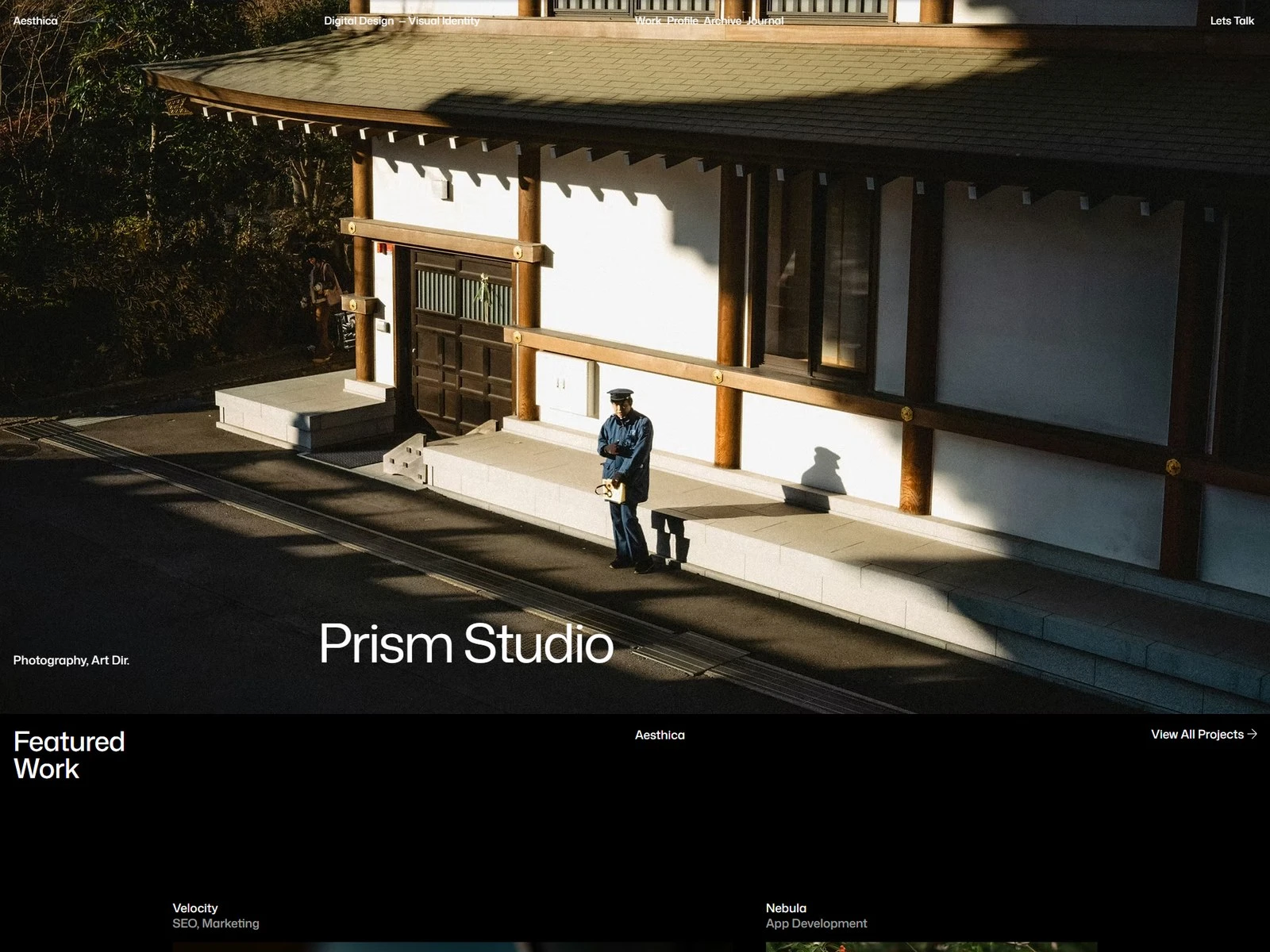
A creative studio's own website is an awkward brief: it has to prove the taste it advertises. Aesthica is the answer to that — a portfolio reduced to three things, typography, spacing, and the work itself.
Restraint as the argument
A strict grid, a quiet palette, and animation used only to establish sequence — never as decoration. Nothing on the page competes for attention except the projects.
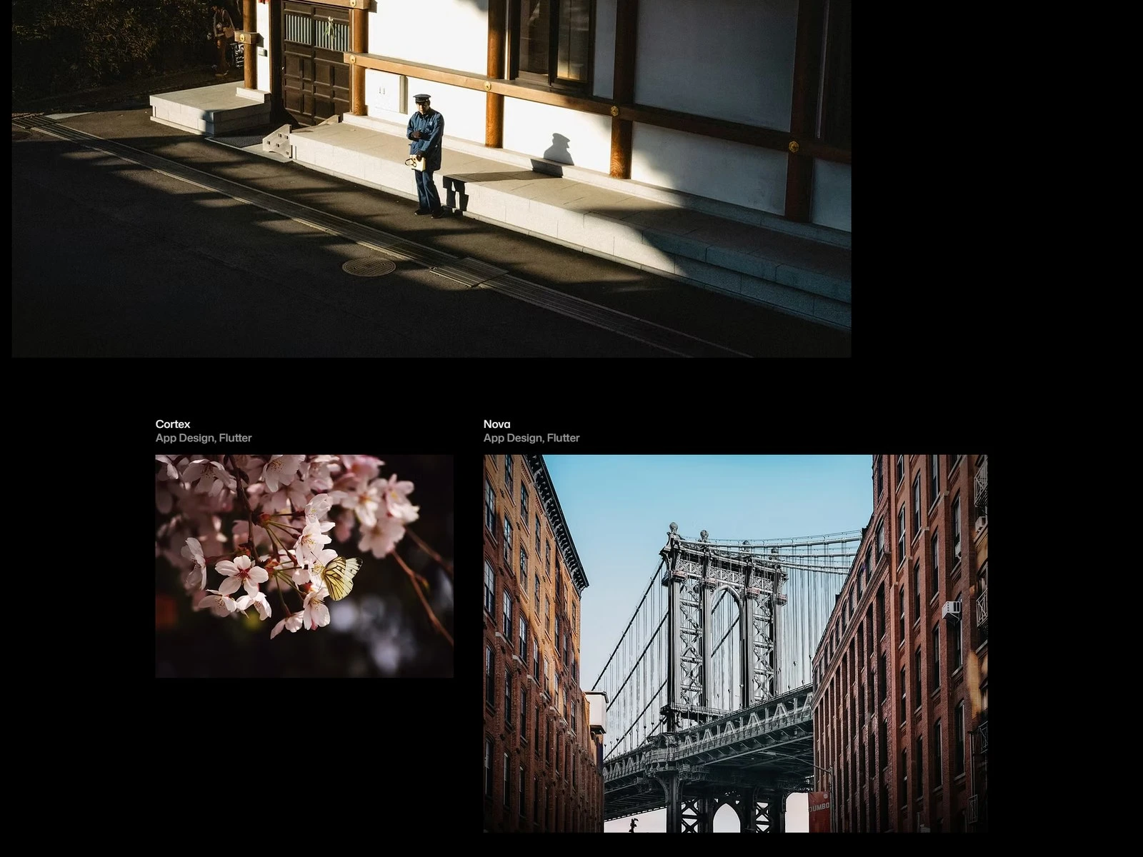
Home — the work on a strict grid
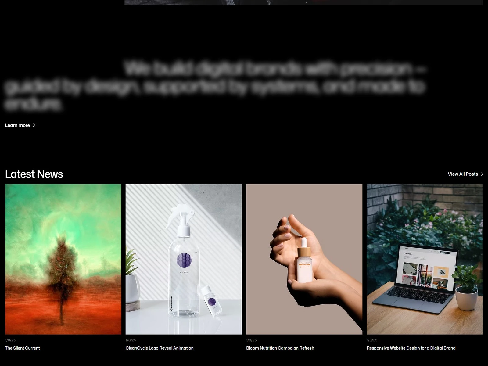
Sequence, not decoration
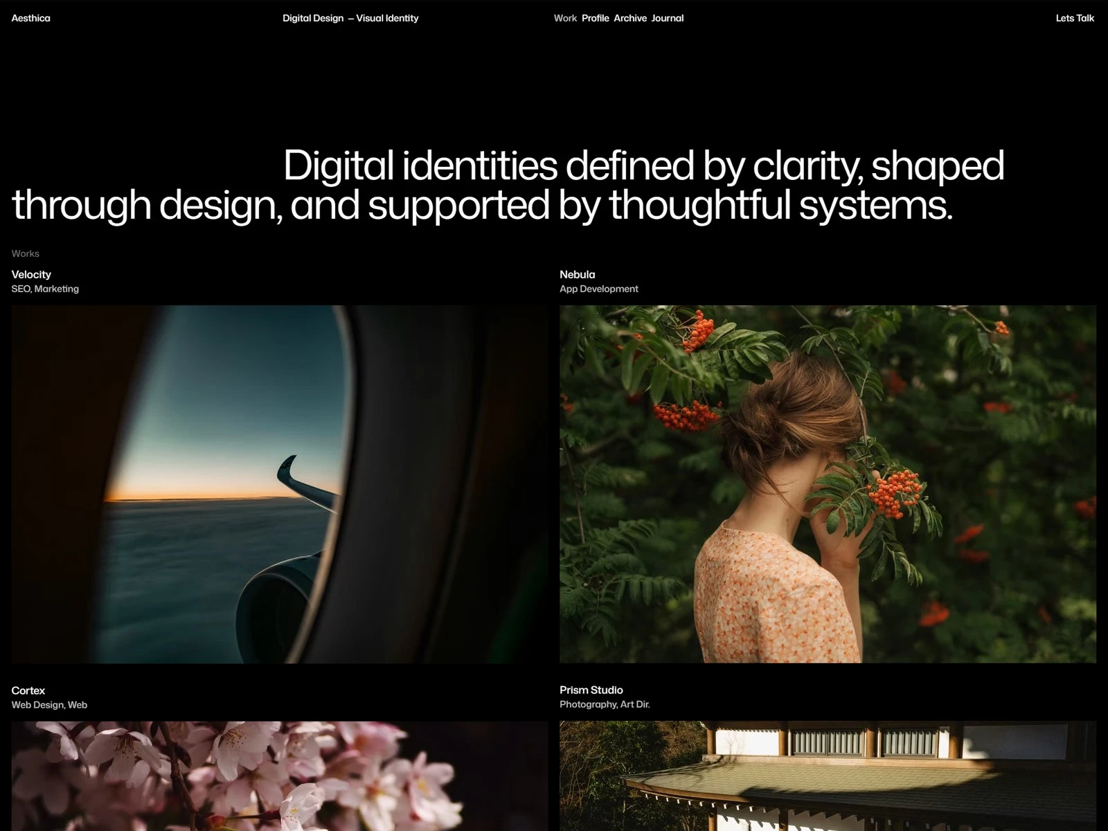
Work index
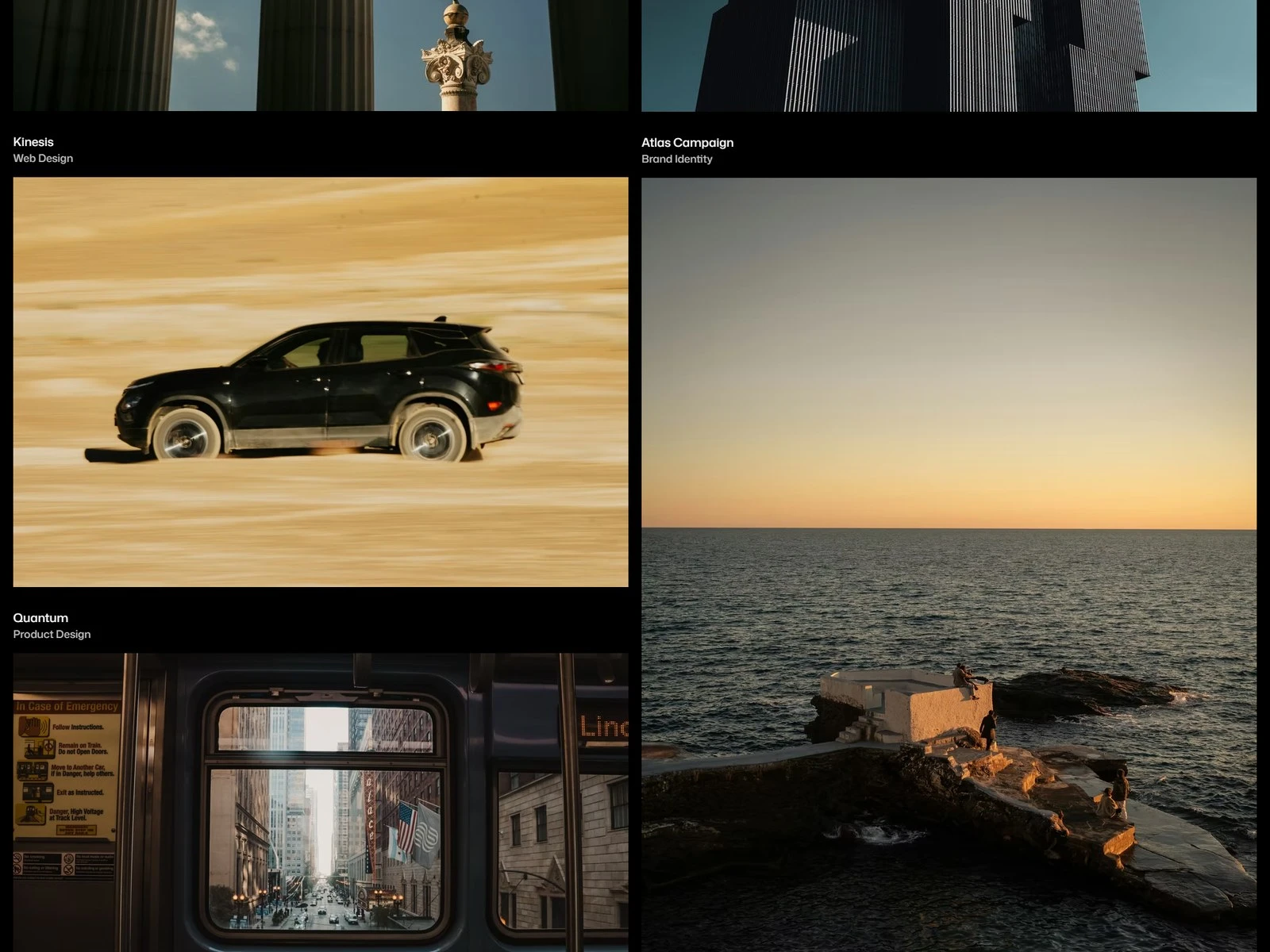
Filtering the index
Eight pages, CMS-driven
Home, about, projects, case studies, blog, posts and contact. The CMS runs both the project index and the writing, so new work slots into the grid without a redesign.
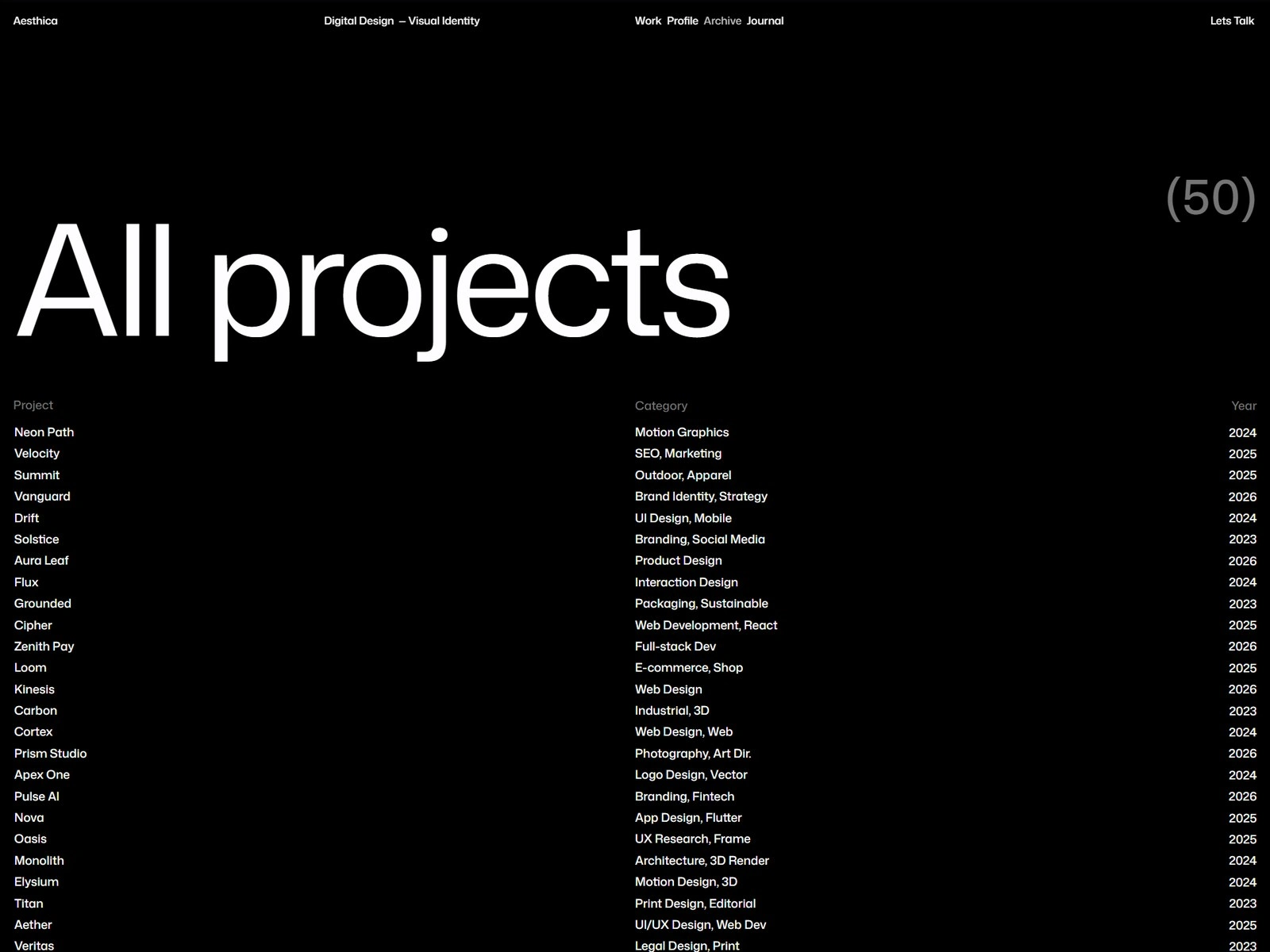
Projects
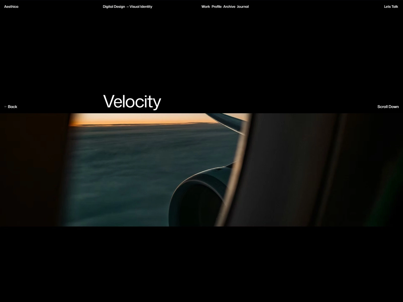
Velocity — an individual project
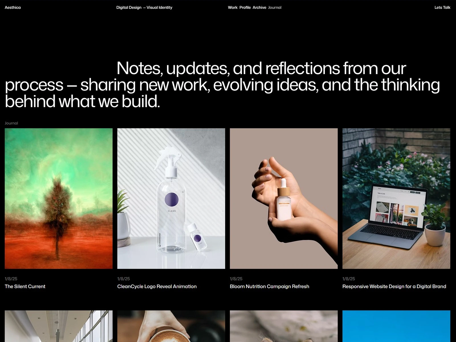
Journal
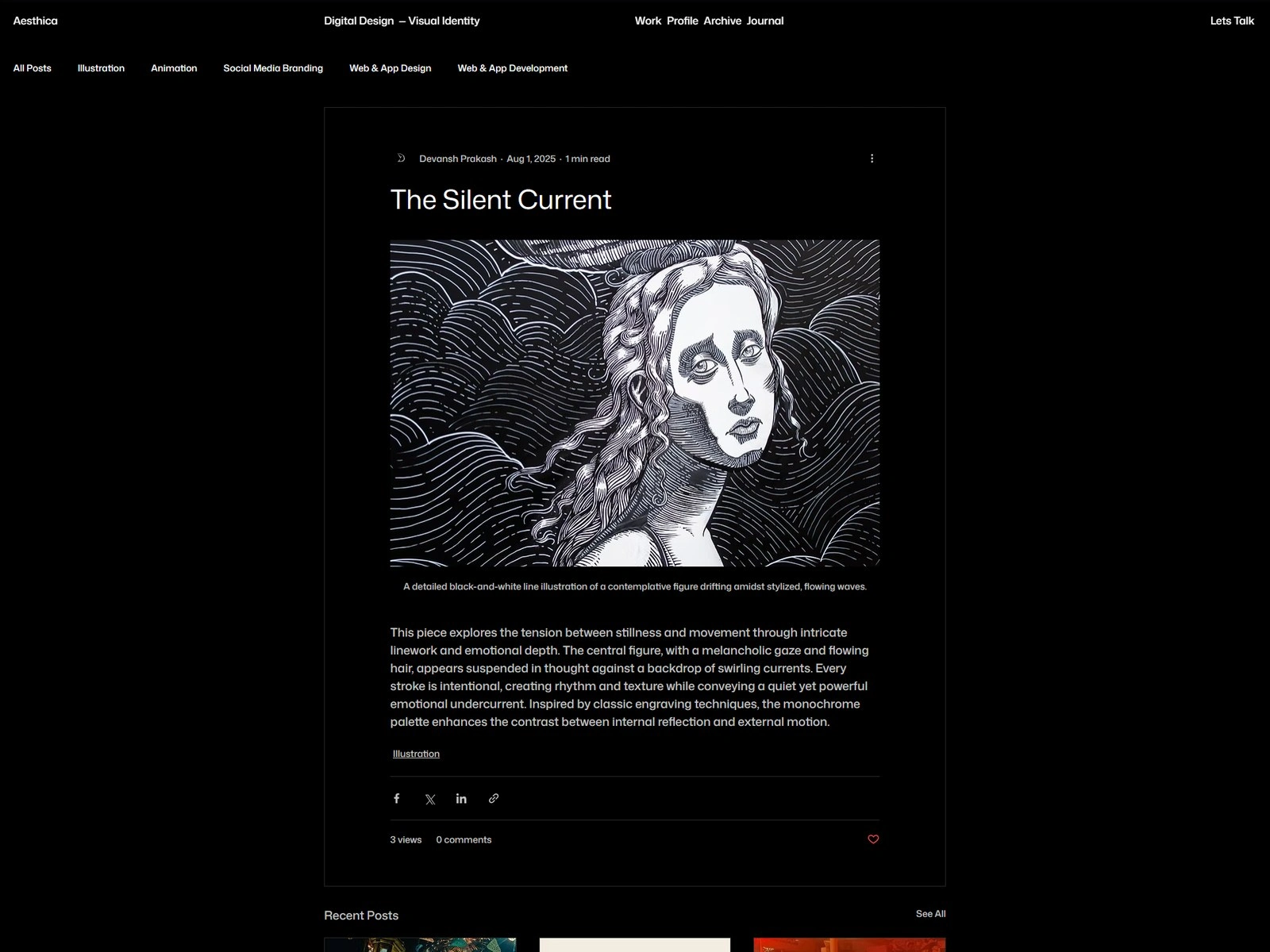
A post
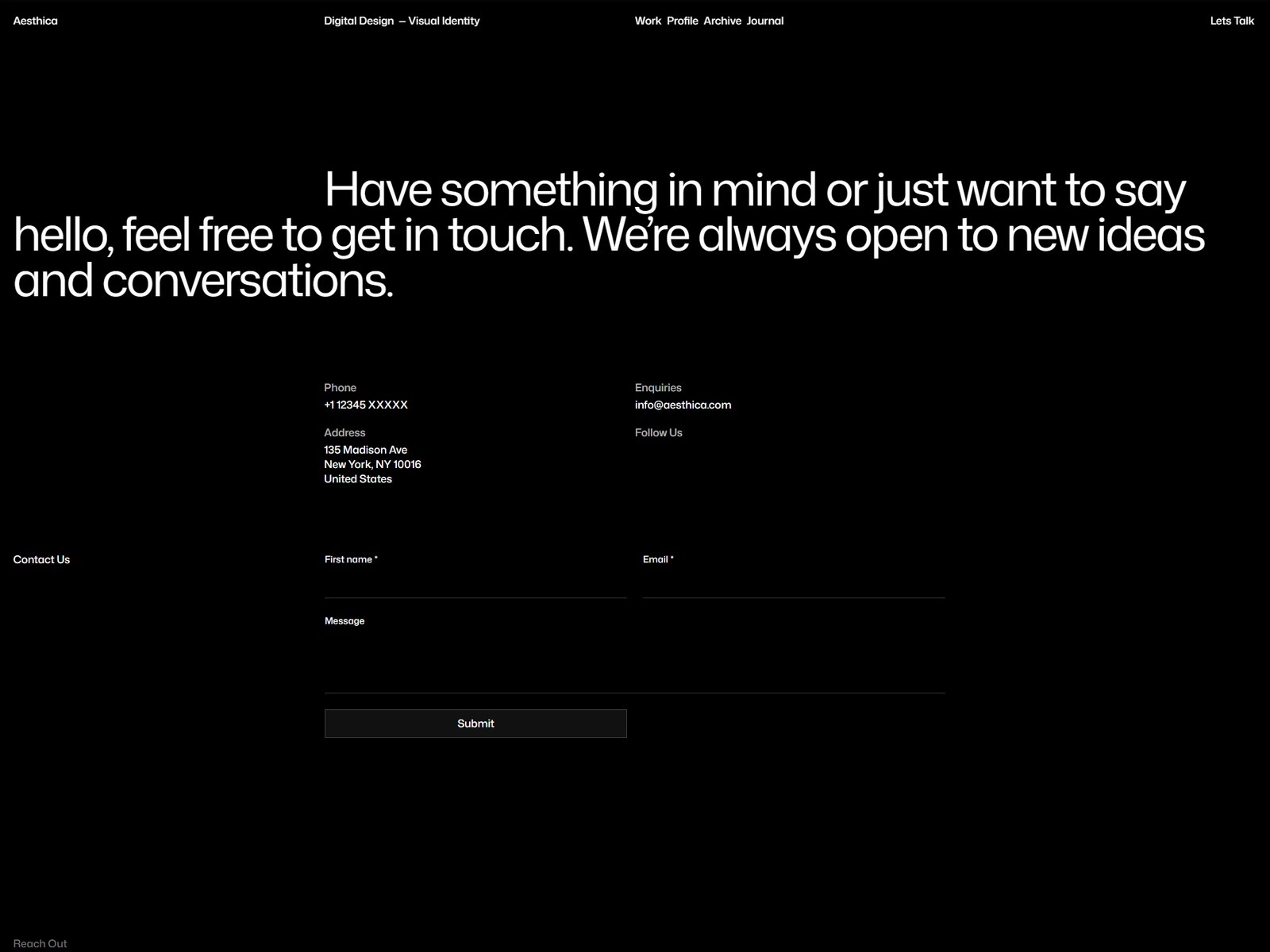
Contact
The site ends up being the studio's strongest credential — a prospective client experiences the standard before reading a word about it.
Like this project
Posted Sep 2, 2026
A studio portfolio that has to pass its own test — a strict grid, a quiet palette, and motion used only for sequence. Eight CMS-driven pages on Wix Studio.
Likes
0
Views
4