
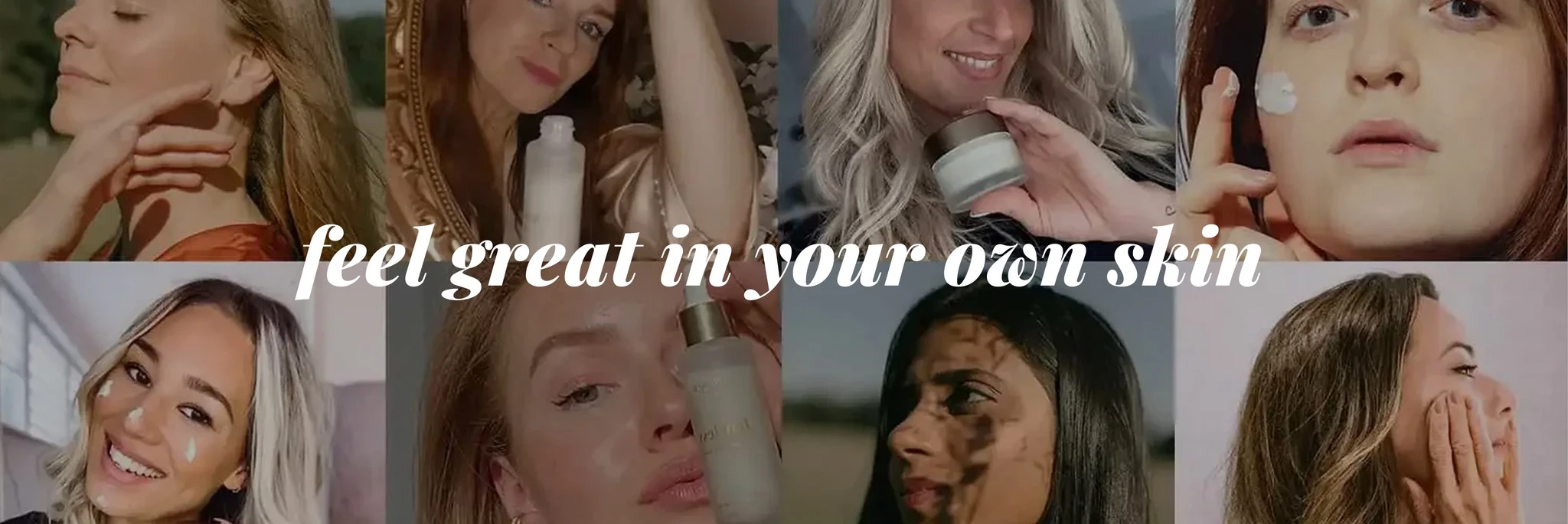
Brand strategy • Brand design • Marketing strategy • Packaging design • Copywriting
Rebranding Nordic Cosmetics into a brand customers connect with
Nordic Cosmetics · 2020-2021
Context
Nordic Cosmetics is a CBD skincare brand founded at the end of 2019 as a joint venture between the founders of Nordic Oil and Hubert Burda Media.
When I joined a few months after its launch, Nordic Cosmetics was more of a product line than an established brand. Without a story or a real reason for customers to connect with it, the brand lacked soul. My challenge was to build Nordic Cosmetics into a desirable brand that converted.
Before (on the left) and after (on the right) the rebranding.
Role and Scope
I joined as an employee tasked with redesigning the packaging. I ended up owning the brand from start to finish, including its positioning, brand narrative and tone of voice, visual identity and packaging, the new webshop, reformulating the full product line with our supplier and the relaunch campaign across print, TV, influencers and paid media.
At the end of the first year, given the profound impact my work had on the brand, I was appointed co-founder. I led Nordic Cosmetics until one year after its acquisition in 2025.
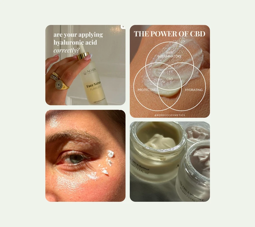
Brand application: social media images.
Strategy
Finding the ideaWhen I started at Nordic Cosmetics, the company had good products but no clear identity. I started by asking what the brand should stand for. After interviewing women in the target group, auditing competitors and running workshops with Hubert Burda Media's team, I realised that the answer lay in the tension within the category.
Skincare speaks to people in the language of problems and solutions in a world that wants women to be younger, fitter and more attractive. We took the opposite position: accepting yourself is the real revolution. Nordic Cosmetics exists to help you feel great in your own skin.
This became the yardstick by which we measured every subsequent decision, and it also told us what to leave out: no retouched pictures, real people instead of models, and no products that make you feel you need to improve yourself. My one regret is not pushing harder to change the name of the 'Anti-Aging Cream' to 'Slow Aging Cream', because ageing is inevitable, but you can work with it.
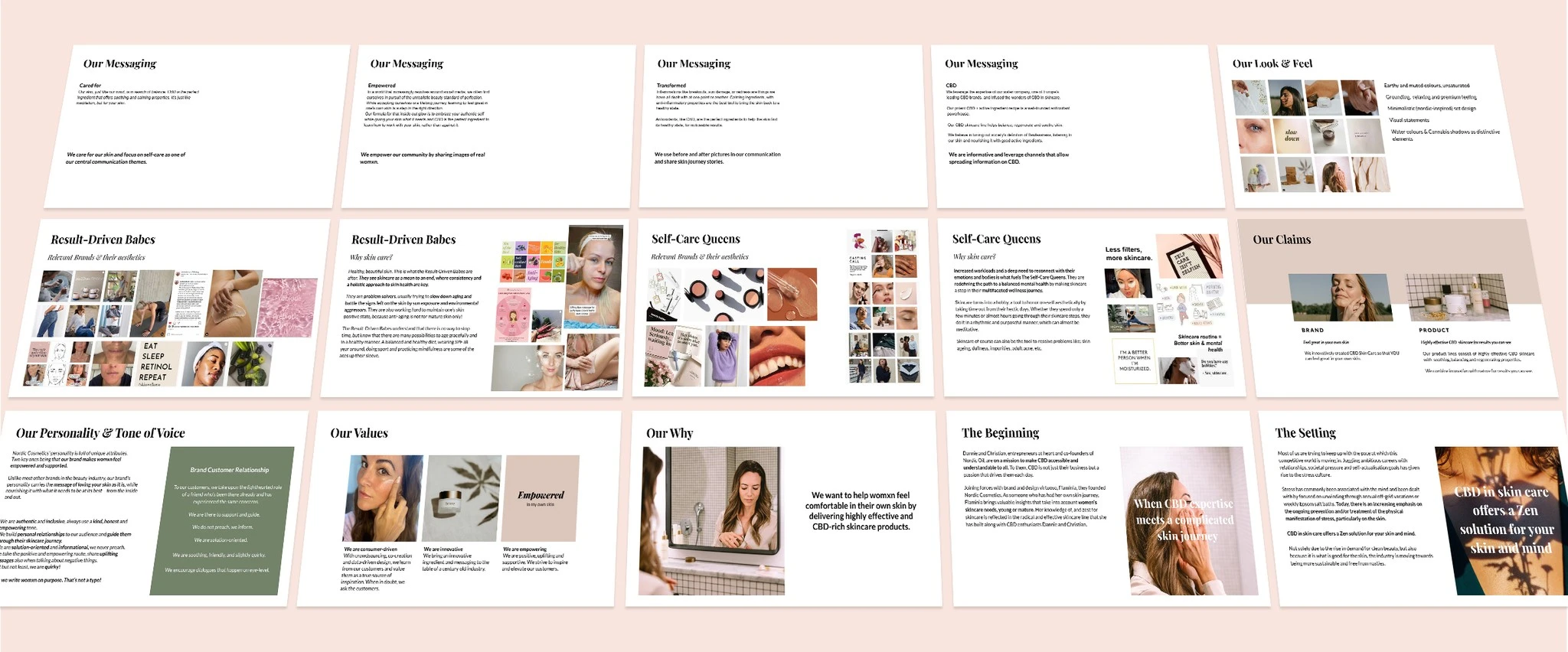
Brand guidelines
It all started with the names. Each product was given a name that went beyond its functional one: Happy, Flawless, Fierce, Proud, Spirited, Brave and Bold. Each one represents a state of mind or an emotion that we hoped to inspire in our customers.
The same logic shaped our communication strategy. We cast real people from our network with different skin types and ages so that customers could see themselves in the brand. To maintain a consistent tone of voice, I created guidelines that integrated seamlessly into the team's daily workflow and wrote most of the copy myself prior to the launch.
The visual identity had to feel natural and relatable. We opted for warm, skin-toned colours instead of clinical white and elegant yet approachable typefaces.
The packaging brought the story to life for customers. We transitioned from white and gold plastic to glass jars with embossed aluminium caps and premium, fully recyclable paper packaging.
The secondary packaging features watercolour brushstrokes. No two brushstrokes are the same, just like no two women are the same, each with a story to tell. Each box also contains a short story connected to the product's name.
Primary and secondary packaging.
A brand must deliver on its promises. In collaboration with our supplier, I reformulated all seven products to provide a more premium experience and enhanced performance, incorporating new scents, a more luxurious texture, and more sustainable ingredients. Despite the reformulation and redesign, the prices remained the same.
Then I developed product sets. Previously, customers had to work out for themselves which products belonged together, so I created sets categorised by skin type or concern to help guide them towards a suitable skincare routine.
Brand video
Outcome and Impact
The relaunch began in February 2021 with new packaging and a social media campaign, followed by the launch of the new website in May. Prices remained unchanged, and the introduction of new sets provided customers with additional incentives to purchase multiple products. With a media budget that included printed advertising and a TV spot, the brand attracted more visitors and earned more from each one. The average order value increased by 21%, and revenue grew by 43% despite a 27% increase in traffic.
+43% YoY revenue
2x revenue per visitor
+21% average order value (AOV)
1 like · 0 views · Nov 9, 2026
Led Nordic Cosmetics rebranding, enhancing brand identity and increasing revenue by 43%.
Timeline
Feb 1, 2020 - May 31, 2021


