Vintriga Brand Identity Design
Valeria Miele
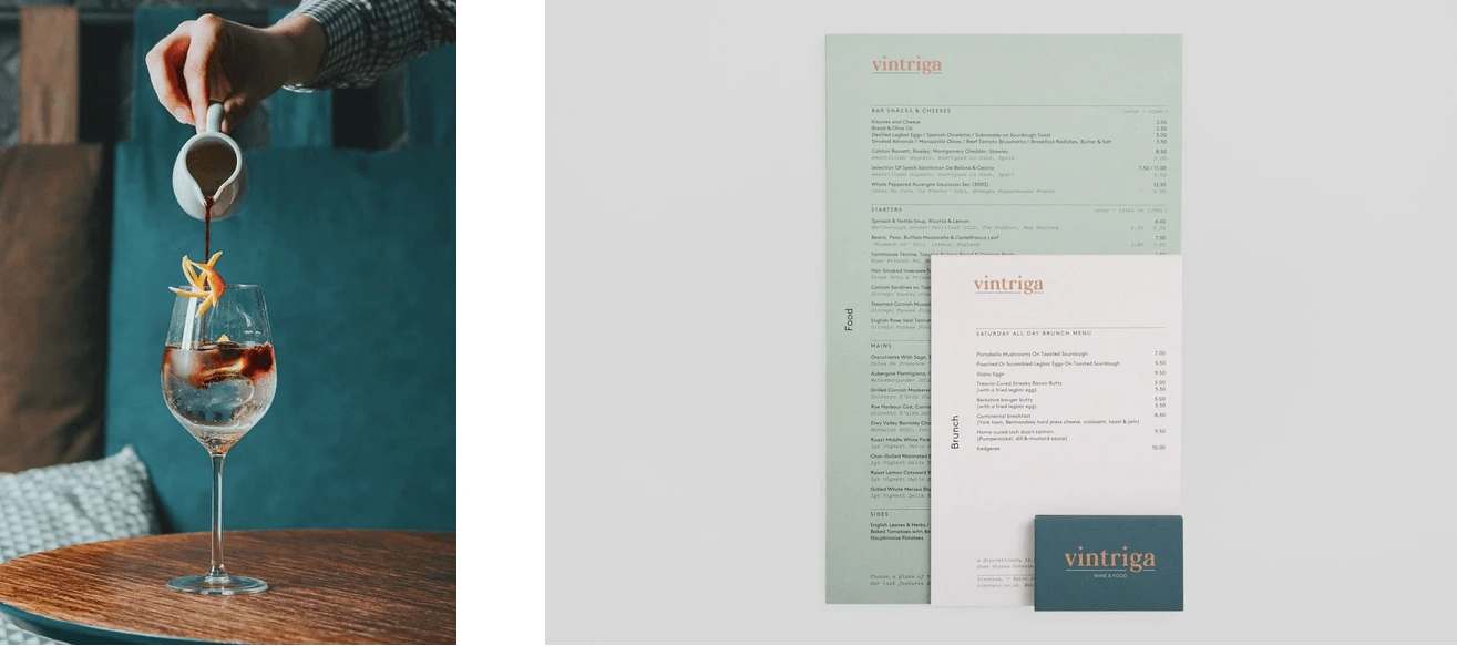
Research and selection are the key for the new Vintriga wine bar. Founded by two Italian brothers, this place in perfect Scandinavian style, but officially made in Italy, is based in Copenhagen. Accurate in every details, cocktails are processed with Italian spirits and Scandinavian alcohols, submitted by the creativity of the team.
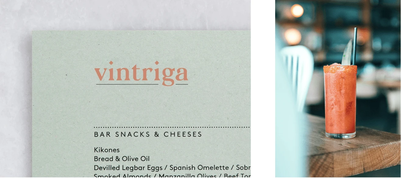
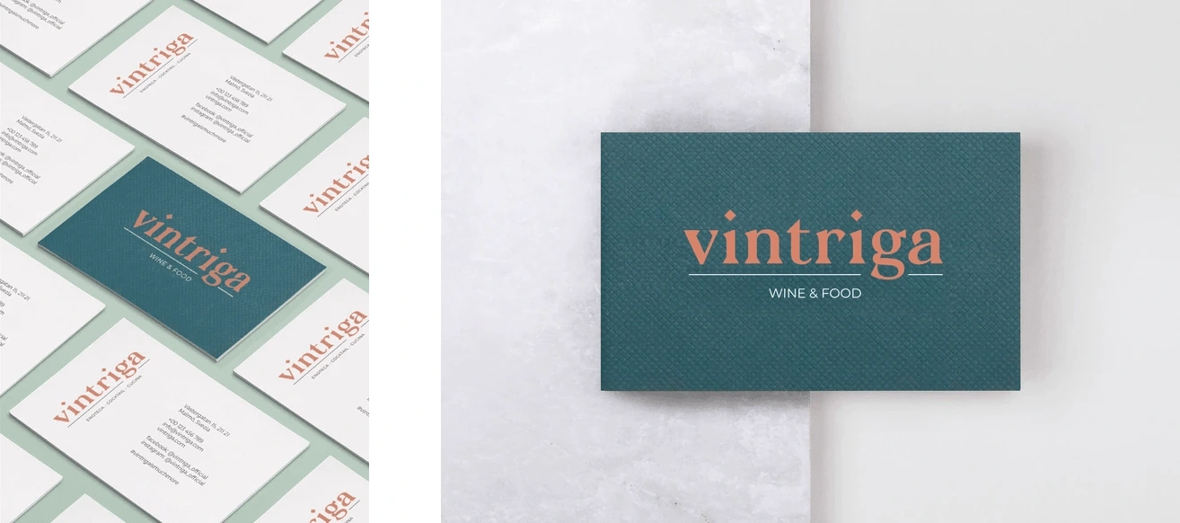
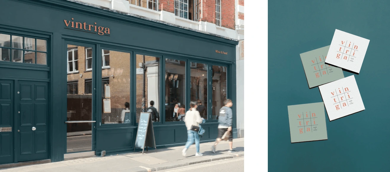
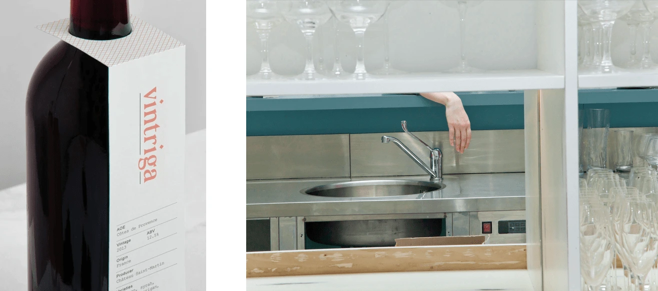
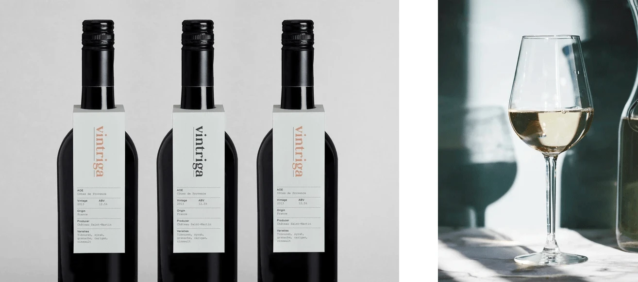
All printed products are mainly based on a simple light and pastel color scheme. The design is complemented by a simple and minimal style. This extends across menus, wine lists and labels, business cards and website. Although the relationship between concept and aesthetic outcome appears, for the most part, nuanced, these combinations are distinctive, visually interesting and work well to make the complexities of wine feel accessible. Flavour profile becomes an array of texture, colour, material and type in print.
Check the full project on Behance 👇🏼
Like this project
Posted Sep 20, 2022
Vintriga is a brand identity design project by Solèrte Studio. All design are inspired by modern and minimal with pastel style inspired to the interior design.