Brand Identity Development for Dear Ma
Ashish Kabir
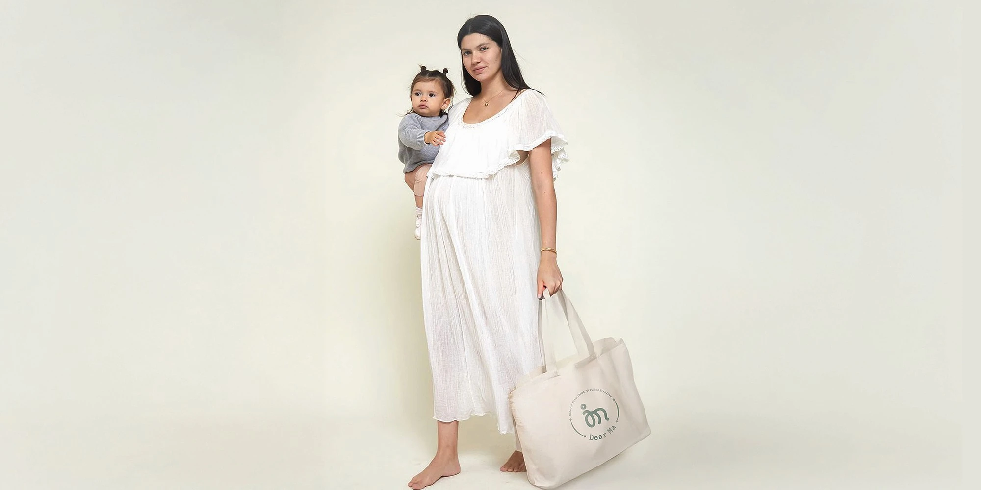
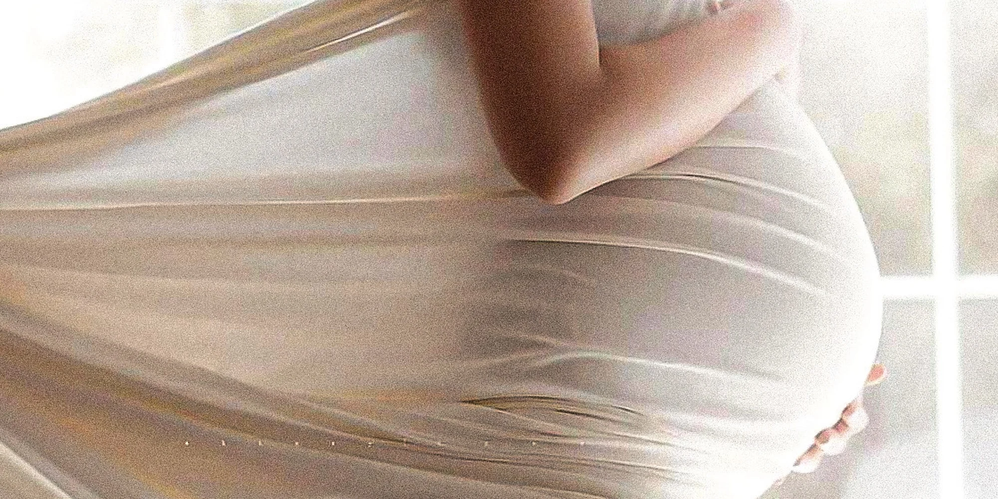
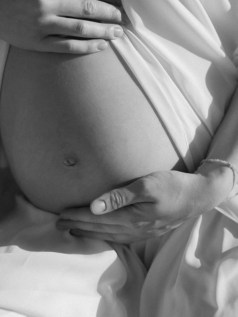
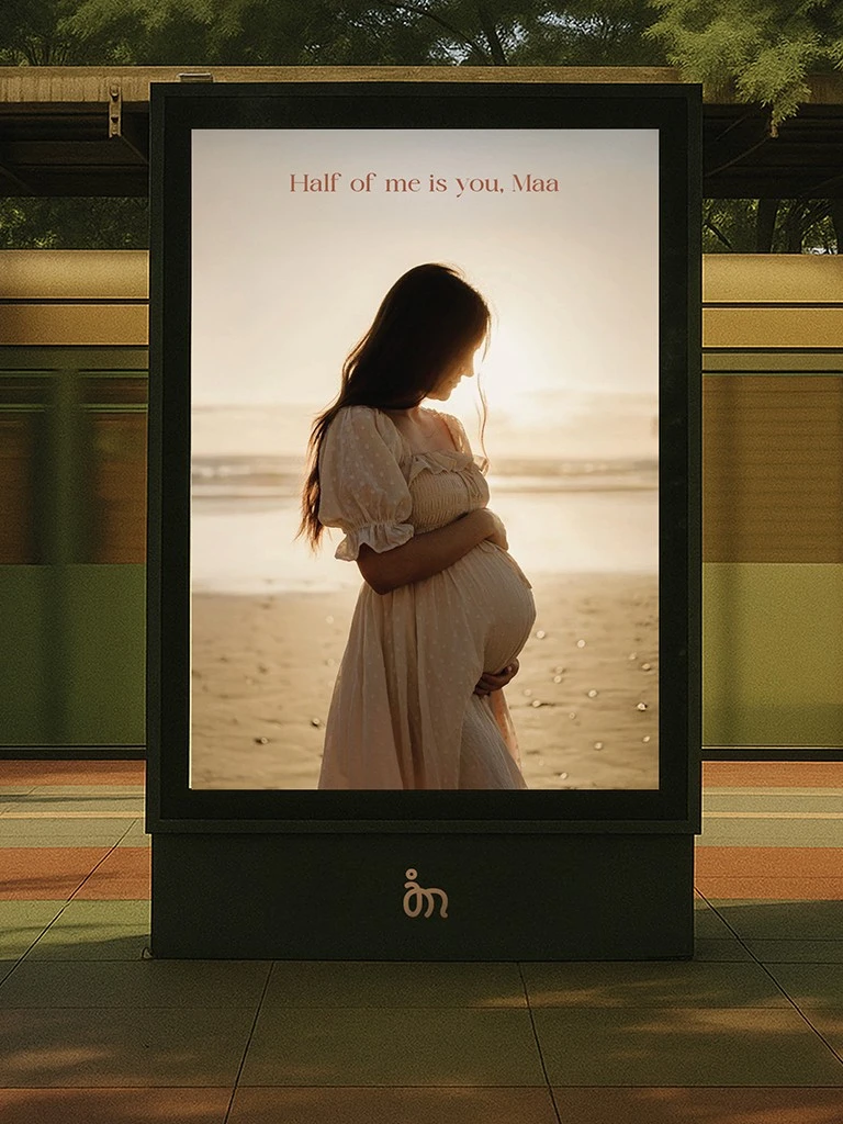
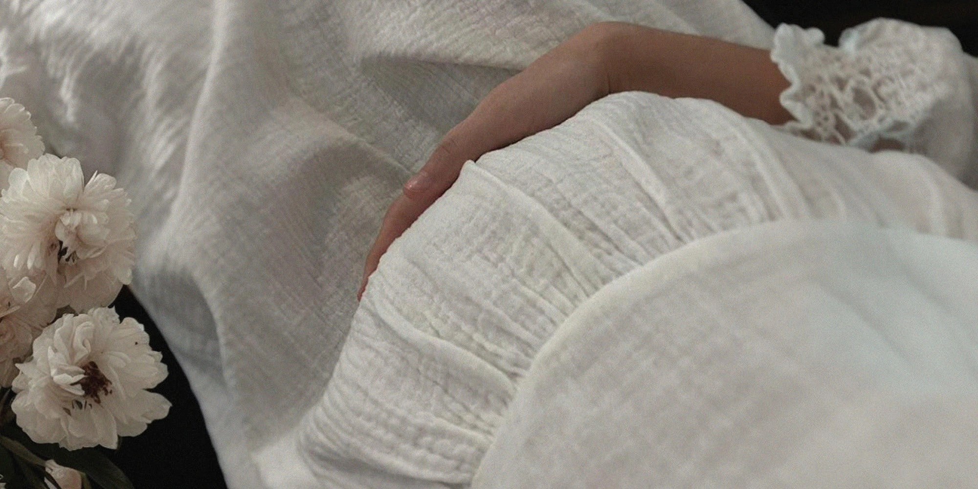
Dear Ma is a love letter to mothers. Conceived as a premium maternity‑wear label, the brand celebrates the strength, grace and vulnerability of expectant and new mothers. Its mission is to offer clothing that adapts to a woman’s changing body while making her feel seen, comfortable and beautiful. Every garment is thoughtfully designed with breathable fabrics, gentle silhouettes and subtle nursing features so mothers can move between pregnancy, postpartum and nursing with ease. The name “Dear Ma” expresses both intimacy and reverence – it speaks directly to mothers and the community that surrounds them.
The maternity‑wear segment sits within the broader apparel market, which is a crowded space. To stand out, a label needs more than attractive garments; it needs a compelling identity that resonates with a clear audience and embodies a distinct ethos. Many maternity brands either lean towards overtly functional basics or trend‑driven styles that quickly date. Our challenge was to create a visual language that balanced practicality and elegance, communicated warmth and care, and distinguished Dear Ma in a way that felt timeless.
We began by immersing ourselves in the world of motherhood – listening to stories from expectant and new mothers about what they needed and how they wanted to feel. Three themes emerged: nurture, empowerment and fluidity.
We sought to capture motherhood.
These informed every design decision, from the logo to the colour palette. Rather than rely on clichéd maternity symbols, we sought to capture motherhood’s duality – softness and strength, vulnerability and resilience – through abstract forms and tactile details.
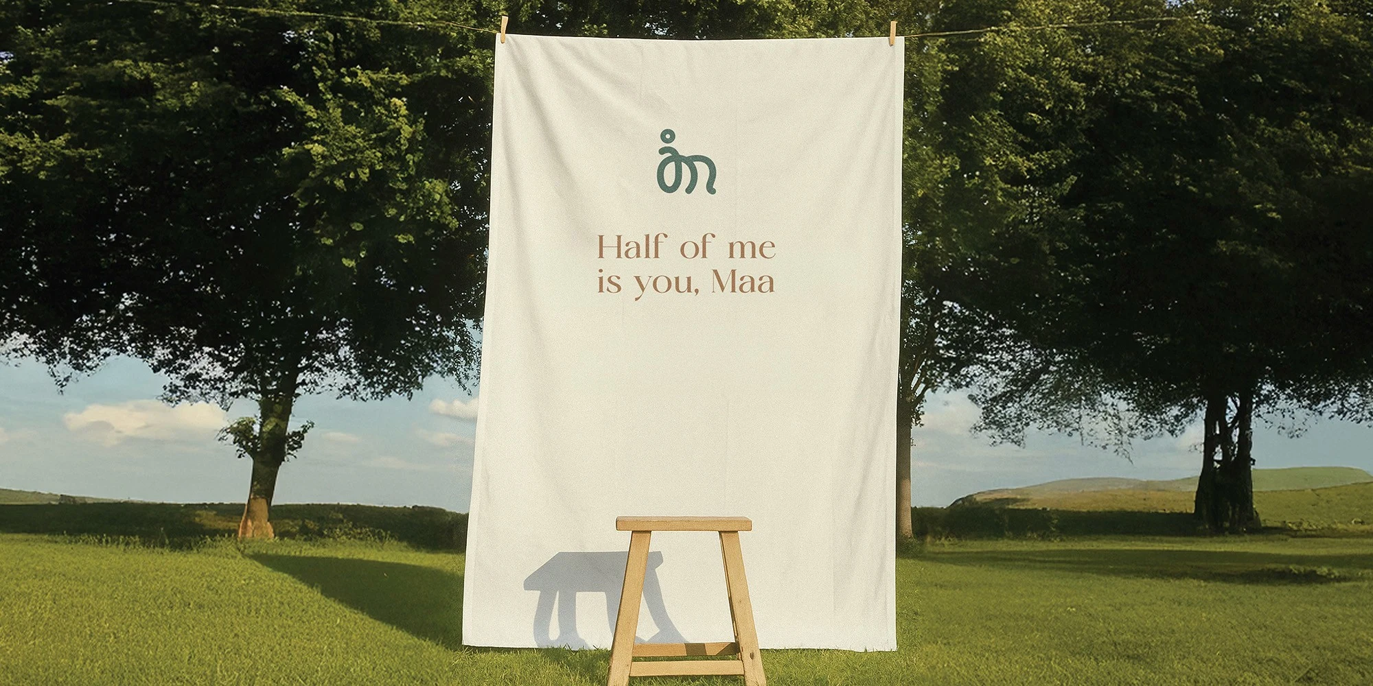
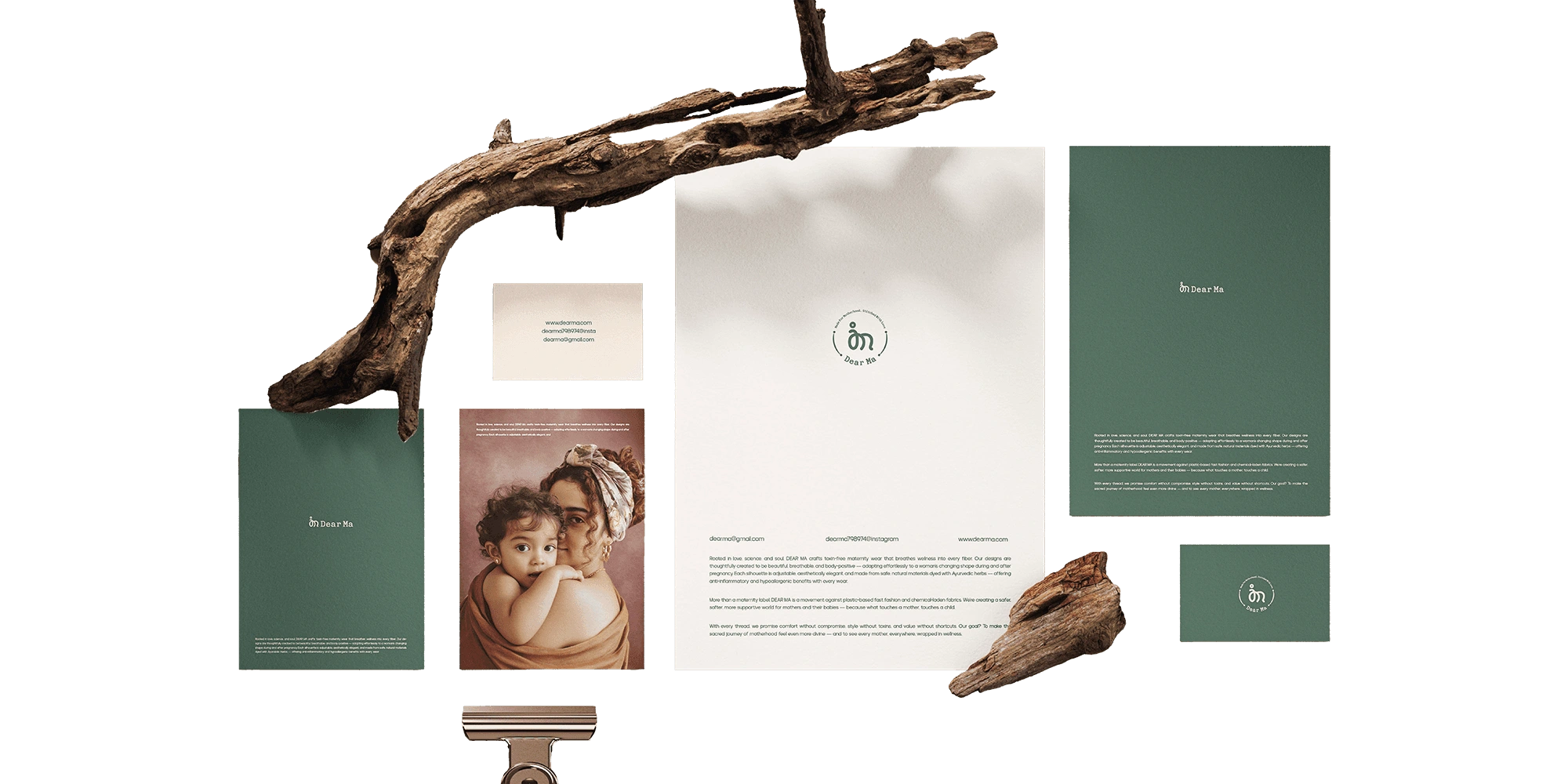
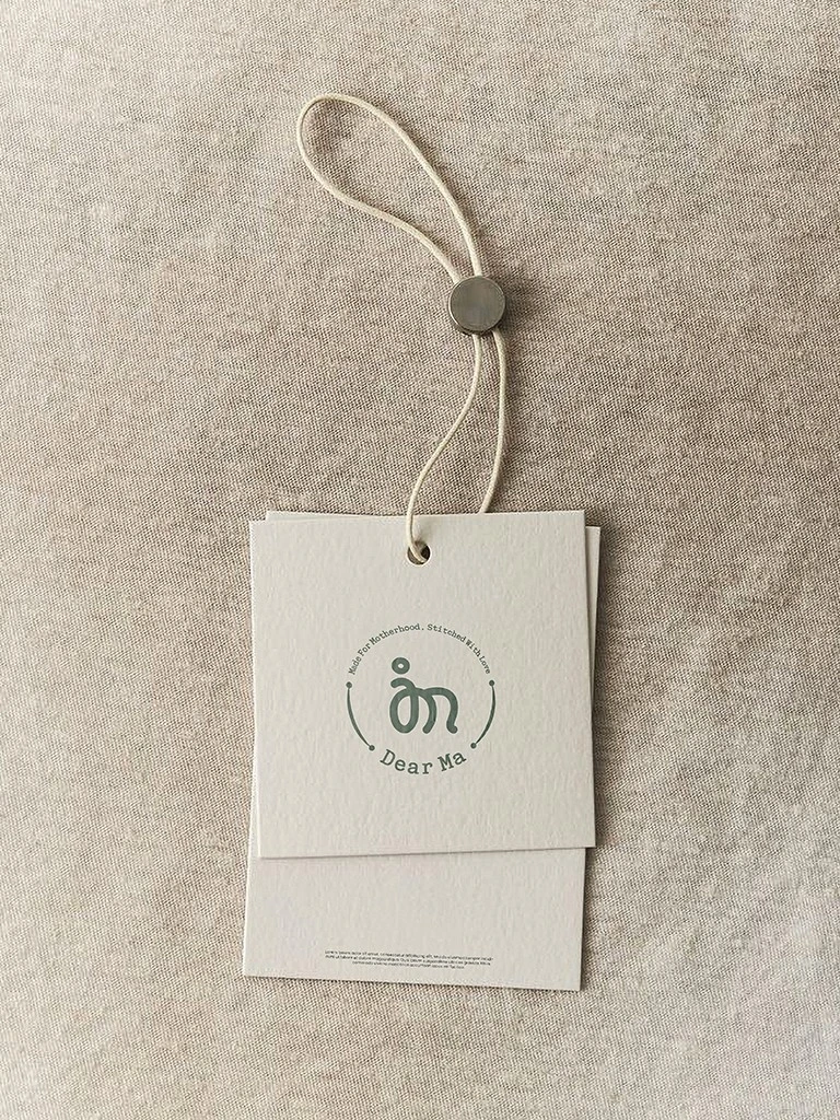
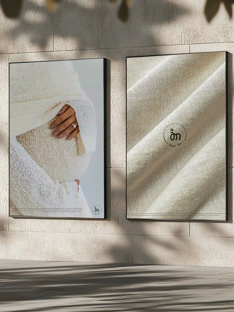
At the heart of the identity is an emblem inspired by an embrace. Two interlocking curves evoke both the shape of a womb and the act of a mother cradling her child. This symbol communicates intimacy without literal depictions; it allows women to project their own stories onto the mark. The flowing lines also reference the fluidity of the body during pregnancy and honour the gentle rhythms of nurturing.
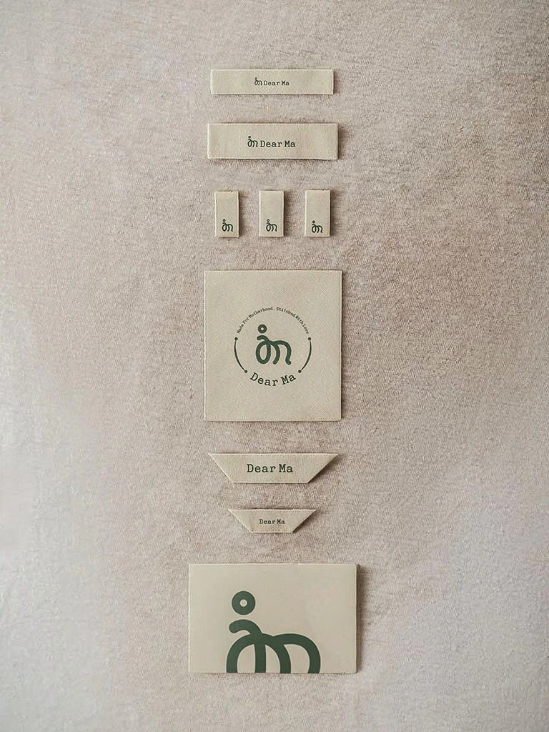
To complement the emblem, we developed a custom wordmark using rounded letterforms and generous spacing. Where one of our other apprell brand Dap Out utilised bold, assertive typography to convey rebelliousness, Dear Ma needs warmth and softness. Rounded terminals and open counters mirror the curves of the emblem, while a subtle calligraphic influence adds a personal, handwritten feel. Secondary typefaces are clean and legible, ensuring the overall system remains accessible.
Calming Colour Palette: Serenity & Trust
The colour palette draws from soothing, nature‑inspired tones: warm creams, gentle terracottas, dusty roses and muted sages. These hues conjure feelings of comfort and calm, contrasting with the high‑contrast palettes often used in streetwear They also provide versatility across digital and physical touchpoints – from fabric labels and packaging to web interfaces.
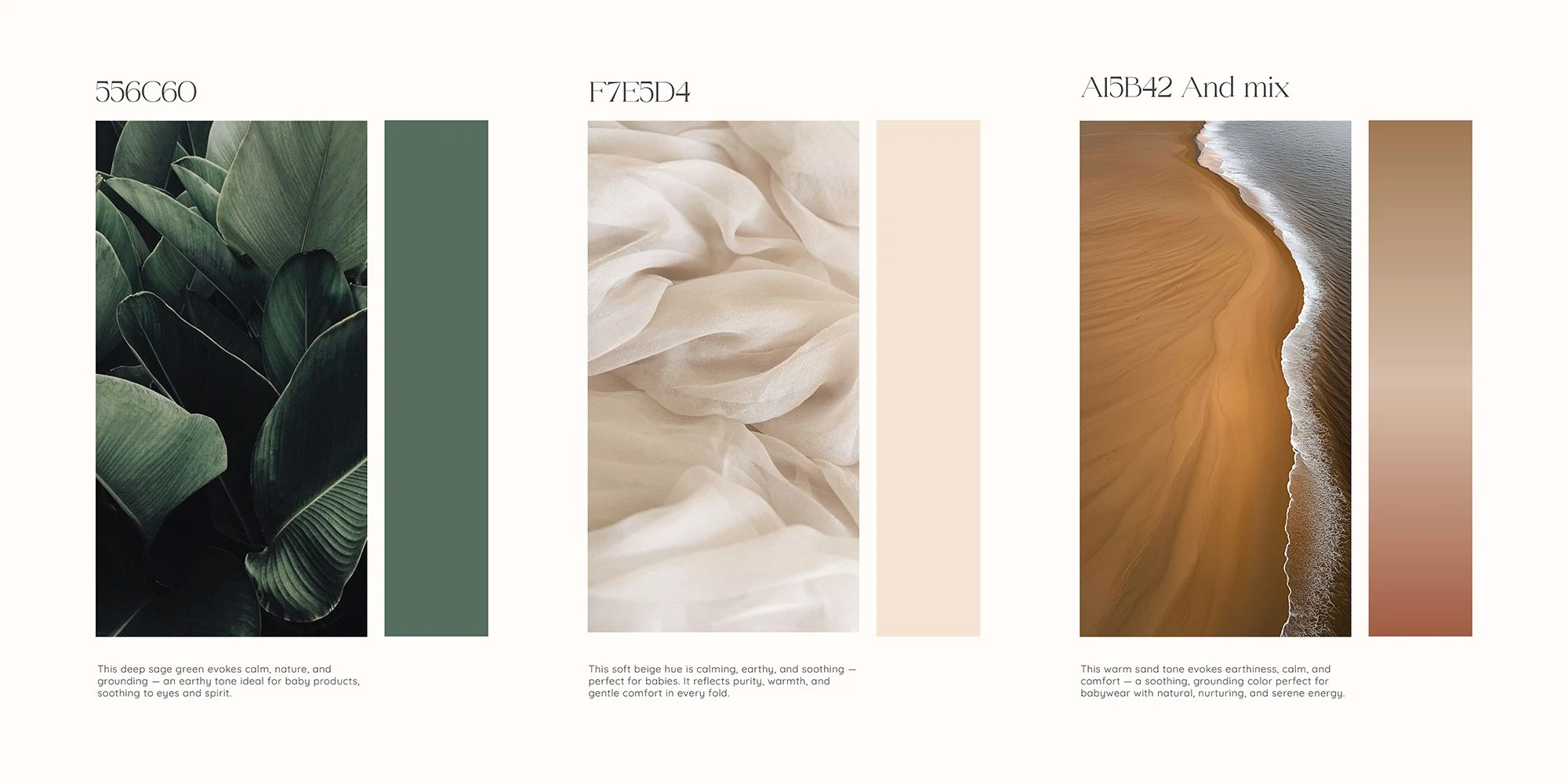
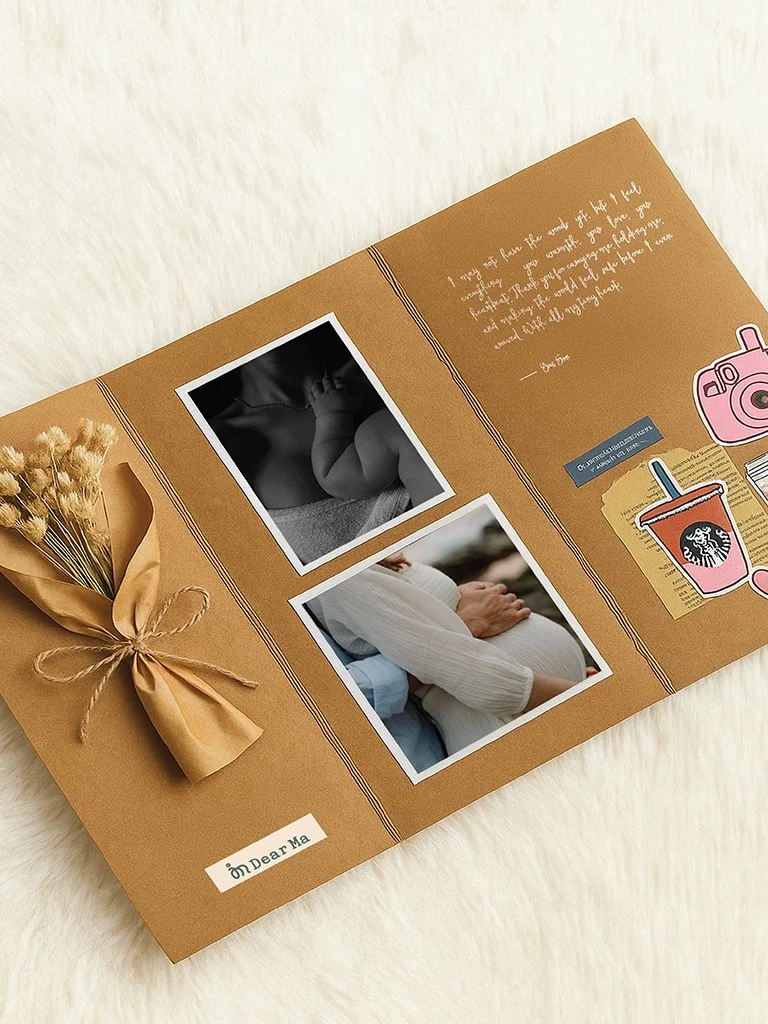
Organic Patterns & Textures We introduced a suite of patterns inspired by botanical forms and rippling water. These motifs add depth and tactility when printed on tissue paper, thank‑you cards or textile linings. Like the geometric abstractions used in other Wortham projects wortham.in , these patterns create a recognisable visual language that can scale across mediums. Subtle embossing and natural‑fibre paper stocks further reinforce the brand’s commitment to quality and care.
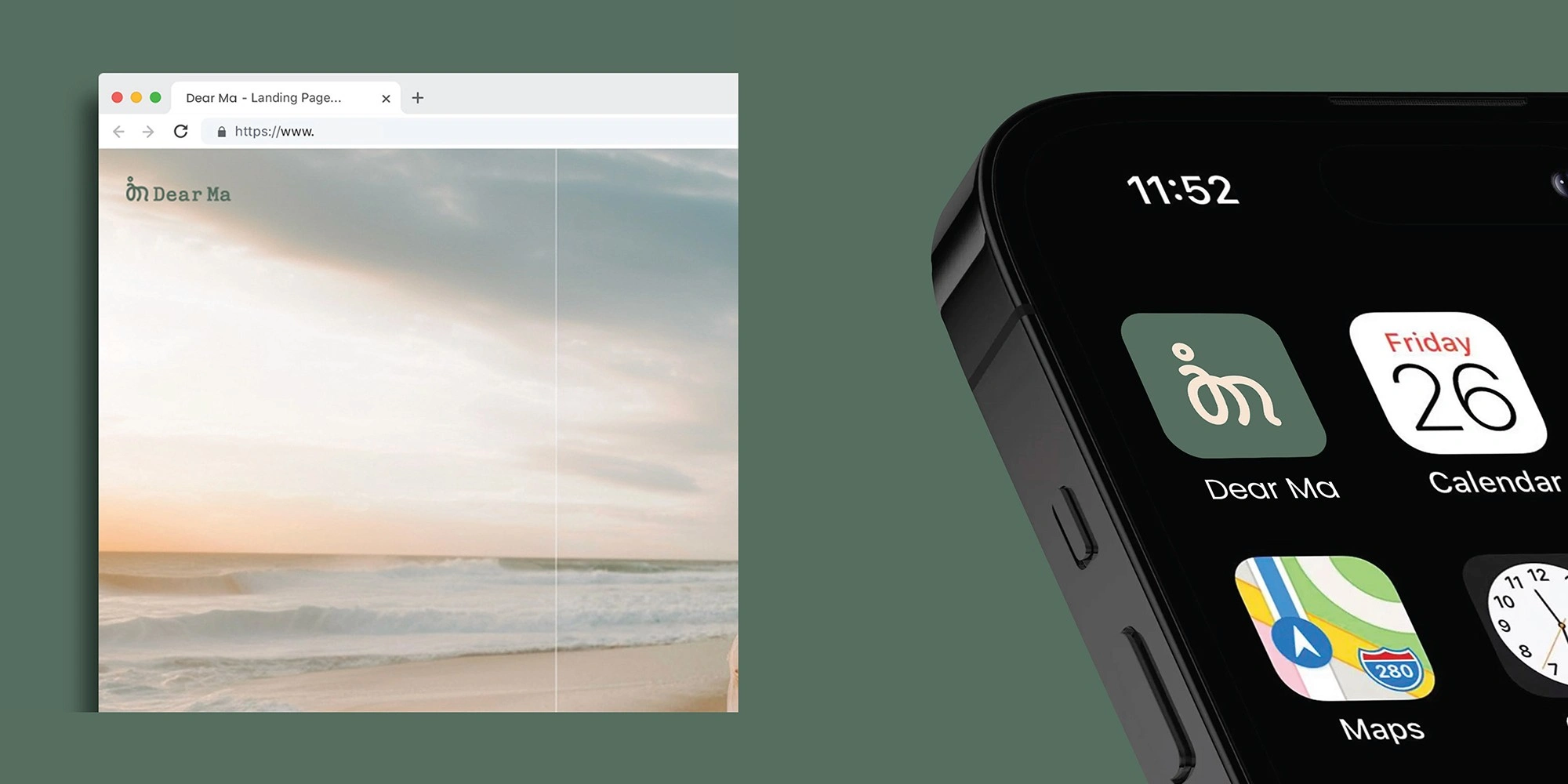
Our goal was not simply to create beautiful visuals but to craft a cohesive experience. We considered how the identity would translate across garment tags, packaging, a responsive e‑commerce site and social media templates. The emblem can be debossed on leather labels, rendered as a monogram on buttons or animated on digital platforms. A suite of templates ensures consistency for lookbooks, packaging inserts and community‑building posts. Attention to detail across these touchpoints ensures the brand feels as considered online as it does in person.
Like every Wortham project, the Dear Ma identity was built on strategy as much as aesthetics. We grounded our decisions in the brand’s values and its audience’s needs, ensuring that every element – from the logo to the colour palette – works in harmony to communicate a unique personality and resonate with its wearers.
Post‑launch, Dear Ma has cultivated a loyal community through its emphasis on inclusivity and authenticity. Customers cite feeling “held” and “empowered” by the brand, while retailers appreciate the clear, cohesive presentation.
By honouring motherhood’s complexity and beauty, Dear Ma has carved out a distinctive space in the maternity‑wear market and set a new standard for thoughtful design.
The inclusion of the recycled paper mask was a key strategic recommendation to leverage the brand's core visual in a tangible way, encouraging customers to become brand advocates through their everyday wear. This fosters a sense of community and organic visibility.
Seasonal Campaign Shoots: Align with photographers for seasonal launches (festive, summer, monsoon), ensuring fresh, relatable imagery is consistently created and shared.
Joint Instagram Reels: Feature behind-the-scenes footage of styling and shoots, boosting organic reach while showcasing product versatility.

Like this project
Posted Aug 14, 2025
Developed a unique brand identity for Dear Ma, a premium maternity-wear label.
Likes
0
Views
0
Timeline
Jul 14, 2025 - Aug 10, 2025