Juliana Dias Lunardi
Overview
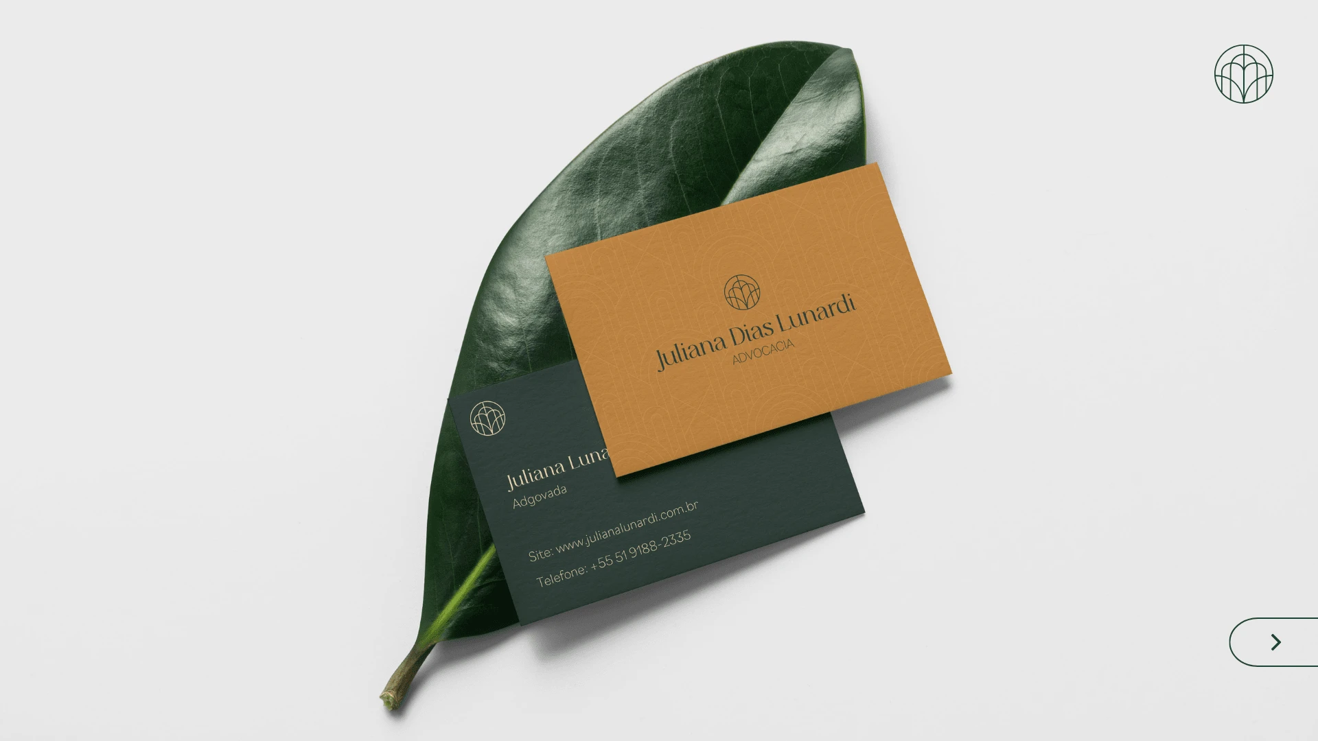
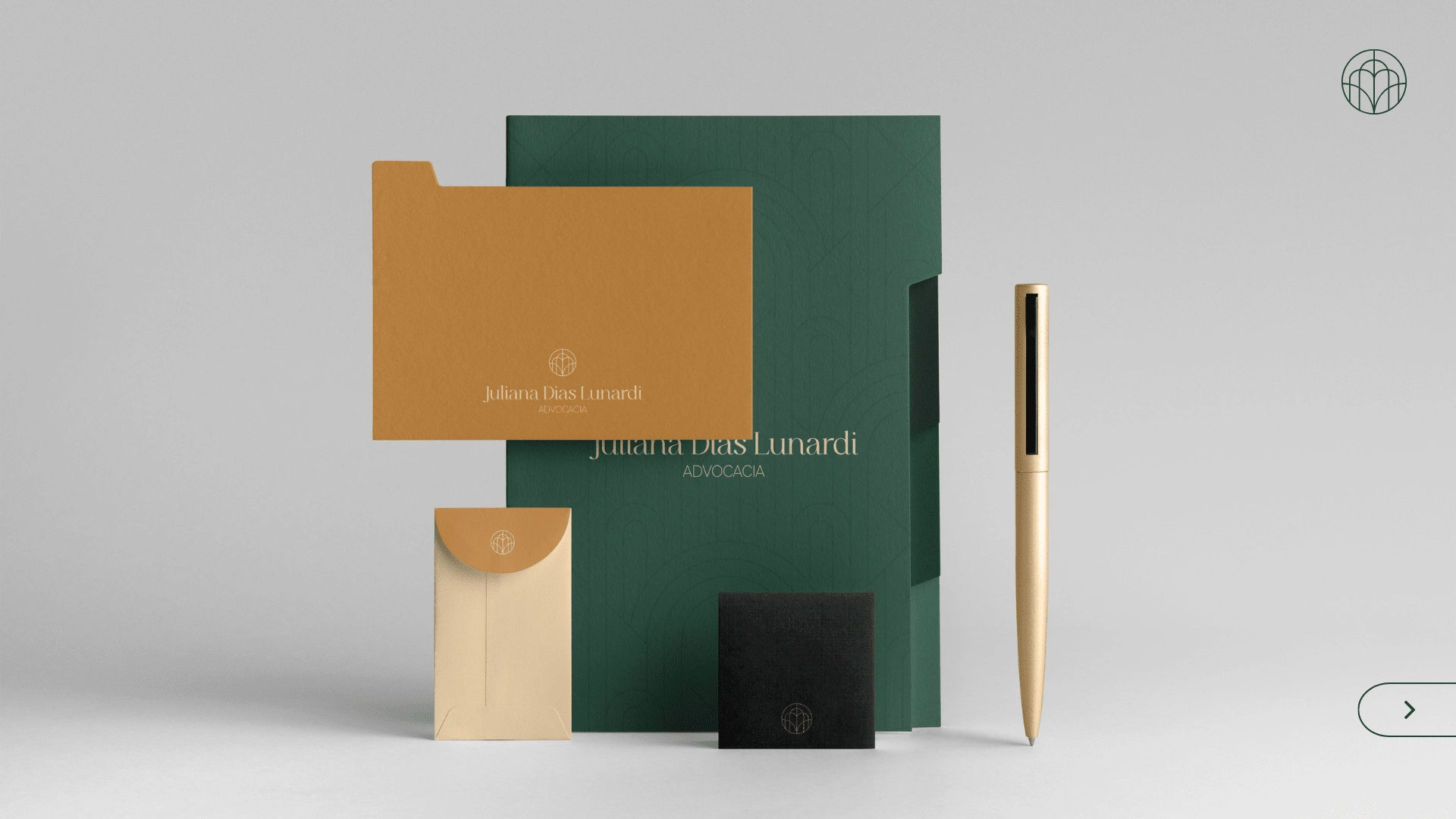
Juliana Dias Lunardi is a brazilian lawyer, focused on digital lawsuits. We wanted her brand to be approachable, authentic, friendly and modern, just like Juliana.
Visual Identity
The brand symbol is the book and bow connection. The book represents intellectuality and study. The arches, on the other hand, refer directly to the ancient Greek courts, organicity and accessibility.
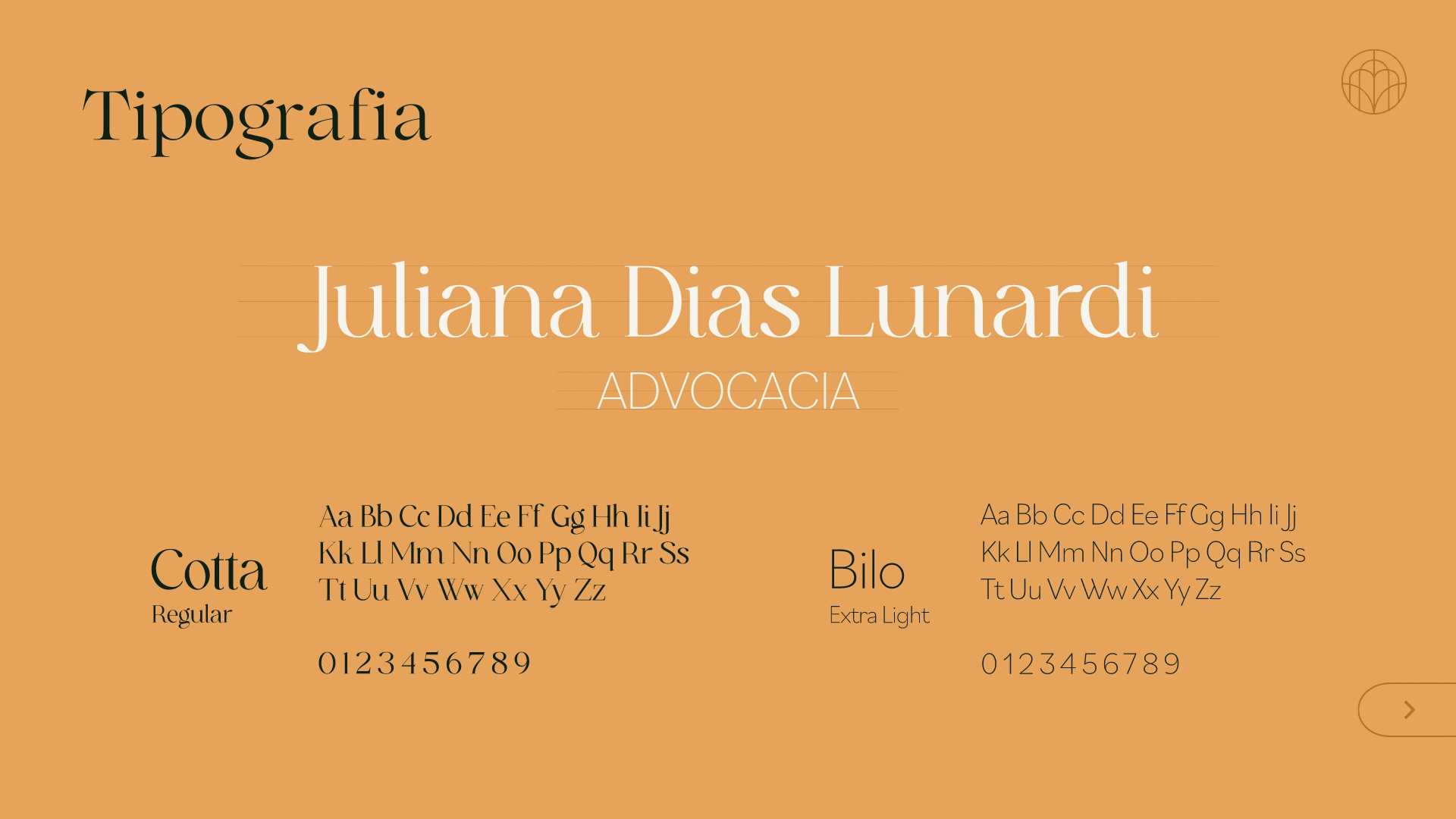
The logo was designed to bring out the modern side of the brand, demonstrate confidence and receptivity. Juliana's initials were applied as an "easter egg".
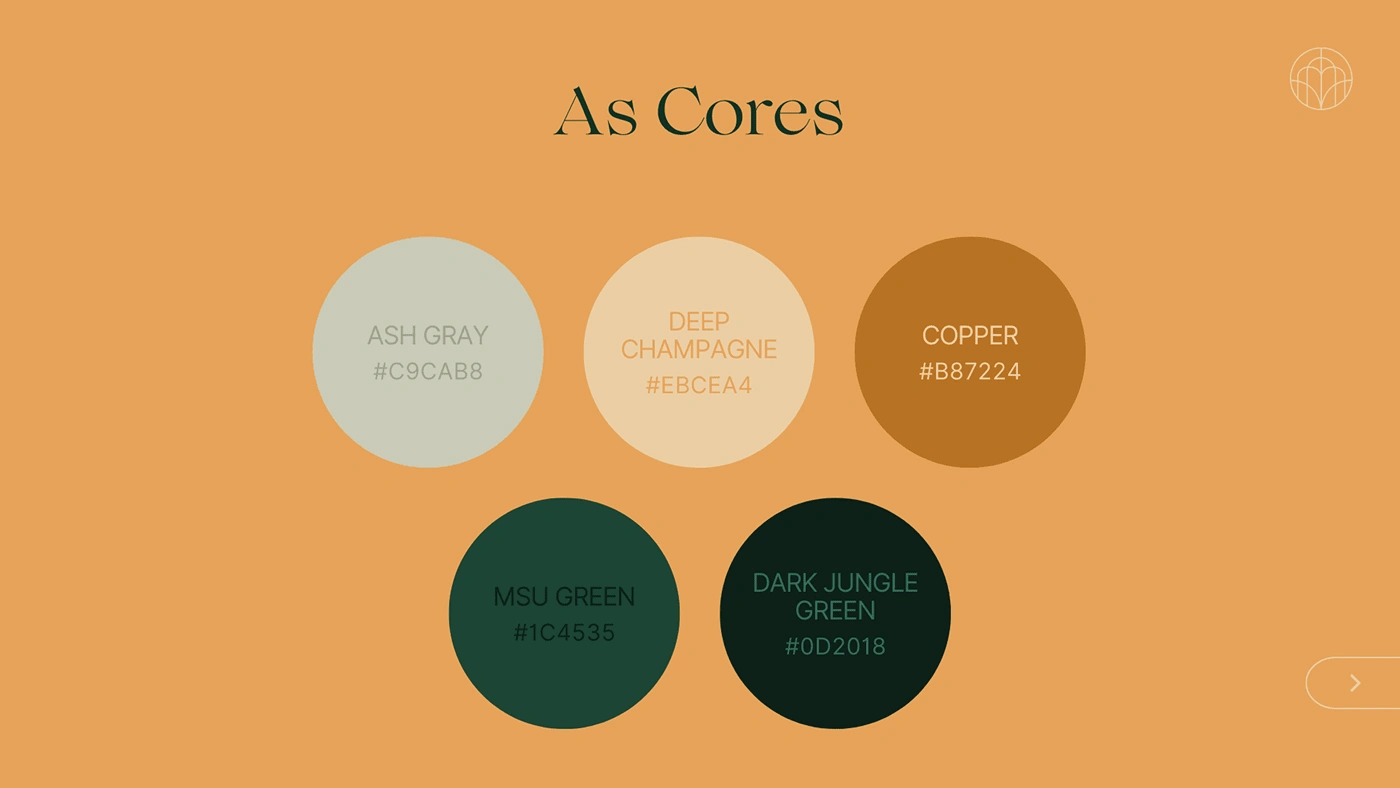
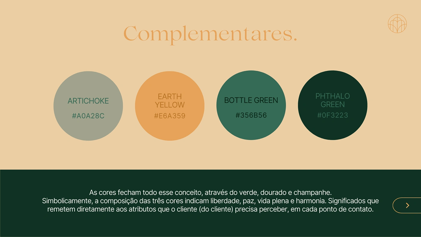
The brand palette was based on Juliana`s favorite colors, such as Dark Green and Copper, with 5 base colors and 4 contrast ones.


Like this project
Posted Feb 8, 2023
Brand Identity developed for brazilian lawyer Juliana Lunardi.
Likes
0
Views
12


