Meet KAMONA: The Design System pulsing through TeamApt’s produc…
Designing for one of Africa’s foremost fintech companies is an experience comparable to little else. Fast-paced and continuously evolving, TeamApt has an ecosystem of products that keep everyone on the team engaged.
In the early days of TeamApt, we were building everything for the first time. So we designed as the ideas led, full of passion and excitement. Soon, however, everything got increasingly inconsistent and we knew that something had to change.
Here’s the story of Kamona, and how it changed our work process.
What is Kamona?
During the lockdown, we worked on a Moniepoint mobile app targeted at consumers. It was an exciting process. I spent my days designing the already hashed-out flow but I soon noticed that something wasn’t quite right with our process.
Most of the features we were building out were repetitions. Whether they were components, widgets or entire screens, most of the things we now worked on were fundamentally similar to something we had previously designed.
For a fast-paced company like TeamApt, I realised that we needed to do things differently. It felt redundant having to create the same things repeatedly. I figured that if we continued at that rate, the entire project would be a chaotic mess. Something had to change.
The name “Kamona”, gotten from an iconic scene in Attack on Titans, is said by Levi, whose speed and skill embodied what we needed our design system to accomplish.
The goal was to optimise speed and effectiveness, creating faster delivery time for designs and the engineering team. In essence, it was to be a single source of truth — useful for all departments — designers, engineers, marketers and the like.
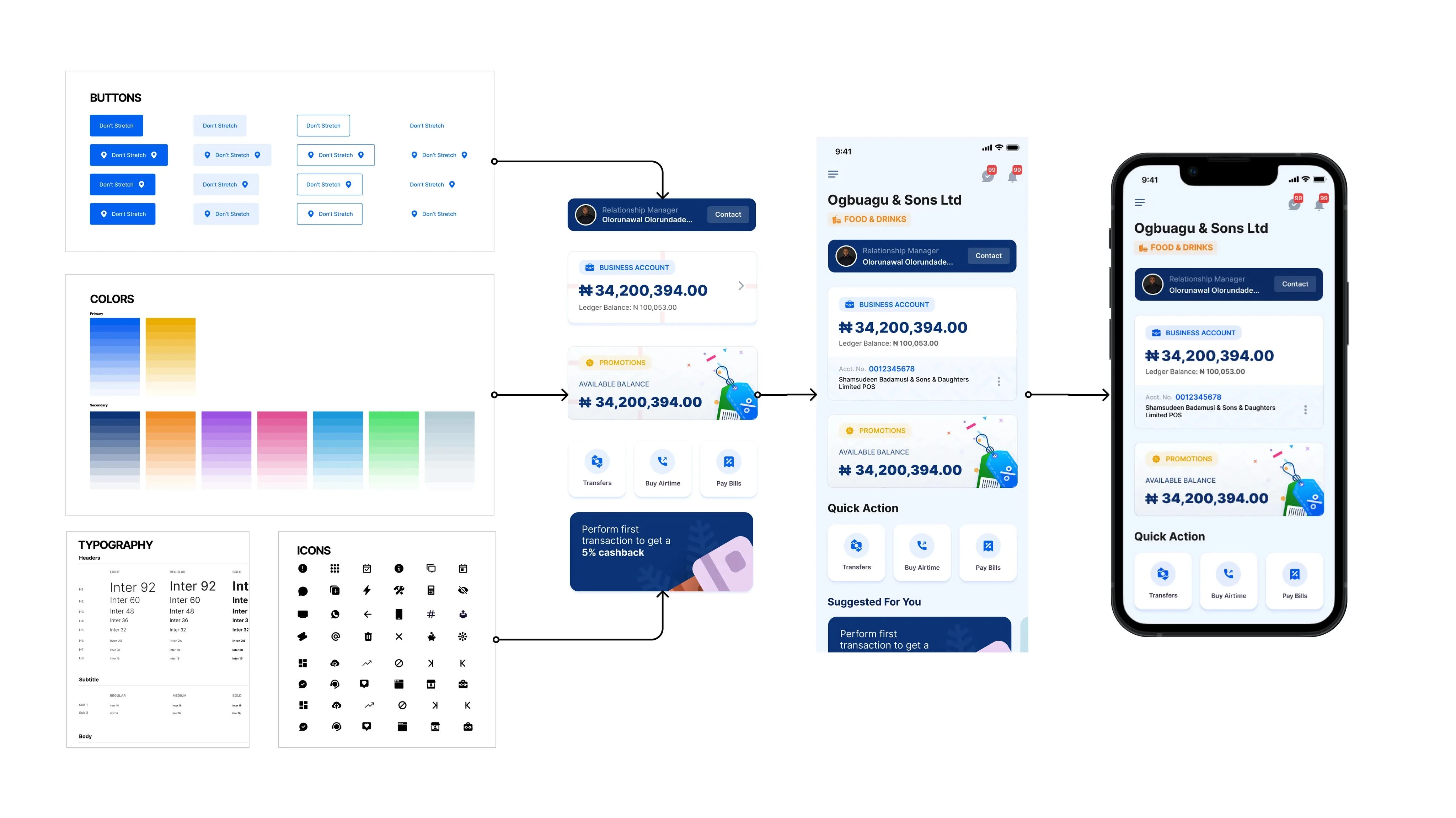
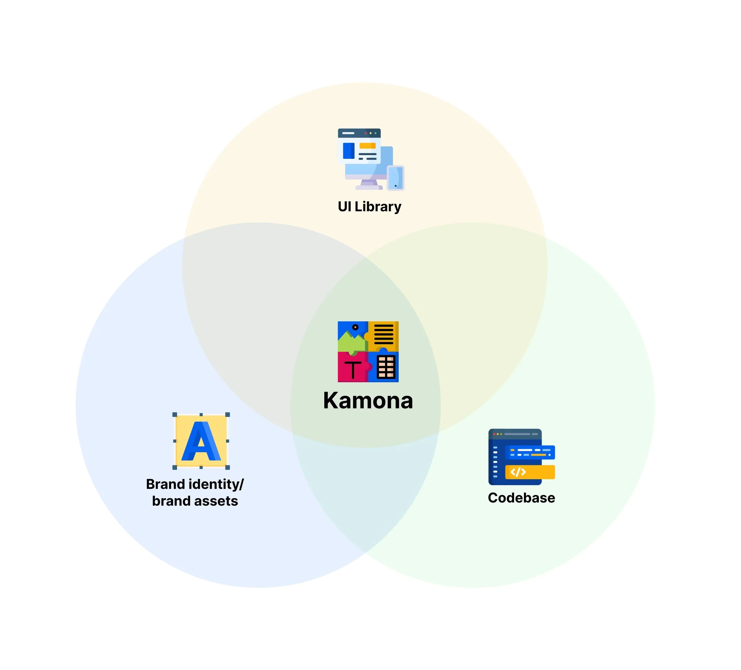
I sat with a team member, Adrian, and pitched the idea to him. We’ve been working with it since. Kamona is a design system created to be a platform-agnostic and consistent experience. Like most design systems, there are three main components of Kamona:
1) Brand identity/brand assets — visual design elements, typography, colours, etc.
2) UI Library — interface elements and how they are styled.
3) Codebase — the code elements to be designed i.e. the code translation of the UI elements that have already been designed.
Design systems are living and there are currently a lot of features on Kamona, including; Widgets, Illustrations, Icons, Input fields (form elements), Logos in different formats, for different platforms, Dialogues, and lots more.
Why did we need a Design System?
While our work began with a greatly inspired burst, it was soon taking us a little too long to complete projects. This was because we had to create all of our designs from scratch. These designs mostly had some recurring features and yet, we often had to go back to the drawing board.
We had been building products and creating features but this time, it became glaring how time-consuming it was to create them from scratch every time. A design system was necessary because:
It was more efficient: Creating a design system would save us time and resources, and it has. It effectively cut down the time it took to accomplish tasks and innovate because we cut out the repetitive aspects. We could easily use components that we had created before. Creating new things was also easier because we had a system to work with.
It eased communication between teams: Although it was difficult getting the teams to adopt Kamona, having a design system made communication between teams relatively simple. Design, product and engineering teams now had a central point where we could collaborate easily. This also meant better optimisation for our users and a better product experience.
It standardised our design process: Kamona became the standard for our designs, and as we evolved, it did too. Since we started using Kamona, we’ve had up to 5 recruits. Once I showed them Kamona, they seemed to get it almost immediately without much explanation. I just had to explain that it was the company library and tell them to use it with care. Once they saw it, they instantly knew what to do with it. We structured it in a way that made you know where things were and what to do. Now, we have faster design times and faster delivery times.
Getting buy-in for Kamona
The hardest part of building a design system is getting the organizational willpower to commit to it. With Kamona, we faced difficulty getting the engineering team to accept and adapt to it.
For them, it was understandably safer to stick with what we currently had. They wanted things to be stable and the change did not seem necessary at the time.
However, understanding how important it would be to the efficiency of our work process, in the long run, I knew I had to find a way to upsell it to them. Many didn’t warm up to it at first, but having convinced Adrian of its importance, I figured I just had to keep trying.
Even though it wasn’t initially accepted, we kept using the Kamona system. We worked on it and when we got to a stable point, I decided to make an explainer video for my colleagues and post it on our internal social media platform. This helped to sell the value of the design system to a lot of people.
The moment I knew we had won, however, was when I dropped the name “Kamona” and it was accepted.
I realised that it was about proving to them the value of having a design system, and by the time they could see how genuinely important it was, they were sold on it. They now saw that we didn’t need to continue with our current chaos as there was now a system to save time and stress.
A more efficient work process.
People make the mistake of assuming that design systems are built to only cater to visuals and the design team, but it is important for everyone. Our engineering team uses Kamona. There are numerous times when they want to flesh out new features that require design assets. These could be complex features that require a lot of time to be put into thinking and playing out the user journey, but with access to Kamona, the story is different.
Currently, the engineering team only reaches out to us when they want to flesh out new features requiring assets they don’t have. These may be complex features that require critical thinking in plotting out the user journey. They can easily access the design system. They only reach out to us when they run into a hitch and don’t want to make mistakes when implementing.
We use Kamona to create the solution and features and walk them through it. We ensure everyone agrees and is satisfied and that what we designed meets their expectations, and then we do a proper handoff.
To put how much time this saves us into context, if we were to design Moniepoint from scratch, a team of 7 people would take 18 months to complete the design.
However, with a design system like Kamona, the duration drops to about 8 months. That’s less than half the time it would have taken us before.
Final Thoughts
Pitching Kamona has been one of my most exciting projects at TeamApt and I had the best team to work with. We are prepared to evolve as Moniepoint’s visual language and strategy evolve. At every point in time, the goal is to have a design system that is tailored to the company’s needs.
Today’s realities were yesterday’s dreams and as we align with the company’s mission to power dreams, we know that this is just the beginning for us and Kamona could be bigger than we currently imagine. While Kamona isn’t publicly available right now, we’ll keep sharing what updates as we go — so stay tuned for future posts!
P.S. Want to join us in making the most of Kamona, and building a design system for world class financial products? Explore open roles.
Like this project
0
Posted Aug 25, 2023
Designing for one of Africa’s foremost fintech companies is an experience comparable to little else. Fast-paced and continuously evolving, TeamApt has an ecosy…
Likes
0
Views
18


