Shape & Sate | Naming and Brand Identity
Sophie OConnor
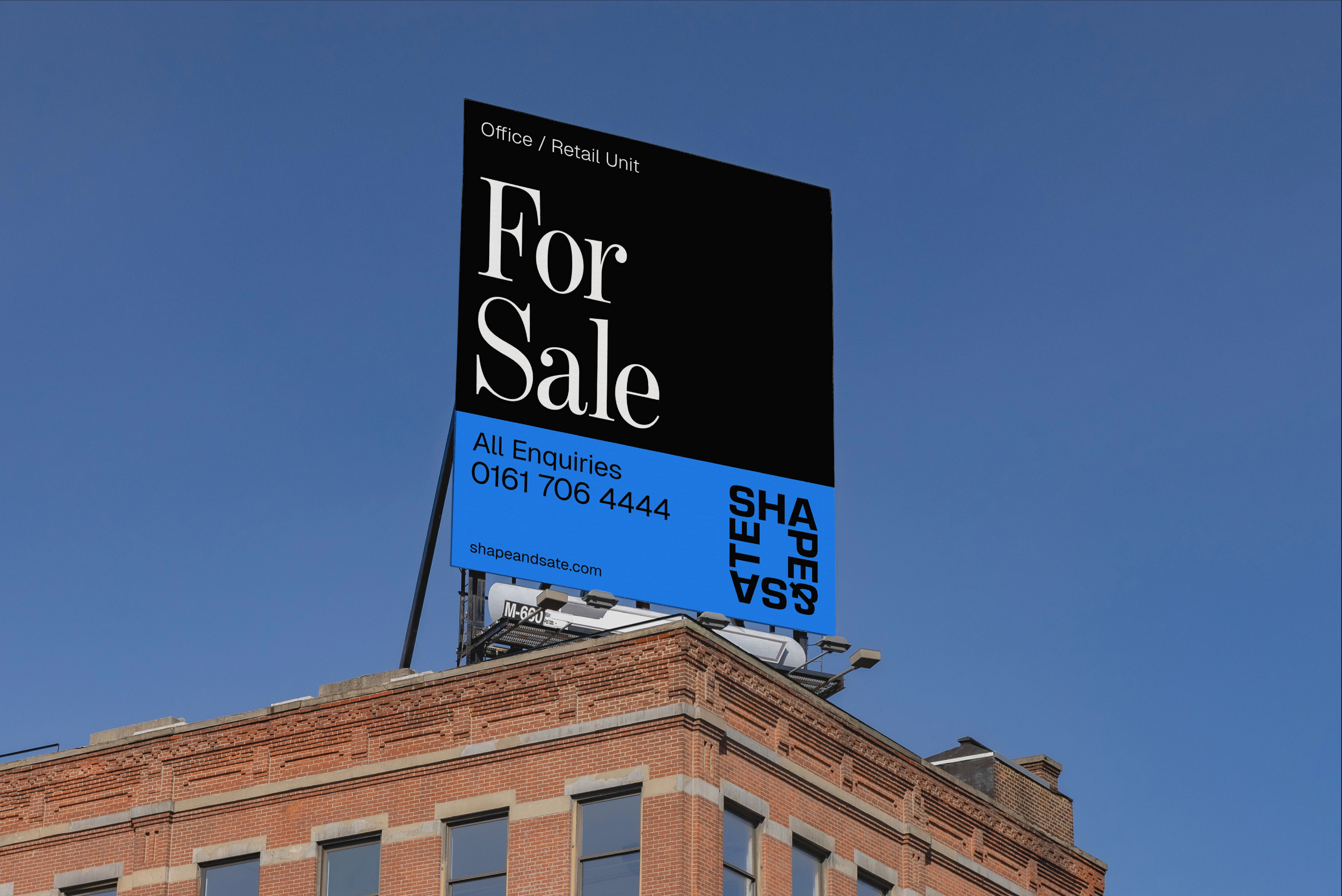
Shape & Sate is a Manchester-based boutique property consultancy. Curating retail and leisure spaces for tenants and landlords across the North.
A new kind of consultancy, built around a clear mission: to curate opportunity through considered support and advice. Pragmatic. Affable. Innovative.
This thinking shaped everything – including the name. Shape & Sate reflects the balance between carefully crafted spaces and outcomes that truly satisfy. Two words. One philosophy.
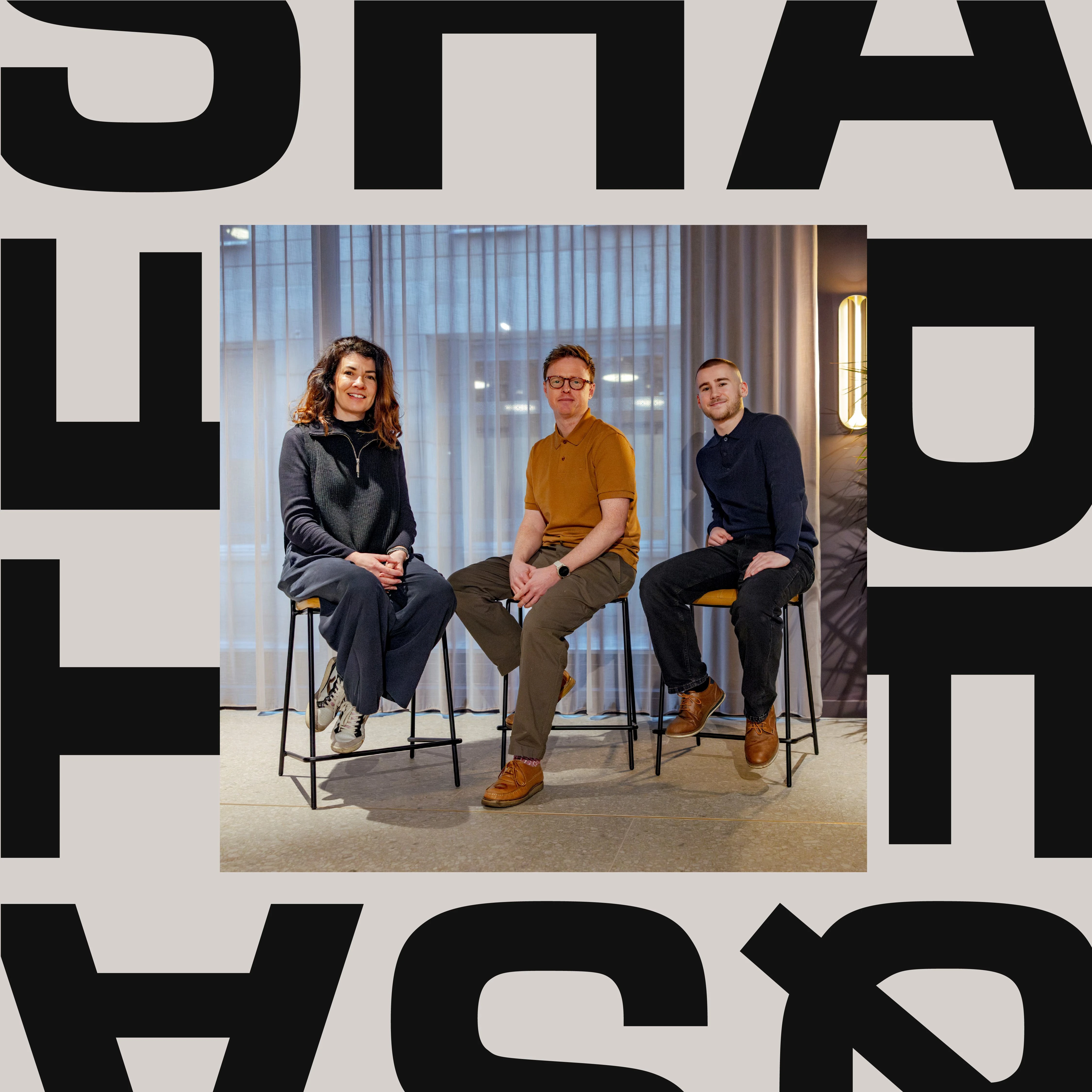
The visual identity centres on a bold typographic wordmark that works in isolation and as a secondary frame across all brand assets, brought to life through motion. A vibrant five-colour palette that stands apart from every other competitor in the space, and a design system comprehensive enough to take Shape & Sate from socials to marketing boards on the streets of Manchester and beyond.

Property Hoarding
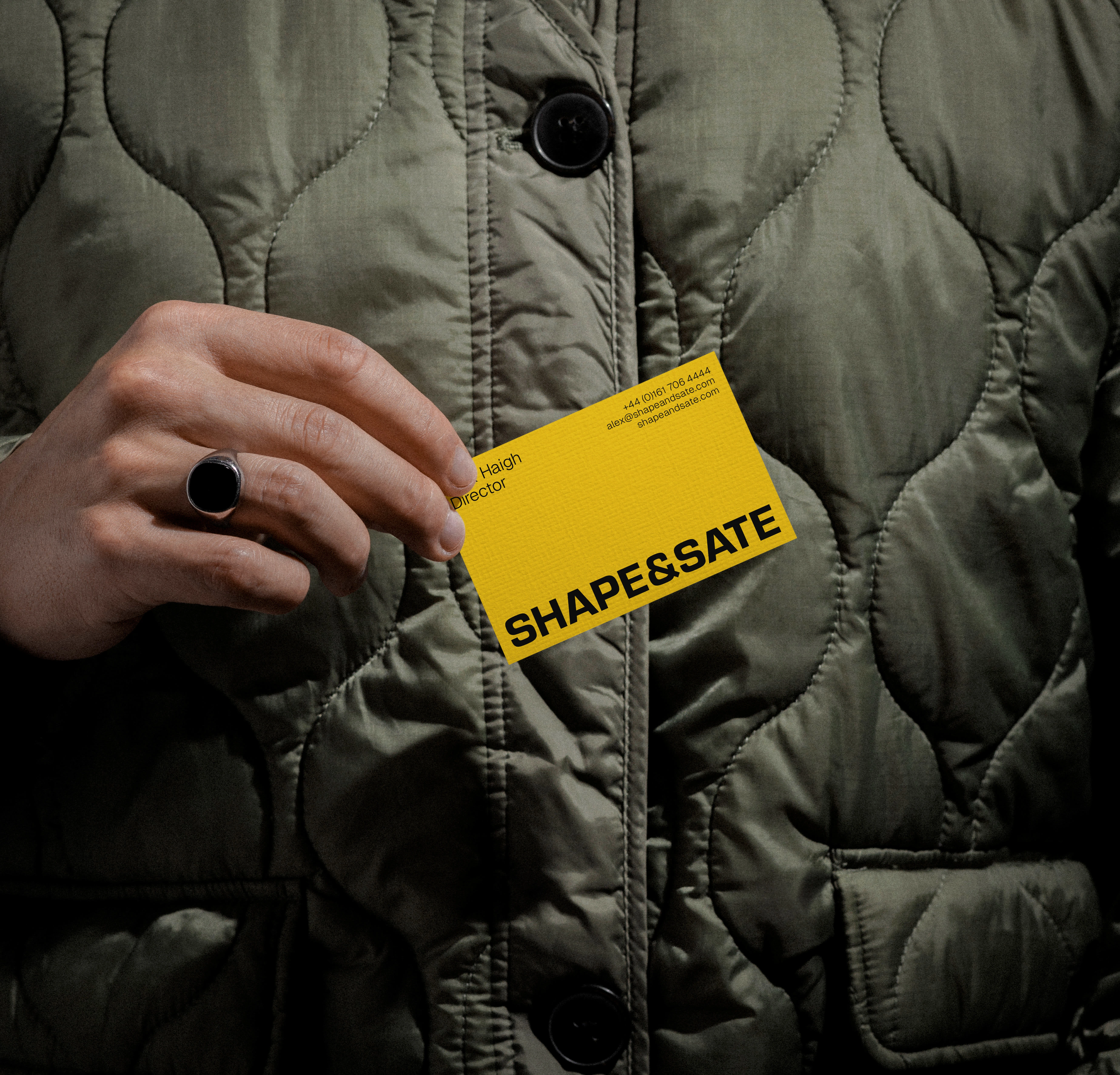
Business Card
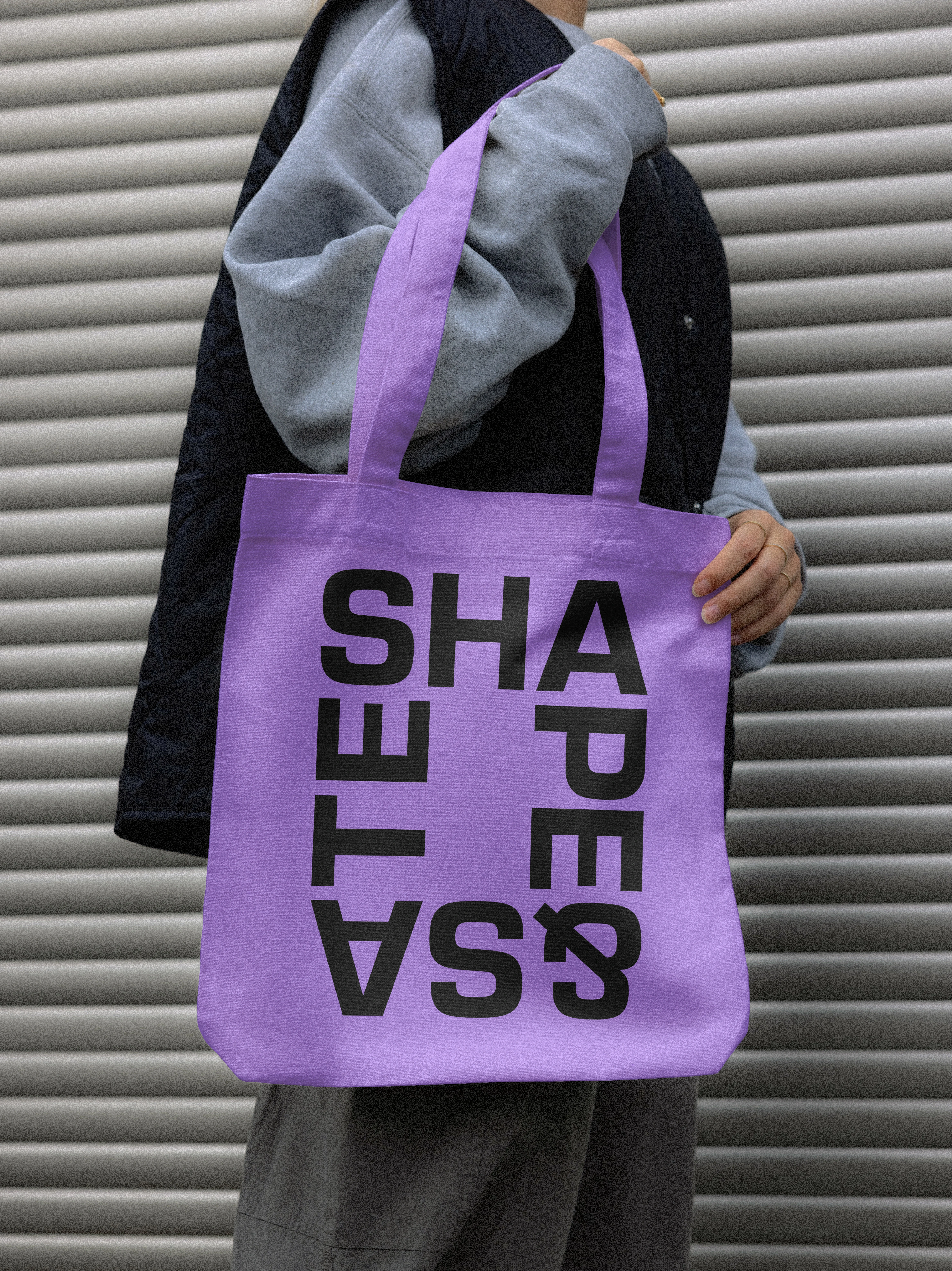
Tote Bag
Social Media Post
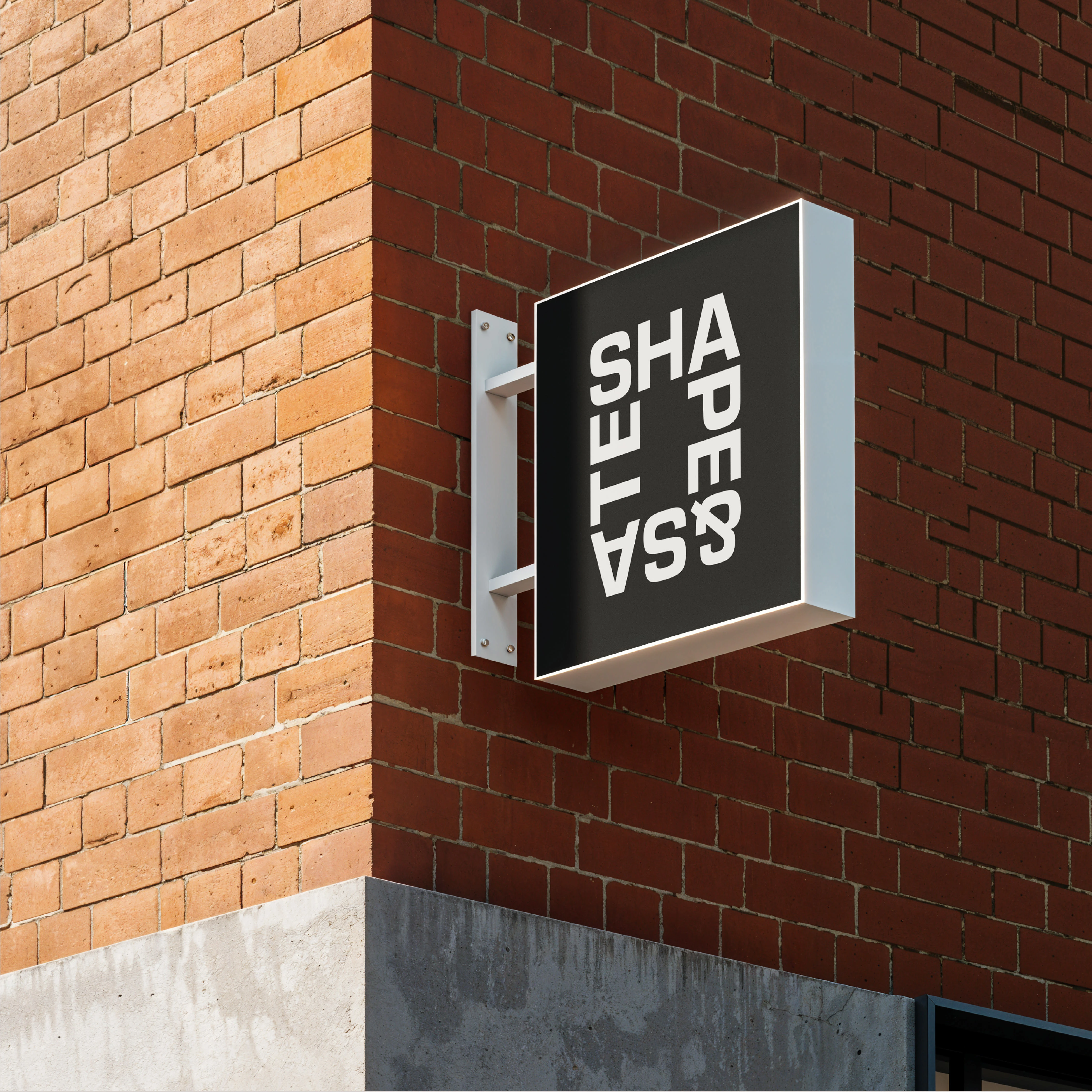
Signage
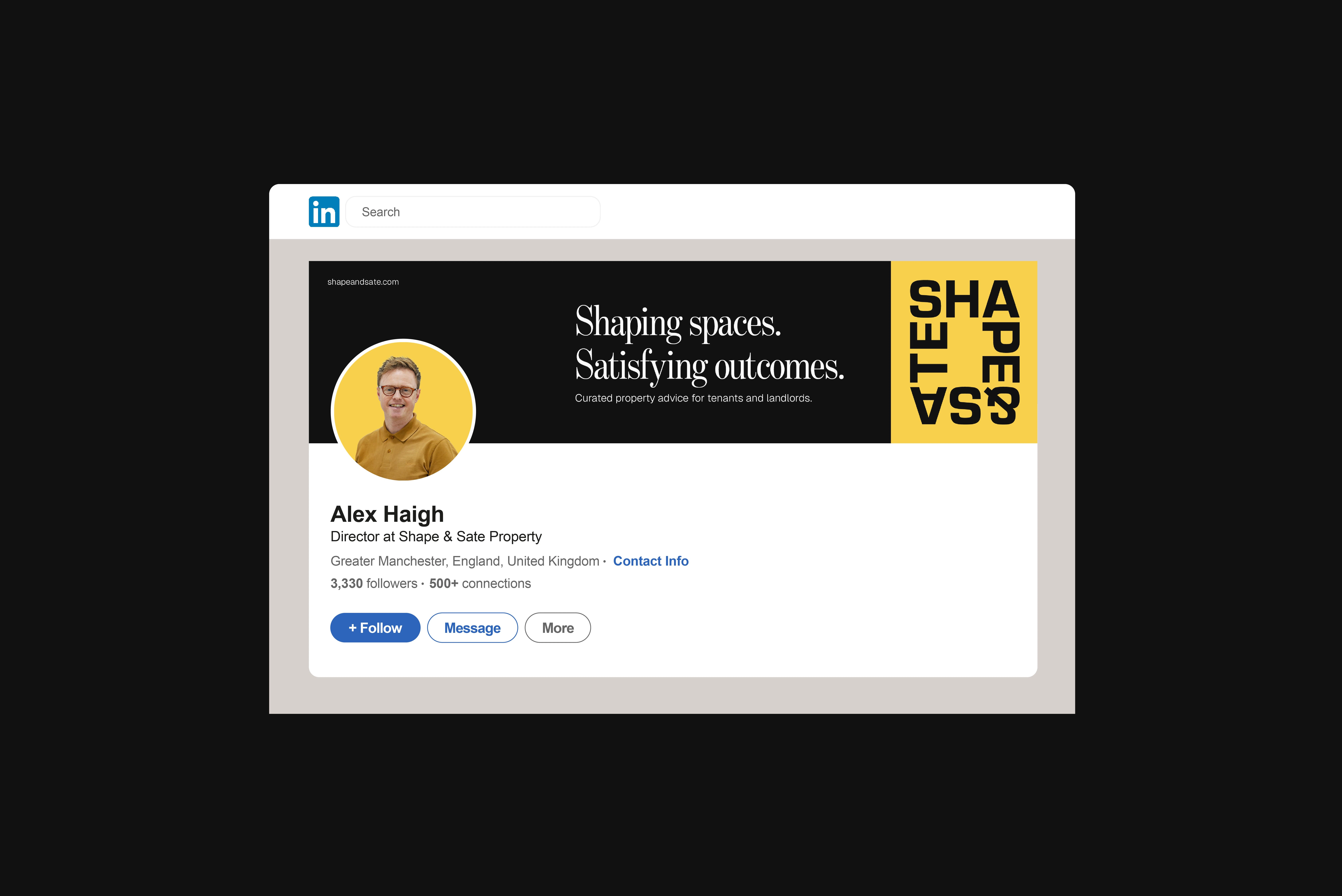
LinkedIn Profile
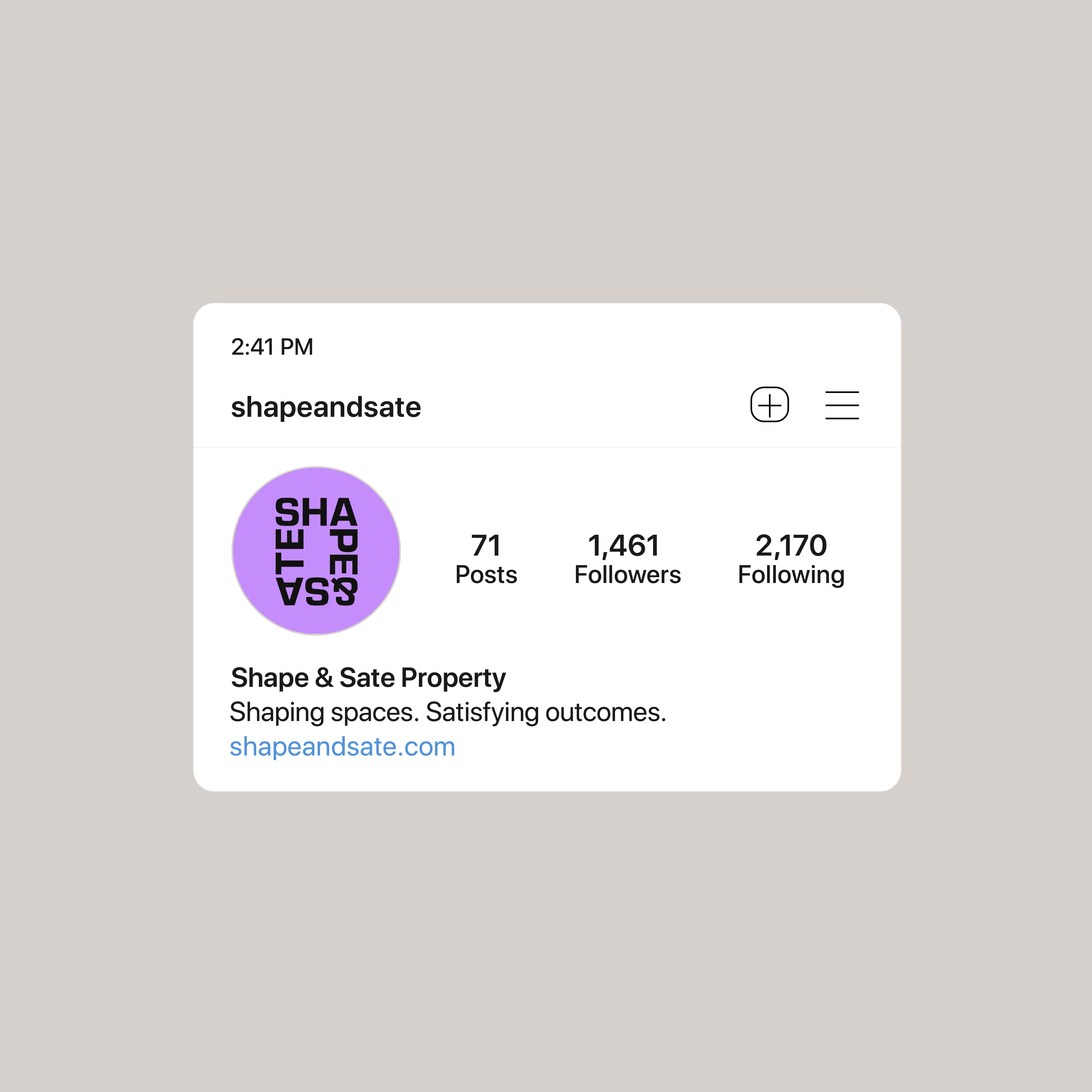
Social Media Profile
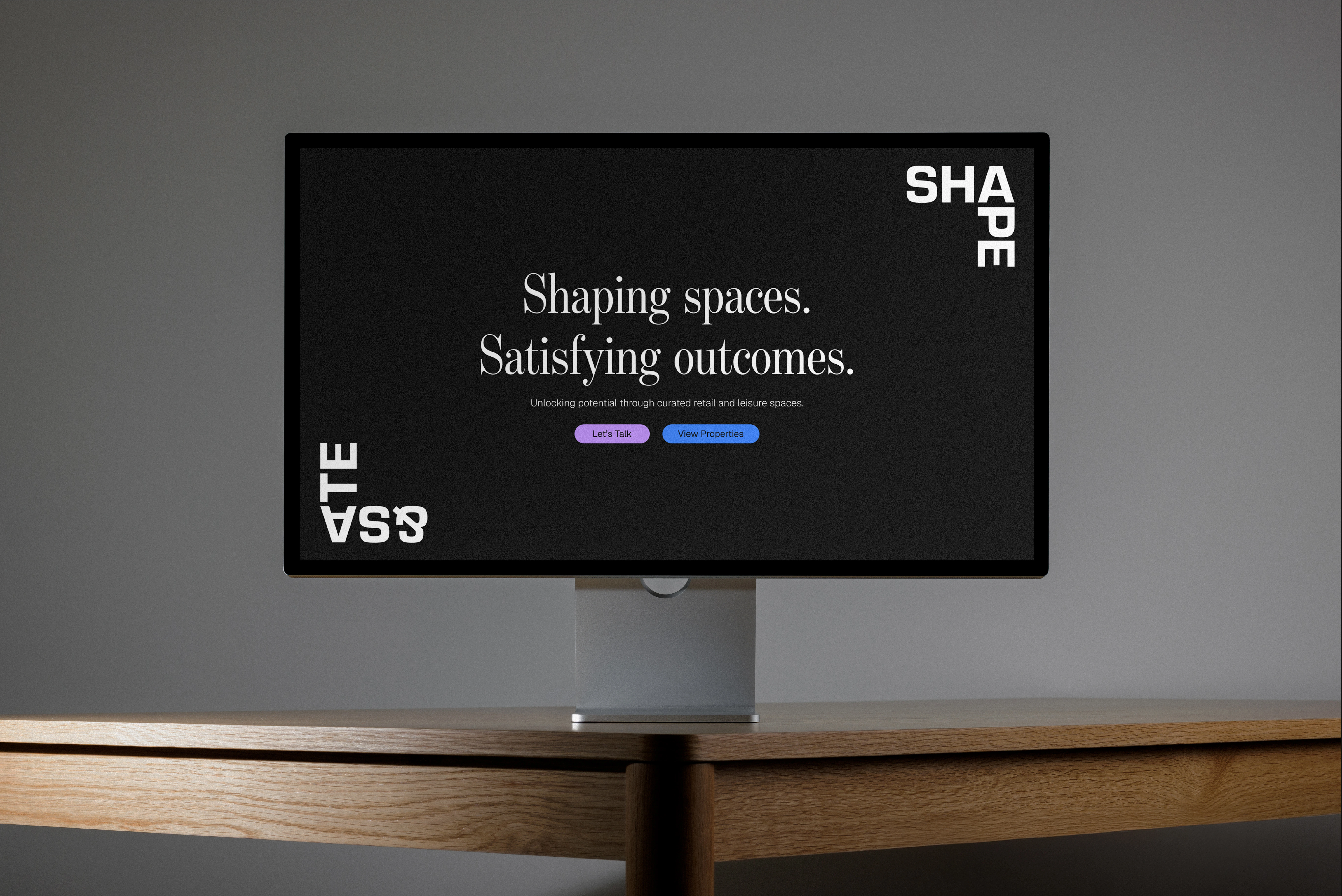
Landing Page
Like this project
Posted Apr 24, 2026
Shape & Sate is a Manchester-based boutique property consultancy. Curating retail and leisure spaces for tenants and landlords across the North.
Likes
0
Views
4