Kitchcomp Food Delivery App Design
Alexander Owolabi
Kitchcomp
A UX case study
Role:
Lead Product (UX/UI) Designer
Project Goal:
Develop a food delivery app tailored for busy professionals who need customizable meals delivered quickly and efficiently.
Research & Outcomes
The Challenge
Despite the abundance of food delivery apps on the market, busy professionals still struggle with overly complex interfaces (especially menus), limited payment options, and poor customization features. Kitchcomp is designed to solve these issues by offering a seamless, user-friendly mobile app experience focused on speed, flexibility, and personalization that puts user needs first.
Research Approach - Survey
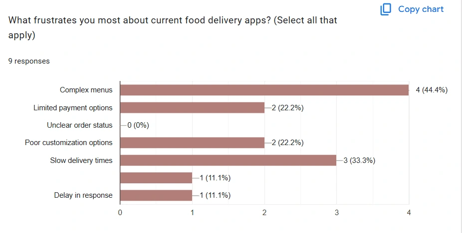
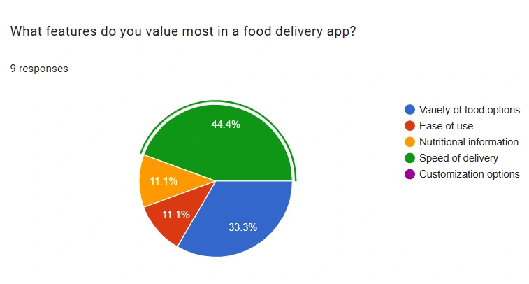
To better understand user pain points and preferences, I conducted a survey focused on food delivery app experiences.
Frustrations with existing food delivery apps
Overly complex menus (most common complaint)
Limited payment options
Poor meal customization
Unclear order tracking
Most valued
Variety of food options
Speed of delivery (highest priority)
Access to detailed nutritional info
Intended Audience
Busy, tech-savvy professionals seeking a reliable, efficient food delivery solution with robust customization and clear, real-time order tracking.
User Persona
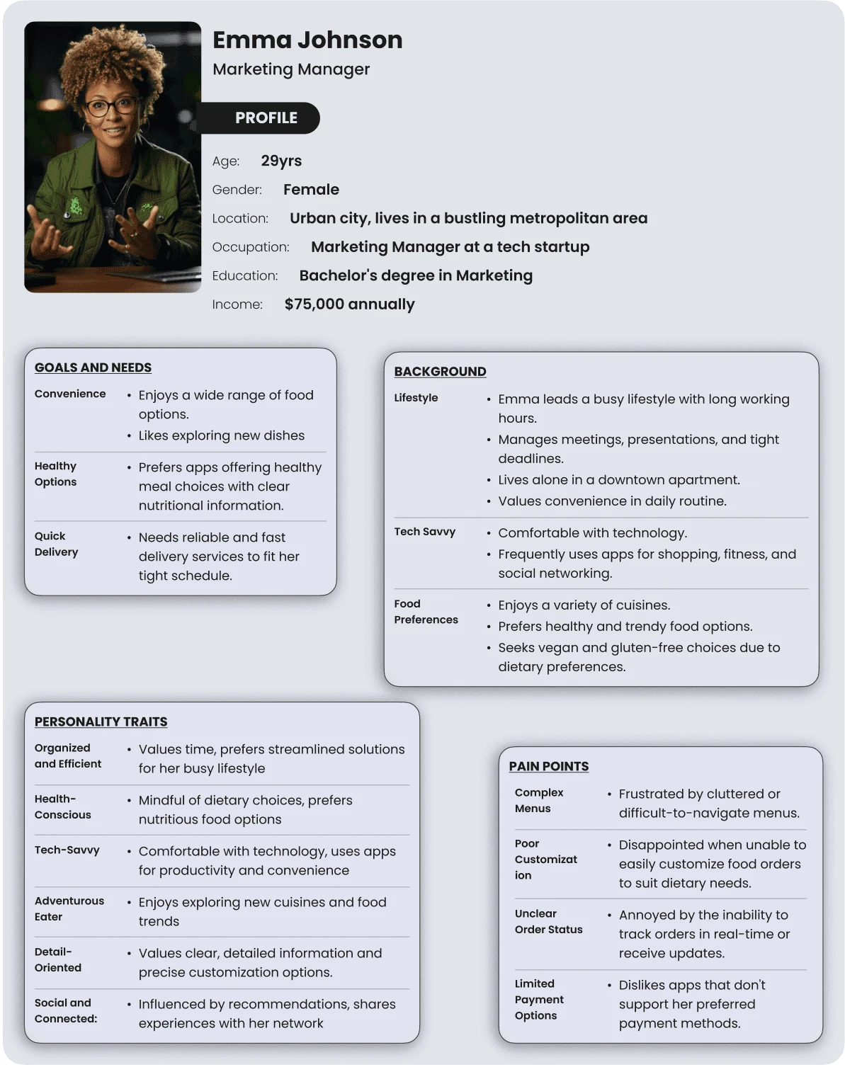
User Persona development
To ground our design decisions in real user needs, I developed a user persona informed by both project goals and survey insights.
Meet Emma Johnson—a busy professional who rarely has time to cook but values healthy eating and enjoys trying trendy meals. Emma’s lifestyle highlights the need for convenience, nutritional transparency, and variety. Her challenges and goals helped shape core features of the app, ensuring Kitchcomp meets the expectations of its primary audience.
"This persona served as a guiding reference throughout the design process, keeping the user at the center of every decision".
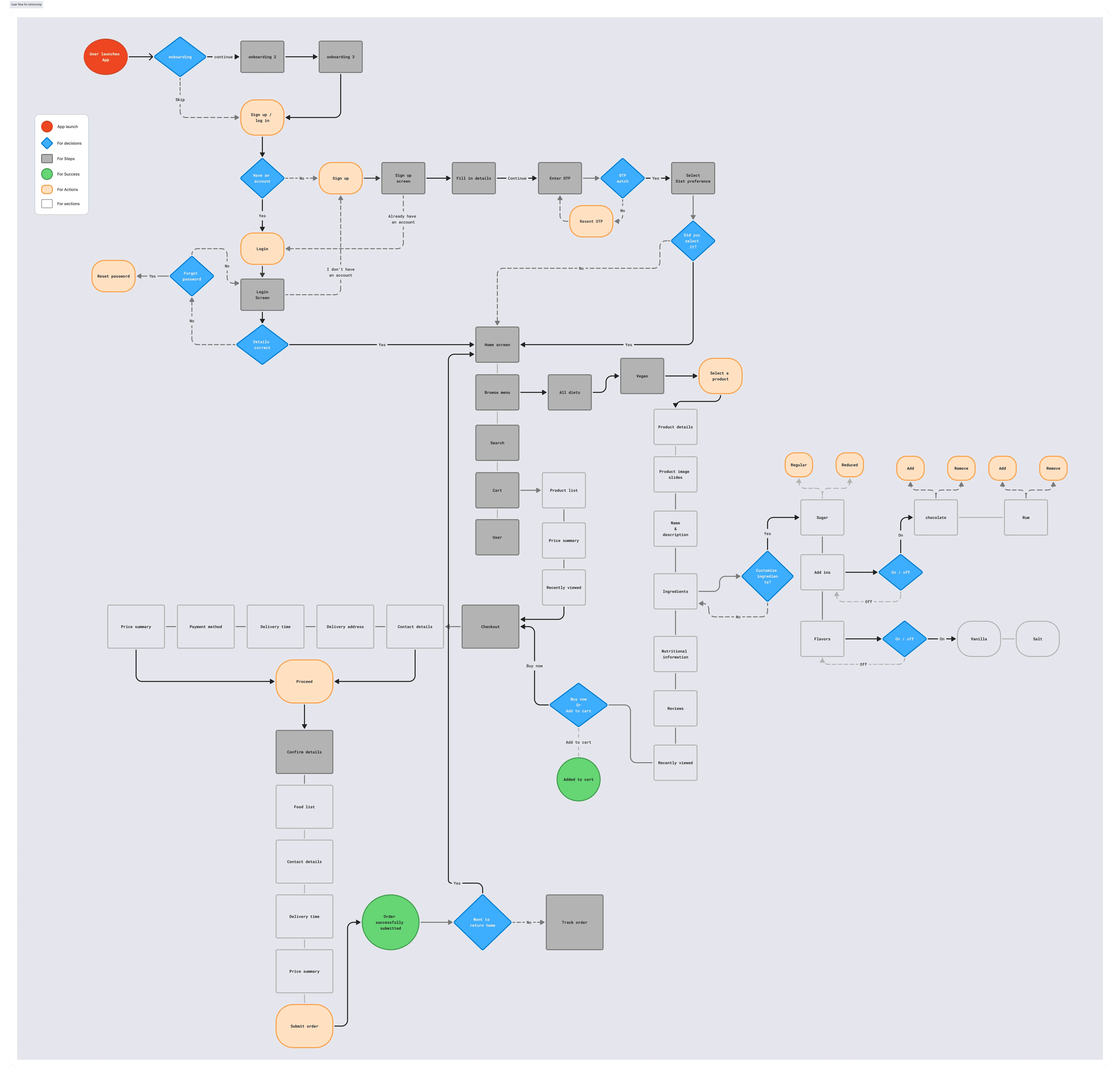
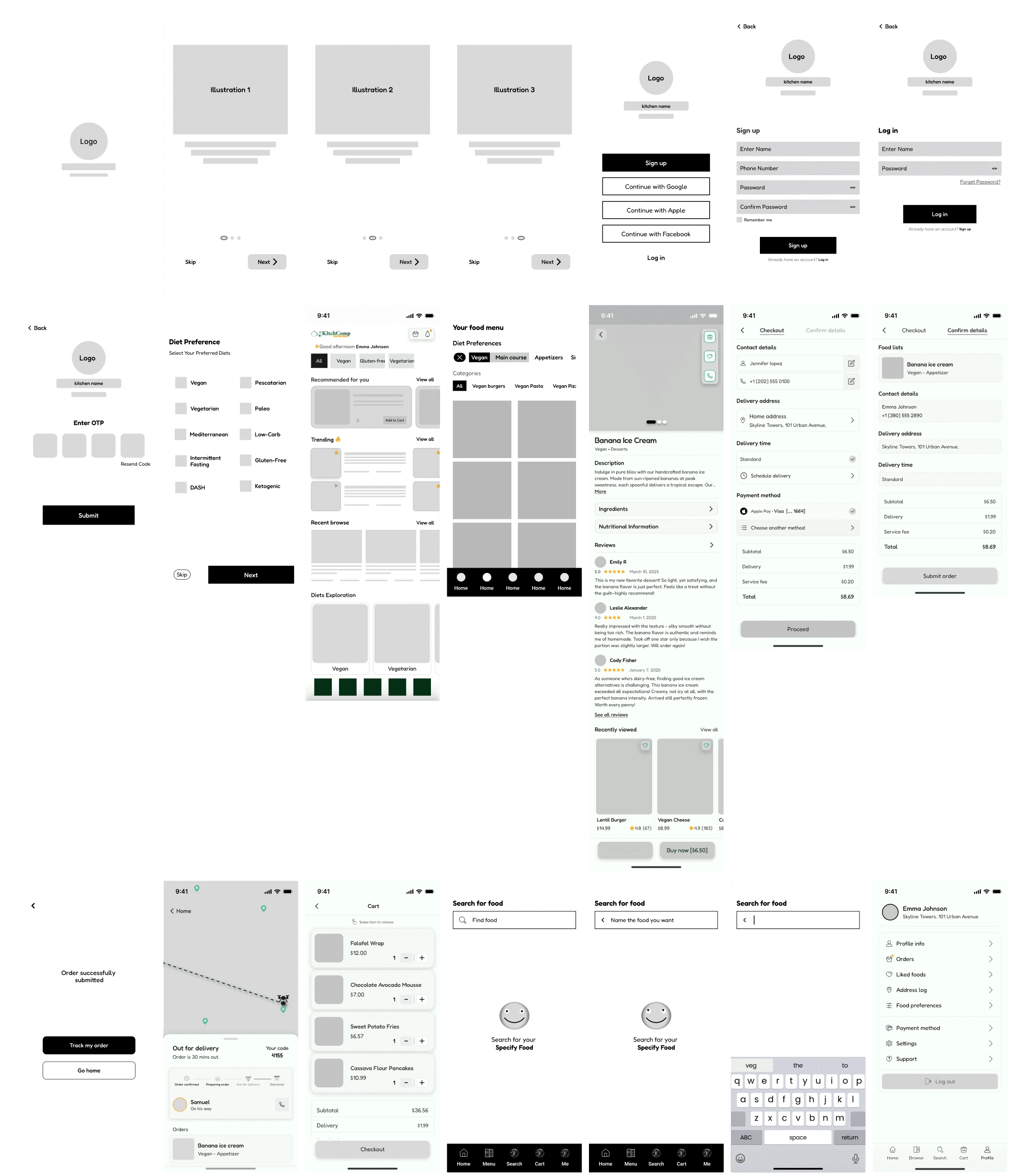
User flow
Wireframes
Addressed pain points
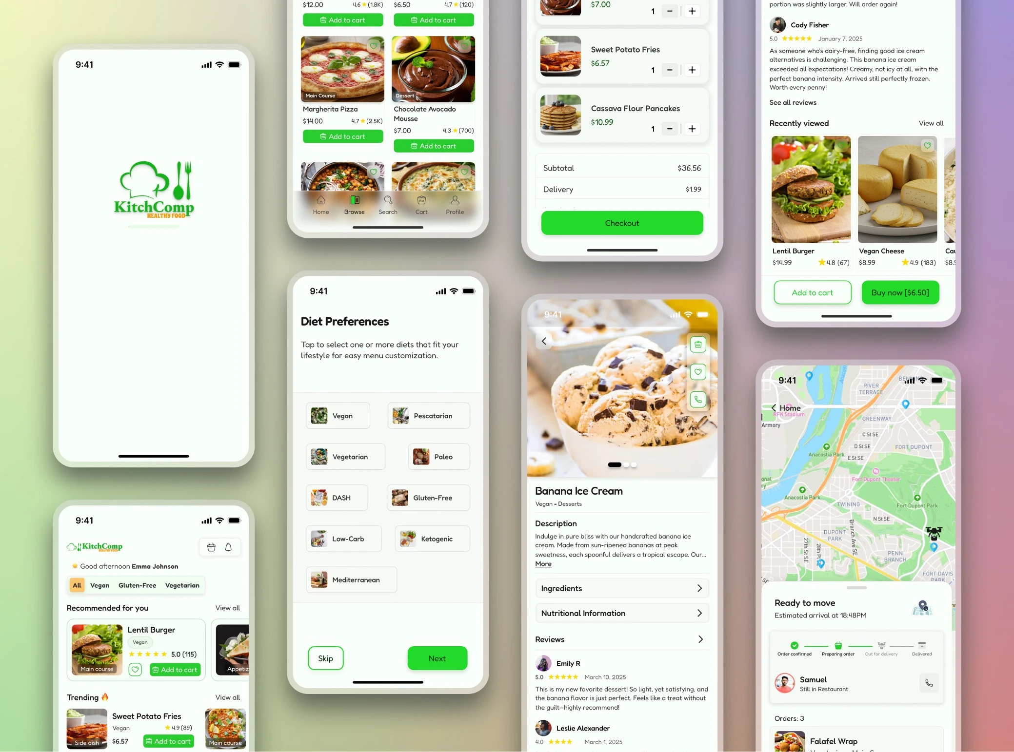
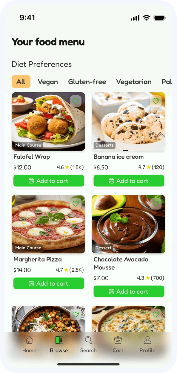
Complex Menu
Streamlined Dietary Filtering
One of the most common complaints uncovered in user research was the complexity of existing menu layouts. To address this, I explored filtering systems from familiar platforms like Spotify, LinkedIn, and YouTube—tools users already navigate with ease.
Spotify's intuitive genre-based navigation stood out as a strong parallel. Inspired by this, I implemented a similar system within Kitchcomp’s. It features a clean top navigation bar that allows users to filter menu items by dietary preferences such as Vegan, Gluten-Free, and more.
This targeted filtering reduces clutter, lowers cognitive load, and makes it easier for users to quickly discover meals that fit their lifestyle, turning a once-overwhelming experience into a seamless one.
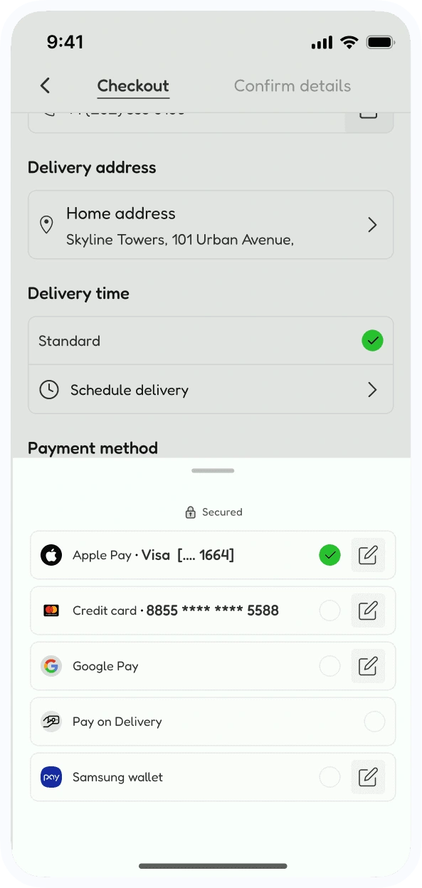
Limited payment option
Users often abandon checkout due to limited payment options, a major barrier to conversion and satisfaction. Addressing this, the payment flow in Kitchcomp was redesigned with flexibility, clarity, and trust in mind.
Multiple Payment Methods: Popular choices like Apple Pay, Google Pay, Samsung Wallet, credit/debit cards, and Pay on Delivery were integrated to meet varied user preferences.
Clear & Organized Layout: All payment options are presented in a unified, easily scannable section to minimize friction and decision fatigue during checkout.
Trust & Familiarity: Recognizable logos and secure partial card displays boost user confidence, making the process feel secure and familiar.
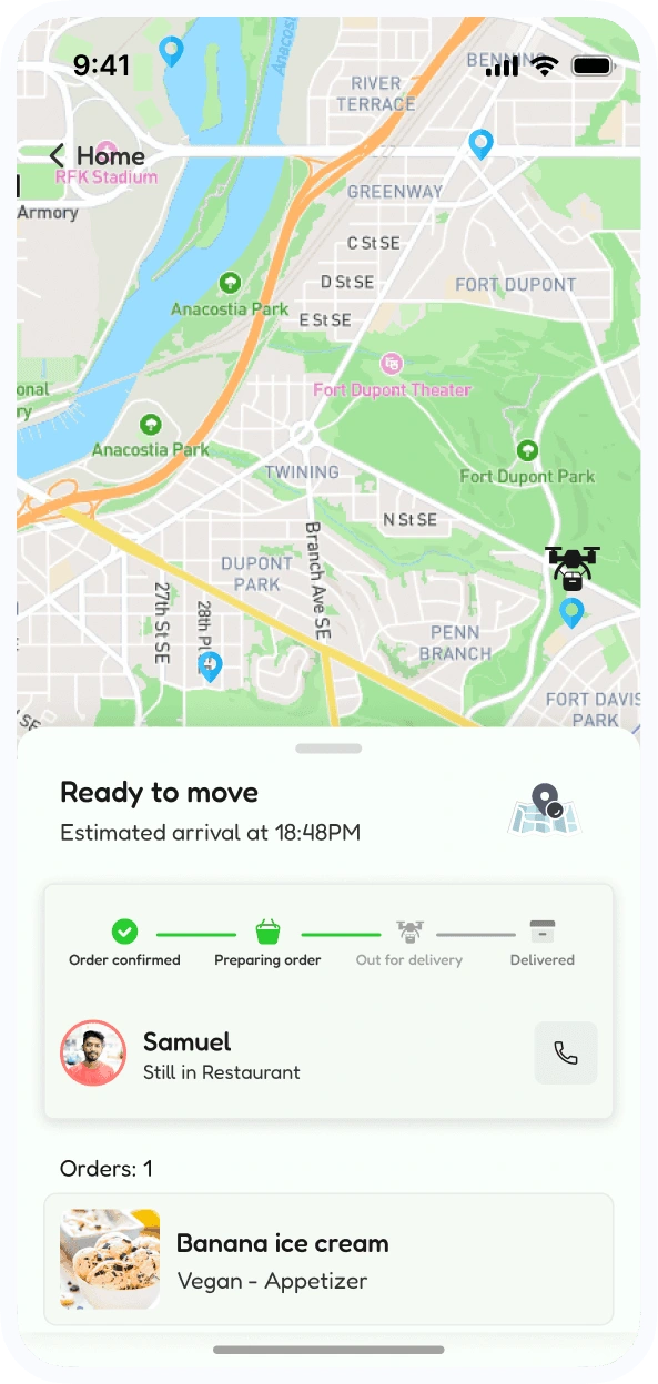
Unclear order status
Uncertainty around order status is a common frustration. Most of us have been there, waiting for updates with no clear timeline.
To solve this, Kitchcomp’s design introduces real-time tracking, providing users with an up-to-the-minute order status, estimated arrival time, and essential details. Additionally, a direct contact feature allows users to reach out to the delivery person for any immediate updates, eliminating confusion and enhancing the overall experience.
UI design
design components
Ideas not used
Key Learnings & Conclusion
Conclusion
From identifying real user frustrations to designing intuitive, human-centered solutions, Kitchcomp was shaped by empathy, strategy, and simplicity. Each feature—from streamlined dietary filters to flexible payment options and real-time order tracking—was purposefully crafted to meet the needs of busy professionals like Emma.
This project reaffirmed a core UX principle: great design doesn’t just look good—it solves real problems. By listening closely to users and leaning into familiar patterns they already trust, we were able to create a food delivery experience that feels effortless, personal, and dependable.
Kitchcomp isn’t just another app—it’s a step toward more thoughtful, efficient, and enjoyable digital experiences.
Key learnings
This project deepened my understanding of how meticulous user research and iterative design processes can create an impactful digital product tailored to real-world user needs.
Figma Prototype Link
For an interactive exploration of the final design and user flows, view the prototype below:
Like this project
Posted May 23, 2025
Developed a user-friendly food delivery app for busy professionals with improved customization and tracking.