Built with Framer
Rukn-Architectural Studio Landing Page
Oussama Chuiter
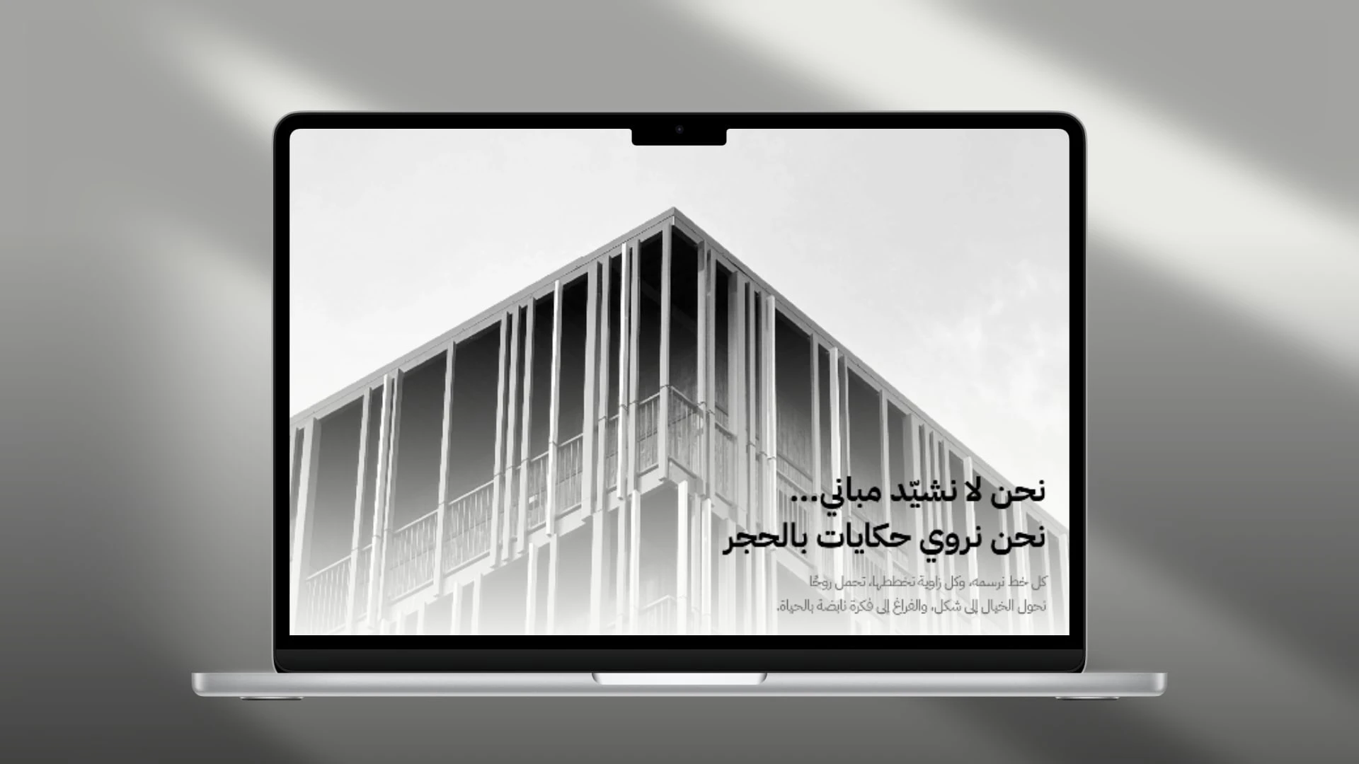
Too many architecture websites look artistic but fail to explain their value. With Rukn, I focused on clarity, storytelling, and effortless navigation.
✅ Hero Section That Inspires Trust Straightforward headline: “We design spaces that tell stories.” It immediately connects with visitors and speaks to what clients truly want — meaningful design with identity.
✅ Clean & Minimal Navigation A simple header with four anchors — Who We Are, Why Choose Us, Testimonials, Projects — guiding visitors without distraction.
✅ Story-Driven Sections From “We start with your feeling” to “Attention to detail as the essence of beauty”, every section flows like a narrative, reducing confusion and building connection.
✅ Key Service Highlights Residential design, interior spaces, commercial projects, and 3D visualization all presented in clear, concise cards.
✨ Built Entirely in Framer
Fully responsive across devices
Smooth, zero-code transitions
Easy for updates and content edits
Lightweight, elegant, and fast
🚀 Outcome
A refined, story-driven landing page that feels premium and inspires confidence. It doesn’t just show design — it communicates the studio’s philosophy and nudges visitors to engage.
If you’re building something unique and want a digital presence that reflects it, let’s connect 🤝
Like this project
Posted Sep 21, 2025
Rukn is a clean and modern landing page for an architectural studio, highlighting its design philosophy, key projects, and signature services.
Likes
1
Views
7
Timeline
Jul 21, 2025 - Jul 28, 2025