Built with Framer
Clinic Performance Dashboard Design
Oussama Chuiter
Too many dashboards show data but leave users confused. So here, I focused on clarity, speed, and actionable insights.
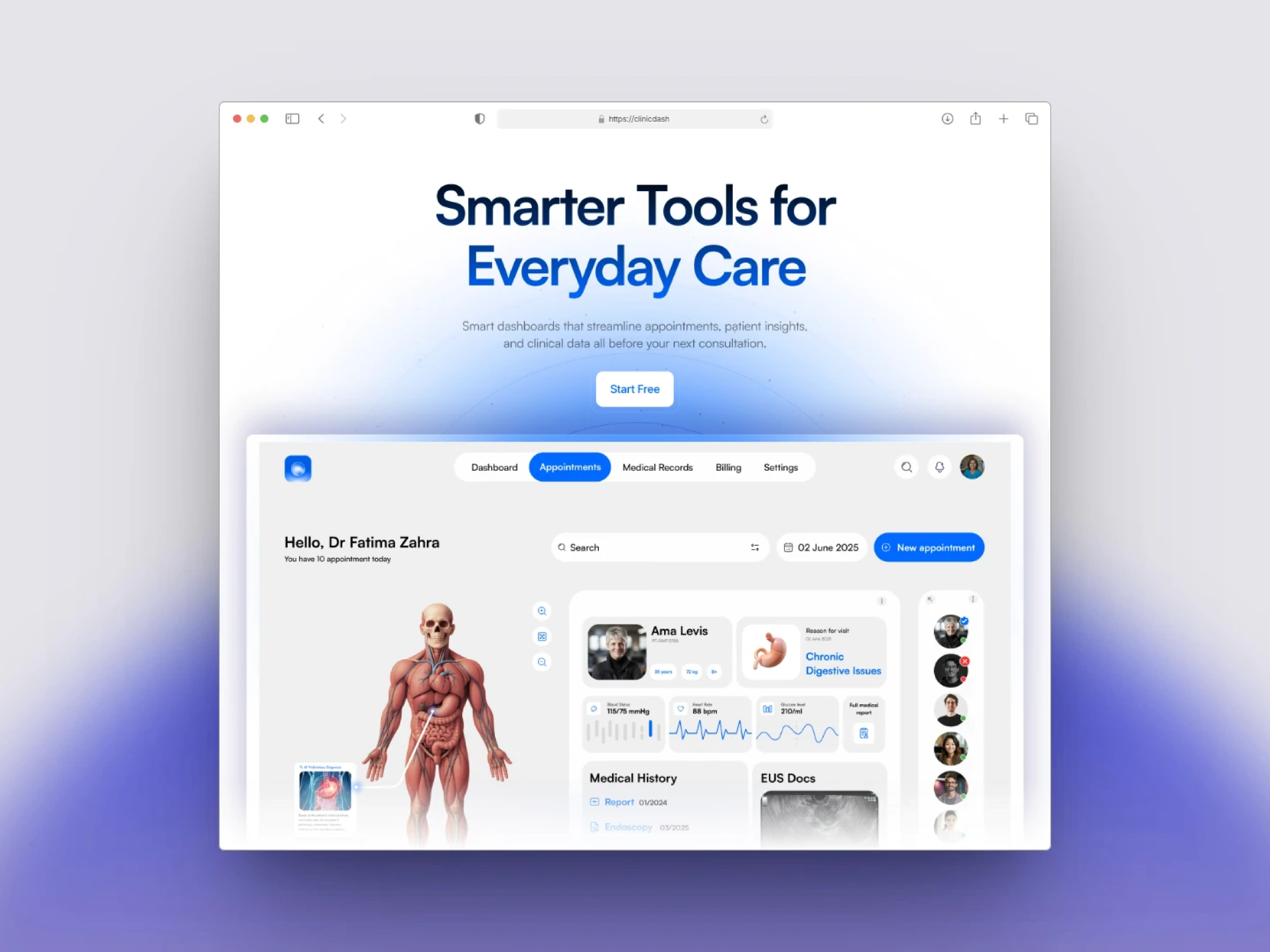
✅ Hero Section That Communicates Performance Fast Straight to the point: “Insights that don’t just look good but drive action.” It builds instant trust and speaks directly to what clinics and managers care about.
✅ Clean & Modern Navigation Minimal header with a bold CTA “Start Free” designed to catch the eye and drive clicks without distractions.
✅ Action-Oriented Sections From “View Metrics” to “Analyze Trends,” every section is built to reduce friction and guide users toward better decisions.
✅ Real-Time, Reliable Data Weekly visits, satisfaction rates, revenue stats — all the key numbers your clinic needs, updated live and easy to interpret.
✨ Built Entirely in Framer Fully responsive across devices Zero-code transitions and smooth scroll Easy for the client to edit and manage content post-launch Lightweight and fast-loading
🚀 Outcome A high-converting, premium-feeling dashboard that presents clinic performance clearly and confidently. It doesn’t overwhelm users — it guides them to act. That’s the difference between a dashboard that looks good and one that performs.
If you want to showcase your clinic’s performance in a way that’s clear, fast, and actionable, let’s connect. 🤝
Like this project
Posted Sep 21, 2025
ClinicDash turns clinic data into clear, actionable insights. Track key metrics, monitor performance in real-time, and make smarter decisions
Likes
1
Views
5
Timeline
Jun 10, 2025 - Jun 15, 2025