Octojan Logistics INC Rebranding
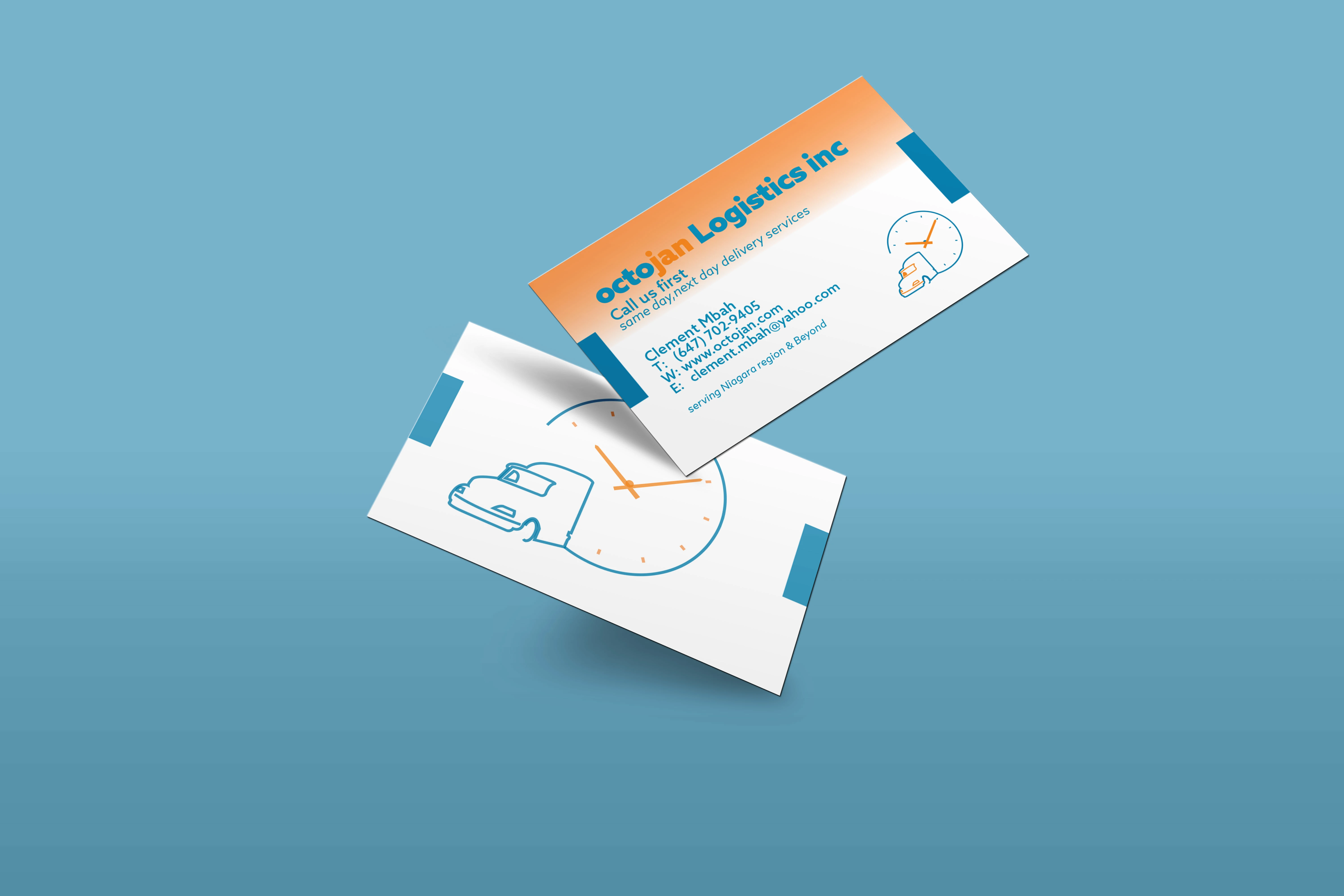



Octojan Logistics a prominent logistics company based in Niagara Falls, aimed to refresh its visual identity to encourage brand recognition.
It required a more uniform and modern look, aligning with the company’s growth and evolving industry standards. This included comprehensive logo redesign, typography, color palette, and brand assets. The colors orange and blue held a deep meaning to the owners so it was necessary to keep them. The new logo retains the essence of the original design, symbolizing continuity trust, and respect for others’ time, while incorporating modern elements to signify innovation and advancement. A modern sans-serif typeface was selected for its clean lines and readability, reflecting the company’s professionalism and efficiency. The typography was carefully chosen to ensure consistency and coherence across all brand communications.
June 2022
Like this project
Posted Jun 20, 2024
I had the chance to work with a local business to help them rebrand as they moved to the next phase of their business. Here are some of the things I designed.

