
JULIA DRUMOND / Architecture
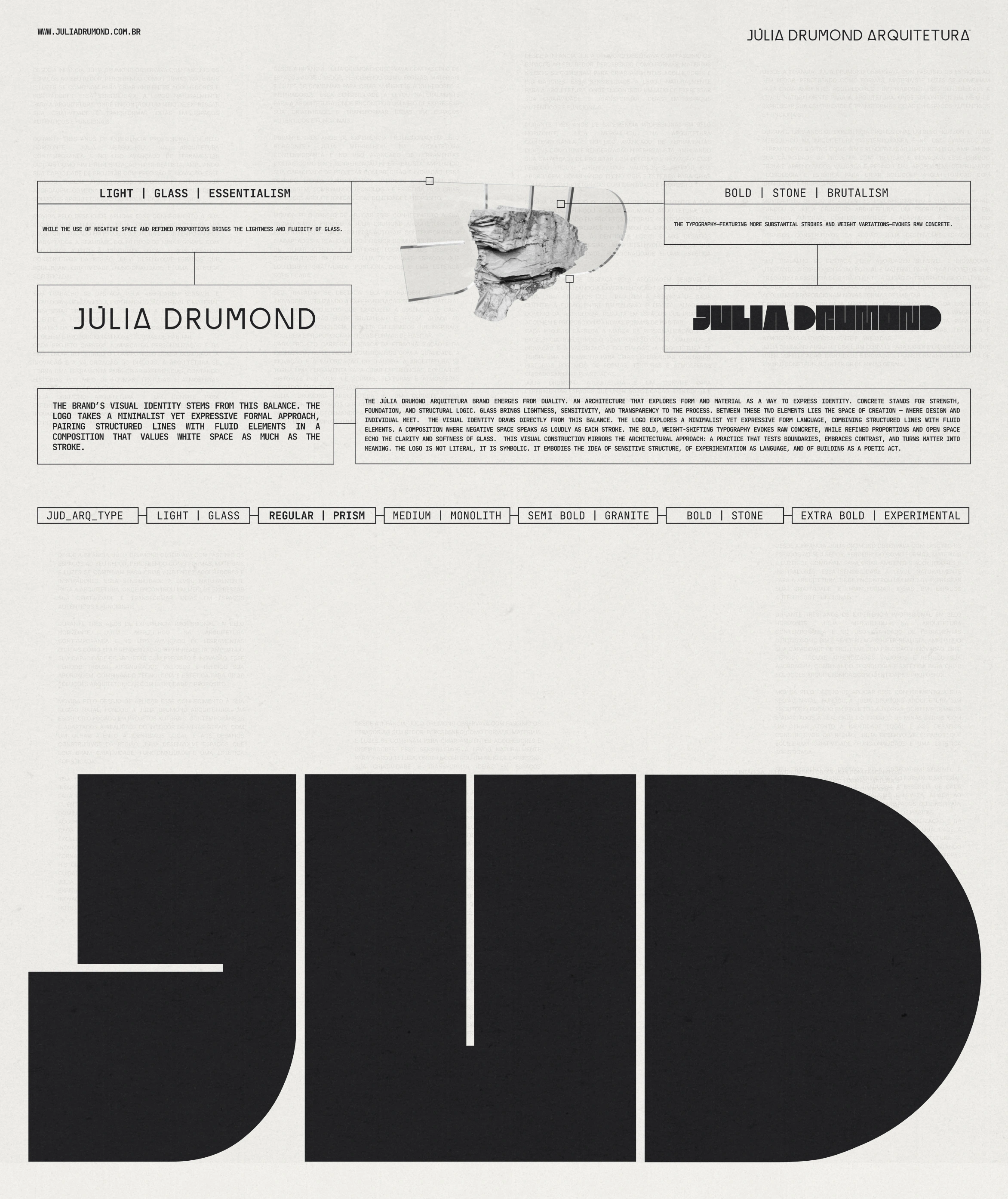
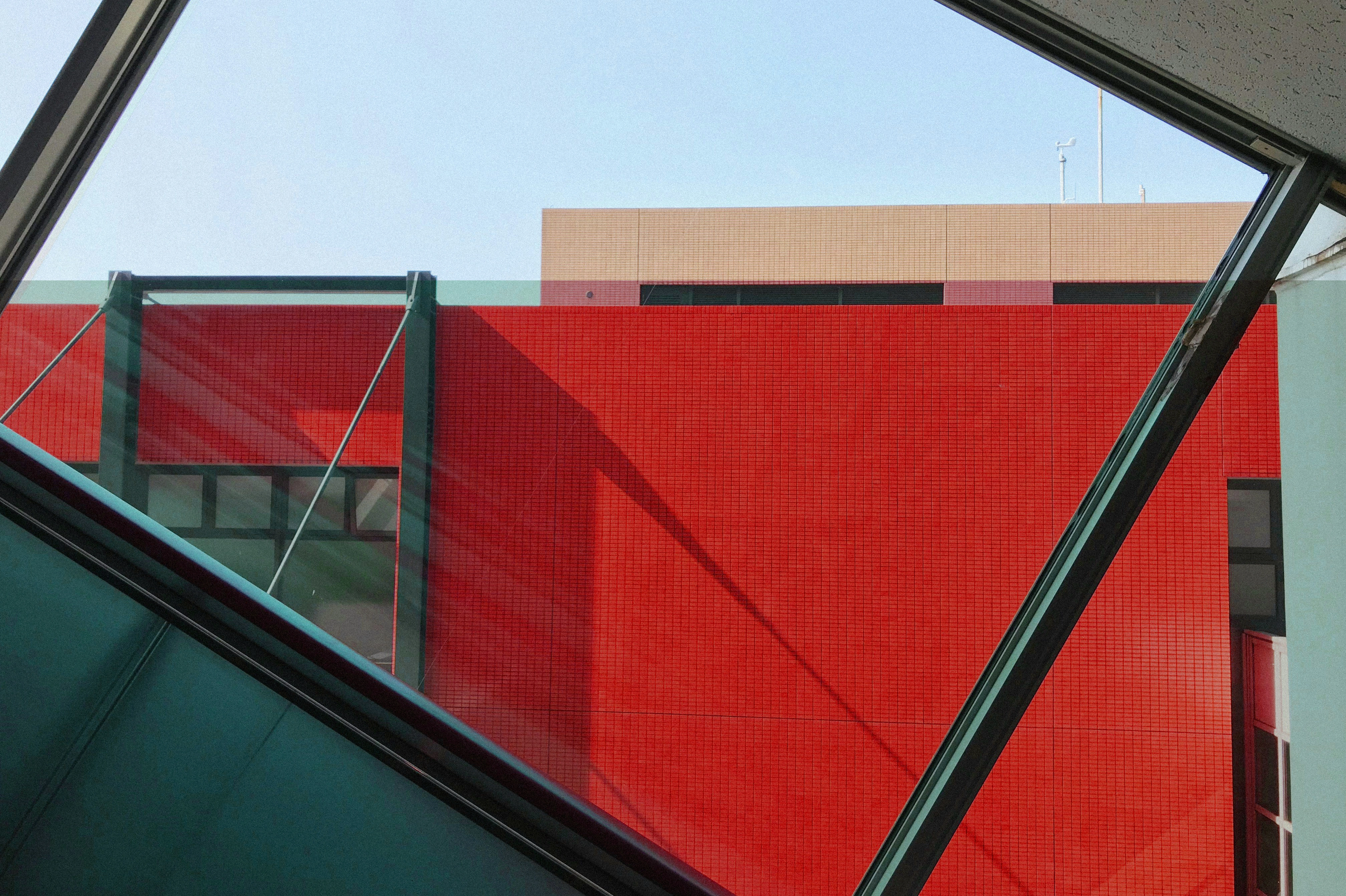
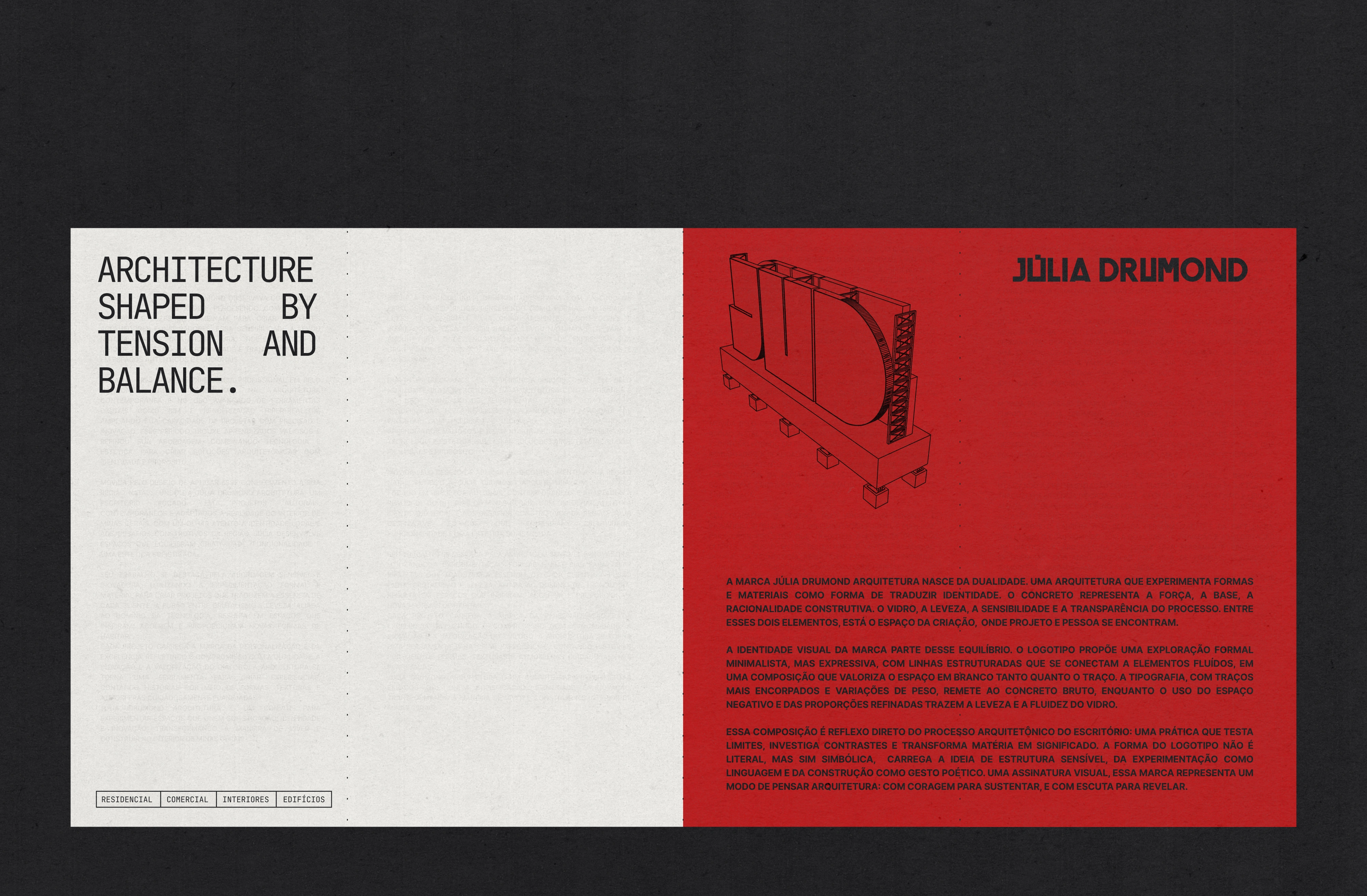
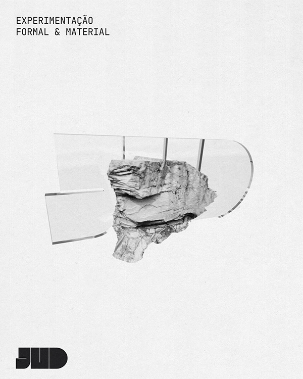
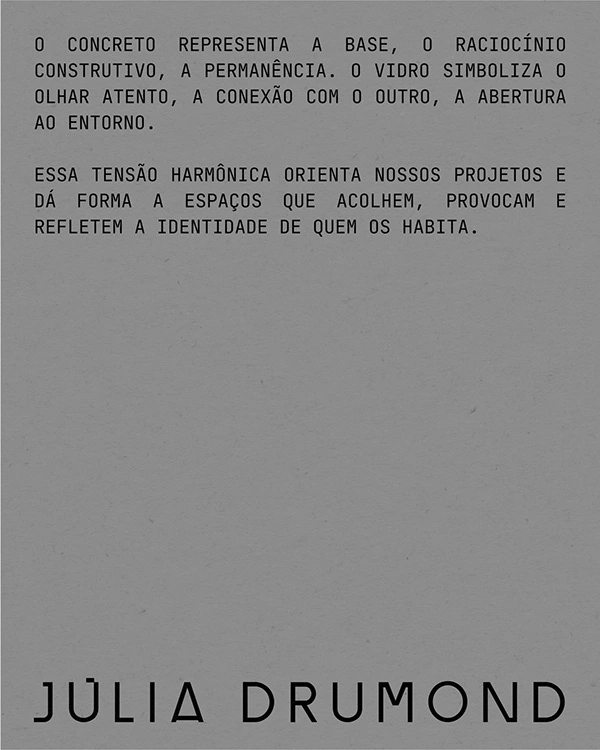
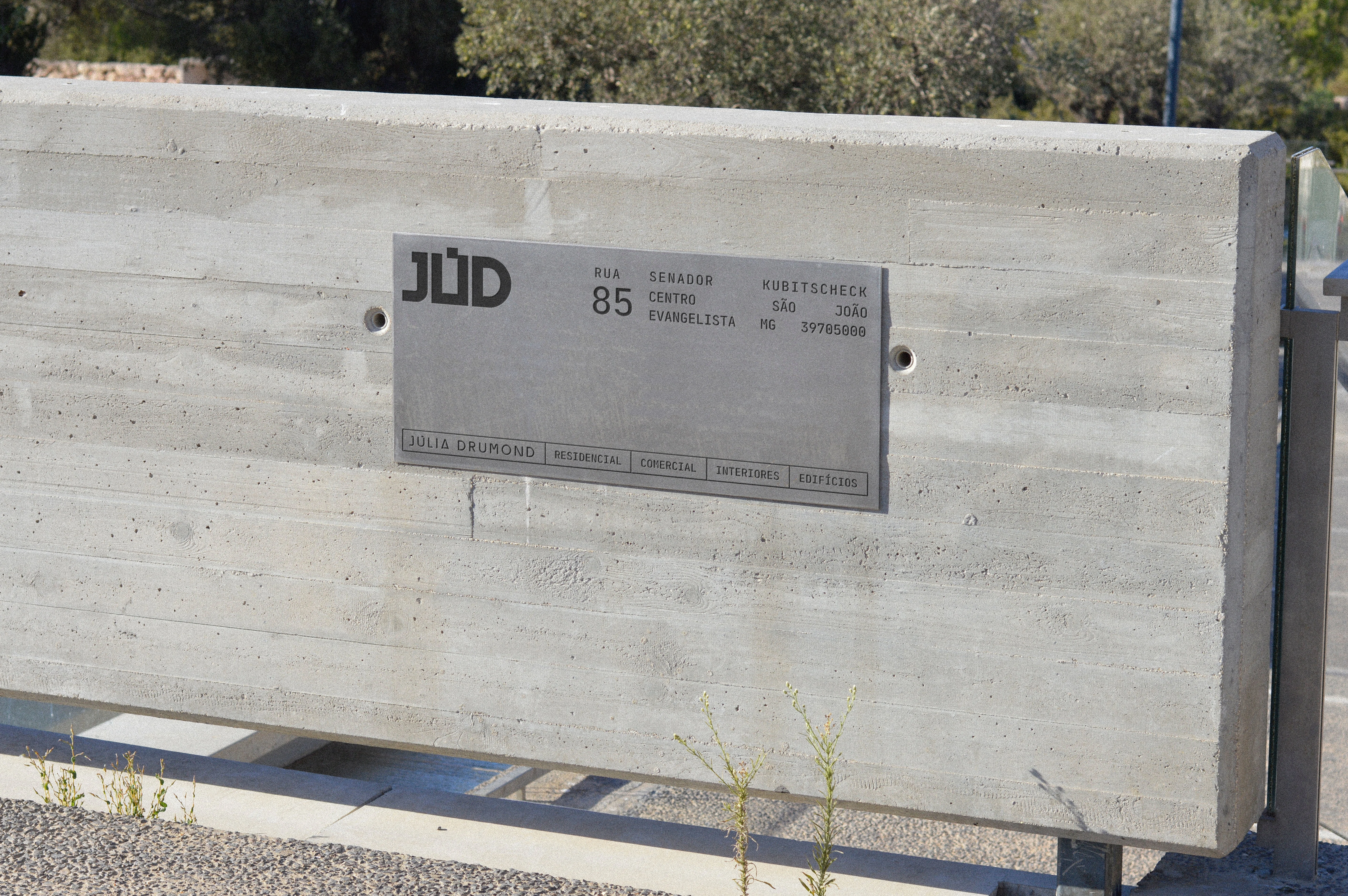
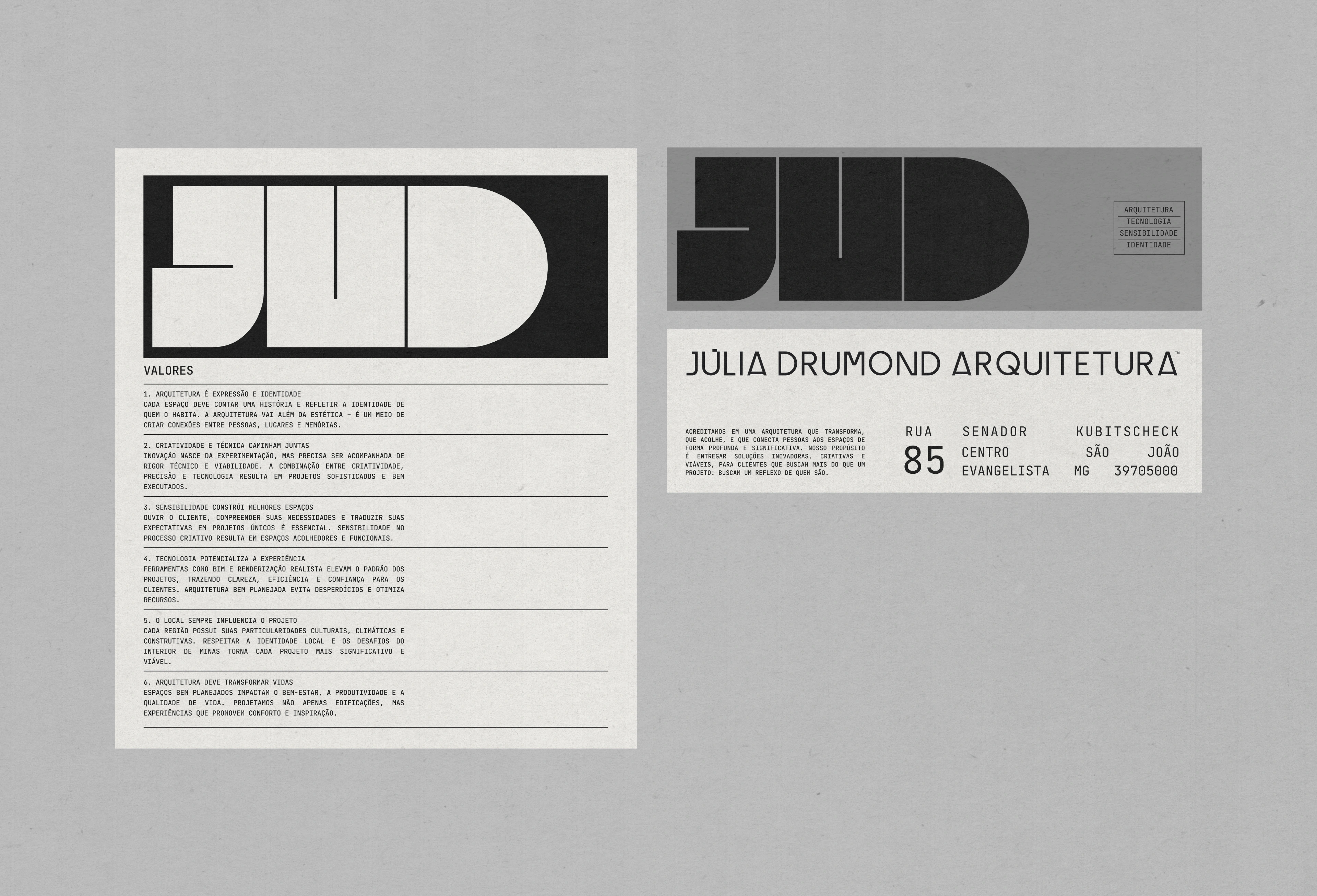
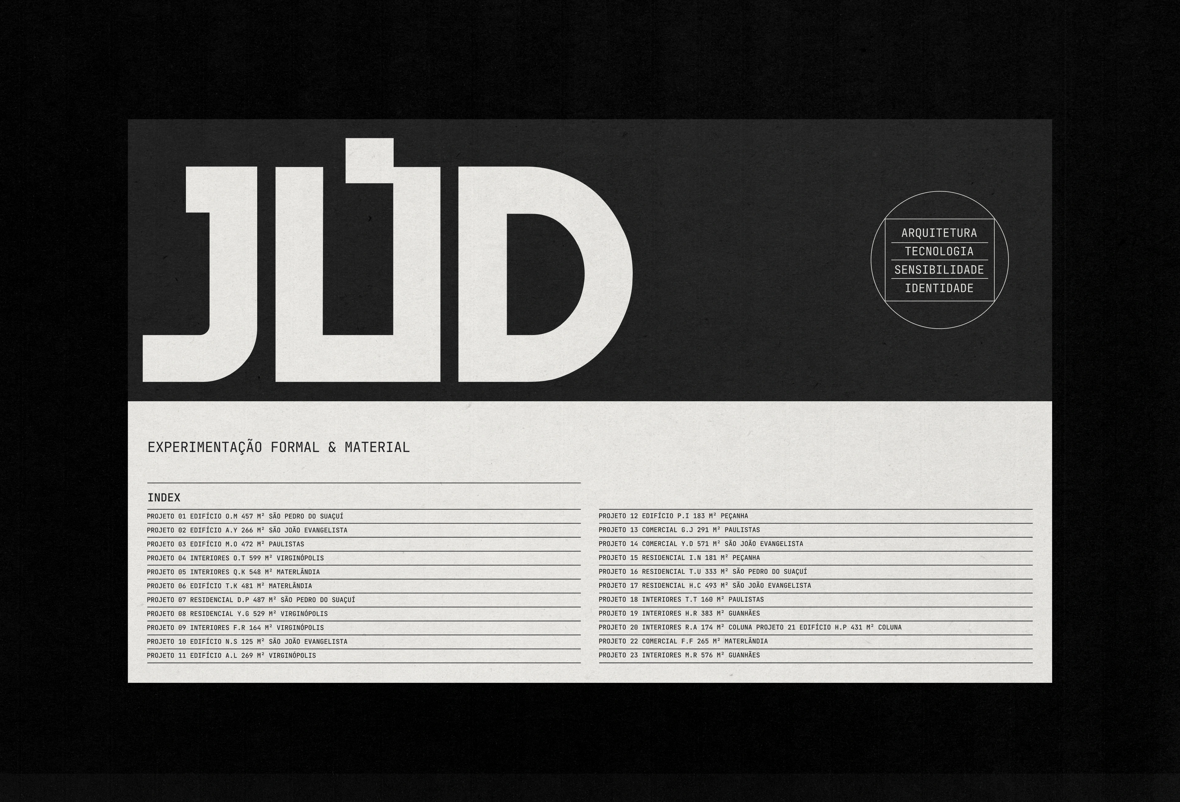
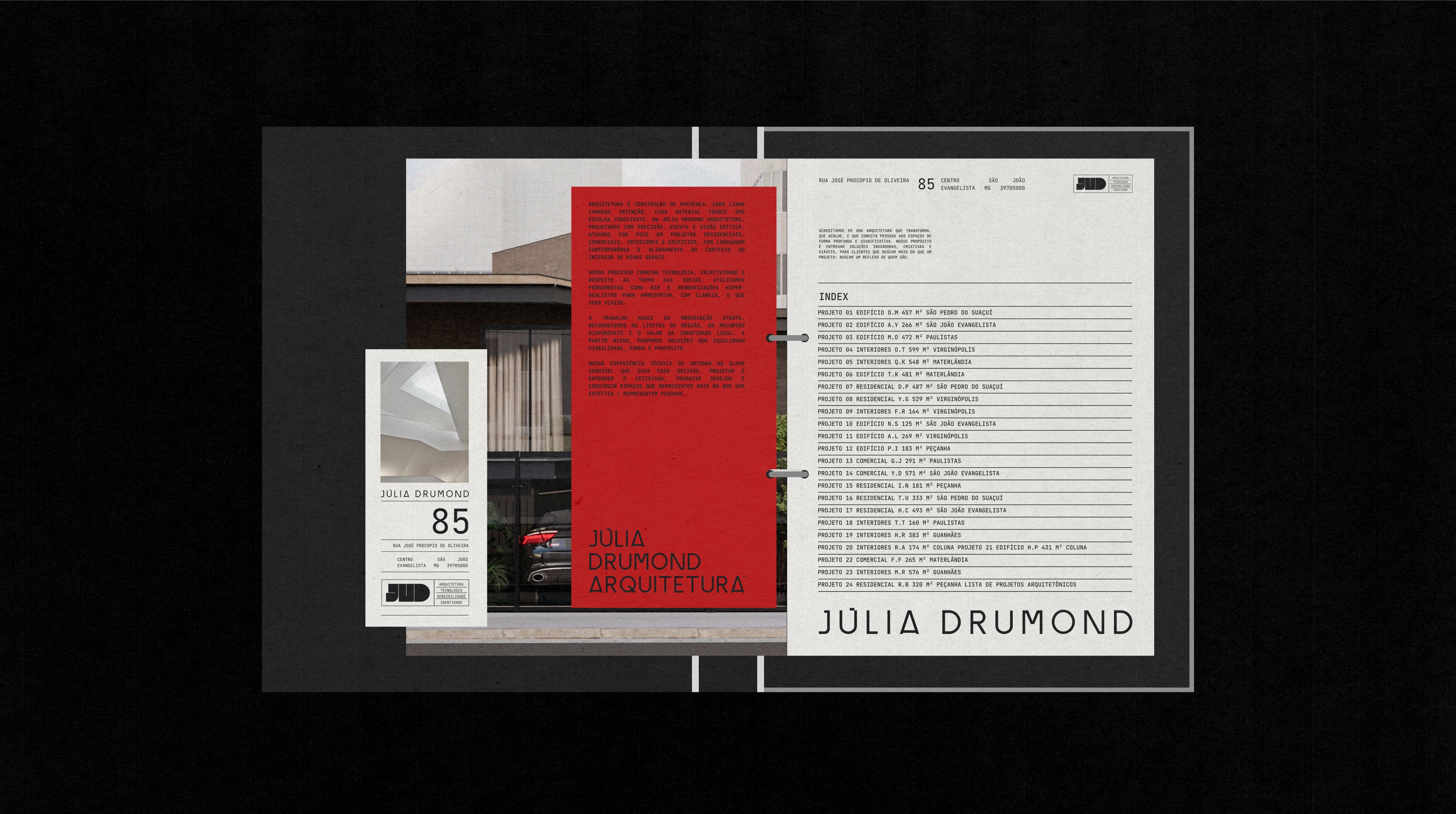
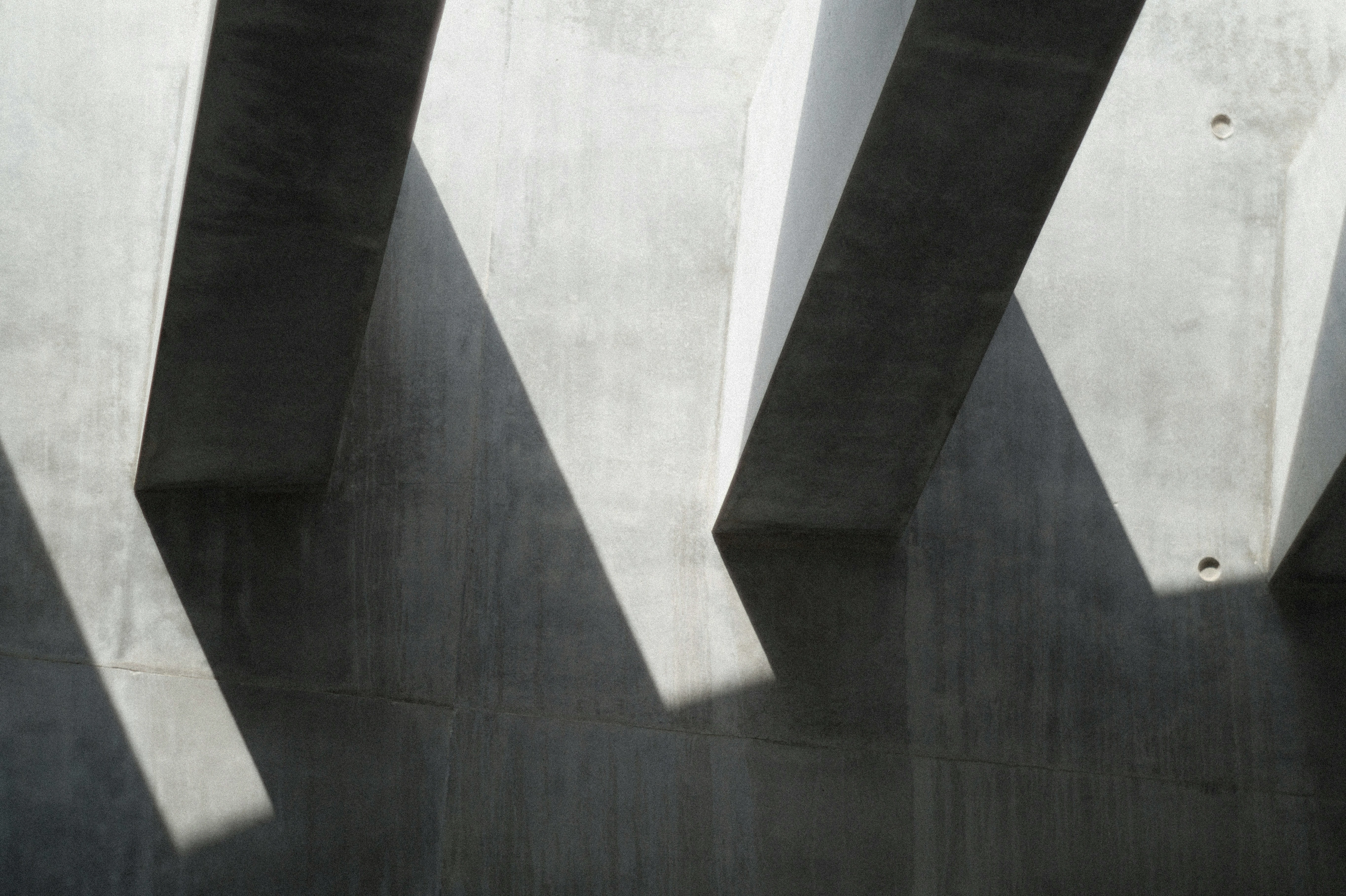
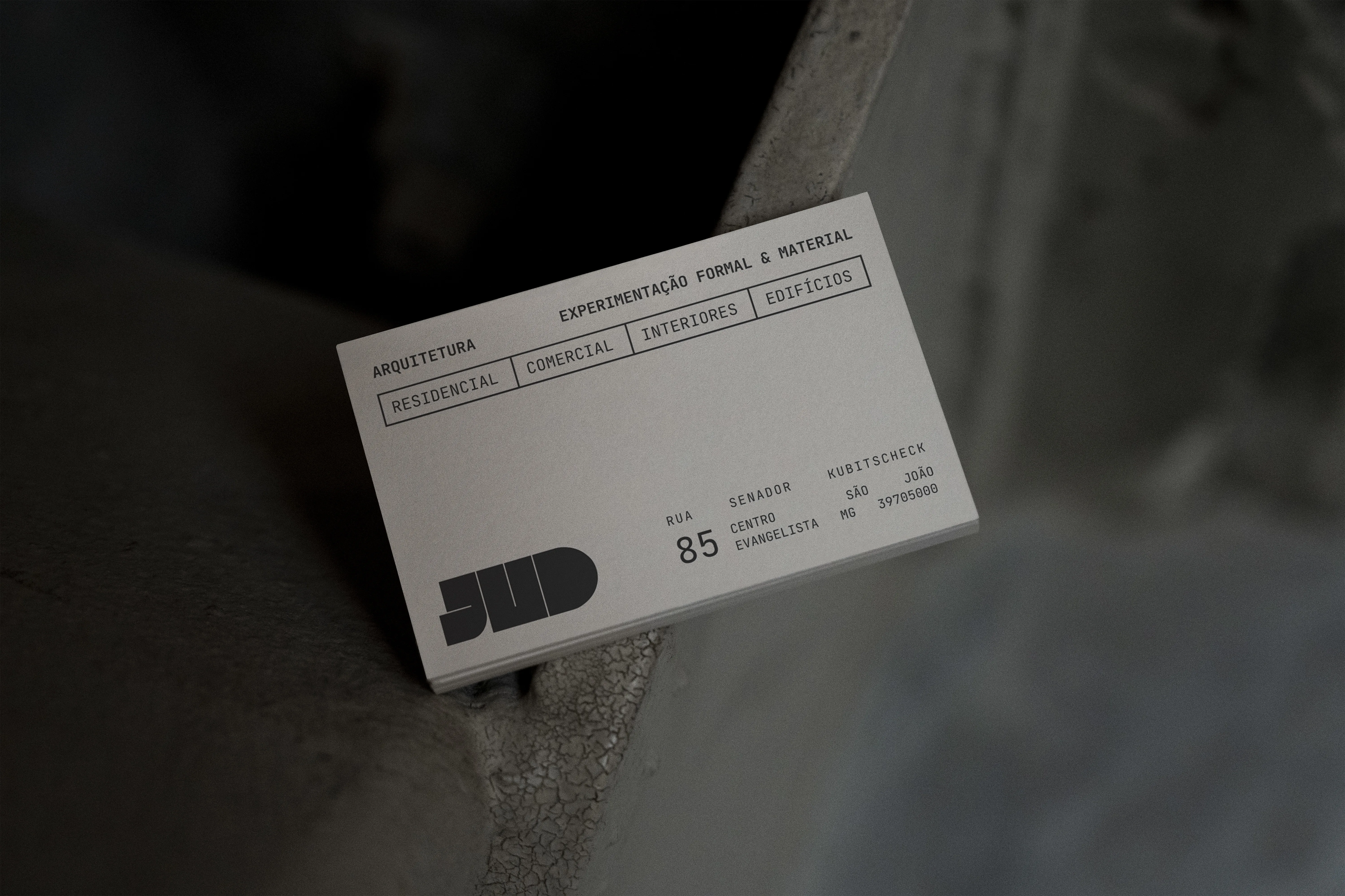
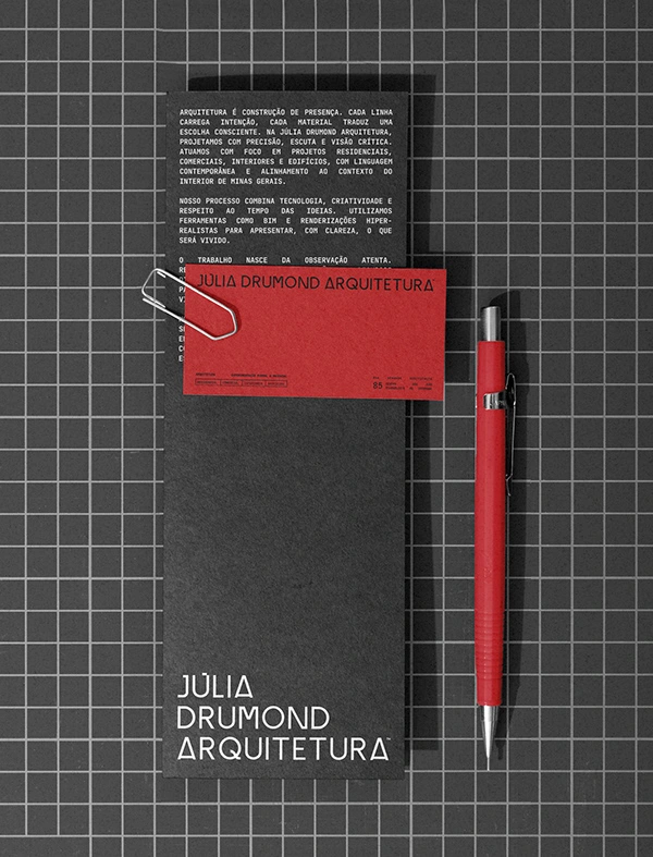
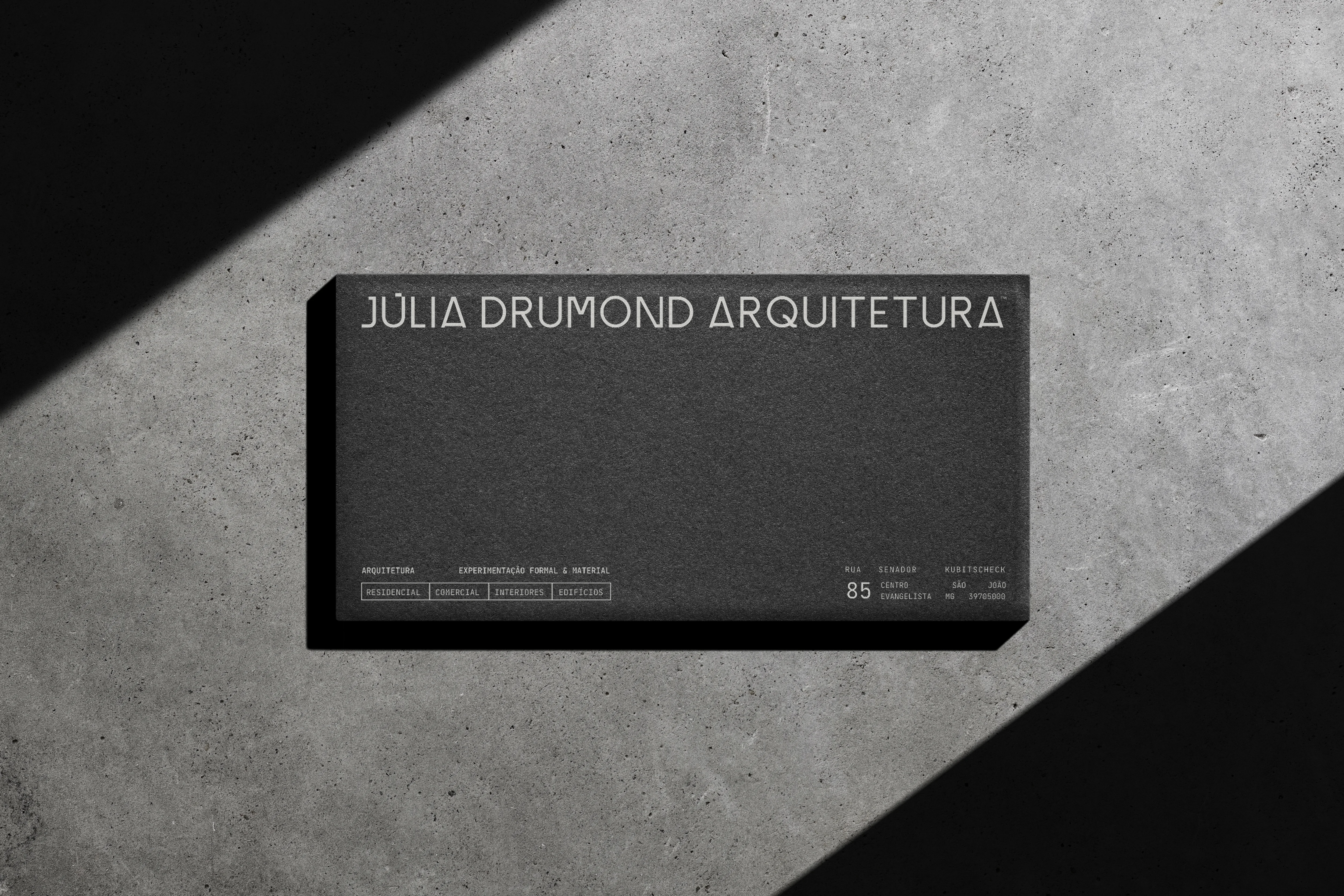
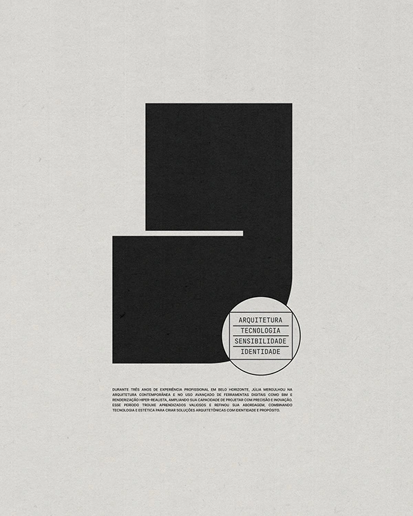
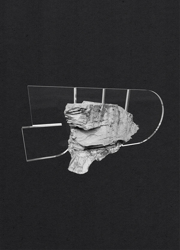
Júlia Drumond Architecture brand emerges from duality. An architecture that explores form and material as a way to express identity. Concrete stands for strength, foundation, and structural logic. Glass brings lightness, sensitivity, and transparency to the process. Between these two elements lies the space of creation — where design and individual meet.
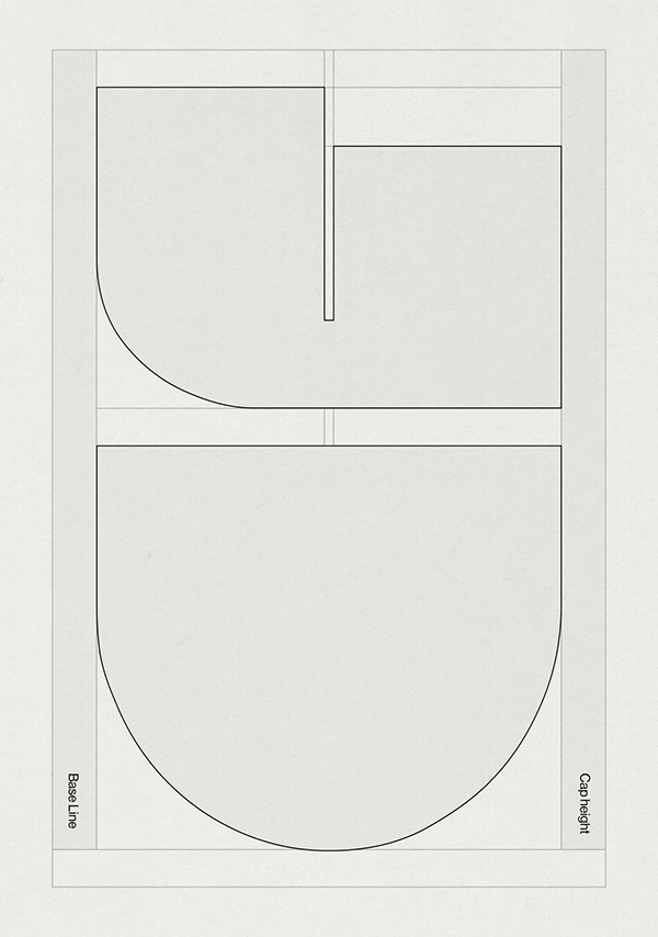
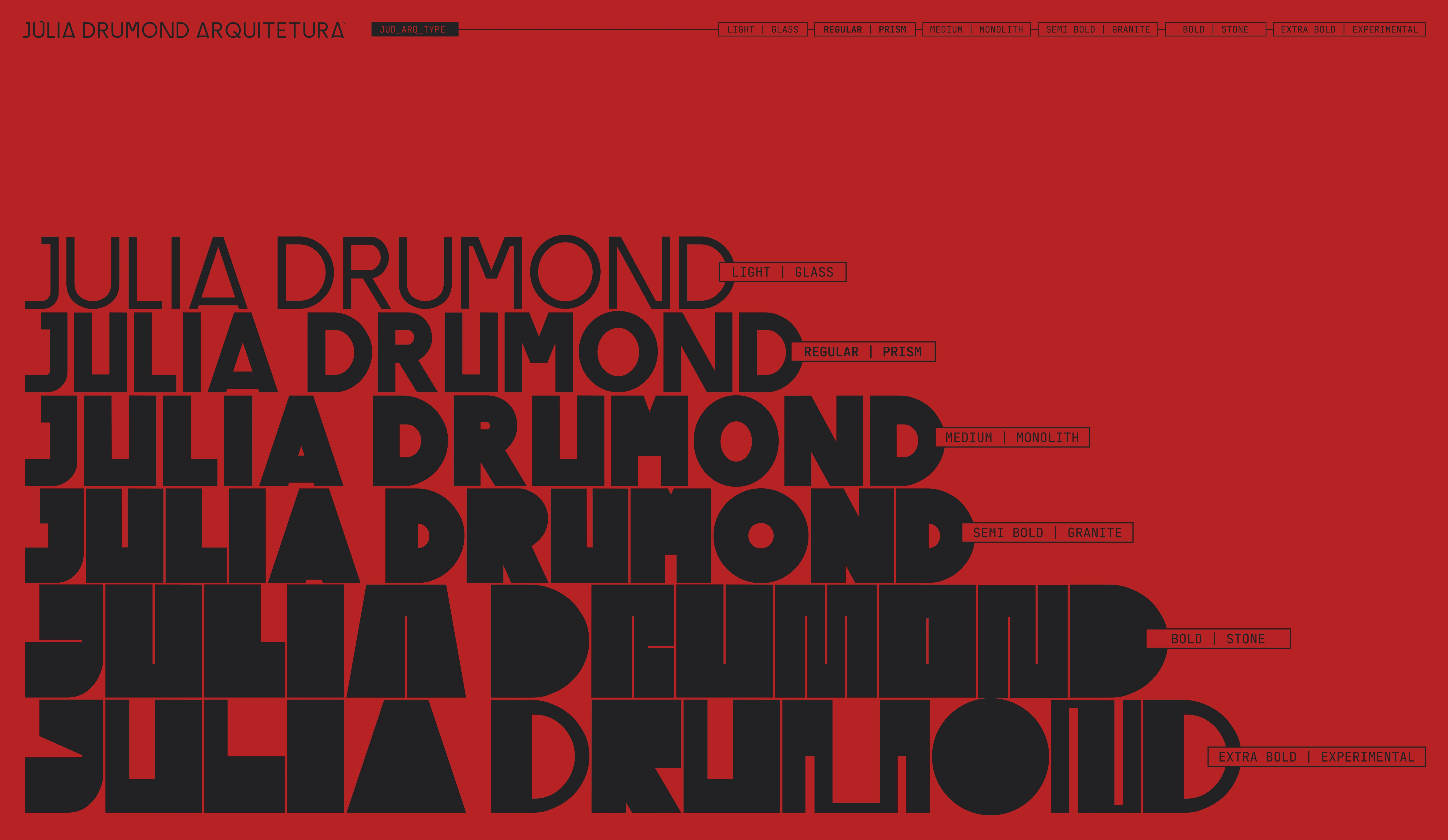
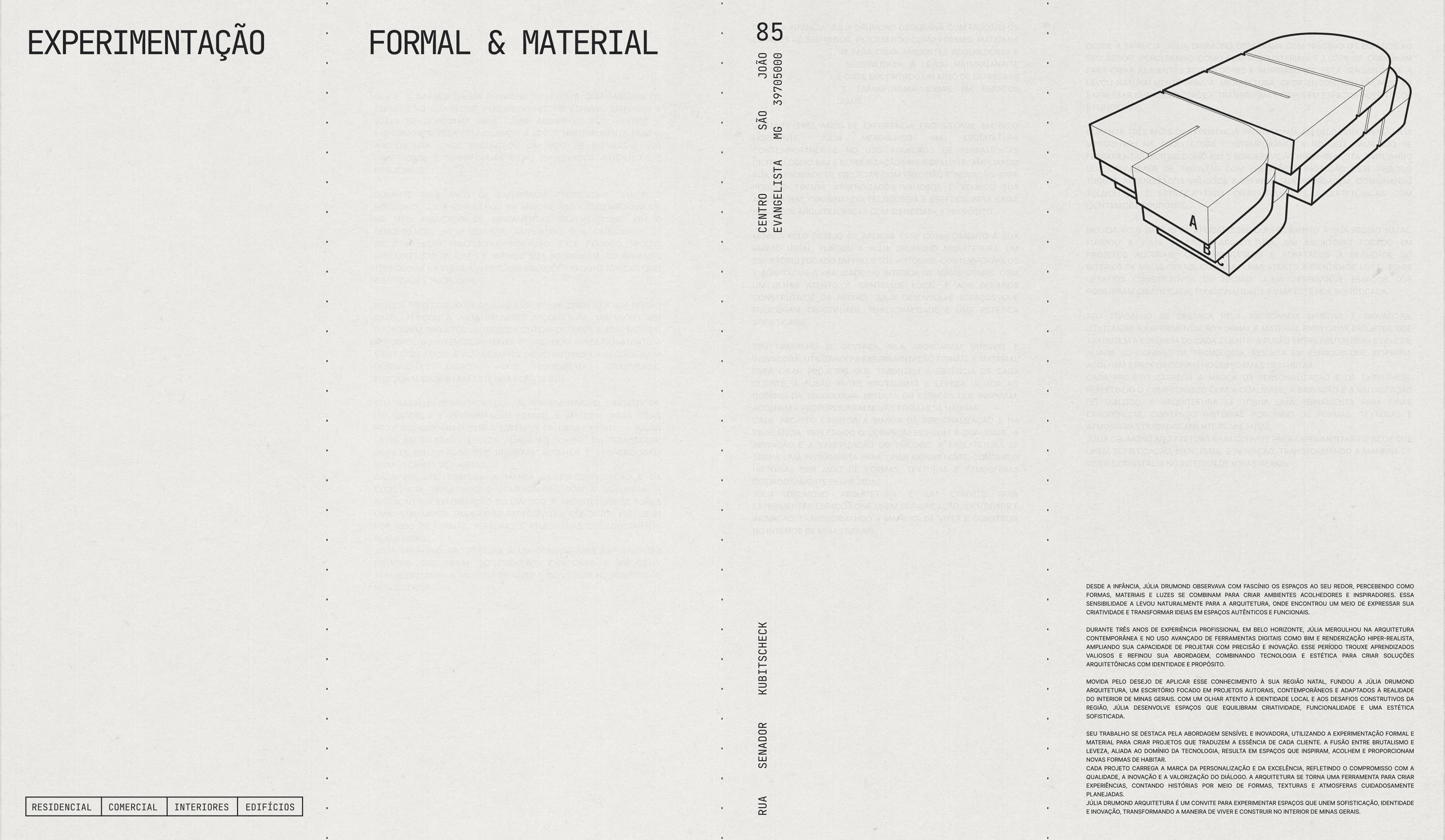
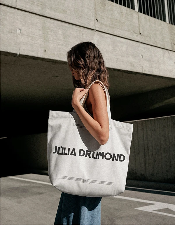
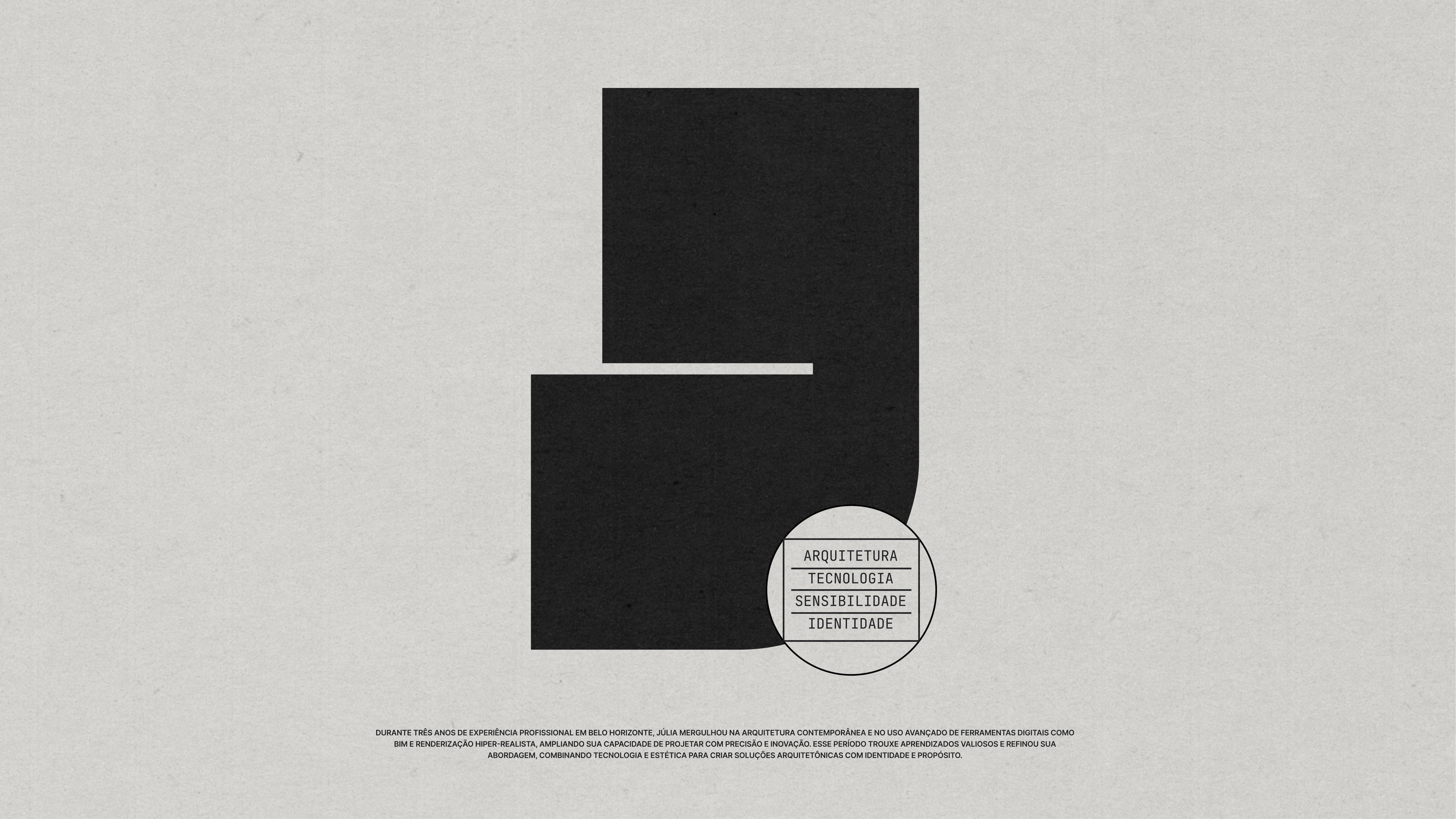
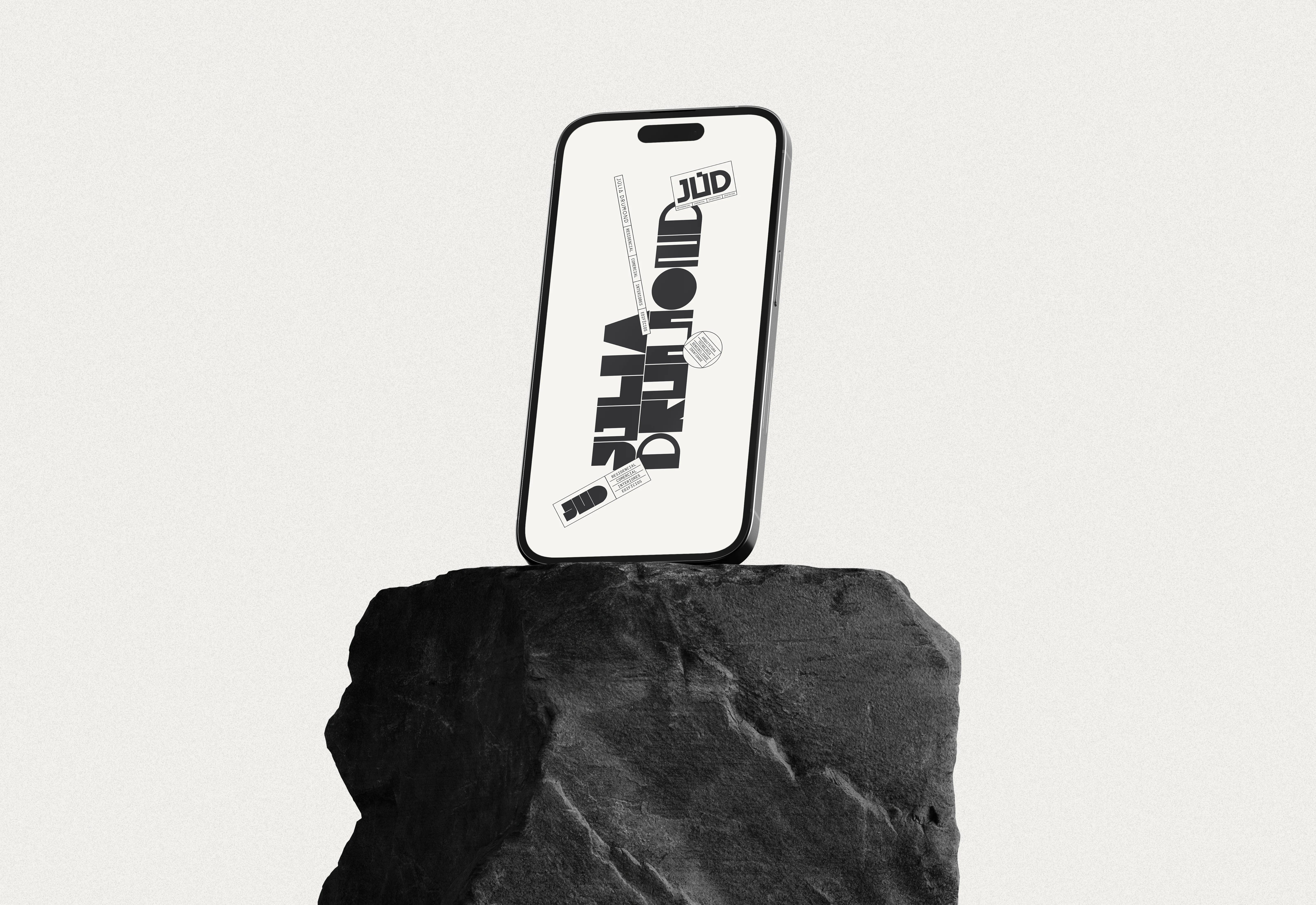
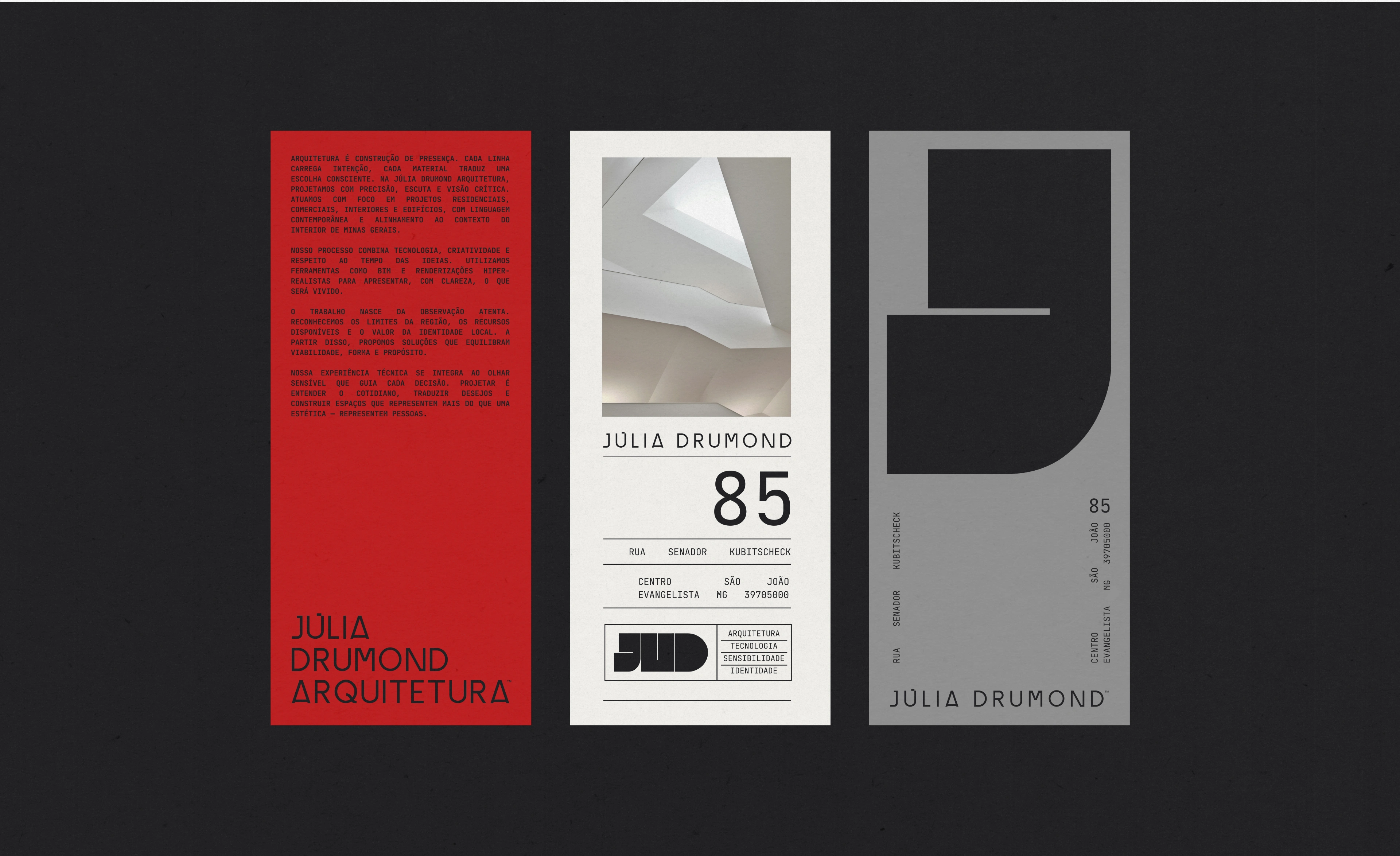
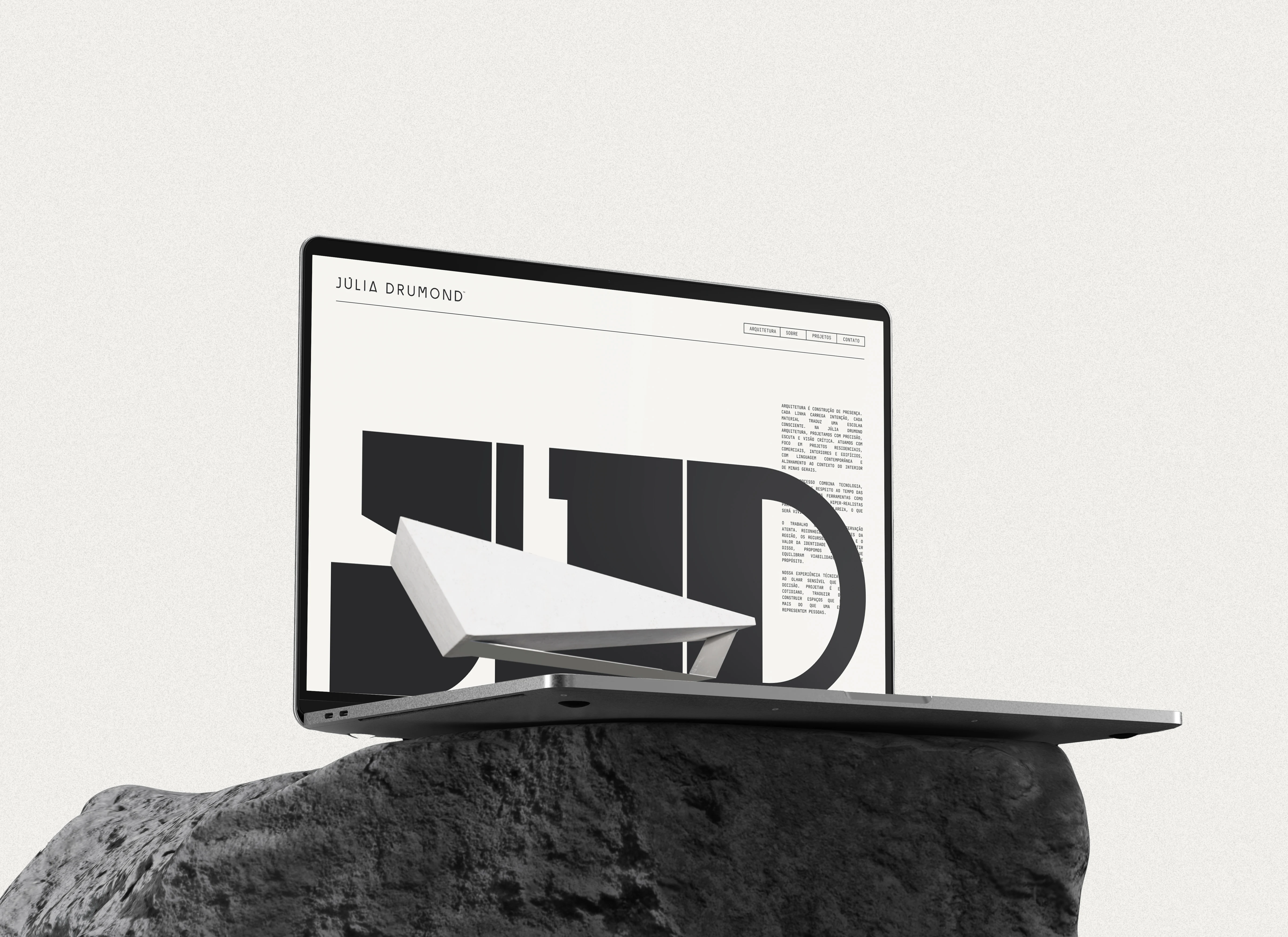
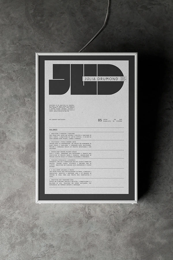
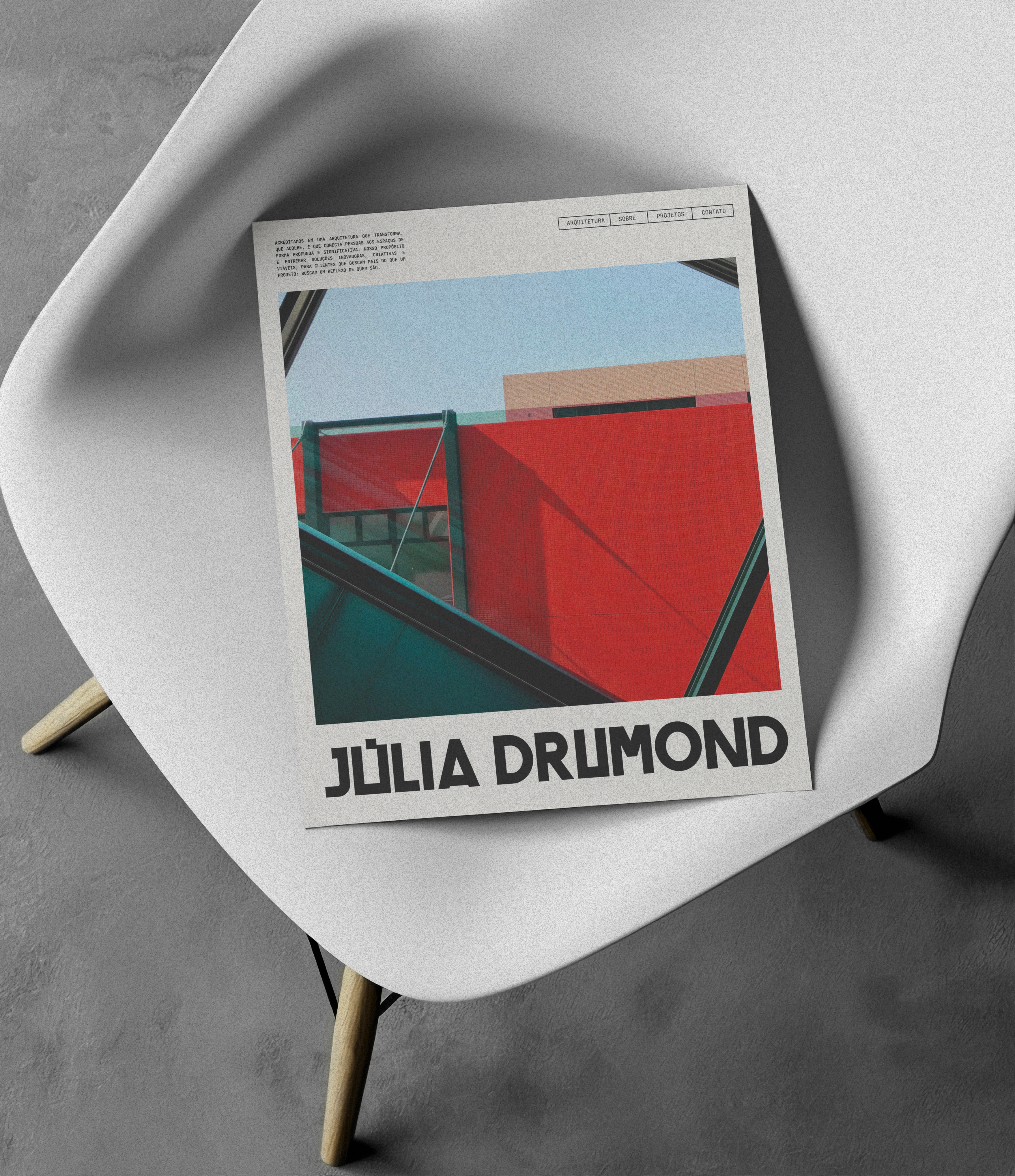
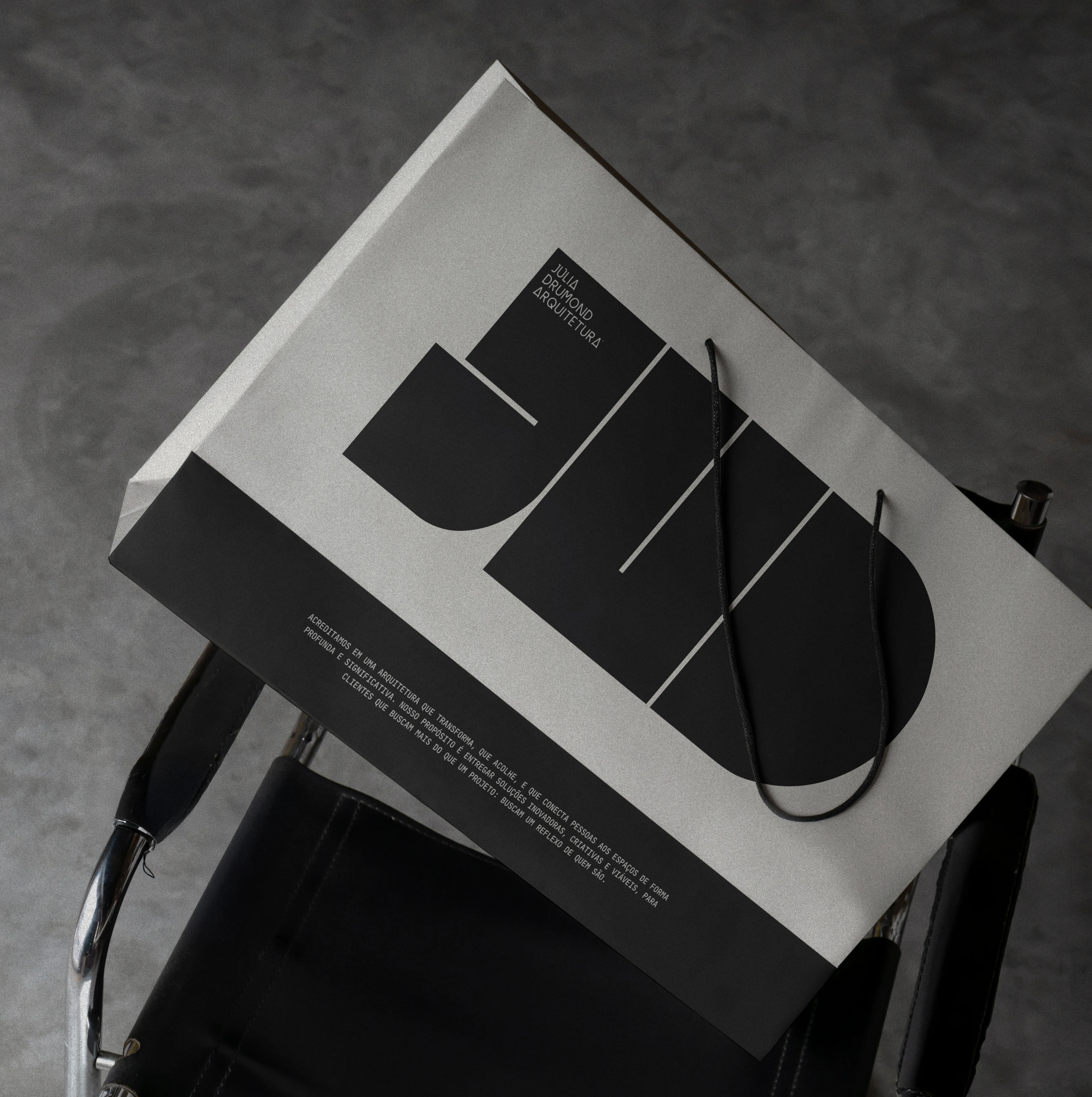
The visual identity draws directly from this balance. The logo explores a minimalist yet expressive form language, combining structured lines with fluid elements. A composition where negative space speaks as loudly as each stroke. The bold, weight-shifting typography evokes raw concrete, while refined proportions and open space echo the clarity and softness of glass.
This visual construction mirrors the architectural approach: a practice that tests boundaries, embraces contrast, and turns matter into meaning. The logo is not literal, it is symbolic. It embodies the idea of sensitive structure, of experimentation as language, and of building as a poetic act.
JULIA DRUMOND / Architecture
Credits:
Visual Identity - by LOTIPA™ (@bylotipa)
Graphic Design & Illustrations - Antoniel Felainne (afelainne)
Follow me → Instagram
Website → lotipa.com
_______
We appreciate your feedback.
All comments are welcome!
Thank you!
0 likes · 1 view · Nov 10, 2026
Identity for Júlia Drumond Architecture, built on the duality of concrete and glass. Brazilian Design Award shortlist.

