Gosolo Real Estate Logo Design

Minhal Jafar

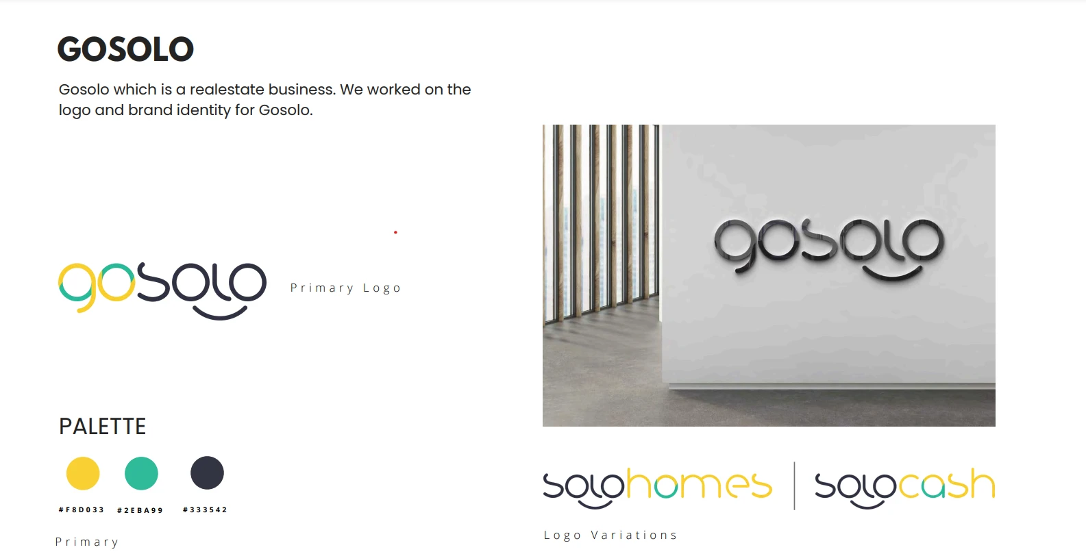
Project: Gosolo Real Estate – Logo Design
For Gosolo, a real estate company, I set out to design a logo that reflects trust, modernity, and growth—all qualities essential in the property market. The goal was to create a mark that feels professional and approachable while standing out in a highly competitive industry.
Approach
I began with research into real estate branding and Gosolo’s target audience to ensure the design would resonate with both investors and homebuyers. The concept was built around combining clean typography with subtle geometric elements, symbolizing structure, stability, and opportunity. The color palette was chosen to evoke professionalism and reliability, while still feeling fresh and modern.
Timeline & Process
The project took about 2 weeks from concept to completion. I developed 3 distinct logo directions, refined the client’s chosen concept, and created a scalable system of variations (full-color, monochrome, and icon-only).
Challenges & Solutions
One of the key challenges was balancing corporate professionalism with a sense of approachability. To resolve this, I leaned into bold but minimal typography paired with versatile iconography, ensuring the logo could adapt seamlessly across signage, digital platforms, and printed materials.
Outcome
The final Gosolo logo is clean, versatile, and future-proof, giving the brand a polished identity that instills confidence and aligns with its mission of helping people find their next home or investment.
Like this project
Posted Sep 27, 2025
Designed a modern, professional logo for Gosolo Real Estate, reflecting trust and growth.
Likes
0
Views
1
Timeline
Sep 1, 2023 - Sep 15, 2023