Shrink the Mutant Branding
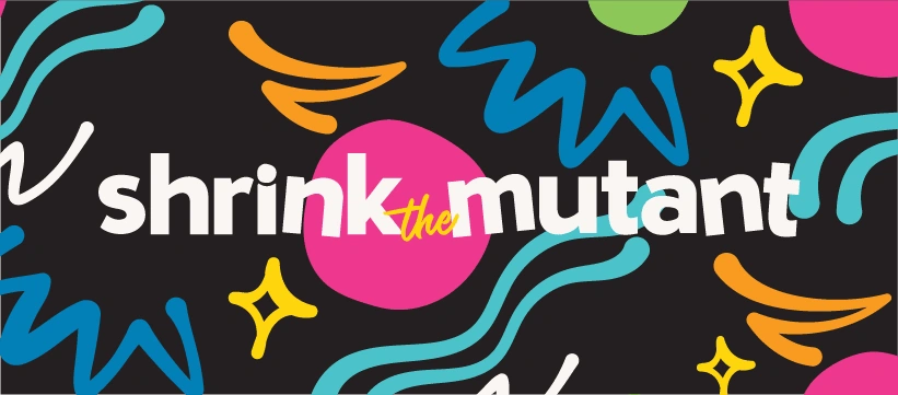
Shrink the Mutant is a business that provides valuable, research-based resources and coaching to people with cancer, or those who know people with cancer and need support. The founder, Jenny Bradley, wanted the brand to reflect her fun, positive nature and not look like a typical business associated with cancer. Before working together, she found that her brand wasn’t cohesive, felt messy, and she wasn’t in love with how it looked or how it represented her and Shrink the Mutant. I created a brand that is more versatile, plus is fun and cheerful like Jenny!
Phase One: Brand Strategy
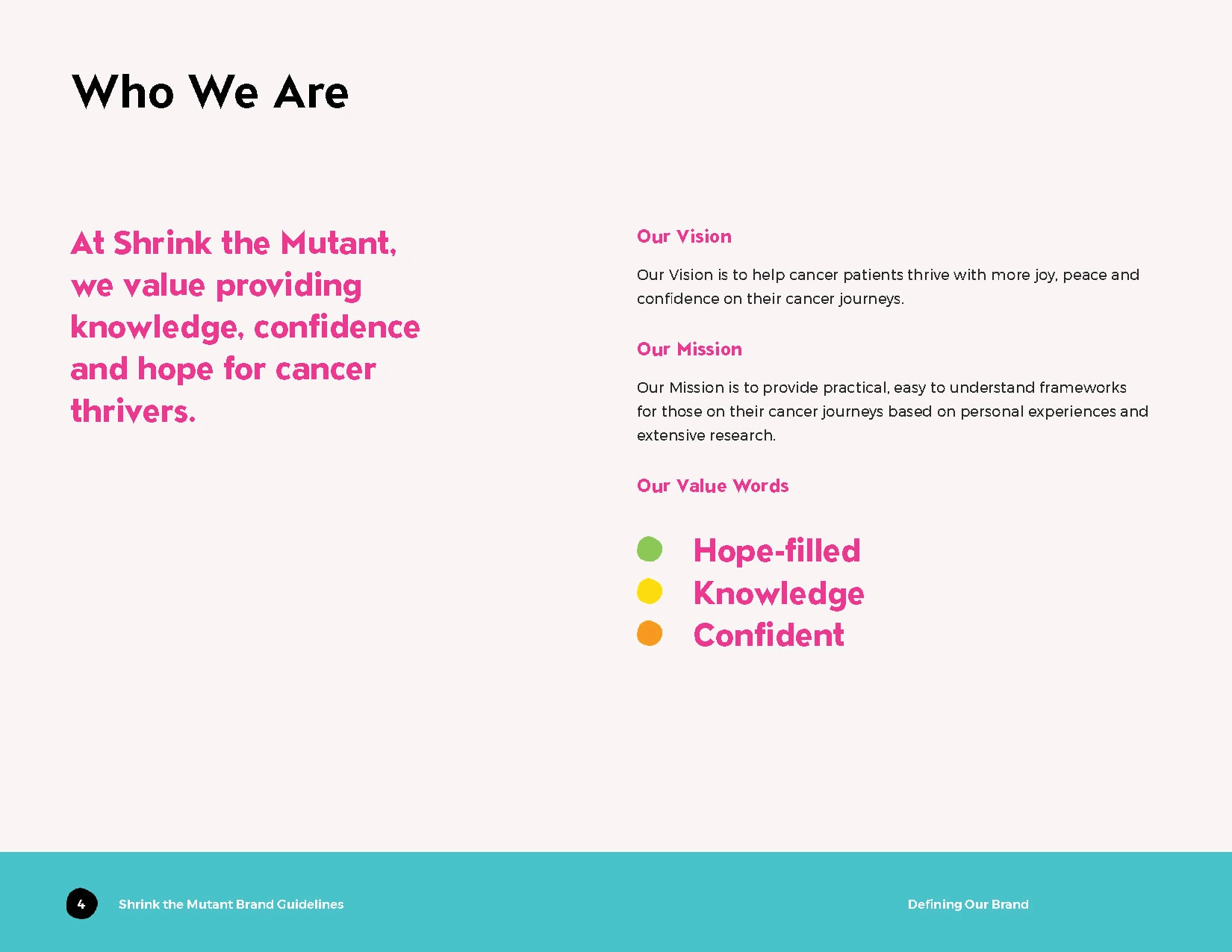
The start of our work together was developing a Brand Strategy for Shrink the Mutant, including writing the brand’s Value, Vision and Mission Statements. Here is a page from the final Brand Guidelines, outlining what the business stands for.
We had a strategy call where I asked Jenny questions to understand the core of her business WHY and what her goals were. One of the exercises was for her to brainstorm 25 words that she wanted to be associated with Shrink the Mutant, and from those she chose three that were the most important, becoming her Value Words.
In the call we also created a customer persona, determined pain points and went through creative inspiration.
Brand Strategy Statements
Phase Two: Concept Work
After the Brand Strategy was solidified and we were both on the same page on what her business stood for, it was time to move on to the visual direction & concept work.
I began with creating a couple of mood boards for the overall design direction, including colour palette and font options.
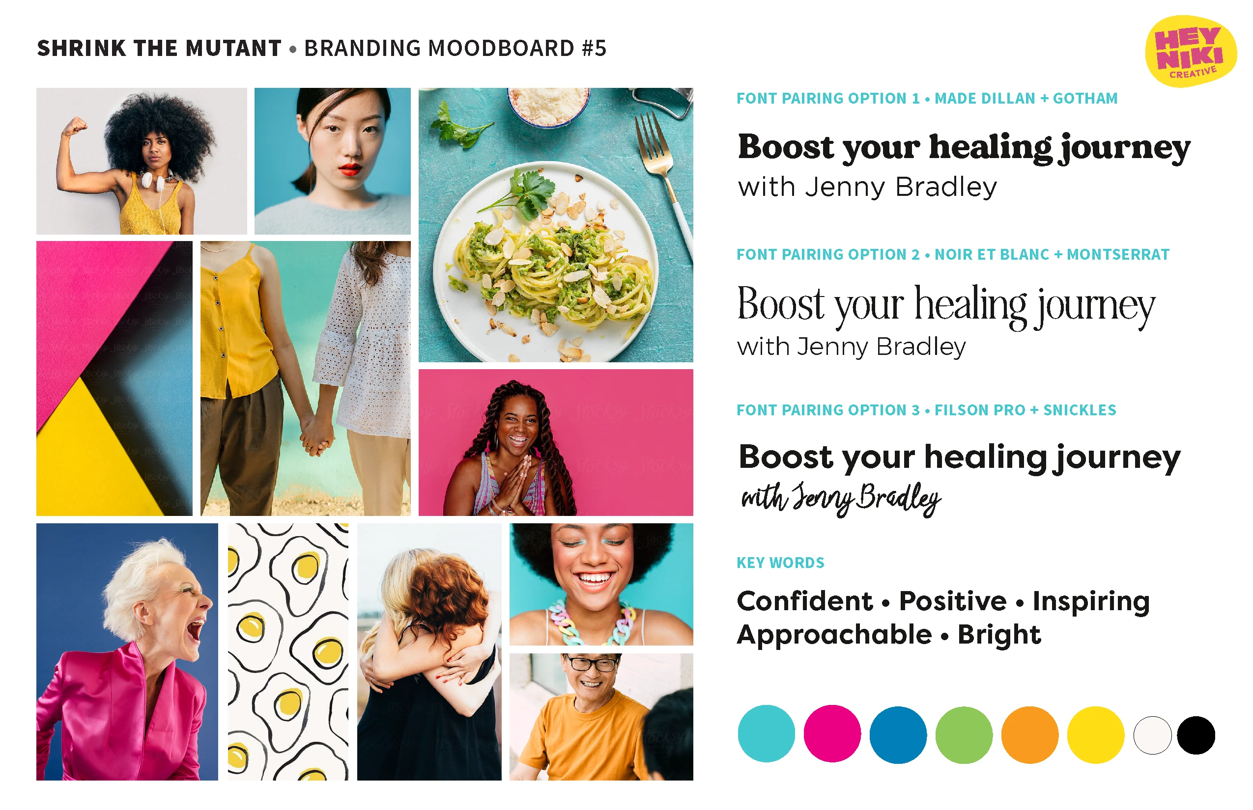
The final mood board for the brand
After finding the creative direction with the mood board, I began on the logo concepts. I started with five concepts, working with Jenny on revisions and tweaking to ensure that the logo perfectly represented Shrink the Mutant and was versatile for all applications.
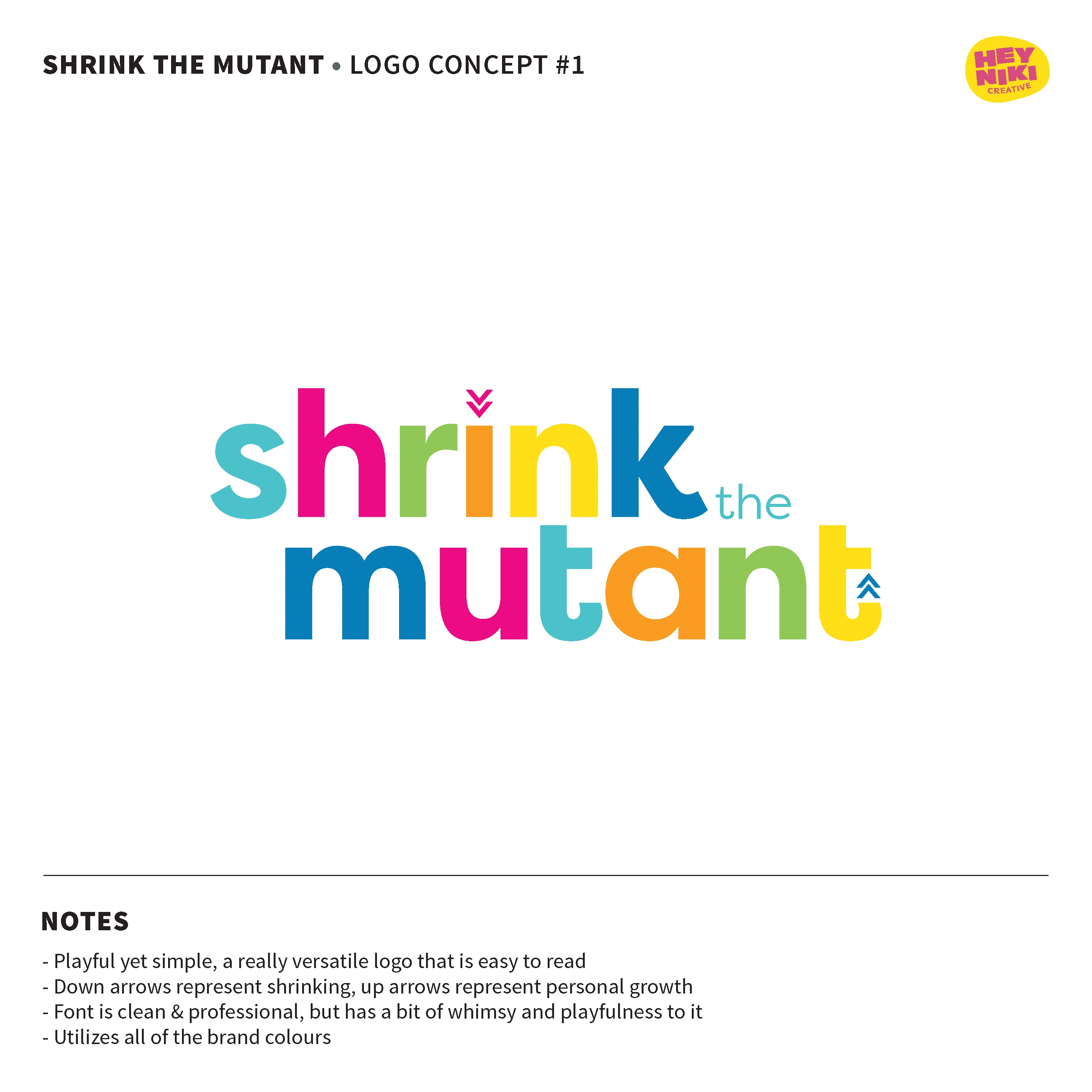
An early logo concept
Phase Three: Final Creative
Once we had the brand’s visual direction with the mood board and the logo, it was time to move onto the final creative elements!
LOGO
The final logo is a playful, fun piece that represents Shrink the Mutant. It’s simple enough to showcase STM as a professional business, but it doesn’t come across as too corporate or impersonal. It has multiple variations in terms of colour and orientation, so it is able to be easily legible in any instance.
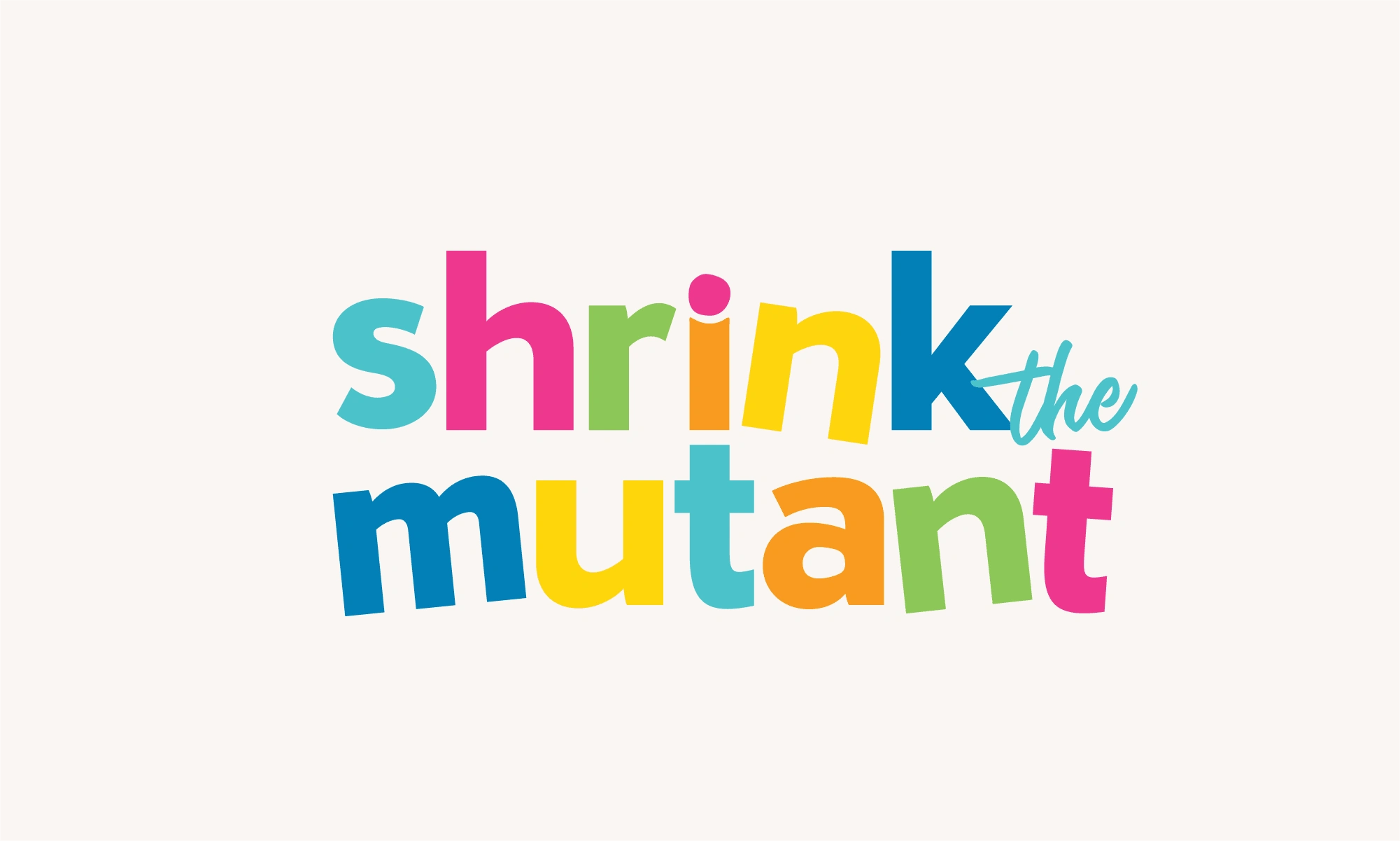
The final Primary stacked logo
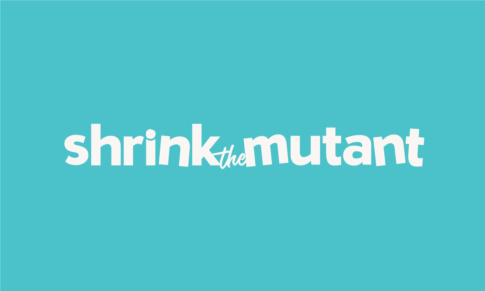
The final Secondary logo

The final Icon
BRANDED ICONS + PATTERNS
To add another creative level to the brand, I created a set of illustrated icons and patterns. They can be used in backgrounds for future creative, as spot illustrations on her website, in social media posts, and more. The icons represent different areas of the Shrink the Mutant business. Here are two pages from the final Brand Guidelines that explain the icons and patterns and their intended uses.
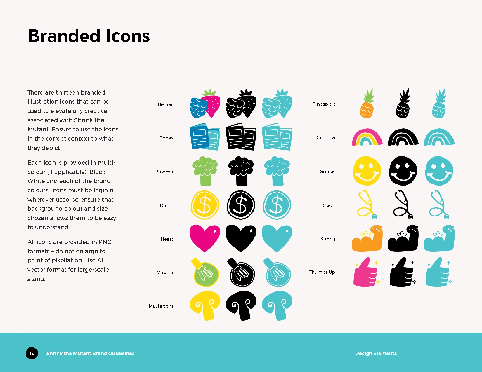
Custom Branded Icons
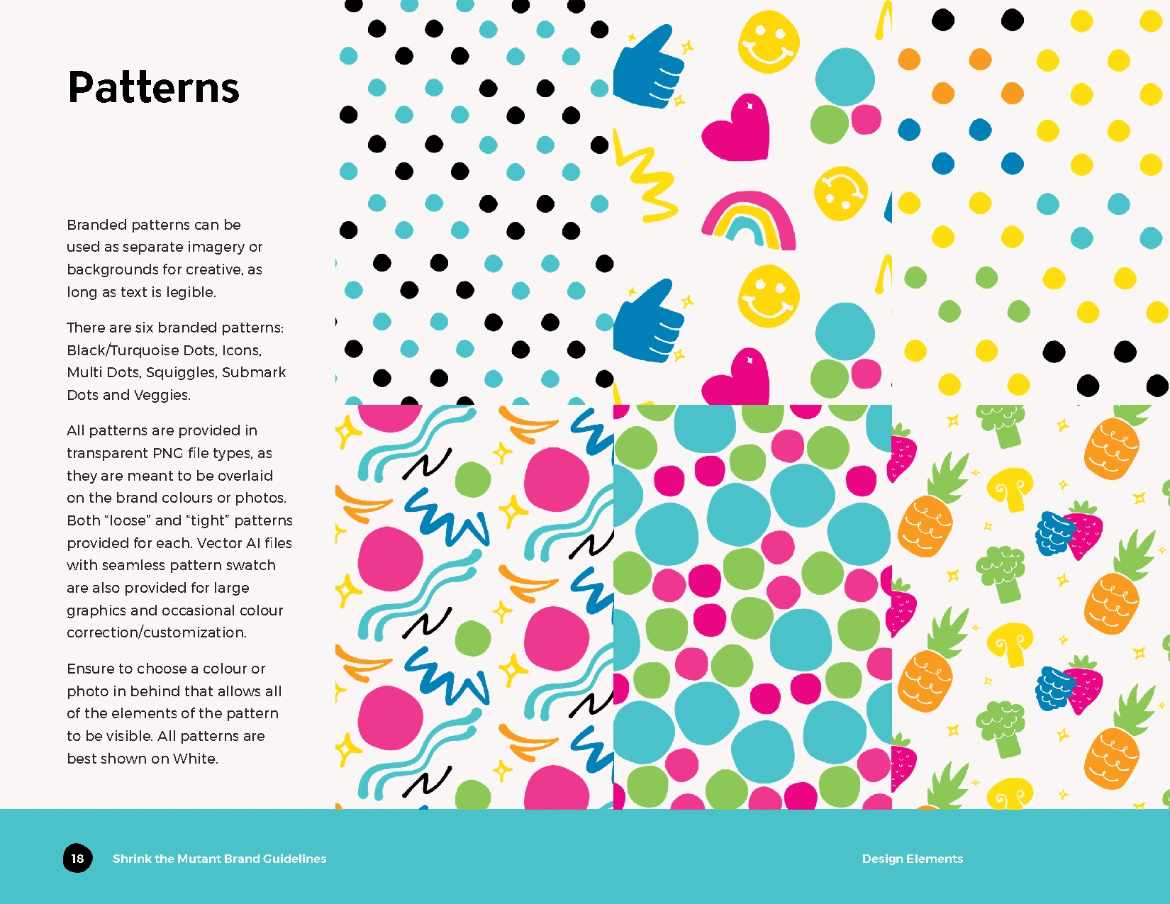
Custom patterns
SOCIAL MEDIA PROFILE GRAPHICS
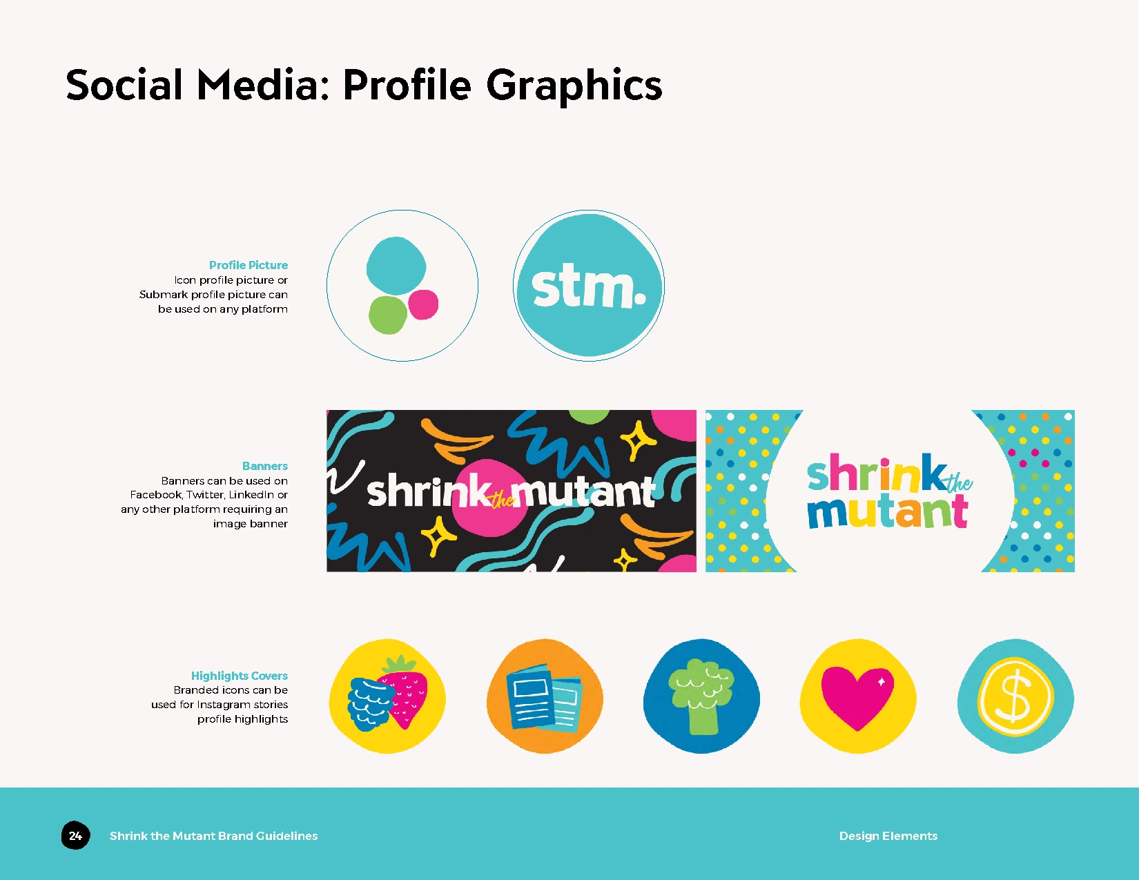
I also provided Jenny with social media profile graphics that she can use to represent Shrink the Mutant on her social media platforms. This included banners, profile pictures and Instagram stories highlight covers.
I created these using the branded icons, illustrations, logos and other elements established in the brand. Not only do the social graphics provide useful creative for Jenny to use moving forward, but it also showcases examples on how the elements look together and can be used moving forward.
BRAND GUIDELINES KIT
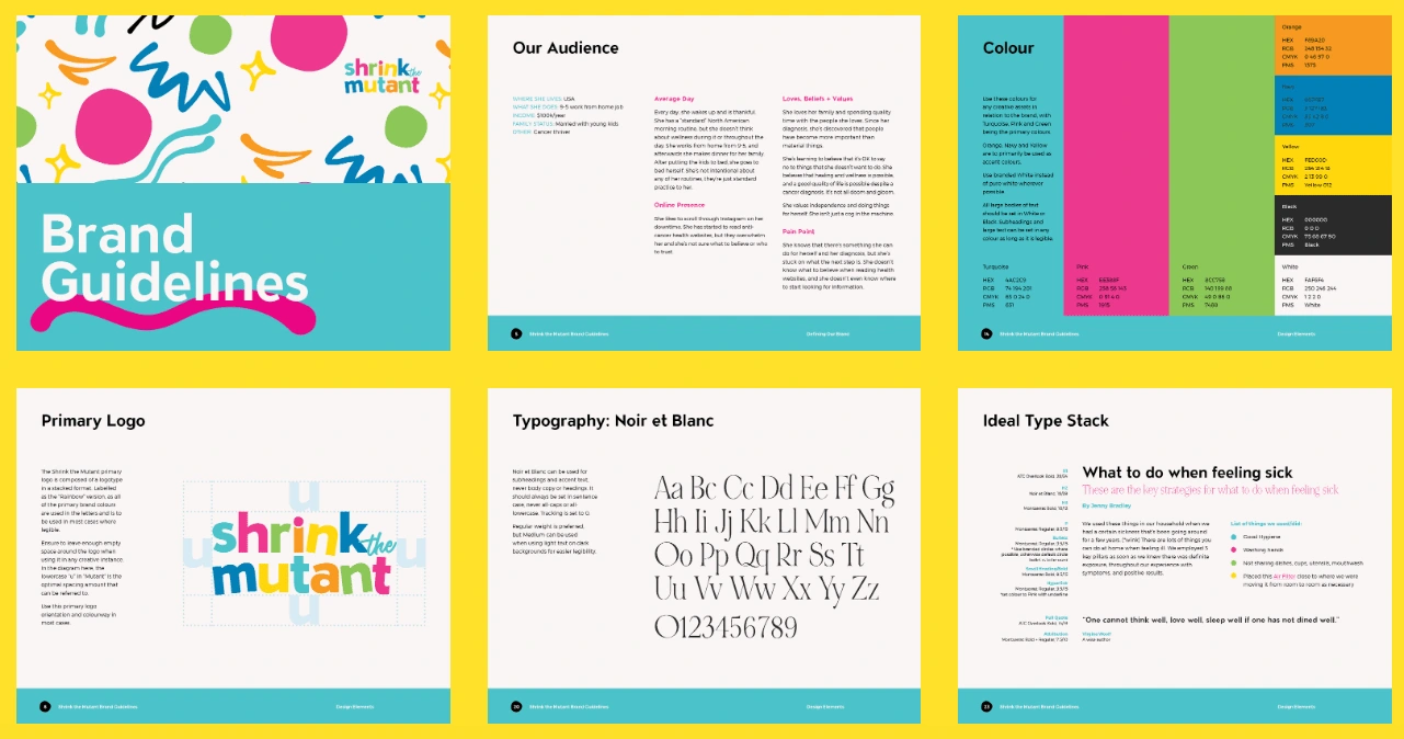
Finally, I created a comprehensive Brand Guidelines PDF that Jenny can reference when creating anything for Shrink the Mutant moving forward. Included in the guidelines are elements from all three phases of the project, and instructions on how to use the creative items properly. Here are a few example pages taken from the guidelines.
Final Thoughts
I had a lot of fun creating the Shrink the Mutant brand! I’m glad that Jenny trusted me to create a fun, colourful brand that represented what the business is all about. The final result is a cohesive, playful brand that is super versatile and that will last!
Like this project
Posted Feb 5, 2024
I created a full strategy-based brand package for a coaching business. The end result was colourful and fun branding with versatile elements.

