Epvi case study
Company - EPVI
My role - Solo intern designer
Duration - 12 weeks
Tools- Figma
About EPVI
EPVI is an electricity management startup with the goal of transforming buildings into smart and energy-conscious structures. This is achieved by monitoring real-time electricity usage, tracking device health and issues, and displaying live data on their dashboard website and application. In order to achieve this EPVI utilises technologies such as IoT, AI, and ML.
Project goal
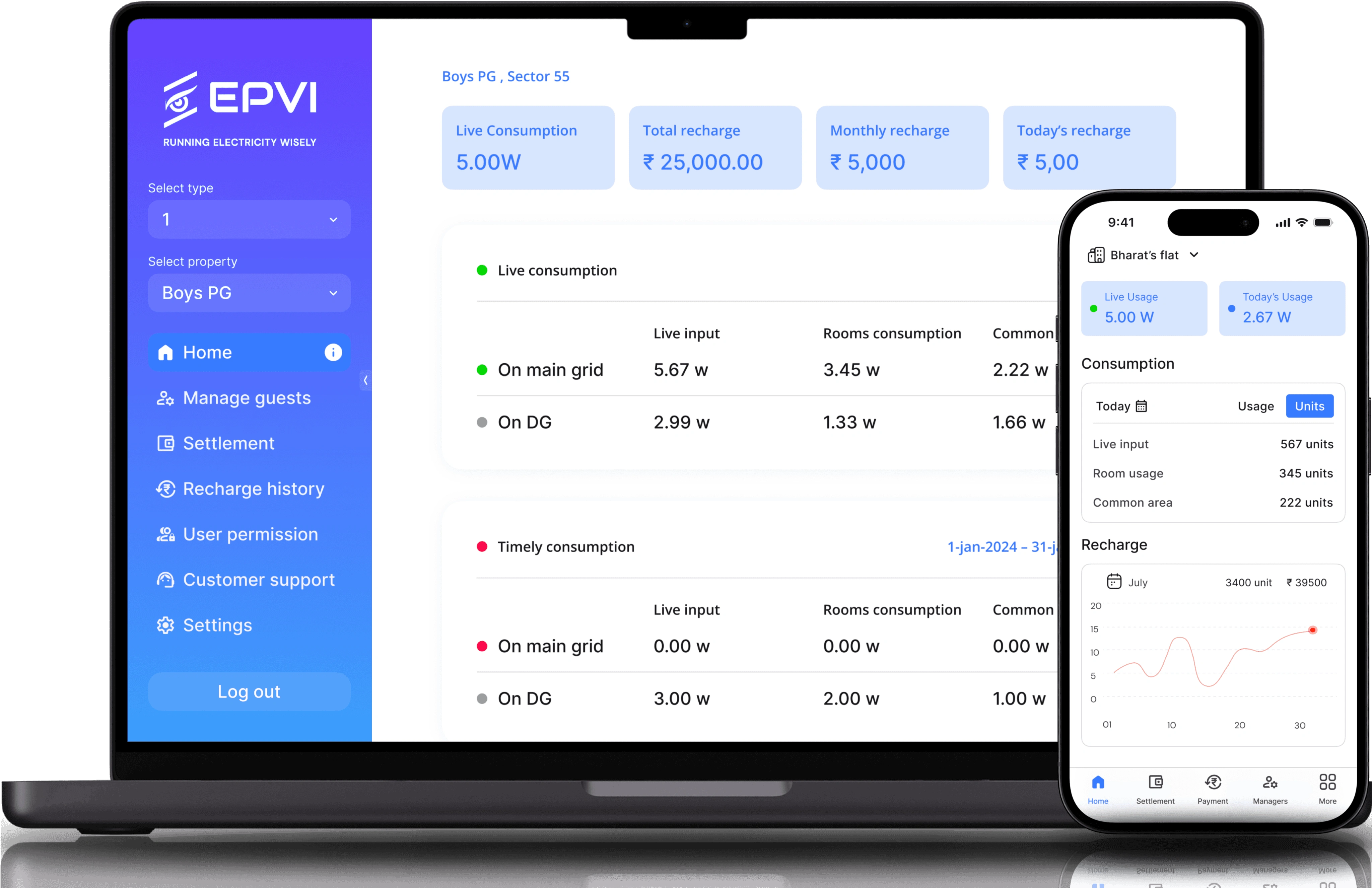
The goal of the project was to redesign EPVI's dashboard website's home and guest page, as well as redesigning the EPVI Connect app to facilitate users' access to the platform, enable faster data retrieval, and provide a clean, accessible, and intuitive interface.
Target users
PG owner, Hotel owners, Mall owners, Firms, Students

So, what the problem
Due to EPVI's numerous features and data, users were struggling to find the information they needed, such as locating the right room among hundreds of available rooms. Additionally, they were unable to use the app properly due to improper navigation and a lack of consistency between the app and the dashboard website.
Solutions
After understanding the pain points, the solutions I came up with are to enhance navigation, remove or deprioritize unnecessary elements, prioritise important features and elements, establish a design system to ensure consistency between the website and application, and simplify the understanding of functions. Huh! Easier said than done.
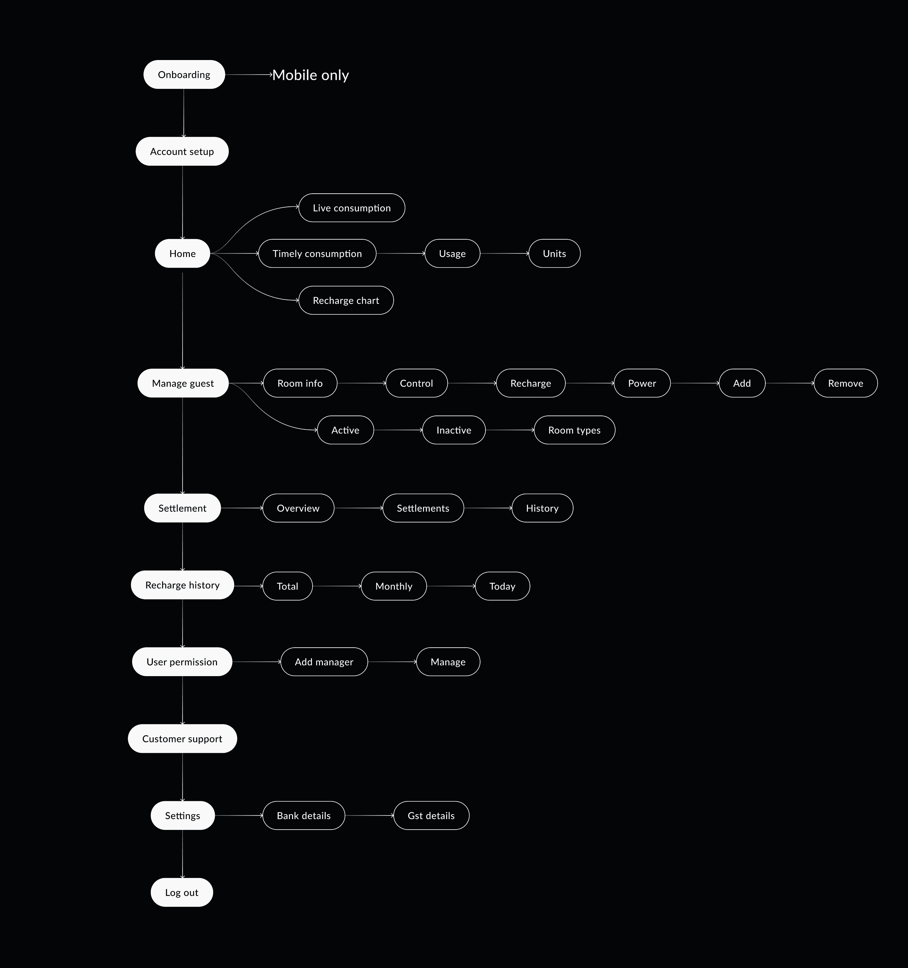
Sitemap
Simplicity is necessity! And when you have a platform with this level of functionality, it becomes even more important to inform users about the available features in a simplified manner.
UX redesign
The original EPVI dashboard and app had decent visual design; however, there were many issues with their UX like.
• Lack of visual clues.
No icons and states for navigation.
Bad colour contrast, consistency and, layout to make things accessible.
Need to Prioritise necessary elements and reducing clutter.
All screens should follow consistent colour, spacing, and patterns (basically a ui guide)

Visual redesign
With the goal of making EPVI welcoming and trustworthy to users, it was essential to optimize its UI.
• Providing hover and pressed states to buttons, drop downs, and other elements.
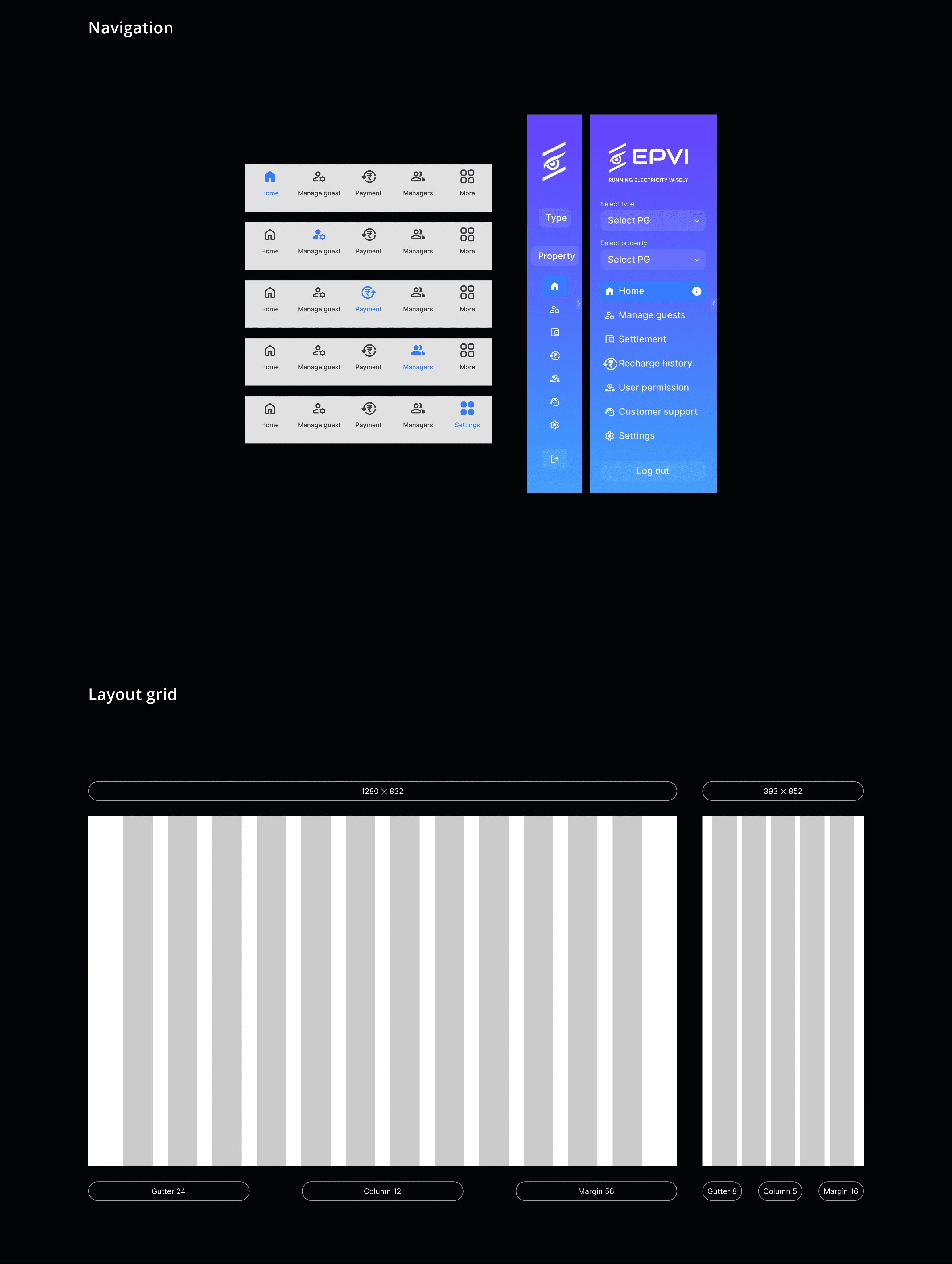
• Redesigning dashboard navigation to make it visually appealing and intuitive.
• Providing visual clues like activity indicators, etc.
• Redesigning the complete EPVI Connect app user flow to match the dashboard and make it intuitive.
Design priorities
Increase trust
Due to the multiple transactions, it becomes important to make users feel comfortable and safe while using EPVI.
Understandable
Making EPVI easy to understand is crucial due to its numerous features and vast data, which can overwhelm users.
Welcoming
Providing users with a intuitive interface that feels welcoming, enhancing experience and being easy to use.
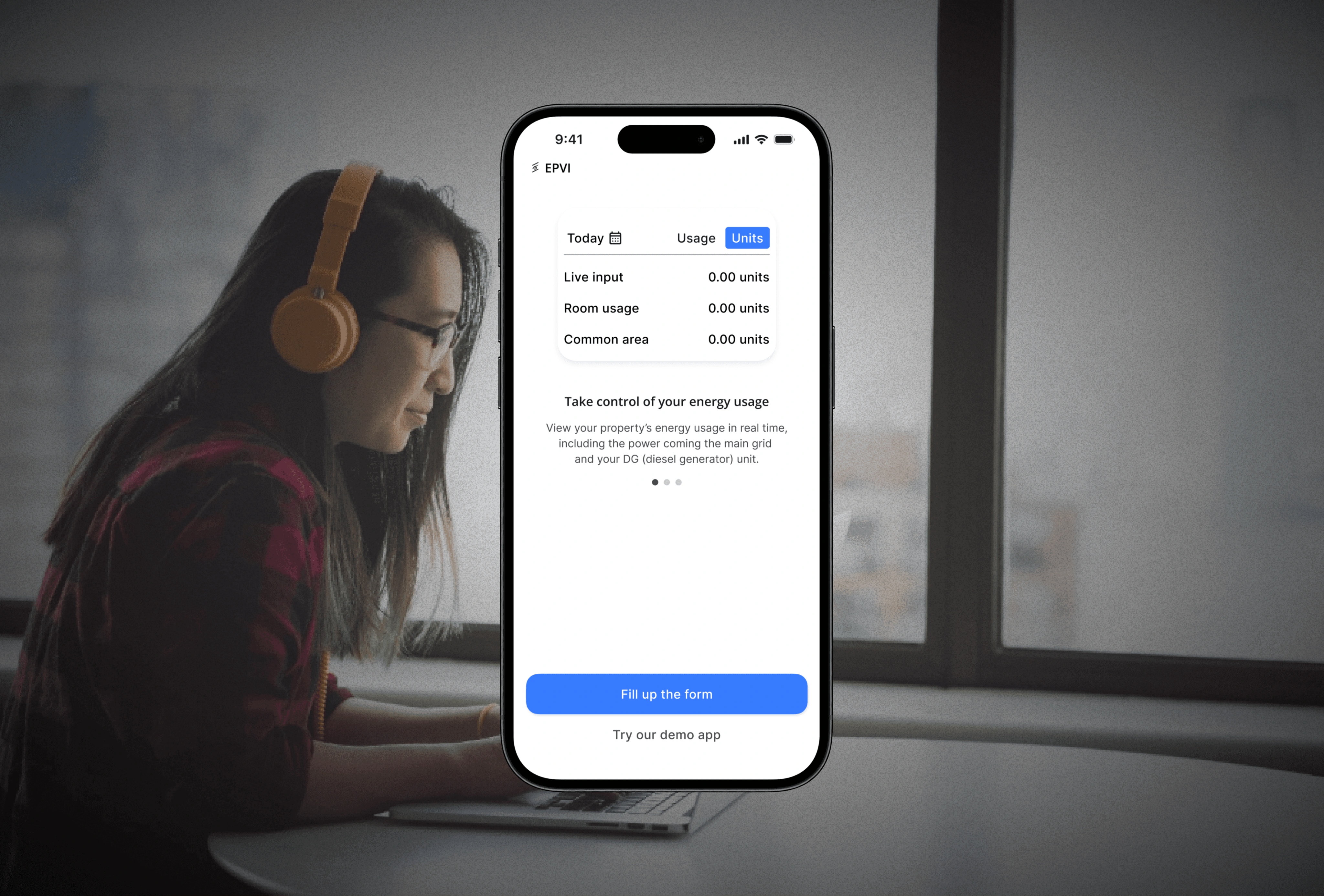
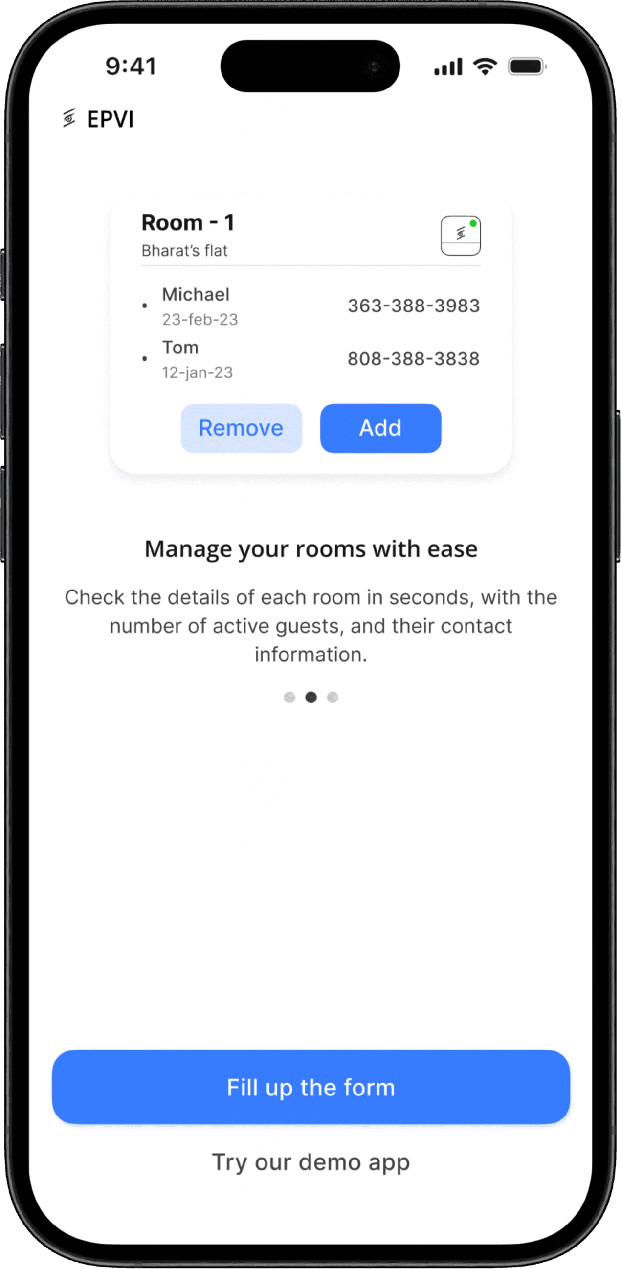
Onboarding
We've decided to implement onboarding to provide users with a better understanding of the platform and what the app offers.
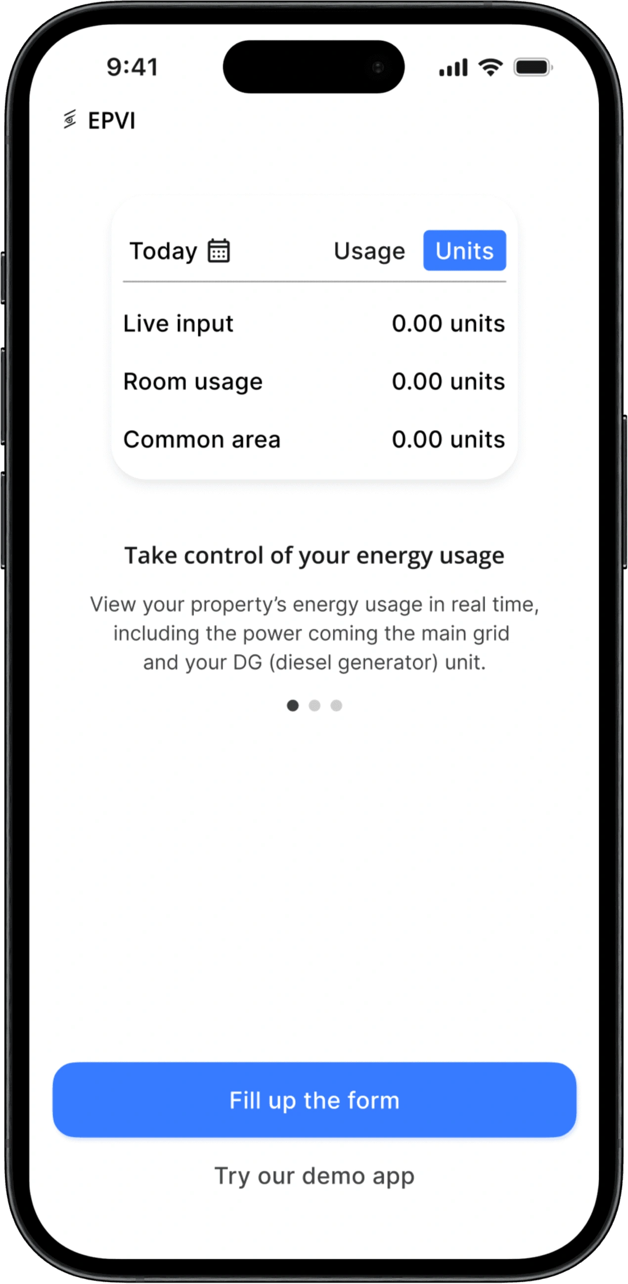
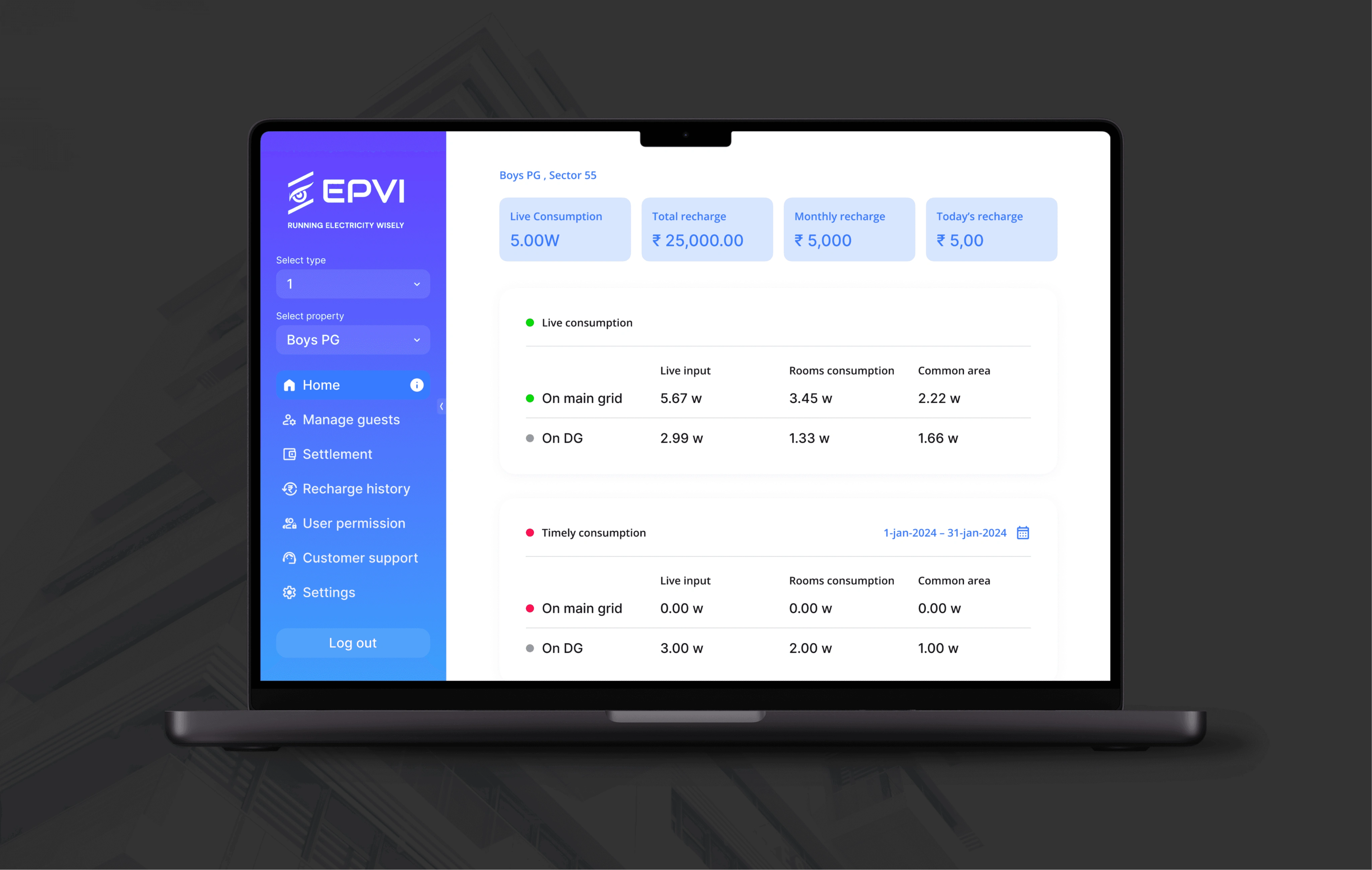
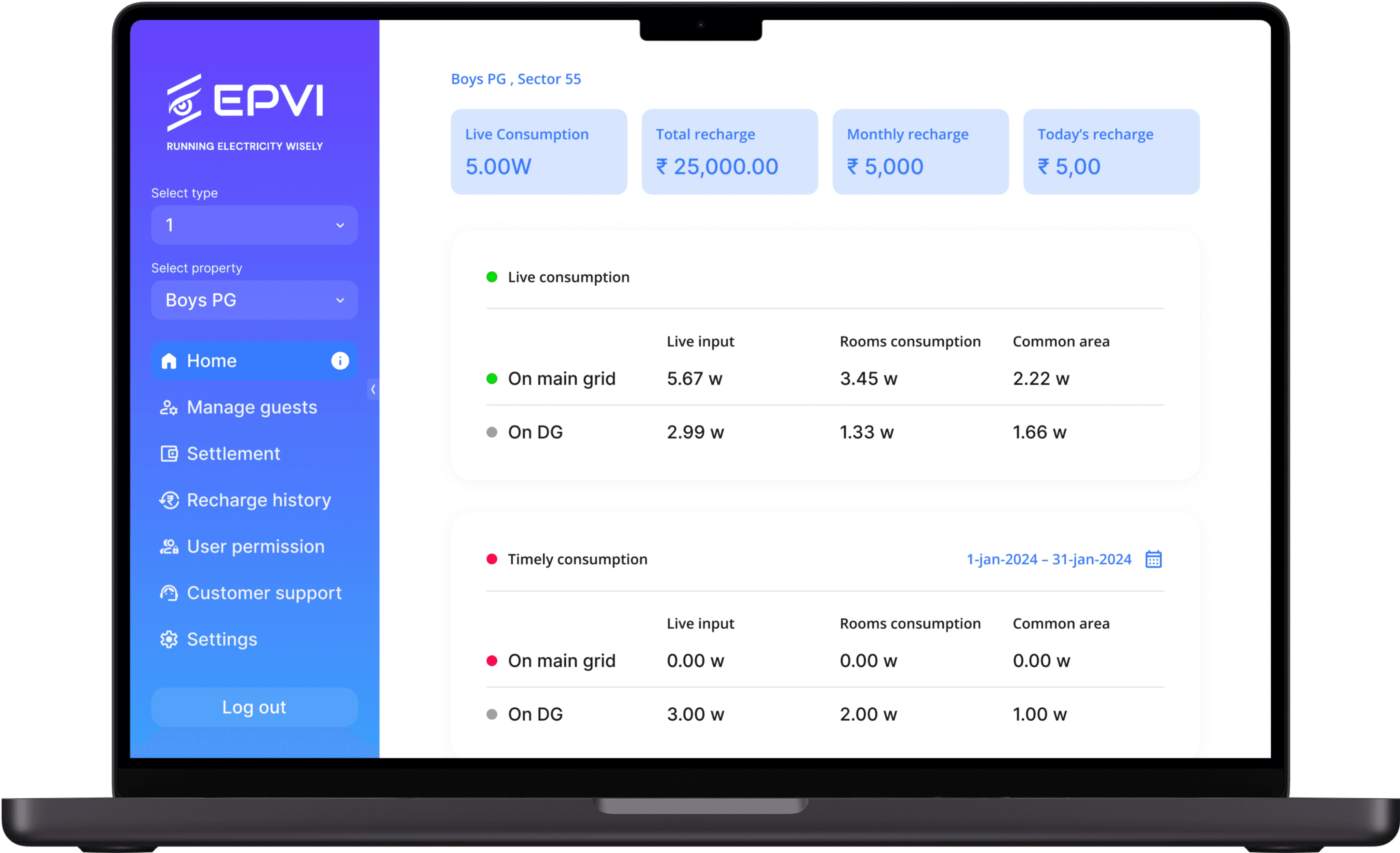
Home
The home screen showcase the data and live energy consumption
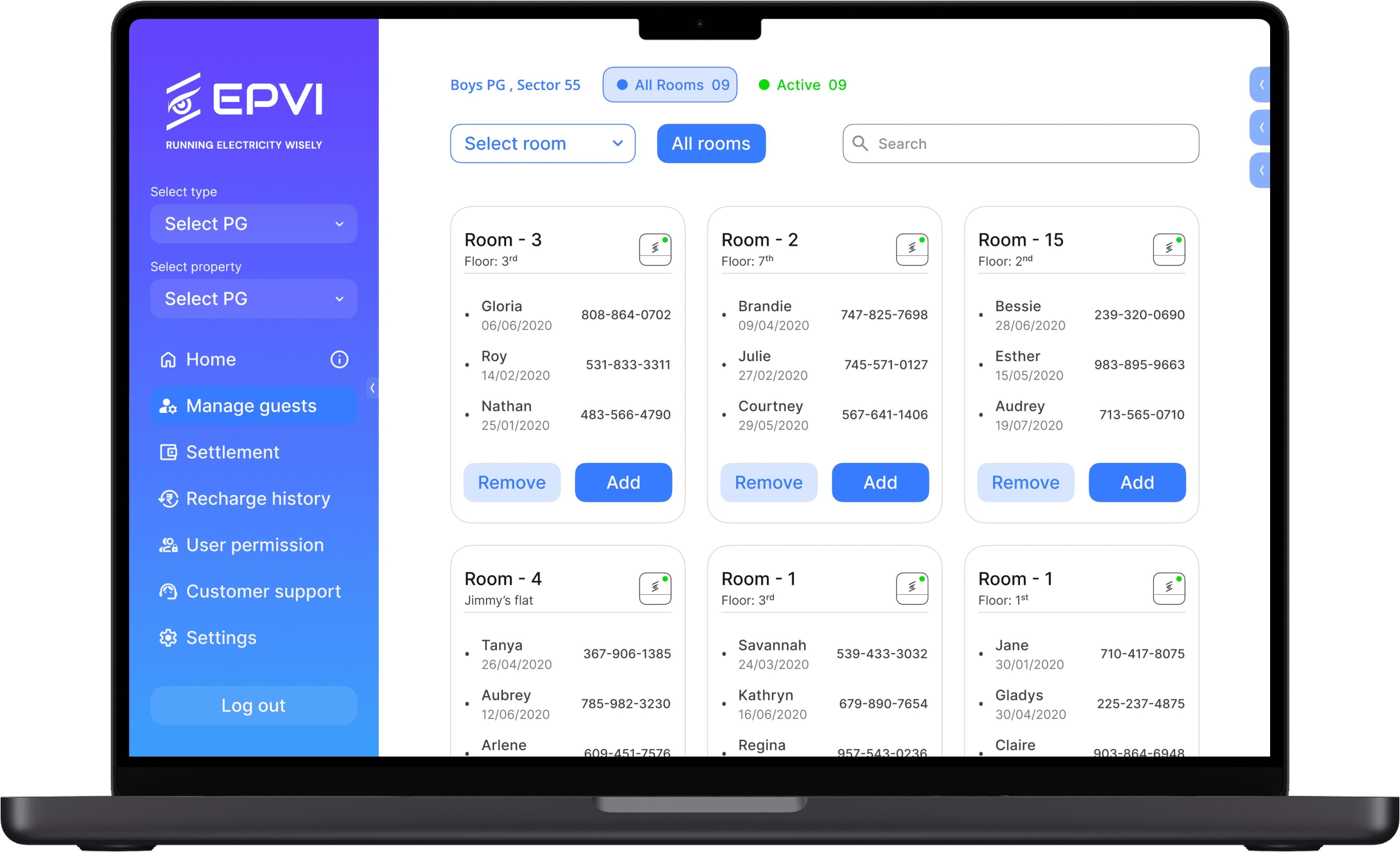
Manage guest
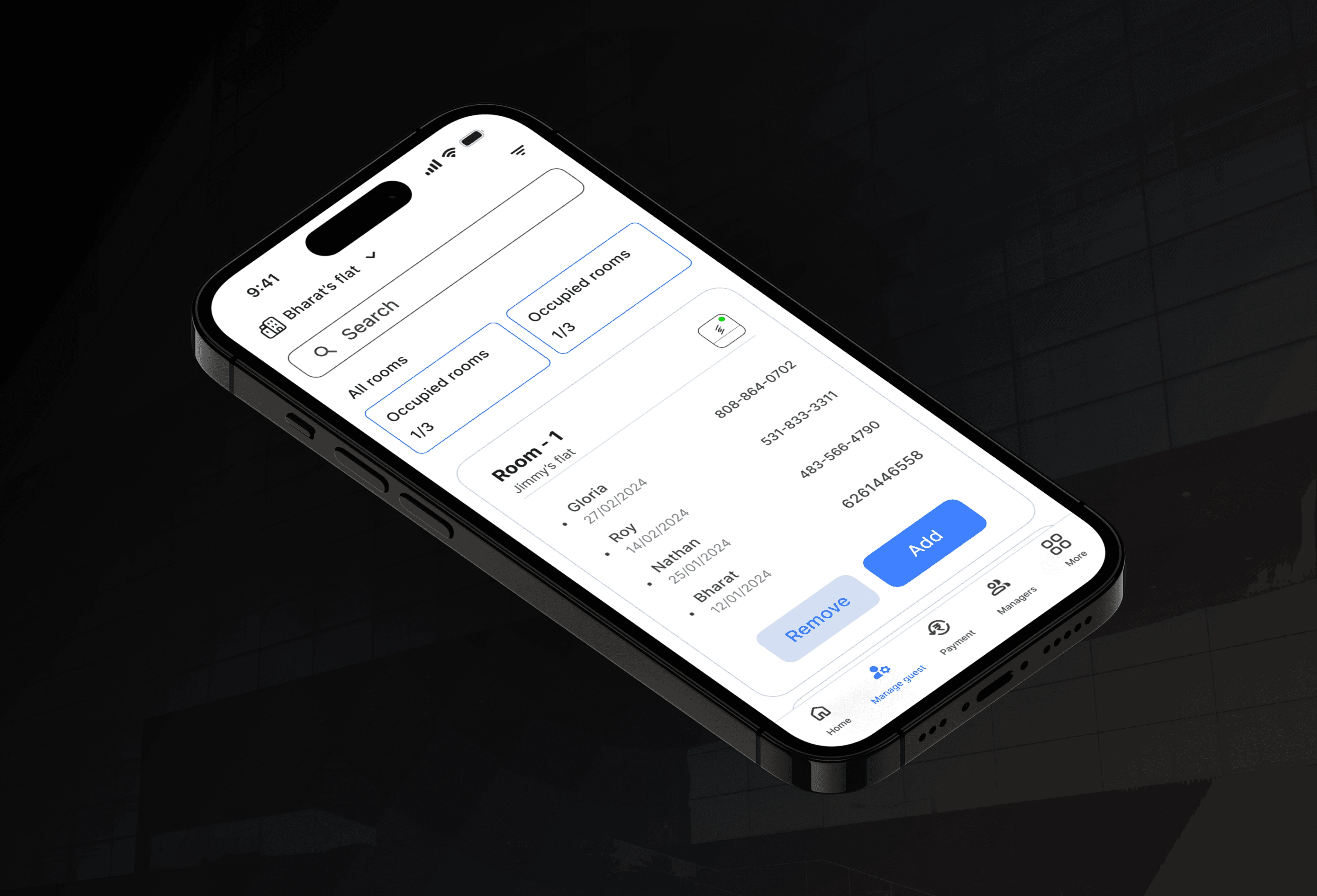
Here, users can check data for a particular floor or room. The goal was to enhance clarity, increase space, and reduce clutter, such as easily accessing all rooms from a specific room.
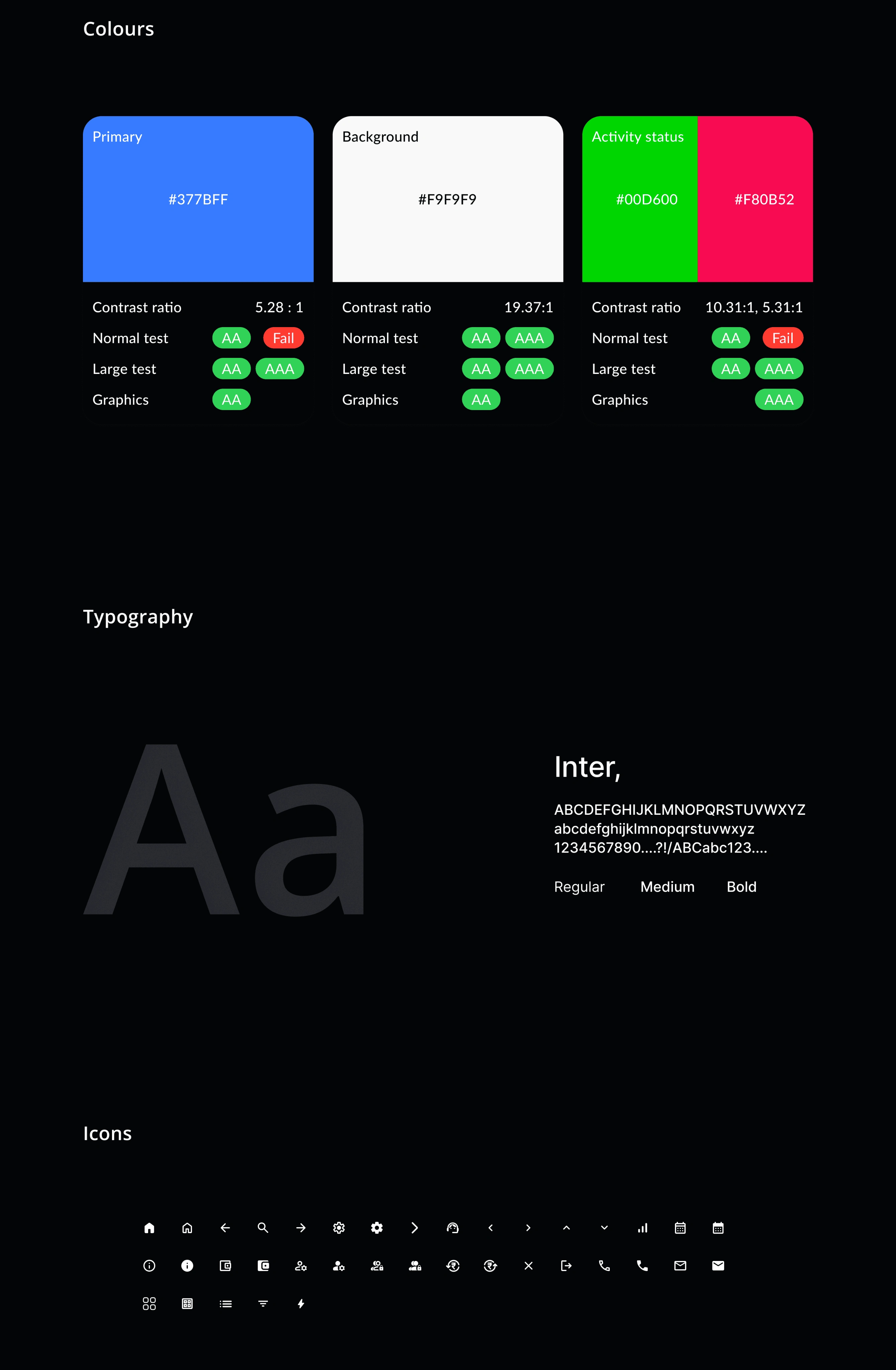
Style guide
To ensure the components are implemented consistently across the site, I created a UI guide like colour palettes, typography, icons and reusable UI elements.
Home
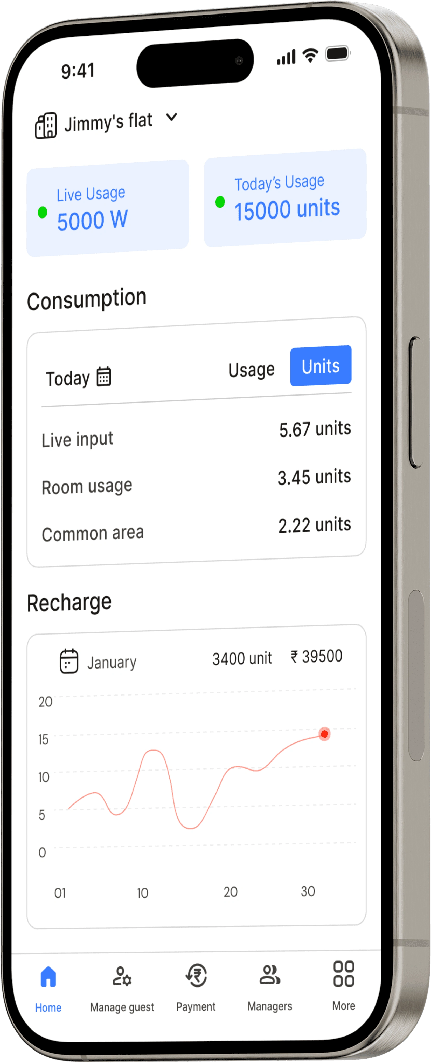
Similar to the desktop version, the mobile home screen provides an overview of energy consumption.
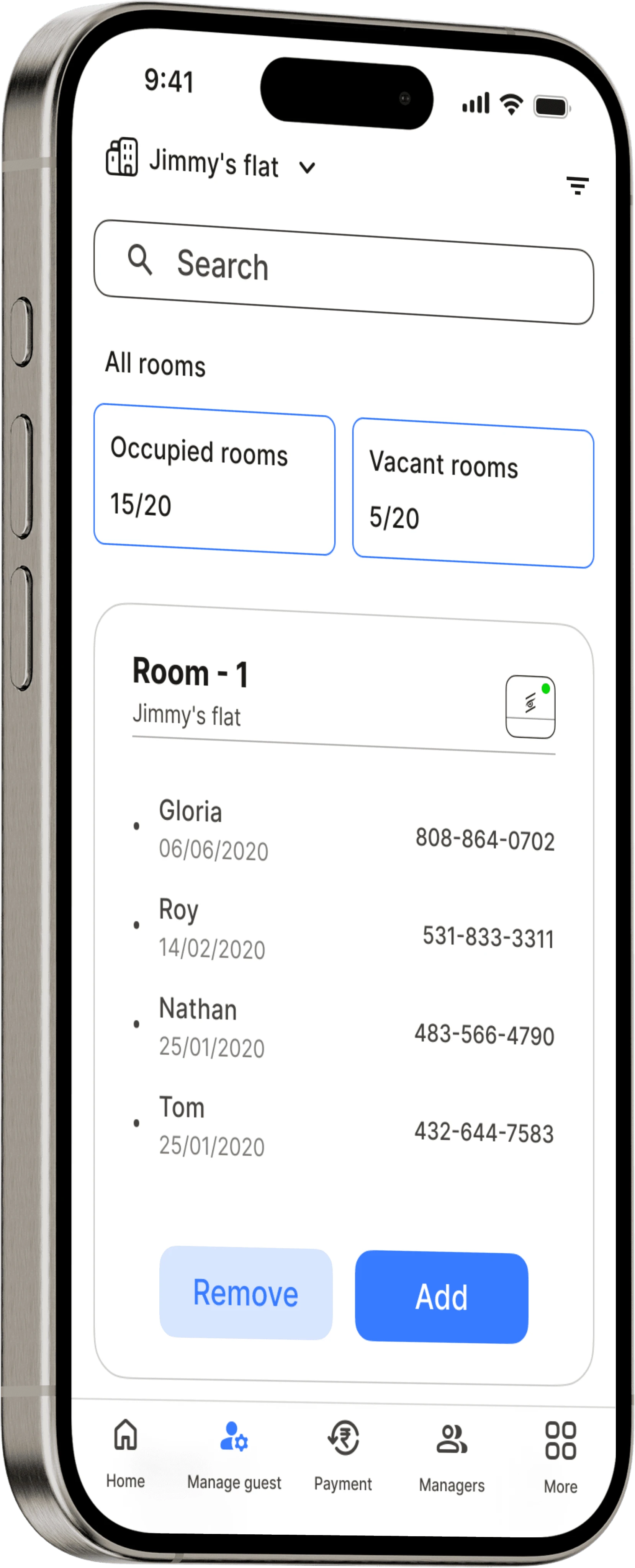
Manage guests
Again! Similar to the dashboard, it allows users to check details for a specific room and add or remove tenants.
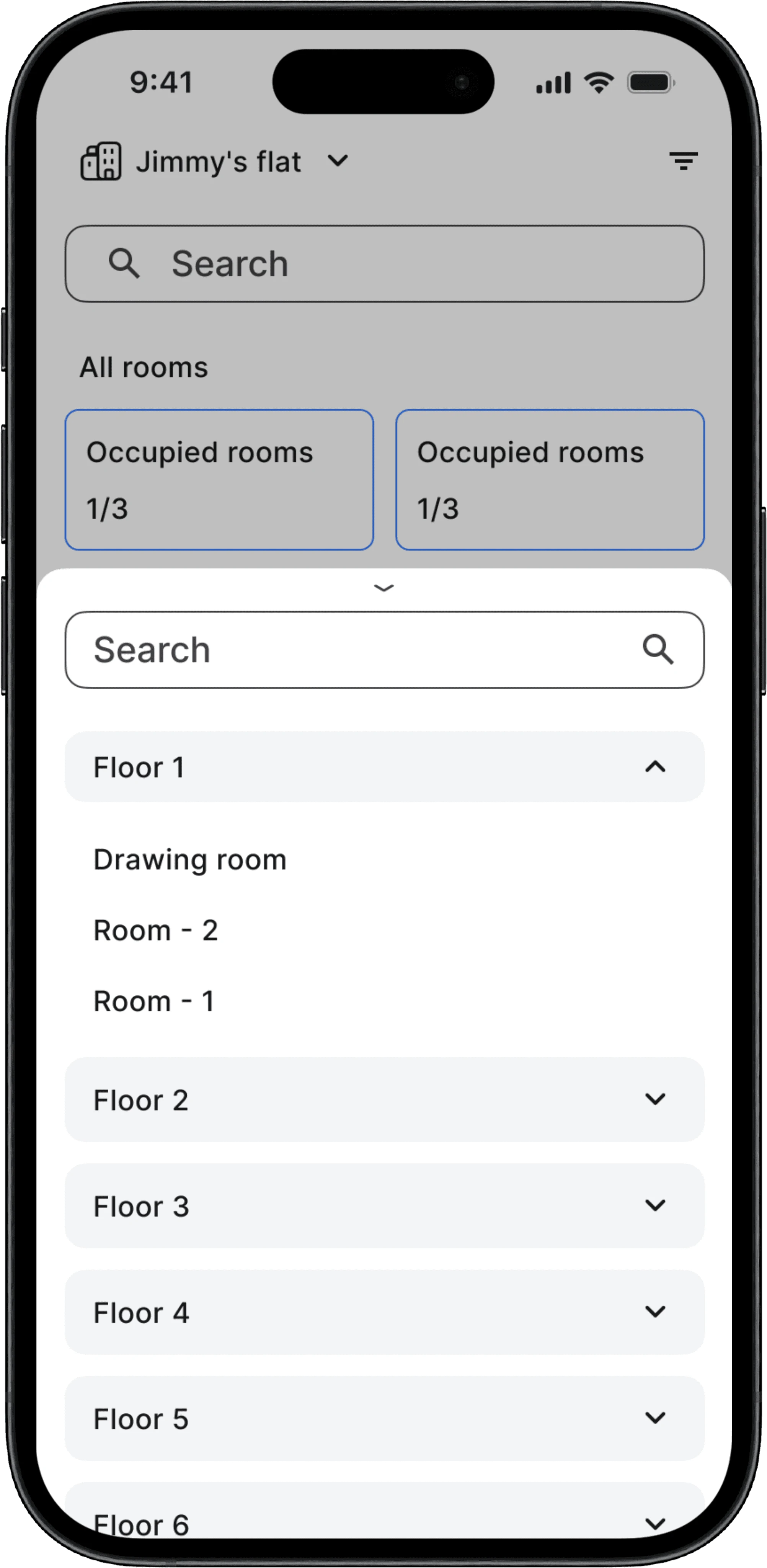
Manage guest (filters)
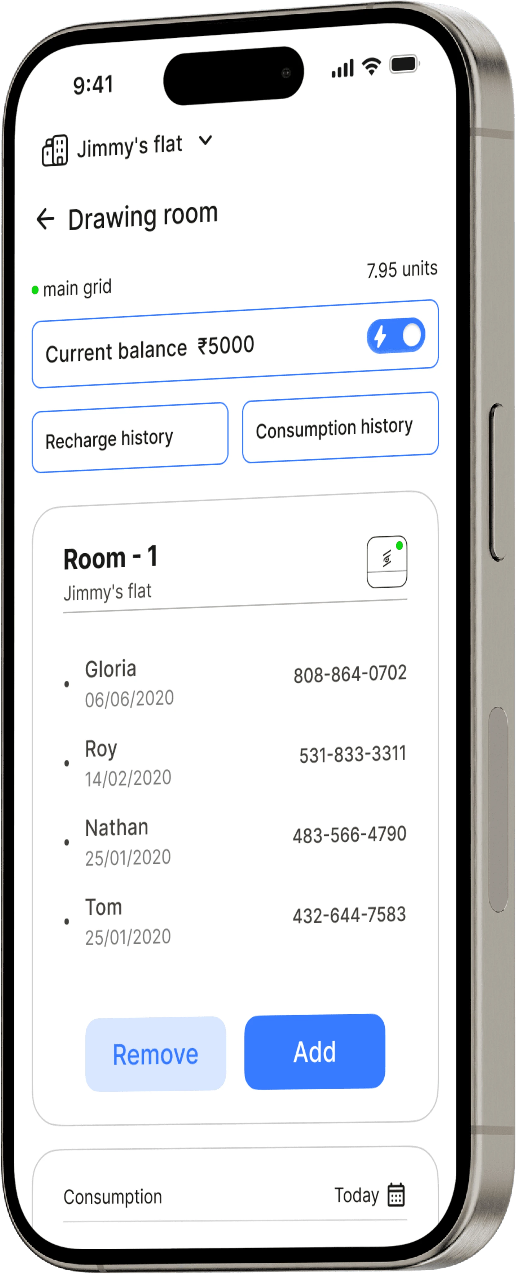
Room info
Here, users can control energy flow for the rooms and check recharge and consumption history.
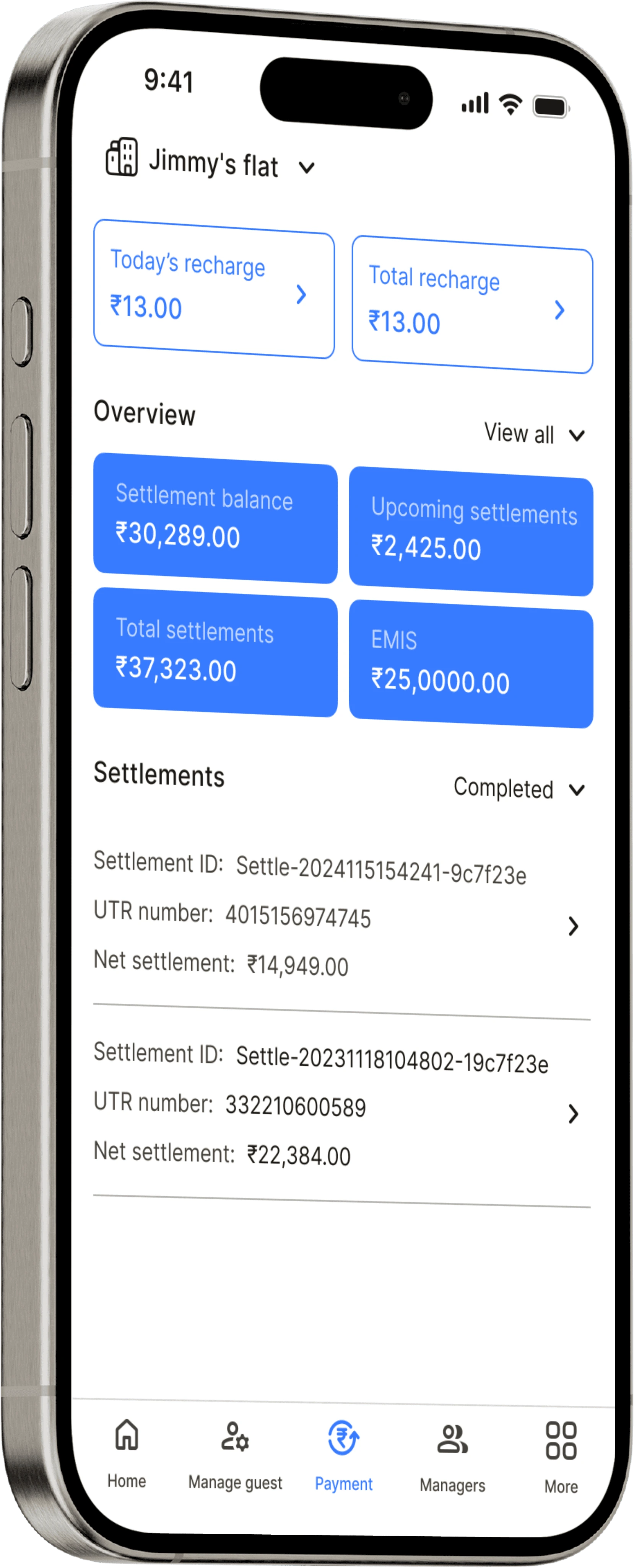
Payments
Users can check recharge history, manage settlements, and perform various other actions such as checking EMIs, total settlements, etc.
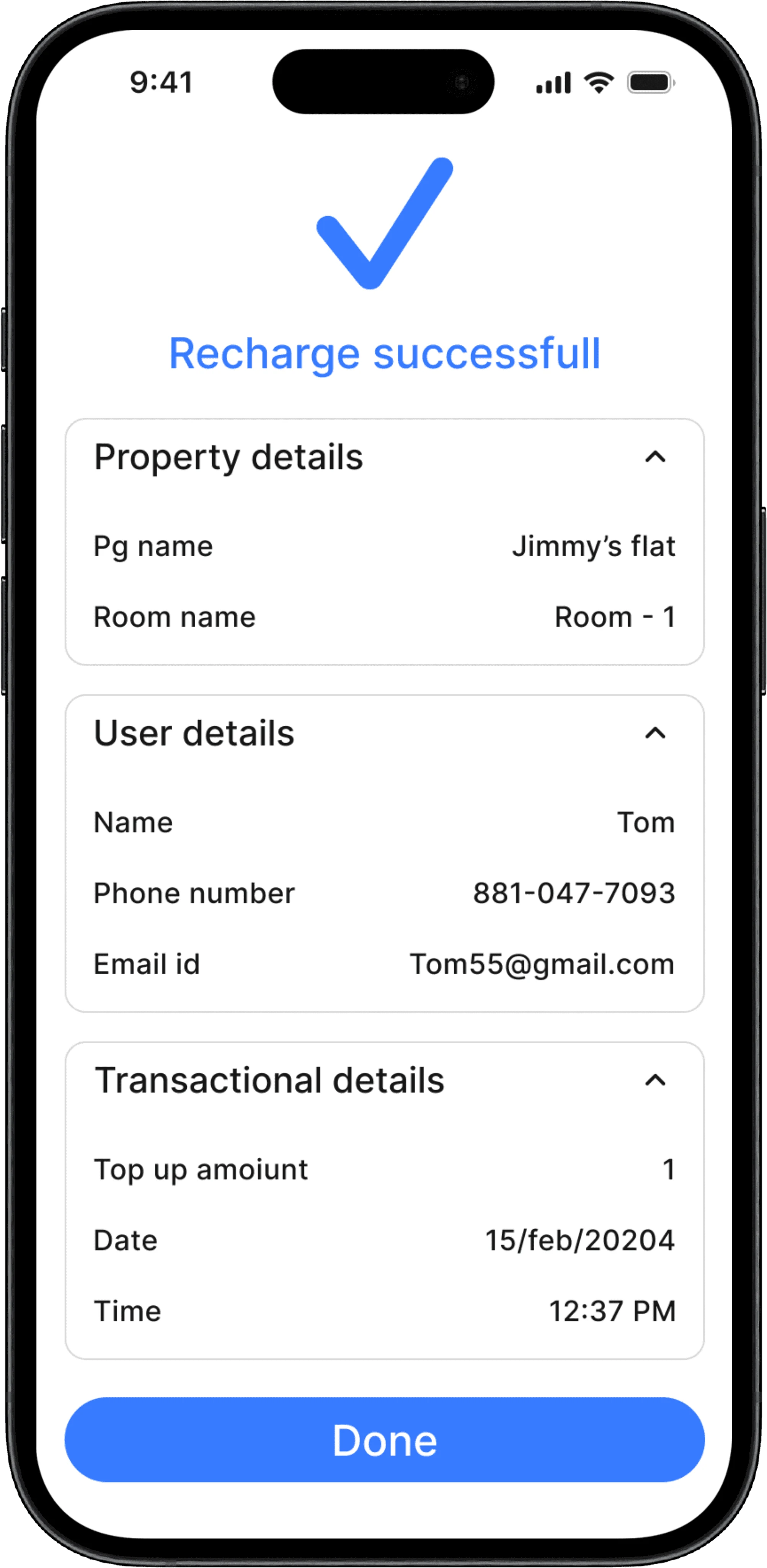
Recharge completion screen
Settings
The purpose of the settings is to check GST details, manage the account, and enable users to contact the support team.
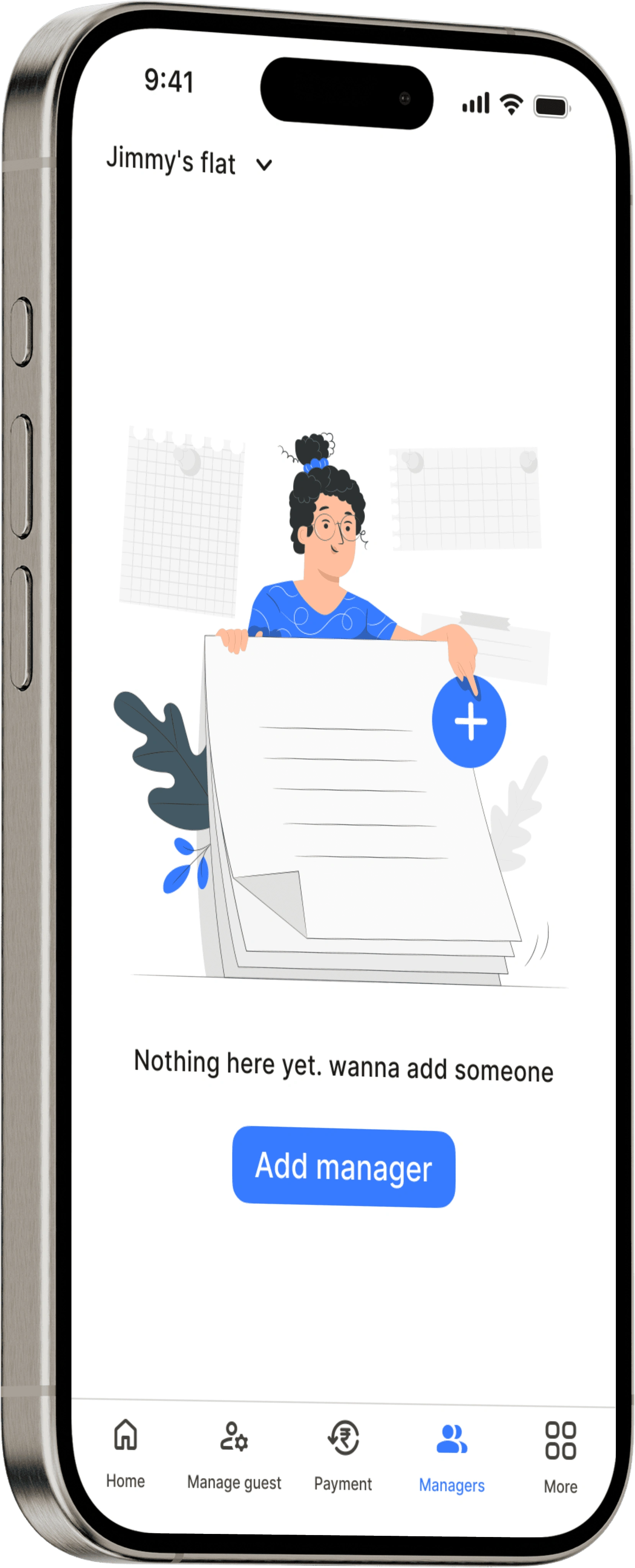
Managers
As the name suggests, you can add or remove managers from here.
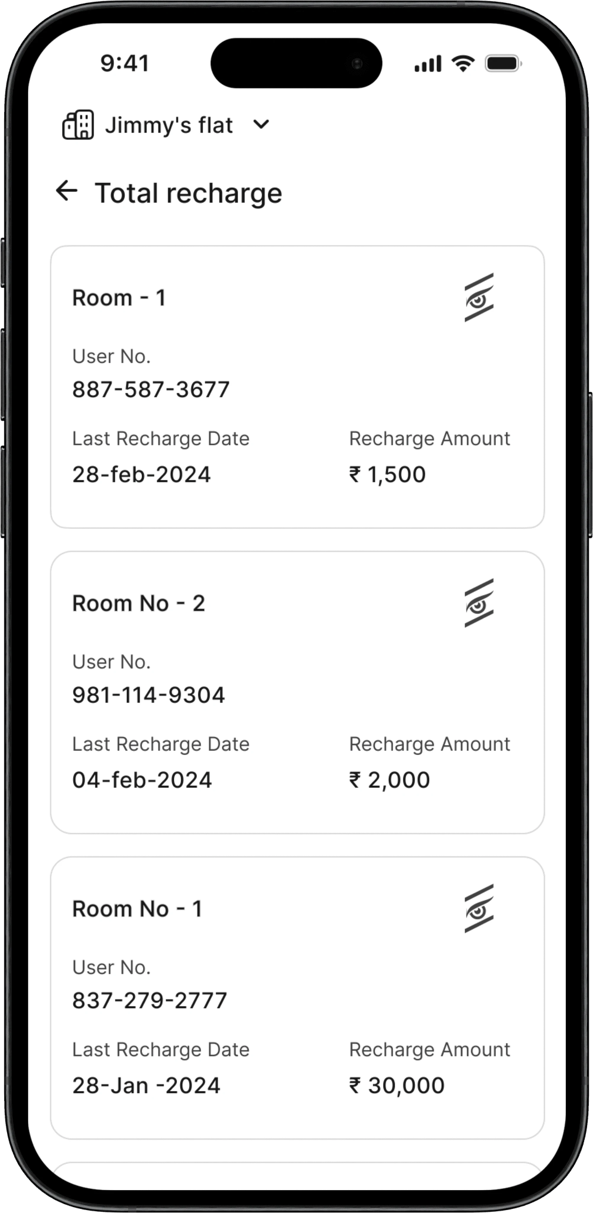
Recharge history
Thanks for visiting
I am a UX designer dedicated to offering services that help you stand out in the digital world.
Like this project
0
Posted Jun 27, 2024
EPVI is an electricity management startup with the goal of transforming buildings into smart and energy-conscious structures. This is achieved by monitoring re


