Streamlining Recruitment Workflows for Evalart

abasifreke Effiong


Streamlining Recruitment Workflows for Evalart
Project Overview
Evalart is a B2B SaaS platform that helps businesses handle recruitment from start to finish — screening candidates, assessing skills, and managing selection processes. While the platform was powerful, it struggled with adoption. The previous interface was complicated, and essential tasks took far longer than they should. Many HR teams felt the system worked against them rather than with them, and that frustration was beginning to affect sales.
My task was to reimagine the platform’s user experience, simplifying workflows and creating a more intuitive, accessible design that recruiters could pick up and use without lengthy onboarding.
Problem Statement
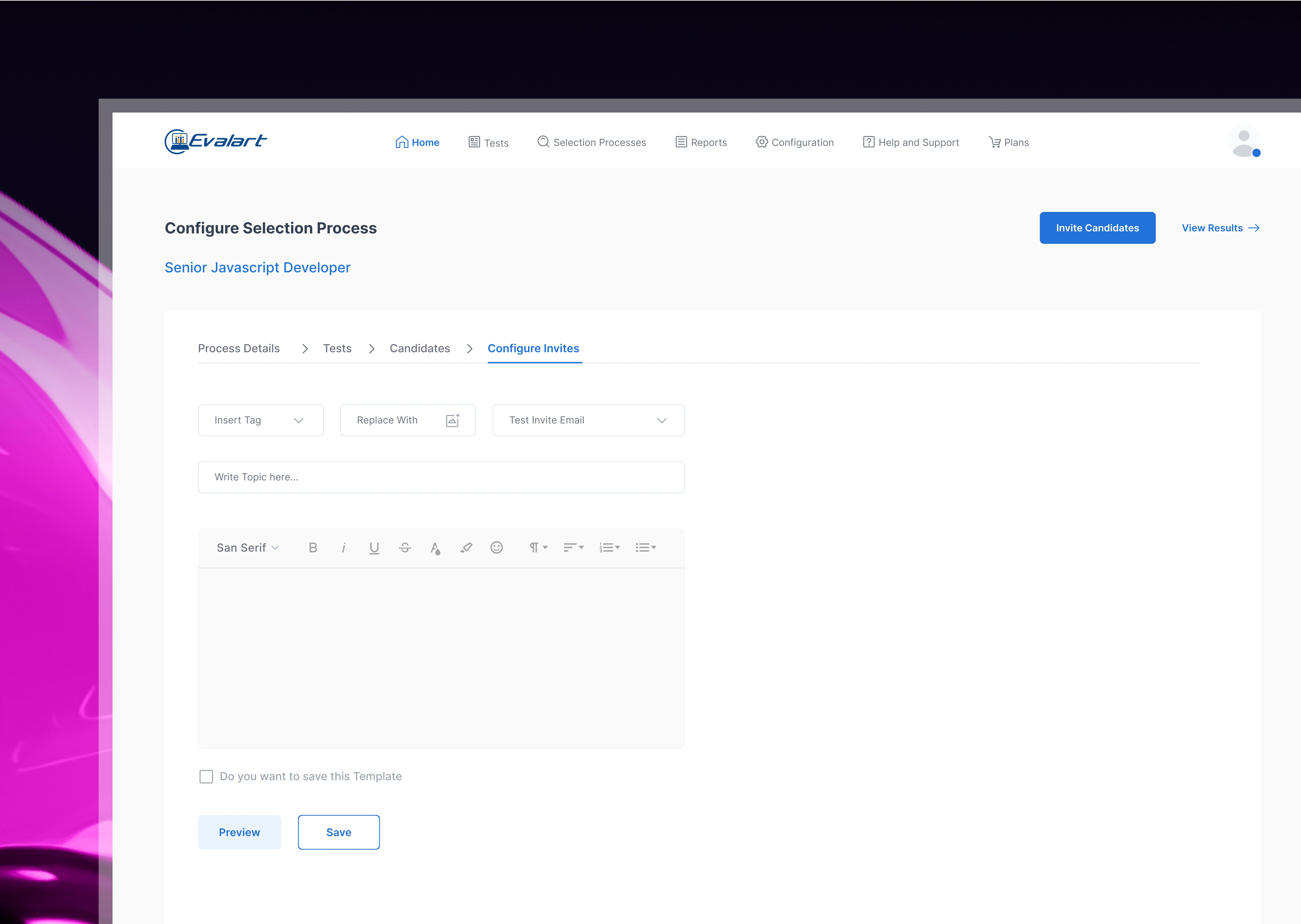
Evalart had a rich set of features but an overly complex way of delivering them. Recruiters found themselves lost in layered menus, scattered actions, and lengthy, disjointed flows. Tasks like creating a new test, sending it to candidates, or reviewing results involved multiple steps that didn’t feel natural. This complexity slowed teams down, discouraged adoption, and made it harder for the sales team to demonstrate the product effectively to potential clients.
Role
I came on board as the Lead UX Designer, responsible for identifying pain points, defining the redesign strategy, and delivering a more intuitive product experience. My work involved deep analysis of the existing interface, reviewing usability test reports, and watching recorded user interviews to see real-world frustrations in action. I also collaborated closely with Evalart’s stakeholders to align business priorities with user needs, ensuring our design direction was both functional and commercially viable.
Solutions
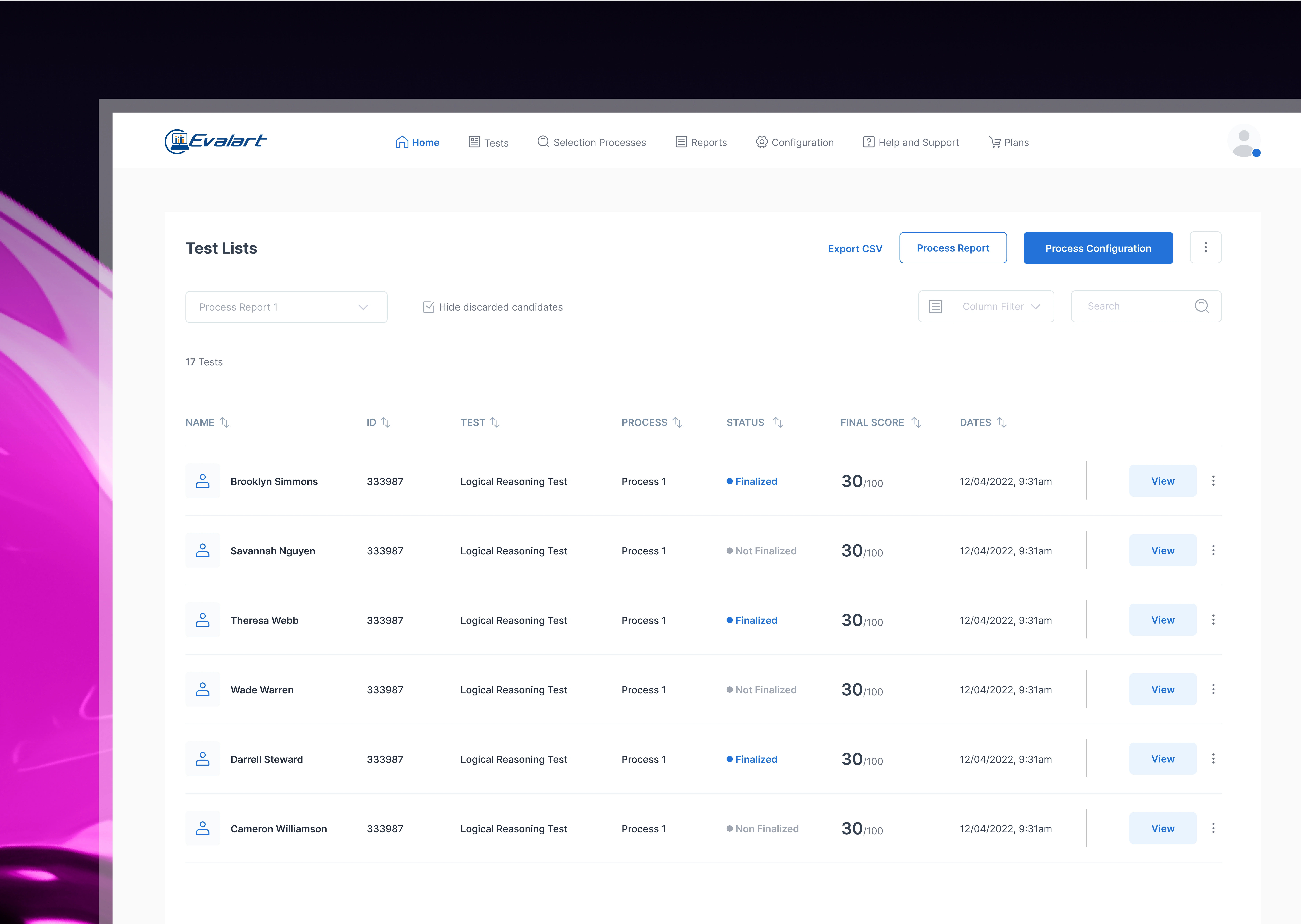
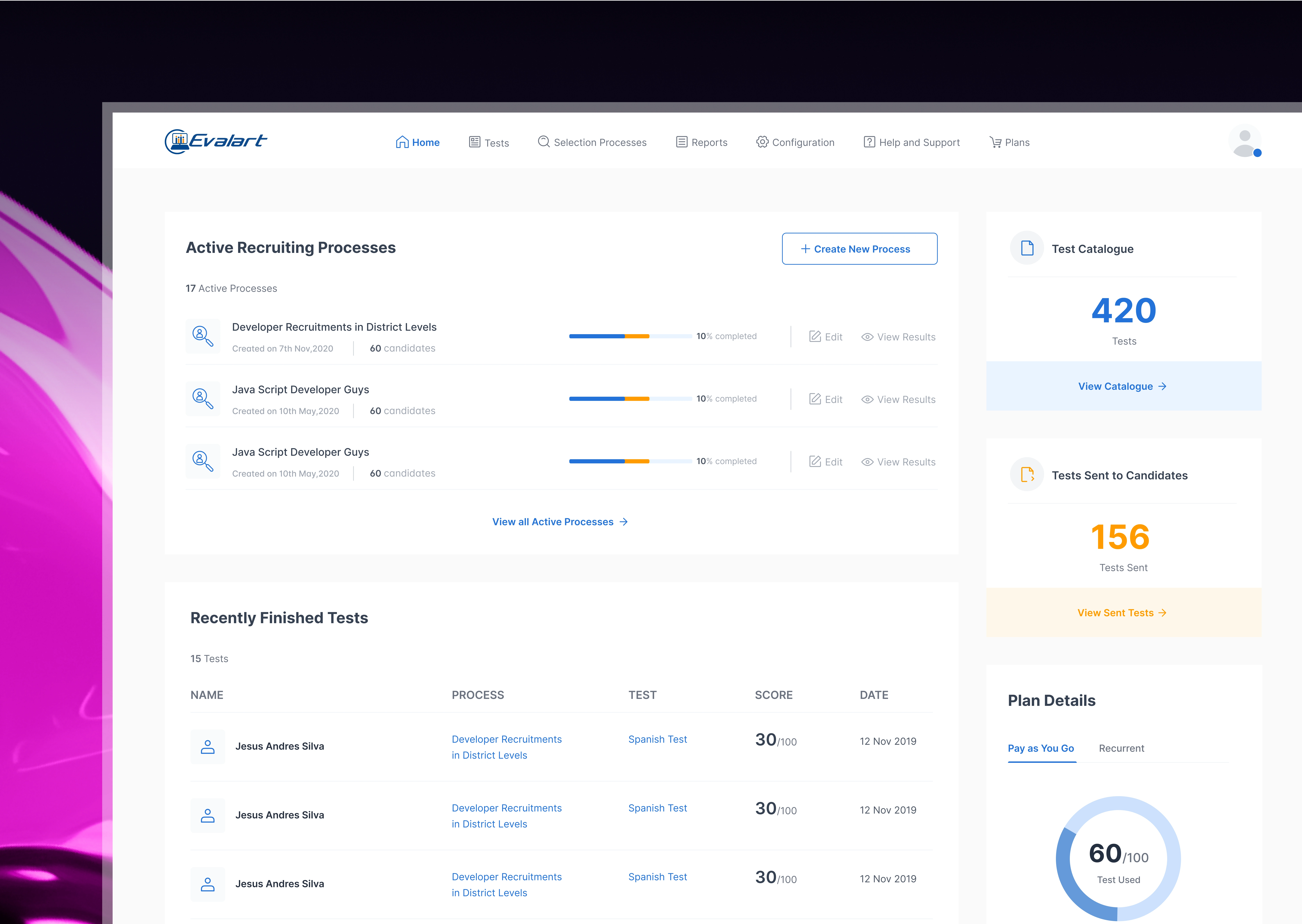
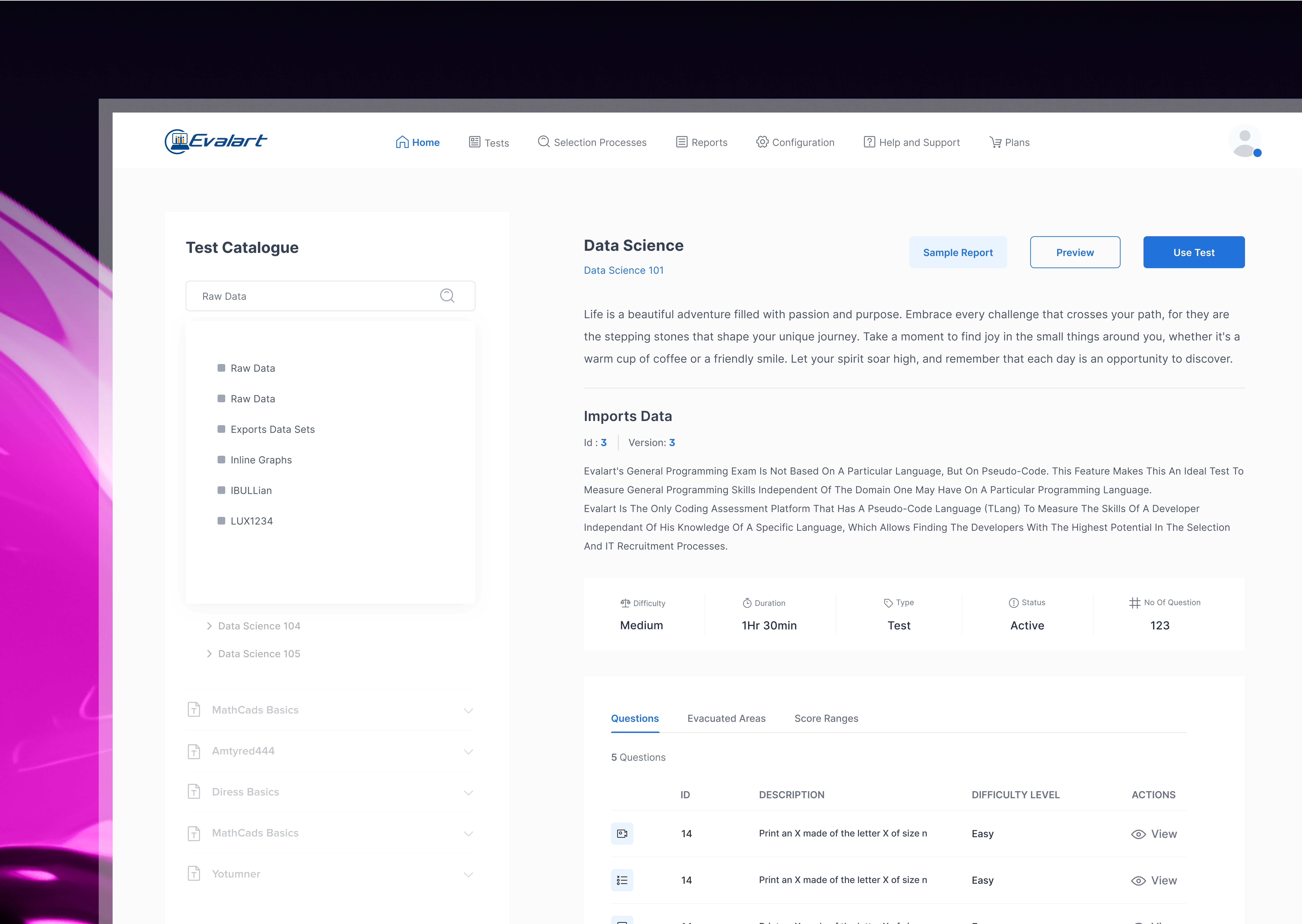
Rather than adding new features, the focus was on clarity, flow, and simplicity. I restructured the information architecture so that related actions were grouped logically, making navigation straightforward. Key flows — such as creating tests and tracking candidate progress — were redesigned to be linear and intuitive, cutting down the number of steps and keeping related actions on the same screen wherever possible.
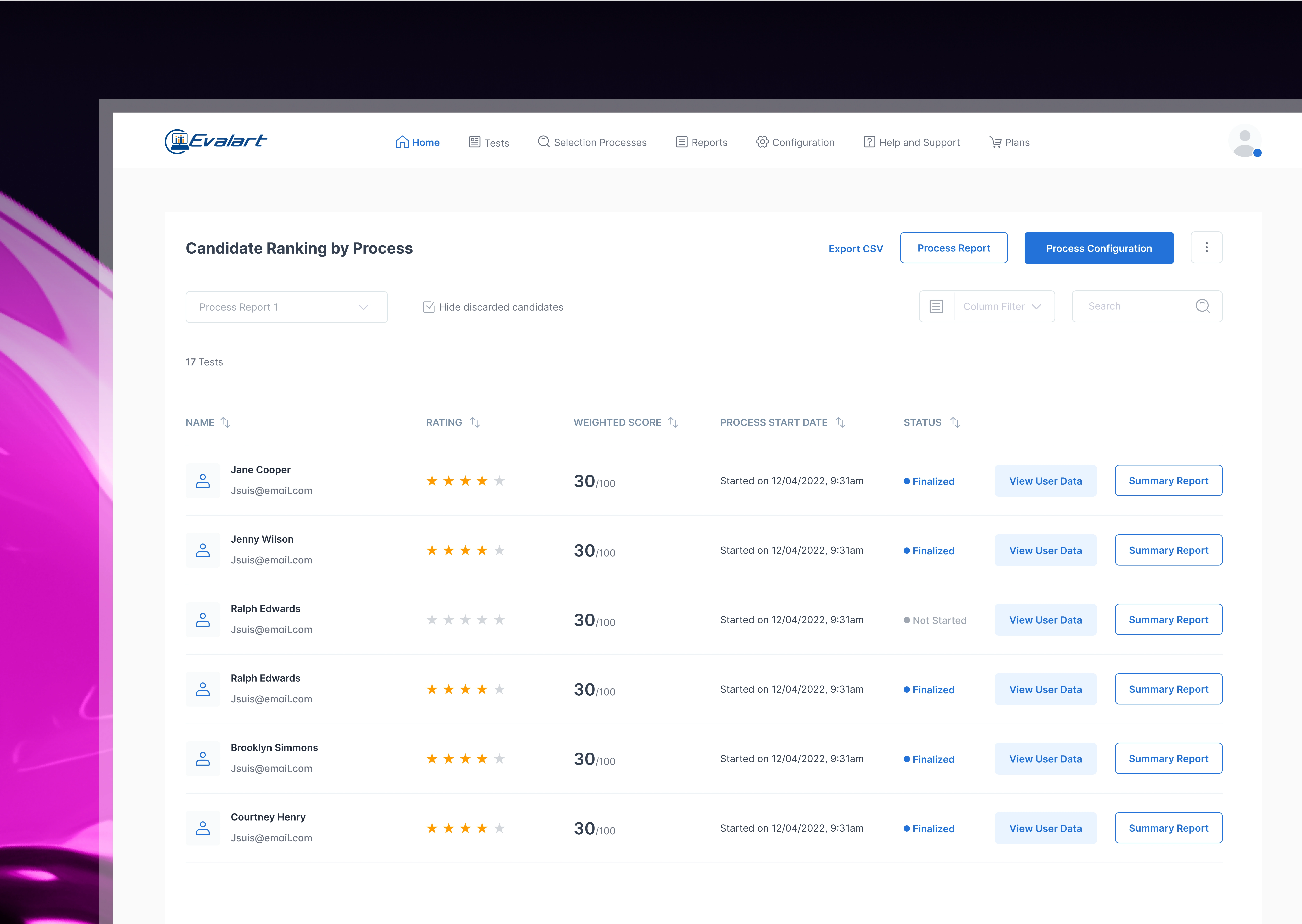
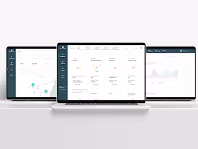
Visually, I moved toward a cleaner, modern interface with consistent styling and more breathing room, allowing users to focus on what matters most. Dashboards were transformed into action-oriented spaces, guiding recruiters toward their next steps rather than leaving them to figure it out on their own.
Results
The redesign had a tangible impact. Recruiters could now complete critical tasks in nearly half the time, and new customers were able to get started with minimal training. Feedback from both existing users and the sales team was overwhelmingly positive the platform no longer felt like a hurdle, but a tool that worked seamlessly with their process. As a result, Evalart saw increased engagement, smoother onboarding, and a stronger position in competitive demos.
Like this project
Posted Aug 12, 2025
Redesigned Evalart’s B2B SaaS hiring platform, simplifying complex workflows into an intuitive experience that boosted adoption and cut task time in half.